Leaks & Rumors

The 4 New iPhones for 2020!


The iPhone 11’s are now out, the reviews are in ours included and the iPhone 11 Pro Max that I’ve been using since September has been very good. The battery life has just been outstanding, the camera is great. I really don’t have any complaints at all, aside for the fact that we have the same design as on the 2018 iPhone XS and 2017 iPhone X.

This is the iPhone that we’ll have until September 2020, meaning that for the past 3 years, Apple hasn’t made any design changes to their iPhones at all, at least not from the front.

But the 2020 iPhones will be one of the biggest changes yet and they will feature a brand new design this time, so considering that I haven’t talked about the 2020 iPhones in a while now, here’s everything new you need to know!


The report on CNBC by JPMorgan Analyst, Samik Chatterjee where they predicted four new iPhones (Source: CNBC)

The report on CNBC by JPMorgan Analyst, Samik Chatterjee where they predicted four new iPhones (Source: CNBC)

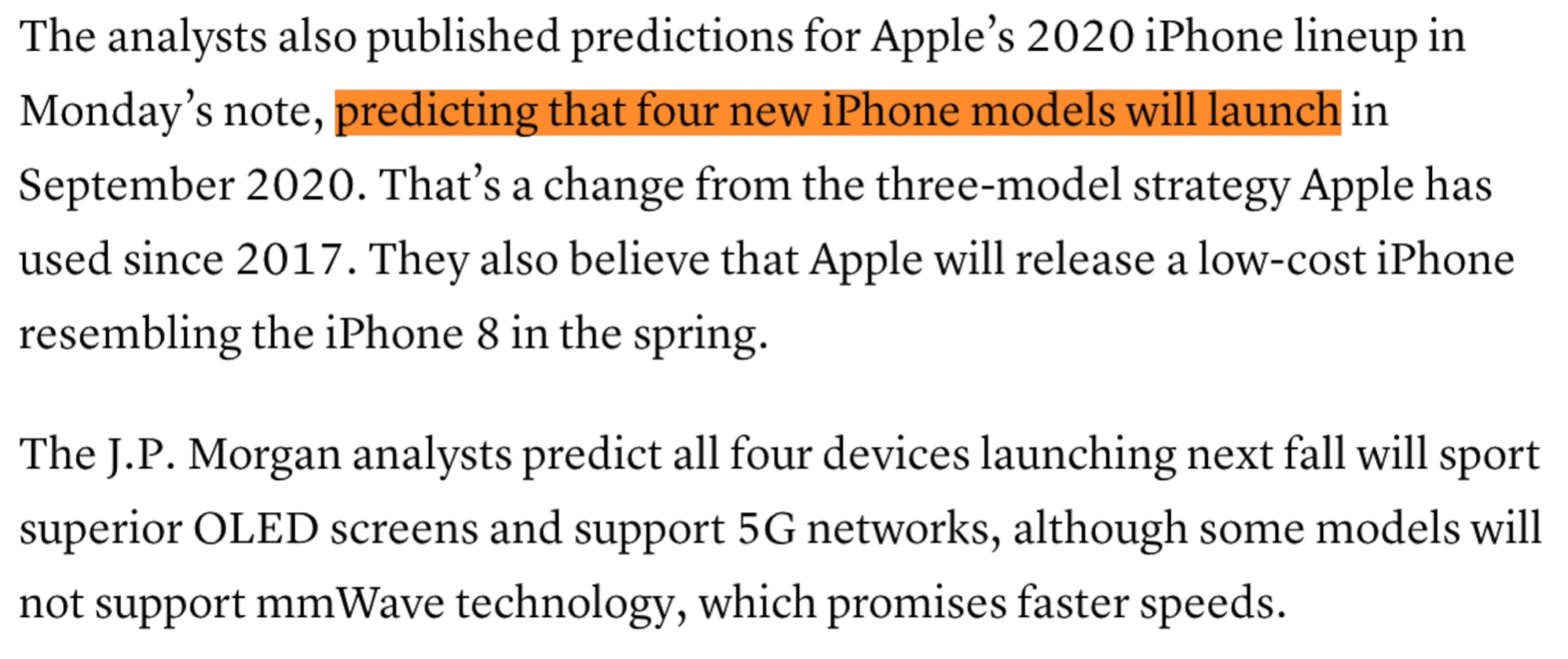
So the biggest leak in terms of the 2020 iPhone 12 (that’s just what we will call them for now) comes from JPMorgan analyst Samik Chatterjee, who claims based on information from supply chain sources, that Apple will be releasing four new iPhones in 2020, rather than three like they did in 2019 and 2018.

The smallest model would be a 5.4” iPhone, then we would have not one but two 6.1” iPhones and finally a massive 6.7” one. But which models would be the Pro’s? Well, Samik does report that one of the 6.1” models and that 6.7” model would both be Pro’s, while the 5.4” one and the other 6.1” iPhone would be lower entry models.

But then we have reports from Ming-Chi-Kuo, who’s had an outstanding track-record in the past, saying that Apple would only be releasing three iPhones in 2020. There would be one 5.4” model, one 6.1” model instead of two, and 1 6.7”. And the Pro models, according to Ming-Chi-Kuo, would be the 5.4” and the 6.7” variant.

Personally, I do think that the best approach for Apple would be to stick to just three models and offer the smaller and the bigger variants as Pro’s. This way, people who want to the performance and features of the biggest and most expensive iPhone that Apple offers can still get all of that in a much smaller form factor.

But according to pretty much every other report that we’ve seen, all four 2020 iPhones will now come with OLED displays. After so many years, we’ll finally get OLED on the entire lineup. However, the Pro models are still said to have a slightly more superior display, which is very likely to be the Pro-XDR display that Apple introduced with the iPhone 11 Pro’s, while the lower end models will likely have the iPhone XS’s display panel, which is still an OLED just not a bright and the 11 Pro’s display. 

Samik also said that all the four iPhone models in 2020 will support 5G, which has also been confirmed by Nikkei. Qualcomm’s President Cristiano Amon, did say earlier this week at their conference that their number one priority of their Apple relationship is launching their 5G phone as fast as they can. So 5G will definitely be one of the main focuses of the 2020 iPhones. However, it seems like the 5G speeds would not be equal on all these iPhones, Smik did say in his JPMorgan report that the lower end non-Pro iPhones will be limited to sub-6GHz 5G networks, which would not support the mmWave 5G which is the fastest 5G available at the moment. Personally I don’t really see this as an issue at all, since 5G is still very limited to just a few cities and you need to have a 5G phone plan as well. 

The new 0.25mm capacitors being produced by Murata Manufacturing (Source: MacRumors)

The new 0.25mm capacitors being produced by Murata Manufacturing (Source: MacRumors)

Also, speaking of 5G Nikkei reports that Murata Manufacturing, which is already a supplier for Apple, will start mass producing new tiny capacitors that take one fifth of the space of the current capacitors but offer ten times the electrical storage capacity. They’re absolutely tiny, at 0.25mm and by Apple using these capacitors it would allow them to free up some more space inside their iPhones, for those 5G antennas, which would indeed require some extra space.

Ok, what else? Well, Barclays analyst Blayne Curtis reported that he and his associates travelled to Asia recently to meet with manufacturers within Apple's supply chain and based on the information that he received it seems that both the iPhone 12 Pro and the 12 Pro Max will feature 6GB of RAM, up from the 4GB that the iPhone 11 Pro’s had, while the lower end models are still expected to come with 4GB of RAM. This is a bit disappointing because I’ve personally had RAM management issues with the iPhone 11 Pro Max, so that one should have definitely been upgraded to 6GB of RAM and then 8GB in the 2020 iPhones, but it seems like Apple will once again be behind in terms of RAM.

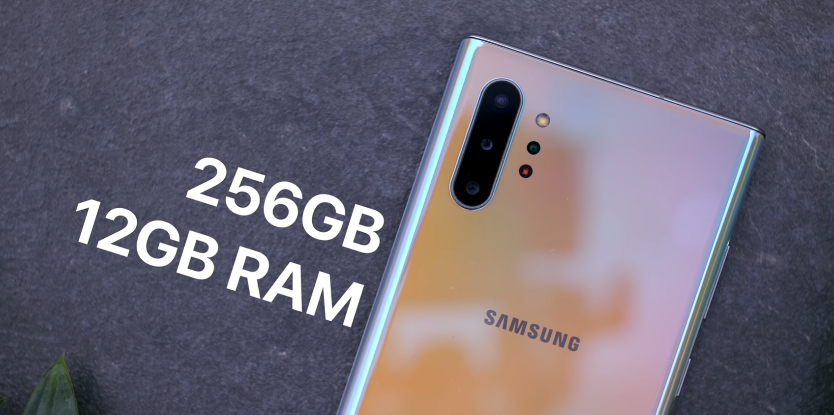
Some Android phones like the Note 10+ come with 12GB of RAM compared to the proposed 6 for the 2020 iPhones

Some Android phones like the Note 10+ come with 12GB of RAM compared to the proposed 6 for the 2020 iPhones

Some Android phones today even have 12GB of RAM and yes, it’s not about the amount of RAM, it’s about how optimised a phone is to deal with that amount of RAM. Like I said, with 4GB of RAM I am having issues with my 11 Pro Max, even after the recent updates. Hopefully 6GB will solve that, but why not give it 8 Apple, just to be safe?

Barclays also reports that the two Pro models of the iPhone 12 will indeed feature a 3D time-of-flight camera. This is something that we’ve seen reported before by Ming-Chi-Kuo, back in July 2019. A TOF camera is essentially two small extra modules that include an IR receiver and an IR transmitter. The IR transmitter will beam a ray of IR light which will reach and object, bounce back and the IR receiver will calculate the distance between the camera and the object, based on the amount of time it takes for the IR light to be reflected back. This will allow the camera to map 3D objects in real time. This is actually how the FaceID camera maps your face as the FaceID camera on the front is already a TOF camera. 

So we’ll pretty much be getting the same thing on the back, which will have a noticeable benefit in AR apps. This means, significantly improved tracking which is already very good, and also the ability to scan objects or even small rooms possibly in 3D. It is likely to be something similar to what the Samsung Galaxy Note 10+ can already do. Mark Gurman from Bloomberg has indeed detailed a road map of Apple’s AR and VR future, saying that they will be releasing a new iPad Pro in the first half of 2020, with this new 3D sensor followed by new high ends iPhones in late 2020 with the exact same cameras. 

Also, speaking of the new iPad Pro 2020, Sony Dickson sent over a model of that upcoming iPad and we’ve even made a separate hands-on video with that, which you can watch here.

Ok, so we’re getting 5G, the camera is getting another module with 3D TOF capabilities, we’re getting more RAM and possibly four rather than just three models. But what changes are we getting design wise?

Well, we’ve had many contradictory reports on this, from all the major sources. Some are saying that Apple will remove the notch entirely, and switch to an In-Display fingerprint reader, some are saying that they will actually use both, and that FaceID will now be included into the top bezel, so no notch, just a thicker bezels surround the phone, and some are saying that we’re still getting FaceID, just with a smaller notch.

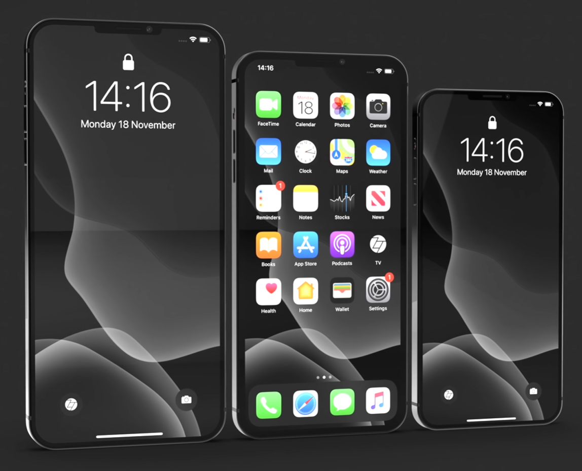
The ZONEofTECH Concept for the 2020 iPhone

The ZONEofTECH Concept for the 2020 iPhone

Personally, I don’t see Apple removing FaceID that quick. They’ve spent so much time perfecting it, and we also have Animoji’s and apps that are using the 3D depth tracking capabilities of the FaceID camera on the iPhones. I do believe the reports however, that are pointing towards the notch being made thinner and smaller and that is how we’ve actually modelled our concepts, which I actually think look really good!

Now, the second design change which is something you’ve probably already noticed from our concept, is the frame of these iPhones.

Rather than this being that rounded shape that iPhones have had since the iPhone 6 in 2014, the 2020 iPhones are rumoured to bring back that old iPhone 4 look, with a more square off frame. The iPad Pro 2018 brought this design back, so we’ve actually modelled our concepts based on the iPad Pro 2018’s frame and I’m absolutely in love with how it looks! The iPhone 4 was by far my favourite design of any phone and this seems to top even that. 

And Korean website TheElec, reports that Apple will be using LTPO displays for the 2020 iPhones. The same technology that Apple is now using in the Apple Watch. This will allow to iPhones to have a variable refresh rate, which could go down to even 1Hz, again, just like on the Apple Watch Series 5. This means that the 2020 iPhones could finally be getting an Always-On Display, something that we’ve had on Android phones for many years now and this has been one of my favourite feature ever in a phone. Being able to see the time and your notifications on screen all the time without having to unlock the phone is just amazing! Apple did add wireless charging to the iPhone X and 8, again a feature that was available on Android phones for years, and now there’s finally a very likely possibility that they’ll also add an always on display.

But this display could be more than just what the Apple Watch Series 5’s display is, which can go from 60Hz, to as low as 1Hz. You see, the iPad Pro’s have something that’s a bit better. They have 60Hz panels that can go as high as 120Hz and as low as 24Hz. They’re called a ProMotion display and I believe that this is what Apple would be including in the 2020 iPhones, at least on the Pro’s. Many smartphones today have started including 90Hz refresh rate displays, some even 120Hz, which make the entire UI experience 50-100% more fluid than what we currently have now.  IceUniverse, a very well known leaker at this point, reported that Apple is actually considering a switchable 60/120Hz refresh rate screen, for the 2020 iPhones and that they’re currently in discussion with Samsung and LG for this. 

Apple Patents hinting towards a full-screen fingerprint reader (Source: AppleInsider)

Apple Patents hinting towards a full-screen fingerprint reader (Source: AppleInsider)

And speaking of the display, here’s something interesting. Economic Daily News Taiwan, who do have a good track record, reported that Apple will be holding meetings with Qualcomm to discuss adding an in-display fingerprint reader to at least one of their iPhones. The reason this is interesting is because when we look back at Apple’s patents they show an iPhone using full screen TouchID, which is something that we do not currently have. Now Qualcomm has recently shown us their new generation of In-Display fingerprint reader, which is 17 times larger than the one on the Galaxy S10 and the Note 10. So it’s likely that they’re in talks with Apple, to turn that into possibly a full-screen fingerprint reader.

Then finally a very surprising report from DigiTimes Taiwan which was picked up by MacRumors, claims that Apple is actually considering bundling AirPods inside the box of the 2020 iPhones. Now, I’m a bit skeptical about this report but when the iPhone X came out, I even said in my full review, that for how much it costs, $1000, Apple should definitely bundle AirPods with this phone, but of course that they didn’t and the prices went up even more. With the introduction of the iPhone XS Max and 11 Pro Max and AirPods became even more expensive, with the 2nd gen and the AirPods Pro. So because of that, it seems to me like Apple’s prime motive is again, to make as much profit as possible, so bundling free AirPods inside the box? I just don’t see them doing that.

Now, this DigiTimes report did claim that smartphone vendors, including Samsung and Xiaomi, so not just Apple, are all considering bundling truly wireless headphones in the box of their upcoming phones. And I do see Samsung doing this, I really do. But Apple? I don’t think so. If they do do it, I don’t see them being the first ones on the market to do it. Probably in about two years time but maybe not even then.

PS5 - MAJOR Leaks Update - Price, Graphics and more!


Over the past couple of months we have done a couple of videos and articles on the upcoming PS5 from Sony.

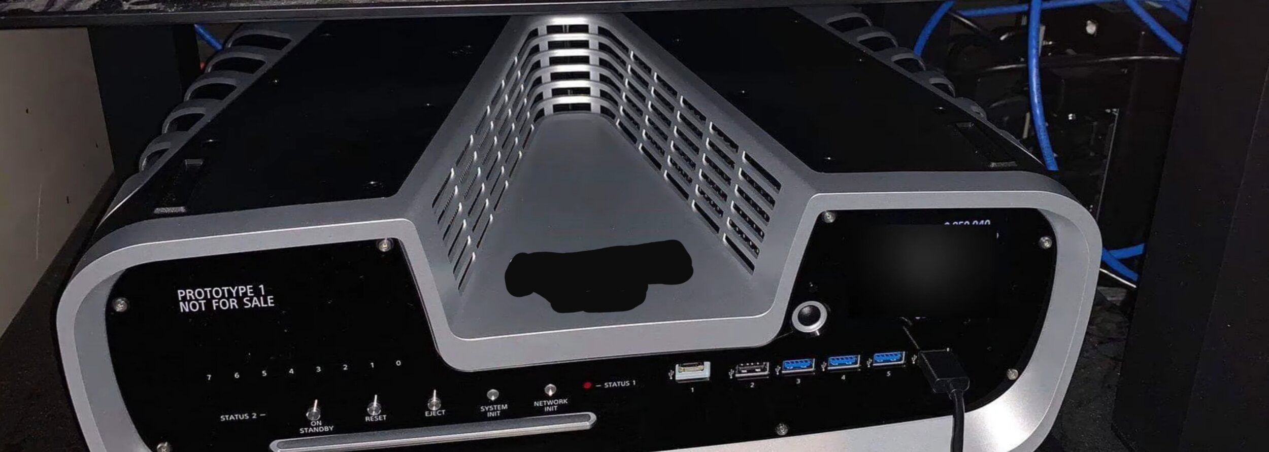
A couple of weeks ago we did a video and article surrounding the PS5 Controller and everything we knew about it, as there had been quite a few leaks regarding it. Then a couple of weeks before that we did a massive video and article covering an exclusive picture that we received of the PS5 developers kit. This was a never seen before image and it basically showing the PS5 that we had seen in previous patents, and we actually got picked up by quite a few tech website thanks to this.

But what will we be covering in this video and article? Well, we have a ton of major updates to cover, from insane spec updates, to some more controller leaks and a direct comparison between the PS5 and Xbox 2. So get those snacks ready and here’s the latest updates on the PS5!


SPECS

The PS5 will have some truly next generation graphics, 4K at up to 120fps and even 8K at 30fps, these have both been officially confirmed by Sony so they’re not even leaks anymore. 

But one of the main upgrades to the PS5, and this is something that some of you might be familiar with would be the HDD. You see, rather than the PS5 using a traditional HDD, like we’ve had in pretty much all modern consoles, both the PS5 and the Xbox 2 will be using SSD’s (Solid State Drives). This is very similar to what you find in modern laptops as SSD’s are up to 10 times faster than HDD’s, offering speeds of around 500MB/s from the standard 50MB/s that a HDD offers.

NVMe or PCIe flash storages are usually found soldered to the motherboard as seen in the image above

NVMe or PCIe flash storages are usually found soldered to the motherboard as seen in the image above

However, the PS5 will be using something even more powerful than a SATA based SSD. Sony did say that they’ve developed a custom storage option that would offer speeds of up to 19 times higher of what the HDD inside the PS4 could achieve. So 19 times 50 is 950MB/s which is pretty much in the territory of NVMe and PCIe based Flash Storage. These are flash modules that are soldered onto the motherboard, that offer much much higher speeds that what a SATA based SSD would be able to offer, which is always limited to between 500 and 550MB/s. Now if you do get a high end laptop that’s aimed at creatives today, such as a Dell XPS or the MacBook Pro, these have read and write speeds of well over 2GB/s. So while the PS5 won’t have speeds as high as a high end laptop’s storage has, it will still be much faster than the HDD inside the PS4 was.

Also, Sony did showcase a demo of Spiderman running on the PS5, and the entire game loaded in just 0.8 seconds! The PS4 Pro was still extremely fast and it only took just over 8 seconds to load the game, but the PS5 took 10 times less than that, and also keep in mind that this game was not optimised fully and not even developed with the PS5 in mind. 

Ok, so this is a standard mid-range laptop NVMe flash module that you can find in any laptop, right? Well, not really. You see, Mark Cerny, the lead system architect for both the PS4 and the PS5, did say that the RAW bandwidth of the PS5’s SSD is higher than of any other SSD’s on the market right now. But what benefits would an SSD bring to the PS5, other than just loading the games really fast? Well, in the Spider-Man demo for example, Sony also showed us the maximum speed that Spidey can swing on webs at, and on the PS4 Pro, once you hit a certain speed the system cannot stream the data fast enough from the HDD and therefore the game freezes and Spidey cannot swing any faster. Then with the PS5, they stared off at the same speeds as before, but everything was much smoother. Then when the speeds are increased, everything is remains perfectly fluid and Spidey can swing insanely fast! Imagine how amazing racing games will be on the PS5 thanks to this new storage. This is huge!

So you see, it’s not just that games will load faster, it’s also the experience inside of a game that would be dramatically improved. And we’ve actually had a few big leaks in terms of the PS5’s SSD recently.

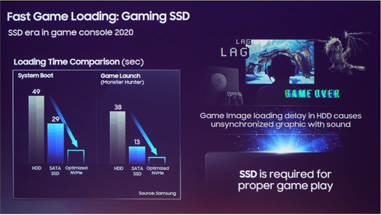
An Infographic from Samsung’s event showing system boot and game launch speeds (Source: TechTastic)

An Infographic from Samsung’s event showing system boot and game launch speeds (Source: TechTastic)

According to TechTastic, Samsung had a presentation in Tokyo where they showcased their upcoming SSD for game consoles in 2020, ‘SSD era in games console 2020’, that’s what it was called. And what they showed was how improved the system boot and the game load times were. For example, with the standard HDD it would take a game console around 49 seconds to boot, and with a standard SSD it would take them around 29 seconds. However, their upcoming Optimised NVMe modules can boot the system in less than half of that, around 10 seconds. Then when it comes to game launch speeds a HDD took 38 seconds to load compared to 13 seconds with an SSD and then less than 6 seconds with the new Optimized NVMe drives. Monster Hunter was the game that these tests were being done with, just so you know.

And Mark Cerny did actually say in his interview with the Wired that the PS5 will indeed come with optimised flash storage, rather than standard modules that laptops use. So it makes a lot of sense for Sony to use Samsung’s brand new “Optimised NVMe” modules in the PS5, which means that this will be a proprietary module, specifically designed for the PS5, rather than something that you would be able to find in stores. However, there is a pretty big issue here. You see, if all the games are optimised to work with Sony’s new flash module, it won’t be cheap to manufacture by any means. I mean if you look at NVMe modules today, a 1TB Samsung made M.2 drive costs around 150-300 pounds in the UK, which is more than half of what the PS5 will cost. 

PSErebus’s tweet regarding the release date and price of the PS5

PSErebus’s tweet regarding the release date and price of the PS5

Speaking of this, twitter leakster PSErebus who’s had a pretty good track record in the past when it comes the accuracy of his leaks posted that the PS5 will be launching on November the 20th 2020, at a price of $500 which is actually the exact same price that the Xbox One X costs. Considering how powerful the PS5 will be, even when compared to the Xbox One X, I would say that $500 is an outstanding price. It’s less than a mid-range smartphone, and this is a console that will last you for 5-7 years, compared to a smartphone that most people change every 2 years or so. 

Ok, so going back to the SSD. I was saying that one issue is the high cost of the SSD itself as the PS5 is very likely to ship with a 1TB NVMe flash module. However games today have become massive and most people will need an external drive, which are supported on the PS4 and will most likely still be supported on the PS5. So the question here is, if you need more storage and you plug in an external HDD, wouldn’t this impact the games heavily, since that storage would be significantly slower than the internal storage? Keep in mind that all games will be made to take full advantage of the extremely fast internal storage.

Well, one solution to this is that Sony could indeed limit the use of external SSD’s only and drop HDD support entirely, but even those, only reach 500MB/s or so. Therefore you would need something like an external m.2 module in order to even reach speeds close to the internal module and those ones pretty expensive. However, I do have some good news here, there have been reports that Sony is planning on developing the flash module as a modular system, so that you can easily swap it out for a higher capacity modules, when you need to.

This means that Sony will very likely sell these modules alongside the PS5. They will be more expensive than what an entry level m.2 drive will cost, but they should be perfectly compatible with the PS5, and games will still make full use of those modules as well. So, if at some point in time you want to upgrade the storage to maybe 4TB you should be able to easily do that by buying one of these modules. Also, it’s very safe to assume that the PS5 will also let you connect these modules externally, so that you can also expand your internal storage.

Renders of PS5 Cartridge concept by LetsGoDigital

Renders of PS5 Cartridge concept by LetsGoDigital

A brand new Sony patent uncovered by LetsGoDigital shows what looks to be a cartridge. Maybe the module 1st party SSD module that you would use to expand your PS5’s storage? Well that’s what it looked to be, and LetsGoDigital even made some renders of it, but unfortunately it turns out that its actually just a cartridge for a completely different Sony product a kids tablet/toy that you use to control some cars.

Anyway, the point is that this is completely unrelated to the PS5 unfortunately. However, like I said before, it is still very likely that Sony will indeed offer SSD modules themselves, that will extend your internal/external storage on the PS5.

Now, in case you’re worried about the storage or the price of these expansion modules, I do have some good news. Mark Cerny did say in his interview with Wired that the PS5 will support a new way of installing and playing games. You would now be able to select if you want just install the Campaign of a game, or just the Multiplayer and you can even delete parts of a game that you’ve already played and no longer wish to play. In Call of Duty Modern Warfare for example, you would be able to uninstall the Campaign right after you’ve finished it and only then install the multiplayer, which would save you around 50GB or so. 

Also, Mark Cerny did say that because of how slow the HDD was on the PS4, some developers had to make copies of the game textures multiple times so that they can load them simultaneously, since it was faster to load them this way. However, this resulted in a lot of space being wasted.

So not only will the PS5 games occupy way less storage, but parts of the games will be able to be uninstalled as we wish, which means even more free space. 

CONTROLLER

Now, something else that we’ve had recently in terms of the PS5 leaks, are some updates on the PS5 controller.

This is something that I’ve covered extensively in our last PS5 video and article. In that one I talked about some leaked PS5 development kit controller photos and showed the PS5 controller with the built-in display that replaced the touchpad. We also got the options and share buttons inverted, so they were horizontal rather than vertical. We also had microphones or dual speakers on each side of the screen and also a very weird shape that had the bottom portion of the controller indented which from the looks of it would feel very uncomfortable, but it might actually be the opposite, when holding this in person.

A design comparison between the new PS5 Controller patent (Left), the Nintendo Switch Controller (Middle) and Xbox controller (Right)

A design comparison between the new PS5 Controller patent (Left), the Nintendo Switch Controller (Middle) and Xbox controller (Right)

Then just last week, we had a new patent filing by Sony on what appears to be a new controller that looks very similar to the PS4 one. We have a shape that now matches the Xbox and Nintendo Switch Pro controller a bit more, which were known to be the most comfortable gaming controllers on the market, so that‘s great to see.

The TouchPad is quite a bit larger than the one we had on the PS4 controller. Also it doesn’t curve anymore but instead it’s now completely flat, which is interesting because you know what else is flat? Touchscreens. I mean yes, there are curved touchscreens and displays but those are very expensive to manufacture. So I believe that because of how this patent looks and because of the leaked PS5 controller dev kit images that we’ve seen before, the PS5 controller will indeed replace the touchpad with a full touchscreen display. And we would be able to use this in games and most importantly see the chat and friends menu. This would be great because if you want to type a message on the PS4, you either have to use the joystick, which will take you a year to type a single sentence, or you’ll have to use your smartphone which isn’t as convenient since you need to connect it to your PS4 first.

Aside from this we still seem to have 2 ports that both look to be 3.5mm headphone jacks, and we are getting a USB C port for charging, Mark Cerny did confirm that, we cannot really tell if that’s the black spot right below the headphone jack or if that’s on the back where it used to be on the PS4 controller.

The weird hole on the controller that, as of now, we are unsure what it is for

The weird hole on the controller that, as of now, we are unsure what it is for

The speaker is in the exact same place, the options and share buttons are also in the same place and in the same orientation. So really, aside from the shape, USB C and the screen, the only thing that looks changed to me is that weird hole right below the PlayStation button.

When Mark Cerny had his October interview with Peter Rubin from the Wired, Mark did actually hand Peter a PS5 controller. He wasn’t allowed to share any photos or videos of it, but this is what Peter had to say: “Cerny hands me a prototype of the next-gen controller, an unlabelled matte-black doohickey that looks an awful lot like the PS4’s Dualshock 4. After all, there’s a little hole on it, and a recently published patent points to Sony developing a voice-driven AI assistant for the PlayStation.” 

If you want to look at the patent that Peter was referring to you can see it here, but from the sounds of it, the one that we’ve seen in the patent sounds like exactly the controller that Peter was given by Cerny. And that mysterious hole would then indeed be for the microphone which would be used for Sony brand new AI assistant.

So there you have it, the latest updates on the PS5. What do you think so far? Are you going to buy one?

THIS is the Samsung Galaxy S11!


The Samsung Galaxy S11 has been leaked and it is going to have that massive Penta camera module on the back which seems to be even bigger than the on the iPhone 11 Pro Max. So without further adieu, these are all the latest Leaks & Rumors on the Samsung Galaxy S11!


The S11 has been leaked quite heavily and we even did a full video and article about two weeks ago, covering everything we knew up until that point. That video and article was split into eight different sections covering everything from; Display, Display, Battery, Special Features, Camera & more. So if you want to get a very detailed look at the S11, do check those out first, since this one is mostly focused on just the more recent leaks.

Recently the biggest leaks have been coming from OnLeaks. OnLeaks has had some pretty outstanding track record in the past, up to the point where if does post a leak or especially a full render, we can probably bet that that’s exactly how that phone will look like, and the S11 is no exception. 

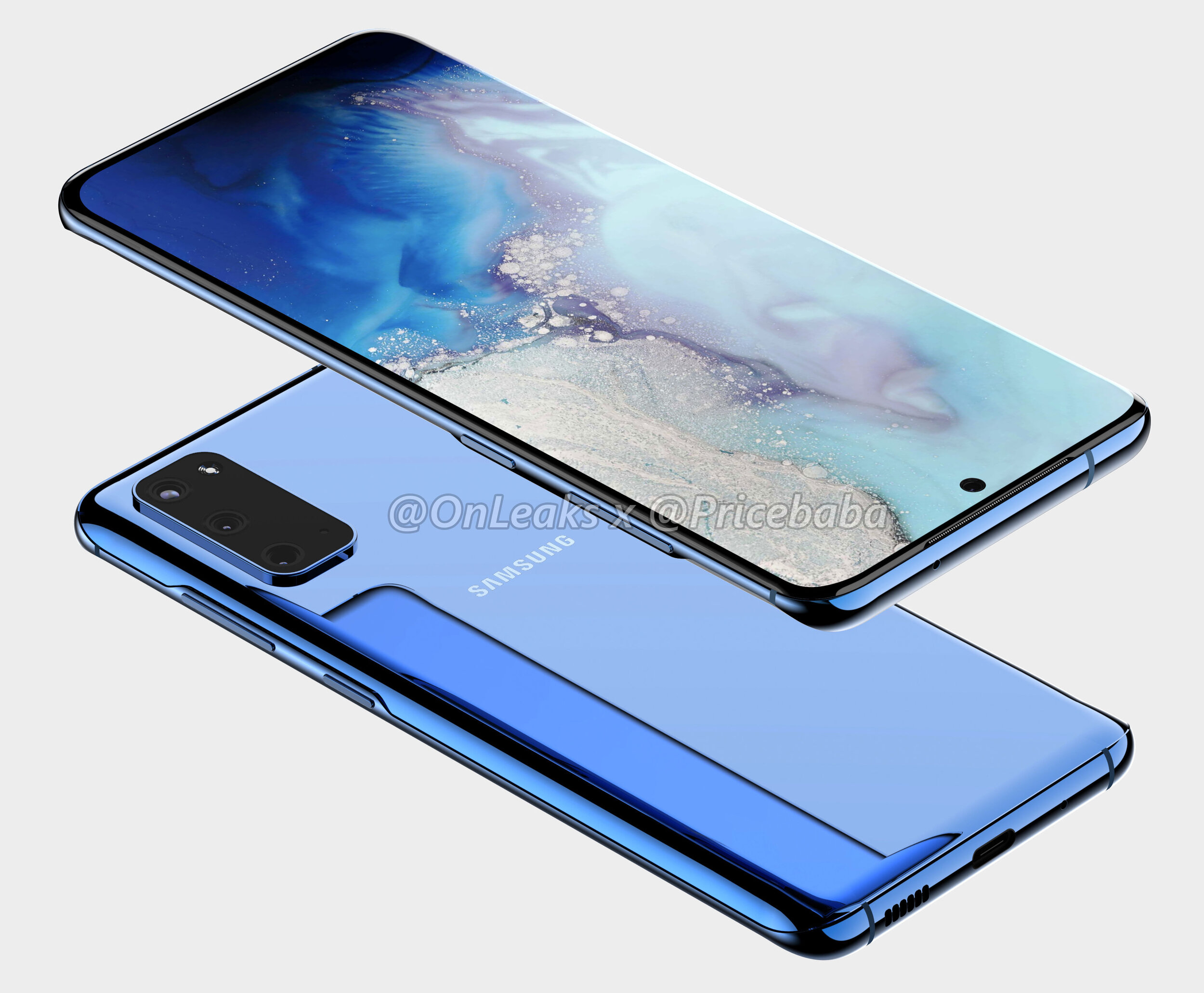
A concept render of the S11e (Source: OnLeaks & Pricebaba)

A concept render of the S11e (Source: OnLeaks & Pricebaba)

On November the 23rd, OnLeaks teamed up with Pricebaba to give us a first look at the Samsung Galaxy S11e, the lowest end model of the S11 lineup. As you can probably tell, the S11e is a gigantic departure from the S10e that we got last year. We no longer get thicker bezels and a flat display, but instead, some very thin bezels and a curved display as well. Then on the line of the display, the size of it got a pretty big bump, from 5.8 inches to 6.2, making the S11e even bigger than the regular Galaxy S10 was last year. The aspect ratio has also been increased to 20:9, from the previous 19:9. This means that it will be noticeably taller than the S10e. In addition, the camera cutout is now in the middle, similar to how it is on the Note 10, rather than to the right like the S10’s had it. We also seem to be getting a triple lens camera module, from the dual lens one that we had before. The Bixby button has been removed, so the only buttons that we now have are the power button and the volume buttons. Now, on the S10e we did have an fingerprint reader built into the power button, rather than the in-display fingerprint reader that the more expensive S10 and S10+ had. But I cannot see any fingerprint reader embedded into the power button, which means that the S11e will very likely get an in-display fingerprint reader. 

Also, I really really love this blue colour from OnLeaks’s render. Considering that it’s in the render itself, it’s very likely that this will indeed be one of the colour options that Samsung will have for the S11e. Personally, I actually think that that is my favourite shade of blue that I’ve ever seen on a smartphone. But of course that is just a render, so that shade of blue will most certainly look a bit different in real life.

So, the S11e looks pretty stunning. If Samsung prices this well, then this will be one of the best selling smartphones of 2020, because it just nails everything so so well.

Now, on November the 22nd, OnLeaks teamed up with another tech website, in this case 91mobiles and showed us the Galaxy S11, which would be the second offering in the S11 lineup. This is actually the one that we based our own concept on, and the S11 does have a few changes from the S11e. 

A concept render of the S11 (Source: OnLeaks & 91Mobiles)

A concept render of the S11 (Source: OnLeaks & 91Mobiles)

First, the bezels do appear to be thinner than on the S11e. Especially if you take a look at the side bezels, there seems to be a very noticeable difference there. In addition, the top and bottom bezels also appear to be a bit thinner than on the S11e. The edges do seem to be a bit more curved on the S11 compared to the S11e. Overall, while I think the S11e still looks amazing, design wise the S11 does have a slightly more modern design. 

Like the S11e we also get a larger display now with the S11. We get a 6.7” panel up from the 6.1” that the S10 came with, so that’s a gigantic increase in the display size. This makes the S11 even bigger than the S10+ was last year and actually the exact same display size as the gigantic S10 5G had. 

But then on the back is where we get the even bigger changes. Rather than three camera modules, we get five modules as the one on the bottom right is actually for the microphone. This means we get a penta camera module, and a microphone, and a flash all in that gigantic camera set up on the back. Personally, I don’t really have a problem with this as long as the camera quality is improved, and the good news is that it will actually be significantly improved! So the main camera module would be upgraded from the S10’s 12MP module to an insane 108MP one! This is Samsung’s latest and greatest smartphone camera sensor, at least in terms of resolution. This new sensor is quite massive not just in terms of the resolution but also in terms of its physical size. Compared to the previous sensor which measured in at 1cm diagonally, this one is 1.91cm, so pretty much double the size which could easily be the reason as to why Samsung has such a gigantic camera module on the back of the S11. But as most of you know, or at least hopefully know, that megapixels don’t means quality. They just mean more resolution so you can zoom in more, that’s it.

Think of a sensor as a chess board, a grid where the size of the board is the size of the sensor and each squares inside are actually the pixels. If you increase the number of pixels, you need to make them smaller, otherwise they won’t fit on the board. But here’s the thing, pixels capture photons or light particles and the larger the pixels are the more photons or light they can capture. Therefore, if you want a sensor to be good in low light you need to have a few mega pixels as possible, otherwise the pixels would be so small that they would barely be able to capture any light and the images would be extremely soft and blurry in low light. This is why high end phones such as the iPhones, the Samsung Galaxy phones, even the Google pixels have always had a 12MP camera, and why mid-range phones from Xiaomi, OnePlus, Oppo added 48MP, 64MP and now even 108MP modules with the Xiaomi Mi Note 10, because just having a larger mega-pixel count does make it sound better which is extremely important to have in the mid-range category, but that doesn’t necessarily mean that it is better.

So I am a bit worried in terms of the low light performance on the S11, considering that the Xiaomi Mi Note 10, which has the exact same 108MP sensor by the way, didn’t really have the best results in low light or even day light. What I mean by this is that if it was slightly cloudy, the results weren’t that great. So I do hope that Samsung optimises this heavily in software.

We’re also getting 8K video recording in up to 30 fps. Yes, 8K video on a phone, we barely even have any professional cameras that can do 8K and Samsung will be the first to support it on a phone! I guess that this is also a way for Samsung to promote and sell their new 8K TV’s now that they also have a phone that can film content for that TV.

Now, so far I’ve only talked about the main module, but we do have a few more modules. So the top and bottom ones would be the zoom and the ultra wide angle modules. The zoom module is actually expected to offer a 10x optical zoom, or lossless zoom, in combination with that 108MP sensor which is pretty impressive. We would then have a digital zoom of up to 50x, so this camera would be very similar to the zoom capabilities that we got with the Huawei P30 Pro. Then we also have two more modules which we don’t yet know what they are for. Some of you might think that they’re TOF, or time-of-flight sensors, similar to what the Note 10+ had, but you’ll see why that’s very likely not the case in just a bit.

So I personally think that one of them is a Macro lens, as quite a lot of mid-range smartphones did include a macro module in 2019, so I do see Samsung including one in the S11 as well and then the second one could be a depth sensor, for improving portrait mode photography with the back facing camera. So that’s what I think, and the reason why I believe that these are not TOF sensors is because OneLeaks also leaked the big S11+.

With the S11+ we get the same design on the front as the regular S11, just with an even larger 6.9” display, making this even bigger than the Note 10+, so this will be a mammoth of a phone.

A concept render of the S11+ (Source: OnLeaks & CashKaro.com)

A concept render of the S11+ (Source: OnLeaks & CashKaro.com)

Then on the back, the camera module itself will be even bigger than on the regular S11 and the camera modules themselves are arranged in a very different way than they are on the S11. We get five main modules, just like on the S11, but then we also get two dots which to me look to be either dual microphones or two TOF sensors. They’re a bit small to be time of flight sensors, but at the same time, there is no cutout in the glass itself for them to be microphones, so they could be either or. Now, when it comes to the front facing camera, this will very likely be upgraded to a 4K 60fps camera so that it matches frame-rate that the iPhone 11 Pro can do, as at the moment the S10 can only do 4K 30fps with the front camera.

The headphone jack will also be removed from the S11’s, just like with the Note 10+. This means that if you want to used wired headphones you would either have to use a dongle, which will probably not come bundled in the box, or you can also use wireless headphones such as the Galaxy Buds 2, which will also be launching alongside the S11. 

Speaking of sound, the top speaker grill is expected to be even thinner than on the Note 10+, which was absolutely minuscule. It was so thin you could barely see it and since the headphone jack is being removed we might be getting dual speakers on the bottom. However, on OnLeaks’s render we only have one speaker grill and one microphone port. In our render, we did add a second speaker grill though. 

Now as a complete 180 on all of that, IceUniverse who’s also a pretty well known leaker at this point, did say that OneLeaks’s rendeers are not 100% correct. He says that the final version will be more beautiful than this so we’ll have to wait and see. OnLeaks has had a very good track record in the past, so my guess is that it will the final design, it’s just that Samsung will be making some more tweaks here and there, until February, shrinking down the camera module a bit for example, or maybe even re-ordering the camera lenses, but the main idea of its design should be very similar to the one we’ve seen.

THIS is the Samsung Galaxy Fold 2!


Samsung is leading the innovation game when it comes to smartphones right now. The Galaxy Fold was one of the most innovative smartphones of the past 10 years, I’d actually go as far as to say that the Galaxy Fold is the most innovative smartphone since the iPhone came out back in 2007.

This is the first actual foldable phone, that came from a major smartphone manufacturer. A phone that’s technically a tablet and then folds in half into something that’s much more portable. Now, yes the Huawei Mate X is in many ways even more innovative but that’s not out just yet, so Samsung Galaxy Fold was and still is one of the most unique phones to ever see the light of day.

In fact, Samsung’s already working on the second generation Fold, the Fold 2 for a release in 2020, so get those snacks ready and here’s everything we know so far, about the Fold 2!


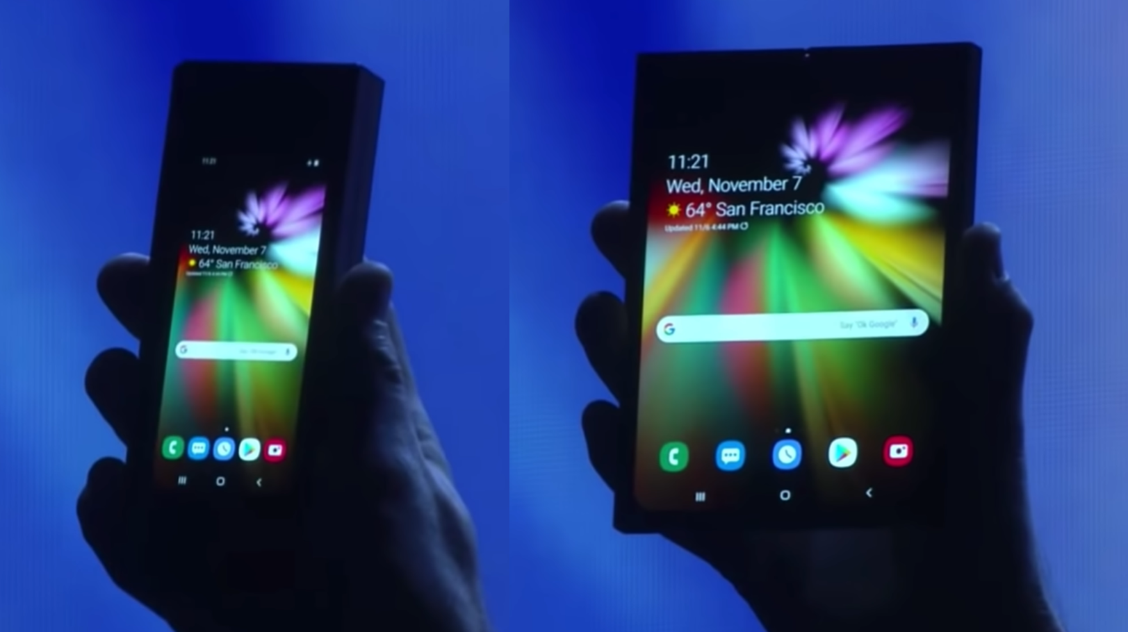
Ok, so the first Galaxy Fold was not a flawless product. It was first teased at Samsung’s Developers Conference, back in November 2018 and back then, we couldn’t really see much.

When it was first shown off, the design of the Fold was hard to determine thanks to the darkened stage

When it was first shown off, the design of the Fold was hard to determine thanks to the darkened stage

All that Samsung showed us was a phone that had a very small outer display that unfolded into a larger tablet. The issue with it was that you couldn’t really see anything in terms of its design, since I believe the Fold was in a case and the scene was made dark on purpose, so that you couldn’t really tell what Samsung’s new innovative phone was.

But this was something that was leaked and rumoured and hyped so much! We even made videos on this back in 2017, on the Foldable Galaxy X, and back then our concepts weren’t that great, but I think we’ve evolved a ton since. 

Anyway, a few months later and in February 2019, the  Fold was officially unveiled by Samsung. Full design, full specs and shortly after, reviewers have gotten their hands on it and they found out that it broke extremely easily. You see, since the display was made out of plastic, any dust or debris that got under the display, killed it off instantly. So Samsung cancelled the release, in order to redesign the Fold and they’ve made a few tweaks, they’ve tested it thoroughly and finally re-released it in September 2019, almost an entire year since the November 2018 tease. 

And the reviews have now been quite positive.  I mean, you could literally kill the display with your fingernail, since the display was still made out of plastic, but at least it now as more difficult for dust and debris to get under the display. This is thanks to that screen-protector layer that a lot of reviewers ended up removing, now being attached under the frame of the phone.

So so far so good, but now we’re in November 2019, just in time for Samsung’s 2019 Developers Conference and they’ve actually released a video titled “A New Form Factor for Foldable Smartphones”. This video is pretty much pointing at the next thing to come after the Galaxy Fold. The video starts with the Galaxy Fold but then they increase the display size and turn it into what looks to be a similar to our Galaxy S11 concept, where we have that very tall 20:9 aspect ratio display and just a central camera cutout. But what’s really interesting about this folding phone is that instead of folding horizontally like the Galaxy Fold does, it actually folds vertically. 

But probably one of the biggest differences is that instead of being a foldable tablet that folds into a phone, this is essentially a regular phone that folds in half, like those old clam shell phones did back in the days of OG cellphones. Now, this is a pretty interesting approach, because I personally find foldable tablets to more way more useful than foldable phones. I mean what would the point of the Fold 2 be, if it’s just a regular smartphone that folds in half? I guess the fact that you can hang up on phone-calls in a really cool way but aside from that, a foldable phone is actually worse from a functional standpoint than a non foldable phone. The reason I say this is because when you fold it in half, whilst you do decrease the height of it by half, but you also increase the thickness of it by two. So rather than having a long thin sheet of metal in your pocket, you would have a short and fat piece of meal and I’m personally not into that. 

However, it seems like there might just be a market for these types of devices.

The new Moto Razr of 2019 (Source: TechRadar)

The new Moto Razr of 2019 (Source: TechRadar)

Do you guys remember the famous Motorola Razr phone? That iconic clam shell smartphone that had a colour display on the back and an extremely thin form factor, for its time at least back in 2005. I never had one myself but I was in middle school back then and one classmate had one and I was always so interested in it, but my parents couldn’t afford buying me one so I never had one. This was back when Motorola was one of the best and most popular cell phone manufacturers. 

Well last week Motorola unveiled the new Moto Razr 2019 which is still a clam shell phone but with a more modern twist to it. So it now has a full-screen display and that’s the one that also folds now, pretty nuts when you realise how far we’ve come since. 

In my opinion, the Moto Razr 2019 is very close to what the Galaxy Fold 2 will look like. It will be a clamshell style foldable phone, rather than a foldable tablet like the Fold 1 was. However I actually do believe that this Fold 2 will not be called Fold 2 and instead something else. The Fold E or something along those lines. The reason for this is mainly because if you look back at Samsung’s teaser video, towards the end, they show both the Galaxy Fold 1 and the unreleased one as well, making me think that it won’t replace the current Fold but rather add onto the lineup.

I do think that this is a great choice! You see, by having two foldable devices, or even more if Samsung decides to expand on the lineup in the future, customers get even more choice at different price-levels as well. We all know that the Galaxy Fold is crazy expensive, at close to £2000 in the UK there’s not many people buying this. However, the Fold E or whatever this new fold will be called, should start at a much more reasonable price. The Moto Razr 2019 would cost $1500, compared to $2000 and even £2000 that the Galaxy Fold 1 costs. Therefore it would make a lot of sense for this Fold E to start from $1500 or so. 

News website, TheBell from South Korea which had some fairly good track record in the past when it comes to unreleased products, reports that the Galaxy Fold 2 is currently in development and uses the code name Bloom and that it will actually be released in April 2020.

And considering that the Fold that Samsung has teased looks pretty much identical to the S11 leaks, this could even be a variant of the S11. The S11 Fold? I think that’s a very plausible scenario, but that’s just my personal prediction but we’ll see if that turns out to be true.

Also the S11 event will be in late February, which will point to a March release for the S11, so April for the Fold E/S11 Fold doesn’t seem that unlikely either. 

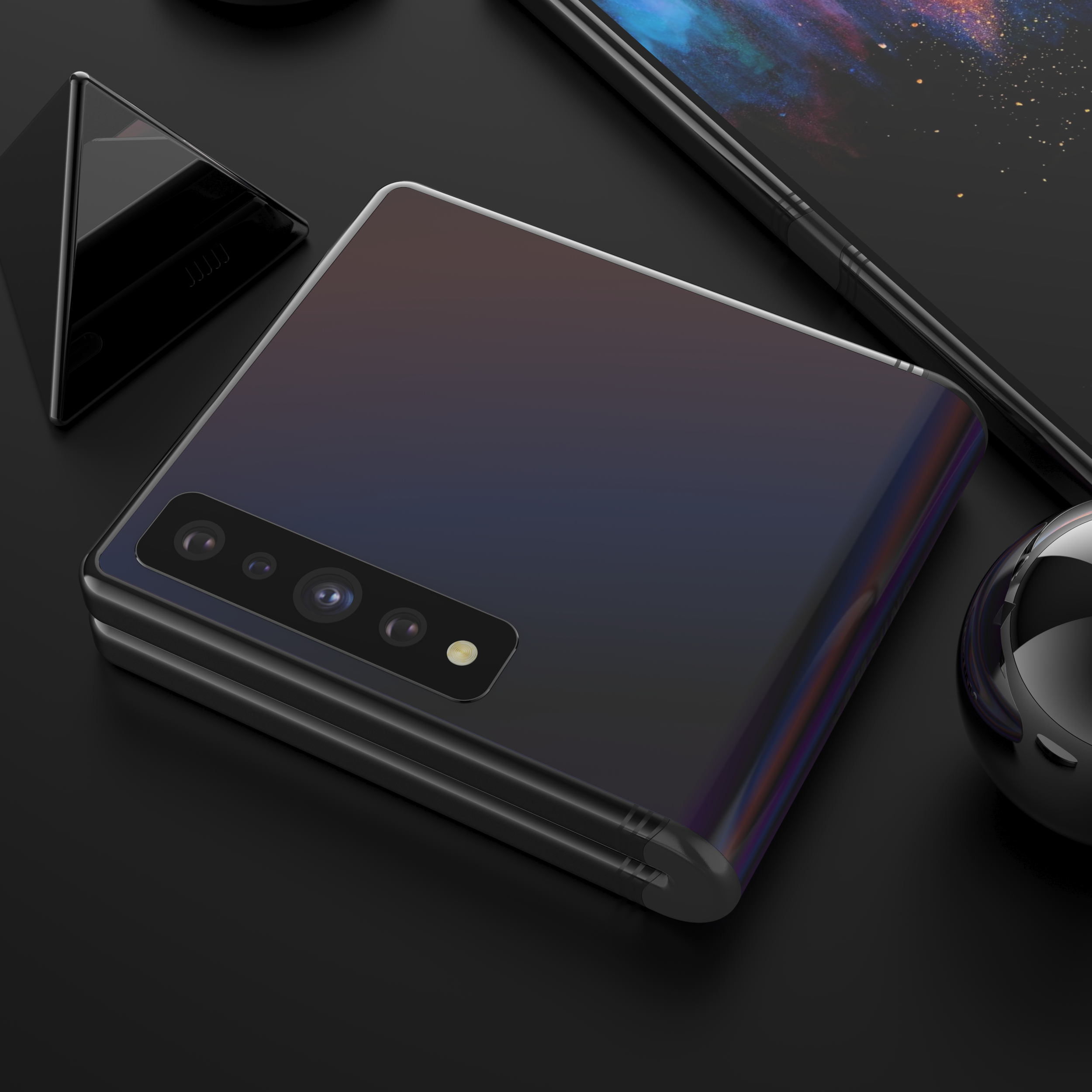
Our concept of the Galaxy Fold 2 showing the clam shell hinge idea

Our concept of the Galaxy Fold 2 showing the clam shell hinge idea

Now, we’ve actually made our very own concept of the Galaxy Fold 2, based on all the leaks that we’ve had and even one of Samsung’s patents that does shows a foldable clam shell style smartphone. We’ve based this off of the Galaxy S11+ design, that comes with a gigantic 6.9” display size, with that single camera cutout in the middle. We have new Quad-Camera module on the back, which now adds the brand new 108MP sensor, just like on the S11, and we’ve modelled the hinge in quite a unique way.

Rather than doing it like Samsung has done it with the Fold 1, we’ve done it in a similar way to how Motorola has done it with the 2019 Razr, where the mechanism is actually on the inside, and then it’s protected and sealed by this rubber hinge on the outside. This means that the phone still preserves its water and dust resistance, unlike the Fold 1 which lacked both of those. Also, this is the same style hinge that Samsung has in one of their Galaxy Fold patents that do show a smartphone that folds vertically. 

Now, comparing that design to the Moto Razr 2019, the Moto Razr does have a more usable design, as we do have another display on the back. Even though it’s a very small display, which is just being used for seeing incoming notifications and reading quick messages, at least you do have that. From the looks of it, the new version of the Galaxy Fold will not have any display on its back, however there are a few Samsung patents that do show this display folding both ways and that would be quite cool, being able to fold the fold on its back and have two mini-displays in this case. However, I dont see this having any major functionality for me at least, as I still prefer the idea of a foldable tablet, than a modern clam shell phone. 

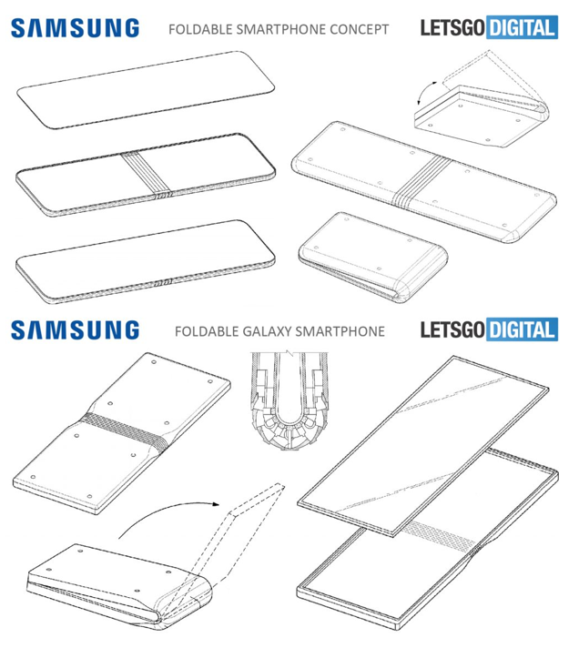
Now, interesting enough, there is a second patent that shows something completely different. This one was found by tech website LetsGoDigital and it shows what appears to be a foldable Galaxy Tab S rather than a Galaxy Fold 2. We have what looks to be a very big tablet sized display, with a fairly thick frame all across it, but I genuinely would pick this over the gigantic side notch that the Galaxy Fold 1 has, and we also seem to have a large display on the front to go with that.

The fold patents as seen on Letsgodigital (Source: Letsgodigital)

The fold patents as seen on Letsgodigital (Source: Letsgodigital)

We also have two more patents , also found by LetsGoDigital that show something similar to the Galaxy Fold 1. Just with a thinner notch, and even a massive display that would actually fold vertically, rather than having mostly the same functionality as the Fold 1 does. So judging by all of these patents, it seems like Samsung is experimenting with different approaches to folding phones. A foldable Galaxy S11, a foldable Galaxy Tab S, a Galaxy Fold that folds vertically and possibly some even more form factors that we haven’t yet seen leaked.

So I’m really looking forward to seeing more foldable devices. I do hope however that the industry doesn’t start making “cool” foldable phones like a clam shell phone is rather than truly useful foldable devices, like a foldable tablet would be.

Samsung Galaxy S11 - FULL Leaks and Rumors!


The Samsung Galaxy S11 is coming out in just three months, so we’re not that far away for the official release, and luckily the S11 will actually be one of the biggest changes that Samsung has ever made to their products! 

We’re getting some gigantic camera improvements, the displays are getting even better, alongside some unique and exclusive features.

So get that popcorn ready and here’s everything we know so far about the S11, on the Design, Display, Camera, Performance, Special Features, Battery, Release Date & Price!


DESIGN

Ok, so starting off with the design, unlike Apple Samsung is actually updates the design of their phones, every single year.

The big redesign is usually every two years, but we still get some small changes with every new generation. For example the S6 was the first Galaxy S smartphone that came with a premium build of glass on the front and back, and a metal frame. The S7 was a more refined version of the S6, the S8 had a brand new design, the S9 was a more refined version of the S8’s design with slightly thinner bezels, and the S10 was a brand new design once again. Therefore it makes sense for the S11 to be a more refined version of the S10, rather than a completely new design.
IceUniverse reported on the 27th of October that the design and configuration of the Galaxy S11 has been finalised and the leak season will now begin. 

BenGeskin’s S11 renders (Back) compared to the S10’s (Front)

BenGeskin’s S11 renders (Back) compared to the S10’s (Front)

BenGeskin posted a render of how the S11’s will compare to the S10, and as you can see, they’re taller than the S10’s and all of them have a single central camera module now, rather than the module to the right, that the S10’s had, and the dual camera module to the right that the S10+ had.

In terms of the models there will be three S11’s. So just like with the S10’s we would have the S11e, the S11 and the S11+. MySmartPrice reports, based on information received by leakster Ishan Agarwal, that the S11 and S11+ will come in Black, Grey and Blue, while the S11e will come in Blue, Grey and Pink. These are some very interesting choices. I’m quite surprised to see Samsung remove White from their offering, as White and Black have always been the default colours. Grey would probably be the one that would be the equivalent to the White colour the most. So I’m guessing that it would have some sort of shine to it, similar to the back colours of the Note 10, where if you look at it from an angle, it would turn into a different colour. I personally believe that all the colours on the S11’s would come with that glowing shimmer effect that changes based on how the light hits it. 

But that’s pretty much it when it comes to the design. We’ll have a very similar look to the S10’s, just longer, with a central camera module and no more headphone jack, but a 2nd speaker grill on the bottom instead. The microSD card slot will still be there as well.


DISPLAY

Moving on to the display, EvLeaks, one of the original leakers has posted some details about these.

Apparently, the S11e will come with a 6.4” display, the S11 will come with a 6.7” display, while the S11+ will come with a gigantic 6.9” panel. Now these are actually a very big jump from the S10’s, that came with a 5.8” in the case of the S10e, a 6.1” display in the case of the S10, and a 6.4” display in the case of the S10+. So it seems like the smallest S11, the S11e, will actually be bigger than the S10+.

Our renders of the S11 showing the new screen sizes

Our renders of the S11 showing the new screen sizes

Now, there are a few contradictory reports on the S11e’s display size, where some reports are saying that it will come with a 6.4” display, and some are saying that it would be a 6.2”. Evleaks even mentioned that himself. My guess is that it will be a 6.2” panel, otherwise the jump in the display size would be just too dramatic and people who just preferred having a smaller display, would be out of luck if that’s the case.

Now, the good news is that the phones will not be getting any wider, instead they will be getting taller. Luckily Samsung’s OneUI is actually optimised for one finger use, and having all the UI elements accessible from the middle of the display will help in making these gigantic S11 phones more easily usable. 

Now, because of that taller display, we will also be getting a wider aspect ratio of 20:9 compared to 19:9 which was what we had on the S10 and the Note 10. It won’t be as wide as the Sony Xperia 1, which has a 21:9 aspect ratio, but it will be close. This will make it much better for watching wide aspect ratio videos and movies, so I wouldn’t be surprised if Samsung launches their own Galaxy Movies store or something along those lines. 

The patent granted to Samsung for SAMOLED found by LetsGoDigital

The patent granted to Samsung for SAMOLED found by LetsGoDigital

But regardless of that, Samsung will very likely call this display AMOLED Cinema or something along those lines. Now, LetsGoDigital actually found a patent that Samsung had just been granted this week, on a display called SAMOLED. Samsung already has their Super AMOLED branding, so this could either be a new branding, or it could just be Samsung next generation of displays. We’ve seen the current generation being introduced with the S10, and this generation featured a much higher brightness of over 1000 nits alongside a physical cutout in their display, for the camera module. The Note 10+ featured the Samsung generation of AMOLED panel that the S10 had and even the iPhone 11 Pro’s had the exact same panel.

Now, EvLeaks has also stated that all three models will have curved-edge displays, unlike the S10e from last year which was the only one with a flat panel. And the bezels are also getting thinner this year, even thinner than the ones we had on the S10. The S11e will probably have thicker bezels, at least when it comes to the top and the bottom ones, just so that it looks more inferior to the S11’s considering the lower price that the S11e will have. 

CAMERA

Now, when it comes to the camera this is actually where the biggest change will be. 

In our Samsung Galaxy Note 10+ Review, I did mention an interesting fact that not a lot of people seem to have been aware of, which was that the fact that Samsung has actually had the exact same sensor specs, since the Galaxy S7. Yes, Samsung did indeed have the switchable aperture with the S9, and the dual and triple lens camera module with the S9 and the S10, but the main module has actually remained the same since the S7 from 2016.

The headline from Samsung’s Newsroom reporting the 108MP sensor (Source: Samsung)

The headline from Samsung’s Newsroom reporting the 108MP sensor (Source: Samsung)

However, in August 2019, Samsung has unveiled their brand new 108MP smartphone sensor which is actually a very big deal. Not only does this have some insanely high level of detail with nine times more resolution than the current 12MP sensor, but the sensor itself it 1.91cm In size, compared to the 1cm sensor that we had before. So this sensor is almost twice the size of the current one and it does need to be bigger, because otherwise the pixels would be so small in that 108MP sensor, that low light shots would look unusable. 

This is actually pretty much confirmed at this point. XDA developers have even found code in the OneUI 2.0 beta, specifically in the Samsung camera app itself that shows support for a resolution of 12000x9000 photos, or 108MP photos if you do the math, and also support for that 20:9 aspect ratio that I was talking about before.

Now the only question that remains is, is Samsung going to use this 108MP module as the main module, or are they going to use it as a secondary module? Well, realistically they will probably use it as the main module, but I’m keeping my hopes high that Samsung will actually just use it as a secondary module and still keep a 12MP main module for low light shots. I only say this because the 108MP sensor will be noticeably worse in low light than even the Galaxy S7, unless of course Samsung does some magic in software and they release a new night mode, specifically designed for this new 108MP sensor. 

Our concept showing the 108MP sensor integrated into the 4 camera module set up

Our concept showing the 108MP sensor integrated into the 4 camera module set up

On our concept, we actually added the 108MP module as an extra module, meaning we’d have four modules; the 12MP night mode module, the zoom module, the wide angle module, and the 108MP module

Also, just so that you’re aware, you won’t be taking 108MP photos with this camera. You will very likely be able to do that in the Pro-Mode, but regular shots will just use that massive sensor to capture more detail and the final image would still be around 12-16MP. Otherwise, taking 108MP photos will just murder your storage. 

But apart from that, now would also be a really good time for Samsung to add 6K or even 8K video recording to this, as the CPU does indeed support that. This would definitely the biggest camera change that we’ve ever had in a Samsung phone.

And we have seen some reports that the zoom capabilities would be greatly improved as well, with possibly a 3x optical zoom camera from the 2, and the remaining zoom would be achieved with that 108MP sensor, which means you will have around a 10X lossless zoom and even up to 30-50X with digital zoom, so very similar to what Huawei did with the P30 Pro.

When it comes to the Front Camera, if you’re worried about the lack of a depth sensor that the S10+ had, you don’t need to worry about that, since the Note 10+ had pretty much the same quality front portrait mode shots as the S10+ did, with just a single camera.


PERFORMANCE

Now, when it comes to the Performance, same as before, we’ll be getting two different CPU modules.

The US & Canada variants will come with the new Snapdragon 865, while the International models will come with the Exynos 990.

The Snapdragon 865 hasn’t been officially unveiled just yet, it’s expected to be unveiled in early December, but according to the leaks the CPU performance will be increased by 20%, while the GPU will get a 17% to 20% bump from the 855, so that’s an even smaller jump from the 855+.

The Exynos 990 is essentially the 9830, just with a different name. Now this one has been officially unveiled and it does support up to a 108MP camera, up to 8K30 video recording, as well as LPDDR5 memory. 

Now, Samsung will be dropping their custom Exynos cores from future Exynos processors, but that’s a story for a whole different article.

RAM wise, 12MP of RAM is pretty much what the S11+ will come with and then 8GB and 6GB are expected on the S11 and S11e.

SPECIAL FEATURES

So aside from the camera and display, there’s not a lot else in terms of special features.

We are getting 5G once again and EvLeaks reports that the S11e and S11 will come in both 4G and 5G variants, while the S11+ will only come with 5G. This means that the S11+ will be one crazy expensive phone.

The headphone jack is likely to be removed from the S11, but that will mean an extra speaker grill

The headphone jack is likely to be removed from the S11, but that will mean an extra speaker grill

The headphone jack is being removed, just like on the Note 10. Unfortunately, with the Note 10, we didn’t get any headphone jack adapter in the box. I really do hope that Samsung does include one with the S11, especially since the Galaxy S series is more popular. Otherwise, you’ll have to buy a separate adapter yourself, or stick to wireless headphones. Speaking of wireless headphones, Ishan Agarwal reported for mysmartprice that the Galaxy Buds 2, with the codename R175, are in development and that they will come in Blue, Pink, Black and White. I do hope that Samsung adds Active Noise cancellation to the Galaxy Buds 2, so that they can compete with the AirPods Pro’s, fingers crossed that they also keep the same price, in that case they would be by far the best wireless headphones on the market. 

Even if we do lose the headphone jack, we do get an extra speaker grill, so the sound quality would be further improved with the S11.

And finally we haven’t included this in our concept but the S11’s will very likely feature the same TOF depth sensor on the back, just like the Note 10+ did. This is for improving the portrait mode photography with the back camera and for AR.


BATTERY

The battery likely for the new S11 (Source: SafetyKorea)

The battery likely for the new S11 (Source: SafetyKorea)

It does seem like we would be getting some very big improvements to the battery. GalaxyClub found a listing on SafetyKorea of a few unreleased Samsung smartphone batteries, and they have the model number ‘EB-GB980ABY L’, which could really be any Samsung phone to be honest. However, when you consider the S10 model numbers, these were SM-G970, 973 and 975. So it would make a lot of sense for the S11e’s model number to be SM-G980, and in that case this battery leak would be for the S11e.

And this appears to be a 4000mAh battery, which would be a gigantic leap from the 3100mAh battery that the S10e had, which means that the S11+ should approach 5000mAh. 

Now another improvement that’s we’ll see here is the SuperFast charge that the Note 10 got. The 45W fast charging which is the fastest fast charge on any smartphone to date.


RELEASE DATE

In regards to the release date, the unveil would be as usual in Mid-Late February, while the delivery and the in-store release would be in early March. This has been confirmed by EvLeaks as well.

PRICE

And finally, when it comes to the price, these would not be cheap phones by any means. 

The S11+ should cost around the same as the Note 10+ does now, so $1100 if not even $1200. While the S11 should be around the same price as the S10+, so $999 and the S11e should be around $650, $100 more than what the S10e costs. The prices haven’t been leaked, these are my personal predictions based on what Samsung has priced their phones in the past. 

So if you don’t care about the camera that much, and you don’t need that insane new 108MP sensor, then picking up an S10 or an S10+ is actually a very good idea. They have the same design, mostly the same display and an even smaller form factor. 

PlayStation 5 (2020) - FULL Controller LEAKED!


Our last PS5 video was quite a special one, because you see we got our hands on the world’s first actual photo of the PlayStation 5 dev kit! Our video actually got picked up by quite a lot of tech websites, which never really happened before, at least not to the same scale so thank you all for your support!

But now, get those snacks ready and here’s the video and article that I promised you, focused just on the PlayStation 5 controller!

If you’re a gamer then you’ll definitely enjoy this article. And if you’re not a gamer well, keep reading anyway because the PS5 will indeed be a truly revolutionary device, not just for playing the most graphically advanced games, but also for watching 4K and even 8K movies.


When playing a game there are three very important parts of every game, in my opinion at least.

1. The Story

2. How that story is being played?

3. What the story is being played with?

Now personally, I’ve always preferred a gaming controller to a mouse and keyboard. Yes a mouse is more accurate, but a controller is much more comfortable and you get motion controllers, vibrations and even touch input, all of which immerse you so much more in the game, than a regular mouse and keyboard can.

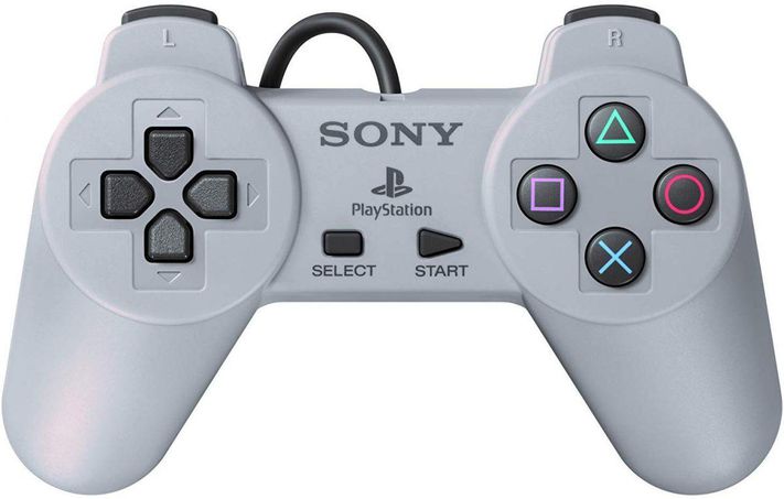
The 1st PS1 controller, the original DualShock was one of the most iconic controllers to ever be released. It had dual joysticks, symmetrical buttons which I’ve always preferred, and vibration feedback, which back in 1997 was a huge deal. 

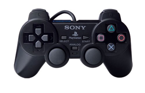
The DualShock 2 which was released with the PlayStation 2 back in 2000, wasn’t really that big of an upgrade. It had pretty much the same style design, just a bit slimmer, a bit lighter, and came in black but all the main buttons were actually pressure sensitive. So the more you pressed the triggers for example, the faster your car would start driving and things like that.

Then came with the DualShock 3 with the PlayStation 3. With this we got the first big change in a Sony controller. You see this was Sony’s first fully wireless controller, it featured 6-axis motion sensing which was basically a gyroscope that could sense the direction and the orientation that you held the controller at. With this you could play certain games that way and even use the controller itself as a racing wheel, really cool stuff! It also featured a miniUSB port for charging and connecting it to other devices, such as the PSP or even a full PC by using some 3rd party apps!

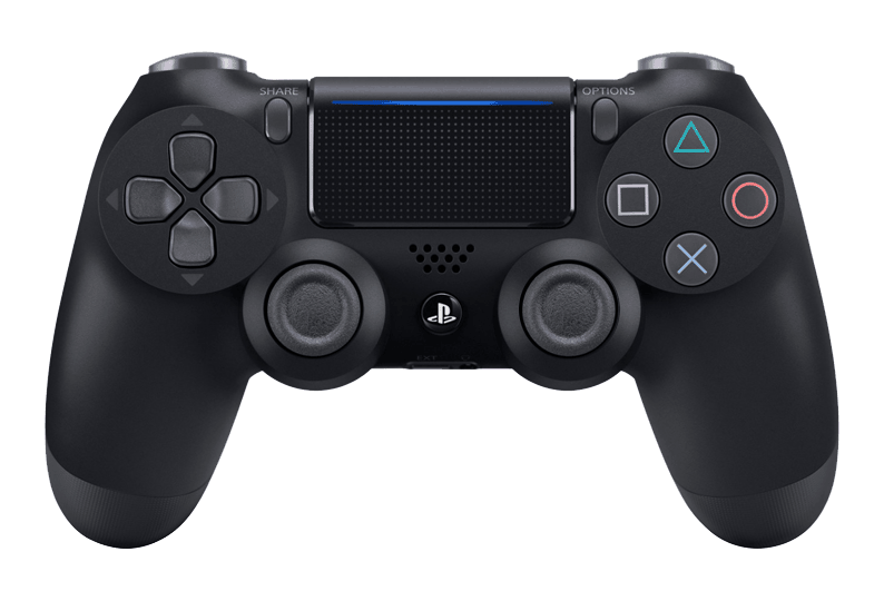
And then in 2013, when the PlayStation 4 was released, we got an even bigger update to Sony’s line of game controllers, the DualShock 4. Not only did the DualShock 4 feature the 1st big design change in a Sony controller, but it also came with a ton of major features.

The start and select buttons were replaced with Options and Share. We also got a built-in speaker for some sound effects that the controller would play for when let’s say, you were reloading a gun. We also got an actual touch-pad on the controller, which would not only be used in games but also in the web browser as a mouse and it was also it’s own pressable button. We got redesigned joysticks that were now concave rather than convex. It came with a massive light bar on the back for not only giving you a visual feedback of what was happening in your game, if the light went red for example, you would know that your health has reached a critical point, but that light was also used for 3D depth tracking for the PlayStation Camera and the PlayStation VR headset which was released later on. We got a microUSB port from the miniUSB that we had before, and we even got something that was by far my favourite feature, a 3.5mm headphone jack! Yes, you could now plug in any headphones that you wanted directly into the controller itself! How amazing was that? 

So yes, the PS4 controller, the DualShock 4, was the biggest change ever that Sony had made. So now what do we know when it comes to the DualShock 5, the PS5’s controller?

Well, we’ve actually had a few leaked images that give us a glimpse at the PS5 controller.

This first one was posted by Ray Sekiro on Twitter and this one shows a very weird looking controller.

The leaked PS5 controller (Source: Ray Sekiro)

The leaked PS5 controller (Source: Ray Sekiro)

Probably the first two things that you’ve noticed are the weird indented shape on the bottom, as well as the integrated display panel. But there’s quite a few more things that do stand out. The directional arrow keys on the left have now been redesigned. They’re slimmer, a bit taller and the arrow symbols are now on the inside of the keys, rather than on the outside. The PlayStation square, circle, triangle and X buttons seem to be the same as before, maybe a bit more raised, but it’s quite hard to tell from this image. The Share and Options buttons are now horizontal, rather than vertical and it seems like we also have two instead of just one speaker grills on each side of the display. And I’m not sure how well you can see this but the L1 and R1 buttons seem to have been redesigned as well and they’re much larger now. It also appears that the 3.5mm headphone jack and the proprietary connector or at least a USB type C port seem to be located on the bottom of the controller, just like on the PS4 one. 

Now let’s talk about the two elephants in the room. The Display and the Shape of this controller.

So when it comes to the display, the whole idea behind it is for it to be an upgrade to the touch panel that we had with the PS4 Controller. Personally I can definitely see this happening. That display would allow you to see certain elements of a game, such as the inventory or the in-game party or chat. I do think that that would be a very useful thing to have, since at the moment if you want to chat with your friends via text, you would connect your phone to the PlayStation, but that does take some time and typing using the joystick is just a nightmare. So something like this would speed up the typing process by a lot.

The only question is, what impact will this have on the battery life? Well it should have quite a significant one. Considering that the PS4 controller is pretty well known for a not so great battery life, I don’t think things are looking that great for the PS5 controller.

The Nintendo Switch Pro has the best battery life on a controller on the market

The Nintendo Switch Pro has the best battery life on a controller on the market

However, if you look at the Nintendo Switch Pro controller, that is by far the best controller on the market when it comes to battery life right on par with the Xbox One Elite 2 controller, both offering a staggering 40 hour battery life.

But even 10 hours would be enough, as long as Sony managed to add everything that they want in this controller, and I would say that that’s perfectly doable. Especially considering that the PS4 controller uses Bluetooth 2.1 and nowadays we have Bluetooth 5.0 which is significantly more power efficient. Add this to more efficient batteries and chips and I would say that 10 hours with that included display is doable.

Now when it comes to the shape, yes it does look to be extremely uncomfortable judging by how the bottom bit is lower than the top portion. I could be wrong, but I would need to hold it in my hand to see for myself how comfortable it really is.

However, something that you should keep in mind is that this is not the final version of the PS5 controller. No, this is very likely a DevKit controller that would work alongside the developers kit that I showed you guys exclusively in a previous video. So make sure you watch that one, in case you want to learn more about the actual PlayStation 5, as this is mostly about the controller itself.

So the final version will be more polished, with a thinner design, and possibly without that indented part towards the bottom. 

Now, when I first saw that image, I did consider the fact that it might be a very well done render. However, I don’t think this is the case for two reasons.

The first one being that we make 3D renders here at ZONEofTECH as well, like the PS5 one that you’ve seen. That was very well done and it’s also an extremely difficult shape to do, so if the controller image is a render, it’s probably the best one that I’ve seen.

Secondly, there were actually multiple leaked photo of this controller, from many other sources and they all look the same. Twitter user Tidux posted an image that shows this PS5 controller, and we have another image that was posted on Reddit, that again shows the same controller from a different angle. The image has been taken down from Reddit but you can see it on hothardware.com here.

Now they could all be renders made by the same person that decided to share it with random people but I don’t think that’s the case. If we take a look at an actual photo of a real PlayStation 4 dev kit controller, you can see that even this one had that big, thick and chunky form factor, and we all know how much thinner and sleeker it got with the final unit. However, the main characteristic of the controller still remained. Things like the overall design from the front, the button layout, the touch bar and even the light bar. Even though it did look more squared off in the dev-kit model.

Now we have actually made our own PS5 controller 3D model. It’s a blend of the PS4 controller and the PS5 dev kit controller. 

The ZONEofTECH PS5 Controller Render

The ZONEofTECH PS5 Controller Render

So we still have overall the same PS4 controller design, just with slightly longer handles. We do have the built-in display, the horizontal Options and Share Buttons, the light bar on the top which we’ve actually made bigger than on the PS4 one, for even easier tracking from a greater distance. We’ve implemented the dual speakers to the side of the display, and the 3.5mm headphone jack on the bottom. We did actually removed Sony’s proprietary connector, in favour of just the USB type C port on the back and that’s pretty much it!

You can see how similar it looks to the PS4 controller, yet how it incorporates the brand new features, such as the display, the speakers, and also a very unique feature that I haven’t mentioned before.

So Sony has had another interview with The Wired, back in early October, where they not only confirmed the name of the PS5 which, surprise surprise is indeed PlayStation 5, but they also confirmed the release date, Holidays 2020 alongside some exclusive details about the PS5 controller.

Mark Cerny, the lead architect on both the PS4 had the PS5, had an interview with Peter Rubin of the Wired, and Mark actually handed Rubin a PS5 controller, which according to Peter, looked very similar to the PS4 controller. According to Mark, it would be a next-generation controller as well, a change as big as the PS4 controller was from the PS3 controller.

Apparently Sony will now have a voice assistant similar to Siri, Alexa or Cortana, built into the PS5, and the controller will also have a built-in microphone to pick up that audio.

The second change that was officially confirmed are adaptive triggers that can offer varying levels of resistance based on the weapon that you use. So you’ll be able to feel the tension increasing as you pull the arrow back in a bow and different weapons having different feels on the trigger, really cool stuff!

The new haptic engine will give the user real time feedback depending on the environment they are in, like driving on dirt in Gran Turismo Sport (Source: Sony)

The new haptic engine will give the user real time feedback depending on the environment they are in, like driving on dirt in Gran Turismo Sport (Source: Sony)

And the third officially confirmed change would be a haptic engine. This would be similar to what modern smartphone use today but basically on steroids. You’ll be able to feel not just vibrations but also certain elements in a game. Peter was saying how he played a platformer game and he could actually feel things such as sand, mud, and ice on the thumbsticks. He could feel the haptic engine and the triggers offering a different type of resistance based on the environment that he was in, in the game. Peter was also shown a new version of Grand Turismo Sport running on the PS5 and he said he could fee the difference in terrain when he was driving on asphalt to when he came off the track and onto grass, sand, gravel.

If this is all true then this is incredible! I am really excited for that, although I believe the competitive gaming community would be a bit frustrated with having joysticks that constantly feel different based on what you touch and what you pick up. But this will definitely be something that the developer can enable or disable and tweak to their liking. 

Also USB type C is confirmed for the next-gen PS5 controller, which was quite expected, and Mark Cerny also confirmed the existence of a larger battery. He also confirmed that the controller is indeed heavier than a PS4 controller but still lighter than the current Xbox Controller. 

With all of this in mind I am very excited for the new PS5 and really excited to check out the new controller and see if all the rumours are true. Let me know in the comments what you guys are excited for with the PS5!

Apple AR Glasses (2020) - The FUTURE!


Some of you might know that Apple is working on a pair of AR glasses. Now in case you don’t know what those are, well I’ll explain everything you need to know in this article, alongside why these glasses have the potential of revolutionising the tech industry entirely, just like the iPhone did back in 2007.

I’m personal extremely excited about these, and you will most certainly be as well, by the end of this.

Grab some popcorn and here’s the real future of the tech industry!


Ok, so for those of you who don’t know what AR is, AR means augmented reality and unlike VR or virtual reality where you put this giant headset on and you’re transported into a fully virtual world, AR keeps you in the real world but it ads certain virtual elements to it.

We’ve recently started seeing AR being used in smartphones, like the iPhone 11 Pro Max. Apple released ARKit which is pretty much an API. In simple English it’s a tool that allows developers to easily make AR apps that would automatically take advantage of all the sensors that the iPhone has, such as the accelerometer, the gyroscope, the dual and now the triple lens camera module and so on.

IKEA’s Place app allows you to see how different items of furniture would fit within your home thanks to AR

IKEA’s Place app allows you to see how different items of furniture would fit within your home thanks to AR

So we started seeing apps such as IKEA’s Place app that allows you to place furniture from their store, inside your real world view. That app works incredibly well, the tracking is spot on, it never lost the tracking and the furniture even had real time shadows as well as the ability to get very close to them and see all the details so I was extremely impressed with what this app can do. I recently moved into a new apartment which is still empty so I’ll be using this app to buy some furniture in the upcoming weeks and it’s been great!

And Apple has put so much resources into ARKit that they got to a point where we have real-time shadows on objects, real-time reflections where lights from the real world will get reflected onto the virual objects which is just nuts. But what’s probably even crazier is that with ARKit 3, virtual objects can detect the presence of a real person and circle around it for example.

While I do see VR as more suitable for games and entertainment in general, I see AR as suited more towards productivity. 

And this is why having this AR experience all the time, without having to use your smartphone would be a game-changer. This is where Apple’s upcoming AR headset comes into play.

And the questions you all probably have regarding this headset are:

1. How will it work?

2. What would it look like? 

3. How much will it cost? 

1. HOW WILL IT WORK?

So let’s start off with how it will work? 

Ok, so there’s multiple ways that you can build such a headset. Usually VR headsets are big, bulky and they connect to your PC via an actual cable. 

There are a few examples such as the Oculus Quest which are completely wireless, and that is where the future of VR is heading towards. When it comes to Apple their AR headset will indeed be fully wireless as well.

One of the patents that Apple has filed for regarding their AR Glasses (Source: Patently Apple)

One of the patents that Apple has filed for regarding their AR Glasses (Source: Patently Apple)

There’s been quite a number of patents that Apple has applied for, all showing a very thin and light device, that looks pretty much like a regular pair of glasses. CNET even released a pretty big report back in 2018, with some details that they got from inside sources, on how Apple’s AR glasses would work like. 

The project is apparently called T288 internally, and even back in 2018 it was still aimed at a 2020 release, just like more recent reports have all pointed towards.

CNET did detail that Apple is actually planning on making this a fully wireless device. So instead of Apple building the processor and everything inside the headset, this would be built into a different device, which would then render the entire scene and transmit the video stream to the glasses. This means the glasses will just act as the display, but a different device will actually render the entire scene. Otherwise, the glasses would have to be very thick, in order to accommodate a large battery that would be required for driving such a powerful processor. In case you’re wondering, the glasses will also be housing multiple cameras for tracking the environment, very similar to the Oculus Quest’s cameras, it’s just that the processing would be done outside of the headset.

Now CNET did also mention that Apple will have a separate box that would be processing all the data from the headset. However, Ming-Chi-Kuo, who’s been pretty much the most reliable source in terms of Apple leaks, reported earlier this year in MacRumors that the separate processing box would actually be the iPhone and that the AR Glasses would be “marketed as an iPhone accessory”. So this would be similar to the Apple Watch or the AirPods, essentially a new product category that would go hand in hand with the iPhone. 

Another report from Bloomberg, that we got back in 2017, pointed towards the exact same thing. It suggested that Apple was working on an AR headset that would release in 2020, and that would eventually even end up replacing the iPhone. In the first few years, it will need the iPhone for processing power, but once the chips get even more power efficient and we hopefully get a new battery technology, that would not be required anymore. 

Now that’s all well and good, but what will you be able to do with the Apple Glasses?

Well essentially you would be able to see everything from your iPhone directly in front of your eyes. So things such as; your messages, your Instagram feed, your emails, all of that would be viewable at all times right in front of your eyes. It would not take your entire feel of view, but instead, a small window overlay would display all of that data, and it’s very likely that you would be able to reposition that window, resize it and so on. The AR Glasses themselves will have Siri integration so most of the interaction will be done by voice and by some touch panels which are said to be embedded into the frame itself. 

So that’s pretty cool but what else will it be able to do?

Google Maps now supports AR where your route will be shown in real life (Source: Darrell as a Service)

Google Maps now supports AR where your route will be shown in real life (Source: Darrell as a Service)

Well, the uses cases that I would personally love to see would be integration with Maps, so that you can see arrows and real time directions on the street itself, right in front of your eyes. Google Maps recently had an update with AR integration, so now you can just lift your phone and you would indeed get real time directions in the real world as to which exact way to go. This is just on smartphones at the moment, but imagine having this on a pair of AR Glasses, that would be incredible!

But the most useful case scenario, for me at least, would be just having loads of displays anywhere I am. Imagine having three big curved monitors surrounding you, or even a room full of displays, or just a gigantic display right on your work-desk or even floating above it that you wouldn’t be able to have normally. 

Speaking of displays, one of the current issues with AR and VR today is the pixel density of the display panels. The lower the resolution of the display is, the lower the pixel density will be and the more pixels you will actually see when you put the headset one, which will create this very blurry and grainy effect.

The Oculus Quest for example, which is by far the best VR headset that I have used, has a resolution of 1440x1600 per each eye which is pretty high, it’s actually on par with the HTC Vive Pro. But you see, even with such a high resolution display, I can still easily see the pixels and the image quality just isn’t realistic at all. We’re still years ahead of extremely high resolution displays on VR and AR headsets.

However CNET did mention in their report that Apple would be using 8K displays in their headset! To give context, VR headsets today have close to a 2K display per eye and Apple wants to use an 8K display per eye! That’s insane! With a resolution like that, per eye, you should be able to see a perfectly clear image, without any pixilation at all, or at least barely even noticeable. 

But can the iPhone drive two 8K displays whilst calculating everything required for the AR Tracking in real time? Well considering that the Apple A10X processor that’s inside the AppleTV 4K can actually handle full 4K output and even 4K games albeit mobile ones, and that the Apple A13 processor that we have in this year’s iPhone 11’s is pretty much twice more powerful than that, and the Apple A14 chip which will be coming out next year will be the first to be based on a 5nm process and it should smoke the A13 chip. Well, it’s looking pretty likely that the A14 will indeed be able to push dual 8K output for the Apple AR Glasses.

2. WHAT WOULD IT LOOK LIKE?

Ok, so that was a fairly long section since how it would work is the most interesting and important part of the headset, but now let’s see what it would look like.

Well, considering Apple’s patents and the fact that the glasses themselves will only be streaming the data from the iPhone rather than calculating that itself, they should look very similar to traditional glasses.

Apple does already have two wearable devices, the Apple Watch and the AirPods, and they both look good. They have an elegant look to them, however we can all agree that they do have a weird/unique look. For example, the Apple Watch is rectangular and you can immediately tell when someone’s wearing an Apple Watch compared to a regular watch, or any other smartwatch for example. The same goes for the AirPods they have this very weird and distinct look to them, and you can always tell when someones wearing them. So I do believe that the Apple Glasses would have a similar look. They would still look like glasses, but they will have Apple’s unique taken on them with a more unusual design.

The ZONEofTECH Concept for Apple’s AR Glasses

The ZONEofTECH Concept for Apple’s AR Glasses

In our concept we actually made it in a realistic way, with a fairly thick frame that houses the battery and the chips for capturing the 3D data and then sending it over to the iPhone. We have three cameras on the front and then two more on each side, for special awareness. We have the wireless charging coils because let’s be real, Apple will very likely use a similar charging system as to what they already use in the Apple Watch and the AirPods, so wireless charging. The speakers would be bone conducting speakers, so the grills that you see there are just for the design actually and for airflow. This is of course our take on it, but I wouldn’t be surprised if Apple does something similar. Like I said, a pair of glasses that looks a bit more unique than the rest, just like the AirPods and the Apple Watch. 

3. HOW MUCH WILL IT COST?

Now this is actually a bit of a tricky one because you see in order for Apple to make the best possible AR Glasses, they would need to charge loads. This is a truly futuristic device that won’t be cheap to make by any means. But at the same time, Apple simply cannot price this at say $3000 since who would really buy it in that case? 

The rumoured price is around $1000-$1500 at this point, which I still think is very high and I don’t see many people buying this considering that it is not a phone, but instead an accessory that you also need an iPhone for.

What I think Apple should do is make the best Apple Glasses that they can, even if it costs them $3000 per unit and then price it very low, at $300 or so, around the same price as an Apple Watch costs. If they did this they would sell loads, and then they can make their money back through software purchases. That’s what I would do. 

But whatever price Apple decides to sell them for, we know that they are definitely happening. We have multiple reports from Ming-Chi-Kuo, DigiTimes, Bloomberg and even actual code found in iOS 13, that points towards Apple actively working on the AR Glasses. Apple even applied for a patent that allows you to adjust the opacity of the display so that AR objects are more or less visible in the real world, apparently. 

However, something that I find to be even more interesting is a recent report coming from DigiTimes that claims that Apple has partnered with Valve to develop the AR headset. Valve has just released their own headset, the Valve Index, which is pretty much the highest end VR headset that you can buy, and the HTC Vive and the Vive Pro had both been made in partnership with Valve. So Valve has been in the VR industry for quite a few years now and it’s definitely been one of the pioneers of VR and Apple partnering with them is just some amazing news! 

The article published on Monday explains that Apple has partnered with Valve (Source: MacRumors)

The article published on Monday explains that Apple has partnered with Valve (Source: MacRumors)

So there you have it, all the latest we know about the upcoming AR Glasses. I am personally really excited to see how these turn out, but we will have to wait until next year at least. Let me know what you guys think in the comments.

What Is Happening with the 16" MacBook Pro?


We’ve seen so many leaks, rumors and even actual proof found in Beta versions of macOS, that clearly showed that Apple is working on a brand new generation of MacBook Pro’s. 

We were expecting to see a new MacBook Pro by the end of October, but that hasn’t happened so here’s an update on everything we know so far and what is really the status of the this 16” MacBook Pro!


It is now November which means that Apple has not had any event in October this year like most of us were expecting, or at least were hoping. 

Apple has two big events every single year. We have WWDC in June, which is Apple’s software event where they announce the new versions of iOS, macOS & tvOS, then in September we have the big hardware focused event, where Apple introduces the brand new iPhones, the new Apple Watch and sometimes a few more things as well.

However, the Macs and the iPads never really had a place in any event. WWDC was always too full with software and the September event was always too full with the iPhones. So because of that, Apple sometimes has two more events in the year. A March event where they release new entry level iPads, and an October event where they release new Macs and iPad Pros.

However, when it comes to Mac events it’s a bit more complicated, as Apple need to wait for Intel to release new processors before they can update their machines. 

Now the MacBook Pro and Air are by far the most popular Macs that Apple has ever made and because, unlike the iPhones which get updated every 2-3 years, Macs don’t really get updated that often there is always a lot of hype around a new generation.

The current generation of MacBook Pros came out in 2016, the previous gen came out in 2012 and the one before that came out in 2008. So it seems like every 4 years, Apple releases a brand new design. So a new design to this generation isn’t expected until 2020.

But as you may know, Ming-Chi-Kuo, Bloomberg, DigiTimes Taiwan, and pretty much every well known source has said that Apple will be releasing a new 16” MacBook Pro in 2019, which was supposed to be launching by the end of October. But all this was quite weird. Why would Apple release the new generation of MacBook Pro’s a year earlier than usual, and why didn’t they have any event to announce it?

Especially considering the amount of issues that this generation has had, ranging from severe keyboard issues, thermal throttling issues, creaking noise issues, faulty speaker issues and much more, if a you were going to bring out a new generation that solved those problems you’d make a big deal out of it wouldn’t you?

I’ve made multiple videos with my own issues with this generation of MacBook Pros, and how Apple’s customer support is just straight up garbage when it comes to dealing with expensive devices such as this. Full video on how Apple still hasn’t fixed my broken $5000 MacBook Pro here

Overtime Apple has attempted to fix the keyboard issues with small upgrades to the keys (Source: iFixit)

Overtime Apple has attempted to fix the keyboard issues with small upgrades to the keys (Source: iFixit)

In short, this generation needs to be replaced as soon as. Apple tried “fixing” the keyboard with every new model that they’ve launched since 2016, with small improvements in the key-cap mechanism but they just couldn’t, just because the butterfly key-switch mechanism was faulty from the very start. Apparently this new generation is said to come with a brand new mechanism, the scissor mechanism, which funnily enough was the one that previous generations of MacBook Pros had. This will give us more key travel than before, since at the moment you can barely even feel the keys moving. So a fixed keyboard is the first change.

We’ll also be getting a larger display, a 16-16.4” panel from the 15.4” one that we have on the current model, whilst also getting slimmer bezels. 

The body will also be getting thicker in order to improve cooling but that’s mostly it, in terms of the main changes.

So that doesn’t seem like a lot. We’ve actually made our own concept, in which we increased the size of the touchbar to make it even more usable and extend it to the very top of the frame, as before, this area was unused and it just didn’t look good at all. However, it seems like the changes would be even smaller than we expected.

French Website, MacGeneration found an icon of the 16” MacBook Pro in the latest macOS Catalina 10.15.1 Beta that even has a file name that says 16” in silver & space grey. However, it looks pretty much identical to the current model. But this is as official as it gets until the unveil. 

The MacBook Pro 15” (Left) compared to the leaked 16” icon (Right) (Source: MacGeneration)

The MacBook Pro 15” (Left) compared to the leaked 16” icon (Right) (Source: MacGeneration)

Unfortunately, unless you put them side by side you cannot really tell the difference. By putting them side by side you can see that the entire machine is indeed larger and the bezels are slightly thinner, but the differences are so small that I just cannot call this a new generation of MacBook Pros.

Even though the bezels are thinner, they’re still thicker than on something like a Dell XPS 13” 2-in-1 or many of the more modern laptops released in 2019. We still have the big chin with the MacBook Pro branding on the bottom which I don’t really like, it’s way too fat and it takes up way too much unnecessary space. I always preferred the previous look of the 2012 Retina MacBook Pro’s that had no branding at all on the display.

Now, there are a few other changes that we get, aside from the slightly thinner bezels and the larger display. For example, if you look at the top left section of the touchbar on the 16” MacBook Pro icon, you can see that there seems to be a space in between the touchbar and a button on the left. Now, we’ve even had a second image that was discovered by developer Guilherme Rambo in macOS 10.15.1 beta again, that shows the full official image of the right hand side of the new 16” MacBook Pro. And there’s probably one thing that you’ve noticed right away, and that is how the touchID sensor is separated from the touchbar now. 

The 16” (Bottom) appears to leave some space between the touchbar and a button on the left (Source: MacGeneration)

The 16” (Bottom) appears to leave some space between the touchbar and a button on the left (Source: MacGeneration)

This means that the button on the left is most likely the escape key which will also now be separated from the touchbar as well. That was one of the main complaints that developers had, I had it as well, since escape is a key that I do hit very often in certain apps and not having a physical key for that, can be extremely frustrating. 

Also in this image we can also see the keyboard, but to me at least, it looks identical to the current gen, with no more key travel than what we have now. So that’s pretty disappointing to see.

Keep in mind that if this is a new generation then this is what we’ll get for the next 3-4 years. Which means a total of 6-8 years with what’s mostly the exact same design and what looks to be the same keyboard.

The touchbar is looking to be the same size as before, maybe even a bit shorter because of the introduction of the escape key. When you take into account that you have laptops such as the Asus ZenBook Duo that have two fully usable displays, or laptops that are 2-in-1 with pen support as well, and a 22 hour battery life and crazy specs and features like that, the MacBook Pro feel extremely old and already outdated, even before it’s out!

Unless of course, this is not a new generation of MacBook Pro’s!

Every new generation has seen some massive changes, in pretty much every single way. The 2012 Retina MacBook Pro was by far the biggest change ever, in a MacBook Pro. It had a high resolution Retina Display, something never before seen in a laptop, a full flash storage from the HDD of the previous generation, it had a design that was pretty much half the thickness of the previous model, and it was lighter, so it was years ahead of the previous generation.

The 2016 generation that we have now, was a much smaller upgrade. Aside from the DCI-P3 displays, slightly thinner bezels, space grey colour, the downgraded keyboard and touchID and touchbar, we didn’t really get much else. 

This is mostly because we’ve reached to a point where laptops have become as good as they can be and the only things that we can improve are the specs. Unless of course we have dual displays or innovative concepts such as that, which Apple doesn’t usually do first.

MacRumors posted a gif of the current 15” MacBook Pro and the 16” MacBook Pro leaked image and like I said, they’re pretty much identical, I will leave a link to it here so you can see what I am talking about. The touchbar appears to maybe be a bit taller, barely even noticeable and luckily the top portion of the case is now a bit slimmer. The keys do seem to have more space in between, than on the current 15” model, which is always a welcome change.

So judging by all these official images that were actually found in macOS 10.15.1 beta, the release of the 16” MacBook Pro seems to be imminent. 

Now, Ming-Chi-Kuo actually released a report this week, updating his research note on the 16” MacBook Pro. In it he said that Apple would only switch to a scissor switch keyboard, in Q2 or Q3 2020. Which means either June or September of next year. And he was also the one that initially talked about Apple working on a scissor keyboard switch for the new MacBook Pro 16” for this year. So if that gets delayed, there’s a very high chance that this MacBook Pro 16” will also get delayed, rather than shipping with the old style keyboard which would be another disaster. 

The headline from the article on MacRumors where Ming-Chi Kuo said it was likely that the new keyboard would be mid 2020 (Source: MacRumors)

The headline from the article on MacRumors where Ming-Chi Kuo said it was likely that the new keyboard would be mid 2020 (Source: MacRumors)

DigiTimes reported that Apple will begin receiving shipments of the 16” MacBook Pro. That’s another reason why I do see this being delayed is because of Intel and AMD.

Intel’s 10th generation processors have indeed launched, but these are only the Y and the U series. So the 7W and 15W ones that are aimed at the MacBook Air and the 13” MacBook Pro are here, but not the H series, which represents the 45W processors aimed at the 15” MacBook Pro’s. 

Those are only coming out next year, around May-June, just in time for a truly next generation of MacBooks Otherwise, if this 16” MacBook Pro gets released before then we would still be getting the exact same processor, the Intel 9980HK, that we already have in the May 2019 release. The same goes for the GPU. Aside from the Vega 20 that we got back in November 2018, which is already an outdated architecture, we haven’t had anything new from AMD since. Now, maybe Apple is working alongside AMD on a custom RDNA GPU, similar to what Sony and Microsoft are doing for the PS5 and Xbox 2, but don’t get your hopes too high. The chances of that happening are extremely slim. 

There are a few more leaks that I want to mention. We did a very detailed video on the 16” MacBook Pro back in July and that was when we had barely any leaks on it, and it that video I talked about a few interesting things that I’ve noticed.

A leaked power adapter from the suspected 16” MacBook Pro showing the 96W Charging (Source: Chongdiantou)

A leaked power adapter from the suspected 16” MacBook Pro showing the 96W Charging (Source: Chongdiantou)

For example, how the upcoming Apple Pro Display XDR supports up to 96W of power output, but the current gen 15” MacBook Pro’s, only support up to 87W. So my theory here was that the new 16” MacBook Pro would require either a 94W or a 96W power adapter. 94W was also an option since the new LG UltraFine 5K display supports up to 94W of power output via thunderbolt 3, rather than 96W. And it seems like there’s been a leaked power adapter, presumably for this 16” MacBook Pro that actually shows a 96W USB-C Power adapter. So it seems like my theory might have been correct here and we should be seeing a 16” MacBook Pro with a power requirement of 96W.

In case you’re wondering what we might need those extra 9W of power for, well it’s very likely for the display, which is not just going to be larger but there’s a very high change that Apple will also brand this display a Pro XDR display to match it up with their actual Mac Pro Pro XDR display and also the new Super Retina XDR naming that they’re now using in iPhones. So this display will very likely be brighter than the 500 nit panel that we currently have in the current generation of MacBook Pro’s. 

I’m just very disappointed that this new 16” MacBook Pro which is supposed to be a new generation of MacBook Pro’s, only seems to be a very slight week to the current gen, which we might have to stick with, for the next 4 years. There’s no FaceID, no larger TouchBar, no touchscreen, no flappable display, no OLED display and nothing really that would make this truly next gen.

[EXCLUSIVE] PS5 (2020) - First Look, Release Date & More!


So a last week we put out a video about the PS5 and the response was amazing! But since then we have had even more leaks and even an exclusive never seen before image of the PS5. If you haven’t seen that video, check it out on this link. But for now let us give you a breakdown of all the new leaks we have!


LEAKED IMAGE

Ok, so a few days ago, someone who I’m not going to name, sent me an email that contained something very unique, an actual first look at the PlayStation 5!

The leaked image we received

The leaked image we received

Right off the bat, this design looks pretty much identical to the leaked PS5 patent that I’ve talked about in the previous video. We have the same V shape vent in the middle, we have the exact same air exhausts on the sides and probably on the back as well.

So on the left, we have the optical drive unit this will support double layer blu-ray drives, up to 100GB in size.

And then we have all the buttons and ports that we’ve had in the actual patent as well including buttons for; On/Standby, Reset, Eject, System Initialisation and Network initialisation. 

On the right hand side, we have that weird connector, that looks to be a USB type B port, then 5 more USB type A ports, out of which the 1st one seem to be USB 2.0, judging by the black inside. The next 3 seem to be USB 3.0 or higher, judging by the blue inside and then we have one more that seems to have an actual cable plugged into it. That’s probably USB 3.0 or higher as well.

And then we also have that weird circle which I believed to be a camera, looking at the patent. Especially since we have had reports that Sony and Microsoft as well, could actually be including 4K cameras into the consoles itself, for live-streaming.  But looking at this leaked image, I cannot see any camera lens or anything inside of that, so that round thing is probably just the power button in this case.

But as you can see, all of these match perfectly with the actual ports on the PS5 patent. Same layout, same number, same dimensions, so this is indeed the real deal.

Now, there are a few more things in this image, that weren’t visible in the patent. For example, we have a few more light indicators, from 7 to 0 on the left hand side, which probably show the number of controllers connected or, even more likely, the number of CPU cores being used. We also have 2 more status lights – status 2 and status 1. 1 appears to be lit up. Then we have a hidden serial number and some sort of QR code I think, on the right and a label saying that this is a prototype, Prototype 1 in this case, and that it is not for sale. 

So yes, it seems like this is indeed a developers unit and not the final version of the PS5.

In that previous video I did say that I found it odd that Sony was patenting the development unit and that I actually believed that to be the final version of the PS5. Now, the thing is the final PS5 would not look identical to this Developer Kit that we see here, but there is a very strong change that it will indeed look very very similar.

The cooling system on the Dev Kit looks to be extremely well designed. It looks like there has been a lot of thought put into this. How it sucks the air from the middle with that massive V shaped intake, which by the way, V is also the roman numeral for 5. The Air is then blown out through the sides and the back, which we cannot see in this image. So the cooling system is very well done, another reason why I think that Sony would definitely not downgrade the cooling in the final unit. Otherwise this is also going to cause a huge performance issue. If the developers work on their games and in the final unit, they end up running worse because the system is throttling due to the downgraded cooling, well that won’t be good for anyone.

Our concept of the PS5 based on the previously leaked patent.

Our concept of the PS5 based on the previously leaked patent.

Now, in the last video, we actually did actually make our very own concept based on that leaked patent and we’ve even made some changes of our own. For example, we added a water cooling system that goes all around the console, cooling both the processor and the graphics card, which would be located right in the middle of the unit. The fans will still be present which will further help cool the system down.

Now even though we have made our concept more visually appealing than in the actual Sony Patent by aligning the ports, cleaning up some details and adding LED’s and water cooling, a lot of you said that it was still quite ugly. Which is true, let’s be honest it is not the prettiest console. Personally I don’t really care about the looks as long as it’s properly cooled and it runs at 4K60 like Sony officially confirmed, on the highest settings possible, without any frame drops.

Now something that I did mention in the previous video, was that on the top of the PS5, we had something that kinda looked like rubber feet. Interesting enough, if we go back to that PS5 image and bump up the shadows, you can now easily see that those rubber feet are actually here on the dev kit as well. Now this makes me think that you can also flip the PS5 and have the air intake on the bottom rather than on the top and in that case, it could actually look better. 

Now, I tried looking at the image for some more details. EXIF files were all removed, so I couldn’t see any details such as what camera module took this, when it was taken and where but I could at least see the file name. And this was ‘2019-10-10 at 03:49:44am’, so judging by the file name at least, this was taken just a few days ago, probably when no-one else was in the building, because of that time. 

So, in conclusion regarding this PS5 design, the bad this is that we still don’t have a look at the final design. However, the good news is that the PS5 will have a brand new cooling system, which like I said, will very likely end up being extremely similar to this patent and it will also look prettier at the same time.

The PS4 Pro dev kit was just gigantic, same for the PS4 dev kit, and the final units ended up being much smaller and thinner and they also looked so much better. So whatever the PS5 is going to look like, it won’t be as ugly as the dev kit unit is.

MARK CERNY

Now, aside from this we’ve also had some more details regarding the PS5 directly from Sony themselves.

The Wired posted a massive article with a ton of exclusive details on the PS5, coming from Mark Cerny, the lead architect on the PS5 and here’s what they said.

First of all, Playstation 5 is the official name. Which I mean I think we all kind of knew that this was going to be the case, but Sony has only referred to the PS5 as “next-gen” console whenever they talked about it. But now, the official name is confirmed and surprise surprise it’s PS5.

Next up the release date is also official. Mark Cerny confirmed that the PS5 is coming in Holiday Season 2020. Which was also what I believed to be the case as well. So a November – December release date is very likely going to be the case here. I would even say that November is looking more likely than December, since that way retailers would have enough time to stock the PS5 in stores for Christmas a month later.

It is also confirmed now that the PS5 will have an AMD Ryzen CPU and an AMD Navi architecture GPU. There will be no more spinning hard-drive, instead we would have an insanely fast flash storage inside the unit, with read and write speeds of close to 2GB/s. Now, the only problem with this, is that this kind of storage is very expensive. So Sony will very likely limit this to 1TB, but hopefully they will be offering some higher capacity models. I personally am quite curious to see how this would impact external storage. Obviously if games are optimised at loading their assets for that insanely fast internal storage, and then some users add an external HDD for more capacity, this would have a huge downgrade on the game’s performance. So I do believe that Sony might limit external devices to external SSDs, or even release some sort of 1st party m.2 enclosure, which with those USB 3.0 or even 3.2 ports, that should be able to reach 1GB/s speeds as well. 

Aside from this, Cerny has also confirmed that the PS5 will actually have hardware accelerated Ray-Tracing support. Now we did know that the PS5 will indeed support ray tracing, but we weren’t sure if this would be software based or not. But from the report it seems like it would actually be hardware enabled, just like the Nvidia RTX series of graphic cards! Pretty impressive! This would significantly improve the graphics quality and the realism in games. We’ve seen the same thing happen with Minecraft, where enabling RTX would literally turn it into a different game, something that looks almost as realistic as real life. Whereas Minecraft, as you all probably known, was quite a different story.

A comparison of Minecraft graphics with RTX enabled (Right) and disabled (Left) (Source: Nvidia)

A comparison of Minecraft graphics with RTX enabled (Right) and disabled (Left) (Source: Nvidia)

On top of this, Mark Cerny also said that the game size will be noticeably reduced. At the moment since the HDD is so slow the data actually had to be duplicated in some cases on the disk, just to make it more easily accessible. This will no longer be required with the flash storage.

And Mark Cerny as also confirmed that the PS5 will be using 100GB Blu-Ray disks, essentially dual layer Blu-Ray drives AND the PS5 will also support 4K Blu-Ray disks for watching movies, which the PS4 Pro ironically lacked. Sony invented Blu-Ray disks and the Blu-Ray players and they also hold all the rights for those, yet, they didn’t include one on the PS4 Pro for movies.

Something else he mentioned was that the game installation would be different on the PS5. Apparently, you would now be able to select which part of a game to install. For example, you would now be able to uninstall the campaign, if you’ve finished that or even the multiplayer, if it’s something you’re not interested in, and save some crucial space.

The UI will also be redesigned. Now you will be able to see your game missions and even the game lobby, without even starting the game, as all of this will now be visible on the home-screen. 

And yeah, there’s even more updates that Mark Cerney has shared, including a completely redesigned controller, so keep an eye out for another video and article, as I’ve got a ton of things I want to cover in that one as well.

Google Pixel 4 - Final Leaks & Rumors!


The Google Pixel 4 is coming out this month! This will be one of the best smartphones to get in 2019, and it might have the best camera in a smartphone for 2019, alongside some very unique features. Personally I’m very excited for the Pixel 4 and here’s everything you need to know about the soon to be device from Google.

This article contains 8 sections: Design, Display, Camera, Performance, Special Features, Battery, Release Data & Price, so you’ll definitely need some popcorn and drinks for this one!


DESIGN

Ok, so Pixel phones are mostly known for 3 things; the amazing camera, the pure stock android experience with no bloatware and day one updates, and the not so pretty design.

The Pixel 1 looked like an iPhone with no home button, but it did have on screen buttons which made the bezels horrendously thick. The Pixel 2 which was released in 2017 already had an outdated design, when compared to the competition, such as the Galaxy S8 or the iPhone X. The Pixel 3 from 2018 had the famous notch which was even bigger and more noticeable than the one on the iPhone X, while lacking any 3D Depth Sensing technology or Face Unlock like the iPhones had. 

And now the Pixel 4 will have another questionable design. Google has tweeted about this and even posted a few teasers. There are so many leaks for this phone that I think its the most leaked phone ever!

A hands on showing the forehead of the new Pixel 4 (Soure: 9to5Google)

A hands on showing the forehead of the new Pixel 4 (Soure: 9to5Google)

First off, the Pixel 4 no longer has that huge notch. Instead we have a fairly noticeable forehead that resembles the one that we had on the Pixel 2XL, back in 2017.  But this year Google is actually packing some serious tech inside that forehead which I’ll cover soon, so it’s not just there without any purpose. The side bezels are fairly thin, they do look to be about the same thickness as on the iPhone 11 Pro and Pro Max, and finally the bottom chin does appear to be thicker than on most phones today, but this one might also have its own purpose.

Moving on to the back we no longer have that iconic dual tone look that Pixel phones were known for, instead we have a single colour glass panel, which is again said to have the same frosted material that the Pixel 3 had and that the iPhone 11 Pro’s now have. 

Google’s ad in Times Square showing the new ‘Oh So Orange’ colour and new camera module. (Source: Reddit)

Google’s ad in Times Square showing the new ‘Oh So Orange’ colour and new camera module. (Source: Reddit)

The leaked colours at least, are black, orange and white. Google even had a massive Time Square poster, teasing the Pixel 4 which featured the orange model, so orange is definitely confirmed at this point. Evan Blass (@evleaks) also confirmed this colours, with their names apparently being “Just Black”, “Clearly White” and “Oh So Orange”! 

Finally, and probably the most noticeable thing on the back, is that camera module which looks so different to how it looked on the previous Pixels. It looks very similar to the iPhone 11 Pro’s module the only differences is that it’s black on the inside rather than matching the colour of the back of the phone. In a way it does look very similar to the camera module on the iPhone 11 Pro mock-ups that we had. It’s not a triple lens camera module unfortunately it’s just a dual one but I’ll be covering that more in the camera section of this article.

Also, the fingerprint reader is now gone and it has now been replaced by something even better. This means that the back has quite a clean look and I overall I do think that Google’s moving into the right direction when it comes to the design. It’s still not as sleek as the S10 is, or the OnePlus 7 & 7T Pro but it will come with some very unique features which I’ll cover later on. 


DISPLAY

Moving on to the display, the regular Pixel 4 will come with a 5.7” FullHD+ display, at 2160x1080 resolution and 424 PPI, whereas the Pixel 4 XL will come with a 6.3” QuadHD+ panel, so 3040x1440 resolution at 534PPI. 

These will both be OLED displays, with Gorilla Glass 6, HDR support, 100% DCI-P3 coverage so they will be very good panels but they will also feature something quite special, a 90Hz refresh rate display! A high refresh rate display such as this, is something that we already have on phones such as the OnePlus 7 Pro, the 7T’s, the Asus ROG gaming phones, and the Razer phones. What this means is that all the animations would be 50% more fluid than on a regular phone which has a 60Hz refresh rate panel. Your laptop, your computer, your monitor, most of them also have 60Hz. So the Pixel 4 will be more fluid than those.

CAMERA

Now the Pixels are known for having amazing cameras but the thing is the camera hardware itself was never anything ground-breaking. Instead, Google’s machine learning has been by far the best in the industry and they’ve been able to deliver some amazing results.

The Pixel 3 introduced a dual front facing camera set up (Source: Google)

The Pixel 3 introduced a dual front facing camera set up (Source: Google)

Where all the other manufactures have had dual, triple, even quad camera modules, Google has only had one module. In 2018 with the Pixel 3, we did get a dual front facing camera module, which was one of the first in any smartphone. We had a wide-angle lens for group selfies which was actually a very useful thing to have, but literally nothing extra on the back.

So this year we are getting a dual camera module on the back, which means that Google would still be a year behind the competition. Smartphones in 2017 and 2018 got a second telephoto or a zoom camera module, then a wide angle in 2019. Unfortunately, according to all the leaks that we’ve seen the second module on the Pixel 4 will actually be a zoom module rather than a wide angle module, which is pretty disappointing. You can always zoom in digitally but you cannot take a wide angle shot, without a wide angle lens. 

What’s even more disappointing is that Google already has a very good digital zoom. Google calls it SuperRes zoom, and while it’s nowhere near the quality of an actual zoom module, it’s very very close. So whilst all the leaks seem to be pointing to a zoom module, I’m still holding out for it to be a wide angle.

From the looks of the leaked designs, the Pixel 4 wont have the same dual front facing camera module that we have seen previously (Source: Genk.vn)

From the looks of the leaked designs, the Pixel 4 wont have the same dual front facing camera module that we have seen previously (Source: Genk.vn)

Now, speaking of the modules, it seems like we won’t be getting a dual camera module on the front anymore. From the official images that Google posted there is only one camera module there, I’ll talk about all the other sensors once we get to the special features section. However, this is expected to be a wide angle lens, or ultrawide as everyone’s calling it now, which means that Google will probably take all photos zoomed in digitally at a lower resolution and them zoom out for that wider field of view, when you need to. A similar technique to what Apple is now doing with the iPhone 11 Pro’s.

In terms of the camera specs the selfie camera is reported to be an 8MP sensor, f/2.0 aperture with 1080p video recording at 30fps. This is quite a big downgrade from the 4K60 that the iPhone 11 Pro for example can do. The back camera is reported to be a 12.2MP sensor with f.1.6 aperture. Same 1 / 2.55” sensor like we had on the Pixel 3 but with that f/1.6 aperture from f/1.8, which means we will be getting more light to the sensor, which in turn means better low light photography. 

Video recording with the back facing camera will finally be bumped to 4K60, as the Pixel 3 could only do 4K30 and we’ve had 4K since on phones since 2017 with the iPhone 8.

In addition this camera will actually have two brand new features. The first one being called the ‘Pixel Neural Core’. This is essentially the next gen version of the Pixel Visual Core which was the imaging chip found in the Pixel 3. This was also the chip responsible for processing the data required for the Night Sight photography. Speaking of Night Sight probably the most impressive camera features for me at least, we are getting a brand new Astral Photography mode which seems to be an even more improved version of Night Sight.

We do now have full leaked images from the Pixel 4 thanks to 9to5Google, which you can check out below.

They’re definitely coming from a Pixel, I can tell that by looking at the portrait mode shot in the first image, where the subjects are clearly separated from the background, so they look as if they were added in photoshop.

That portrait mode of the dog looks incredible (Image 2). That’s some very good background separation right there, were the image becomes blurrier the further away you get from the lens, and that 2nd camera module is definitely helping make that portrait mode look realistic. 

There’s also a Night Sight shot (Image 3) that look very good and has that signature Pixel look, where the colours are quite vibrant and cool compared to the warmer tint that we get with Samsung phones and iPhones.

Image 4 is a sample of the Astral photography mode which just look mind-blowing! I can’t believe that these were taken on a phone.

And then we a leaked Macro shot (Image 4) which just looks stunning, look at that detail!

Then we also have samples of food (Image 5) which seems to be very sharp and very colour accurate. 


PERFORMANCE

Now, when it comes to the Performance, Pixel phones have never been that impressive. I mean sure, they were smooth and fluid and got day one updates but raw performance wise, they were quite weak when compared to the competition. This is because Pixel phones get released in October and they are one of the last smartphones to be released in the year. Whereas Qualcomm announces their new processors in December, so Pixel phones only get two months until they are already outdated.

In terms of the CPU, the Pixel 4 will come with the Snapdragon 855+. This is actually a fairly new CPU, being launched back in August, however it is just an overclocked 855 and not anything like the 865 will be, which will be announced around December. Still, the 855+ is a very good processor and a pretty big bump from the 845 that the Pixel 3 had.

Aside from the CPU, Pixel phones were also lacking RAM. The Pixel 3’s only come with 4GB of RAM which for an iPhone that’s quite normal but for an Android phone, 4GB of RAM is usually what you now find on low end handsets. Google stated that they don’t need more RAM since they optimise their Pixels very well which unfortunately hasn’t been the case. They were lots of complaints with the RAM management on the Pixel 2 & 3, which Google could easily fix by just adding more RAM in the Pixel 4. And they will, it’s just that the leaks suggest a bump to 6GB of RAM from 4, which isn’t that much. Today we have Android smartphones that come with 12GB and many more than come with 8 as standard. So even 6GB would be slightly outdated.

SPECIAL FEATURES

Ok, now aside from the camera upgrades, and the performance improvements, what are the features that make the Pixel 4 unique? Well, this is where we get the biggest improvements!

A leaked tear down of the forehead showing the implementation of the Soli Radar Chip (Source: Genk.vn)

A leaked tear down of the forehead showing the implementation of the Soli Radar Chip (Source: Genk.vn)

First off, we get the brand new Soli chip. So this is essentially a miniaturised radar that can detect and measure movement much better than a camera can. In fact, Google had a special team just working on this Soli chip. What this chip allows you to do is control your Pixel 4 using Air Gestures. Now this isn’t anything new. We’ve had this with the Galaxy S4 and some other smartphones as well, and while you will be able to just wave at your Pixel to stop an alarm or skip to the next song, I still find this to be a gimmick.

Leaks suggest that Face Unlock will be coming to the Pixel 4 (Source: Genk.vn)

Leaks suggest that Face Unlock will be coming to the Pixel 4 (Source: Genk.vn)

But the good news is that It will work in conjunction with the other sensors in that forehead, to enable the second big new special feature, Face Unlock. Just like we have on the iPhone X and newer, the Pixel 4 will have a full 3D Depth sensing camera. At the moment, no one apart from Apple, Huawei and now Google, are using this tech, mostly because it’s quite expensive. But, Google Face Unlock might be even better than Apple’s, thanks to that Soli Radar chip. Reportedly, the Pixel 4 lights up the display as soon as it sees your face, and unlocks the phone. This is will make it so much faster than Apple’s approach, where you have to lift the phone or tap the display, for the display to even light up. Also, if you take a look at the entire list of sensors that Google has inside that forehead, they’re actually using 2 Face unlock IR cameras, rather than just 1 like Apple uses. This could mean that Google will be using those for even better 3D depth mapping or even faster and more secure unlock.

The 3rd new feature will be UFS 3.0 storage. So just like the OnePlus 7 Pro and the Samsung Galaxy Note 10, the Pixel 4 will have the fastest storage on the market, with Read speeds of just over 1GB/s, which is really impressive to have on a smartphone! This will go really well with that 90Hz refresh rate panel. 

The 4th, and final, new feature is 8x zoom with the back facing camera. We’ve seen some hands-on videos with the final retain unit of the Pixel 4. Unfortunately it seems like it will have a telephoto module rather than an ultra wide angle module, like I am hoping. And that 8X zoom would be digital instead of optical but hey, at least it’s there.


BATTERY

In terms of the battery, this is reported to be 2800mAh for the Pixel 4 and 3700mAh for the Pixel 4 XL.

Interesting enough, this is actually a downgrade on the Pixel 4, from the 2915mAh that the Pixel 3 had, but it is however an upgrade on the Pixel 4XL from the 3430mAh that we had on the Pixel 3XL. 

No updates on the fast charging as to whether it is going to be improved in any way. 

RELEASE DATE

So the actual Pixel 4 event is happening on October the 15th, which is just next week! This will be when Google will unveil the Pixel 4, the new Pixel Buds and possibly some brand new Google Home’s as well. 

In terms of when the Pixel 4 would actually be released, this should also be on the 15th. Usually it’s about a week or two after the unveil but considering the amount of leaks that we’ve had, including people making videos with the actual retail unit of the Pixel, months before release, seems like Google already has the Pixel 4’s ready to ship.


PRICE

Price-wise we’ve only had one leak from a website called Elara, which was discovered by 9to5Google and according to this leak the prices for the Pixel 4’s would be 820 euros (£730) and 1126 euros for the XL (£1,000). Now although this is quite the price increase from the Pixel 3’s, I wouldn’t be surprised if that’s the case. The Soli radar chip and Face Unlock are indeed some very expensive components which will increase the manufacturing cost of the Pixel 4. But at the same time, Google didn’t sell a lot of Pixel 3’s so they really shouldn’t be bumping up the price.

Leaks from Elara appear to show the prices of the yet to be released Pixel 4s (Source: Elara & 9to5Google)

Leaks from Elara appear to show the prices of the yet to be released Pixel 4s (Source: Elara & 9to5Google)

Also we’ve had a leaked listing of what we get inside the box, posted by 9to5Google, and it seems that we get a USB c to USB C charging cable, the power adapter, which is actually the same 18W charger that we got with the Pixel 3, the sim eject tool and the quick start guide. So no headphones again, which to me is another reason why Google should drop the price, since all the other smartphones at this price point do include headphones and more accessories, especially when it comes to Samsung.


CONCLUSION

Ok, so in the end, what do I think about the Pixel 4? Well, it’s not out just yet so I’ll reserve my final thoughts until then but based on all the leaks that we’ve seen, it’s going to be a very strong phone. Basically a OnePlus 7T Pro, with a much worse design but with Face Unlock, Air Gestures, a much better camera and even more stock OS with literally day 1 updates.

It won’t be the prettiest but it might just be the best android phone of 2019.