Apple

Apple 'Time Flies' Event - Apple Watch Series 6, Watch SE, iPad 8, Air 4 & more!

Apple have just concluded their September Event and as well their usual slick & cinematic presentation, we got a whole host of announcements and updates. If you haven’t seen it yet, we’ve linked the replay of the livestream above.

Some highlights to note:

Apple Watch Series 6 (Source: Apple)

Apple Watch Series 6 (Source: Apple)

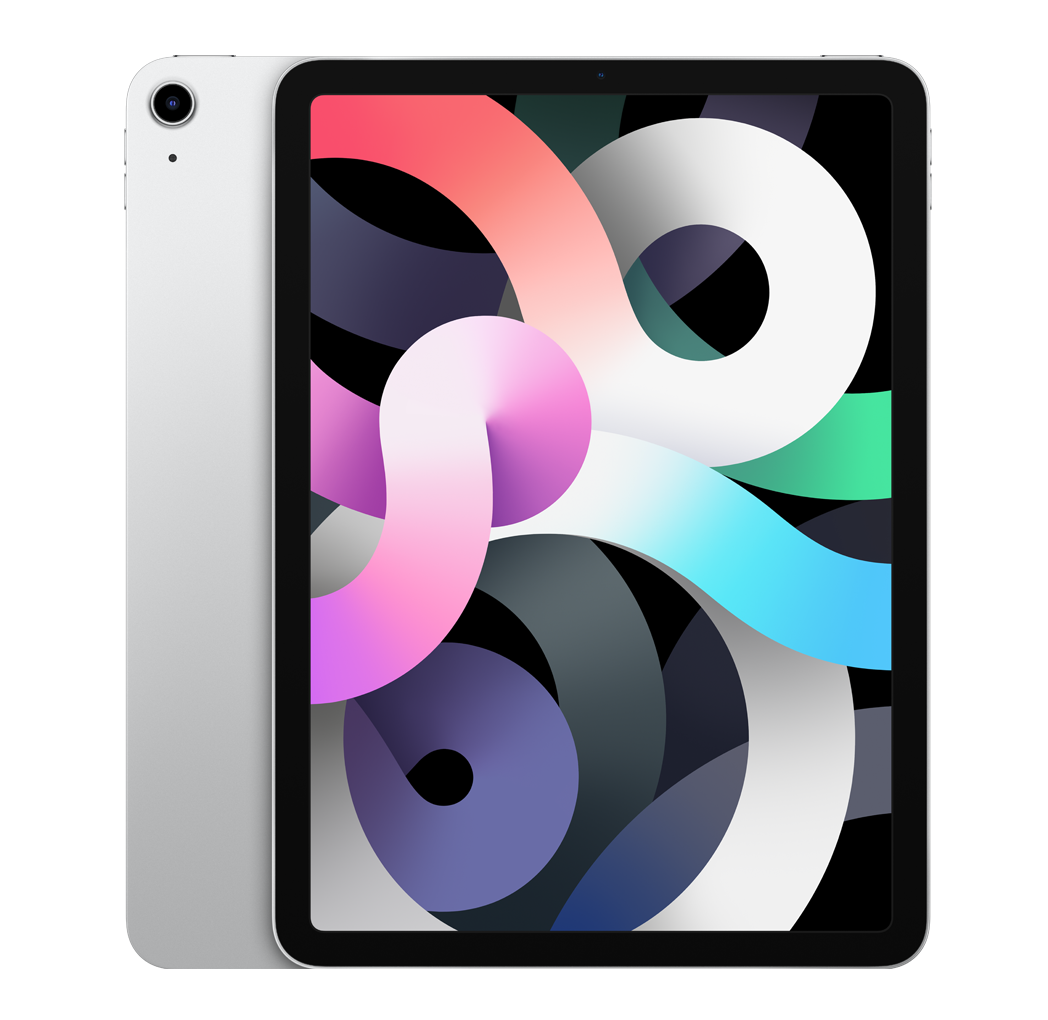
The iPad Air does not have a definitive release date as of right now (Source: Apple)

The iPad Air does not have a definitive release date as of right now (Source: Apple)

  • Apple Watch Series 6 - Presented with a particular emphasis on Health & Lifestyle. The major upgrade that Apple pushed was the Blood O2 Meter. This starts at £370 and is available on 18/09.

  • Apple Watch SE - Budget option with the S5 Processor. This will start at £269 and is available 18/09. They have also dropped the price of the Series 3 to £199.

  • Apple Fitness + - New, pre-recorded work-outs each week, world-class trainers and metrics sent straight from the Watch in real-time. The subscription is £9.99/mo or £79.99/year and is coming in late 2020. You get 3 months for free if you buy an Apple Watch.

  • Apple One - Combines Apple Services in one package and ranges from £14.95/month to £29.95/month.

  • iPad 8 - This comes with the same Design as the last generation but includes an A12 Bionic Chip with a 6-Core CPU & a 4-Core GPU. This starts from £329 and is available from 18/09.

  • iPad Air 4 - We get a new design with some new colours, improvements to TouchID and an A14 Bionic Chip. The starting price has been bumped to £579 and is available in October.

  • No AirTag - Is this being saved until the iPhone announcement?

  • iOS 14, iPadOS 14, WatchOS 7 - All of these are being released…tomorrow!

We’ll have a load of content covering all of this in more detail over the next week, so make sure you are Subscribed to the channel so you don’t miss out.

What are you most exited for?

Apple vs Fortnite - The FULL Story!

You’re probably aware that there’s a massive dispute going on where not only has Epic Games sued Apple, but Apple has now removed Fortnite from the App Store. I want to give you the full story and everything you need to know when it comes to what is probably one of the biggest ever battles between two tech companies. Get those snacks ready and enjoy! 

If you’ve been following me on Twitter (@ZONEofTECH), you probably know that I’m kind of on Apple’s side here. But, to be as unbiased as possible, I’m going to split it into four sections: Apple’s Side, Epic’s Side, My Thoughts and the Present Day. 


Epic’s Side

Starting off with Epic’s side, Epic Games are now one of the biggest Game Development companies in the world, mostly thanks to their very popular game… Fortnite. But they were not always like that.

Whilst they were known for the first three ‘Gears of War’ games, Epic Games was mostly known for the Unreal Engine. This was not a game, but rather a Game Engine that Developers could use in order to develop games easier. I’ve used Game Engines before, mostly Unity. I have played around with Unreal Engine as well but long story short, Unity was originally aimed at Mobile Games whilst Unreal Engine was pretty much the most popular and advanced Engine for AAA Open-World games for PC and Console. Developers have been using Unreal Engine since it came out in 2001. Games such as the Tom Clancy series, the Batman Arkham Series, Borderlands, Fable, the Mass Effect series, Medal of Honor, the recent Mortal Kombat games, Darksiders and dozens more were all made using Epic Games’ Unreal Engine.

Fortnite isn’t the only game that Epic are known for.

Fortnite isn’t the only game that Epic are known for.

But then in 2017, something happened. Epic Games had this game called Fortnite in the works and at that time, it was just a Co-Op RPG Shooter. But after Epic saw how successful PUBG’s Battle Royale mode was, they decided to add the Battle Royale mode in Fortnite as well. They released the game with the ‘Save the World’ beta, which was the original Fortnite game-mode and was only released as a full game three years later, in June 2020. 

Fun Fact, the Battle Royale mode in Fortnite was so simple to make, that it took Epic Games just two months to build it, whereas ‘Save the World’ was in development for many years prior to 2017. As you all probably know, Fortnite ended up being a world-wide success and overtook PUBG quite quickly. The main reason for it being so successful was that you could play it on literally any platform from PlayStation, to Xbox, to PC, Mac and even iOS and Android, Fortnite was basically everywhere. 

Unfortunately, it wasn’t going that well for PUBG, who tried to sue Epic Games for copying their Battle Royal idea. However, it was actually Minecraft that first introduced the Battle Royale genre with a mod, followed by an ARMA 2 mod in DayZ. Fun fact again, there was a Japanese movie called ‘Battle Royale’ from 2000, based on the 1999 novel by Koushun Takami, which was the very first to introduce the Battle Royale concept. This was even before ‘Hunger Games’. 

Anyway, I hope that this gives you a bit more of an insight into Epic Games as a company. They’re really more like a Game Engine company that then became massive thanks to Fortnite. Earlier this month, they launched a silent update to Fortnite on iOS where they purposely introduced a direct payment system. This meant that users could pay Epic Games directly, rather than the money going through Apple first, which would take a 30% cut. I’ll cover why Apple takes that 30% cut when I’m covering Apple’s side but essentially, Epic Games were not ok with Apple taking a 30% cut of their revenue, so they wanted to avoid paying it. Makes sense, right? 30% is quite significant.

Unfortunately, avoiding the 30% cut was against Apple’s App Store policies, so Apple took down Fortnite until they fixed the issue and as soon as Apple did that, Epic Games had a massive lawsuit ready and they sued Apple and even released a full-on anti Apple video. They even held a ‘#FreeFortnite’ tournament where you could get this ‘Evil Apple’ skin.

Epic knew that this would get them banned, so what’s their angle?

Epic knew that this would get them banned, so what’s their angle?

They had all of this ready on the spot, so it was pretty clear that they’ve been preparing for this for a while now and intentionally wanted to get banned in an attempt to get Apple to decrease, or even drop that 30% fee entirely. That makes sense. Fortnite made $1.8 billion in 2019, which makes it the most successful game of 2019 and also one of the most successful Video Games in history. Epic Games doesn’t share how many players they have on iOS, but if we estimate this as 10% of the total player-base, Apple would’ve taken $54 million in commission, and I’m pretty sure iOS, macOS and the iPadOS player-base is quite a bit larger than 10%. This is why Epic Games wants that commission to be decreased or even dropped, they want more profit. But according to them, the users would also benefit by the fact that the prices would be lowered.

When Epic Games introduced the direct payment method in Fortnite, the prices were $2 less, however Epic was still charging $1 more than the revenue that they were making after Apple’s cut. So they were still making more money this way than by going the Apple route. Tim Sweeney, the CEO, Founder and Prime Shareholder of Epic Games, actually sent an email to Tim Cook, Phil Schiller, Craig Federeighi and Matt on June 30th, telling them that Epic is unable to provide consumers with certain features in their iOS Apps. They requested the following:

1. Allow Epic Games to have a direct payment method, without Apple taking that 30% cut.

2. Allow Epic Games to launch their own Epic Games Store App on iOS, to compete with Apple’s own App Store.

Those are some big requests, but I do see where Epic are coming from. They say that there are no other options on iOS for Game Developers other than going through Apple’s system. Epic are calling Apple a monopoly and they want others to be able to compete with Apple’s own App Store, on Apple’s own devices. Epic Games stated that on Android you can side-load Apps, so you can have a separate store that competes with Google’s own PlayStore, which Epic Games does actually have. On iOS, you cannot have another store, other than the App Store.

On August 13th, the day Fortnite launched the new direct payment method, Tim Sweeney emailed Apple again, basically making them aware that they will be launching the update today and if they do get their game blocked, they will follow the legal path in getting this resolved. So, this is pretty much what Epic wants. This is their side of the story. 


Apple’s Side 

What’s Apple’s perspective on this? Well, Apple does indeed take 30% as a commission, but they do take this from every single Developer on the AppStore. Apple’s argument is that they created the iPhone, they created iOS and they also created the App Store, the world’s very first global App Store on a mobile device. For that 30% cut, Apple is giving Developers:

Apple announced the App Sore back in 2008, the first of its kind and now worth over $50 Billion a year (Source: Apple)

Apple announced the App Sore back in 2008, the first of its kind and now worth over $50 Billion a year (Source: Apple)

  • Exposure to literally billions of Apple users.

  • Hosting services on Apple’s store.

  • Tools to build their App, with Xcode. 

  • A programming language (Swift) that Developers can use. 

  • Access to thousands of guides, tutorials and help.

  • WWDC - an entire week full of workshops for Developers so that they can update their Apps and get it ready for when the new version of iOS gets released. 

On top of that, Apple manually verifies every App that goes onto the App Store for not just Malware, but also Performance issues and UI Design. They need to make sure that everything is consistent and high quality. For everything that Apple does, they feel like they deserve that 30% cut. It would not be fair for Apple to have to fund the AppStore through AirPods sales rather than AppStore revenue directly. When it comes to Epic’s second request, releasing a competing App Store, Apple’s argument is that they built the iPhone as well as iOS and in order to maintain that high quality and security that they praise themselves for, they need this to be their system. This is the reason why we only have Apple’s AppStore on iOS.


My Thoughts

So, what are my thoughts on all this? When it comes to that 30% commission, Epic Games’s first issue, I’m sort of in the middle. I don’t agree with Epic, where they basically want this fee removed as Apple’s clearly providing a ton in return for that 30% commission. But at the same time, I don’t agree with Apple either here as 30% is quite a large chunk.

Initially, that 30% cut was only there in order to help Apple run the servers. But in 2008, Apple was only worth $75 Billion. Today, they are worth more than $2 Trillion! Fun Fact, Apple’s entire AppStore in 2019 alone made over $50 Billion in revenue. So in a single year, that 30% commission that Apple takes made them almost as much money as Apple was worth back in 2008, when the App Store was launched. Does Apple need that $50 billion, when they have $2 Trillion? Probably not. 

Apple are by no means the only ones charging 30%, but a change from them may trigger a drop industry-wide.

Apple are by no means the only ones charging 30%, but a change from them may trigger a drop industry-wide.

However, I’m not saying that Apple should drop the commission entirely, as they still deserve to charge some sort of commission from Developers, but I do think that 30% is far too much. I would say that 15% would be fair and anything lower would deeply benefit the Developers and to some extent, the customers as well. Now, the thing is, Apple isn’t the only one taking a commission. Google also takes a commission, the Playstation Store is also taking one, the Xbox Games Store, the Samsung Galaxy Store, the Nintendo eShop, Steam has one as well and even physical stores such as GameStop, Amazon, BestBuy and Walmart, they all take a commission if you want to sell your product through them. Take a guess what percentage all of these companies charge, as commission? That’s right, 30%.

They all charge 30%. Likely because of Apple being the very first, but the idea here is that no matter where you sell your product, you do pay a 30% commission, with only two exceptions. The first one being the Microsoft Store on Windows, which has recently dropped the commission to only 5%, then there’s the Epic Games Store, which is charging 12%. Other than that, everyone’s at 30%.

I do hope that Apple drops this to 15% or so as that way, all the other Stores will likely follow suit and drop the commission as well, in order to stay competitive. Interestingly enough, YouTube actually takes a 45% commission, which I do think is gigantic. But, I am happy to give YouTube that big of a share because without YouTube, I wouldn’t even have that income in the first place. It’s the same thing with the commission that these stores charge. Without any of these stores, you wouldn’t have any audience and if you do, your audience would be a fraction of what it could otherwise be. 

Epic isn’t only going after Apple, this is all part of a much wider mission (Source: The Verge).

Epic isn’t only going after Apple, this is all part of a much wider mission (Source: The Verge).

Something that I do want to mention here, regarding the commission, is that there are a few stores that do make some exceptions. Samsung’s Galaxy App Store does take a 30% commission, but you can actually cut a deal with Samsung if you’re big enough. There are some reports that Epic Games has a 0% commission deal with Samsung, which I think is pretty messed up considering that you need to be big to strike a deal. Speaking of that, apparently Apple struck a deal with Amazon where Apple was not taking the 30% commission on movies bought by users who already had an Amazon Prime Membership. Only new Prime Members would trigger Apple’s 30% commission. I think that’s messed up, no store should make any exceptions whatsoever. 

When it comes to Epic’s second request, their own Epic Games Store on iOS, I personally don’t agree with that at all. It’s Apple’s own platform, why would they allow a competing store on it. Not even to mention the fact that this will affect the quality and security of the Apps available. Playstation doesn’t have an alternative to the PlayStation Store, Xbox doesn’t have an alternative to Microsoft’s Xbox Store either, so why should iOS have one? Epic’s argument here is that you can indeed install a third-party store on Android but you cannot do it on iOS at all.

But even with that argument, side-loading isn’t something that the average user would do. Epic already has a Game-Store on Android and then they decided to go on the PlayStore, but not before suing Google as well, in order to avoid Google’s 30% cut. Obviously that lawsuit didn’t go anywhere and they just gave up and stayed on the PlayStore in the end. Now, one counter argument to this would be: why do we have the Epic Game Store on macOS, but not iOS? MacOS doesn’t have as many limitations as iOS does but at the same time, take a look at the quality of Apps in the Epic Games Store or Stream for Mac, compared to the Apps that we get in the App Store.

The App Store games use metal, they run very smooth, they’re very well optimised, whereas Fortnite on Mac for example, even if you have a very powerful Mac that can play it well on Windows, on macOS on the same exact hardware, it has random freezes and many frame-drops that can make it unplayable. Still, Apple made the entire platform, from the hardware to the software, and if they don’t want to compromise on the quality and security of their App Library, I do support that entirely.


Present

Now that I’ve covered both sides as well as my own thoughts, what is the status of all this, as of right now? Shortly after Fortnite got banned by Apple, guess what? Google banned it too, Fortnite had implemented the direct payment method on the PlayStore as well.

Epic Games basically had a lawsuit ready for Google, just minutes after the ban. Everything was carefully planned. But they haven’t targeted Google as much as they have with Apple. This is mostly because they do have their own third-party store on Android, it’s far more difficult to access, when compared to Google’s own PlayStore.

This dispute and very quickly, and very publicly turned sour and it’s the Players & Developers who are currently being affected the most.

This dispute and very quickly, and very publicly turned sour and it’s the Players & Developers who are currently being affected the most.

Apple then gave Epic Games a deadline, August 27th, to release an update to their game to fix the direct payment issue. Otherwise, Apple would close Epic Games’s Developer Account, essentially taking all of their Games and products off the App Store. Luckily, Epic doesn’t have loads of Games. It’s just Fortnite and Infinity Blade but they do have the Unreal Engine, if you remember that from earlier in the video. What this ban meant, was that Apple was planning to revoke Epic’s Unreal Engine License on Apple products, meaning that no Developer could use Unreal Engine at all. So, all the games that I’ve listed before, would be banned on any Apple device (Mac, iPhone & iPad) and third-party Developers would be banned from updating and developing new Games using the Unreal Engine. This was really messed up and I was very against this from the moment I heard about it. These Developers shouldn’t be affected by Apple and Epic’s dispute at all.

Anyway, Apple and Epic had a court hearing and the judge basically ruled the Unreal Engine ban to be completely unfair so they forbid Apple from doing it, but they did give Apple the green-light to keep Fortnite off their platform if Fortnite doesn’t want to follow Apple’s rules and pay that 30% cut. The lawsuit is still ongoing and it looks like it might take a few years to get it fully sorted. 

In the meantime, Epic Games released a few more anti-Apple videos, just mocking Apple and trying to rally their Fortnite community against them. I think that’s messed up and completely unprofessional, so I’m not ok with mockery of any sorts. Apple’s keeping Fortnite blocked until Epic updates the Game. It’s good that Apple are still leaving that door open for Epic to return, when they want. The game is still playable if you have it installed, but you would not be able to download it again if you do not have it installed. If you open up the game, you’ll notice that all the in-app purchases are gone, the Battle-Pass is gone and the game is stuck to the pre-Season 4 update. Also, Apple has now started promoting PUBG on the front page of the App Store, probably in response to Epic mocking Apple so much.

In the end, it really does suck that the player-base is really the one affected the most here. Epic Games could stop this at any time they want really. But, I don’t think they will. I think they’re going to keep this going just to paint Apple in a bad way and if Apple drops the commission, that would be great as other stores will drop it as well. If they don’t, then Epic Games made a massive mistake as they will likely be losing hundreds of millions of dollars over the years.

iPhone 12 Pro, Apple Watch Series 6, iPad Air 4 – Latest Leaks & Rumors!

We haven’t made a Leaks & Rumors episode since July. This is mostly because I like to wait until we get a few more things to talk about and we haven’t really had a good amount of new leaks, until now.

We finally have some major updates on the iPhone 12 Pro, the Apple Watch Series 6, which is apparently launching next week, as well as the iPad Air 4 and the upcoming Apple Event. So, without any further ado, get those snacks ready, sit back, relax, and enjoy!


iPhone 12 Pro 

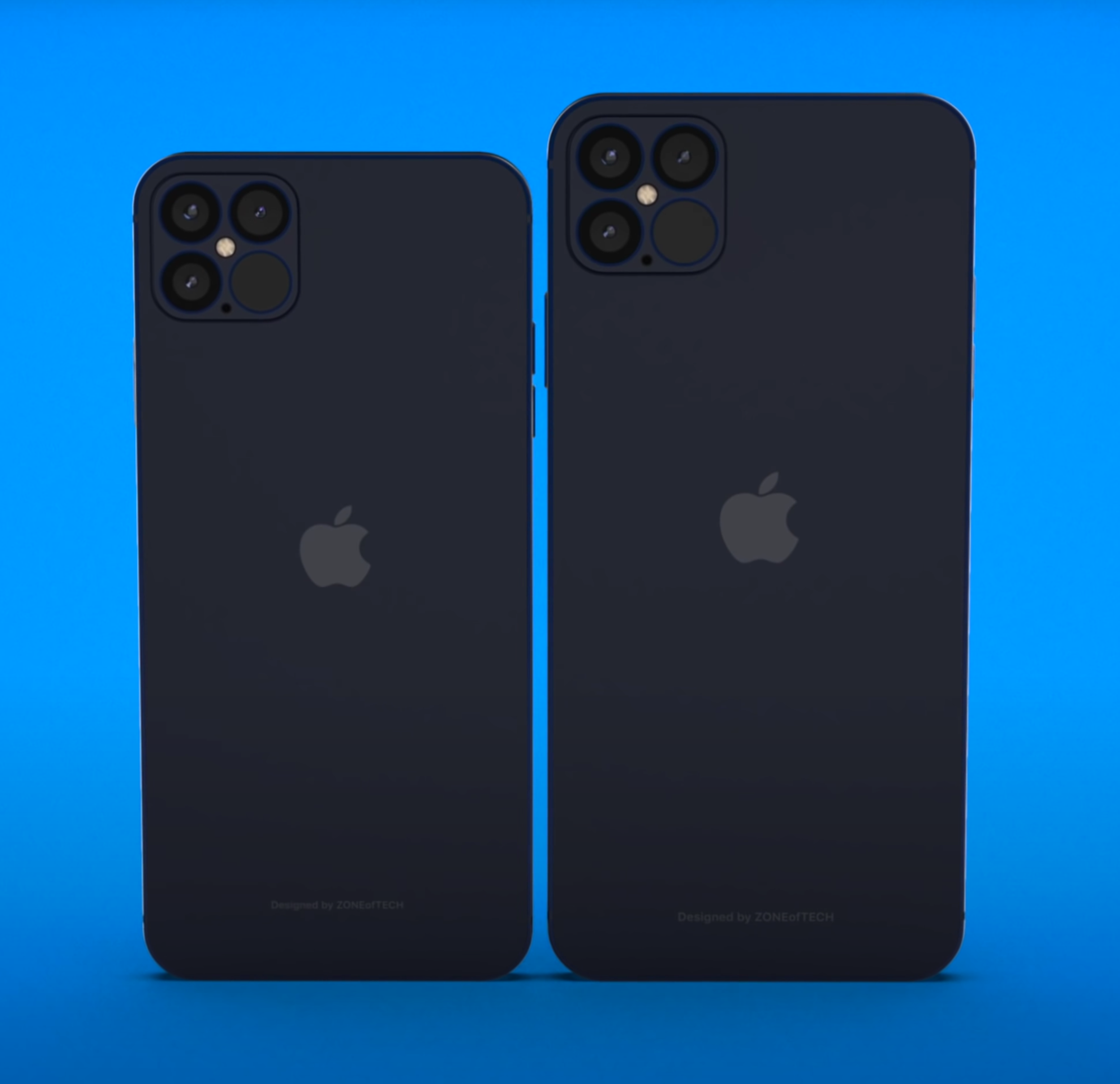
In terms of the iPhone 12, you might remember the large number of leaks that we got suggesting the Frame was going to be squared-off, the Notch was going to be smaller and that the Triple Camera Module would now be a Quad-Camera Module with one of the Modules being that LiDAR Sensor. Even though these were “meh” changes, I would’ve loved to see the Notch be made even smaller or even removed entirely. Jon Prosser posted a CAD drawing of the iPhone 12’s Notch back in May, which appeared to show the Speaker Grill moving into the Bezel, making the Notch a bit smaller this way. 

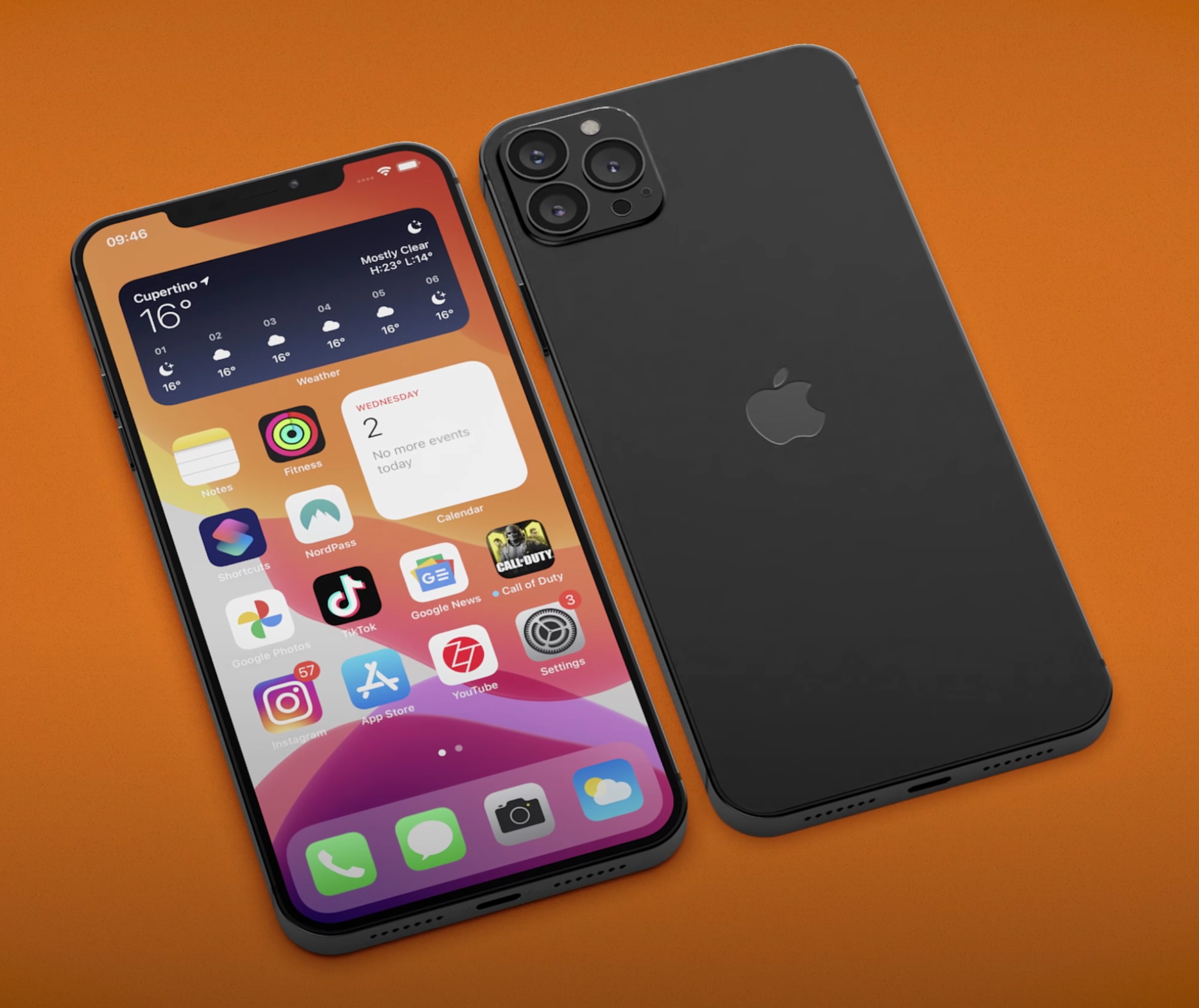
This our idea of what the iPhone 12 will look like, check out "@ZONEofCONCEPTS’ for more.

This our idea of what the iPhone 12 will look like, check out "@ZONEofCONCEPTS’ for more.

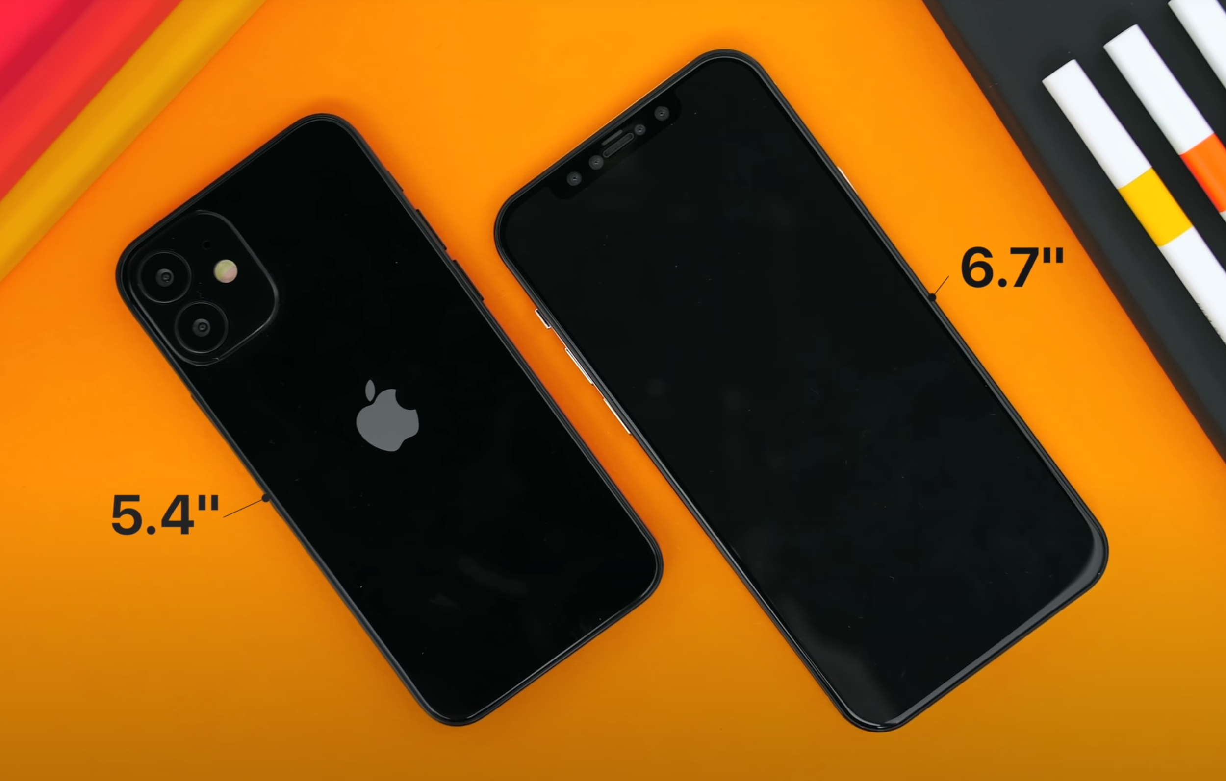
Another leaker (@Choco_bit) posted an image of the iPhone 12 Pro, showing the smaller Notch, the Quad-Camera Module on the back (again with a LiDAR Sensor) and we also saw the iOS 14 Widgets. We did get the Widgets, but the other two changes would not be happening anymore. Jon Prosser posted, on August 26th, saying that the Notch is staying the same and the Bezels are getting noticeably thinner, so at least there’s that. The Notch will appear smaller on the 6.7” iPhone 12 Pro Max as the Display itself will be bigger. Jon also mentioned that FaceID will work from wider angles, even flat on the table, so that is indeed a nice improvement. 

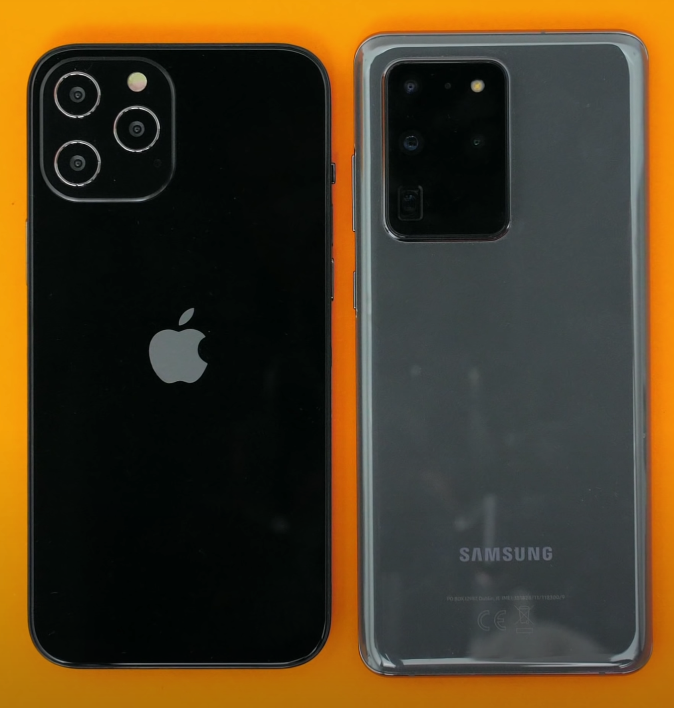
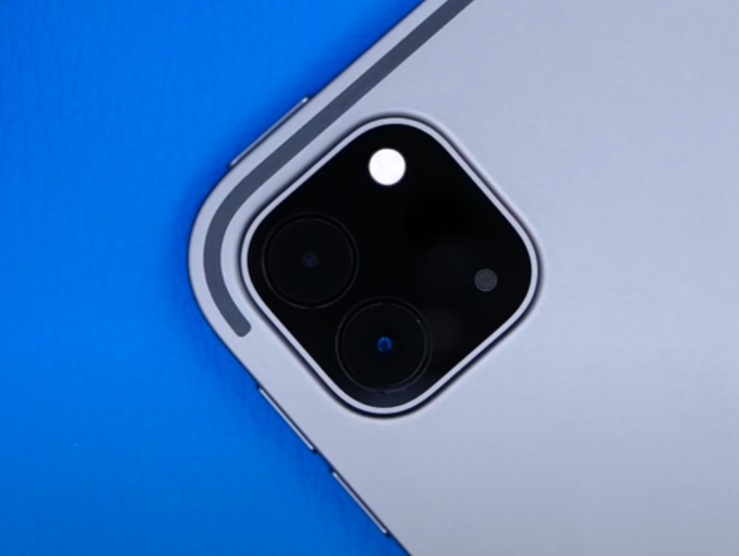
The sides are flat, like we’ve seen in all the leaks. We’re going to get that iPhone 4 & iPhone 5 style Body, while the Glass will indeed have a slight curve, which will make it easier to use when it comes to Gestures. Jon is also saying that the entire Camera Module would now be 10% larger. I’m assuming that he’s referring to the big square housing for the Modules. In terms of that Back Camera Array, we’ve had a bunch of recent leaks. These are Case leaks that mostly show a Triple Camera Module Array, instead of the Quad that we’ve seen leaked before as the LiDAR Module would now be positioned in a very similar manner to how the Flash is. I think that’s a worse approach. Also, the LiDAR Module on the iPad Pro 2020 is quite a bit larger than the one on these iPhone 12 leaks. Maybe Apple can pull this off and compact it a bit more to make it smaller but in my opinion, I still think it would look nicer with a Quad-Camera Module Array.

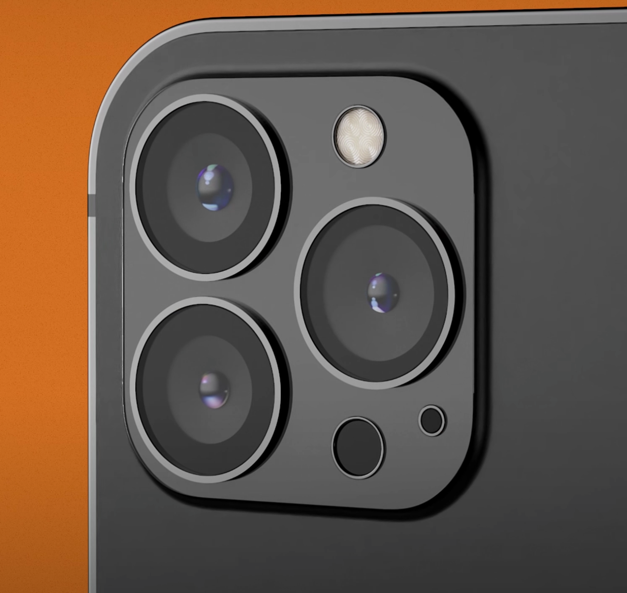
It looks like the Triple-Camera Array is staying for the iPhone 12.

It looks like the Triple-Camera Array is staying for the iPhone 12.

So, no smaller Notch or Quad-Camera Module Array, any other updates? Well, we still don’t know for sure what is happening with the high Refresh Rate Display. We’ve had countless leaks saying that it will happen and countless leaks saying that it won’t. But luckily, it seems like there is some hope. Jon Prosser posted a bunch of photos and even a full hands-on video of an iPhone 12 Pro PVT unit. These are the Production Validation Test units and they’re basically tested by Apple employees in order to ensure that they’re working correctly. They need to undergo a bunch of tests and if they pass all tests correctly, these are the units that will be mass produced. In most cases, these are exactly what the retail units would look like.

Interestingly enough, there is actually a toggle in the Settings to enable High Refresh Rate on these, but there is also a note telling employees to check if their PVT unit supports high Refresh Rate. It seems that Apple has manufactured some units with 120Hz, and others without. Display Analyst Ross Young reports that, based on his sources, it is way more likely for Apple to release the iPhone 12 Pro with just a 60Hz Panel. It looks like Apple has managed to get the 120Hz Panels in the end, but not the 120Hz Driver.

So, we’ll have to wait and see what happens but in my opinion, a high Refresh Rate on the iPhone 12 Pro is a must. We’ve had high Refresh Rate Smartphones since 2017. The first Phone to come with it was the Razer Phone, which featured a 120Hz Panel. Since then, more and more Smartphones have started including this to the point where even mid-range Smartphones in 2020, such as the OnePlus Nord, come with a 90Hz Panel.

Apple is late to the party with higher Refresh Rate Displays.

Apple is late to the party with higher Refresh Rate Displays.

I know that Apple wants to wait until they get it working properly. They want to use an LTPO Panel so that they can adjust the Refresh Rate from 120Hz, all the way down to 1Hz, just like the iPad Pro’s ProMotion Display does. That is an LCD Display, rather than an OLED. The only Smartphones out right now with an LTPO Display, are Samsung’s Note 20 Ultra and Z Fold 2. That’s it. Samsung has already made it clear to Apple that they would not be able to provide them with an LTPO Panel in 2020. It seems like that has changed, or at least Apple has found a different solution for that. Judging from the PVT units, it seems like they can only switch between the 60Hz and a 120Hz Refresh Rate, which could point towards this not being an LTPO Panel, but rather a standard 120Hz Panel like we’ve seen on most 2019 and 2020 Smartphones. On those Phones, you can indeed switch between 60Hz and 120Hz, but nothing more than that. Anyway, if this iPhone doesn’t have 120Hz, then it would be a major disappointment in my eyes. 

Camera-wise, we haven’t really had any massive leaks aside from a new Sensor that Apple will be using to enable better Low-Light Performance, as well as Night Mode with the Ultra-Wide Angle Module. Aside from that, Jon Prosser showed us that the Camera will indeed support 4K120 as well as 4K240, both of which are likely to be used in slow-motion, or at least the 4K240 mode will as that’s listed as Slow-Mo. That’s pretty nuts for a Phone. There’s no other Phone, other than the iPhone 11 Pro, that can shoot 4K60 and all Lenses. Now, the iPhone 12 Pro will bump that up to 4K120 and even 4K240. It’s pretty nuts what Apple’s Processor is capable of. But that’s mostly it.

There will be no Charger in the box, that’s already confirmed. ‘LoveToDream’ reported that the Lightning Cable will now be braided, so at least there’s that.

In terms of the Release Date, Jon Prosser has posted the timeline for Apple’s upcoming releases. Do keep in mind that Jon has been 100% accurate in the past, in terms of actual Release Dates. According to Jon, Apple will launch the new Apple Watch next week, followed by a new iPad. Then the iPhone 12 event will be in mid-October, followed by the iPhone 12 release on October 19th, followed by the iPhone 12 Pro release sometime in November. 


Apple Watch Series 6

What about the Apple Watch Series 6? If you’re enjoying this, we have some really awesome content coming in the next few days so it would be great if you could Subscribe so you don’t miss out, it’s free to do so. 

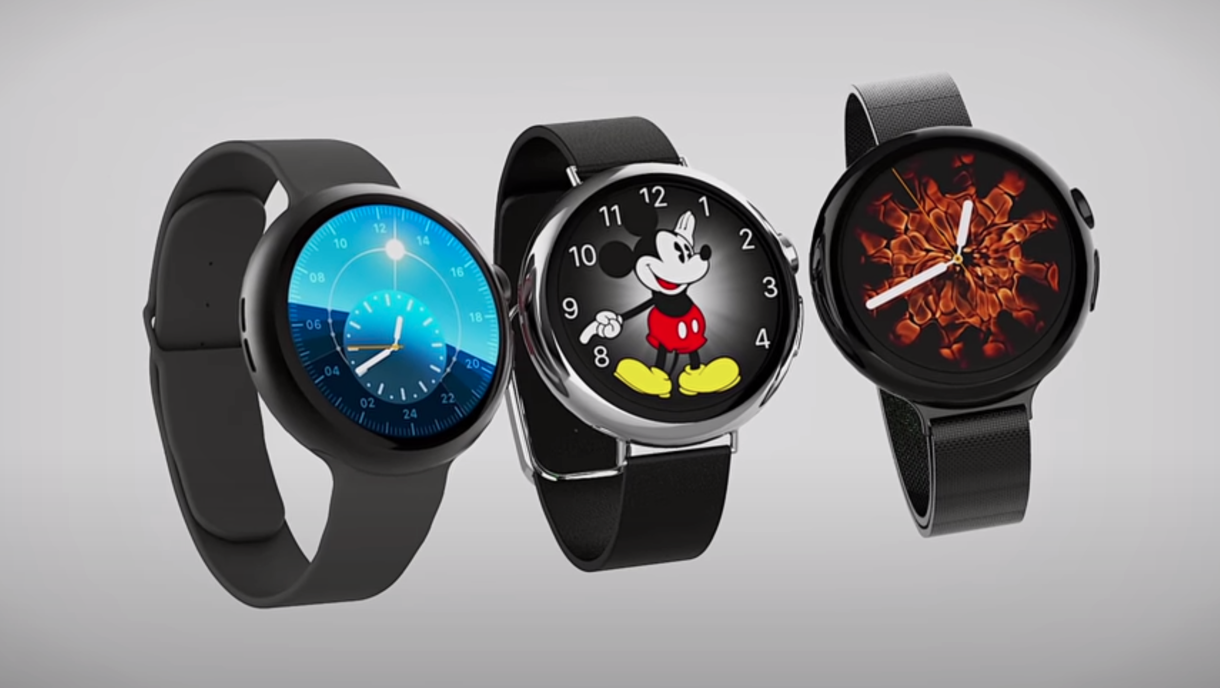
Well, my top request would be for Apple to redesign the entire Watch and make it into a Circular Design, or at least offer a Circular Design as well. That’s my personal request and I would love to see that happen. Unfortunately, it will not happen this year. The Series 6 would look identical to the Series 5. There will only be one major improvement, the addition of a Blood Oxygen Level Meter. This will show you the saturation of Oxygen in your blood. If it’s between 95% and 100%, then that’s all good. Anything lower and you might want to go and see a Doctor. Also, COVID does affect the Oxygen level in your blood so the Series 6 might even be able to give you a notification in case you have signs that could point to you having COVID. So, that’s the main feature.

The Circular Design may come one day, but not this time.

The Circular Design may come one day, but not this time.

The Battery is getting larger, but only from 296mAh, to 303.8mAh. The Performance is going to be improved thanks to the Apple Watch S6 Processor. I am hoping that the Battery Life will be improved quite substantially because the Series 5 was actually a downgrade over the Series 4. The Series 4 could easily last me two days, whereas the Series 5 has even died on me mid-day when I was cycling for like four hours with GPS enabled and Cellular enabled. Workouts kill off the Battery like crazy. Now that Sleep Tracking has been added in watchOS 7, Battery Life is more important than ever.

We’ve also seen reports that Apple is working on an Apple Watch SE, essentially updating the Apple Watch Series 3 with a more recent Processor and selling that for around $200. Mark Gurman from Bloomberg has reported on this as well. Overall, it seems like they’re just making as few small changes as they can until they can really re-design this thing. The Series 4 was really the big change, back in 2018. The Series 5 only added a Display Controller, which in combination with the LTPO Panel, which the Series 4 also had, allowed it to have an Always-On Display. The Series 4 could’ve easily had it as well, it only needed that tiny Display Controller.

It seems like the Series 6 will be another minor upgrade, with the biggest change just being the Oxygen Level Meter, which could’ve been easily added to the Series 5 and even the Series 4.


New iPad 

Finally, it seems like there is also a brand new iPad that Apple will be launching as early as next week, according to Jon Prosser. But which iPad is this? Is it a new iPad Pro, or a new iPad Air or a new entry-level iPad? Well, it’s definitely not a new iPad Pro as we just got one earlier this year.

It will either be a new iPad Air (the iPad Air 4) or a new entry level iPad, (the iPad 8th Generation), ‘mydrivers.com', which has a mixed track record, reports that this will come with an 11” Display, an A14 Processor and 128GB of Baseline Storage. Essentially, identical to the 2018 iPad Pro in terms of Design, just with a more powerful Processor. ‘91mobiles’ posted a few schematics of this new iPad, showing some slightly thicker Bezels than on the iPad Pro and a slightly smaller 10.8” Display. 

We don’t know exactly which iPad this will be, just that it won’t be new ‘Pro’ model.

We don’t know exactly which iPad this will be, just that it won’t be new ‘Pro’ model.

FaceID will be included, as opposed to just TouchID on the Power Button, which a leaked manual was apparently showing. A Smart Connector does appear to be present on these schematics, which would allow support for Apple’s Magic Keyboard.

Mark Gurman and Debby Wu of Bloomberg have both written a fairly comprehensive report outlining Apple’s plans for this quarter and according to them, this iPad would indeed be a brand new iPad Air with pretty much the same Design style as the iPad Pro. It would make sense for the Display to indeed be an 11” Panel, rather than something smaller with slightly thicker Bezels just to make the iPad Pro look a bit better.

I have to say, I am a bit unsure in terms of the Processor. Some reports are saying that it will come with an Apple A14X Chip, while some are saying that this will be an A14 Chip. The A14 would make sense but only if Apple also updates the 2020 iPad Pro with the A14X. Otherwise, it would just be weird having an A14 in this new iPad Air and a slower A12Z, at least slower on the CPU side, on the iPad Pro. That just wouldn’t make that much sense. That’s my personal prediction, a CPU update for the 2020 iPad Pro with the A14X.


AirPods Studio

The New AirPods Studio could be right around the corner.

The New AirPods Studio could be right around the corner.

Now, here’s a bonus item. A brand new pair of AirPods. Mark Gurman and Debby Wu also report that Apple is preparing a new pair of AirPods, those AirPods Studio that we’ve been hearing about for a few months now. The leaker ‘Komiya’ reports that the AIrPods Studio will come in White and Space Grey. The Audio Quality and Active Noise Cancelling would be “very high”, according to Komiya.

Apparently, they will also come with Apple’s new H1X Chip, some new Equaliser Settings and Ear Detection, so just like the regular AirPods. They may have some sort of Hand Gesture, like the HomePod does.

The Price will be $350, likely £350 in the UK, and they will ship in September/October and announced via a press release on Apple’s website. From the looks of it, it seems like these could be announced next week when Apple also launches the Apple Watch Series 6 and the new iPad Air 4. Jon Prosser even posted the time of the release, which according to him would be on Tuesday, September 8th between 9-12 EST when Apple will be holding *something* on their website.

The Future of the MacBook Pro (2020 & Beyond)

The MacBooks are changing. Apple is on the verge of completely revolutionising the computing industry, not just in terms of the Macs, but also in terms of CPU Design.

We made a video back in June in which I talked about the switch to ARM in detail, so definitely give that video a watch if you want to learn more about the CPU itself. But here, I’ll be focusing on the future of the MacBook & MacBook Pro. We’ve had a ton of recent leaks that give us a glimpse at what Apple is aiming for with these devices, so without any further ado, here is The Future of the MacBook Pro (2020 and Beyond).


As most of you probably know already, Apple is ditching Intel in favour of their own Processors. Apple are already using their own Chips in the iPhones and the iPads so it makes a ton of sense to also use their Processors in the Macs, as that way they will have an entirely unified system.

So, what benefits will we get from this transition and how will these affect future Macs?


Performance

The most recent iPad Pro has shown us what Apple’s Chips are capable of.

The most recent iPad Pro has shown us what Apple’s Chips are capable of.

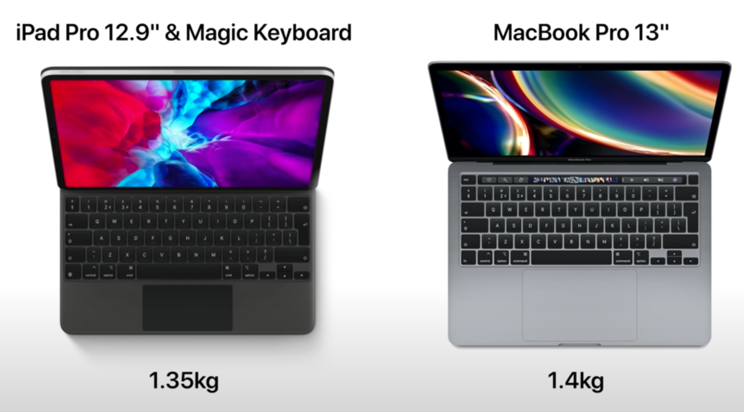
The biggest improvement that we’ll see is when it comes to the Performance. Apple’s A12X Processor, the one that’s inside the 2018 iPad Pro, is already more powerful than the 2020 MacBook Air and the baseline MacBook Pro. In fact, we even did a full video comparing the 2018 iPad Pro with the 2020 (high-end) 13” MacBook Pro in real-world tests such as Video Editing. The MacBook Pro exported a five minute, 4K60 timeline in 7 minutes and 27 seconds, while the iPad Pro only took 2 minutes and 52 seconds. Now, keep in mind that this was on a Tablet that was using a two year old Processor and didn’t even have a Fan. It was passively cooled and yet it was significantly thinner than the MacBook Pro, which had a Fan and was using Intel’s latest 10th Generation Processor. 

By Apple using a modern and more powerful A-series Chip, specifically designed for the Mac, they could significantly improve their Performance over even the iPad Pro. 


GPU and Memory

The use of SoC’s in Apple’s smaller devices greatly reduces latency between the separate components.

The use of SoC’s in Apple’s smaller devices greatly reduces latency between the separate components.

The second change would be when it comes to the GPU and of course, the Memory. 

On regular computers, such as a Desktop PC or a Laptop, the CPU, GPU and RAM (or the Memory) are all separate Components which are slotted into the Motherboard. The GPU, for example, uses a PCIe Interface to communicate with the CPU. The only problem here is that there is quite a bit of Latency when it comes to the CPU accessing the data from the GPU, which is determined by the speed of the PCIe Slot. Smartphone Processors, since there’s not that much room inside, actually combine all of these Components onto one single Chip, which is called a ‘System On a Chip’ (SoC). 

This is what Apple is using in their iPhones and iPads. Since the CPU now has direct access to the Memory and the GPU, the Latency is greatly reduced and therefore the overall Performance is greatly increased. I’ve had a look through Apple’s developer presentations for their upcoming transition to Apple Silicon and there was no mention of the GPU. In fact, Apple was even talking about how much they can improve the Performance by building an SoC inside their Macs. What this means is that we would not be getting any separate GPU options inside future MacBooks. This makes me wonder…what about the different SKU’s?


SKU’s 

Well, if we take a look at the Macs, there are many different CPU models that you can choose from. The MacBook Air has three CPU options: an i3,  i5 and an i7. But, the MacBook Pro has four options with the first two being Intel’s 8th Generation Chips, while the last two are Intel’s 10th Generation Chips. So, how many SKU’s will Apple have, when it comes to the next-gen Macs? If we take a look at the iPhone, Apple only releases one CPU model every year and all iPhones have that exact CPU model.

On the iPad side, we do have the X variant, which does pack more GPU power than the non-X variant that we get inside the iPhones. The last X variant that we got was back in 2018, so these do take a while to make and we only get those on the iPad Pro’s as the regular iPads still use the exact same Chips as the iPhones do. I think it’s pretty safe to assume that for the MacBooks at least, Apple will either have one SKU or two, at most.

The use of SoC’s will limit the amount of SKU’s and likely follow a pattern similar to the current iPad Pro’s.

The use of SoC’s will limit the amount of SKU’s and likely follow a pattern similar to the current iPad Pro’s.

My prediction is that the MacBook Air would be using the exact same Chip that the iPhones use, the Apple A14, and whatever comes next. While the MacBook Pros will be using a more powerful version of that to give them the “Pro’ name. Not only that, but I predict that the 13” and the 16” MacBook Pro would be identical in terms of the performance and the only advantage that the 16” model will have, would be when it comes to its Display Size, just like we have on the iPad Pro’s right now. We have two models, the 11” and 12.9”, both with the same Performance and the only difference being the Display size.

So, what about the RAM? Well, since the CPU would now be an SoC, it would be very difficult for Apple to give us multiple RAM options when we configure our MacBooks, like we get now. I believe that the MacBook Air would come with, like I said, an A14 Processor but more RAM than the iPhones do. Possibly 16GB of RAM, while the MacBook Pro’s would come with more than that. Maybe the 16” would come with 64GB of RAM by default and the 13’ would come with 32GB, that would be the one and only RAM option. As we know from the iPhone and the iPads, Apple’s Processors are extremely efficient in terms of Memory, and so is iOS, so you won’t need as much RAM as we have on the Intel Macs now. 


Design Changes

The next big change that this transition would bring, is when it comes to the Design. As Apple’s Processors are an entire SoC, you’re saving up a ton of space inside as there’s no need for a separate GPU and Memory. Not only that, but Apple’s Processors are also Fan-less. While Apple might add a Fan to some of their Macs to increase the Performance even further, by overclocking the Processors, the idea here is that they don’t necessarily require a Fan. Instead, they can use that extra internal space for a bigger Battery or a slimmer Chassis.

We sat down and brainstormed how Apple could design such a MacBook from scratch. This is our vision as to how we think Apple could realistically design a future MacBook now that they’ve made the transition to their own Processors.

We’ve modelled our own Concept of what we think these new MacBook Pro’s will look like.

We’ve modelled our own Concept of what we think these new MacBook Pro’s will look like.

We’ve designed the Display so that it matches the aesthetic of the iPad Pro. This means a uniform Bezel that also features curved corners which actually match the Design style of the upcoming macOS Big Sur. We’ve also made the Bezels a bit thinner than on the iPad Pro as we do think that those are indeed a bit too thick. This new MacBook Pro Design is finally in line with the modern 2020 Laptop Designs. The Aspect Ratio is still 16:10 and we’ve also added FaceID into the top Bezel as this has been recently leaked to be coming in all next-gen Macs moving forward. FaceID on a Mac makes so much more sense than having a TouchID Sensor. 

Now onto the Body. You can probably tell that this looks incredibly thin and that’s because we’ve actually used the same Body size as the iPad Pro. That means a thickness of only 5.9mm and a chassis that’s symmetrical and flat, so no more wedge shape MacBook Air style Design. We’ve added a USB Type C Port on each side and in case you’re wondering, these are indeed Thunderbolt 3 Ports, which are supported by the new USB 4 standard. So, Apple would not be losing Thunderbolt 3 by switching to their own Chips. We’ve also added two Speaker Grills on each side, with the same Design style as on the iPad Pro. 

The Trackpad is shorter now, as the Body is shorter as well, thanks to the Bezels being so thin now. This is how we designed it, but of course Apple could easily make the Display taller, maybe change the Aspect Ratio to a taller 3:2 Panel, just like on the Microsoft Surface Laptops, and have more room for the Trackpad in that case.

Colour-wise, we’ve kept Apple’s classic Space Grey and Silver colours but we’ve also added a brand new Matte Black colour, which I think looks amazing. I really hope that Apple gives us a darker colour option for this new generation as that’s definitely something that I would personally be going for.

For more Concepts and behind the scenes, be sure to check out our secondary ‘ZONEofCONCEPTS’ accounts on Instagram & Twitter.

For more Concepts and behind the scenes, be sure to check out our secondary ‘ZONEofCONCEPTS’ accounts on Instagram & Twitter.

When it comes to the Keyboard, obviously we have a Scissor Mechanism here but we have made the keys a bit thinner than on the current MacBooks, just to make it look better. Apple can easily keep the same thickness or just have the Keys deeper so that they travel more while also keeping this fairly thin Design, from the outside. The Touchbar is pretty much the same as before, so no changes here. The separate Escape Key is there, as well as an individual Backlight for each of the Keys. Apple, if you like what we’ve done, just get in touch.

Do let me know what do you guys think of our Design and if you want to see more of our concepts, it would be amazing if you could subscribe and also give us a follow on our ‘ZONEofCONCEPTS’ Instagram & Twitter pages. 

But, which MacBook is this? Is it the 12”, the Air or the Pro? Well, here’s what I’m thinking. Since Apple will have their own SoC now, and they’ll likely only have one or two SKU’s at most for these, they could unify the entire lineup, Design-wise. What I mean by this is that they could easily just call this the new MacBook, then have this in a 12” 14” and 16’ size, with the 14” and the 16” sizes being the MacBook Pro variant. These would also come with that more powerful A Series Processor that I mentioned, while the 12” would come with the same Chip that we have in the iPhones.

Personally, if I were Tim Cook, this is what I would do. I would create this beautiful singular Design, that would be instantly recognisable as a MacBook Design, and as use that for the entire lineup. Let me know in the comments what your thoughts are on this are. 


Battery Life

Another big improvement that the new MacBooks would feature thanks to the switch to Apple Silicon, is the Battery Life.

Battery Life is likely to get a huge bump in upcoming releases.

Battery Life is likely to get a huge bump in upcoming releases.

Most MacBooks from 2010 have claimed to offer a 10 hour Battery Life, which is exactly what the iPads have claimed since the original iPad came out in 2010 too. Personally, my iPad lasts me for about seven hours, while my MacBook Pro lasts me for around five hours. 

Apple leaker ‘KomiyaLeaks’ tweeted a few details about an upcoming 12” MacBook. I’ll get into these in just a bit, but probably the most surprising thing here is the Battery Life, which is now expected to be up to 20 hours. So, in real world usage, if we go by the iPad’s Battery Life, this should now translate into around 15 or so hours of actual usage, which is a pretty gigantic jump from the current five or so hours that I was personally getting. We’ve also had a leak on a supposed MacBook Air Battery, likely the new MacBook Air. This Battery is very similar to the one that we have on the current model, just with a brand new model number on it. 


Unified OS

Could a unified OS bring Touch Screen Support to future Macs?

Could a unified OS bring Touch Screen Support to future Macs?

The next big advantage of this transition, is a unified OS. Apple has already announced that iOS apps will now be able to be run natively, on the Mac. Meaning that you can run all of your favourite Apps, including ones that have zero optimisation, such as Instagram for example, directly on the Mac with no tweaking needed.

Apple has even demoed Final Cut Pro X and even Maya, running on a Mac Mini with an Apple A12Z Processor, the same Chip as in the 2020 iPad Pro, which is almost identical to the 2018 iPad Pro’s A12X Processor. This also means that iOS devices, such as the iPhone and the iPad, could easily run Mac software. Final Cut Pro X on the iPad is likely to be a possibility. In fact, Jon Prosser even stated a few months ago that XCode is actually coming to the iPad. This also makes me think that Apple could potentially add Touch-Screen support to the Mac, which would make a ton of sense as the iPad did get Mouse & Keyboard support. Also, macOS Big Sur does bring the Control Centre amongst other features, which are all Touch friendly. 


More Frequent Updates

I also expect to see more frequent updates to the Mac as Apple would not have to wait for Intel to release new Chips anymore. Instead, they can move the Macs to a yearly update cycle, just like they already do with the iPhones. 


Lower Prices 

Since Apple will be designing their own Chips, the prices of future Macs could in fact go down. ‘KomiyaLeaks’ reported that the new 12” MacBook would cost $800, making this the most affordable new MacBook that Apple has ever released. But at the same time, all the savings could go into Apple making these devices even better, so it’s not 100% guaranteed that the prices will indeed go down. 

In terms of what to expect in the near future, we’ve seen quite a few reports that we would see either a 12” MacBook or a new MacBook Air by the end of the year. Some reports even mention Apple releasing a 13” MacBook Pro with the same exact Design that we have now, just with an Apple Processor. Komiya reports that the Butterfly Keyboard will be coming back, which I personally don’t buy. He also reported that there is no Apple Event planned for October, which is where Apple would unveil these new Macs, so they could indeed be delayed until next year. What we do know for sure is that Apple is indeed planning some major redesigns with pretty much all of these upcoming Macs, including the iMac. 

iPhone SE vs Pixel 4a vs OnePlus Nord vs Samsung Galaxy A71!

So, I’ve got four Phones right here: the iPhone SE 2020, the Google Pixel 4a, the OnePlus Nord as well as the Samsung Galaxy A71. All of these Phones cost between $300-$400, so I really want to see which one is worth it the most?

In this video, I’ll be comparing everything from the Design, Display, Camera, Performance, Special Features, Battery & Price to let you decide which one out of all these four Phones is the best one for you! We have seven sections and I want you to pick a Phone for each of those sections and then at the end you’ll see which Phone is the best for you, as that’s the one that you’ve picked the most. 

Get those snacks ready and enjoy! 


Design

Starting off with the Design, these four Phones couldn’t be any more different.

On the front, the iPhone SE has the most outdated Design as it uses the exact same front as the iPhone 6 from 2014. The Pixel and the Samsung are very similar, as in they both have extremely thin Bezels and just a Single Camera Cutout, the Samsung in the middle and the Pixel on the left. The OnePlus is similar as well, the only difference is that it has a Dual Camera Cutout on the front, rather than a Single.

The new, reduced price of the A71 makes it a far superior alternative to the lower-end A51.

The new, reduced price of the A71 makes it a far superior alternative to the lower-end A51.

Design is indeed a personal preference, but from the front at least, I do prefer the Galaxy A71 the most. Just as a side note, in case some of you are wondering why we chose the A71 rather than the A51, the A71 has now dropped in price and it does have better specs than the A51. Taking a look at the back and the Build Quality, there are some major differences between these Phones. 

The Galaxy A71 definitely feels the cheapest. It has a full Plastic back and Frame surrounding it. Then it’s the Pixel 4a, which still has a Plastic back, but since it’s Matte and the Frame itself blends in with the back, it does indeed feel far more premium than the A71 does. Then we have the OnePlus Nord, which uses a Glass back and a Plastic Frame. This one already feels so much better than the other two. Finally, we have the iPhone SE, which has a full Glass back and a Metal Frame. The iPhone definitely feels the most premium, but we do have that six year old Design on the front, whereas these other three Phones all use a modern 2019/2020 Design. 

So, out of all these four, I actually do like the OnePlus Nord the most, Design-wise. We have a very modern looking front, while not necessarily sacrificing too much on the Build Quality. That’s my pick but let me know which one you’d pick, Design-wise.


Display

Moving on to the Display and I have to say, all of these Phones have a very good Display Panel. There’s not a single one that I wouldn’t recommend, but there are indeed some differences between all of these Phones.

The biggest difference is when it comes to the Size. If you’re looking for a small and compact Phone, then the iPhone and the Pixel are the best options. They’re about the same size, the Pixel 4a is only a tiny bit bigger but the Display size difference is quite noticeable. The iPhone has the smallest Display, at 4.7”, while the Pixel 4a has the second smallest, at 5.8”. The good news is that you can easily use both of these Phones with one hand, whereas the other two are just so much bigger. The OnePlus Nord comes with a 6.44” Display, while the Galaxy A71 comes with the biggest Display out of these, a 6.7” Panel.

With the A71, bigger is not necessarily better.

With the A71, bigger is not necessarily better.

Now, the second big difference between these Displays is the Display Panel technology that they each use. All of  these Phones except the iPhone, have an OLED Display. The iPhone has an LCD Panel. This means that you have perfect Black Levels and essentially an infinite Contrast on all of these, compared to the iPhone.

The third difference is when it comes to the Resolution and the Pixel Density. So here, the Pixel 4a actually has the highest at 443 PPI. Then, it’s the OnePlus at 408 PPI, then the Samsung at 393 PPI and then the iPhone at 326 PPI. What this means is that when you’re looking at the Displays up close, the Pixel 4a has the sharpest image, while the iPhone has the least sharpest image. If you watch a lot of YouTube videos, all these Phones, with the exception of the iPhone, can play 1440p as well as 1080p YouTube content. The iPhone can still play 1080p, but the Display is lower than 1080p so you’re not actually watching 1080p content here, but rather 720p at a higher Bit-Rate. 

The fourth difference is when it comes to colour and how good these Displays are for editing photos and videos. I personally prefer the Pixel and the iPhone as I feel like they do have the most natural colours, but the OnePlus and the Samsung are both very good as well. 

You get decent Displays with any of these models, but the OnePlus is my pick here.

You get decent Displays with any model, but I would say the OnePlus is my choice.

In terms of Brightness, the iPhone came out on top with a max of 720 Nits, then we had the Pixel narrowly behind at 710, with the OnePlus & Samsung much lower down at 560 & 550 respectively.

Then we have the Refresh Rate. All of these Phones, with the exception of the OnePlus Nord, have a 60Hz Refresh Rate. The OnePlus Nord has a 90Hz Refresh Rate, meaning that anything that you do on the OnePlus would feel significantly faster and more responsive than on the other Phones. Animations are 50% more fluid and using it in general feels so much nicer, compared to the other three Phones.

Now, those were the big changes, but there are a few more smaller differences as well. For example, the iPhone SE has a True-Tone Display, which can automatically adjust its Colour Temperature to match the lighting conditions around you, making it much easier on the eyes when you’re reading. The Samsung and the Pixel both feature an Always-On Display and the Pixel allows you to tap the Display once to turn it on, wheres on the OnePlus and Samsung you have to double-tap and on the iPhone you have to press the Home Button to even turn the Display on, which is not as convenient. 

Overall, I like the OnePlus Nord’s Display the most, but the Pixel is definitely on my second choice. Let me know which one has your favourite Display. 


Camera

Moving on to the Camera, this is where it gets tricky. The iPhone SE has a Single Camera Module, which is actually the exact same Camera as the Main Camera Module on the iPhone 11 Pro’s.The Pixel 4a also has a Single Camera Module, which is the same exact Camera as the Pixel 4 XL. So, both the SE and the 4a have flagship level Cameras.

The OnePlus Nord and Samsung Galaxy A71 on the other hand, have mid-range Camera Modules, each with four individual Modules, which I’ll get to in just a bit. 

The Nord is the only one with both an Ultra-Wide Angle & a Macro Module.

The Nord is the only one with both an Ultra-Wide Angle & a Macro Module.

The OnePlus Nord and the Samsung also have an Ultra-Wide Angle Module, which is something that we do not have on the iPhone or the Pixel. The OnePlus also has a 2MP Macro Module, but it’s pretty bad and I wouldn’t really use it, but it’s there. When it comes to night time photography, the iPhone is the only one that doesn’t have a Night Mode.

When it comes to video, the iPhone is the only one that can do 4K60, with all the other ones capping out at 4K30. Moving on to the Front-Facing Camera, pay attention to the HDR Processing and the Sharpness, if you get a chance to test these for yourself. In terms of front video, the OnePlus Nord can actually record 4K30/60, while the other ones are stuck to 1080p30.

Overall, when it comes to day-time shots, I like the iPhone SE the most. But the fact that we don’t have a Night Mode or an Ultra-Wide Angle Module might make you go for the OnePlus or Samsung, in case you’re looking for that extra bit of flexibility. My choice here is still the iPhone, as it does have the best video capabilities on the back and that’s something that I do use quite a lot, especially when I’m travelling. But, the Pixel 4a is an outstanding choice as well. It also comes with the Astrophotography Mode, which is still the best one on any Phone. 

Do let me know what was your choice in terms of the Camera. 


Performance

When it comes to the Performance, CPU wise, the iPhone SE has the most powerful Processor, which is the Apple A13 Chip. This is the exact same Processor that’s inside the iPhone 11 Pro.

The iPhone SE 2020 comes with the best Chip, but the Pixel is very well optimised for what it has.

The iPhone SE 2020 comes with the best Chip, but the Pixel is very well optimised for what it has.

All of the other Smartphones have mid-range level Processors, with the OnePlus having the second most powerful Chip, the Snapdragon 765G, while the Pixel and the Samsung both have the Snapdragon 730G Processor. With the RAM, the iPhone has 3GB, while the Samsung and the Pixel both have 6GB, the OnePlus has 8GB.

When it comes to the Storage, the iPhone has 64GB as the baseline, while the other three all have 128GB. After using these Phones, I have to say that the OnePlus definitely feels the fastest. That 90Hz Refresh Rate makes a massive difference, so even though it is not the most powerful one, using it makes it feel like it is.


Special Features

What about the Special Features? Is there anything unique that each of these Phones has? Ironically, the iPhone actually has the highest number of Special Features. We have IP67 Water Resistance up to 1m of depth for up to 30 minutes, as well as Wireless Charging.The OnePlus Nord is indeed sealed on the inside, so it might be able to sustain some water, but it doesn’t have any official IP Rating.

What Apple saved on the Design, they put into adding some very useful features.

What Apple saved on the Design, they put into adding some very useful features.

While the iPhone and the Pixel have a Capacitive Fingerprint Reader, the Samsung and the OnePlus have an In-Display Fingerprint Reader. Samsung’s one is ok, but the OnePlus Fingerprint Reader is crazy fast. The Samsung however, has a microSD Slot, in case you want to expand that Storage even further.

In terms of the Speakers, the iPhone and the Pixel both have Stereo Speakers, while the OnePlus and the Samsung have Mono Speakers. If you care about 5G, the OnePlus Nord is only one that supports 5G, but the Samsung & the Pixel have a Headphone Jack.

Now, there is one more Special Feature which makes a huge difference on these Phones, and that is the Haptics. The iPhone, the Pixel and the OnePlus all support Haptic Feedback. The typing experience is by far the best on the Pixel, followed by the OnePlus. The iPhone doesn’t have any Haptic Feedback on the Keyboard, unless you install the Google Keyboard.

Overall, in terms of Special Features, I gotta give this one to the iPhone. Water Resistance, Wireless Charging, Stereo Speakers and those Haptics, these are all some very useful things to have. 


Battery 

When it comes to the battery, the iPhone has the smallest Battery at 1821mAh, followed by the Pixel 4a at 3140mAh, then the OnePlus at 4115mAh and then the Samsung at 4500mAh. I haven’t used these for long enough to be able to tell you which will last you the longest, I would put my money on that being the OnePlus Nord, especially if you set the Refresh Rate to 60Hz.

All of these Phones support Fast Charging up to around 50% in 30 minutes, but the OnePlus supports up to 70% in 30 minutes and it already comes with a ‘Warp’ Charger in the box, whereas the iPhone, for example does not. Battery wise, the OnePlus takes this one. 


Price 

So in the end, which one is worth it the most? Well, at the moment, in the UK for example, the iPhone SE costs £420. The OnePlus Nord costs £380, the Samsung Galaxy A71 costs £360 and the Pixel 4a costs £350.

Now, in terms of each of the previous categories, I picked:

These are the prices for each one at the time of writing. We chose the Nord, which one would you get?

These are the prices for each one at the time of writing. We chose the Nord, which one would you get?

Design - OnePlus Nord, 

Display - OnePlus Nord 

Camera - Pixel 4a

Performance - OnePlus Nord

Special Features - iPhone SE

Battery - OnePlus Nord

Price -  Pixel 4a

So my choice here is definitely the OnePlus Nord, but another thing that you should keep in mind when buying these Phones is longevity. The iPhone SE, since it’s an Apple product and it also comes with the A13 Processor, will be supported for many years to come. 

Google does tend to support their Phones for a long period of time, but the Pixel 4a comes with the Snapdragon 730 Processor, which is a bit on the lower-end so I’m not sure how well this Phone will age up. I actually think the OnePlus Nord will age up better and then in last place we have the Samsung Galaxy A71.

Apple AR Glasses - The Future of Reality!

AR is the future and I’m so excited for it! 

Apple is currently the leader in terms of AR Tracking right now. We know that they’re working on their brand new AR Glasses, which we’ve done a number of videos on but you see, this video is quite a bit different, this is because I’ve sort of tried the Apple AR Glasses myself. Well, not the actual unit as no one outside of Apple really has access to those, but I have tried two devices which are essentially early prototypes of what the Apple AR Glasses will deliver, in terms of functionality.

So, without any further ado, get those snacks ready and let’s jump into some AR.


DreamGlass 4K

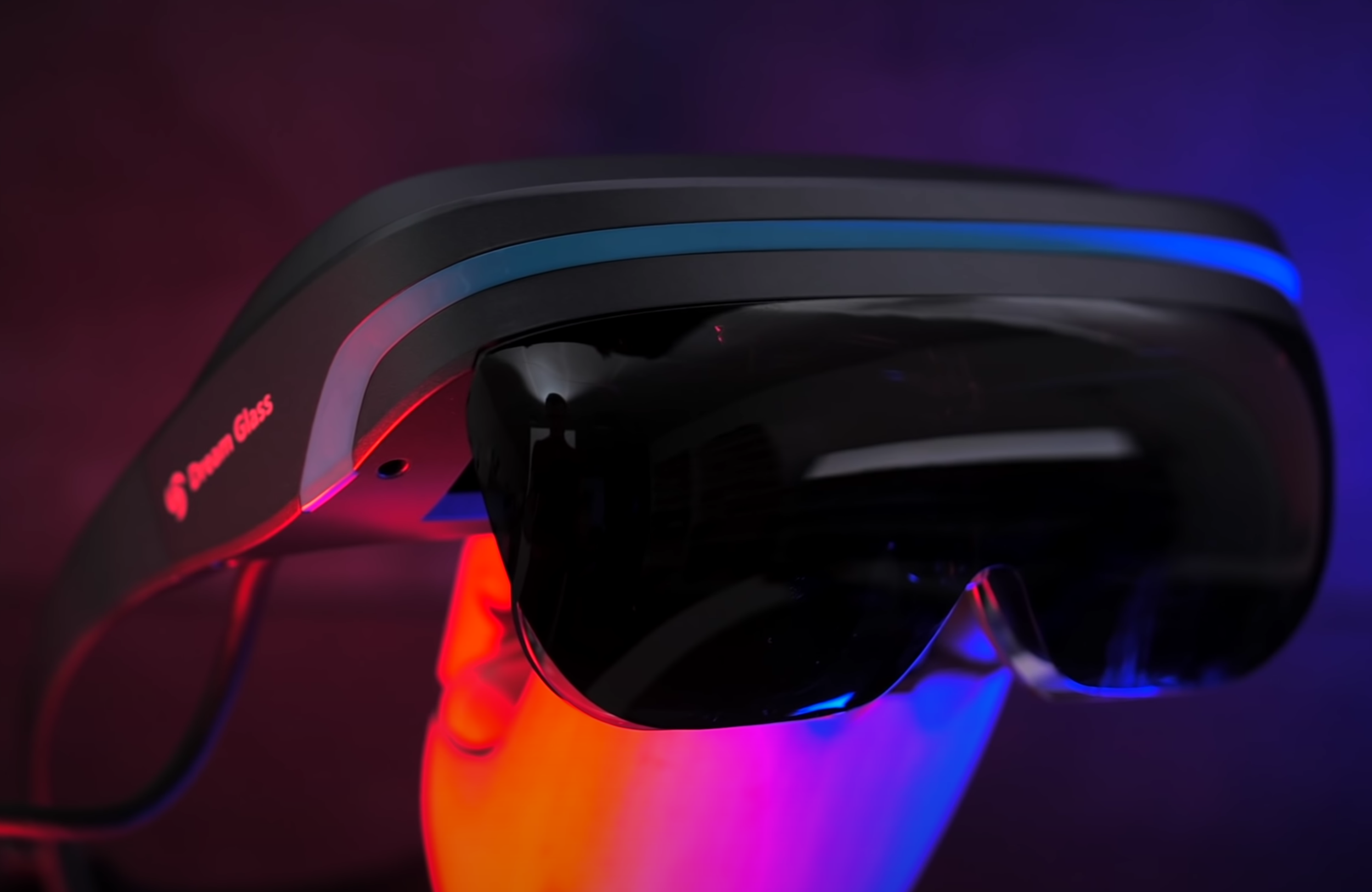
The first item that I have tried is called the DreamGlass 4K. This thing hasn’t fully launched just yet, it’s on Indiegogo, DreamGlass hasn’t sponsored this in any way, they have sent this over for us to check out. After checking it out, I honestly don’t recommend it but it does have some interesting features that do give us an early taste of what the Apple Glasses can do.

This is basically a Heads-On Display Headset, very similar to the Google Glass where you had this tiny Display in a corner of your field-of-view. That tiny Display would show you some info such as the Time, Date, Weather, Notifications and stuff like that. The first difference here is that the Display on these is Full-Screen, rather than it being a tiny window. Secondly, these Glasses are actually tethered to a Remote, which I’ll get to in just a second, meaning that they’re more like a home-experience device rather than something that you would take on the street or in public.

The way they work is that they have these two tiny Displays in each of the Lenses, which your eye then perceives as one Display. It’s fairly high-res, at least according to DreamGlass. They claim that this is a 4K Panel, but  I’m not so sure about that as the content that I was viewing on this was mostly 1080p. However, I can’t deny that the Display inside of this is pretty decent. You connect the Headset to a Remote, which runs Android. It has Bluetooth, WiFi and all of that, which means you can put movies and a few Apps on here, then preview those on the Headset itself. The reason why this isn’t AR is because the Display itself is fixed, it doesn’t move. If you move your head, it will move as well, just like the Google Glass did. 

The DreamGlass 4K is an early prototype with some flaws to iron out, but it has some promising features.

The DreamGlass 4K is an early prototype with some flaws to iron out, but it has some promising features.

Now, what’s cool about this is that the Remote itself also has a HDMI Port, meaning that you can connect this to a Console and play Console Games on your Headset without anyone even noticing. You can connect your Smartphone and play some movies directly or even stream content wirelessly, that’s doable as well. Plus, you can connect a Controller and basically have a gaming set-up on the go. However, my favourite feature is that you can also connect it to a Laptop and have a full Desktop UI, which you can then control with your Mouse & Keyboard and then when you remove the Glasses, the virtual set-up is all gone.

So, that’s what I really like about these, the fact that they give us a glimpse of what we could do with true AR Glasses in the future. If you’re ever played ‘Horizon Zero Dawn’, humans had these Chips that they would attach to their heads and they were able to see AR Elements in the real world, that’s how they were all using their computers. There were no Monitors, you would just sit on a desk, turn on your AR Chip or Headset and your computer will appear right in front of you. The DreamGlass is essentially an early look at that.

Unfortunately, it does have a lot of issues. For example, even-though DreamGlass says that this is 4K Display, on their Specs sheet they only list 2.5K, which I’m assuming is for each eye. But anyway, once I connected my Laptop to the Headset, the Laptop was only seeing this as a 1080p Display, rather than a 4K Display. Not only that, but there was a significant amount of ghosting and lag when using the Mouse. So, the Response Time on this is extremely high, making it unsuitable for almost anything other than watching movies really. Speaking of that, we tried manually putting some videos and Apps onto the Headset, but our computers just couldn’t see it. Not even a USB stick would work, through that single USB A Port. You can activate 3D Mode using a Button on the Remote, which actually works surprisingly well, that’s cool but realistically, I just cannot recommend this to anyone.

It costs $400 or £300, as much as a Console, but it’s nothing more than a Monitor that’s strapped to your head, which also needs another device to work properly. The DreamGlass isn’t really worth it, but at least we got a good idea of how the Apple Glasses could be used to interact with a virtual Mac.


Oculus Quest

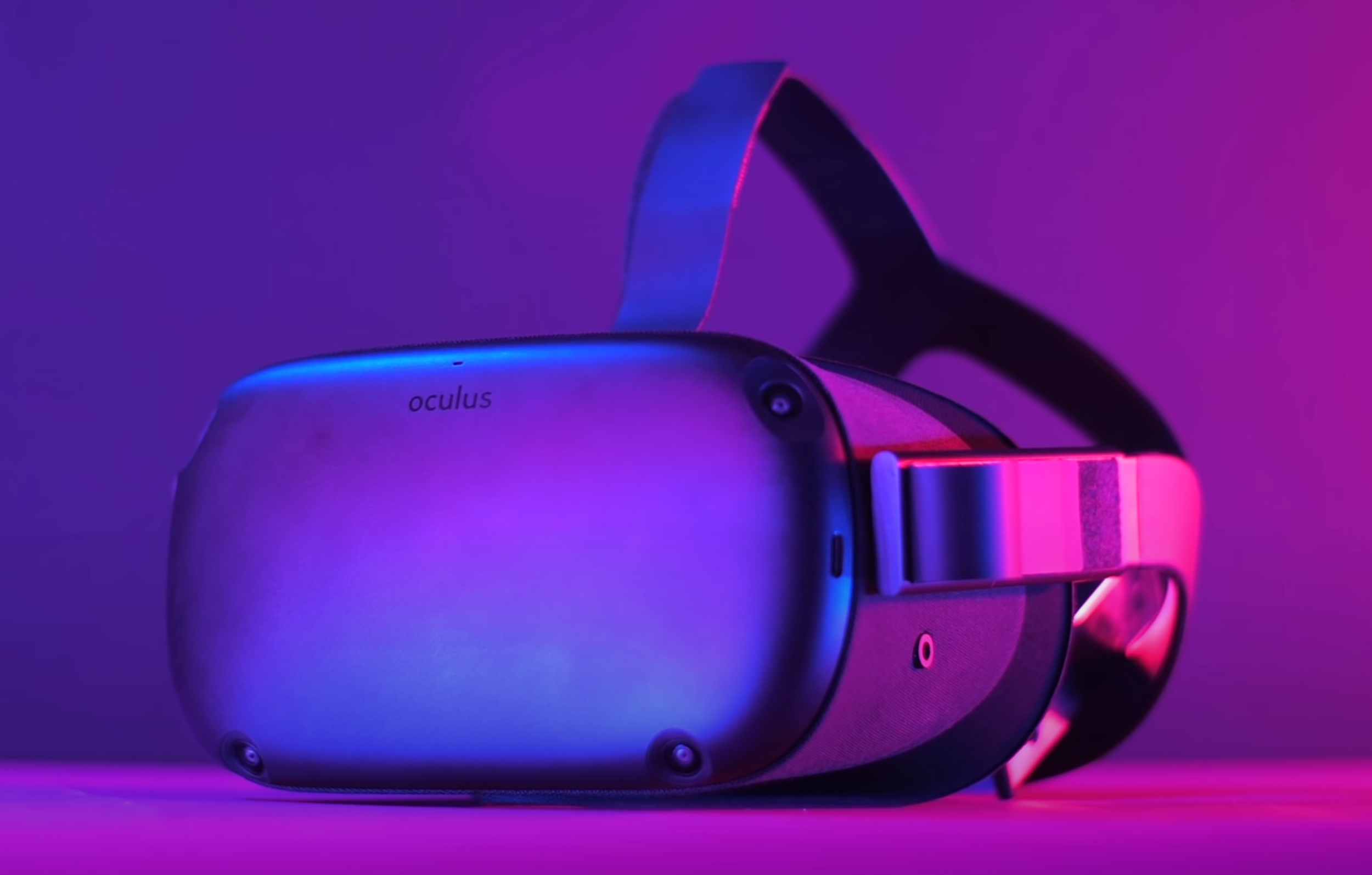
Now, the second device that I have is a bit more special, this is the Oculus Quest. It is something that came out last year and we’ve even made a very detailed Review Video, which you can check out on the channel.

Now, as most of you might now, the Oculus Quest is a VR Headset, meaning that you’re fully immersed into the experience and you cannot see the real world at all. Something quite unique about the Oculus Quest is that it is a fully wireless VR experience so unlike the Smartphone VR systems, where you just slide in your Phone and you can just look around up, down, left or right, the Quest has the full Six Degrees of freedom. This means that you can even walk around your room and the Quest would be able to track that. It’s pretty much like the high-end VR systems, like the HTC Vive, except it’s fully wireless and it does all the tracking on its own, without the need to place large tracking Sensors in your room. In order to achieve this, it uses four Cameras, one in each corner that tracks the environment in 3D. 

A recent update for the Oculus Quest really ups it’s AR game, with features that Apple’s own device could implement.

A recent update for the Oculus Quest really ups it’s AR game, with features that Apple’s own device could implement.

But what has this got to do with the Apple AR Glasses, which are surely AR and not VR? Well, Oculus has actually released a recent update, which allows you to also use the Quest as an AR Headset. So, remember those Cameras that I mentioned that are used to map the environment in 3D? Well, with this recent update, you can actually replace the standard background in the Menus, with the video feed from the Cameras. Even-though this is just black and white, it perfectly matches the environment in real life and you now have all the Menu Elements appear on top of your real world. This is fully tracked, which is really what the Apple AR Glasses will be all about.

The only difference will be that Apple’s Glasses will be smaller and made so that they resemble actual Glasses. Plus, the AR Elements would be overlaid on top of your real-world view, rather than a Camera recording your real-world view and then overlaying the AR Clements on top of that video recording. Everything will be just as sharp and just as colourful as in real life.

This would be cool if you could just use your hands to control the UI. Well, it turns out you actually can! The Oculus Quest has full Hand-Tracking Support, meaning that I can just use my hands to navigate the UI. There are also a few Gestures that I can do to simulate a click or even move the UI around. I have to say, if you do have an Oculus Quest, you have to try this for yourself.

Firstly, you need to make sure that you have the latest updates installed, then go into ‘Settings’, ‘Experimental Features’ and turn on the new Beta HomeScreen UI. Once you’ve done that, the Headset will reboot. After that, you can go into ‘Settings’ again, select ‘Virtual Environments’, select ‘Passthrough’ and there you go, an early look at AR Glasses.


Apple AR Glasses

Ok, so now that I have talked about two pieces of tech that give us an idea of how Apple’s AR Glasses will work, how would they be any different from these two Headsets?

First of all, Apple will designing their AR Glasses to look like regular Glasses. We have heard some rumors that Apple is also working on a VR/AR Headset, which is said to look similar to the Oculus Quest and that one might launch earlier. The main AR Glasses Headset that we’re all waiting for, that would just look like a regular pair of Glasses.

The use of the LiDAR Sensor on the iPad Pro & iPhone 12 Pro’s may be a test-run for something much bigger.

The use of the LiDAR Sensor on the iPad Pro & iPhone 12 Pro’s may be a test-run for something much bigger.

The second difference, like I mentioned before, is that the AR Elements would be displayed on the actual Lenses of the Glasses, rather than those being displayed on a video-stream, like they are on the Oculus Quest. You will get to see the AR Elements projected right onto the real world, with the elements themselves being in 8K Resolution, according to the info that we’ve seen so far. Also, instead of using actual Cameras to map the environment, like the Oculus Quest, Apple is said to be using LiDAR Modules that they’re currently using in the 2020 iPad Pro (this is also what the iPhone 12 Pro’s will be using).

Not only that, but Jon Prosser said that this is Apple’s plan, to implement the LiDAR Module on their iPads and iPhones first so that users get to use it for a bit, then take all the AR data that they’ve gathered from those devices and improve on the AR experience for the Glasses. It seems like the only reason why the LiDAR Modules are there is to create the AR experience of a future product, Apple’s AR Glasses. 

In terms of interacting with the UI Elements, Siri will indeed be present. Just like with the AirPods and pretty much all of Apple’s devices today, you’ll be able to ask Siri different questions and requests certain actions. The interesting part is when it comes to touch interaction. We’ve seen some reports that Apple will have a Touch Panel built into the Frame. That may be the case for things such as Volume Control, but I think the main interaction would be done in a very similar way as to how it works on the Oculus Quest, which is by fully using your hands in the air, flicking and scrolling through the UI. 

In fact, a recent Patent Application found by ‘AppleInsider’ shows that Apple is looking into having interactive AR Elements appear on a real-world surface. What this means is that you would be able to have Buttons, Menus and even Apps on a flat surface, in the real world, and interact with them just by pressing the virtual Buttons. This will be sort of like having a virtual iPad that’s just sitting on a desk, that you can actually interact with. 

In fact, one MacRumors user, ‘AngerDanger’, claims that Apple could potentially use Thermal Imaging to detect hotspots left by finger-taps on surfaces, which they can then register as Touch Input. Not only that, but if you’ve been following Apple’s advancements in AR, with ARKit, you know that they managed to pull off things that were previously considered impossible. They managed to pull of AR Tracking with just a single Camera Lens. Normally, you would need at least two Cameras so you can compare the differences between the two and create a 3D shape. Apple managed to pull this off with just one Camera and by using the data from their built-in Gyroscope and Accelerometer. Not only that, but Apple has also managed to add real-time shadows onto the virtual AR objects. What this means is that, if you have a virtual object and in the real world and you have a light pointed in one direction, that virtual object would blend into the scene perfectly with the light casting a shadow on its other side.  Apple has also managed to pull this off with reflections. If you have a glossy virtual object, objects from the real world, this would actually cast reflections on it.

The bulkier headset that Mike Rockwell advocated for would need external hardware, something that Jony Ive and Tim Cook did not side with.

The bulkier headset that Mike Rockwell advocated for would need external hardware, something that Jony Ive and Tim Cook did not side with.

Apple’s AR glasses are said to be announced by the end of 2021, with a full release in 2022. This can of course be delayed, depending on how the project is going for Apple. Speaking of that, a report that came from Mark Gurman in June 2020 claims that there have been some serious internal debates between Jony Ive and Mike Rockwell, who leads Apple’s AR and VR development on how this Headset should work.

Jony wanted a fully wireless Headset that was thin and sleek, essentially, the Glasses. Mike, on the other hand, wanted something revolutionary in terms of Graphics and experience and because of that, the Headset ended up being bulky and needing an External Box, which would process all the data and then stream it wirelessly to the Headset. This Headset would’ve been an AR and VR Headset, again, very similar to the Oculus Quest. 

Tim Cook apparently sided with Jony on a Headset that doesn’t take people from the real world, but instead adds Elements onto the real world in order to improve it, which I fully agree with. I’m personally team Jony here but do let me know what do you guys think? Would you prefer that Apple develops the AR Glasses or an AR/VR Headset, like the Oculus Quest, instead?

Samsung Galaxy Note 20 Ultra – Why Apple should be worried!

With a release date of mid-to-late August, the Samsung Galaxy Note 20 is just around the corner. Not only that, but the Note 20 is looking to be a true iPhone 12 killer. We know most of the details of both the iPhone 12 and the Note 20, so let’s take a closer look at the Note 20 and see how it stacks up against the iPhone 12!


Design

The Note 10+ from last year was one of my favourite Smartphones ever, in terms of the Design. Having that squared-off form-factor with almost no Bezels and a curved Display made the Phone look and feel like it was something straight from the future. The Camera was great, the S-Pen was always a nice touch and overall, I was a massive fan of the Note 10+.

When it comes to the Note 20, ‘OnLeaks’, who’s been incredibly accurate in the past when it came to his leaks, revealed the full Design of the Note 20 back in May. It looks like it is pretty much a Note 10+, with a few minor changes. The first change is that the edges are not as curved as they were on the Note 10+. In fact, they look to be almost entirely flat now, similar to what we got with the S20 Ultra. Personally, I have always preferred curved edges as they just look so futuristic and while accidental touches have been an issue in the past, with the S7, S8 and even the S9, I’ve never had that issue with my S10 or my Note 10. So, it’s a bit of a shame that Samsung got rid of those.

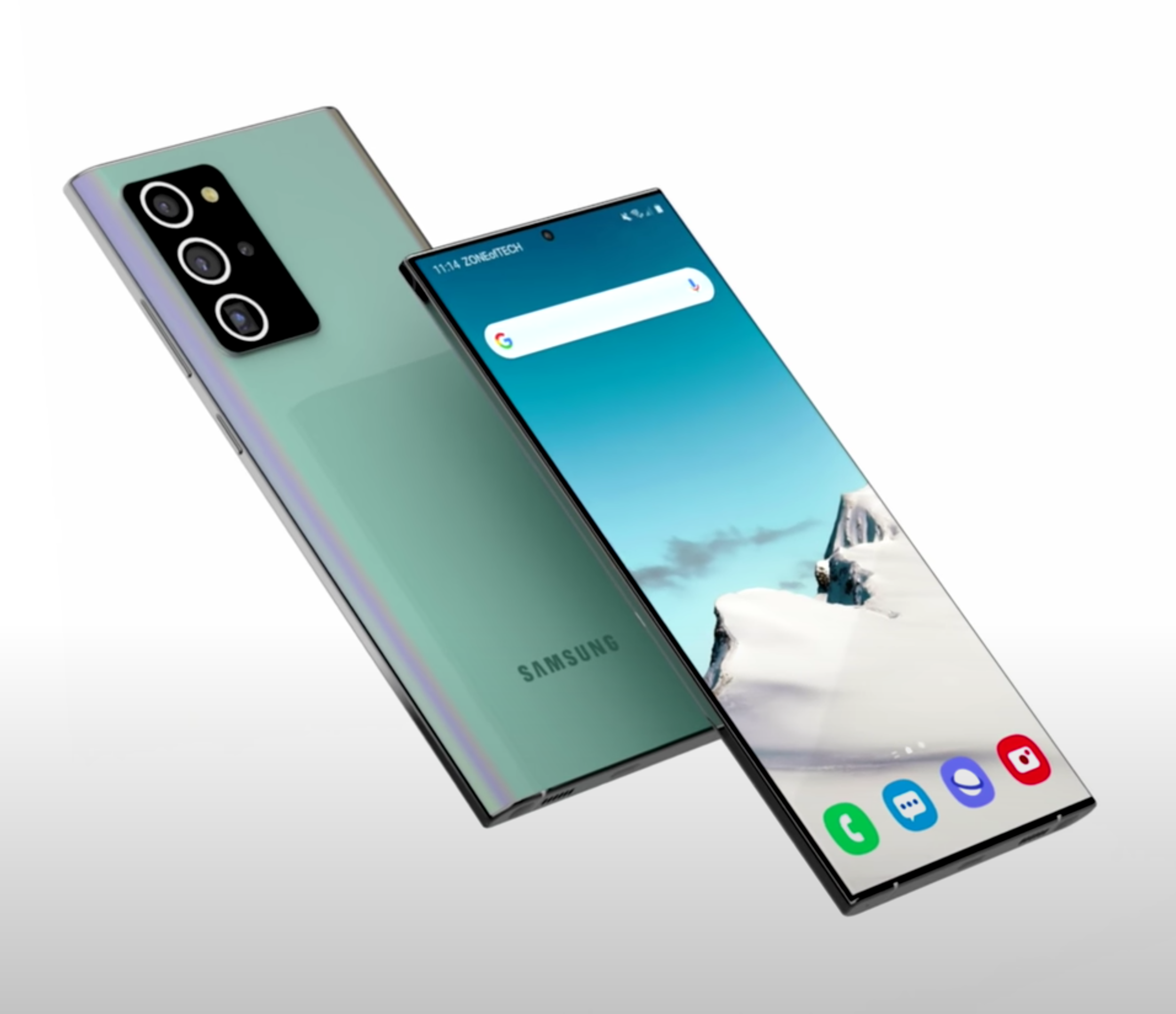
Check out "@ZONEofCONCEPTS” on both Instagram & Twitter for more concepts like this one

Check out "@ZONEofCONCEPTS” on both Instagram & Twitter for more concepts like this one

The second change is that the Front Camera Cutout is now smaller, it’s pretty much the same size as it was on the S20’s. The third, and final Design change is when it comes to the Camera Module on the back, which I’ll get to when I’m talking about the Camera Section. But, Design-wise at least, we do have these rings that actually match the colour of the Phone, which I think looks so good. I’m absolutely in love with the Note 20’s Design, even more so than with the Note 10+.

Moving on and just as we had last year, Samsung will be releasing two models of the Note 20. These will be the regular Note 20 and the Note 20 Plus, which might be called the Note 20 Ultra, which is how I’m going to refer to it throughout this video. We don’t really know much about the regular Note 20 aside from the fact that it will be smaller, with a lower Refresh Rate and a downgraded Camera. So, I won’t really be talking about the regular Note 20 from this point on as I’ll be focusing on the higher-end Note 20 Ultra model.

Speaking of that, we are expecting three colours: White, Black and this new Copper colour. We’ve actually had a recent leak of the new Copper Note 20 Ultra, which was posted on Samsung’s Russia website by…Samsung themselves. I’m not really sure if this is even a leak at this point but you can’t get more official than that. I have to say, the Note 20 Ultra looks absolutely gorgeous, even better than in our own concept. I love how the squared-off Camera matches the squared-off Body. The S-Pen also seems to perfectly match the Body of the Phone now, possibly even down to the actual material. 


Display

The Note 10+ came with a 6.8” Display with a 19:9 Aspect Ratio and a Resolution of 3040x1440. The Note 20 Ultra is said to be getting a larger 6.9” Display with a taller 20:9 Aspect Ratio and a Resolution of 3200x1440. Not only that, but Ross Young, a well known Display Analyst, says that the Note 20 Ultra will be Samsung’s first Smartphone to come with an LTPO Display.

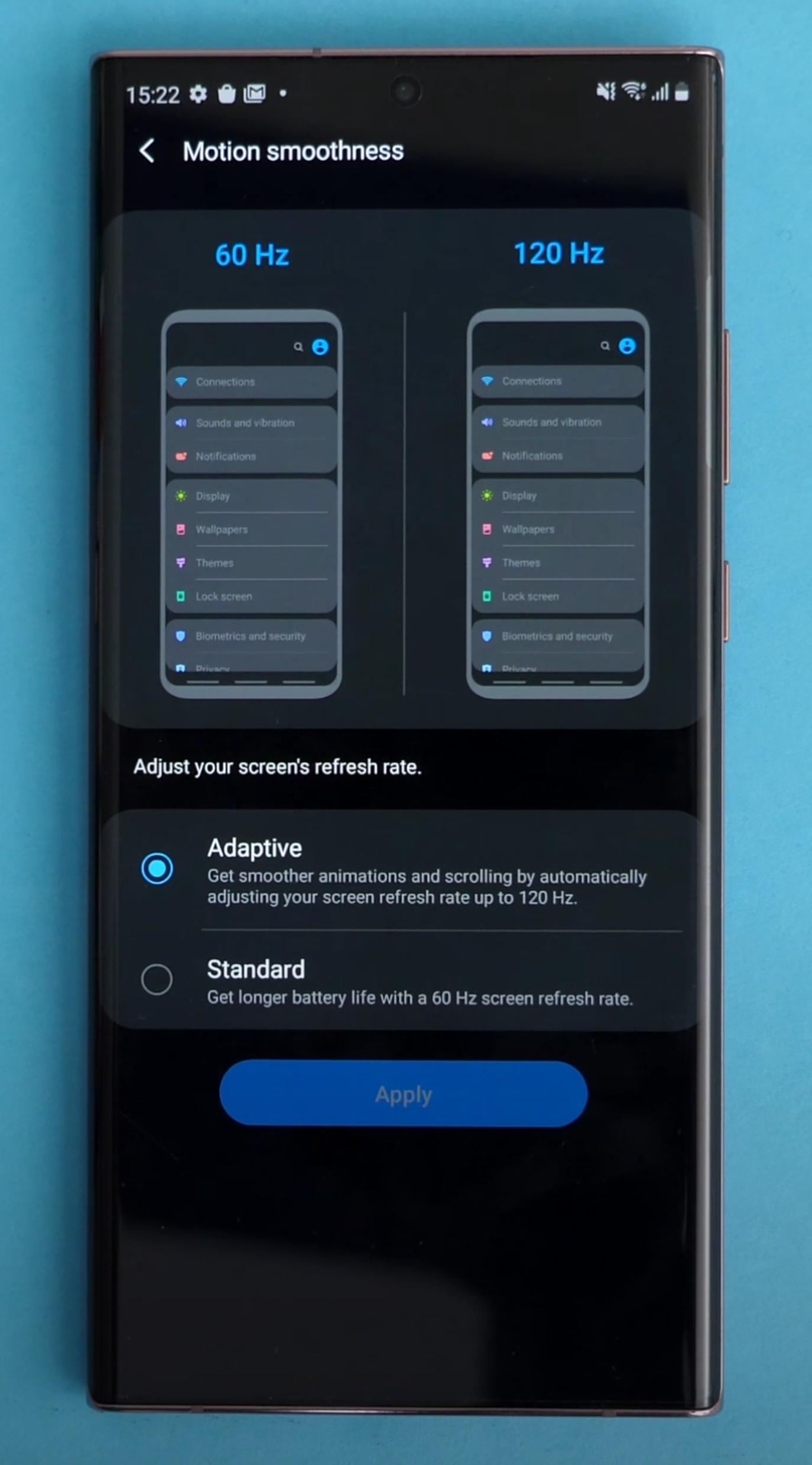
The Note 20 Ultra is said to come with a Dynamic Refresh Rate, similar to the iPad Pro.

The Note 20 Ultra is said to come with a Dynamic Refresh Rate, similar to the iPad Pro.

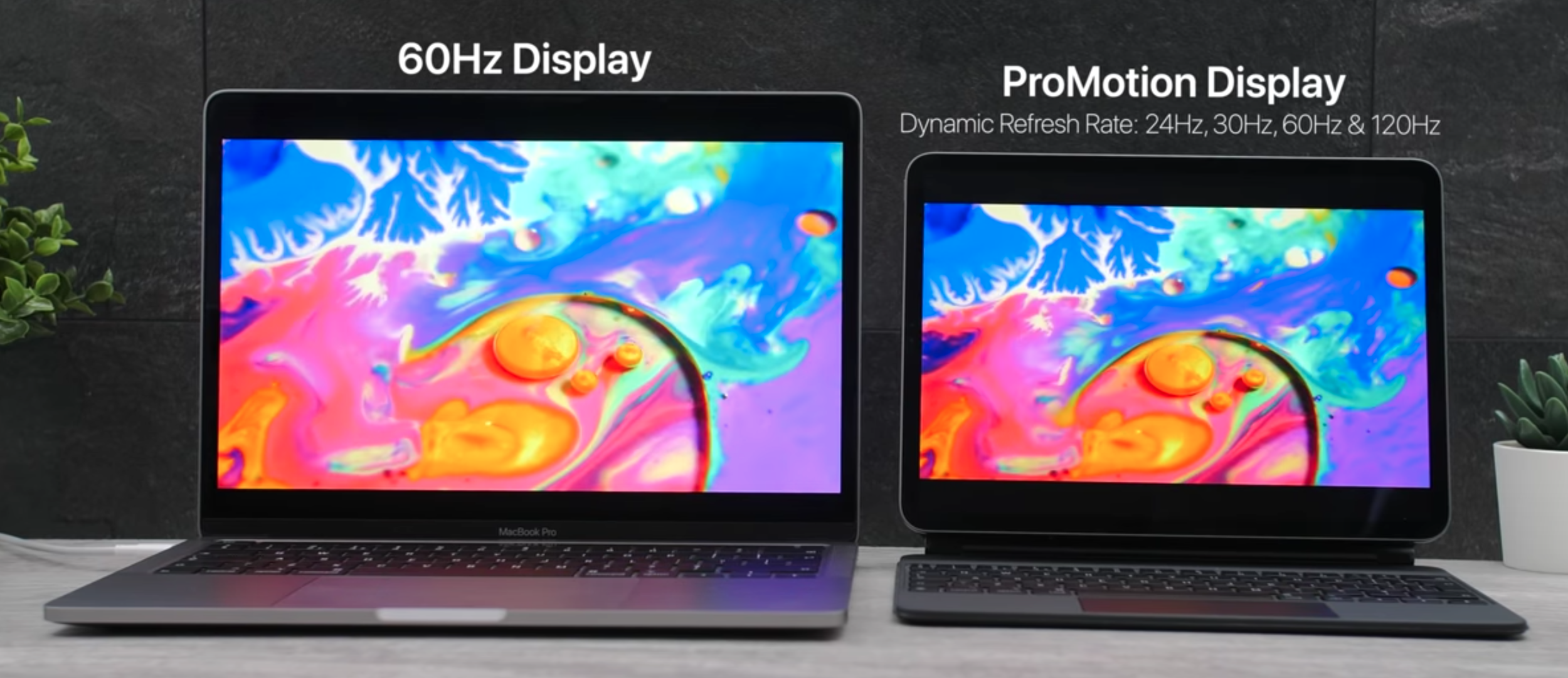
Essentially, with the Galaxy S20’s earlier this year, we got a 120Hz Refresh Rate Display. However, we did not have a Variable Refresh Rate, meaning that you could either get 60Hz all the time, or 120Hz all the time. We didn’t have a dynamically adjustable Refresh Rate like on the iPad Pro for example, which can automatically adjust from 24Hz, all the way up to 120Hz, whenever it needs to. However, this will indeed be possible on the Note 20 Ultra, which will be able to dynamically adjust the Refresh Rate from 1Hz, all the way up to 120Hz. What this means is that we’ll see a much improved Battery Life over the S20 line and hopefully even 120Hz at Native Resolution, which on the S20’s is currently limited to 1080p.


Camera

Samsung made some gigantic Camera improvements with the S20 line. Not only did we have a larger Image Sensor for the first time since 2016, but we also got 8K Video Recording and 30x Digital Zoom on the S20 & S20+.

Of course, we also had the big S20 Ultra, which added a 108MP Sensor, up from the 12MP Main Module that the other two S20’s had. It also added 100x Space Zoom, which could theoretically zoom in so much that you could even see the surface of the Moon. All of that sounded great on paper, but unfortunately the S20 Ultra’s camera was plagued with issues.

The Low-Light performance was severely impacted by how small the Pixels on the Sensors really were. Even with Samsung’s Pixel Binning technology, photos and videos in Low-Light looked like they were taken on a Phone from a few years ago. The Zoom functionality was actually very good, but only up to 10x. Once you got to 30x, or not even to mention 100x, you know the story. That’s not even to mention all of the Auto-Focusing issues that were still not fully resolved, even after Samsung issued a ton of software updates. The Image Processing had its own fair of issues, with photos being either overly exposed, under exposed and the HDR Processing was hit and miss.

The Laser Module enables precise Auto-Focus.

The Laser Module enables precise Auto-Focus.

So what about the Note 20 Ultra’s Camera then? Is it the same problematic Camera that the S20 Ultra had? Well…yes and no.

The Main Camera is said to be the same as on the S20 Ultra. That means we get a 108MP Sensor, with an f/1.8 Aperture and 0.8 µm Pixels. However, Samsung is said to be adding a new Laser Module to the right, the purpose of this new Module is to help the Main Camera focus faster. In theory, that should solve all the Focusing issues that the S20 Ultra had.

That 48MP, 100x Zoom Periscope Module that the S20 Ultra got is indeed said to be replaced with a 13MP Module that provides 5x Optical Zoom and around 50x Digital Zoom. This is compared to the 4x Optical Zoom, 10x Hybrid Zoom and 100x Digital Zoom that the S20 Ultra had. The quality at 50X, as this is quite a low Resolution Sensor, should be similar to the quality that the S20 Ultra had at 100x. But at 10x, it should be quite similar to the Ultra or even better, as we do have 5x Magnification on the Lens, so I’m definitely looking forward to trying that out.

Also, since we also get an f/3.4 Aperture, rather than the f/3.5 that the S20 Ultra got, alongside the much lower Resolution of 13MP, the Zoom Module should be much better in Low-Light than the S20 Ultra’s Camera was. 

Finally the third Module is said to be the same 12MP, f/2.2 Ultra-Wide Angle Module that we got with the S20 Ultra. Aside from this, the Front Camera is said to be the same one as on the S20 Ultra, which means that it would be a 40MP Sensor with an f/2.2 Aperture capable of recording 4K Video at 60 FPS. 8K Video Recording will be there as well, but that’s on the Back Camera. So, overall if Samsung can indeed fix the Auto-Focusing issues, the Zoom issues and of course the Image Processing issues that the S20 Ultra had, I do think that this would be a great Camera.


Performance

Performance wise, this is a bit of a tricky one. You see, the S20 Ultra actually had very good Performance. It came with 12GB or even 16GB of RAM, the Note 20 Ultra will pretty much be the same. The baseline Storage model is said to be bumped to 256GB, compared to 128GB on the S20 Ultra. That would be the one that would come with 12GB of RAM, as the 512GB model would come with 16GB of RAM. So, with regards to RAM and Storage, we’re all good.

The tricky part is when it comes to the Processor. The S20 Ultra came with two different Processors, based on where you bought it from. If you bought it from the US, Canada, China or even South Korea, it would come with the Snapdragon 865 Processor. However if you bought it from Europe and anywhere else, it would come with Samsung’s own Exynos 990 Processor. You would expect Samsung’s own CPU to be the better choice as this is a Samsung Smartphone, but it turns out that it was actually the other way around.

The S20’s RAM & Storage Specs.

The S20’s RAM & Storage Specs.

The Snapdragon Processor models ended up having better performance, cooler Operating Temperatures and even better Battery Life by a significant margin, when compared to the Exynos models. Also, keep in mind that Samsung was charging the same amount of money for both Phones. It was just that based on where you lived, you could be getting a noticeably inferior product. Samsung has received a ton of backlash for this to the point where Users even started a petition, which ended up getting over 44,000 signatures. This was for Samsung to stop using Exynos Processors in their Phones.

So now, what about the Note 20 Ultra? Well, all the rumors point towards Samsung still using Exynos Processors in some of the Note 20’s. However, I do have some good news here. A report from ZDNet Korea states that Samsung would be using a new Exynos 922 Processor inside the Note 20. This would be the world’s first Chip to be manufactured on a 6nm process and apparently Samsung is also trying to get this down to 5nm. Apple will be switching to 5nm in September 2020 with the introduction of the Apple A14 Chip, inside the iPhone 12. 

The reports are saying that this new Exynos 922 even outperforms the Snapdragon 865 but, to be honest, I just don’t believe that’s the case, considering that Samsung has been lacking behind Qualcomm for a number of years now. Even if the Exynos 922 outperforms the Snapdragon 865 in terms of raw Performance, Power Consumption and Heat are still two ongoing issues that would also need to be solved. But at the end of the day, the Exynos variant is still a good Phone, just not quite as good as the Snapdragon variant. 


Special Features

If you’re looking for the S-Pen, the Note 20 will be your only option.

If you’re looking for the S-Pen, the Note 20 will be your only option.

So what about Special Features? Is there anything that would make the Note 20 Ultra stand out from the rest?

Well, the main reason why anyone would be a Galaxy Note, rather than a Galaxy S, is because of that S-Pen. The S-Pen is said to be getting some more improvements this year, with the biggest one being a significantly improved experience, all thanks to that 120Hz Refresh Rate Display. This will make writing and drawing on that Display feel so much more natural and fluid than ever before.

Also, Ice Universe says that the Note 20 will have some new S-Pen features. We don’t really know what these features are, but I would say it would be quite safe to assume that most of these would be software features similar to what we got with the Note 10+. The S-Pen has already reached a point where it is quite difficult to improve anything in terms of the hardware as it’s already so advanced.  Aside from this, the surface area of the Ultrasonic Fingerprint Reader is also rumoured to be increased but..that’s pretty much it.


Battery

In terms of the Battery, the Note 10+ had a 4300mAh Battery. The Note 20+ is rumoured to have anywhere between a 4500mAh and a 5000mAh Battery. The S20 Ultra, for example, has a 5000mAh Battery, however, do keep in mind that the Note also needs some extra space inside for that S-Pen. My prediction would be around 4800mAh at the very best and likely somewhere around 4600mAh. 

Fast charging is said to stay the same as on the S20 Ultra and the Note 10+, so 25W with support of up to 45W (with a separate Charger). 


Release Date

When it comes to the Release Date, the event is said to be on August 5th, with the Note 20’s to be released on August 21st and fun fact, that’s just two days after my birthday so, that’s pretty exciting!


Price 

Price-wise, the Note 20 line is said to be the most expensive, non-folding, Smartphone from Samsung yet. Greek website ‘Techmaniacs’ claims that the Note 20 will start at 1,250 Euros, while the Note 20 Ultra will start at 1400 Euros.

It seems like the Note 20 Ultra would be about the same price that the S20 Ultra was, even though it does come with more features and that S-Pen. 

In conclusion, I’m pretty excited for the Note 20 Ultra but I’m personally more excited for that Galaxy Fold 2. Having used the Fold 1 as my daily driver for around two months, I just cannot be as excited for regular Smartphones. Folding Phones are the future and this is also the field where we’ll see the biggest improvements, year after year.

Unfortunately, even-though the Fold 2 would be a gigantic upgrade from the original Fold, it seems like it would actually not have an S-Pen in the end, despite many rumours saying that it will. This means that if you really want that S-Pen experience, the Galaxy Note 20 is pretty much your only option.

iPhone 12 (2020) - Hands-On with Mockups!

Here, we have something pretty special. These are the upcoming 2020 iPhones. The iPhone 12, the iPhone 12 Pro and the iPhone 12 Pro Max. So, wait a second Daniel, did Tim Cook send these to you? Do you actually have the new iPhones two months before release? Well…yes and no.

These are essentially non-functional models that are made for Case Manufacturers so that they can start working on their Cases. A massive thanks to Sonny Dickson for arranging these units too. Even though they are non-functional units, they do have the exact dimensions of the upcoming iPhones, which means that we can stack these up against other Smartphones and see how they compare.

So, without any further ado, here is an early look at the iPhone 12 line-up! 


iPhone 12

The regular iPhone 12 from the front.

The regular iPhone 12 from the front.

The first iPhone that we have right here would be the smallest of the bunch and also the most affordable one, the iPhone 12. This iPhone is actually smaller than the current iPhone 11 Pro or the iPhone XS or X,  which at the moment are the smallest notched iPhones that we have. Not only that, but the iPhone 12 is even smaller than the iPhone SE, 8, 7, 6s and even the 6, being just a tiny bit taller and wider than an iPhone 5. So if you’ve always wanted a flagship iPhone that was small and easy to use with one hand, that option is now finally back.

Now, something interesting about this iPhone is that it comes with a 5.4” Display, meaning that while the size of the Phone is smaller than an iPhone 6, the actual Display is noticeably bigger. Also, this is an OLED Display, just like on the iPhone X and newer. So, no more LCD Panels on any of the 2020 iPhones. Goodbye LCD, you won’t be missed.

Another big change to the iPhone 12 is that it now has a squared-off frame, very similar to the iPhone 5 and the iPhone 4, which were my favourite iPhone designs ever. While having a squared-off frame isn’t as comfortable in the hand, as a wedge shape frame is, they do have way more grip and they won’t be as slippery because of that. As a bonus, you can even prop the Phones up which might not sound like a big deal for you guys, but for us, that’s pretty huge. It means that we don’t have to prop the Phones on something when we’re filming.

Taking a look at the Ports and the Buttons, on the bottom we have the Lightning Port as well as the Speaker and Microphone Grill. On the right, we have a massive Power Button. Nothing really on the top and finally on the left, we have the Mute Switch and the Volume Buttons. Finally, when it comes to the back and the Camera Module, we have a Dual Camera Module here, as opposed to the Triple Camera Module that we’ll see on the Pro models. This is pretty much the same arrangement as we got with the regular iPhone 11.

A top-down view of the back of the iPhone 12.

A top-down view of the back of the iPhone 12.

This means that we have the Main Module as well as an Ultra-Wide Angle Module. The Cameras on the iPhone 11’s were already pretty much the best in the industry, with 4K60 Video Support on all of the Lenses. These ones are said to be getting even better with support of possibly even 4K Video at 240 FPS.

We’re also getting an Apple A14 Processor, which would be manufactured on a new 5nm process so overall, the iPhone 12 is a pretty big upgrade in every single way and really the biggest upgrade that we got even since the iPhone X, in 2017.

There is one thing that isn’t fully known about these iPhones yet, that is the Notch. Since these models were made for Case Manufacturers, the Notch would not be 100% accurate. We’ve had many reports that the Notch would indeed be getting smaller, so I do expect this to look about the same as we’ve modelled it in our Concepts. This won’t really be that much of a change on the larger models of the iPhones, but it definitely will be on this 5.4” iPhone 12, where that Notch is already taking a considerable amount of space on this tiny Display.

Price wise, this iPhone is said to start at $650, $50 less than what the current iPhone 11 starts at. That is pretty awesome considering that you’re also getting an OLED Display, 5G and better Performance as well. 


iPhone 12 Max

The iPhone 12 Max  has the exact same Camera cut-out as the regular 12.

The iPhone 12 Max has the exact same Camera cut-out as the regular 12.

The second 2020 iPhone would be the iPhone 12 Max. This one is basically the successor to the iPhone 11 as it has the exact same 6.1” Display size, only this time, it is an OLED Display. I really do like this size a lot, especially now that we have these flat sides. I can grip it perfectly and it is noticeably larger than the 5.4” iPhone 12.

On the back, we have the exact same Dual Camera Module setup as on the iPhone 12. The front would have the same Notch size as on the iPhone 12 which again, I do believe will be around the same size as we’ve modelled it in our concept, based on all the leaks that we’ve seen.

The iPhone 12 Max is rumoured to start at $750, or $50 more than the iPhone 11. But, we are getting an OLED Display, thinner Bezels, a new Design with a flat frame as well as 5G support.


iPhone 12 Pro

Then, we have the two Pro iPhones, starting with the iPhone 12 Pro. This one also has a 6.1” Display, the same as the iPhone 12 Max. This Display is very likely to be a 120Hz Panel, making everything far more fluid and responsive than on the non-pro iPhones. The frame, while still flat, will be made of out Stainless Steel, as opposed to the Aluminium on the non-pro models. Personally, I think I do prefer the Matte Black frame on the non-Pro iPhones. There’s something about that, that just takes me back to that iPhone 5 Design, which was by far my favourite.

The 12 Pro and the 12 Max will have the exact same dimensions.

The 12 Pro and the 12 Max will have the exact same dimensions.

Also, something to note here is that on the bottom left, we have this thing that looks like a Smart-Connector. Some of you might be thinking that this is the SIM Card Tray but, if you take a look at the previous unreleased iPhone models that we’ve shown you over the years, none of them had the SIM Card Tray on them. That was just on the final models, mostly because you don’t need access to the SIM Card like you do for the Buttons.

We do know that Apple plans on removing the Lightning Port entirely with the iPhone 13 next year and that the Charging will be done through a Magnetic Smart Connector or directly through Wireless Charging. But, Apple could already be including that Smart Connector on the iPhones this year just to get Users accustomed to charging with that Magnetic Connector already. Aside from this, this iPhone will also come with 6GB of RAM, compared to the 4GB that we have on the non-Pro iPhones.

The Cameras will be getting a pretty big improvement too. Not only will we be getting a Triple Lens Camera Module, we would also be getting that LiDAR Sensor that the 2020 iPad Pro got. This LiDAR module is not present on our models right here. This is, again, mostly because they’re for Case Manufacturers and as long as the size of the Camera Unit is correct, it doesn’t really matter what they have inside. Our concept is more accurate, so that would be closer to what the 2020 iPhones will look like, from the back.

The model we received had a White back, which is really clean (Centre-Top).

The model we received had a White back, which is really clean (Centre-Top).

Now, aside from that new LiDAR Module, which will allow you to scan objects and even the environment in 3D for a significantly improved AR experience, the three Main Cameras will also be getting some major upgrades. The rumors are saying that they’ll be getting higher quality optics, with a Seven-Element Lens system. We’ve also heard rumors of a 64MP Sensor, but those aren’t confirmed as of yet. All we know for now is that the Pro models will definitely be an upgrade over the current iPhone 11 Pro’s in terms of the Camera quality, we just don’t know how much as of yet.

The iPhone 12 Pro is said to start from the same $999 price-point that the iPhone 11 Pro started at. We do get a larger Display, better Performance, a LiDAR Scanner, improved Cameras, 5G support and possibly even a 120Hz Refresh Rate.


iPhone 12 Pro Max

Finally, the last iPhone would be the iPhone 12 Pro Max, which is the second iPhone out of the iPhone 12 line-up to get a change in terms of its size. But, unlike the regular iPhone 12, which is now smaller, the 12 Pro Max is bigger than ever before, coming in with a massive 6.7” Display. I have to say, while I absolutely love how this iPhone feels in the hand, it is just gigantic. The 11 Pro Max was always on the big side but this is just humongous. However, when we compare it to the Note 10+, which comes with a 6.8” Display, the iPhone is almost the same size, the Note is still bigger of course, but not by a lot. 

The iPhone 12 Pro Max, compared to the S20 Ultra.

The iPhone 12 Pro Max, compared to the S20 Ultra.

The same thing applies when we compare it to the S20 Ultra. But you see, while the Ultra is much taller, the iPhone 12 Pro Max is noticeably wider, making it feel far chunkier and more Tablet-like in the hand, than the S20 Ultra. The fact that we also don’t have a Notch at all gives us much more screen-real-estate, when compared to the iPhone.

Now, even-though I do like the look of this iPhone a lot, and the fact that it has such a massive Display, I still cannot use an iPhone for business, when I’m traveling. We still do not have side by side multitasking support on the iPhone at all. So, if I want to use two Apps at the same time, which I pretty much do all the time when I’m traveling as I need to look at my Calendar and schedule some events based on some emails or some notes, I cannot do that at all on the iPhone. I can only run one App at the same time. But, on a Samsung Galaxy Note for example, or any Android Phone really, you can in fact run two or more Apps at the same time, significantly improving the multi-tasking experience.

I think I might just go for the iPhone 12 Pro this year and of course, the Samsung Galaxy Fold 2 as my Main or Secondary Phone, once that releases. 

Other than that, the 12 Pro Max would have the same Specs and Features that the 12 Pro has. This means 6GB of RAM, alongside that Triple Lens Camera Module on the back with the LiDAR Scanner included. Interestingly enough, if you take a look at the side of the 12 Pro Max, while on the left we do have that Smart Connector shape, on the right we have another Cutout which does resemble the Apple Pencil Connector on the iPad Pro. Also, this Connector is much larger than the single Connector on the 12 Pro. 

The range in sizes for this line-up is pretty significant.

The range in sizes for this line-up is pretty significant.

So..what could this be? My theory is that the Connector that’s on the right of the iPhone 12 Pro Max and the one that’s on the left side of the iPhone 12 Pro, will both be used for that new Magnetic Charger. It is a bit weird that they’re not on the same side and they also have different sizes, so I’m not fully sure what’s up with that, but I do believe that they’re both Magnetic Connectors.

When it comes to the second tiny Connector on the 12 Pro Max, I do think that this is actually the SIM Tray and for some reason it was modelled onto this iPhone, even-though it didn’t need to be. That’s my theory but do let me know what you guys think.

Something else that I want to mention here is that all of these iPhones feel considerably thinner than the 11 Pro’s. The 11 Pro’s measured in a 8.1mm thick and the 12 Pro’s are said to be getting thinner, at 7.4mm. As long as that doesn’t affect the Battery Life, that’s really nice. Finally, the 12 Pro Max is said to start at $1,100. For this, we’re getting a larger Display with possibly a 120Hz Refresh Rate, faster Performance, improved Cameras with that LiDAR Scanner, 5G and of course, that brand new Design.


Overall, the iPhone 12 line-up is looking to be very promising. Especially considering what Apple will be pricing these iPhones at. It will be like $750 for the 12 Max, which would have the most powerful Processor in any Smartphone and likely one of the best Cameras in a Phone, that’s an amazing deal.

However, in order to achieve these prices, Apple had to remove the Charger and the Headphones from the box, so you will have to buy those separately now. Some people might be ok with that, some might not. I personally am, as long as the price gets decreased which unfortunately, for the iPhone 12 Pro’s, it has not.

iOS 14 Review - Biggest Change Since 2007!

Every year in June, Apple announces a new version of iOS, iPadOS, watchOS and macOS. We also have tvOS but come on, no one really cares about that.

This year, we had a few leaks that iOS 14 would bring a new Fitness App to the table, alongside possibly a new list view for the Home-Screen, but that was pretty much it. However, it turns out that iOS 14 is actually pretty much the biggest change that the iPhone has had since the introduction of the very first iPhone, back in 2007. This version of iOS (4) brought the ability to change the Wallpaper, as well as multitasking support. Then, iOS 7 redesigned the whole look and now iOS 14 allows you to have more than just Icons on the Home-Screen. 

It introduces Widgets and an App Library UI, amongst many massive features, making it a gigantic update. I’ve already covered over 40 big changes in our previous video, but now that I actually got a chance to use iOS 14 on my actual iPhone for a few days, I wanted to talk about my personal experience and how it actually is to use iOS 14, iPadOS and watchOS 7. So, without further ado, here is my iOS 14 experience!


iOS 14

Starting off with iOS 14 and the biggest feature that we got were the Home-Screen Widgets.

Now, we did kind of have Widget support with iOS 8, which came out in 2014. But these Widgets were only viewable in the Notification Centre. In more recent versions of iOS, you had to swipe right from the Home-Screen in order to see them, which was not that convenient. But now with iOS 14, you can place Widgets pretty much anywhere you want on the Home-Screen, which reminds me of Android.

This is so much cleaner, on the face of it.

This is so much cleaner, on the face of it.

In fact, Widgets support has been my number one most requested feature in iOS and it’s been one of the major reasons why I keep gravitating towards Android, whenever a major new device comes out. However, unlike on Android where you can basically place a Widget anywhere you want, on iOS they work in the same way as Apps do. They still magnetically attach to other Apps, which means that you just cannot have Widgets on the top, empty space in the middle and Apps on the bottom. You can only place Widgets where you already have Apps, which is a bit of a bummer.  

Also, you always need to have two rows of Apps between Widgets. For whatever reason, you just cannot have one single row, probably because Apple is using a 4x4 App Square for each small Widget. Something cool that I’ve noticed is that now you can just hold your finger anywhere on the Home-Screen to activate the Jiggle Mode, this is what it’s called internally. You also get this nice Haptic Response when you’ve done that. 

In order to add Widgets, you just press on the ‘Plus’ Button in the top right corner, you then get a bunch of automatic Widget suggestions, based on the Apps that you use the most. Once you scroll down, you get to this list of all the Apps that support Widgets. Since the Widget system has been completely redesigned in iOS 14, Apps will need to implement these Home-Screen Widgets, which is the reason why right now, only a few First-Party Apps support them. But then, it’s pretty straight forward. You select a Widget and then you get to choose between three or even four different sizes, in the case of Notes. Unfortunately, you cannot resize a Widget once you’ve placed it. In order to change the size of it, you’ll have to remove it and add it again. 

Now, if you choose to go for a small Widget, then that Widget would not be intractable. The moment you tap it, you would be taken to that App. Whereas if you have a larger Widget, with more UI elements, then you can click one of those elements to get taken to that specific function in the App. You can also hold on a Widget and then edit it with things such as changing the location that the Weather App shows you, the Note that’s currently displayed in the Notes Widgets and so on. 

You can also drag one Widget on top of another, to have a stack of multiple Widgets that you scroll through. It might be useful for some users, but for me personally, I like having all my information visible at a glance. I do prefer having all of my Widgets un-stacked and visible all the time.

Yes, ‘Jiggle Mode’ is the actual term for it.

Yes, ‘Jiggle Mode’ is the actual term for it.

Overall, I really do like the Home-Screen Widgets a lot and I just cannot wait for more Developers to start creating their very own Widgets. I predict that I would be changing my Home-Screen almost daily when that happens, by playing around with different Widget layouts. But unfortunately, Widgets are far from perfect. 

You cannot position them anywhere on the Home-Screen, for some reason Apple still kept the previous Widget View from iOS 13. Meaning that you can still swipe right from the Home-Screen and get this very long scrollable list with all of your Widgets. I just think that they should remove this because it just complicates things way too much for the average user. Having two places where you can have the same Widgets is just not ok. But wait, it gets even weirder.

In the Widget Panel, you can still hold to make them jiggle and then you have the same ‘Plus’ symbol, from where you can add more of them. It turns out that if you scroll down you still have the ‘Edit’ Button, from where you can add all the iOS 13 style Widgets here. Now, I really do hope that Apple fixes this in a future Beta Version. I do think that it will be fixed by the time iOS 14 launches, especially since all Widgets will be converted to the new style.

The second big new feature in iOS 14, is the App Library. Just like on Android again, where this is called the App Drawer, if you swipe left from your last Home-Screen, you can access the App Library, which is really just like the Launcher on Mac. A collection of all of your Apps installed on your iPhone. While I do like this idea a lot, unfortunately there are many issues and inconsistencies that I’ve found with the App Library. For example, on stock Android you get this App Drawer which lists and sorts all of your Apps alphabetically. Personally, I’m not really a fan of this as I do prefer having my Apps in Folders, which Samsung actually allows you to do in their own Android skin. which I love. Apple is somewhere in the middle.

The App Library does create App Folders, but those Folders are created automatically for you. There’s no way you can change that which means that finding a specific App can be quite tricky. Apple, please give us the option to rename and organise the Folders, as that would help a ton! 

Another mainstay on Android has come to iOS in the form of the ‘App Library’.

Another mainstay on Android has come to iOS in the form of the ‘App Library’.

The way it works now is kind of pointless as I can still better organise all of my Apps, by having custom Folders on the Home-Screen. Also, opening those Folders in the App Library is very confusing as well. Unlike the Folders on the Home-Screen, if you tap on an App, it just launches it. So, you need to press on the bottom right Icon that shows multiple Apps, in order to open up the Folder. Ok, so you’re probably wondering, what happens if you delete an App from the Home-Screen? Does it go to the App Library or does it get removed? So, once you get into Jiggle Mode, the ‘Delete’ option has been renamed into ‘Remove App’ and once you press that, you’ll be asked if you want to delete the App or add it to the App Library. Which again, is extremely confusing because all your Apps are already in the App Library anyway. I think this should be renamed into “Hide App” and “Remove App”. 

Back to the App Library. If you swipe up, you get this list view in alphabetical order, with all of your Apps. This is sort of like on Android and then you can scroll through them or even search through them, which I can already do that in Spotlight Search, but at least we get this list view, which I am a fan of. Those are the two big changes in iOS 14, Widgets and the App Library. While I do love both, I do feel like iOS is becoming a bit of a mess now. You can swipe right to access the Widget Panel which you can also add to your Home-Screen anyway. You can then swipe down to access the search functionality which you can also access by swiping left from your last Home Screen, but that search is only for Apps, whereas the swipe down search is for everything. I just feel like it needs a lot of polish as right now, it’s like a notebook full of ideas, instead of an organised Operating System.

There have also been a few extra things that I have noticed, which I do really want to point out. First off, the stability has actually been very good. I haven’t had any system crashes or anything really. It was a bit slow at first but after it indexed all the Apps, things got back to normal. It was so good that I even installed it on my personal iPhone and from all the Betas that I’ve used over the past ten years or so, iOS 14 is definitely the most stable. Battery life has been affected, but it’s nothing too severe.

The double-tap on the back functionality allows you to select a specific function that your iPhone will execute, once you double or triple-tap on the back. The way it works is that it uses your iPhone’s motion sensors to detect the tap on the back. However, because of this, my double tap functionality also got activated a few times when I laid my iPhone flat on my desk. The good news is that you can also have custom Siri short-cuts on this, meaning that you can pretty much assign anything you want to this double or triple tap Gestures. I’ve set mine to launch the Camera App as iOS still doesn’t have a quick Camera Launch functionality on the Volume or the Power Button. These gestures are a bit finicky to activate, but when they do work, it’s a pretty nice feature to have. 

A long-awaiting and welcome new feature, is 4K YouTube Content.

A long-awaiting and welcome new feature, is 4K YouTube Content.

Also, you can finally watch 4K YouTube content now, after so many years.

The reason why we couldn’t do it before was because Apple wasn’t using Google’s VP9 Codec and Google wasn’t using the h.265 that Apple was using. But now that the new AV1 Codec has been agreed to by both Apple and Google, and iOS 14 supports AV1, 4K playback is finally possible on Apple devices. But there is a catch. Google only seems to be using AV1 for 4K HDR videos, meaning that you can only watch 4K videos that are HDR. Otherwise, they’ll still be 1080p. I really hope that this gets fixed.

Speaking of things that need to get fixed. There’s now a way to adjust the exposure in the Camera App separately from the Focus, which is pretty great! We’ve had this in some third-party Apps as well. However, the way it currently works in iOS 14 has to be the most unintuitive way that I’ve seen. You can still adjust it via the up/down Slider when you’re focusing, but now you also have this Exposure Meter. The thing is, once you adjust it, there’s no reset button and you can increase/decrease the Brightness the same old way while the exposure meter is set to a custom value and that value won’t change. However, I’m pretty sure that this is a glitch though. 

In the Weather App, you can now see the AirQuality Index, which is pretty nice. Probably my favourite feature that I’ve found is that now you can hold the Navigation Buttons to go back to a specific previous category.  This really helps for when you’re buried deep into the Settings and you don’t want to keep going back and back until you get to where you want to be.

Siri now has a brand new UI, which I do like. You can now summon her without blocking the entire Display. However, what I don’t like is that you cannot interact with your Phone, whilst using Siri. Other than that, it’s more or less the same Siri as before. This UI now applies to whenever you’re getting a call. Rather than this blocking your entire Display, you get this notification-style window which you can even dismiss and continue doing your own thing.

‘App Clips’ is another thing that we’re looking forward to testing in the future.

‘App Clips’ is another thing that we’re looking forward to testing in the future.

Control Centre now allows you to show individual Accessories and Scenes from the Home App. Unfortunately, you cannot customise which Scenes or Accessories it shows you as this has all been automated, based on the ones that you use the most.

If you’re wondering how the AirPods pro sound, with that new 7.1 Surround Sound support, I won’t be able to tell you that because it seems that this is not available in Beta 1 just yet. Picture-in-Picture is though and it works just as you would expect it to, kind of. It doesn't work in the YouTube App so you have to be playing a video in Safari in order for that to work. But, it does work for Face-Time now, meaning that the person that you’re speaking to won’t get a black screen every time you go to check a Notification, but instead they’ll get to see you all the time, ands likewise.

Of course, there are many more features, such as App Clips, which I cannot test just yet. In terms of the big changes that I have noticed, these would be the main ones. 


watchOS 7

Moving on to watchOS 7, by far the biggest change here is Sleep Tracking and…I’m quite disappointed. The way it works is that you have this Sleep App and you select how many hours of sleep you want to get and when you need to wake up, it will then tell you when you have to go to bed. Right before that, you’ll have a ‘Wind Down’ period, which is usually around 45 minutes. This is when DND will automatically be enabled and that’s pretty much it. 

Your Apple Watch will estimate the Battery Life it would have, when you go to bed, and if that amount would be less than 30%, you’ll get a Notification to charge it. The only problem is that I never got that Notification, which I’m assuming will get fixed in the final version. Not only that, but Automatic Sleep Detection never worked for me. I had to manually put my Watch into Sleep Mode, rather than this being enabled automatically based on the sleep times that I’ve set it to. Again, I’m guessing that this will be fixed when iOS 14 comes out.

But probably my main issue with Sleep Mode is that you cannot really see your sleep stats, unless you go into the Health App and into the ‘Sleep’ section of that. Moreover, it doesn’t even tell you much, just the time you were in bed, which is literally based on when you tapped the ‘bed-time’ Icon and the time you were asleep. There are no mentions of sleep quality, REM data or anything like that. An App such as Sleep Cycle is so much better than the native Sleep Tracking is, as of right now.

Native Sleep Tracking will now be a thing, but there are already alternatives that do it better.

Native Sleep Tracking will now be a thing, but there are already alternatives that do it better.

Also, you’re probably wondering how much Battery Life it drains in Sleep Mode. Well, in my case, I had 51% Battery when I went to bed and 37% when I woke up about six-seven hours later. A 14% drop is actually very good, I just really hope that the Sleep Tracking gets smarter by the time this gets released. 

There is a new hand-wash feature which would show you a timer when it detects that you’re washing your hands. That’s not working just yet, or at least I could never get it to work, on my Apple Watch. 

Aside from that, the only new Watch-Face that we get, is the Chronograph Pro, which includes a Tachymeter that you can use to measure the speed that you are traveling at. I just wish this also had a digital version. You can also have complications on the X-Large Face, which is pretty nice to have and you can also add a Colour Filter to the ‘Photos’ Watch-Face. I also really do like how Apple has redesigned the Watch-Face customisation page and they now show you the colour selector on the right of the Face, rather than inside the Watch-Face.

There’s a new Workout for Dancing, but this was actually in watchOS 6. It was hidden in ‘Others’ and I’ve used it all the time for when I was playing ‘BeatSaber’. I’m not fully sure what’s new with this, possibly improved tracking?  But that’s pretty much it in terms of big, noticeable changes.


iPadOS 14

Finally, there’s also iPadOS 14, which is a very small update. Aside from ‘Scribble’, there’s nothing really that stood out to me. In fact, we don’t even get the Widgets from iOS, there’s still stuck in the Side Panel and we don’t have the App Library at all, which is extremely inconsistent.

While I do believe that these will be added by the time iPadOS releases, Craig Federighi indicated to Marques that this is how they’ve intended to release iPadOS 14, for now. So, we’ll see.

But that’s about it, macOS does have a lot of changes as well, just like iOS 14 did, but that’s an entire video in itself.

macOS Big Sur Review - A New Era for the Mac!

Just like with iOS, watchOS and iPadOS, Apple also releases a new version of macOS every year at WWDC, in June. Last year we had macOS Catalina, which was filled with bugs and stability issues, some of which still haven’t been fixed. I was honestly expecting the next macOS version to just be a stability improvement, over Catalina.

Since we didn’t had any leaks on the next version of macOS at all, pretty much the entire tech community was assuming that this would be a very small update. But instead, macOS Big Sur is actually the biggest macOS update that we’ve had in years snd probably the biggest update that macOS has had since the introduction of macOS X, in 2001.

So, without any further ado, here is my experience with macOS Big Sur!


Ok, so by far the biggest change that we got with macOS Big Sur is the new design. Unlike iOS, which usually gets a decent set of improvements every single year, macOS is a bit more conservative. For example, all versions of macOS, from macOS 10.0, to macOS 10.9, have looked almost identical. 

Spot the difference

Spot the difference

But in 2014, Apple released macOS 10.10 (Yosemite). This was the biggest design change that the Mac ever got, at least up until that point. Gone was the skeuomorphism that Steve Jobs was a big fan of, as now we got the same design language as on the iPhones and the iPads with iOS 7, back in 2013. A design that featured a heavy emphasis on transparency, 2D effects and simplicity. I was actually a big fan of this design, I literally had zero issues with it, but I always felt like it could be improved. And it was!  

With macOS Mojave, in 2018, we got Dark Mode. This was one of my favourite macOS features ever and now with macOS Big Sur in 2020, Apple has redesigned macOS pretty much entirely again. 

Essentially, we get an even more iOS like look with things such as Control Centre, the Notifications and Widgets panel from iOS 14 as well as System Toggles that look exactly like they do on iOS. I’m actually a massive fan of this Design. I think it looks absolutely gorgeous, however I do have some concerns that I want to raise, which hopefully Apple will address by the time macOS Big Sur releases to the public.

My first concern is the Contrast. On the current macOS Catalina, all the top bar Elements are perfectly visible. Everything looks pretty great, I’ve never had any issues identifying UI Elements. However, on macOS Big Sur, UI Elements are all over the place. The Contrast is almost entirely gone on the top bar, making everything barely even readable. Not only that, but Apple has also added more space between the Icons in the top bar. This means that for people like me, who have a ton of Icons there, many of those Icons would not be visible anymore due to the extra spacing required.

My second concern is the Control Centre. So, I do like how it looks and how it works a lot, you can even control the Screen Brightness from there and even things such as the Keyboard Backlight, which I think is absolutely brilliant as it just looks and behaves so much like iOS. I wouldn’t normally have a problem with this, if the device had a Touchscreen but…it doesn’t.

Whether this means that Apple will release TouchScreen Macs in the not too distant future, we do not know. But what we do know is that Big Sur behaves a lot like iOS and while using Big Sur with a mouse, it just doesn’t feel right.

Having a UI designed for Touch Input can have its’ upsides and downsides.

Having a UI designed for Touch Input can have its’ upsides and downsides.

Now, speaking of the Control Centre, there are a lot of things that I like about it. For example, having the Control Centre means that you no longer need individual Icons in the top bar for things such as WiFi or Bluetooth. You can now keep all of those in the Control Centre, which does mean that you can indeed clear up a lot of space out there. But, probably my favourite thing about the Control Centre is that you can even drag elements outside of it and onto the top bar. So, if you ever wanted to have, let’s say, ‘Do Not Disturb’ Mode or even AirDrop in the top bar, that is now possible. On iOS, you can have third party apps in the Control Centre, I am predicting that this will also be possible later on, in macOS.

Next-up, Widgets are absolutely brilliant. They look and work exactly like they do on iOS 14, meaning that you can just add different sizes. These can be Small, Medium or Large and they’re fully interactive. My only complaint here is that I wish you could place them on the Desktop as well, rather than having them constrained in this separate Widget Panel. Essentially, just like you can on iOS 14, I think that being able to just drag them out of the Widgets Panel and onto the Home-Screen would be ideal, especially on a Mac, since you have a much larger Display, compared to an iPhone. 

Notifications have also been tweaked. Rather than getting a massive list of all of your Notifications, they are now grouped into a stack which you can then expand to access all of them. Again, I just wish that they worked like they do on iOS or iPadOS. On iPadOS for example, you just bring the Mouse to the top portion of the screen and the Notifications Panel drops down. Apple is aiming for consistency between macOS, iOS and iPadOS, so I think it would be great to have Notifications work in the same way as they do on Apple’s other platforms.

My third concern is when it comes to UI Design. If you take a look at Finder, you can probably tell that it’s been completely redesigned. The Buttons are all in the window to the right, while the Side Panel alone is on the left and we have no control in that one at all. I really do like the way this looks, but the spacing is completely off.

So what about Calendar? The Spacing is completely different from Finder and System Preferences. Speaking of which, why is it still called ‘System Preferences’ and not ‘Settings’, like it is on iOS? I could keep adding to that list. For example with Siri, while it has indeed been redesigned on iOS and iPadOS, on macOS it still uses the same exact look as it did in macOS Catalina. There are many things left that Apple needs to polish, by the time macOS Big Sur releases.

Concern number four, are the Icons. In Big Sur, Apple decided to completely redesign the System Icons to essentially bring them more in line to iOS and I couldn’t agree more. I don’t know why we didn’t have identical Icons until now. But the problem is that they look atrocious. For example, while some Icons look identical as to how they look on iOS, like Calendar, Notes & Reminders, some Icons have this 3D look to them. Some examples include Messages, Mail, Face-Time and App Store, they also have an inner shadow.

The Icons are inconsistent in design, something I hope is addressed before release.

The Icons are inconsistent in design, something I hope is addressed before release.

I’m honestly not a fan of this Design, I think it looks pretty bad, especially if you take a look at the System Preferences Icon or that horrid Battery Icon. These icons look like when you add Drop Shadow and Bevel & Emboss in Photoshop, if you know what I’m talking about. I wouldn’t necessarily be that critical of them, if they were all consistent, but they’re not. It looks as if each of these Icons was designed by a completely different person and none of these people were ever in touch.

Finally, my last concern is the Launchpad. First of all, why is it still called the Launchpad instead of the App Library like we now have on iOS? It’s essentially the exact same thing. Anyway, my problem here is that it’s still as painful and as slow, when it comes to organising your Apps. On iOS, you can indeed drag multiple Apps at the same time and place them in Folders. On macOS, you have to do it one by one, which is just a pain to do with a Mouse and even more so when you have loads of Apps installed, like I do.

Now, there are a few smaller features which I did find to be really cool so, here are a bunch of those features. I really do like how every UI Element has curved corners now, this also means that everything just looks off, when you look at the straight corners of the actual Display on your Mac. Because of this and the fact that the iPhone and the iPad both have curved corners, I do believe that the next Macs, starting with the new 14” ARM MacBook Pro, will indeed come with curved corners as well.

Also, remember that Battery Life indicator which also told you exactly how many hours of Battery Life you had left? Well, Apple removed that a while ago but now this seems to be back in Big Sur, which is great. The scheduling feature, which has been buried deep down into the Settings, is much more visible in the Battery section. You can even see your Battery Usage for the past day or week, just like you could for a number of years on iOS.

Everything about Big Sur just looks cleaner, but it’s not perfect.

Everything about Big Sur just looks cleaner, but it’s not perfect.

Safari now lets you see how much websites track you. I’m pleased to say that we only use Google Analytics for tracking, so ‘ZONEofTECH.com’ is pretty tracker free, unlike many other websites out there. Speaking of websites, Safari now lets you watch Netflix in Full 4K Dolby Vision. Up until now, it was limited to 1080p. 

Also iOS 14 does indeed support 4K Video playing on YouTube, albeit you have to be watching a 4K HDR Video, as you don’t really get the 4K option on non-HDR content. But, I am assuming that this will be fixed and it seems likely that we would also be getting 4K support in YouTube on the Mac as well with Big Sur, when it releases. 

Speaking of Safari, you can now customise the Safari Home-Screen quite significantly. So now, not only can you customise the content that it displays by selecting and deselecting categories of items, but you can also have a custom Wallpaper in Safari, just like you can in Chrome. Apple will now be including the Safari Extensions in the AppStore and we also have a brand new API, which should make it much easier for Developers to develop and port their extensions from Chrome, into Safari. Safari is finally becoming more useful and I’m extremely happy with that.

I should also point out that I’m absolutely in love with the new Mail App. The UI has been cleaned up substantially and all the controls are now on the top right, with the left being reserved for the Side Panel, just like in Finder. This design actually reminds me a lot of Outlook, which actually had one of the very best designs for a Mail App.

The Calendar App has been redesigned as well, but I am still not a big fan of the Pastel Colours. I’ve always preferred the look of Google Calendar, maybe that’s just me. The Messages app also got a new Design, which brings in more in line with the iOS version, not just in terms of looks, but also in terms of its functionality.

Hopefully further support for more Apps comes in time.

Hopefully further support for more Apps comes in time.

So overall, I am a massive fan of how macOS Big Sur looks but like I’ve mentioned before, there are quite a few things that just need to be more polished and I’m really hoping that they will be by the time macOS Big Sur releases.

But in the end, macOS Big Sur isn’t just a massive visual upgrade, it is also a gigantic upgrade under the hood. It is the first version of macOS to fully support ARM Processors, which is the reason why Apple has also called it macOS 11. This lays the foundation of all future Macs that will feature Apple Processors. Speaking of that, Windows will not be supported.

Just as a final note, some of you are probably wondering what is the performance is like? Well, unlike iOS 14, which I actually ended up installing on my own personal iPhone just because of how stable it was, I just could not do the same with macOS Big Sur. This was not necessarily because of stability issues, but mostly because of a number of my Apps that just don’t work on Big Sur, without receiving an update.

Google Drive File Stream, which we use a lot for our work here, does not work at all. Mailbutler, a great tool that I use with the native Apple email App does not work either as well as a few more.

These apps will only get updated closer to macOS Big Sur’s release, so I still have to wait a few months until I actually get to use it. Apple hasn’t really told us an exact date for when macOS Big Sur will be released. I would predict the end of October, as COVID has delayed pretty much everything. But I don’t think it would be any later than that though.

The Future of the Mac - Explained!

Every once in a while, usually once per decade or so, there is one big change that happens in tech that affects everything. Not just that, but it also affects our everyday lives.

A good example would be the introduction of the first iPhone back in 2007, which literally changed how future Phones looked and functioned to this very day. Samsung’s Flexible Display Technology from 2011 allowed us to have the Foldable Smartphones that we have today, with many more to come in the future. Tesla’s Autopilot has redefined, and will continue to redefine, the car industry. Now…there is another big change just around the corner and this time, it’s all about the Processor.

So, get ready for a bit more of a technical video and have those snacks ready and enjoy!


Up until 2006, Apple Macs were using PowerPC Processors. PowerPC were a type of Reduced Instruction Set Architecture Processors, which were created in 1991 by, ironically, Apple, IBM and Motorola. This was also known as the AIM Alliance. 

The whole idea behind PowerPC Processors was for them to be affordable to the average consumer, rather than for high-end business computers. Additionally, they were intended to not just be very powerful for the average user, but also allow Programmers to very quickly and easily write Code for them. This was all good. From 1994 up until 2006, Apple had only been using PowerPC Processors. But at WWDC 2005, Steve Jobs went on stage to make a big announcement. He announced that Apple will be moving from PowerPC Processors, to Intel Processors.

The main reason for this was ‘Performance per Watt. He said that PowerPC Processors gave Macs around 15 Units of Performance per Watt, whereas Intel was giving them 70 Units, almost five times as much. This is why Apple switched from PowerPC, to Intel Processors. Intel’s Chips were more powerful and also consumed less energy, meaning that their machines could be thinner and more portable, which was very important back then. Devices back then were not as thin and portable as they are now.

Apple’s Processors haven’t always come from Intel

Apple’s Processors haven’t always come from Intel

Now, switching to a new Processor, especially when it has a different Architecture, is extremely difficult and PowerPC and Intel were both based on a completely different Architectures. PowerPC CPU’s were based on the POWER Instruction Set Architecture, whereas Intel CPU’s were based on the x86-64 Architecture. What this means was that they were speaking completely different languages. 

This also meant that every single new program had to be re-written from scratch, but macOS in itself was not capable of running on Intel Processors unless of course, they had a Translator. That Translator was called Rosetta, named after the stone that helped us translate Ancient Egyptian, as the top half of it was written in ancient Egyptian, whilst the bottom half was written in ancient Greek. Anyway, Rosetta translated PowerPC instructions into x86-64 instructions, which meant that most, but not all programs that were developed for the PowerPC era, could actually run on Intel based Macs without the need for a full re-write.

It wasn’t perfect, just like when you’re translating between two different languages, some expressions just won’t translate that well. So, while PowerPC Apps could run on Intel Macs, Native Apps that were designed for Intel Macs first would always run better. That transition actually went very smoothly and fast forward 14 years and up until this point, Apple has kept on using Intel Processors in all of their Macs.

However, Apple is now switching from Intel, to their own Apple Series of Processors and this change will be even bigger than the last one. 


Why?

Why switch? Isn’t Intel the market leader when it comes to CPU’s? They are in terms of sales, but they’ve been having some serious issues in the last few years.

You see, the way a CPU works is that they have these tiny Transistors that can pass electrical current through them, which the CPU then reads as one’s and zero’s. Modern CPU’s have billions of Transistors and the smaller and thinner these are, the faster they can pass the current through and therefore, the faster the CPU. It’s like driving a car from NY to LA to deliver a package, compared to driving from your house to your neighbour’s house, to deliver the same package. Obviously, the package will get to your neighbour’s house much faster as the distance is smaller, CPU’s work in the same way.

Apple will soon be making Processors with Transistors that are only twice as thick as Human DNA.

Apple will soon be making Processors with Transistors that are only twice as thick as Human DNA.

The size at which the Transistors inside a Processor are measured at is just in a few Nano-Metres. Intel has been using a 14nm manufacturing process and just to give you an idea of how thin those Transistors are, a human hair is around 90,000nm in thickness. A single strand of human DNA is 2.5nm. Intel’s has been manufacturing transistors at 14nm, which is pretty incredible. But, Intel has been releasing 14nm CPU’s since 2014 and they’ve been trying to switch to 10nm, the next step in the manufacturing process, since. They’ve only been able to do it in 2019. 

Apple, on the other hand, switched to 10nm in 2017, two years ahead of Intel. Not only that, but Apple has since switched to 7nm in 2018 and will switch to 5nm in 2020, with the upcoming Apple A14 Processors. Apple is already three generations ahead of Intel when it comes to the manufacturing process. To be more accurate, TSMC is, they are the actual manufacturers for Apple’s CPU’s. Additionally, AMD is also manufacturing on a 7nm process now, being two generations ahead of Intel. 

Intel launched 10nm in 2019, but even now in 2020, only ‘Y’ & ‘U’ Series Mobile CPU’s come with it. Desktop and high-end Laptop Processors, such as the H-Series that you would find on a 16” MacBook Pro for example, those are still based on a 14nm process.

Even if you take a look at the 10nm ‘Y’ & ‘U’ Series Processors, not even all of the models are based on the 10nm process, some are still 14nm CPU’s. It’s so horribly confusing. The whole point of Intel’s 10th Generation Processors was to finally switch to 10nm, but they’ve only done that on around 20% of their 10th Generation CPU’s, the rest are still 14nm. AMD Processors now out-perform Intel quite substantially and they even do it at a lower price. 

Not only that, but Apple has improved their own Processors so much, that even the 2018 iPad Pro now out-performs most Laptop Processors from Intel. The iPad Pro has significantly better performance than a 2020 baseline 13” MacBook Pro, it’s even better than the higher-end model. The iPad Pro is also significantly thinner than a Laptop and it does not even have a Fan in it, it is all passively cooled, whereas Laptops need to have gigantic Cooling Systems.

The new iPad Pro is a great example of what Apple can achieve with their own technology.

The new iPad Pro is a great example of what Apple can achieve with their own technology.

These are the two main reasons why Apple wants to move away from Intel. They want better Performance and they want that Performance at a lower power consumption than at what Intel offers, which means that they can make way more portable devices with a significantly better Battery Life. Imagine having an iMac that’s as thin as an iPad Pro, or a MacBook Pro that lasts for 20 hours, or more, on a single charge.

But, there is one more reason why Apple wants to switch now. Unlike 2005, when they were just looking for better performance at a lower power consumption, Apple now has the iPhone and the iPad, none of which they had back in 2005. Those devices also run on Apple’s own Processors, which means that Apple can now unify their entire line of devices and have any APPS run on the iPhone, the iPad and on the Mac natively, with no changes in the code required. This means that you’ll be able to run any iPhone App directly on your Mac including Instagram, Facebook Messenger or basically anything. 

Moreover, Mac Apps such as Final Cut Pro X and Logic Pro X will also able to run on iPhone and iPad. In fact, Apple even showed FCP X running on a Mac Mini with an Apple A12Z Processor, the same Processor as in the iPad Pro 2020. While it did have 16GB of RAM, compared to the 6GB on the iPad, and the CPU was likely cooled too, it could actually play three streams of 4K ProRes with effects at the same time, without dropping any frames at all. A 16” MacBook Pro can run around 11 streams of 4K ProRes, which is quite a bit more, this would also be ProRes RAW. But, keep in mind that the A12Z is just a Tablet Processor. Apple already mentioned that they’re working on multiple variants of their own CPU’s to be used in Macs, which Apple hasn’t really showed yet.

Credit: Apple

Credit: Apple

However, they did show us this graph that compared their Processors to the current devices that Apple is offering. Whilst Apple’s range is quite big, we can indeed tell that they are developing Laptop Processors that are just on par with Intel’s lowest-end Desktop Processors, while also having less power consumption than Intel’s current Laptop Processors .That equates to a 12” MacBook or a MacBook Air with a 20 hour Battery Life, having more performance than the regular iMac. Now, if we take a look at the upper part of this graph, we can see that Apple’s even aiming to make Processors better than any Desktop Processors that Intel has now, with just a bit more power consumption than a current Laptop.

These are very bold claims but I do believe that they can pull this off, especially if we take a look at what they’ve already achieved with the iPad alone.

Ok, so now that we’ve covered the ‘Why’, what about the ‘How’?


How?

To help this transition, Apple is bringing back Rosetta. Credit: Apple

To help this transition, Apple is bringing back Rosetta. Credit: Apple

MacOS Big Sur, which is coming out later this year, will be the first macOS that has been developed for both x86-64 Intel Processors and ARM Processors (ARM being the Architecture that Apple’s using for their own Chips). Apple will be using the same Rosetta tool that they used back in 2006 to switch from PowerPC to Intel, which is now called Rosetta 2 and will translate x86-x64 Code, into ARM code. This means that you’ll still be able to run all of your Intel software on future ARM Macs.

Native apps will still run much better, FCP X was a good example and Apple has also shown Photoshop as well as Lightroom, which were both running extremely smooth. Lightroom was able to open up a massive library of RAW photos without any lag or slowdown whatsoever. On the Mac, I always get the beachball and some lag here and there whenever I do that, so that’s crazy.


When?

You’re probably wondering, when is this transition going to happen and how would you be impacted?

We could soon be looking at one unified system for the Mac line-up.

We could soon be looking at one unified system for the Mac line-up.

Well, Apple has said that this transition would take two years. Meaning that by the end of 2022, we should have an Apple Processor in every single Mac that Apple sells, from the MacBook Air, all the way up to the Mac Pro, which is nuts. ARM CPU’s have never been designed for sustained workloads but it seems that this concept has been proven wrong, ‘The Verge’ reports that Japan has developed a supercomputer using ARM Processors and it turns out that this is now the fastest computer in the entire world, with it also being 2.8 times faster than the previous most powerful supercomputer in the world. So, ARM is definitely looking very promising. 

Now, Intel based Macs will still be supported for a number of years, but if you do plan on getting a Mac now, I would highly highly advise you to wait until the end of the year when Apple would be releasing their first Mac with an Apple Processor. Ming-Chi Kuo says that it will be a new 13” MacBook Pro. I’m fine with that, so I can’t wait! 


MacOS big Sur

I just want to touch a bit on macOS Big Sur. This is really the biggest software update since macOS Yosemite, which changed up the design significantly from the previous design language that macOS Mavricks used. ‘Big Sur’ is an even bigger change as it adds a ton of elements from the iPhone and the iPad, to macOS. We even get things such as Control Centre and the same iOS-style Toggles.

While I do really like this design a lot, it kind of looks like it was made for Touch Input first because, well, it was. The iOS UI was made for Touch Input rather than Mouse Input. So, the fact that Apple’s adding the exact same design language and the same UI style makes me think that maybe we will see a TouchScreen Mac in the not too distant future. That would be pretty amazing.

I wouldn’t exactly call this a ‘Unified Design’. Credit: Apple

I wouldn’t exactly call this a ‘Unified Design’. Credit: Apple

The start-up sound is back, which is quite interesting to see, alongside a ton of design elements from iOS. These include the Notification Panel and the indicator that shows amount of battery you have left in hours, is now back. They’ve also just cleaned up the entire UI a lot.

I do have two main concerns regarding Big Sur’s design. Firstly, the UI elements and how they just don’t feel right, they were designed for Touch Input. My second concern is the Icons. Apple is calling this a unified design, but they don’t look the same. They all have this weird shadow that is on the inside, very strange. We don’t have this on iOS and it just looks as if different Icons were designed by different people. The ‘Reminders’ Icon has no shadow at all, whereas the ‘Messages’ Icon does. Hopefully Apple fixes this by October, when macOS Big Sur is said to be released to the public. 

Anyway, I’m definitely looking forward to the future of the Mac and this transition will shape the entire tech industry. It will end up forcing more companies to innovate into the Mobile CPU space and of course, forcing Intel to do something about their CPU offering because at this point, AMD is ahead and it seems like Apple is now ahead as well.

iOS 14 - 40+ New Massive Changes!

WWDC… how amazing it was. We got the expected ARM transition, macOS Big Sur (not so expected), a full OS redesign that is the biggest change since macOS X and of course there was iOS 14, another gigantic change.

There were not any hardware releases, so no new iMac or AirTags. According to a Jon Prosser and a few others, Apple was planning to announce new hardware but for some reason fairly recently, they decided to push all of that into Q3 or Q4 of 2020. In this video, we’re fully focusing on iOS 14 and covering not 5, not 10 but over 40 big changes!


1) Widgets!

It’s been a long time coming. Credit: Apple

It’s been a long time coming. Credit: Apple

I’ve been wanting for this since I first got my Galaxy S4, in 2013. This has been a feature on Android since Day One, we sort of got it last year in iPad OS but it’s now finally here in iOS 14.

With the Widgets API, Developers can create their own Widgets. They will work in a similar way to how they currently work in the Notifications Panel, but you can have them on the Home-Screen and re-size them. You can even have multiple Widgets behind the same Widgets and then swipe between all the ones stacked there. Overall, this is a gigantic change to iOS, which I cannot wait to use.


2) App Library! 

Multiple Home-Screens are still there but you can now compact all of them into something called ‘AppLibrary’, which is sort of like the AppDrawer on Android. Swipe left and you get a list of your Folders with all your Apps. You can search Apps and scroll that list alphabetically, making it much easier to find the Apps that you need. 


3) Back Gestures

There’s now Gestures on the back of the iPhone, just double and triple tap and you can customise those for different actions, I would personally recommend Screenshot.


4) Fixed Calls

No more blocking up the UI. Regular Calls & Facetime Calls, or any other sort of Call, now don’t take up your entire screen. Instead, they now pop-up just like a Notification Card does.


5) AirPods Auto-Switch

You can Auto-Switch between your devices. It uses Gyroscope data to tell when you’ve picked up a new device and the Headphones switch to that, which is amazing.


6) AirPods 7.1 Support 

This is for AirPods Pro only. It includes Spacial Audio that creates a theatre experience, 7.1 Support and Dolby Atmos.


7) Siri Overlay

Siri no longer takes up the whole Display, but it does disable it for now.

Siri no longer takes up the whole Display, but it does disable it for now.

Same as with Calls, this doesn’t take up the entire screen anymore.

It will appear as a Card on the bottom. The only problem is that you cannot interact with the Display at the moment.


8) Smarter Siri 

Siri now knows 20 times more facts. The Web Answers are improved and she can send Audio Messages as well now. 


9) PiP Video

We had this on the iPad, now we have it on the iPhone as well, this is PiP Video from Safari and supported Apps. I believe my S4 from 2013 had this, but it’s good to finally have it on the iPhone as well.


10) Unlock Your Car

Open your Car Door using the iPhone. This only works with 2021 BMW series 5 at the moment but more cars will be included. You can give people full access and also works in iOS 13. Future versions will take advantage of the U1 Chip so that your car can unlock even when your iPhone is in your pocket or bag. 


11) Spotlight Search

This now works just like on the Mac, it no longer blocks the entire Display. Instead, you get this floating Search Bar and you can search anything now, from Apps to Web Searches.


12) AppClips

No App? No problem. Credit: Apple

No App? No problem. Credit: Apple

This is really cool. You go to a Store and if there’s a QR Code or an NFC Tag, you can still use their App to get reward points and so on, without having the App installed. It’s like a small version of that specific App, without having to install the full version. You only use it when you need it. For example, if you’re at a parking space and you need to get this App to pay, there’s no need to install that App anymore, AppClips would solve that issue.


13) Smarter Maps

Rich detail is coming to the UK, Ireland and Canada and overall accuracy has been improved. There’s guides for what to eat and where to watch movies, just like on Google Maps. Congestion and Green Zones are now included. 


14) Cycling Support

On the same subject, you will also get messages for when you’re going uphill or for when you’ll have to take the stairs.


15) EV Routing

If you have an EV, it will automatically link to that car and it will plan your route accordingly, if you’ll need a charge part-way through. 


16) Translate App

To me it looks like Google Translate but it can also work completely offline as it uses on-device machine learning. It only supports 11 languages so far though. 


17) iMessage Improvements

Chats have become far more intuitive. Credit: Apple

Chats have become far more intuitive. Credit: Apple

Your pinned conversations and most recent Messages will be on top. Group conversations have also been improved, you can just tap on a person and highlight all messages referring to that person alone, with in-line replies in groups as well as mentions.


18) Adaptive Lightning

During working hours, your lights would have a cool temperature and a warm temperature at night. This is thanks to the Home App.


19) Activity Zones & Face Recognition

You can set Activity Zones in Cameras so you get notified when there’s movement in that specific region. Also, Face Recognition works with faces that you’ve tagged in the Photos App. 


20) Safari Passwords

There is now an automatic warning if your password isn’t secure. 


21) Safari Privacy Report

Just tap the Privacy Report to see how websites track your data. 


22) CarPlay Wallpapers

How was this not a thing before. It looks so much nicer now, I don’t have a car, so…moving on.


23) Exposure Control

In the Camera App, you can now control the Exposure separately from the Focus, just like you could in third-party Apps. 


24) ARKit 4

Location Anchors are present, which allows for directional icons and art to be placed in specific parts of the world. Everyone looking at those places will get the icons that those Developers placed.


25) Default Apps

You can set a default email and browser App, I would have liked Calendar too though. 


26) Weather Forecasts

Dark Sky has long been one of the best weather Apps out there. Credit: Apple

Dark Sky has long been one of the best weather Apps out there. Credit: Apple

There’s now minute-by-minute forecasts in the US, thanks to Dark Sky. Apple purchased this App this year, I believe. It’s the best weather App in my opinion.


27) Voice Memos

Improve the sound quality of your recordings with a single tap. This utilises AI Processing. 


28) QuickTake Video

This is now available on the iPhone XS & XR, not just the iPhone 11’s.


29) Emoji Search

You can finally search for Emoji’s, just like on the Mac. Finally!


30) AirPods API 

Developers can take advantage of the Gyroscope Sensors from the AirPods, which will be useful in some audio Apps and Games.


31) AirPods Battery Notifications

Screenshot 2020-06-26 at 15.55.35.png

You will get a message when your Battery is low and you need to charge them. 


32) Selfies Flip

You can choose if you want your Selfies to be mirrored or not. 


33) New Fitness App

Unlike the leaked one, there are no actual fitness plans that you can take or workout guides yet. This App is just the renamed Activity App, which now includes more workout data, that’s it.


34) Sleep Tracking 

You can do this on the Apple Watch now but if you don’t have one, you can kind of do it on the iPhone. Sleep Mode dims the screen, turns on DND Mode and tells you when to wind down in order to get the desired hours of sleep for the next day.


35) Recording Indicator

There’s now an indicator when your Front Camera or Microphone is being used by a third party App. On the Macs, you have the LED indicator for the Front Camera, but you never had anything like this on iOS, until now. 


36) FindMy - 3rd Party Support

Third-party Accessory support in the ‘FindMy’ App. This would help companies such as Tile survive, once Apple releases their own AirTag. 


37) YouTube 4K?

AppleTV now supports it. It’s not available on iOS just yet, but it might be coming in future beta versions.


38) APFS in Files 

The Files App now supports an external SSD that’s formatted as an APFS Drive. 


39) Spotify on the HomePod

Third-party Music Apps will now be supported on the HomePod.


40) Night Mode

You now get a Gyroscope preview to better centre your shots and you can even cancel a Night Mode shot mid-way through.


41) Video Frame-Rate

Screenshot 2020-06-26 at 15.56.29.png

Toggles to switch in the Camera App are now available on all of the iPhones, not just the 11’s.


42) Supported Devices

All devices that supported iOS 13, are still supported here. This includes the iPhone SE and 6S as well as anything newer. These were only the biggest changes, there’s been hundreds in total. A video on macOS Big Sur and ARM will be coming up next. 

What other videos do you want to see?

iPad Pro vs MacBook Pro 13 (2020) - Which One's the Real Laptop?

Over the past few months, there have been two devices that I’ve been using a ton. The iPad Pro with the brand new Magic Keyboard, which has actually now become my home computer and a full Laptop replacement for when I’m on the go. Also, I’ve also been using the new 13” 2020 MacBook Pro, which has now replaced my 15” MacBook Pro from 2019.

The Full In-Depth Review of the 13” 2020 MacBook Pro is coming out the week following this video but until then, here’s the answer to the question that a lot of you have been asking. Should you buy an iPad Pro with the Magic Keyboard, which is finally a true Laptop replacement now, or should you get the MacBook Pro 13”?

Well, get all those snacks ready and buckle up because this is going to be a very detailed comparison. We’ll be covering everything from the Design, Display, Keyboard, Trackpad, Camera, Microphones, Speakers, Performance, Battery Life and the Value! 


Design

Starting off with the Design, these two devices couldn’t be any more different. The MacBook Pro was born to be a Laptop, while the iPad Pro was born to be a Tablet, which then became a Laptop.

In terms of which one looks better, this is very subjective because if you’re looking for a more traditional Laptop, the MacBook Pro is the winner here. You get a full Aluminium and Glass Unibody build, which is extremely sturdy and premium. But, if you’re looking for something that’s a bit more versatile, the iPad Pro is indeed the winner here. With that floating design, the iPad Pro definitely looks more futuristic. But with the Magic Keyboard itself, it doesn’t feel as premium as the MacBook Pro does. I’m not referring to the actual Keys, but the material that surrounds them. 

On the iPad Pro we have this Silicone/Rubber material, while it does indeed protect the iPad, you don’t get that ultra-premium feel that the MacBook Pro gives you. Also, this material gets smudged extremely easy, after even just a few hours of use. So, the iPad Pro will look very used, in a matter of hours, while the MacBook Pro will keep on looking brand new for years as it has a full metal body. So overall, the MacBook Pro does look and feel like a more premium device.

The iPad Pro 12.9” weighs roughly the same, and is slightly thicker than the MacBook Pro 13”. But it is much more versatile.

The iPad Pro 12.9” weighs roughly the same, and is slightly thicker than the MacBook Pro 13”. But it is much more versatile.

But which one is more usable? Well, the iPad Pro has a significant advantage here. You see, not only does the iPad Pro support Touch Input, but you can easily remove it from the Keyboard Case and use it just like a Tablet in Landscape or even Portrait mode, whenever you wish. You can use the iPad Pro with the Apple Pencil as well, you can use it as an External Monitor for your MacBook Pro, none of which you can do with a Mac. You also have FaceID, compared to the TouchID unlock on the MacBook Pro and I have to say, FaceID is significantly superior. The moment you tap the screen or even a Key on the Keyboard, the iPad instantly unlocks.

Same goes for when you’re filling in passwords or using Apple Pay, the iPad Pro is a massive improvement over a MacBook Pro. The MacBook Pro is just a traditional Laptop, whereas the iPad Pro is this brand new modular device that you can use in any shape or form you want, it’s a magical device.

When it comes to the Portability, the iPad Pro comes in two sizes, the 11” and 12.9”. The MacBook Pro comes in 13” and 16”. So, if we compare both 13” sizes of both devices, the iPad Pro on its own weighs 641g, while the MacBook Pro 13” weighs 1.4kg. However, if we add in the Magic Keyboard to the 12.9” iPad Pro, it ends up being 1.35kg, almost as heavy as the MacBook Pro is. The 11” iPad Pro, with the Magic Keyboard, weighs 1.07kg, so that’s much lighter. However, both iPad Pro’s are actually slightly thicker than the 13” MacBook Pro. So, just because of how much more versatile and flexible the iPad is to use, I have to give the design award to the iPad Pro. 


Display

So now, what about the Display? Well, both the iPad Pro and the MacBook Pro have an outstanding Display Panel. 

They’re both LCD displays, but they’re IPS Panels, meaning that they have an almost 180 Degree viewing angle. They both have a DCI P3 Panel, which can display around 25% more colours, when compared to a standard sRGB Display. They’re very good Displays, the best LCD Displays that you can find on a Laptop or a Tablet. But, the iPad Pro’s Display is actually superior in three ways.

The iPad Pro’s biggest advantage, with the Display, is definitely that Dynamic Refresh Rate.

The iPad Pro’s biggest advantage, with the Display, is definitely that Dynamic Refresh Rate.

Firstly, the Bezels are much thinner on the iPad Pro. This means that the iPad Pro’s Display not only looks better and more futuristic, but if you get the 12.9” iPad Pro, it would be noticeably smaller than the Display on the MacBook Pro 13”, even-though they’re almost the same physical size.

Secondly, the iPad Pro’s Display is actually brighter, with a peak brightness of 600 Nits, compared to around 500 Nits on the MacBook Pro. This means that if you plan on using either of these outdoors, the iPad Pro is a much better option.

Lastly, the iPad Pro also has a ProMotion Display, which can adjust its Refresh Rate from 24Hz, 30Hz, 60Hz and all the way up to 120Hz, depending on the content that you’re watching. The MacBook Pro has a fixed 60Hz Refresh Rate Display. I have to say, this is by far the biggest advantage of the iPad Pro. Everything that you do on the iPad Pro feels so smooth. The thing is, my MacBook Pro does drop a lot of frames when scrolling and navigating through the UI. The animations don’t always run at 60FPS, so when they drop to 50FPS or even 40FPS and then you compare that to the iPad Pro, which always runs at 120FPS in the UI, the difference is just gigantic. Because of this, I have to give the Display win to the iPad Pro.


Keyboard & Trackpad

Next up, we have the Keyboard and the Trackpad.

When it comes to the Keyboard, both of these devices now feature Apple’s brand new Magic Keyboard. Long gone is the disastrous Magic Keyboard that had almost no Key Travel and Apple refused to replace over a period of five years, even-though it constantly broke. This Magic Keyboard is very similar to the one that we get on the iMac Keyboards, which is also called…the Magic Keyboard.  They’re also very similar to the amazing Keyboards that we used to get on all the MacBooks up until 2015.

The difference is some areas is not quite as black & white as it might seem.

The difference is some areas is not quite as black & white as it might seem.

The difference here is that we do get larger Key-Caps and a more stable Keyboard. Both of these Keyboards are actually much better than on the 2015 MacBook Pro and even better than the current Magic Keyboards on the iMacs. But which one of these is better?

Well, the MacBook Pro definitely has a better Keyboard, which you probably expected, as this is..you know…an actual Laptop. But the thing is, it’s not actually that much better. If the MacBook Pro has a 10/10  Keyboard, the iPad Pro probably has around an 8.8/10. At least when it comes to the 11” iPad Pro, which does indeed have a much smaller Keyboard overall. I do find it to be a bit too crammed and some of the Keys also have a much smaller size in order to fit in this footprint.

The 12.9” iPad Pro has a full-size Keyboard, just like the MacBook Pro and that one’s much more comfortable to type on. But, aside from the size difference, the typing experience is almost identical between the two sizes of the iPad Pro and the MacBook Pro. You get the same 1mm of Key Travel, I actually ended up scripting almost all of my videos off of the iPad Pro, until I got this 13” MacBook Pro. The moment I started scripting on the iPad Pro, I couldn’t go back to my 2019 15” MacBook Pro, which still comes with that Butterfly Keyboard. So, the typing experience is excellent! 

One advantage that the MacBook Pro has over the iPad Pro’s Keyboard is that we do get a function row of keys. We have the Escape Key as well as the TouchBar, which gives you virtual controls based on the App that you’re using. The iPad Pro however, has none of that. If you want to adjust the volume or the brightness, you have to go into the Control Centre, which takes noticeably longer, compared to the MacBook Pro.

Both Keyboards are Backlit but the iPad Pro does not have a Key, or even a software toggle in the Control Centre, to adjust its brightness. In order to do that, you have to go all the way into the Settings and adjust it from there, which is very inconvenient. On the MacBook Pro, you just have a toggle for the Backlight built into the TouchBar, it’s very quick and convenient to adjust it.

Interestingly enough, I do find typing on the iPad Pro do be somewhat more comfortable. This is mostly because, since it is a much thinner device when open, the Chassis doesn’t hurt on your Wrists as much as they hurt on the MacBook Pro. We also have a soft rubber Chassis, compared to a full metal Chassis on the MacBook Pro, so the iPad’s Magic Keyboard is much easier on the Wrists. 

The MacBook Pro does win in both departments, but that doesn’t make the Keyboard & Trackpad on the iPad Pro bad by any means.

The MacBook Pro does win in both departments, but that doesn’t make the Keyboard & Trackpad on the iPad Pro bad by any means.

The tilt is greater on the MacBook Pro, so you can lean the Display further down, compared to the iPad Pro. The MacBook Pro is also more stable, compared to the iPad Pro, which when tilted all the way backwards, does have a tendency to tip over. Overall, the MacBook Pro does have a better Keyboard. So, what about the Trackpad?

Well, the MacBook Pro takes this one as well. Not only is the Trackpad on the MacBook Pro much bigger, but it also doesn’t physically click. Instead, there’s a Vibration Motor inside it that gives you the impression that you’ve clicked the Trackpad. This way, you have two levels of pressure, with the second one being used for the Force Click, which gives you more options when pressing on an item.

The iPad Pro uses a much smaller Trackpad, which does indeed physically click. However, unlike the Trackpad on most Windows Laptops, you can press the iPad’s Trackpad anywhere, even on the top. So, this is not a diving board mechanism but instead, the entire Trackpad can click. The Gestures are very similar on both of these, however, the iPad does have a few that are different, such as taking you Home or displaying the Notification Centre. 

Overall, the MacBook Pro has a better Keyboard, as well as a better Trackpad. But, the iPad Pro still has a better Keyboard and Trackpad than most other Laptops on the market, so they’re still very, very good. 


Camera, Microphones & Speakers

In terms of Cameras, the iPad is the clear choice.

In terms of Cameras, the iPad is the clear choice.

Moving on to the Camera, Microphones & Speakers. Firstly, the Camera is a massive win for the iPad. Not only do we have a 1080p, 60FPS Front Camera, compared to the 720p, 60FPS Camera on the MacBook Pro, but the iPad Pro also comes with an actual Camera on the back. This Camera is capable of taking some breath-taking photos, 4K60 video and overall, images and videos that are pretty much just as good as on the iPhone.  Not only that, but we also have an Ultra-Wide Angle Module as well as a LiDAR Scanner for AR Apps, on the 2020 iPad Pro. 

In case you’re wondering what the Microphones sound like, be sure to check out the test in the video. In terms of the Speakers, they’re both very good. The MacBook Pro is better as it is a larger device, but we also tested both in the full video linked at the top.


Performance

Moving on to the Performance, this is probably going to be shocking for most of you. On paper, the MacBook Pro smokes the iPad Pro. My model has an Intel 10th Generation, Quad-Core Processor, 16GB of RAM and 512GB of Storage. The iPad Pro, on the other hand, has Apple’s A12Z Processor, 6GB of RAM and 128GB of Storage. Also, the MacBook Pro has two Cooling Fans and some pretty big Air Intake and Outtake Vents, whereas the iPad Pro has no Fans, or Vents, at all. 

In a lot of ways, the iPad can go toe-to-toe with the MacBook Pro.

In a lot of ways, the iPad can go toe-to-toe with the MacBook Pro.

So, you would expect the MacBook Pro to just murder the iPad Pro when it comes to performance. But, to my surprise, it was actually the other way around! In GeekBench 5, the iPad Pro scored 1114SC and 4654MC, while the MacBook Pro 13”, with the i5 10th Generation Intel Processor, scored 1128SC and 4370MC, quite a bit lower on the Multi-Core side. Interesting, so what about the GPU?

Well, the iPad Pro 2020 scores 9547 points, while the MacBook Pro scores around 8374 points, sometimes as high as 9960 points. Long story short, it seems like they’re both pretty much identical when it comes to raw performance. In fact, the iPad Pro even appears to be slightly more powerful. If you compare it to the baseline 13” MacBook Pro, the iPad Pro is clearly more powerful when it comes to both the CPU and GPU. 

How does this translate to some real world usage? Well, in our video we had the same 4K video timeline, with the same exact 4K60 shots taken from our Panasonic GH5, and they’re pretty demanding on both of these machines, I also added some transitions and titles. This five minute timeline took 2:53 to export on the iPad and 7:27 to export on the MacBook Pro, which is a significant difference. The iPad Pro was more than 2.5x times faster than the MacBook Pro. Obviously, if you have longer and more complex projects, the iPad Pro would have an even bigger advantage. 

Now, if you’re into Gaming, and you’re wondering which of these machines is better, the iPad Pro, strangely enough, is a significantly better option. Most of the games on the App Store are Mobile Games, but you do get millions of those and they’re extremely well optimised to run on the iPad. On the MacBook Pro, there are barely any games available. This is because Apple now prefers games to use Metal instead of openGL, macOS Catalina and 32-bit games have been dropped as well. Meaning that those very few games that we had on Steam are now barely even supported, as most games were dropped.

Let’s take a look at Fortnite for example. A game that runs on both platforms. Which machine can run it better? The iPad Pro can run Fortnite in Native Resolution at 2388x1668, on EPIC settings and we’re getting just about 30FPS. That’s extremely impressive because this is literally fully maxed out. If we drop the graphics to Medium, we’re now getting around 76FPS, if we drop them all the way to Low, we’re getting 120FPS. Since the iPad has a 120Hz Display, it means that we can actually see all those individual Frames. The experience running this game on the iPad is just unbelievable, everything is crazy fluid and smooth. Even on Low Settings, I still have the 3D Resolution scaling set to 100%, so this is still running in Native Resolution.

Now, taking a look at the MacBook Pro, I’m running the game in Native Resolution again, so 2560x1600 in this case, which is slightly higher than on the iPad Pro, but not by a lot. It seems like even on Medium Settings, we’re only getting around 17FPS. The game is fully unplayable and even if we drop to Low, we’re only getting 25FPS compared to the 120FPS that the iPad Pro was getting. That’s extremely impressive for the iPad Pro, a Tablet that’s miles thinner than the MacBook Pro and also has no Cooling Fans at all. All the Cooling is done passively and we get significantly better performance for both Video-Editing and Gaming, on the iPad Pro. 

But, probably the biggest advantage to the iPad Pro is that it can run both Mobile as well as some Desktop Apps too. These include iMovie, GarageBand, Microsoft Office, Photoshop, Lightroom and more, while the MacBook Pro can only run Desktop Apps. There are a few iOS Apps that have been ported to macOS, thanks to Apple’s Catalyst Tool. So, we do have Apps such as the Home App, News, Apple TV, and more, but the UI still sucks, they’re not that easy to control as they were designed for Touch Input first. The iPad does a much better job at running Desktop Apps such as Photoshop, especially now that we have full Keyboard and Trackpad support.

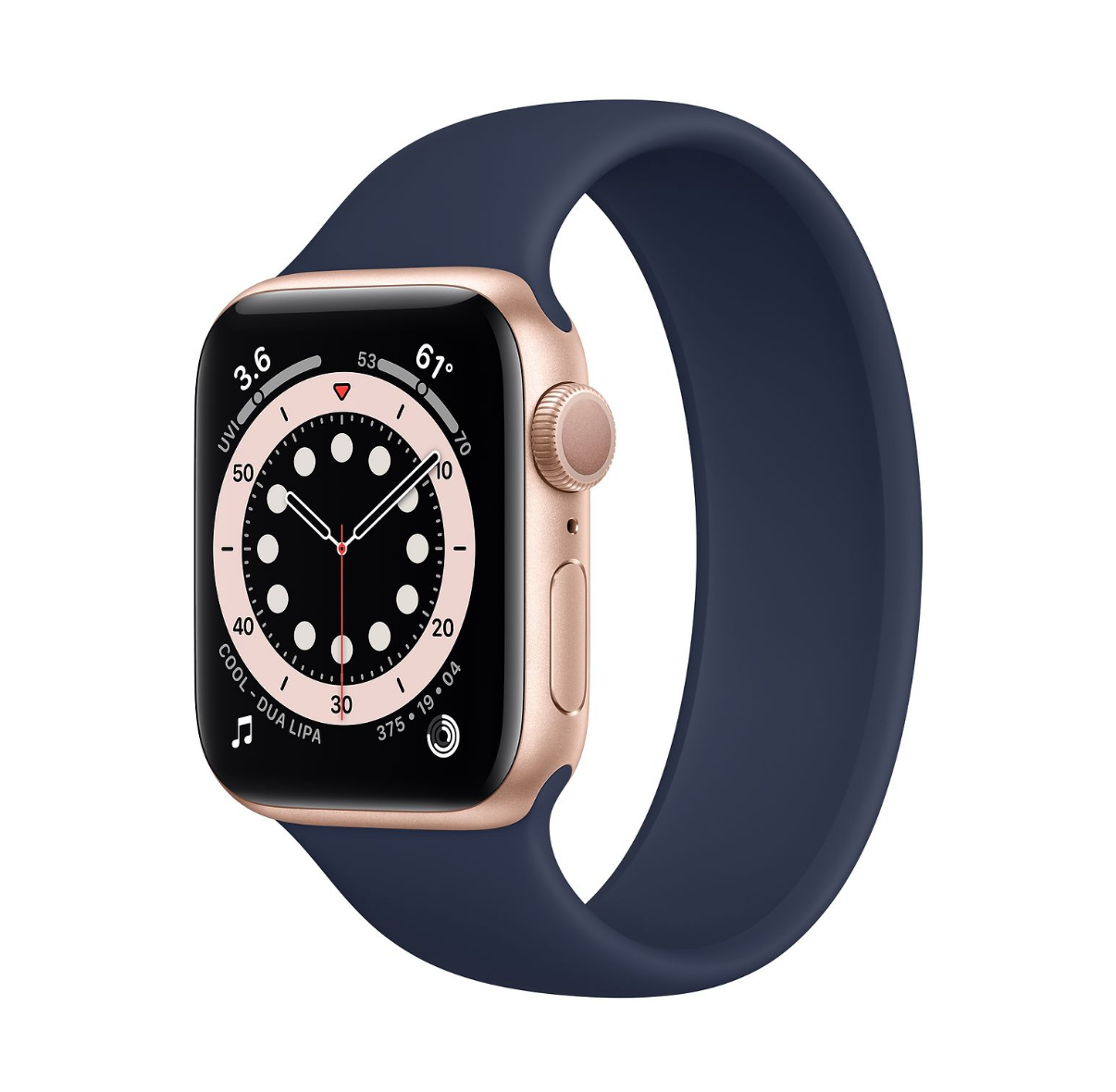
The iPad Pro is not capable of properly running External Displays.

The iPad Pro is not capable of properly running External Displays.

In this case, the iPad Pro is a much better Computer, and it has replaced my MacBook Pro, right? Well...not really.

You see, there are things that the iPad Pro still cannot do. For example, if you plan on connecting multiple Monitors, the iPad Pro is just a mess, the video output doesn’t scale properly and you can only connect one Monitor. With my MacBook Pro, I have a 5K Monitor, a 4K monitor and I’m also running its internal 2K Display, all through a single Thunderbolt 3 Cable, which the iPad does not support at all. Not only that, but I can directly connect to our Thunderbolt NAS and get some insane 1-2GB/s transfer speeds, wheres the iPad is limited to using a wireless connection, via SMB, with significantly lower speeds of just around 10MB/s. 

If you want to do any App Development, there is no XCode on the iPad. Same goes for Video-Editing. Whilst LumaFusion is very good, FCP X on the Mac is still better. Plus, you can run a lot more Pro tools on the Mac, such as LogicProX, Ableton, DaVinci Resolve, Adobe Premiere and Adobe After Effects, all alongside a ton of their plugins. So, if you need any of those, the MacBook Pro is the way to go.

Now, remember when I said that I felt that my MacBook Pro 13” dropped Frames when scrolling through the UI? Well, I can use a tool called Quatrz Debug, which allows me to measure the drops. The iPad Pro on the other hand, has no way to actually measure that unless you open up the Xcode Viewer, but I couldn’t notice any lag or any slow-down whatsoever.


Battery Life

Next up, when it comes to the Battery Life, they both claim up to 10 hours of usage, which neither of these machines can achieve, unfortunately. With my usage, my MacBook Pro gets around 5-6 hours, while my iPad Pro gets around 6 hours. So, pretty much the same.You can detach the Magic Keyboard from the iPad Pro and actually get a better Battery Life that way.


Value 

Finally, having said all of this, which one is worth it the most?

The MacBook Pro starts at $1300 and for that you get a 1.4GHz Intel Core i5 Processor (8th Generation). You also get 8GB of RAM and 256GB of Storage. My MacBook Pro model is the higher-end $ 1800 model, which gets you the more powerful 2.0GHz Intel Core i5 Processor (10th Generation). With this, you get 16GB of RAM and 512GB of Storage.

The iPad Pro could end up costing you more than a baseline MacBook Pro 13”, but it could be just as good, for a lot of people.

The iPad Pro could end up costing you more than a baseline MacBook Pro 13”, but it could be just as good, for a lot of people.

The iPad Pro 11” starts from $800 for the 11” model or $1000 for the 12.9” model. If you add the Keyboard, which I’m assuming most of you will, that would bring the price of the 11” to $1100 and the 12.9” to $1350. So, the 12.9” iPad Pro, with the Keyboard, is actually more expensive than the baseline 13” MacBook Pro. Unfortunately, you only get 128GB of Storage. If you need 256GB, that would make the 13” $1200 and the 12.9” $1450.

Is the iPad Pro really worth it over a MacBook Pro? Especially considering that it is even more expensive? Well, for 90% of people, it actually is. If you don’t need to do any App Development or any high-end Video-Editing, the iPad Pro is actually a much better device than a MacBook Pro. You get a much more versatile device that supports Touch Input and Vertical or Landscape Orientation. It’s great for reading books, it’s great for browsing the web and it’s perfect for Photo-Editing and Graphic Design, thanks to the Apple Pencil.

On top of all this, it will feel way more fluid than the MacBook Pro does. I strongly believe that the iPad Pro is indeed the future. It seems like Microsoft was right from the very start! 

iPhone 13 (2021), AirPods Studio, Apple Glass & more!

We don’t even have the iPhone 12 yet, but we already have some iPhone 13 leaks. Get those snacks ready as we’ll be covering the recent iPhone 13 Leaks, Apple Glasses updates, iPhone 12 updates, AirPods Studio Headphones and so much more!


iPhone 13

Another iPhone, another Camera Module

Another iPhone, another Camera Module

Starting off with the iPhone 13, Twitter leaker Fudge (@choco_bit), who’s been accurate in the past, claims that this is the supposed layout for the iPhone 13 (Right), which would be the 2021 iPhone. He did say that we should take this with a grain of salt, since these leaks are pre-event. So, this could indeed be something that Apple is considering for the iPhone 13 lineup, it’s just that it’s way too early to know for sure if Apple would indeed go down this route.

Regardless, this is our very first look into what could materialise into the iPhone 13 and as you can see, the back is quite a bit different now. We have four Camera Modules, compared to three on the iPhone 11/12. That LiDAR Sensor, from the iPhone 12, has now been moved underneath that four Camera Array. I would say that this does make a lot of sense. If Apple were to add another Module, they would preferably add it in that Triple Camera Array, where the LiDAR Module is currently sitting on the iPhone 12’s. This would be in order to have a consistent design, so the LiDAR Module would be moved somewhere outside of that Array.

Now, you’re probably wondering, what would that fourth Camera be for? Is it a Zoom Camera? Is it one of those strange Colour Filter Cameras that OnePlus added?

Well, it is way too early to know but my personal guess is that it is some sort of Periscope Telephoto Module, similar to what Huawei and Samsung have added. It may possibly be a 5x Optical Zoom Module or something along those lines.The likelihood with a Module like that, is that you can only go from 1x to 5x, anything in between would just be Digital Zoom. However, if you keep the 2x Module and then add a 5x Module, you still retain a sharp Zoom Level in between the two. This is what I believe Apple would do, judging from this design leak.

Speaking of the Cameras, Fudge also tweeted some details about the iPhone 13 Camera System and according to him, the iPhone 13’s model number is D6x and the Main Camera would be a 64MP Module with 6x Digital Zoom. Others have done this in the past. Samsung is a very good example, they added a very high Megapixel count to their Smartphones but as a result, Low-Light Performance was affected negatively. They started having Focusing issues so, as long as you have a tiny Smartphone Sensor, adding more Pixels would just make those Pixels smaller as there’s finite room inside the Smartphone Sensor. Because of this, they would capture less light. This is why Apple is one of the last Smartphone manufacturers that kept the (now) low-res 12MP Sensor, because the lower the MP count, the bigger the Pixels are and the better the Camera is in Low-Light. Anyway, that’s just the Main Module.

Then we would have a 40MP Ultra-Wide Angle Module and a 40MP Telephoto Module with 3-5x Optical Zoom, like I was assuming, with a 15-20x Digital Zoom. These are very likely possibilities. Probably not so much in terms of the the Ultra-Wide Module as it’s already pretty bad in Low-Light, an increase in Megapixel count would just make it worse. But the Telephoto Module would benefit a lot from an increased Megapixel count.

Finally, the fourth Module would actually not be a 2x Telephoto. According to Fudge, it would be a 64MP Anamorphic Lens. So, a 2.1:1 Aspect Ratio that would give you an incredibly wide and cinematic view, especially when shooting video. But, is there really any point in having that if we already have an Ultra-Wide Module? I would say no, and Fudge pretty much agrees. He does say that we should take this with a huge amount of salt. It’s extremely likely that his sources did tell him that these are things that Apple is currently considering doing, but it doesn’t necessarily mean that it will definitely happen. We can’t be sure of that just yet. Also, it seems that Jon Prosser disagrees. He says that the Camera layout of the iPhone 13 would be identical to the iPhone 12, something that ‘LoveToDream’, another accurate leaker, disagrees with. From my understanding, both LovetoDream and Fudge get their info from a Supply Chain source, whereas Jon Prosser gets his info from Apple’s own team, this is the reason why we have some conflicts here.

Given Apples’s history with recycling old designs, we wouldn’t expect any massive changes in that single year.

Given Apples’s history with recycling old designs, we wouldn’t expect any massive changes in that single year.

Aside from that, another change that could be coming to the iPhone 13 is the Notch. As you probably all know by now, the iPhone 12 will still have the Notch. It’s just that it would be smaller, thanks to the repositioning of the Earpiece. We’ve heard some rumors that Apple could be removing the Notch from the iPhone 13 entirely, with them being in favour of a Full-Screen Display. But, knowing Apple and how they like to keep a certain design for as long as possible, I don’t see them giving up on the iPhone 12”s front design after just one year. It would be cool, but I don’t think that’s happening in 2021.

But something that is happening in 2021, is Apple finally dropping Lightning from the iPhone! However, we would not be getting USB C, which we’ve been wanting for so many years now, but instead, the iPhone 13 would have a complete Wireless Charging solution. This means that we would have no Ports on the 2021 iPhone. Instead, we would be getting something that looks like a Smart Connector, which would allow you to connect a Magnetic Charging Cable and charge the iPhone like that. This would be very similar to how the Apple Watch charges.

Now, while that is pretty neat, USB C Charging would still be preferred. Otherwise, this would still be another extra cable that you would have to carry with you, which would be just as inconvenient as it is to carry the Lightning Cable now, when all of your other devices are USB C. But the thing is, this is looking extremely likely to happen.

Fudge reported that this is indeed happening but that you would be expected to charge the iPhone wirelessly instead. Ming-Chi-Kuo has reported the exact same thing and Jon Prosser has also mentioned this as well. They are all saying that one Portless iPhone will be coming next year and that Apple will never add USB C to their iPhones. Bloomberg also reported a similar thing. That Apple will be removing the lighting connector from at least one of their iPhones, in 2021. These are four sources with a very good track-record, all reporting the exact same thing. So, it’s looking quite likely that at least one iPhone 13 would be going fully wireless next year.

So, there you go, that’s how the iPhone 13 is shaping up. This completely wireless iPhone with the same frame as the iPhone 12, possibly the same exact Notch and likely some Camera improvements, which will be focused on the Zoom functionality that is currently lacking.


iPhone 12

When it comes to this year’s iPhone, the iPhone 12, we do have some fresh updates. According to Ming-Chi-Kuo, the iPhone 12’s would not come with Headphones inside the box anymore, in order for Apple to sell more AirPods.

That does make a lot of sense, especially considering the price leaks that Jon Prosser has posted. According to Jon, the 5.4” iPhone 12, which would be the lowest-end model, would start from $650. It will come with an OLED Display, the new A14 Processor and a Dual Camera Module. That’s an insanely low price for new iPhones. The 6.1” iPhone 12 Max would cost $750, followed by the 6.1” iPhone 12 Pro, which could cost $1000, followed by the 6.7” iPhone 12 Pro Max, which would cost $1100.

After the $400 iPhone SE, it seems that the base iPhone 12 is also on the more affordable side.

After the $400 iPhone SE, it seems that the base iPhone 12 is also on the more affordable side.

Aside from the Camera Modules and the Stainless Steel build, the regular iPhone 12’s would still come with all the features that the Pro models come with. Meaning that there hasn’t been a year when Apple had a better iPhone line-up. They obviously had to make some trade-offs to keep that price low and it seems like one of these would be not including Headphones. Unfortunately, one of the other trade-offs would be the lack of any high Refresh Rate Display.

There have been a ton of conflicting reports on this, with some saying that it would have a 120Hz Display, and some saying that it would not. Long story short, according to Display Analyst Ross Young, Apple wants to include an LTPO OLED Display on the iPhone 12’s so that they can dynamically adjust the Refresh Rate from 1Hz, all the way up to 120Hz. This is just like what they’re doing on the iPad Pro, but keep in mind that the iPad Pro has an LCD Display, not an OLED.

Samsung does have 120Hz Displays for Smartphones but the Refresh Rate is fixed. This is what Samsung has been using on their own S20 line and while they’re good, the Battery Life just isn’t that great, at least not on the Exynos models. Samsung will indeed have a 120Hz LTPO OLED Panel this year but according to Ross, they are reserving it for the Galaxy Note 20 and the Galaxy Fold 2.

Apple will only be allowed to use it next year, in 2021. Which means that this year, they will have to choose between a great Battery Life and a constant 120Hz Display, it seems like they’re not choosing the 120Hz at all this year. This is mostly everything new, when it comes to the iPhone 12. 


AirPods Studio

Next up, we have some quick updates on the next-gen AirPods.

So, Jon Prosser mentioned back in May that Apple will be releasing some new over-ear Headphones, just like the Beats Solo’s or Studio. However, rather than calling these the new Beats Studio, they will be marketing these as AirPods. Which means that we would now have three variants of the AirPods. The entry level models, the AirPods Pro and these new AirPods Studio, which are codenamed B515 and will start at $350, according to Jon

Be sure to check out our second Instagram account (@ZONEofCONCEPTS) for more concepts like this one!

Be sure to check out our second Instagram account (@ZONEofCONCEPTS) for more concepts like this one!

Mark Gurman from Bloomberg released a massive report, with a ton of inside details on the new AirPods studio. According to Mark, Apple is actually working on two AirPods Studio models, a premium version with leather-like fabrics and a fitness focused model that uses lighter, breathable materials. The headband is said to be very thin, with full metal arms. Not only that, but Mark says that the ear-pads would be magnetic and that you can indeed replace them with different designs when you wish. This design would allow you to go from fitness mode to ‘pro mode’ so to say, whenever you want. Now, I’m not sure to what extent these ear-cups would be modular, since they do have a lot of tech inside and you can just buy more of these, as it would be quite pricey. I think it’s just the material surrounding it that would be modular and replaceable. 

This is how we’ve modelled our concept (Above) and we decided to base these off of the leaked iOS 14 icon. We’ve made these gigantic ear-cups, held in place by a fairly thin headband. We do have invisible touch controllers on the sides, which would allow you to adjust the volume, skip to the next song, skip to the previous song as well as invoke Siri, which you can also do by saying the magic keyword command.

At a price point of $350, Apple seems to be competing directly with Sony, Microsoft and Bose, with their line of high-end, Noise Cancelling Headphones. Sony is currently the king in this department, with their WH-1000WM3’s and I’m really curious to see if Apple can actually beat them in terms of Sound Quality and of course, Noise Cancelling. 

Personally, I’m not really into over-ear Headphones. I always find them to be way too big. They’re perfect on a plane but, aside from that, I would never use them. I do prefer in-ear Headphones, like the AirPods Pro, so do let me know down below, which team are you?


Apple Glass

Finally, just some quick updates on the Apple AR Glasses. In a previous video, I talked about those massive leaks from Jon Prosser. 

Jon Prosser also said that Apple is working on a circular version of their Glasses, which would be called the “Steve Jobs Heritage Edition” and they would be more premium and likely more expensive than the usual model. However, Mark Gurman calls this, and all of the leaks that Jon Prosser covered, as complete fiction.

All the patents we’ve sen so far point to something similar to the Oculus Quest, which we absolutely loved.

All the patents we’ve sen so far point to something similar to the Oculus Quest, which we absolutely loved.

Mark Gurman said that there are two devices in the works right now, rather than just one, this is what I’ve personally heard as well. One device is the mixed AR and VR Headset, similar to the Oculus Quest. This is called N301 according to Mark Gurman, it could be announced as early as 2021 (matching Jon’s report) and released in 2022. The other model would be those pure AR Glasses (N421), which would not launch until the end of 2022 or even 2023.

Now, we have seen a ton of Apple patents on both of these designs, but most of the patents seemed to show the Oculus Quest style Headset, rather than the true AR Glasses design that we’re all looking forward to. My guess is that it’s somewhere in between. The AR/VR Headset would launch in late 2021, like Jon reported, and then the actual AR Glasses would launch in 2022. These ones will need more tweaks, especially considering the insanely high Resolution Displays. These would be 8K Displays in each eye, if we’re going by CNET’s 2018 report on this.

So, there you go! We still have quite some time to wait until any of these come out, so do let me know, which of these products are you excited for the most?

MacBook Pro 13 (2020) - 25 Things You Didn't Know!

I’ve just got my hands on the brand new 2020 13” MacBook Pro, the one that I’ve been waiting for, for a while now. But, I’m not going to open it and give you guys my first impressions just yet, that would be in a different video. In this one, I want to tell you 25 interesting things that you need to know about the new 2020 MacBook Pro!


1) Two Models

First things first, if you plan on buying a new 2020 MacBook Pro, Apple actually sells two very different models of it. If you go onto Apple’s website, you won’t be able to tell which is which, as they both look identical. But, as a matter of fact, these two models couldn’t be any more different.

The base-model starts at $1300/£1300 and then the high-end model starts at $1800/£1800. Think of these two as the iPhone 11 and the iPhone 11 Pro. While the ’11’ has most of the features that the ‘Pro’ has, the ‘Pro’ still has quite a few advantages over the ’11’ that give it its ‘Pro’ name.


2) Four vs Two Thunderbolts 

Now, since you can indeed select a low-end model and spec it out so that it ends up being more expensive than the high-end model, the easiest way to tell them apart is by looking at the number of Thunderbolt 3 Ports that they have. The low-end model will always come with two, while the high-end model will always come with four. 

I would say for most people, two is enough. But if you’re more of a power user and you need to connect a 5K Monitor, eGPU and a few HDD’s, then getting the four Port model is something that I would definitely recommend.  Also, if you have the four Port model, you would be able to charge it from either side of the Laptop. The two Port model has both Ports on the left-hand side. 


3) Baseline 8th Gen

Something else that you should know is that Apple advertises the new Intel 10th Generation Processors on these MacBooks, but the baseline model still has the 8th Generation, from last year.


4) Almost the Same 

In fact, the baseline model is pretty much identical to the 2019 model, with the exception of the Keyboard, which has now been replaced by the new scissor-style mechanism, just like we got in the 16” MacBook Pro and the 2020 MacBook Air. Finally, goodbye Butterfly!


5) Thickness

The 2020 MacBook Air is actually thicker, at its thickest point, that the latest 13” MacBook Pro.

The 2020 MacBook Air is actually thicker, at its thickest point, that the latest 13” MacBook Pro.

Interestingly enough, both models of the MacBook Pro are now thicker at 1.56cm, compared to the 1.5cm of the previous models. Fun fact, while the MacBook Air is much thinner at its thinnest point, measuring just 0.41cm, at its thickest point the Air is actually thicker than the Pro, measuring 1.61cm, compared to 1.56cm. Still, while the 13” Pro did get thicker this year, it is still noticeably thinner than the 16”, which measures 1.62cm. 

Fun fact number two, the new 2020 13” Pro is now thicker than the old 15” from 2019, which was 1.5cm thick. This thickness increase was made in order to accommodate the new Keyboard, which does have quite a bit more key travel. 


6) Weight

On top of this, the new Pro is also heavier at 1.4kg, compared to the 1.29kg of the MacBook Air or the 2kg of the 16” MacBook Pro. However, the footprint is identical to what we had on the 2019 model. 


7) Keyboard 

Speaking of the Keyboard, even though this now uses the old style Scissor-Switch mechanism, just like on the 2015 13” MacBook Pro, the Keyboard is quite a bit different.

We don’t get as much key travel, but the keys are way more stable than before. In a way, it’s sort of like the child of the Butterfly Keyboard and the old 2015 style Keyboards. I personally like it a lot and I can type so much faster from it, with way less typing errors than before. Speaking of that, if you do a lot of typing, the MacBook Air might be a much better choice.

Because of its wedge shape design, it is much more comfortable to type on as the Keyboard itself is at an angle, compared to the straight Keyboard of the MacBook Pro. 


8) Escape & TouchID

We also get a dedicated Escape Key, which is really nice to have and the TouchID Sensor is now a bit raised, just like on the MacBook Air, to bring it in line with the taller Keyboard. 


9) Smaller Trackpad

Another change that we get is in terms of the Trackpad, which is a tiny bit narrower than on the 2019 models. This is probably to prevent any accidental touches when typing. 


10) Double the Storage

You can now get double the Storage, at a price of course.

You can now get double the Storage, at a price of course.

Aside from this, we did get double the Storage on the baseline model, from 128GB, to 256GB, which is nice. Aside from that and the Keyboard, the baseline is identical to last year’s model. 

The high-end model also got double the Storage, by giving you 512GB, compared to 256GB and it also now gives you the option to bump that to 4TB of Storage, up from 2TB. The model with two Thunderbolt 3 Ports can only be configured up to 2TB. 


11) RAM Amount 

Another difference that you should be aware of is that, while the two Port model can be configured to up to 16GB of RAM, the four Port model can now be configured to up to 32GB of RAM. This is thanks to the new Intel 10th Generation Processors, which support LPDDR4X Memory.


12) RAM Speed

On top of that, while the two Thunderbolt Port model supports 2133MHz LPDDR3 Memory, the four Thunderbolt Port model supports much faster 3733MHz LPDDR4X Memory. So, if you’re into photo-editing, that faster RAM would come in handy. 


13) CPU Differences

Ok, but what about the actual CPU? Is it really worth getting the Intel 10th Generation models or is the 8th Generation enough?

On Single-Core Performance, the 2020 13” out-does the 16”.

On Single-Core Performance, the 2020 13” out-does the 16”.

Well, we actually do get around a 35% faster Single Core performance on the 10th Generation model, which is not gigantic but it is a fair gain indeed. In fact, the 13” Pro with four thunderbolt 3 Ports, even the i5 model, now scores the highest in ‘Geekbench 5’. It’s higher than even the 16” MacBook Pro and the Mac Pro, so that’s very impressive.

If you’re mostly into simple tasks that only require one Single CPU Core, you’ll definitely notice an improvement. Multi-Core performance is up by close to 20%, so overall, we are indeed getting some pretty good gains by upgrading to the four Thunderbolt 3 Port model. 


14) i5 vs i7

So, the real question here is, should you get the i5 version of the four Thunderbolt 3 Port model, or the i7?

Well, the difference between the two is pretty much negligible. While the i7 can boost up to 4.1GHz, compared to the 3.8GHz of the i5, it also has 8MB of L3 Cache, compared to 6MB. They’re both Quad-Core Processors and they’re both thermally restricted so they will never be able to sustain that turbo boost clock. This means that they are actually way more similar than you would think. 

If you plan on getting the four Thunderbolt 3 Port model, just stick with the i5. If you plan on getting the two Thunderbolt 3 Port model, it’s same story here, just stick with the base CPU. 


15) Graphics

Something that is a pretty big difference, are the Graphics. First of all, none of these have Dedicated Graphics. If you need a high-end GPU for intensive video editing, 3D modelling or even gaming, just go with the 16” Pro instead. 

Now, while the baseline model still gets the Intel Iris Plus Graphics 645, the four Thunderbolt 3 Port model gets the new Intel Iris Plus G7 Graphics, which is the highest-end Integrated Graphics that Intel make. This new Integrated GPU features improved Video Encoding and 64 Execution Units, compared to 48.  This means a pretty big boost in graphical performance in gaming and video editing. So, if you care about any of those, the four Thunderbolt 3 Port model is much better. 


16) 6K Support

Also, thanks to these new Graphics, the new 10th Generation Intel Processor and a tweaked Thunderbolt 3 interface, the four Port model can now drive a 6K Display, such as the Apple Pro Display XDR. The two Thunderbolt 3 Port model can only drive up to 5K Resolution. 

Not only that, but even the new 2020 MacBook Air, which also comes with 10th Generation Intel Processors, can drive a 6K Display, whereas the baseline 2020 MacBook Pro cannot. 


17) VS MacBook Air 

The TouchBar isn’t for everyone, but I actually quite like it.

The TouchBar isn’t for everyone, but I actually quite like it.

In that case, you might be wondering, isn’t a 2020 MacBook Air just better than the 2020 MacBook Pro? Well, not really. You see, while you do technically get a faster Processor and even G7 Graphics, the Fan on the MacBook Air isn’t connected to the CPU’s Heatsink. In English, the MacBook Air is like a high-speed car that slows down considerably after 2-3 seconds, just to cool itself down. However, the MacBook Pro, even the baseline, doesn’t have this issue at all. 

So, for very simple tasks such as web-browsing or emailing, the MacBook Air would indeed be better than the baseline MacBook Pro, once you do anything more intensive than that, the Pro will be able to sustain those higher clock-speeds for much longer. Also, the Pro does have a DCI-P3 Display, which makes it much better for photo or video editing. We also have the TouchBar, which some people like and some don’t. I do like it, so I’d rather have it included than not have it at all. 


18) Cooling 

Speaking of that Cooling, there is actually a pretty big difference between the baseline MacBook Pro and the high-end model. The two Thunderbolt 3 Port model only comes with a single Cooling Fan, while the four Port model comes with two Fans. This not only means that the four Port model will run cooler, but it will also be quicker as those two Fans don’t have to spin as fast as that single Fan. So again, if you plan on doing anything more intensive, go for the four Port model. 


19) Old WiFi

Something that I was very surprised to see, is that none of the models come with WiFi 6. In fact, not even the MacBook Air comes with it, meaning that no Macs to this day come with WiFi 6. Instead, they all come with the previous Generation WiFi 5 (or WiFi 802.11ac), which was introduced back in 2013.

This means that you will get slower WiFi speeds than on other 2020 or even 2019 Windows Laptops. What is very strange here is that the new iPhone 11’s, as well as the new iPad Pro 2020, both feature WiFi 6. It’s just Macs that Apple decided to leave it out of. Here’s a fun fact, Intel actually embedded WiFi 6 support onto their 10th Generation Processors. Now, the Chips that Intel made for Apple are exclusive to Apple, meaning that Apple had to intentionally tell Intel to remove the WiFi 6 functionality from their Chips.

My guess is that they’ve done this in order to keep the cost low as we do know that Intel does charge significantly more for their 10th Generation Processors, when compared to the 8th Generation. That could be the reason why Apple managed to double the Storage that they offered, which at the end of the day, for the end-user, is way more important than faster WiFi. 


20) Webcam

Something else that Apple hasn’t changed, is the Camera. We still get a 720p Webcam, which is pretty much a joke when compared to the 4K 60FPS Front Camera that we get with the new iPhones.

I know that the Display of a MacBook is much thinner than a Smartphone, but Apple could’ve at least added a 1080p Camera, like many other Windows Laptop manufactures have done. 


21) Microphones & Speakers 

On paper, you shouldn’t notice any difference between either model…

On paper, you shouldn’t notice any difference between either model…

The Microphones and the Speakers of these two models of the MacBook Pro are identical, at least from what Apple states on their website.

However, some Reviewers, such as Max-Tech, did tests and found out that the four Thunderbolt 3 Port model actually does indeed have noticeably better Speakers. In fact, the MacBook Air 2020 now has more Bass than the baseline 13” MacBook Pro. 


22) Base 13 vs Base Air

If you’re debating between the base Air and the base 13” Pro, for most people I would say that the base Air is more than enough. But for $300 more, the base Pro does give you a better Display that’s brighter and more colourful, you also get a TouchBar and better performance under load. But, the Air is a tiny bit lighter and thinner and also has a one hour longer Battery.  So it’s really up to what you need the most. 


23) High-End 13” vs 16”

Now, if you plan on going for the four Thunderbolt 3 Port model, this is where it gets tricky. It does cost $1800, but the moment you upgrade anything on that, you’re already better off with the baseline $2400 16” MacBook Pro. This offers you a much more powerful Six-Core Processor, a larger Display, better Battery Life and a Dedicated GPU for a massive boost in GPU performance.

So, if you plan on doing any serious work, in terms of video editing, 3D modelling or programming, just get the 16” MacBook Pro. It is significantly larger and heavier, but you do get an even bigger difference in performance. 


24) 14 Inch is Coming

For me, this MacBook Pro is almost perfect. If only it had a larger 14” Display and thinner Bezels just like Apple did with the 16” MacBook Pro. Even though we’ve seen loads of leaks & rumors on this upcoming MacBook Pro 14” this is still pretty much the exact same design.

However, recent rumors are saying that the new 14” has been pushed into 2021, so if you were on the fence about buying a new 13” Pro, it is unlikely that we’ll see another update this year.


25) I might switch

Finally, I might actually be switching to it. You see, I don’t edit videos anymore and the most intensive task that I do is Photoshop and Lightroom, which I don’t even do on a daily basis. The 13” Pro is perfect for me, especially on the go. The only question is, can it run my 5K Monitor and my 4K setup?

Find that out and much more, in the Full Review, which is coming out very soon!

MacBook Air (2020) - Full In-Depth Review! (After 3+ Weeks of Use)

Every few years, every few decades, there is this one product that completely changes everything. A product that’s so new, so innovative that it breaks the boundaries of what we believed was even possible, one of those products was…the MacBook Air.

Originally introduced back in 2008, the MacBook Air was the thinnest Laptop in the world. It was so thin, that Steve Jobs even took it out of an envelope and the audience was amazed! Not only that, but the MacBook Air ended up giving birth to the UltraBook category of Laptops that we have now. Those very thin, light and portable Laptops that tens of millions of people own. 

Aside from being extremely thin, the original MacBook Air was extremely innovative in many other ways. It had a multi-touch Trackpad that supported the same gestures as the iPhone that was introduced a year prior. Gestures such as pinch to zoom, rotating a photo with two fingers, swiping with three fingers from one Home-Screen to another and much more. It removed the Disc Drive and featured the smallest HDD ever, in a Laptop, alongside the ability to upgrade that to a Solid-State-Drive, making the MacBook Air the world’s first Laptop to come with Flash Storage. 

An iconic reveal for an iconic device.

An iconic reveal for an iconic device.

However, the First Generation MacBook Air was flawed. The low power Intel Core 2 Duo Processor and that painfully slow 4200rpm, 80GB HDD alongside the lack of any Ports aside from a single USB 2.0 Port, a micro-DVI Port and a 3.5mm Headphone Jack made it quite unpopular at first. All that and the insanely high $1800 starting price point, which back in 2008, that was a lot. Then, just two years later in 2010, Apple released the Second Generation MacBook Air. 

This one featured a new tampered design without a pop-out slot for the Ports. It added a second USB Port on the other side, it dramatically improved the performance, thanks to Intel’s new Core 2 Duo Processors. Also, Apple now included Solid State Storage as standard on all models of this MacBook Air and dropped the price by $500, bringing it down to $1300. Not only that, but Apple also released a smaller 11-inch model, which I actually happened to have, a few years ago. This generation, the Second Generation design, was what Apple sold for the next eight years, up until 2018. I mean sure, we did get improvements in terms of performance and higher capacity Storage options, but the design has remained unchanged.

But then in 2018, we got the big new Third Generation, which finally updated the design to bring it in line with the MacBook Pro’s, which got a big update in 2016. The 12” MacBook, which was re-introduced in 2015, with that space grey thin design, sparked this new generation of MacBooks. This was the biggest update that the MacBook Air line has ever received as we finally got a Retina Display, that Butterfly Keyboard from the MacBook Pro’s, which ended up being very controversial, and we also got multiple colour options such as Space Grey & Gold, aside from just Silver. In 2019, we got a very small update to the 2018 model, with a slightly improved Butterfly Keyboard mechanism and a True Tone Display, but that was mostly it.

Now, we have the 2020 model, which I’ve been using for quite a few weeks now and I’m very comfortable giving you my full In-Depth Review on it. This was a pretty long intro, so without any further ado, here is my In-Depth MacBook Air 2020 Review, covering the Design, Display, Keyboard & Trackpad, Camera, Microphone & Speakers, Performance, Battery Life and finally, Value!


Design

Starting off with the design, I have to say, Apple Laptops are definitely my favourite and the MacBook Air is no exception. Just like the 2018 model, it is made out of a single piece of Aluminium and it comes in three colours, which are Space Grey (the one that we have) as well as Silver and Gold. If you’re planning on keeping your MacBook Air for many years, you should be aware that the Space Grey and the Gold colours have coatings on top of the Silver Aluminium. This means that if they scuff, they will reveal the Silver underneath it. Therefore, the Silver model is the most durable over-time. I’ve always taken really good care of my MacBooks and I only have a few minor scuffs on my 2015 12” MacBook and my 2017 MacBook Pro but, if you do want to get the Space Grey model, and you take very good care of it, you should be fine.

The MacBook Air still features the same teardrop shape design, where the Body gets thinner towards the front and thicker towards the back, with pretty much no body flex at all. This is really one of the sturdiest Laptops that I have ever seen. It’s pretty much a tank in terms of Build Quality,  nothing to complain about here.

For a Device with ‘Air’ in the name, this is pretty bulky.

For a Device with ‘Air’ in the name, this is pretty bulky.

But, something that definitely shocked me when I took it out of the box, was just how heavy it was. I’m coming from a 15” 2019 MacBook Pro, and I’ve used a 12” MacBook for years before that as a secondary MacBook, and the MacBook Air is very heavy compared to the 12”. It’s 1.29kg, compared to the 0.92kg of the 12” MacBook. So, if you’re coming from a 12” MacBook, the MacBook Air will feel extremely heavy. If you’re coming from a MacBook Pro 13”, you probably won’t even be able to tell the weight difference as the MacBook Pro 13” weighs 1.37kg, so they’re both extremely similar. So, while the MacBook Air is currently the lightest Laptop that Apple sells, as the 12” MacBook got discontinued, it is not as light as you would expect it to be, considering its’ ‘Air’ branding. Also, fun fact, the 2020 MacBook Air is now 40 grams heavier than the 2018 and 2019 models. 

Fun fact number two, the 2020 MacBook Air is also thicker this year, coming in at 1.61cm at its thickest point, compared to 1.55cm like the 2018 and 2019 models were.  I’ll explain why the 2020 MacBook Air is thicker and heavier, later on.

But overall, design wise, I am extremely impressed. My only two complaints here is that I wish the MacBook Air was lighter and the Bezels were thinner. When comparing the MacBook Air against something like a Dell XPS 13,  there’s a gigantic difference in terms of the Bezel sizes. The MacBook Air looks more like a 2016 Laptop, than a 2020 one. I really do hope that Apple updates the Bezels with the next model, because it’s already starting to look quite outdated. 


Display

Speaking of the Bezels, let’s talk about the Display. We have a 13.3” Display, which is very comparable to a lot of Windows Laptops. But, we do have a 16:10 Aspect Ratio, meaning that the MacBook Air, just like all the other MacBooks, has a taller Display compared to most Windows Laptops. I absolutely love this. Having more vertical screen-real estate is great for reading articles or for when you’re writing text. Some Windows Laptops, like Microsoft’s Surface Laptops or the new Dell XPS 13”, have started adding a 16:10 Aspect Ratio, but most manufacturers unfortunately didn’t.

The MacBook Air hits that sweet spot, in terms of the Display.

The MacBook Air hits that sweet spot, in terms of the Display.

In terms of Resolution, we have a 2560x1600 Resolution Display, which at 227 PPI, I cannot see any Pixels on this from the regular viewing distance. It’s an incredibly sharp Display, text looks like printed paper, it’s just a joy to look at. On the Windows side, we don’t really have Laptops with a 2K Display, it’s usually either 1080p or 4K. I find that 4K is overkill for Laptops. They’re very sharp, but 4K consumes a lot of power and the Sharpness from the regular viewing distance is almost the same as 2K. With 1080p, it does offer the most Battery Life, but I can easily tell that the Display isn’t as sharp and text is a bit too blurry for me, on a 1080p 13” Display. So, 2K is definitely the sweet-spot here and I really do hope that more manufacturers start adding such Displays, even on the Windows side as well.

Colour wise, we have 93.3% sRGB coverage, and 70.8% DCIP3 % coverage. While this is actually very good for a Laptop and one of the very best Displays on any Laptop out right now, if you’re into video editing or photo editing and you need the most colour accurate Display, just get a MacBook Pro instead. MacBook Pro’s have 100% sRGB coverage and 98.9% DCI P3 coverage, meaning that they can display about 30% more colours than the MacBook Air.

Now, I’m not saying that you cannot edit video or photos on the MacBook Air at all, you can definitely do that without any issues. But, if photo or video editing is what you do on a daily basis, then I would look at something like a MacBook Pro, just because of that even wider Colour Gamut.

The MacBook Air has just over 400 Nits of Brightness, compared to 500 Nits on the MacBook Pro or 600 Nits on the 2018 and 2020 iPad Pro’s. Now, while that is still a very high number and one of the highest on any Laptop out there (most Laptops have around 350 Nits of Brightness), again, if you’re into photo editing and you need a brighter Display or you just like working outdoors a lot, then a MacBook Pro is a better choice. But, when indoors and in most cases, 400 Nits is more than enough for me. I almost never even max out the Brightness.

Finally, the MacBook Air also features a True Tone Display. Essentially, if you enable this in the Settings, the White Point of the Display will automatically match the light around you. Just like a piece of paper, if the lights in your room are yellow, the Display will turn yellow to match that light, making it very easy on the eyes for when you’re reading or writing. I do have to manually disable this setting every single time I want to edit a photo or a video, as I do want to preserve the colour accuracy. It does get a bit annoying having to constantly remember to do that every time you want to do any colour work. I wish Apple had True Tone automatic so that it turns off when you open up Final Cut or Photoshop. 


Keyboard & Trackpad

Now, the third very important part of any Laptop, for me, is the Keyboard & Trackpad. I am very glad to say that the Keyboard has finally been improved, or should I say, completely replaced.

The troubled Butterfly Keyboard is gone, which Apple introduced with the 12” MacBook in 2015, then the MacBook Pro’s in 2016 and the MacBook Air in 2018. That Keyboard was flawed from the very start. It had almost no key travel, so it was very difficult typing on it and it broke extremely easily. Apple ended up being sued multiple times, you probably know that whole story already.

The really good news here is that we get the same Keyboard as on the new 16” MacBook Pro. This is a more standard Scissor Switch Keyboard, very similar to what we had on the Second Generation MacBook Air from 2010. The only difference being that the keys are now even more stable and they feel even better to type on, compared to the Second Generation MacBook Air.  In fact, the entire 12 page Review video was fully scripted on my MacBook Air. I even scripted a few other videos on it, including the OnePlus 8 Pro Experience and about three or four more recent videos. I have to say, the typing experience on this MacBook Air is the best I have ever had on any Laptop, even better than on the 16” MacBook Pro.

A very notable improvement, with a slightly less notable Fingerprint Reader

A very notable improvement, with a slightly less notable Fingerprint Reader

The fact that the entire MacBook is much smaller than the 16” Pro, you don’t have this massive board of Aluminium which you’re resting your palms on. Instead, you’re typing on the entire Laptop, if you know what I mean, rather than typing on a Keyboard that’s inside a gigantic Laptop. It just feels much more comfortable. Also, the fact that you have this teardrop/tapered design makes it so much more comfortable to type on as not only is the Keyboard angled when you type on it, but it doesn’t feel as sharp and raised on your wrists as a MacBook Pro does.

Also, the arrow keys are now back to being that inverted ’T’ shape. Funnily enough, the only thing that I miss about the Keyboard from my 15” 2019 MacBook Pro, is the Touchbar. Yes, I do miss having it. I mostly used it in Word for changing some text presets or for quickly adjusting the Volume or the Brightness. I wasn’t using it a lot, but now that I don’t have it anymore, I do kind of miss it. Luckily, we do have a Fingerprint Reader built into the Power Button, which is a bit recessed compared to the rest of the keys, but other than that, I really have no complaints.

The Trackpad is outstanding as well. Trackpads on Macs have always been the best ones in the industry and this is no exception. It is a bit smaller than on the 13” MacBook Pro and way smaller than on the 15” or 16” models, but it’s still larger than on most Windows Laptops. It uses a Haptic Motor underneath it, so the Trackpad doesn’t click but that Haptic Engine gives you the impression that you pressed it, even though the glass itself doesn’t move.


Camera, Microphones & Speakers 

The 2020 Air has the same Camera as the 2018 model. It’s a 720p Camera, which is far inferior to the iPad or the iPhone Camera.  I know the screen is pretty thin but Apple could’ve still added a 1080p Camera there. The quality just isn’t great.

The Microphones have been improved as we now get a Three-Mic Array with Beam-Forming. The Speakers have a deeper bass as well as support for Dolby Atmos Playback.


Performance 

Now, we get to move to the Performance section. This is where I have the most to say as, aside from the Keyboard upgrade, this is where the other big changes are.

First off, the 2020 MacBook Air is Apple’s first Mac to move onto Intel’s new 10th Generation Processors. They actually got released in September of last year, so not that new. Anyway,  we get a 10th Generation i3, i5 and i7 mode but, don’t be fooled, this is not comparable in any way to a Desktop Class i3, i5 or i7, or even a MacBook Pro’s i3, i5 and i7.  These are all Intel’s Low Powered Y Series Processors and in fact, these Chips are basically the successor to Intel’s Core M Processors, found in the 12” MacBook from back in 2015. These are all some very low power 10w Processors that don’t even require a Fan.

The big change this year is that we do get Four Cores in a MacBook Air, something that only the 15” models used to have back in the day and something that the 13” Pro added in 2018. But, if you do want the Quad-Core CPU models, those are the i5 and the i7 but not the i3. The i3 is still Dual-Core, this is the one that I have.

So which one is right for you, and should you pay extra for the i5 and the i7 models? Well, I’ll tell you straight away, don’t buy the i7 model. The performance difference between the i5 and the i7 is almost nothing, you basically get the exact same experience, for $150 less. The real question is, should you get the Dual Core i3 model or upgrade to the Quad-Core i5 model instead? 

The 2020 model looks to perform very well (on paper).

The 2020 model looks to perform very well (on paper).

Well, performance has indeed been improved from the 2019 and 2018 models, even on the base i3 model, and the Single Core performance between the two is almost identical. In fact, the MacBook Air actually scores the highest, in Single Core performance, compared to all the other Macs out there, including the 16” MacBook Pro and the Mac Pro. If you do a lot of Single Core tasks, such as word processing, browsing the web or even watching YouTube videos, you’re better off with the Dual Core i3 model as the Battery Life would actually last you longer on that one.

But if you do want to future proof it and maybe use it for a few more years, or you’re just someone that’s a bit more demanding in terms of what you do on your Laptop, I highly recommend getting the i5 model. You not only get two extra Cores for much higher Multi-Core performance, but you also get a much more powerful GPU. This is the G7 variant of the Iris Plus Graphics, which is noticeably more powerful than the G4 that you get with the i3 model. The i7 also has the G7 GPU, in case you’re wondering. 

Now, something that does directly affect GPU performance, is the amount of RAM. As Intel’s Integrated GPU uses part of your RAM as Shared Video Memory. The more RAM you have, the more memory the GPU will also have, and the better overall performance you’ll get. I highly recommend upgrading to 16GB of RAM. Mine only had 8GB of RAM and my usage was pretty much maxing that out all of the time. This meant that the system felt a bit sluggish most of the time, even when I was just scripting and had a few pages open in Safari. So, 16GB of RAM is a must. Upgrading to the i5 over the i3 isn’t a must but I would suggest that as well, if you plan on using this for more than three years. 

The RAM has had a massive boost.

The RAM has had a massive boost.

The MacBook Air now has the fastest RAM that Apple has ever put in a MacBook, this is now 3733MHz RAM, compared to the 2133MHz RAM that the 2019 MacBook Air had, or the 2666MHz that the MacBook Pro has.

By now you’re all probably wondering, how does the new MacBook Air compare to the 13” MacBook Pro? We do get what looks to be faster Processors than the Pro, we also get a much better GPU and we also get much faster RAM.

Well, I’m sorry to break it to you, but the MacBook Pro 13” is still far more powerful than the MacBook Air. Ironically, this is not because of the components, which are indeed more powerful on the MacBook Air, but because of Cooling. The MacBook Air only has one single Fan for Cooling, whereas the MacBook Pro 13” can have two Fans, if you go for the higher end model with four Thunderbolt 3 Ports. That one Fan on the MacBook Air isn’t even connected to the CPU’s Heatsink. Instead, it just randomly sits there inside the Case, as if it got disconnected and fell, because of this, thermals on this Laptop are bad. 

Whenever you’re doing something more intensive, such as video editing, the CPU gets as hot as 100 degrees on the MacBook Air, that Fan doesn’t seem to help at all and the performance takes a big hit. 

It doesn’t actually throttle, as the Clocks still remain above the base 1.1 GHz Clock on both the i3 and the i5, but it gets very close to that number when you’re doing some very intensive tasks, rather than staying at the Turbo Boost of 3.2 or 3.5GHz. This is the only reason why the MacBook Pro 13” can outperform it. 

So, why has Apple done such a thing? Why is Apple intentionally limiting the thermal performance of the MacBook Air? Is it so that you upgrade to the 13” Pro? Not necessarily.

A view from the inside.

A view from the inside.

You see, the Y series Processor that is inside the MacBook Air is actually a Fan-less design, whereas the U series Processor that is inside the 13” MacBook Pro, is not. As per Intel’s own recommendations, the MacBook Air doesn’t actually need a Fan at all, whereas the Pro does. When Apple updated the MacBook Air in 2018 with the Third Generation design, they didn’t even have to include a Fan at all, because this is the same CPU design as the Intel Core M inside the 12” MacBook, which didn’t even have a Fan at all. But Apple decided to include a Fan in the MacBook Air, just for the sake of longevity. When Intel added two more Cores and therefore more heat, Apple decided to just stick with the same Cooling as they had the year prior.

So if you plan on doing any video or photo editing, the MacBook Air can easily handle that, even 4K video editing for that matter. It’s just that the export times would be much longer compared to a 13” MacBook Pro or not even to mention a 15” or a 16” model. If this is something you do on a daily basis, just don’t buy the MacBook Air, get a MacBook Pro instead. If it’s just occasional photo and video editing that you do, the MacBook Air can still handle that quite well.

So, what about gaming? First off, don’t buy a Mac for gaming and secondly, if you do buy a Mac for gaming, don’t buy the MacBook Air. It’s literally the worst option, for gaming, out of all the Macs that Apple sell. Again, even if the GPU is far more powerful than on the 13” Pro, because of that Fan not being connected to the Heatsink, gaming performance is pretty bad on the Air. You can play some very lightweight games such as Hearthstone, but when it comes to even Fortnite or most of the SteamGames, which are actually 32-bit games and are no longer supported, you’re out of luck.

Something that I do like a lot about the MacBook Air is that it comes with two Thunderbolt 3 Ports. Thunderbolt 3 is the fastest Port on any consumer device out there right now, with speeds of up to 40Gb/s or 5GB/s.

Gaming on a Mac? We don’t recommend it.

Gaming on a Mac? We don’t recommend it.

You can not only use this to connect to Thunderbolt 3 Docks, which gives you a ton of extra Ports by just using a single Thunderbolt 3 Cable, but you can also use it to connect to a 5K Monitor, two 4K Monitors or even one 6K Monitor.  The MacBook Air does support Apple’s Pro Display XDR at full Resolution, something that ironically, not even the iMac Pro supports. This is because the iMac Pro is using an older Thunderbolt 3 Controller. 

You can also use Thunderbolt to connect an External GPU for some incredible GPU performance, which won’t be throttled. In this case you might be wondering, what’s the gaming and video editing performance?

Well, in Fortnite for example, on Native Resolution & Medium Settings, the MacBook Air was averaging around 10fps. With an eGPU attached, a Vega 64 in this case, we were getting around 60fps on average. So a pretty big difference. In FCP X for example, exporting our Blind Camera Comparison, took 1h:15min without an eGPU and just 22 minutes, with the Vega 64 eGPU attached. This was with the eGPU connected directly to the MacBook Air. If you connect it to a Monitor first and then to the Air, you would get even higher performance. 


Battery Life

What about the Battery Life? Well, Apple actually dropped the Battery Life from 12 hours, which is what we had in 2019 and 2018, to 11 hours.

The Battery is actually the exact same size as last year, 49.9 Watt-Hour. The increase in the thickness is only due to the Keyboard, which needed more space to travel and then, because the body got thicker, it also increased the weight. In terms of how much of those 11 hours I got, I personally only got about five to seven hours, seven hours at most.

My use case scenario on the MacBook Air was pretty light. I used it mostly for scripting & researching, so I had about 20 Tabs open all the time. I did a tiny bit of Photoshop work and I also had Slack open, which consumes a lot of Battery. With this use case scenario, I got about 6 hours on average. 


Value 

In the end, is the MacBook Air 2020 worth it? Well, let’s see. 

Compared to the 2019 model, we get a Quad-Core Processor option, we get a better GPU and a much better Keyboard. We also get 256GB of Storage on the baseline model, compared to 128GB like we got before. You get all of this for $100 less. The new MacBook Air starts from $1000, or £1000 in the UK. This is indeed for the Dual-Core model, the Quad-Core is $100 more, but there you go, the MacBook Air was never a better deal that it is now. 

So, for any casual user, I would highly recommend it. For people that want something more powerful and much better for regular photo and video editing, definitely consider the 13” Pro but don’t get one right now, because there will be a newer model, with that updated keyboard, coming out very very soon. So hold off for that model instead.

That 14” MacBook Pro that we’ve seen rumoured is likely to get released by June. If that is indeed the case, I might be upgrading, or downgrading, depending on how you put it, from my Eight-Core 2019 15”. 

iPhone SE (2020) - 20 Things You Didn't Know!

The Second Generation of one of Apple’s most beloved products, the iPhone SE, which was originally introduced back in 2016, is finally here! The $400 flagship iPhone, kind of. This will indeed be one of Apple’s best selling iPhones of all time.

So, without any further ado, here are not 5, not 10, not 15, but 20 interesting facts about Apple’s iPhone SE 2020.


1) SE Name

Firstly, why is it called the iPhone SE? Why not, for example, iPhone 11 Lite or iPhone 9? Well, “SE” actually comes from “Special Edition”. Back when the original iPhone SE was introduced, in 2016, Apple had already released the iPhone 6S and they were just about to launch the iPhone 7. The iPhone 6S was already the Second Generation iPhone to use the new design. 

A summary of what we got with the original SE.

A summary of what we got with the original SE.

However, many people preferred the old iPhone 5 and 5S design. That and the smaller 4 inch Display, compared to the 4.7” Display that the iPhone 6 came with. So, in 2016, Apple brought back the iPhone 5. But, the iPhone 5, which came out in 2012, already had some very outdated hardware in 2016. What Apple did was put the iPhone 6S’s hardware, the most recent iPhone that they were selling, inside of the iPhone 5’s Body and called it the “iPhone SE”, or “iPhone Special Edition”. This was pretty much like buying an old classic car and refurbishing it with a brand new engine. 

We got the same performance as the 6S, same CPU, same amount of RAM and even the back Camera was identical. The only thing that you were missing out on, was the more modern design of the 6S, the larger & better Display and Front-Facing Camera, which was a bit better on the 6S. But other that that, you literally had the exact same Smartphone, just for $400, compared to the $650 that the iPhone 6S used to cost. 

After the success of the iPhone SE, consumers were eagerly awaiting the Second Generation. We had a ton of leaks on this, showing a smaller iPhone X or even an iPhone 6 Body with updated specs. We made so many videos on the iPhone SE 2, even back in January 2018, but it never ended up happening.

Instead, we got reports that it was cancelled by Apple, for whatever reason. But now we have it. More than two years after we started seeing the leaks, the iPhone SE 2020 is here. 


2) Old Cases 

Now, the second thing that you should probably know, is that since this has literally the same design as the iPhone 8 from 2017, which looks the same as the ‘7’ from 2016, the ‘6S’ from 2015 and the ‘6’ from 2014, at least from the front. Some Cases will fit, but not all of them will.

You see, the ‘SE’ and the iPhone 8 have literally the exact same thickness, at 7.3mm thick. The iPhone 7 on the other hand, and the ‘6S’, were thinner, at 7.1mm whilst the iPhone 6 was just 6.9mm. That was actually the thinnest iPhone that Apple ever made and because of this, not all cases will work. The iPhone 8 Cases will and the iPhone 7 & 6S Cases might, if they were not super tight on the Phone. However, iPhone 6 cases are likely not going to fit the iPhone SE, just because of that extra 0.4mm in thickness. 


3) Design Changes 

Design wise, from the front, you won’t be able to tell the ‘6’ from the ‘6s’, from the ‘7’, from the ‘8’ and from the ‘SE’. They all look identical. From the back, there are a few differences though. 

The ‘8’ and the ‘SE’ both have a Glass back, while the ‘7’ has a Dark Aluminium back and the ‘6S/6’ both have a Light Aluminium back.  Another change is that the Apple logo is now centred like on the iPhone 11’s, as opposed to being more towards the top, like it was on the ‘8’ and the ones before it. 


4) New Colours

Now, another design change that we get is with the colours. We get three (Black, Red and White), compared to the four colours that the iPhone 8 came in, which were Space Grey, Red, Silver and Gold. 

With the colour selection, we lose the Rose Gold option that the iPhone 8 had.

With the colour selection, we lose the Rose Gold option that the iPhone 8 had.

There are a few changes here. The Black is actually darker than Space Grey now and this is the first time, I believe, since the iPhone 6, where Apple isn’t calling an iPhone Space Grey anymore. Also, the White is now much brighter than the previous Silver colour and it also comes with a Black front now, so no more White front on the SE.

Finally, the RED colour is pretty much identical to the one that we got with the iPhone 8. The only small difference here being that before, Apple used to give a percentage of their product RED items sales to fighting HIV. Those proceedings are now going towards fighting COVID-19. 


5) 3D Touch

Something that the SE is lacking, is 3D Touch. This did get removed from all the iPhone 11’s last year and instead, Apple is just using the Haptic Engine and a long-hold to simulate 3D Touch. But if you were a big fan of Peek & Pop and those Force Touch Wallpapers, that’s pretty much gone now. Not entirely, but it just doesn’t work as well as it did before.

Strangely enough, the weight is still the same as the iPhone 8 at 148 Grams, the thickness is the same at 7.3mm and the Battery Life, which I will cover in just a second, is also the same. I’m really not sure what Apple did with that extra inside space. 


6) WiFi Speeds

The next big change is when it comes to WiFI. The iPhone SE now comes with WiFi 6, or 802.11ax, which can give you speeds of up to 9.6Gb/s, compared to around 6-7Gb/s of WiFi 802.11ac. But the biggest difference here is in terms of Bandwidth. WiFi 6 can support four times the number of devices, with longer Battery Life and much improved Network Efficiency. If you have a WiFi 6 Router and a bunch of WiFI 6 devices, they should all run incredibly smooth, even when the network is congested.  Fun fact, not even the MacBook Pro 16” got WiFI 6. The iPhone 11’s did indeed get it as well.


7) Cellular Speeds 

The Cellular Speeds have also been improved. We now have Gigabit-class LTE, so while it’s still 4G, we can now get up to 1Gb/s 4G speeds. Previously, we had a limit of around 300Mb/s. At these speeds, you don’t even need 5G. 


8) No U1

Something that the iPhone SE doesn’t apparently need, is a U1 Chip. This is the Ultra-Wide Band Positioning Chip that the iPhone 11’s added. That Chip will be used for precisely locating those upcoming Apple AirTag Trackers. The iPhone 11’s have it, but interestingly enough the 2020 iPad Pro doesn’t have it either, but that’s likely due to the fact that not as many people would be walking down the street with iPads compared to iPhones. But the ‘SE’ is an iPhone and considering how popular it will be, it’s quite a shame that we won’t get improved AirTag Tracking capabilities with it. 


9) Dual SIM 

But, something that we do get on the iPhone SE, is Dual SIM Support. Now, you don’t really have a Dual SIM Slot, it’s still a single SIM. But, the SE now supports eSIMs as well. 
You can just go into your Settings and select a Carrier from there. Not only does this make it so much easier to add a Smartphone plan but if your Smartphone does get stolen, there is no way for the thieves to remove the SIM Card and block your network connection. Which means that, as long as that iPhone is turned on, you should be able to quickly locate it using ‘FindMyiPhone’.


10) Express Card

A really cool feature that the SE comes with is called Express Card Power Reserve. There’s this feature in Apple Pay, where you can have Express Cards set up. These are essentially cases where you don’t have to scan your face or authenticate, in order to use Apple Pay.

These Express Cards are usually used for public transport. I actually used it when in London, on the London Underground.  Now, what this Express Card Power Reserve feature does is, even after your iPhone discharges completely, as in you cannot even turn it on, allow you to still scan your iPhone and get onto public transport. It essentially saves a tiny bit of power, in order to power that NFC Chip. The iPhone 11’s have this as well, pretty cool stuff. 


11) Camera System

Speaking of the iPhone 11’s, the SE has the same Camera as the iPhone 11’s do, to some extent. We don’t get the Zoom Module that the iPhone 11 Pro’s come with, or the Ultra-Wide Angle Module that both the 11 Pro’s and the regular 11 comes with, instead we get a Single Camera Module.
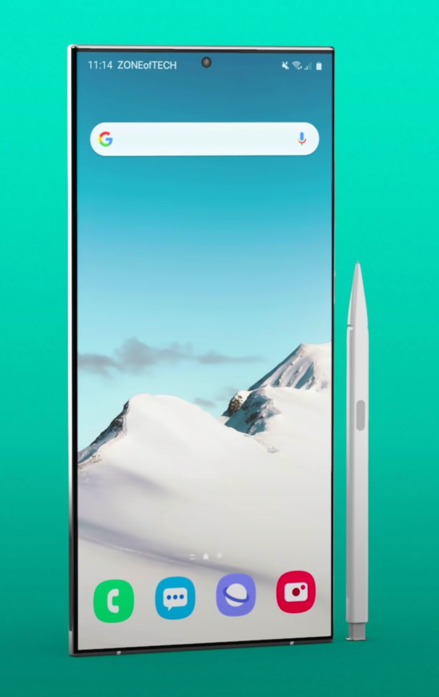
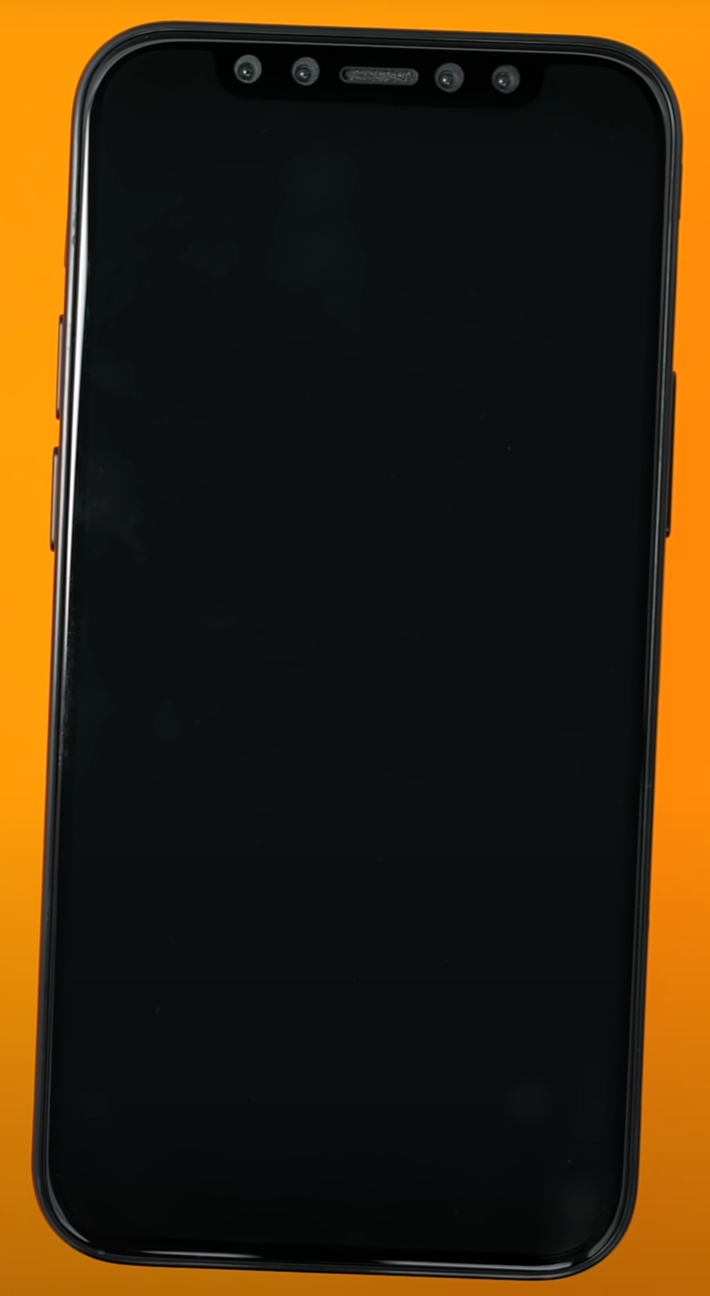
We only get a Single Module on the SE, but it does the job of more.

We only get a Single Module on the SE, but it does the job of more.

That Camera Module is said to be pretty much identical to the iPhone 8’s Camera, or the iPhone X’s Main Camera, so the quality there is pretty good. But, on top of that, we also get the same Image Processing as found in the iPhone 11’s, thanks to the Apple A13 Processor. Realistically, this is an even bigger improvement than just the Camera System in itself, meaning that the photos coming out of this Smartphone would look almost as stunning as they do on the highest-end iPhone 11 Pro Max. 

In fact, Apple has even shared some pictures, coming out of the iPhone SE’s Camera, and they look absolutely stunning. This might just be the very best Camera on a Smartphone at this price. The only competitor that it has, the the Pixel 3a. 


12) Video Performance 

The Video Performance is excellent as well. It still records in up to 4K60 but now we get an extended Dynamic Range, which is made possible thanks to that new Apple A13 Processor. 


13) Special Video Features

Aside from this, we also get some new video features, such as Quick Take Video. Just like on the iPhone 11’s, it lets you hold the Shutter Button and you would automatically start recording a video. We also get Stereo Audio Recording during video, which is something that we didn’t have with the iPhone 8. 


14) Portrait Mode

To my surprise, the iPhone SE also comes with Portrait Mode, which was introduced on the iPhone 7 Plus back in 2016, by the fact that it had two Camera Modules. Well, this is now all done through software, on the ‘'SE’. We only have one Single Module and this is doable in real time, thanks to that Apple A13 Processor.

Not only that, but we also get all the Portrait Mode effects that we get with the iPhone 11 Pro which, as you know, has three Camera Modules, compared to just one. We get those six effects, such as Studio, High Key Mono and so on. 


15) Front Camera

When it comes to the Front Camera, it is pretty much the same one as on the iPhone 8, which had the same Front Camera as the iPhone 7. This is a 7MP Sensor, with an f/2.2 Aperture.

There’s nothing new with the Front-Facing Camera.

There’s nothing new with the Front-Facing Camera.

Video recording is unfortunately still limited to 1080p 30 on the front, compared to 4K 60 for example, like we have on the iPhone 11’s. But something that is indeed new is that we also get all the Portrait Mode effects on the iPhone SE as well. You know, the ones that actually required the massive FaceID camera system? Portrait Mode Front, those Portrait Mode Lighting effects, those are all still there. I’m quite surprised that Apple managed to add all of this in, with just a Single Camera Module.

But, something that we don’t get are the Animojis. It seems like for now, these still require the FaceID Camera on the front, which creates a 3D Depth Map of your face. Apple cannot just do this with a Single Lens and purely through software, at least for now. But, here’s the thing, if Apple can already do Portrait Mode with just one Lens, I would happily just get rid of that entire Notch in favour of just a small Front-Facing Camera Cutout. Please don’t tell me that the only reason why Apple is keeping that is for Animoji support, please don’t. 


16) Storage

Moving on to the Storage, we still get a 64GB and 128GB option like we did with the iPhone 8, but now, we also get a 256GB model. So, if you’ve always wanted a very portable iPhone, with a ton of Storage, now is a pretty good time to get one.


17) Battery Life 

In terms of the Battery Life, even though we do get the A13 Processor, which is the same extremely power efficient Chip that the iPhone 11’s also got, we don’t really see any battery improvements. Apple’s still rating this at 13 hours of video playback, which is exactly the same as the iPhone 8, iPhone 7 and two hours more than the ‘6S’ and the ‘6’.


18) Highest Performance

Also, fun fact, I think the iPhone SE might actually be the most powerful iPhone ever made, here’s why.

It does indeed have the exact same Processor as the iPhone 11 Pro Max, the Apple A13 Chip, which is the most powerful Chip in any Smartphone on the market. But, the 11 Pro Max or even the 11 Pro, have much higher Resolution Displays. This would be a 2688x1242 Resolution Display in the case of the 11 Pro Max, compared to just 1334x750 on the ‘SE’.  This translates to 3,338,496 Pixels on the 11 Pro Max and just 1,000,500 on the ‘SE’. So, the ‘SE’ has 3.33 times less Pixels to render than the 11 Pro Max does, meaning that performance would actually be better and you would get more FPS in apps, on the ‘SE’, compared to all the other iPhones. Too bad that the Display is only 60Hz and you won’t be able to see those extra Frames. 


19) RAM

Something else that you won’t be able to see, is the amount of RAM. Apple never tells you how much RAM they have in their phones. On the 11’s, we have 4GB of RAM, which to be honest, was never enough for me. YouTube especially keeps reloading from scratch pretty much every single time I launch it.

The iPhone 12’s are said to come with 6GB of RAM, the ‘SE’ only comes with 3GB. For most people that should be fine, but I just wanted to mention it regardless as you will have half the amount of RAM, compared to the upcoming 2020 iPhones. Multitasking will not be as good on the ‘SE’.


20) Water Damage

Also, with the ‘SE’, we do have an IP68 Water Resistance of up to 1m, for up to 30 minutes. This is the same as on the iPhone 8 and 7 before it. However, as with all the iPhones before it, if it does break when it’s underwater, the warranty would not cover that.  Water Damage is a bit of an odd thing, so many manufacturers do promote it but if your Smartphone does break, they won’t cover that under warranty. 


21) Fast Charging 

Finally, I’m not sure how many of you know this, but the iPhone SE does indeed support Fast Charging, just like the iPhone 8. In the box, you only get the same painfully slow 5W Charger, but if you buy a more powerful Charger or if you simply have a MacBook Charger, all you need to do is buy a USB type C to Lightning Cable and you can get your iPhone charged to 50% in just 30 minutes.

iPhone 12 Pro & iOS 14 – Final Details Revealed?

We haven’t really made a Leaks & Rumors episode on the 2020 iPhones in more than a month now. Mostly because there wasn’t anything new to talk about. But, we’ve got a ton of fresh new leaks to talk about now, most of them from just the past week alone, coming from Jon Prosser from ‘FrontPageTech’. I don’t know how he did it but he’s pretty much the person with the highest amount of inside news on Apple at the moment.

So, here’s everything new in terms of the 2020 iPhones! 


iPhone SE (Second Generation) 

First things first, Apple has now unveiled what we thought was going to be the iPhone 9. This is the one we were talking about for so long, it is essentially the iPhone SE 2. Only, it isn’t called the iPhone 9 or the iPhone SE 2, but instead they called it the iPhone SE…Second Generation.

I personally think that iPhone 9 would’ve been the perfect name as this would be the last iPhone to feature the old pre-iPhone X design and Apple has yet to use the iPhone 9 naming scheme. But at the same time, calling this the iPhone SE means that Apple is not necessarily considering this inferior to the iPhone 11. They seemingly just consider it something different.

The iPhone 9, or the iPhone SE Second Generation as it is being called by Apple, is our first iPhone of 2020.

The iPhone 9, or the iPhone SE Second Generation as it is being called by Apple, is our first iPhone of 2020.

The iPhone SE Second Generation is essentially just an iPhone 8, but with upgraded internals. We have the same design on the front as the iPhone 8, 7, 6s & 6, so we’re getting a six year old design here. But, we are getting some very nice specs.

To start with, we’re getting Apple’s most powerful iPhone Chip, the Apple A11. The same CPU as found in the iPhone 11 & 11 Pro’s. We’re also getting an improved Camera, which looks to be the same Module as the Main on the iPhone 11 & 11 Pro. Don’t quote me on this because I do need to get it and test it to confirm that.

That’s pretty much it. Other than that, this is an iPhone 8. The only other difference being that this iPhone only costs $400 / £420 in the UK. The UK market is getting a slap in the face again. It is almost half the price of the iPhone 11, which starts at $700, so if you don’t care about having an outdated design and you just want a very affordable iPhone (price can actually go down further if you trade in your old phone) with the very best performance and almost the same quality Camera as on an iPhone 11 Pro, then this is a perfect deal.

We’ll be making a more in-depth video about the iPhone SE Second Generation, once we get it ourselves, so stay tuned for that. Subscribe and hit the bell so you don’t miss out. 


AirPower

Then, at number two, AirPower is apparently making a comeback. You know, the Wireless Charging Mat that Apple kept on postponing and then eventually cancelled? We may be seeing that after all.

Essentially, AirPower was a fairly revolutionary Wireless Charger. On pretty much every single Wireless Charger out there, you need to position your Smartphone on a specific spot because that’s where the Wireless Charging Coil is located. Apple, on the other hand, wanted you to be able to place your Smartphone, Apple Watch or even your AirPods literally anywhere on the Mat. In order for you to be able to do that, the Mat needed a ton of Charging Coils. I’m not talking about two, three or even five, the AirPower Mat was developed with over 20 different Coils in mind. But, these Coils generated a lot of heat, which made an AirPower Mat a safety hazard to use, so it got cancelled. 

How will the AirPower solve the overheating issues that has prevented it from being released so far?

How will the AirPower solve the overheating issues that has prevented it from being released so far?

Well, it seems like it might have been revived! According to Jon Prosser, Apple’s Sharing & Proximity Team are receiving prototype units of something called C68, which looks a lot like the AirPower Mat. Not only that, but apparently this new AirPower Mat actually has an Apple A11 Processor inside that’s being used to dynamically manage heat. An Apple A11, inside of a Wireless Charger! 

The A11 is what the iPhone X from 2017 used and it is still one of the most powerful Chips in the mobile industry. According to Jon, because the Apple Watch uses a proprietary charging method, when you placed the Apple Watch on charge while other devices were also on the Mat, the AirPower would combust because the Watch required so much power. The A11 can tell when the temperature drops and it can wait until that happens before diverting power to charging the Apple Watch. It’s a pretty genius solution but I’m not so sure if this is indeed the answer. 

I’m saying this because firstly, having an A11 Chip inside what is essentially just a Wireless Charger means that the price of it will sky-rocket and secondly, it’s not like the Mat won’t overheat. It’s just that the A11 will put some devices on hold, in terms of charging, until the temperatures go down. This means that if you need a quick charge of your Apple Watch and your iPhone is also charging, you might not even be able to charge your Apple Watch at all, if the A11 Chip decides that is the safest case.

I still think that the best approach here would be to have marked spots on the Mat, where you can place your devices. These spots will also be magnetised so that the devices snap into place once they’re close.


iOS 14

Next up, we have some updates to iOS 14. In case you missed it, we did an iOS 14 video back in March that covered every single thing we knew up until that point, in terms of iOS 14. Definitely do give that video a watch, in case you want to know more about it. But since that video of ours went live, a few more details have emerged.

Reports from ‘9to5Mac’ indicate that Apple is working on improving iCloud Keychain on iOS to make it compete better with apps such as ‘1Password’ or ‘LastPass’. Apparently, users will now be warned if their passwords are being reused, so that they can change them if they’re using one multiple times. Users will also be getting some sort of new 2-Factor Authentication that will let you log into a website using just iCloud Keychain, rather than using SMS or Email. But keep in mind, this will still be 2-Factor Authentication.

Twitter user ‘DongleBookPro’ shared a few more details about iOS 14. The first one being that Apple seems to be working with car manufactures, such as BMW, to allow you to use the iPhone itself as a car key. It won’t work with all models, just with a few select ones, but this will apparently be called CarKey. 

‘DongleBookPro’ also shared some iOS 14 images. One, with how the new Wallpaper selection would work, which has been reported previously. It seems that now, we would be able to tweak the current Wallpaper. It seems like the stock iOS 13 Wallpaper has four different variants, one of them being a gradient. The ability to turn them into gradients seems to be applicable to all of Apple’s first party Wallpapers. They’re calling it a Smart Gradient.

Aside from this, Dongle also shared an image of how the Wallpaper selection screen will look, with Wallpapers now grouped into Collections. You can also have some photos of your own there, which is great. Third party apps should be supported as well, according to some of the earlier leaks that we’ve seen before.

Now, there’s one more thing about iOS 14 that I want to share here and it is coming from Jon Prosser. We’ve heard some rumors that Apple might be implementing a new list view on the iPhone, similar to the one that we have on the Apple Watch. But now it seems that Apple is indeed considering Widgets on iOS. Jon is saying that there are currently no internal builds featuring Widgets, but it is something that Apple is internally working on. They’re also considering third-party Widgets in the Control Centre. Now, Jon did say that this is probably something likely to come in iOS 15 rather than iOS 14. We’ll have to wait and see. 

But, I’ve had two massive requests for iOS, for so many years now. One of them being an Always-On Display. Android Smartphones have had this for so many years now and it’s a complete game-changer. The ability to see the time and the notifications on your Display, all the time, even when your phone is in sleep, is so useful.  But for some reason, we never got that on the iPhone. Now that the Apple Watch finally got it with the Series 5, I would bet that Apple is at least considering adding an Always-On Display to the iPhone as well.

You may soon be able to use some popular apps without actually needing to have them installed, such as Twitter.

You may soon be able to use some popular apps without actually needing to have them installed, such as Twitter.

My second request was on-screen Widgets. This is something that we’ve had on Android Smartphones for years. The iPhone Home-Screens have pretty much remained unchanged since the very first iPhone launched, back in 2007 (13 years ago). We can now change the Wallpaper but aside from that, and the fact that we can put apps in folders, which Apple added in iOS 4 back in 2010, we cannot really change anything.  Widgets will allow us to see the Weather, Calendar, To-Do List and more, right on the Home-Screen without even having to open up those apps.

Apple did indeed add Widgets, but only to the Notification Panel in iOS 13, on the iPad, with iPadOS. They finally added Home-Screen Widgets, but it only works in Landscape Mode and it is a separate panel on the Home-Screen, rather than something that’s embedded into it.

It seems like we will have to wait a bit longer and see if this does happen, but if it does, it will be a pretty massive change for iOS functionality wise, which is something that we haven’t seen since iOS 4, back in 2010.

The last piece of news that we have on iOS 14 comes from 9to5Mac. They claim that they’re developing a new feature called “Clips”, which will allow us to use an app without necessarily having it installed. A good example of this would be when you’re on a web page and you’re opening up a Twitter link. Normally this will just take you to the Twitter browser, the same applies to YouTube where, as we all know, the UI is really messed up. Well, with this new Clips API, you will pretty much get the same experience as if you actually had the app installed. It’s just that you won’t need to actually have it installed, which is pretty cool.


iPhone 12 Pro 

Now, onto the good stuff, the iPhone 12. The biggest thing here is that we finally know the final design of this year’s iPhone.

We’re getting four iPhone 12 models this year. A 5.4” model, which will be the smallest one. This will be even smaller than the 5.8” iPhone X, XS or iPhone 11 Pro and this one will come with two Camera Modules, the Apple A14 Processor and 5G, as well as an Aluminium Body. Then, we have a 6.1” iPhone, similar in size to the regular iPhone 11, this will also come with two Camera Modules, the A14, 5G and an Aluminium Body too. We have another 6,1” iPhone, a Pro model this time. This will still come with the A14, 5G, only three Camera Modules as well as that LiDAR Module that the iPad Pro just got. This will have a Stainless Steel, rather than an Aluminium, Body. Finally, we have a 6.7” iPhone, another Pro model. This will come with the A14, 5G, three Camera Modules, LiDAR and that Stainless Steel Body as well. In summary, two regular and two ‘Pro’ models.

All models are indeed said to come with an OLED Display, so finally no more LCD. All models are said to come with a smaller Notch as well as a Squared-Off Frame, similar to the one that we got on the 2018 iPad Pro. So, we’re finally getting a return to that iPhone 4 & iPhone 5 style design, which was definitely my favourite. This had been initially reported by Ming-Chi Kuo, but has now confirmed by Bloomberg as well. 

Remember the iOS 14 Widgets image that Jon Prosser shared? Well, it seems like that image is coming from Twitter user Fudge (@choco_bit).  This gives us a really good idea of what the smaller Notch would look like. It looks to me that it’s about half the size of the Notch on the current iPhones.

Unfortunately, the Bezels still seem to be the same size. I was really hoping that these would be getting a bit thinner, as iPhones now have one of the thickest Bezels / Border on any Smartphone now and they’re already looking quite outdated when compared to the competition. But, keep in mind that this is not a Press render, it is what looks to be an iOS icon, which means that the Bezels might indeed be bit thinner on the actual iPhone 12.

Follow our second Instagram account @ZONEofCONCEPTS for more models on upcoming releases.

Follow our second Instagram account @ZONEofCONCEPTS for more models on upcoming releases.

Anyway, Fudge also shared an image of the back of the iPhone and from this one we can see that the LiDAR Sensor has been added as a fourth Module, just like we envisioned in our very own concept months ago. Funnily enough, we modelled this concept back in October 2019 and at that time, we only knew that Apple was going to add a ToF Camera. We didn’t know where and how it would be positioned. So, we fully modelled ours based on what made the most amount of sense. A fourth module in that Camera Array alongside a Flash in the middle, for even Light Exposure, and a Microphone just under it for a consistent design. It seems like we were pretty much spot on.

So, this is what the iPhone 12’s would look like. A Flat Frame, just like on the 2018 and 2020 iPad Pro’s, which would be made out of Aluminium on the non-pro models, just like on the iPhone 5 and SE, and full Stainless Steel on the Pro models. We also get a smaller Notch, at least in terms of its length, and two new Display sizes, a 5.4” and a 6.7” as well as a Quad Camera Module on the back, with that brand new LiDAR Sensor.

We have seen multiple reports that the iPhone 12’s could indeed be delayed up to October or so, but there are many reports on this, some saying that they will be delayed while other are saying that they’re still scheduled for a September release. If I were to put my money on any of these, I would say that the regular iPhone 12’s will be released in September, while the Pro models would be released a bit later, around October. This would just be because of that LiDAR Module, which is a brand new component to manufacture.

Apple Watch Series 6 - Finally Something New?

The Apple Watch has been one of my favourite pieces of technology, ever. I recently switched to a Samsung Galaxy Fold as my daily driver and the only thing that I miss about my iPhone, is the Apple Watch sync. 

Luckily, I still have my iPhone around but my point here is that while I can indeed switch away from iOS, there’s not really an overall better Smart Watch than the Apple Watch, at least for iOS users.  So, without further ado, here is everything we know, so far, in terms of the Apple Watch Series 6. This is set to be one of the biggest changes to ever come to the Apple Watch!


The Story So Far

I have always been a massive fan of the Apple Watch. I remember making videos on it years before it was launched, such as the ‘Leaks & Rumors’ episodes talking about every piece of information we had about Apple’s super secret project. Then we finally got it, the original Apple Watch.

But unfortunately, the first generation, which came out in 2015 and was announced back in 2014, was not great at all. It was pretty slow, the battery life wasn’t anything amazing and it was extremely expensive. Apple even sold that $17,000 18-Karat Gold model.

With the Series 2 in 2016, they dropped the Gold model, they added 50m Water Resistance, up from the 1m for up to 30 minutes that the original model had. They also increased the screen brightness to 1000 Nits, up from 500, and significantly improved the Processor. The Battery even lasted two days now and we got GPS, so the Series 2 was a very big upgrade.

The Series 3 launched in 2017, adding Cellular support so that you can get a network connection without the need for you to have your iPhone with you. It added an even faster Processor, with the S3 Chip being 70% faster than the S2, which was already twice as fast as the S1 inside the original Apple Watch.  It doubled the Internal Storage to 16GB and increased the amount of RAM to 768MB from 512MB. 

Then we had the Series 4 in 2018, which was the biggest upgrade to come to the Apple Watch since the original one was introduced. We got a new design (sort of) with a more rounded frame as well as a much larger Display. Also, it had almost the exact same body, so the screen Bezels got significantly thinner. We got another new Processor, the S4, with double the performance of the S3, an ECK Meter, an improved HR Monitor and Haptic Feedback on the Digital Crown itself. This was such a big upgrade.

Finally, last year we got the Series 5, which was essentially just a Series 4 with an Always On-Display, something that I’ve been requesting ever since the original Apple Watch. Having said all of this, the Series 6 should be a fairly big upgrade, considering that we haven’t had once since 2018.


Design

When it comes to the design, we’ve yet to see reports that state that Apple is working on a major redesign, similar to what we saw around the same time two years ago, ahead of the Series 4’s release. This means that it is extremely likely that we would see the exact same design that we’ve seen with the Series 4 and the Series 5, just possibly with some more finishes.

The Series 5 introduced Titanium as a brand new finish and also brought back Ceramic, which we hadn’t seen since the Series 3. We wouldn’t be surprised if Apple ends up introducing one more material option, or at least some different colour options, for the materials that we have now. I’m not sure about you but I think a Ceramic Forest Green or Midnight Blue would look incredible.

Regardless, there is a small possibility that Apple will indeed tweak the design. Ever since the original Apple Watch came out, we always wanted Apple to release a circular Apple Watch, we’ve actually modelled our very own. Whether Apple does this with the Series 6, Series 7 or even later, we don’t know yet.

This is our concept for the next Apple Watch, will it finally come full circle?

This is our concept for the next Apple Watch, will it finally come full circle?

We based this design off of the current Series 4 & Series 5. We kept the same design language while at the same time, making the body circular. This means that we still have the same style of the Digital Crown, with the Red Ring and the Haptic Engine. We still have the same Heart-Rate Monitor but with additional functionality, which we will be covering shortly. We still have the same iconic circular Apple Watch Faces, which now look better than ever before on a circular Display. Also, we based all of the colours on the current Apple Watch series 5 offering.

Do leave a comment down below, on what do you think about a Circular Apple Watch and if you want to see more concepts such as this, definitely subscribe and also follow our second Instagram account (@ZONEofCONCEPTS) for more 3D Concepts such as this.

But unfortunately, the Series 6 is likely to look extremely similar to the Series 5. 


Display

When it comes to the Display, ‘EconomicDailyNews’ reported back in July 2019 that the 2020 Apple Watch could be getting a microLED Display. This is something that ‘DigiTimes’ also reported back in 2018. Unfortunately, we haven’t had any more recent leaks on this, so do take this with a grain of salt.

Essentially, microLED Displays are the biggest Display innovation since OLED. This is not be confused with miniLED, which is what the November 2020 iPad Pro’s are said to feature, as well as the upcoming 16 inch MacBook Pro’s. Long story short, LCD panels are the most inferior Display technology that we have now. 

In LCD panels, the Pixels only provide the colour and not the backlight. Therefore, you need to add a separate backlight layer. This means that the Display will be thick and will consume a lot of power. Also, you cannot have perfect Black Levels, if you have a white text on top of a black surface, the backlight will still have to be fully on in order for the text to be visible, which means that blacks will always look greyish or blueish.

Then we have OLED Displays in which, unlike LCD’s, the Pixels can provide both the colour and the backlight. This means that OLED Displays can be very thin, they consume very little power and they have perfect black levels as you can individually turn the Pixels on and off. The only problem with OLED is that they can easily burn, so their life span is very limited. 

Then we have miniLED, which is a fairly new technology and is what Apple is using in their Apple Pro Display XDR. Essentially, it is still an LCD panel, but the backlight is split into multiple smaller zones, 576 in this case, which can individually turn on and off. It still has the downsides of an LCD panel but the black levels are much improved.

And finally, we have microLED, which is essentially OLED with extremely tiny inorganic LED’s, rather than organic LED’s. This means that it has all the advantages of OLED, but without the burn-in issues. Not only that, but microLED Displays can be even thinner than OLED, with even lower power consumptions while also being much brighter. These microLED Displays are really the future and the Apple Watch is indeed a very good candidate for this technology. At the moment, microLED is even more expensive than OLED, so Apple cannot implement this on devices that have a large Display. If you take a look at the first Apple Watch, it was also Apple’s very first device to come with an OLED Display. Whenever Apple is implementing microLED, it will very likely come to the Apple Watch first and is looking like it could come this year.


Specs

What other changes could we see with the next Apple Watch?

What other changes could we see with the next Apple Watch?

Moving on to the specs, the Series 6 will finally feature a bump in performance. The Series 5 did come with the Apple S5 Processor, but this was actually just an S4 with a built-in Compass and the new Display Driver for the Always-On Display. So, we actually haven’t had a performance boost, since the Apple Watch Series 4 in 2018. Here’s a fun fact, my Series 4 was perfectly smooth, I had zero issues in terms of its performance. 

However, the Series 5 actually lags on me quite a bit. It might be because of the Always-On Display. The Processor has to keep updating that all the time, albeit at just 1Hz, compared to 60Hz. But still, the CPU is running more intensively than on the Series 4 and the RAM is also used more because of the Always-On Display.

Ming-Chi-Kuo did report that the Series 6 will indeed be getting some bumps in performance. This not only includes the CPU getting faster, but apparently WiFi and Cellular speeds will also be improved. Kuo also stated that the Circuit Board will now be made out of LCP (Liquid Crystal Polymer) as opposed to Polyimide or PI. Dongshan Precision, Avary Holding and Flexium Interconnect will be the primary suppliers.


Special Features

Moving on to the Special Features, this is where we’ll see the biggest changes.

Blood Oxygen Level Meter

The first one will be a Blood Oxygen Level Meter. Based on leaked iOS 14 code that ‘9to5mac’ managed to find, we now know that Oxygen Level Saturation is something that Apple plans to include in the Series 6. Essentially, if the Oxygen in your blood has a level under 95%, you will get a notification alert, similar to how you’re now getting an alert when your heart-rate is abnormally high. Even the original Apple Watch from 2015 had hardware capable of measuring the amount of Oxygen in your blood, ‘iFixit’ found that from their teardown. 

However, for some reason, this functionality was never enabled. Some reports are saying that this is because Apple never got the FDA approval for this, so it could be that the Series 6 will now get an improved hardware version of that or watchOS 7 will actually enabled Oxygen Level Saturation measurement on all the previous Apple Watch models that support it as well.

watchOS 7

Speaking of watchOS 7, ‘9to5mac’ managed to find some more code that points towards some upcoming features. These include the ability to share your Watch Face with other users and a brand new Infograph Pro Watch Face that will include a Tachymeter, which will tell you the speed at which you’re traveling.

Aside from this we would also be getting a new Countries Flag Watch Face, which will allow you to pick a flag and have a Watch-Face on top of it. This can easily be done at the moment via the Photos Watch Face.  Speaking of the Photo Watch Face, it is said to be getting an improvement that allows you to select photos from a shared album, rather than just your own albums.

Parental Controls will also be added, as well as School-Time for restricting some Apple-Watch apps for when a child is in school. We are also said to be getting an improved Control Centre with new toggles and a brand new Architecture for apps, which will remove the extensions base for apps entirely, meaning that Apps will now fully run on the Apple Watch rather than being extensions to iPhone apps. 

According to ‘The Verifier’ who claims that they have some high level sources inside Apple, watchOS 7 will only work on the Apple Watch Series 3 and newer, with support for the Series 1 & 2 finally being dropped. 

Sleep Tracking

Now, the third big new feature of the Series 6 is said to be Sleep Tracking. According to some more code found my ‘9to5Mac’, Sleep Tracking will finally be included. As reported by Bloomberg, this will indeed be a feature implemented at the hardware level, rather than just being a software update that will work on older models.

Apple will need to heavily improve the Battery Life, which according to these reports, they wouldn’t be doing, at least not to the amount that will make the battery last for a week. We don’t fully know how Apple will address this, but it is likely that they will use a new low power Chip that will monitor the sound and the movement alongside your heart-rate, when you are asleep. Chances are that you will have to charge it in the morning, before you go to work, as you will need to wear the Apple Watch while you’re sleeping in order for Sleep Tracking to work. 

What would TouchID on an Apple Watch look like?

What would TouchID on an Apple Watch look like?

TouchID

A very strange report, coming from ‘The Verifier’ once again, claims that the Series 6 could be getting TouchID. This would either be integrated into the Crown or even integrated into the Display panel itself. That would be amazing but, they’re also saying that this could be a 2021 feature and might just be something that the Series 7 will come with. 

Kids Mode 

Additionally, ‘9to5Mac’ found references in the leaked iOS 14 code to a brand new Kids Mode, which will replace the current activity rings with something more suitable for kids. Rather than tracking the amount of calories burned, these will just track the amount of movement and will be tweaked with a child’s’ activity pattern in mind. This is a watchOS 7 feature so it will very likely come to all the models from the Series 3 upwards. 

Improved Water Resistance

Finally, Ming-Chi-Kuo reported that the Series 6 will be getting an improved Water Resistance. At the moment, we get up to 50m submersion, which is pretty nuts. However, Apple themselves state on their own website that you shouldn’t use it for scuba diving or any other activities that involve high velocity water or submersion below shallow depth.  This could be fixed with the Series 6. 


Battery Life

Battery Life is said to be improved with the Series 6, now that we’re getting Sleep Tracking. Whether this is done by just increasing the Battery size, or by the new microLED Display, or even both, we do not know. But, Apple will have to do something as the Battery Life on the Series 5 was noticeably worse than on the Series 4 before it. 


Release Date 

And finally, when it comes to the Release Date, we would expect pretty much the same as always, September 2020. However, this year we might actually see a slight delay because of the current outbreak situation. With this in mind,  it could be pushed to November, or in the worst case scenario, to March 2021 or further, although I don’t think it would be delayed that heavily.


Conclusion

So, in the end, what are my thoughts on the Apple Watch Series 6?

Well, it looks like the biggest new feature that most of you will care about will be Sleep Tracking. Aside from that, things such as the new Watch Faces, the Oxygen Level Meter and Kids Mode are likely to be added to some of the previous Apple Watch models as well.

If you were hoping for a major redesign, you might have to wait until the Series 7, or even later, until we finally get something similar to our render.

The iPhone SE (2020)

Credit: Apple

Credit: Apple

The new iPhone SE 2020 has been announced, this is the device that we thought was going to be called the iPhone 9, which, if you ask us, would have been a much better name for it. We get a 4.7” Retina HD Display, up to 256 GB of Internal Storage, an A13 Bionic Chip, a 12MP Wide Camera, Portrait Lighting Effects, 4K Video recording at up to 60 FPS, Touch ID and so much more!

Pre-Orders begin on 17/04/2020 at 1PM GMT and prices begin at $399/£419, full release on 24/04/2020.

Stay tuned for our upcoming iPhone SE content!