Apple Watch

iPhone 12 Pro, Apple Watch Series 6, iPad Air 4 – Latest Leaks & Rumors!

We haven’t made a Leaks & Rumors episode since July. This is mostly because I like to wait until we get a few more things to talk about and we haven’t really had a good amount of new leaks, until now.

We finally have some major updates on the iPhone 12 Pro, the Apple Watch Series 6, which is apparently launching next week, as well as the iPad Air 4 and the upcoming Apple Event. So, without any further ado, get those snacks ready, sit back, relax, and enjoy!


iPhone 12 Pro 

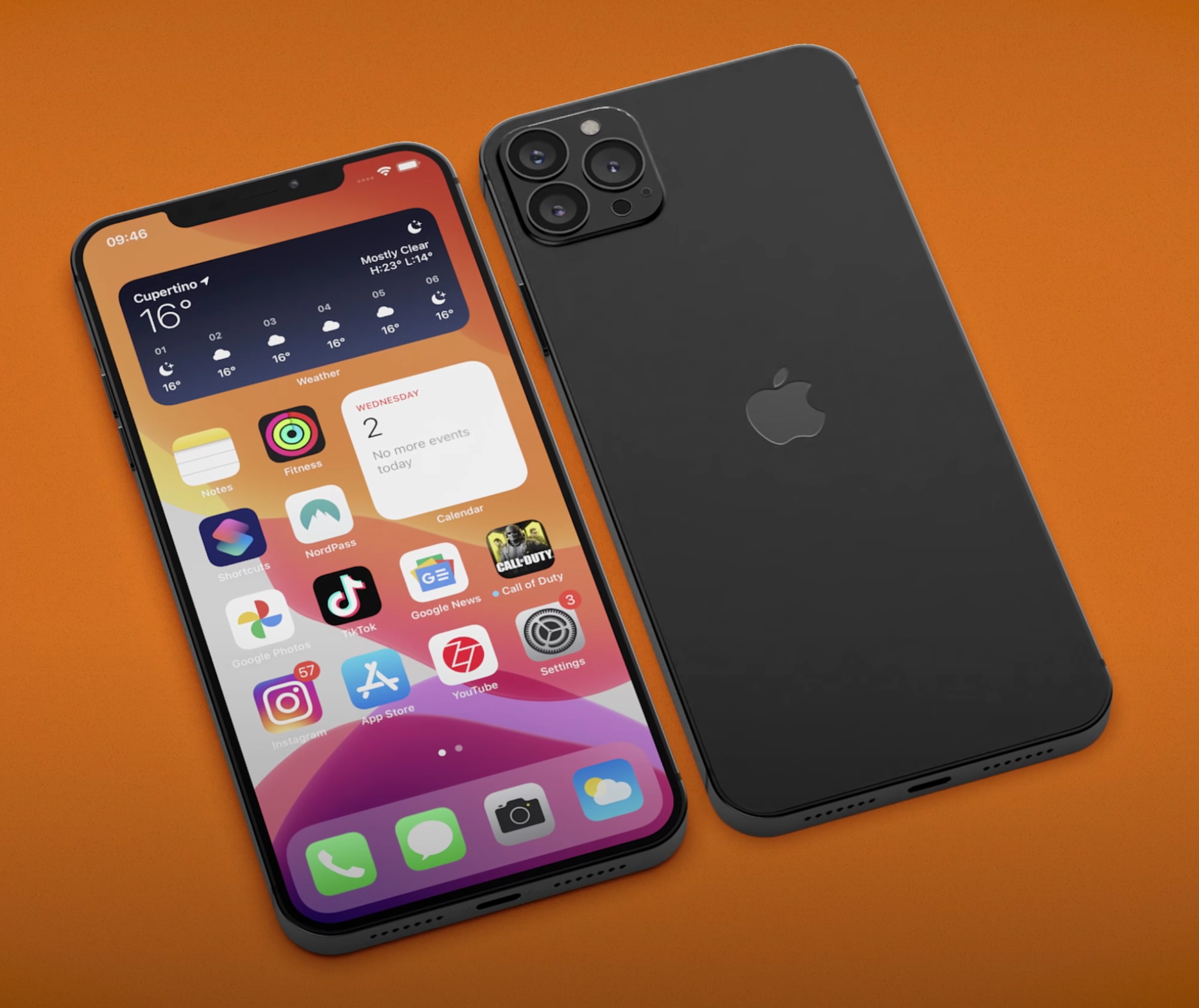
In terms of the iPhone 12, you might remember the large number of leaks that we got suggesting the Frame was going to be squared-off, the Notch was going to be smaller and that the Triple Camera Module would now be a Quad-Camera Module with one of the Modules being that LiDAR Sensor. Even though these were “meh” changes, I would’ve loved to see the Notch be made even smaller or even removed entirely. Jon Prosser posted a CAD drawing of the iPhone 12’s Notch back in May, which appeared to show the Speaker Grill moving into the Bezel, making the Notch a bit smaller this way. 

This our idea of what the iPhone 12 will look like, check out "@ZONEofCONCEPTS’ for more.

This our idea of what the iPhone 12 will look like, check out "@ZONEofCONCEPTS’ for more.

Another leaker (@Choco_bit) posted an image of the iPhone 12 Pro, showing the smaller Notch, the Quad-Camera Module on the back (again with a LiDAR Sensor) and we also saw the iOS 14 Widgets. We did get the Widgets, but the other two changes would not be happening anymore. Jon Prosser posted, on August 26th, saying that the Notch is staying the same and the Bezels are getting noticeably thinner, so at least there’s that. The Notch will appear smaller on the 6.7” iPhone 12 Pro Max as the Display itself will be bigger. Jon also mentioned that FaceID will work from wider angles, even flat on the table, so that is indeed a nice improvement. 

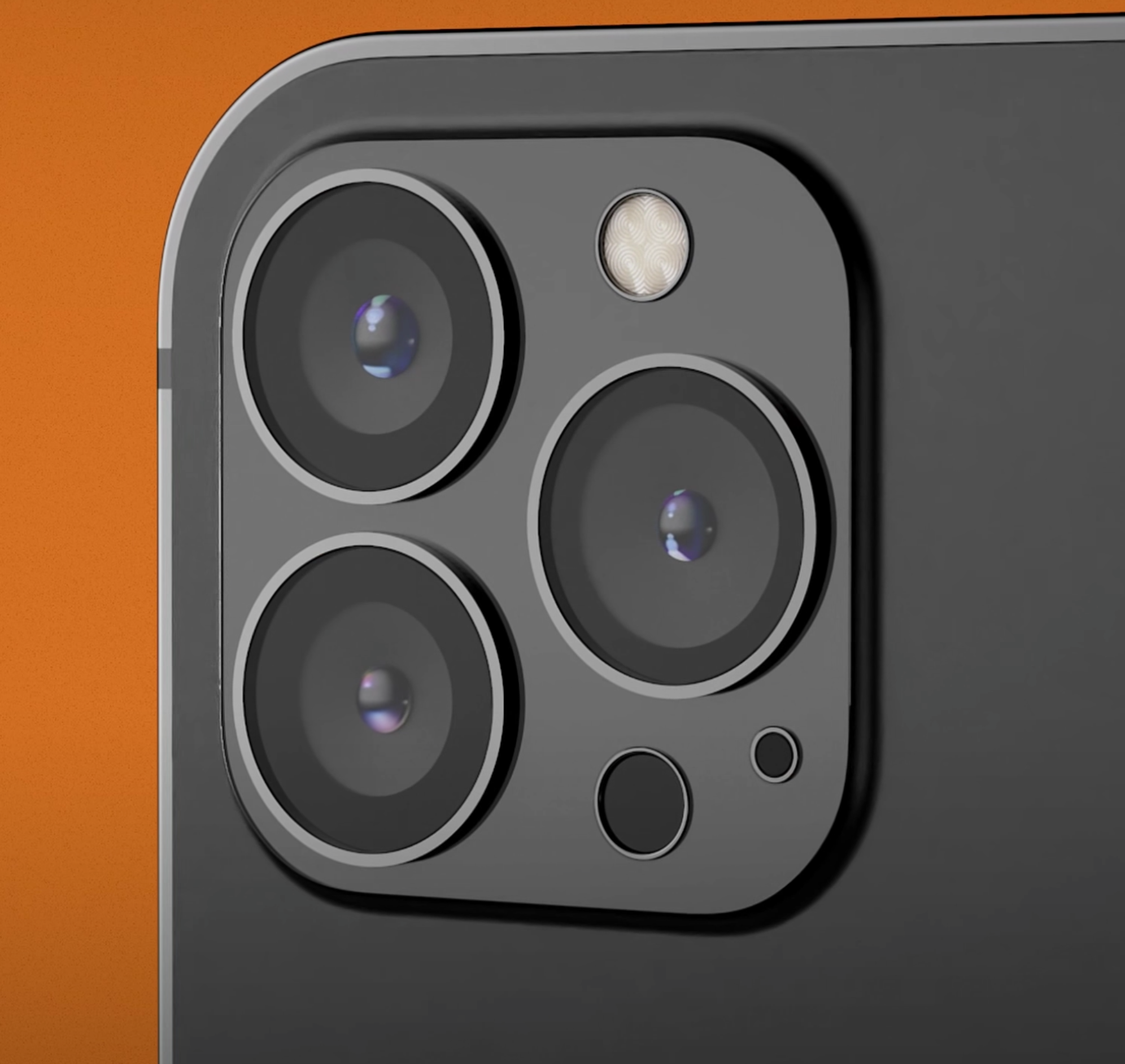
The sides are flat, like we’ve seen in all the leaks. We’re going to get that iPhone 4 & iPhone 5 style Body, while the Glass will indeed have a slight curve, which will make it easier to use when it comes to Gestures. Jon is also saying that the entire Camera Module would now be 10% larger. I’m assuming that he’s referring to the big square housing for the Modules. In terms of that Back Camera Array, we’ve had a bunch of recent leaks. These are Case leaks that mostly show a Triple Camera Module Array, instead of the Quad that we’ve seen leaked before as the LiDAR Module would now be positioned in a very similar manner to how the Flash is. I think that’s a worse approach. Also, the LiDAR Module on the iPad Pro 2020 is quite a bit larger than the one on these iPhone 12 leaks. Maybe Apple can pull this off and compact it a bit more to make it smaller but in my opinion, I still think it would look nicer with a Quad-Camera Module Array.

It looks like the Triple-Camera Array is staying for the iPhone 12.

It looks like the Triple-Camera Array is staying for the iPhone 12.

So, no smaller Notch or Quad-Camera Module Array, any other updates? Well, we still don’t know for sure what is happening with the high Refresh Rate Display. We’ve had countless leaks saying that it will happen and countless leaks saying that it won’t. But luckily, it seems like there is some hope. Jon Prosser posted a bunch of photos and even a full hands-on video of an iPhone 12 Pro PVT unit. These are the Production Validation Test units and they’re basically tested by Apple employees in order to ensure that they’re working correctly. They need to undergo a bunch of tests and if they pass all tests correctly, these are the units that will be mass produced. In most cases, these are exactly what the retail units would look like.

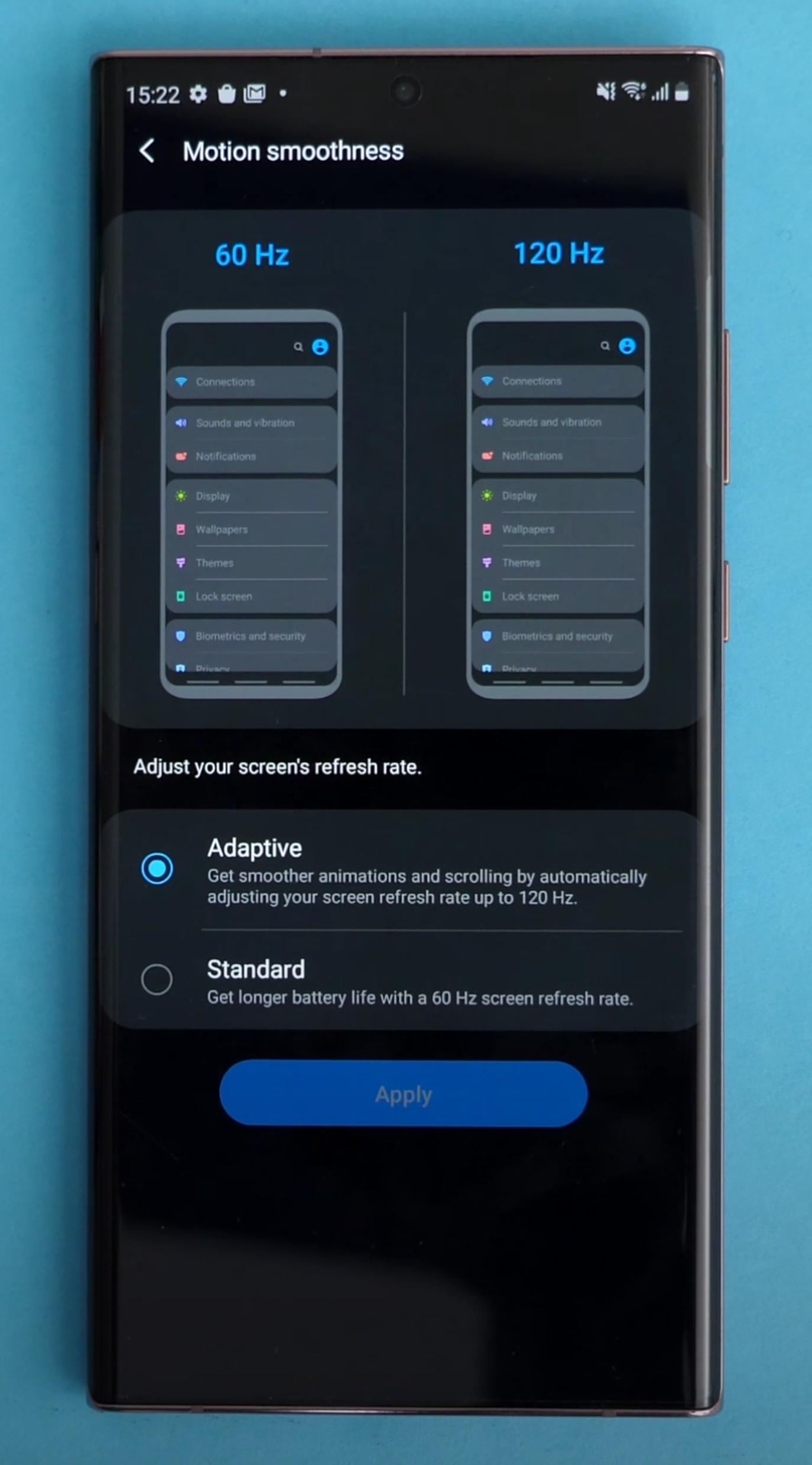
Interestingly enough, there is actually a toggle in the Settings to enable High Refresh Rate on these, but there is also a note telling employees to check if their PVT unit supports high Refresh Rate. It seems that Apple has manufactured some units with 120Hz, and others without. Display Analyst Ross Young reports that, based on his sources, it is way more likely for Apple to release the iPhone 12 Pro with just a 60Hz Panel. It looks like Apple has managed to get the 120Hz Panels in the end, but not the 120Hz Driver.

So, we’ll have to wait and see what happens but in my opinion, a high Refresh Rate on the iPhone 12 Pro is a must. We’ve had high Refresh Rate Smartphones since 2017. The first Phone to come with it was the Razer Phone, which featured a 120Hz Panel. Since then, more and more Smartphones have started including this to the point where even mid-range Smartphones in 2020, such as the OnePlus Nord, come with a 90Hz Panel.

Apple is late to the party with higher Refresh Rate Displays.

Apple is late to the party with higher Refresh Rate Displays.

I know that Apple wants to wait until they get it working properly. They want to use an LTPO Panel so that they can adjust the Refresh Rate from 120Hz, all the way down to 1Hz, just like the iPad Pro’s ProMotion Display does. That is an LCD Display, rather than an OLED. The only Smartphones out right now with an LTPO Display, are Samsung’s Note 20 Ultra and Z Fold 2. That’s it. Samsung has already made it clear to Apple that they would not be able to provide them with an LTPO Panel in 2020. It seems like that has changed, or at least Apple has found a different solution for that. Judging from the PVT units, it seems like they can only switch between the 60Hz and a 120Hz Refresh Rate, which could point towards this not being an LTPO Panel, but rather a standard 120Hz Panel like we’ve seen on most 2019 and 2020 Smartphones. On those Phones, you can indeed switch between 60Hz and 120Hz, but nothing more than that. Anyway, if this iPhone doesn’t have 120Hz, then it would be a major disappointment in my eyes. 

Camera-wise, we haven’t really had any massive leaks aside from a new Sensor that Apple will be using to enable better Low-Light Performance, as well as Night Mode with the Ultra-Wide Angle Module. Aside from that, Jon Prosser showed us that the Camera will indeed support 4K120 as well as 4K240, both of which are likely to be used in slow-motion, or at least the 4K240 mode will as that’s listed as Slow-Mo. That’s pretty nuts for a Phone. There’s no other Phone, other than the iPhone 11 Pro, that can shoot 4K60 and all Lenses. Now, the iPhone 12 Pro will bump that up to 4K120 and even 4K240. It’s pretty nuts what Apple’s Processor is capable of. But that’s mostly it.

There will be no Charger in the box, that’s already confirmed. ‘LoveToDream’ reported that the Lightning Cable will now be braided, so at least there’s that.

In terms of the Release Date, Jon Prosser has posted the timeline for Apple’s upcoming releases. Do keep in mind that Jon has been 100% accurate in the past, in terms of actual Release Dates. According to Jon, Apple will launch the new Apple Watch next week, followed by a new iPad. Then the iPhone 12 event will be in mid-October, followed by the iPhone 12 release on October 19th, followed by the iPhone 12 Pro release sometime in November. 


Apple Watch Series 6

What about the Apple Watch Series 6? If you’re enjoying this, we have some really awesome content coming in the next few days so it would be great if you could Subscribe so you don’t miss out, it’s free to do so. 

Well, my top request would be for Apple to redesign the entire Watch and make it into a Circular Design, or at least offer a Circular Design as well. That’s my personal request and I would love to see that happen. Unfortunately, it will not happen this year. The Series 6 would look identical to the Series 5. There will only be one major improvement, the addition of a Blood Oxygen Level Meter. This will show you the saturation of Oxygen in your blood. If it’s between 95% and 100%, then that’s all good. Anything lower and you might want to go and see a Doctor. Also, COVID does affect the Oxygen level in your blood so the Series 6 might even be able to give you a notification in case you have signs that could point to you having COVID. So, that’s the main feature.

The Circular Design may come one day, but not this time.

The Circular Design may come one day, but not this time.

The Battery is getting larger, but only from 296mAh, to 303.8mAh. The Performance is going to be improved thanks to the Apple Watch S6 Processor. I am hoping that the Battery Life will be improved quite substantially because the Series 5 was actually a downgrade over the Series 4. The Series 4 could easily last me two days, whereas the Series 5 has even died on me mid-day when I was cycling for like four hours with GPS enabled and Cellular enabled. Workouts kill off the Battery like crazy. Now that Sleep Tracking has been added in watchOS 7, Battery Life is more important than ever.

We’ve also seen reports that Apple is working on an Apple Watch SE, essentially updating the Apple Watch Series 3 with a more recent Processor and selling that for around $200. Mark Gurman from Bloomberg has reported on this as well. Overall, it seems like they’re just making as few small changes as they can until they can really re-design this thing. The Series 4 was really the big change, back in 2018. The Series 5 only added a Display Controller, which in combination with the LTPO Panel, which the Series 4 also had, allowed it to have an Always-On Display. The Series 4 could’ve easily had it as well, it only needed that tiny Display Controller.

It seems like the Series 6 will be another minor upgrade, with the biggest change just being the Oxygen Level Meter, which could’ve been easily added to the Series 5 and even the Series 4.


New iPad 

Finally, it seems like there is also a brand new iPad that Apple will be launching as early as next week, according to Jon Prosser. But which iPad is this? Is it a new iPad Pro, or a new iPad Air or a new entry-level iPad? Well, it’s definitely not a new iPad Pro as we just got one earlier this year.

It will either be a new iPad Air (the iPad Air 4) or a new entry level iPad, (the iPad 8th Generation), ‘mydrivers.com', which has a mixed track record, reports that this will come with an 11” Display, an A14 Processor and 128GB of Baseline Storage. Essentially, identical to the 2018 iPad Pro in terms of Design, just with a more powerful Processor. ‘91mobiles’ posted a few schematics of this new iPad, showing some slightly thicker Bezels than on the iPad Pro and a slightly smaller 10.8” Display. 

We don’t know exactly which iPad this will be, just that it won’t be new ‘Pro’ model.

We don’t know exactly which iPad this will be, just that it won’t be new ‘Pro’ model.

FaceID will be included, as opposed to just TouchID on the Power Button, which a leaked manual was apparently showing. A Smart Connector does appear to be present on these schematics, which would allow support for Apple’s Magic Keyboard.

Mark Gurman and Debby Wu of Bloomberg have both written a fairly comprehensive report outlining Apple’s plans for this quarter and according to them, this iPad would indeed be a brand new iPad Air with pretty much the same Design style as the iPad Pro. It would make sense for the Display to indeed be an 11” Panel, rather than something smaller with slightly thicker Bezels just to make the iPad Pro look a bit better.

I have to say, I am a bit unsure in terms of the Processor. Some reports are saying that it will come with an Apple A14X Chip, while some are saying that this will be an A14 Chip. The A14 would make sense but only if Apple also updates the 2020 iPad Pro with the A14X. Otherwise, it would just be weird having an A14 in this new iPad Air and a slower A12Z, at least slower on the CPU side, on the iPad Pro. That just wouldn’t make that much sense. That’s my personal prediction, a CPU update for the 2020 iPad Pro with the A14X.


AirPods Studio

The New AirPods Studio could be right around the corner.

The New AirPods Studio could be right around the corner.

Now, here’s a bonus item. A brand new pair of AirPods. Mark Gurman and Debby Wu also report that Apple is preparing a new pair of AirPods, those AirPods Studio that we’ve been hearing about for a few months now. The leaker ‘Komiya’ reports that the AIrPods Studio will come in White and Space Grey. The Audio Quality and Active Noise Cancelling would be “very high”, according to Komiya.

Apparently, they will also come with Apple’s new H1X Chip, some new Equaliser Settings and Ear Detection, so just like the regular AirPods. They may have some sort of Hand Gesture, like the HomePod does.

The Price will be $350, likely £350 in the UK, and they will ship in September/October and announced via a press release on Apple’s website. From the looks of it, it seems like these could be announced next week when Apple also launches the Apple Watch Series 6 and the new iPad Air 4. Jon Prosser even posted the time of the release, which according to him would be on Tuesday, September 8th between 9-12 EST when Apple will be holding *something* on their website.

iOS 14 Review - Biggest Change Since 2007!

Every year in June, Apple announces a new version of iOS, iPadOS, watchOS and macOS. We also have tvOS but come on, no one really cares about that.

This year, we had a few leaks that iOS 14 would bring a new Fitness App to the table, alongside possibly a new list view for the Home-Screen, but that was pretty much it. However, it turns out that iOS 14 is actually pretty much the biggest change that the iPhone has had since the introduction of the very first iPhone, back in 2007. This version of iOS (4) brought the ability to change the Wallpaper, as well as multitasking support. Then, iOS 7 redesigned the whole look and now iOS 14 allows you to have more than just Icons on the Home-Screen. 

It introduces Widgets and an App Library UI, amongst many massive features, making it a gigantic update. I’ve already covered over 40 big changes in our previous video, but now that I actually got a chance to use iOS 14 on my actual iPhone for a few days, I wanted to talk about my personal experience and how it actually is to use iOS 14, iPadOS and watchOS 7. So, without further ado, here is my iOS 14 experience!


iOS 14

Starting off with iOS 14 and the biggest feature that we got were the Home-Screen Widgets.

Now, we did kind of have Widget support with iOS 8, which came out in 2014. But these Widgets were only viewable in the Notification Centre. In more recent versions of iOS, you had to swipe right from the Home-Screen in order to see them, which was not that convenient. But now with iOS 14, you can place Widgets pretty much anywhere you want on the Home-Screen, which reminds me of Android.
This is so much cleaner, on the face of it.

This is so much cleaner, on the face of it.

In fact, Widgets support has been my number one most requested feature in iOS and it’s been one of the major reasons why I keep gravitating towards Android, whenever a major new device comes out. However, unlike on Android where you can basically place a Widget anywhere you want, on iOS they work in the same way as Apps do. They still magnetically attach to other Apps, which means that you just cannot have Widgets on the top, empty space in the middle and Apps on the bottom. You can only place Widgets where you already have Apps, which is a bit of a bummer.  

Also, you always need to have two rows of Apps between Widgets. For whatever reason, you just cannot have one single row, probably because Apple is using a 4x4 App Square for each small Widget. Something cool that I’ve noticed is that now you can just hold your finger anywhere on the Home-Screen to activate the Jiggle Mode, this is what it’s called internally. You also get this nice Haptic Response when you’ve done that. 

In order to add Widgets, you just press on the ‘Plus’ Button in the top right corner, you then get a bunch of automatic Widget suggestions, based on the Apps that you use the most. Once you scroll down, you get to this list of all the Apps that support Widgets. Since the Widget system has been completely redesigned in iOS 14, Apps will need to implement these Home-Screen Widgets, which is the reason why right now, only a few First-Party Apps support them. But then, it’s pretty straight forward. You select a Widget and then you get to choose between three or even four different sizes, in the case of Notes. Unfortunately, you cannot resize a Widget once you’ve placed it. In order to change the size of it, you’ll have to remove it and add it again. 

Now, if you choose to go for a small Widget, then that Widget would not be intractable. The moment you tap it, you would be taken to that App. Whereas if you have a larger Widget, with more UI elements, then you can click one of those elements to get taken to that specific function in the App. You can also hold on a Widget and then edit it with things such as changing the location that the Weather App shows you, the Note that’s currently displayed in the Notes Widgets and so on. 

You can also drag one Widget on top of another, to have a stack of multiple Widgets that you scroll through. It might be useful for some users, but for me personally, I like having all my information visible at a glance. I do prefer having all of my Widgets un-stacked and visible all the time.

Yes, ‘Jiggle Mode’ is the actual term for it.

Yes, ‘Jiggle Mode’ is the actual term for it.

Overall, I really do like the Home-Screen Widgets a lot and I just cannot wait for more Developers to start creating their very own Widgets. I predict that I would be changing my Home-Screen almost daily when that happens, by playing around with different Widget layouts. But unfortunately, Widgets are far from perfect. 

You cannot position them anywhere on the Home-Screen, for some reason Apple still kept the previous Widget View from iOS 13. Meaning that you can still swipe right from the Home-Screen and get this very long scrollable list with all of your Widgets. I just think that they should remove this because it just complicates things way too much for the average user. Having two places where you can have the same Widgets is just not ok. But wait, it gets even weirder.

In the Widget Panel, you can still hold to make them jiggle and then you have the same ‘Plus’ symbol, from where you can add more of them. It turns out that if you scroll down you still have the ‘Edit’ Button, from where you can add all the iOS 13 style Widgets here. Now, I really do hope that Apple fixes this in a future Beta Version. I do think that it will be fixed by the time iOS 14 launches, especially since all Widgets will be converted to the new style.

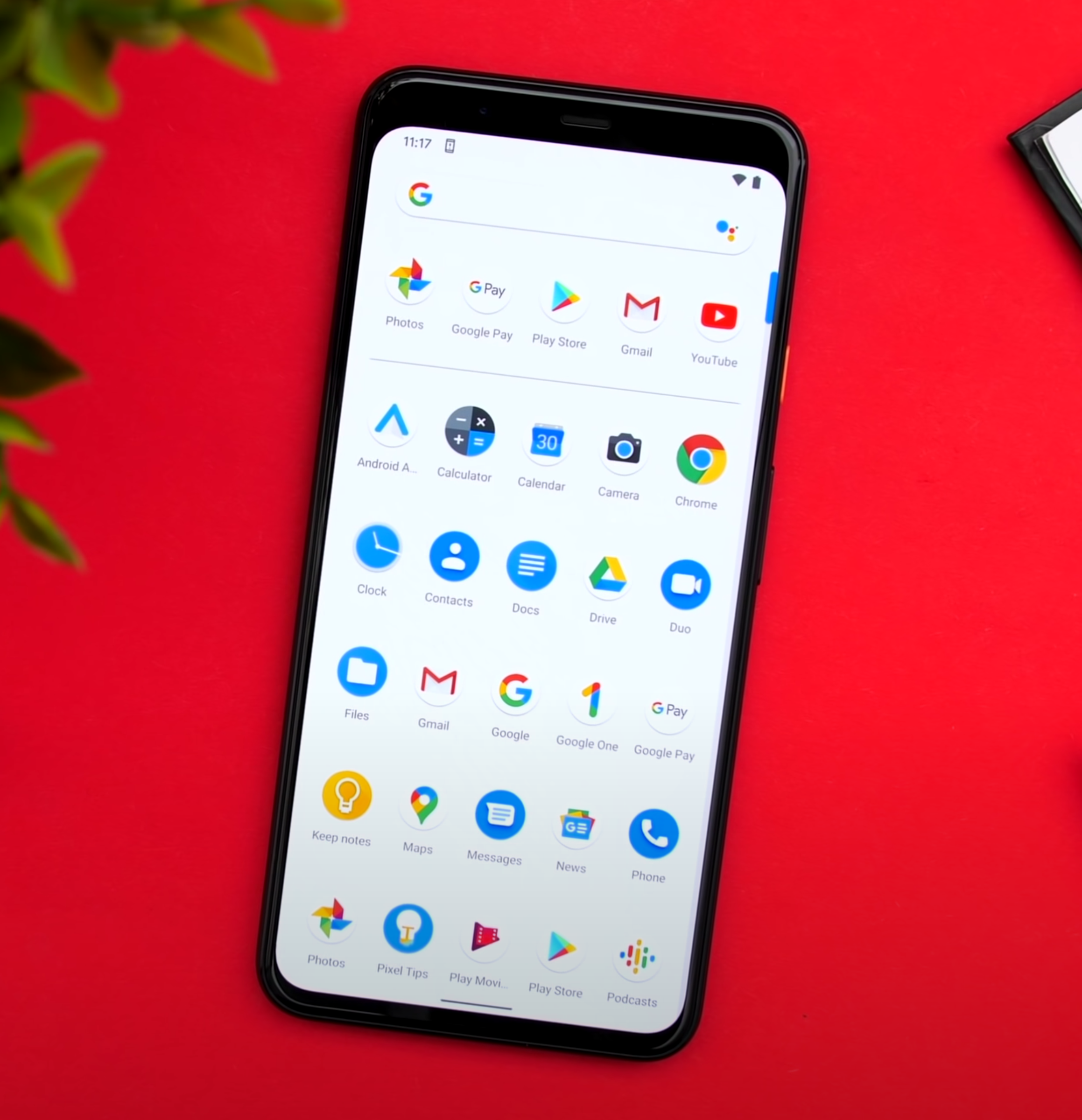
The second big new feature in iOS 14, is the App Library. Just like on Android again, where this is called the App Drawer, if you swipe left from your last Home-Screen, you can access the App Library, which is really just like the Launcher on Mac. A collection of all of your Apps installed on your iPhone. While I do like this idea a lot, unfortunately there are many issues and inconsistencies that I’ve found with the App Library. For example, on stock Android you get this App Drawer which lists and sorts all of your Apps alphabetically. Personally, I’m not really a fan of this as I do prefer having my Apps in Folders, which Samsung actually allows you to do in their own Android skin. which I love. Apple is somewhere in the middle.

The App Library does create App Folders, but those Folders are created automatically for you. There’s no way you can change that which means that finding a specific App can be quite tricky. Apple, please give us the option to rename and organise the Folders, as that would help a ton! 

Another mainstay on Android has come to iOS in the form of the ‘App Library’.

Another mainstay on Android has come to iOS in the form of the ‘App Library’.

The way it works now is kind of pointless as I can still better organise all of my Apps, by having custom Folders on the Home-Screen. Also, opening those Folders in the App Library is very confusing as well. Unlike the Folders on the Home-Screen, if you tap on an App, it just launches it. So, you need to press on the bottom right Icon that shows multiple Apps, in order to open up the Folder. Ok, so you’re probably wondering, what happens if you delete an App from the Home-Screen? Does it go to the App Library or does it get removed? So, once you get into Jiggle Mode, the ‘Delete’ option has been renamed into ‘Remove App’ and once you press that, you’ll be asked if you want to delete the App or add it to the App Library. Which again, is extremely confusing because all your Apps are already in the App Library anyway. I think this should be renamed into “Hide App” and “Remove App”. 

Back to the App Library. If you swipe up, you get this list view in alphabetical order, with all of your Apps. This is sort of like on Android and then you can scroll through them or even search through them, which I can already do that in Spotlight Search, but at least we get this list view, which I am a fan of. Those are the two big changes in iOS 14, Widgets and the App Library. While I do love both, I do feel like iOS is becoming a bit of a mess now. You can swipe right to access the Widget Panel which you can also add to your Home-Screen anyway. You can then swipe down to access the search functionality which you can also access by swiping left from your last Home Screen, but that search is only for Apps, whereas the swipe down search is for everything. I just feel like it needs a lot of polish as right now, it’s like a notebook full of ideas, instead of an organised Operating System.

There have also been a few extra things that I have noticed, which I do really want to point out. First off, the stability has actually been very good. I haven’t had any system crashes or anything really. It was a bit slow at first but after it indexed all the Apps, things got back to normal. It was so good that I even installed it on my personal iPhone and from all the Betas that I’ve used over the past ten years or so, iOS 14 is definitely the most stable. Battery life has been affected, but it’s nothing too severe.

The double-tap on the back functionality allows you to select a specific function that your iPhone will execute, once you double or triple-tap on the back. The way it works is that it uses your iPhone’s motion sensors to detect the tap on the back. However, because of this, my double tap functionality also got activated a few times when I laid my iPhone flat on my desk. The good news is that you can also have custom Siri short-cuts on this, meaning that you can pretty much assign anything you want to this double or triple tap Gestures. I’ve set mine to launch the Camera App as iOS still doesn’t have a quick Camera Launch functionality on the Volume or the Power Button. These gestures are a bit finicky to activate, but when they do work, it’s a pretty nice feature to have. 

A long-awaiting and welcome new feature, is 4K YouTube Content.

A long-awaiting and welcome new feature, is 4K YouTube Content.

Also, you can finally watch 4K YouTube content now, after so many years.

The reason why we couldn’t do it before was because Apple wasn’t using Google’s VP9 Codec and Google wasn’t using the h.265 that Apple was using. But now that the new AV1 Codec has been agreed to by both Apple and Google, and iOS 14 supports AV1, 4K playback is finally possible on Apple devices. But there is a catch. Google only seems to be using AV1 for 4K HDR videos, meaning that you can only watch 4K videos that are HDR. Otherwise, they’ll still be 1080p. I really hope that this gets fixed.

Speaking of things that need to get fixed. There’s now a way to adjust the exposure in the Camera App separately from the Focus, which is pretty great! We’ve had this in some third-party Apps as well. However, the way it currently works in iOS 14 has to be the most unintuitive way that I’ve seen. You can still adjust it via the up/down Slider when you’re focusing, but now you also have this Exposure Meter. The thing is, once you adjust it, there’s no reset button and you can increase/decrease the Brightness the same old way while the exposure meter is set to a custom value and that value won’t change. However, I’m pretty sure that this is a glitch though. 

In the Weather App, you can now see the AirQuality Index, which is pretty nice. Probably my favourite feature that I’ve found is that now you can hold the Navigation Buttons to go back to a specific previous category.  This really helps for when you’re buried deep into the Settings and you don’t want to keep going back and back until you get to where you want to be.

Siri now has a brand new UI, which I do like. You can now summon her without blocking the entire Display. However, what I don’t like is that you cannot interact with your Phone, whilst using Siri. Other than that, it’s more or less the same Siri as before. This UI now applies to whenever you’re getting a call. Rather than this blocking your entire Display, you get this notification-style window which you can even dismiss and continue doing your own thing.

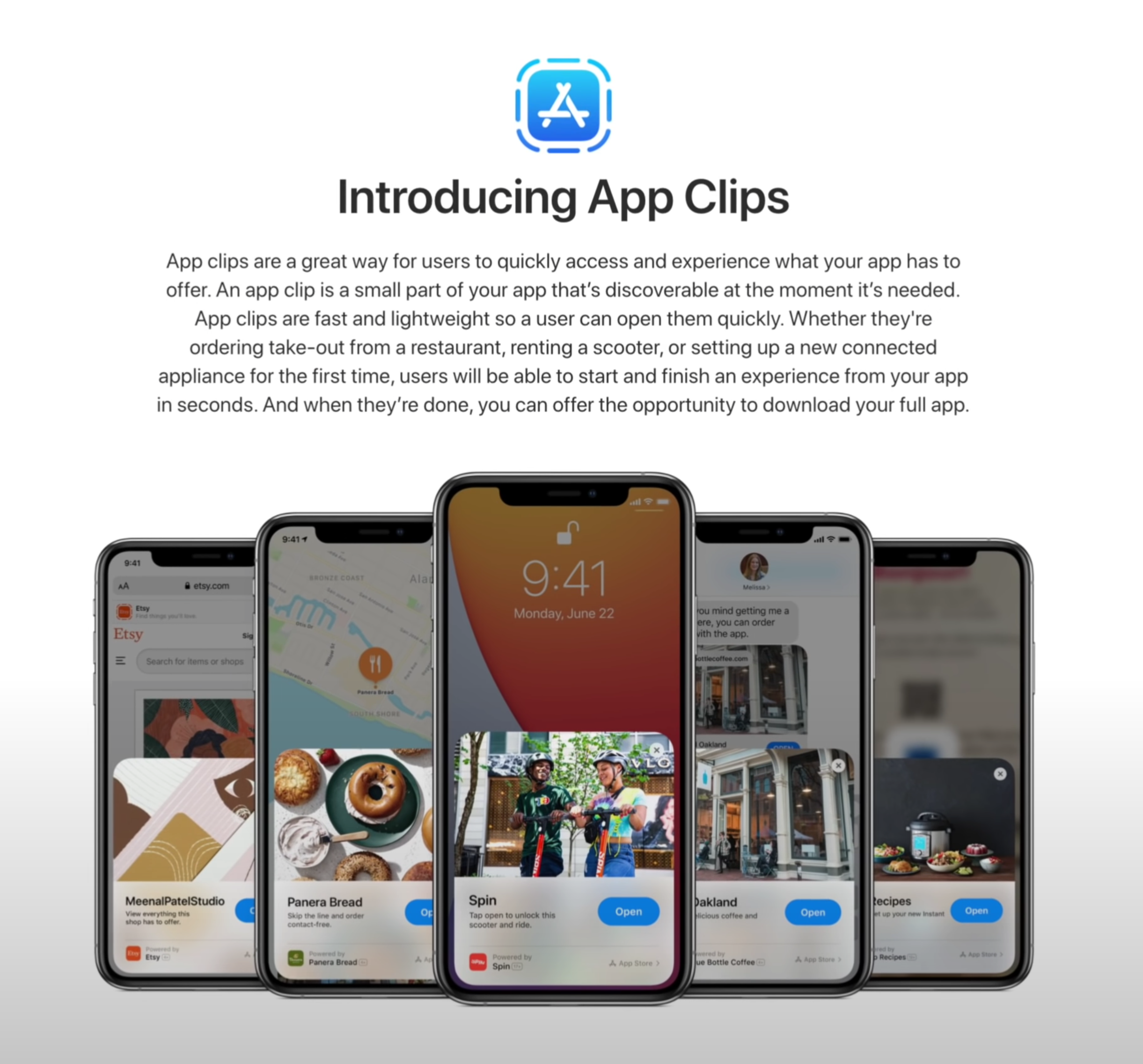
‘App Clips’ is another thing that we’re looking forward to testing in the future.

‘App Clips’ is another thing that we’re looking forward to testing in the future.

Control Centre now allows you to show individual Accessories and Scenes from the Home App. Unfortunately, you cannot customise which Scenes or Accessories it shows you as this has all been automated, based on the ones that you use the most.

If you’re wondering how the AirPods pro sound, with that new 7.1 Surround Sound support, I won’t be able to tell you that because it seems that this is not available in Beta 1 just yet. Picture-in-Picture is though and it works just as you would expect it to, kind of. It doesn't work in the YouTube App so you have to be playing a video in Safari in order for that to work. But, it does work for Face-Time now, meaning that the person that you’re speaking to won’t get a black screen every time you go to check a Notification, but instead they’ll get to see you all the time, ands likewise.

Of course, there are many more features, such as App Clips, which I cannot test just yet. In terms of the big changes that I have noticed, these would be the main ones. 


watchOS 7

Moving on to watchOS 7, by far the biggest change here is Sleep Tracking and…I’m quite disappointed. The way it works is that you have this Sleep App and you select how many hours of sleep you want to get and when you need to wake up, it will then tell you when you have to go to bed. Right before that, you’ll have a ‘Wind Down’ period, which is usually around 45 minutes. This is when DND will automatically be enabled and that’s pretty much it. 

Your Apple Watch will estimate the Battery Life it would have, when you go to bed, and if that amount would be less than 30%, you’ll get a Notification to charge it. The only problem is that I never got that Notification, which I’m assuming will get fixed in the final version. Not only that, but Automatic Sleep Detection never worked for me. I had to manually put my Watch into Sleep Mode, rather than this being enabled automatically based on the sleep times that I’ve set it to. Again, I’m guessing that this will be fixed when iOS 14 comes out.

But probably my main issue with Sleep Mode is that you cannot really see your sleep stats, unless you go into the Health App and into the ‘Sleep’ section of that. Moreover, it doesn’t even tell you much, just the time you were in bed, which is literally based on when you tapped the ‘bed-time’ Icon and the time you were asleep. There are no mentions of sleep quality, REM data or anything like that. An App such as Sleep Cycle is so much better than the native Sleep Tracking is, as of right now.

Native Sleep Tracking will now be a thing, but there are already alternatives that do it better.

Native Sleep Tracking will now be a thing, but there are already alternatives that do it better.

Also, you’re probably wondering how much Battery Life it drains in Sleep Mode. Well, in my case, I had 51% Battery when I went to bed and 37% when I woke up about six-seven hours later. A 14% drop is actually very good, I just really hope that the Sleep Tracking gets smarter by the time this gets released. 

There is a new hand-wash feature which would show you a timer when it detects that you’re washing your hands. That’s not working just yet, or at least I could never get it to work, on my Apple Watch. 

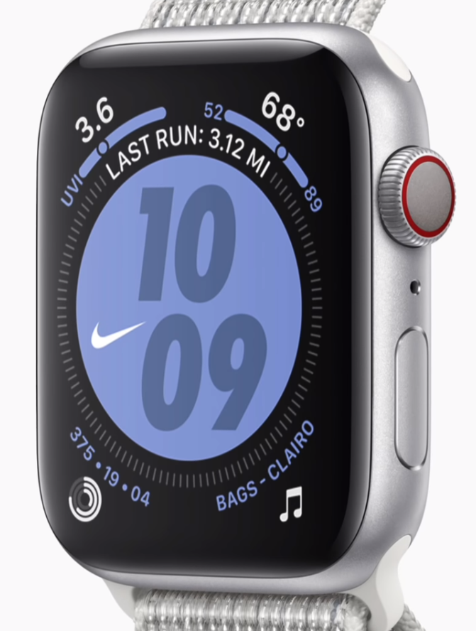
Aside from that, the only new Watch-Face that we get, is the Chronograph Pro, which includes a Tachymeter that you can use to measure the speed that you are traveling at. I just wish this also had a digital version. You can also have complications on the X-Large Face, which is pretty nice to have and you can also add a Colour Filter to the ‘Photos’ Watch-Face. I also really do like how Apple has redesigned the Watch-Face customisation page and they now show you the colour selector on the right of the Face, rather than inside the Watch-Face.

There’s a new Workout for Dancing, but this was actually in watchOS 6. It was hidden in ‘Others’ and I’ve used it all the time for when I was playing ‘BeatSaber’. I’m not fully sure what’s new with this, possibly improved tracking?  But that’s pretty much it in terms of big, noticeable changes.


iPadOS 14

Finally, there’s also iPadOS 14, which is a very small update. Aside from ‘Scribble’, there’s nothing really that stood out to me. In fact, we don’t even get the Widgets from iOS, there’s still stuck in the Side Panel and we don’t have the App Library at all, which is extremely inconsistent.

While I do believe that these will be added by the time iPadOS releases, Craig Federighi indicated to Marques that this is how they’ve intended to release iPadOS 14, for now. So, we’ll see.

But that’s about it, macOS does have a lot of changes as well, just like iOS 14 did, but that’s an entire video in itself.

Apple Watch Series 6 - Finally Something New?

The Apple Watch has been one of my favourite pieces of technology, ever. I recently switched to a Samsung Galaxy Fold as my daily driver and the only thing that I miss about my iPhone, is the Apple Watch sync. 

Luckily, I still have my iPhone around but my point here is that while I can indeed switch away from iOS, there’s not really an overall better Smart Watch than the Apple Watch, at least for iOS users.  So, without further ado, here is everything we know, so far, in terms of the Apple Watch Series 6. This is set to be one of the biggest changes to ever come to the Apple Watch!


The Story So Far

I have always been a massive fan of the Apple Watch. I remember making videos on it years before it was launched, such as the ‘Leaks & Rumors’ episodes talking about every piece of information we had about Apple’s super secret project. Then we finally got it, the original Apple Watch.

But unfortunately, the first generation, which came out in 2015 and was announced back in 2014, was not great at all. It was pretty slow, the battery life wasn’t anything amazing and it was extremely expensive. Apple even sold that $17,000 18-Karat Gold model.

With the Series 2 in 2016, they dropped the Gold model, they added 50m Water Resistance, up from the 1m for up to 30 minutes that the original model had. They also increased the screen brightness to 1000 Nits, up from 500, and significantly improved the Processor. The Battery even lasted two days now and we got GPS, so the Series 2 was a very big upgrade.

The Series 3 launched in 2017, adding Cellular support so that you can get a network connection without the need for you to have your iPhone with you. It added an even faster Processor, with the S3 Chip being 70% faster than the S2, which was already twice as fast as the S1 inside the original Apple Watch.  It doubled the Internal Storage to 16GB and increased the amount of RAM to 768MB from 512MB. 

Then we had the Series 4 in 2018, which was the biggest upgrade to come to the Apple Watch since the original one was introduced. We got a new design (sort of) with a more rounded frame as well as a much larger Display. Also, it had almost the exact same body, so the screen Bezels got significantly thinner. We got another new Processor, the S4, with double the performance of the S3, an ECK Meter, an improved HR Monitor and Haptic Feedback on the Digital Crown itself. This was such a big upgrade.

Finally, last year we got the Series 5, which was essentially just a Series 4 with an Always On-Display, something that I’ve been requesting ever since the original Apple Watch. Having said all of this, the Series 6 should be a fairly big upgrade, considering that we haven’t had once since 2018.


Design

When it comes to the design, we’ve yet to see reports that state that Apple is working on a major redesign, similar to what we saw around the same time two years ago, ahead of the Series 4’s release. This means that it is extremely likely that we would see the exact same design that we’ve seen with the Series 4 and the Series 5, just possibly with some more finishes.

The Series 5 introduced Titanium as a brand new finish and also brought back Ceramic, which we hadn’t seen since the Series 3. We wouldn’t be surprised if Apple ends up introducing one more material option, or at least some different colour options, for the materials that we have now. I’m not sure about you but I think a Ceramic Forest Green or Midnight Blue would look incredible.

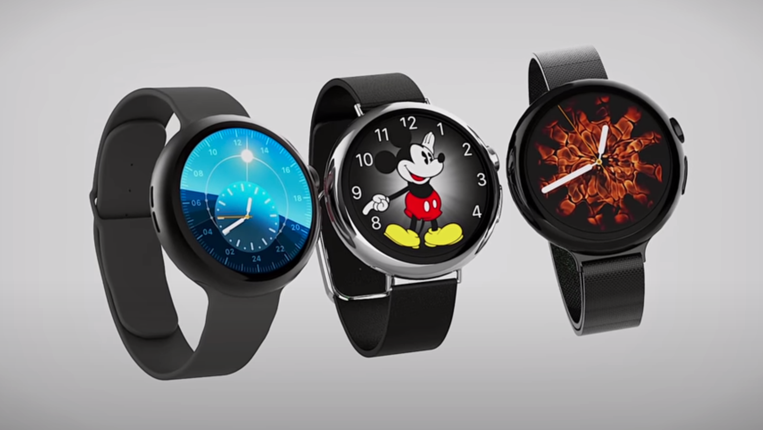
Regardless, there is a small possibility that Apple will indeed tweak the design. Ever since the original Apple Watch came out, we always wanted Apple to release a circular Apple Watch, we’ve actually modelled our very own. Whether Apple does this with the Series 6, Series 7 or even later, we don’t know yet.

This is our concept for the next Apple Watch, will it finally come full circle?

This is our concept for the next Apple Watch, will it finally come full circle?

We based this design off of the current Series 4 & Series 5. We kept the same design language while at the same time, making the body circular. This means that we still have the same style of the Digital Crown, with the Red Ring and the Haptic Engine. We still have the same Heart-Rate Monitor but with additional functionality, which we will be covering shortly. We still have the same iconic circular Apple Watch Faces, which now look better than ever before on a circular Display. Also, we based all of the colours on the current Apple Watch series 5 offering.

Do leave a comment down below, on what do you think about a Circular Apple Watch and if you want to see more concepts such as this, definitely subscribe and also follow our second Instagram account (@ZONEofCONCEPTS) for more 3D Concepts such as this.

But unfortunately, the Series 6 is likely to look extremely similar to the Series 5. 


Display

When it comes to the Display, ‘EconomicDailyNews’ reported back in July 2019 that the 2020 Apple Watch could be getting a microLED Display. This is something that ‘DigiTimes’ also reported back in 2018. Unfortunately, we haven’t had any more recent leaks on this, so do take this with a grain of salt.

Essentially, microLED Displays are the biggest Display innovation since OLED. This is not be confused with miniLED, which is what the November 2020 iPad Pro’s are said to feature, as well as the upcoming 16 inch MacBook Pro’s. Long story short, LCD panels are the most inferior Display technology that we have now. 

In LCD panels, the Pixels only provide the colour and not the backlight. Therefore, you need to add a separate backlight layer. This means that the Display will be thick and will consume a lot of power. Also, you cannot have perfect Black Levels, if you have a white text on top of a black surface, the backlight will still have to be fully on in order for the text to be visible, which means that blacks will always look greyish or blueish.

Then we have OLED Displays in which, unlike LCD’s, the Pixels can provide both the colour and the backlight. This means that OLED Displays can be very thin, they consume very little power and they have perfect black levels as you can individually turn the Pixels on and off. The only problem with OLED is that they can easily burn, so their life span is very limited. 

Then we have miniLED, which is a fairly new technology and is what Apple is using in their Apple Pro Display XDR. Essentially, it is still an LCD panel, but the backlight is split into multiple smaller zones, 576 in this case, which can individually turn on and off. It still has the downsides of an LCD panel but the black levels are much improved.

And finally, we have microLED, which is essentially OLED with extremely tiny inorganic LED’s, rather than organic LED’s. This means that it has all the advantages of OLED, but without the burn-in issues. Not only that, but microLED Displays can be even thinner than OLED, with even lower power consumptions while also being much brighter. These microLED Displays are really the future and the Apple Watch is indeed a very good candidate for this technology. At the moment, microLED is even more expensive than OLED, so Apple cannot implement this on devices that have a large Display. If you take a look at the first Apple Watch, it was also Apple’s very first device to come with an OLED Display. Whenever Apple is implementing microLED, it will very likely come to the Apple Watch first and is looking like it could come this year.


Specs

What other changes could we see with the next Apple Watch?

What other changes could we see with the next Apple Watch?

Moving on to the specs, the Series 6 will finally feature a bump in performance. The Series 5 did come with the Apple S5 Processor, but this was actually just an S4 with a built-in Compass and the new Display Driver for the Always-On Display. So, we actually haven’t had a performance boost, since the Apple Watch Series 4 in 2018. Here’s a fun fact, my Series 4 was perfectly smooth, I had zero issues in terms of its performance. 

However, the Series 5 actually lags on me quite a bit. It might be because of the Always-On Display. The Processor has to keep updating that all the time, albeit at just 1Hz, compared to 60Hz. But still, the CPU is running more intensively than on the Series 4 and the RAM is also used more because of the Always-On Display.

Ming-Chi-Kuo did report that the Series 6 will indeed be getting some bumps in performance. This not only includes the CPU getting faster, but apparently WiFi and Cellular speeds will also be improved. Kuo also stated that the Circuit Board will now be made out of LCP (Liquid Crystal Polymer) as opposed to Polyimide or PI. Dongshan Precision, Avary Holding and Flexium Interconnect will be the primary suppliers.


Special Features

Moving on to the Special Features, this is where we’ll see the biggest changes.

Blood Oxygen Level Meter

The first one will be a Blood Oxygen Level Meter. Based on leaked iOS 14 code that ‘9to5mac’ managed to find, we now know that Oxygen Level Saturation is something that Apple plans to include in the Series 6. Essentially, if the Oxygen in your blood has a level under 95%, you will get a notification alert, similar to how you’re now getting an alert when your heart-rate is abnormally high. Even the original Apple Watch from 2015 had hardware capable of measuring the amount of Oxygen in your blood, ‘iFixit’ found that from their teardown. 

However, for some reason, this functionality was never enabled. Some reports are saying that this is because Apple never got the FDA approval for this, so it could be that the Series 6 will now get an improved hardware version of that or watchOS 7 will actually enabled Oxygen Level Saturation measurement on all the previous Apple Watch models that support it as well.

watchOS 7

Speaking of watchOS 7, ‘9to5mac’ managed to find some more code that points towards some upcoming features. These include the ability to share your Watch Face with other users and a brand new Infograph Pro Watch Face that will include a Tachymeter, which will tell you the speed at which you’re traveling.

Aside from this we would also be getting a new Countries Flag Watch Face, which will allow you to pick a flag and have a Watch-Face on top of it. This can easily be done at the moment via the Photos Watch Face.  Speaking of the Photo Watch Face, it is said to be getting an improvement that allows you to select photos from a shared album, rather than just your own albums.

Parental Controls will also be added, as well as School-Time for restricting some Apple-Watch apps for when a child is in school. We are also said to be getting an improved Control Centre with new toggles and a brand new Architecture for apps, which will remove the extensions base for apps entirely, meaning that Apps will now fully run on the Apple Watch rather than being extensions to iPhone apps. 

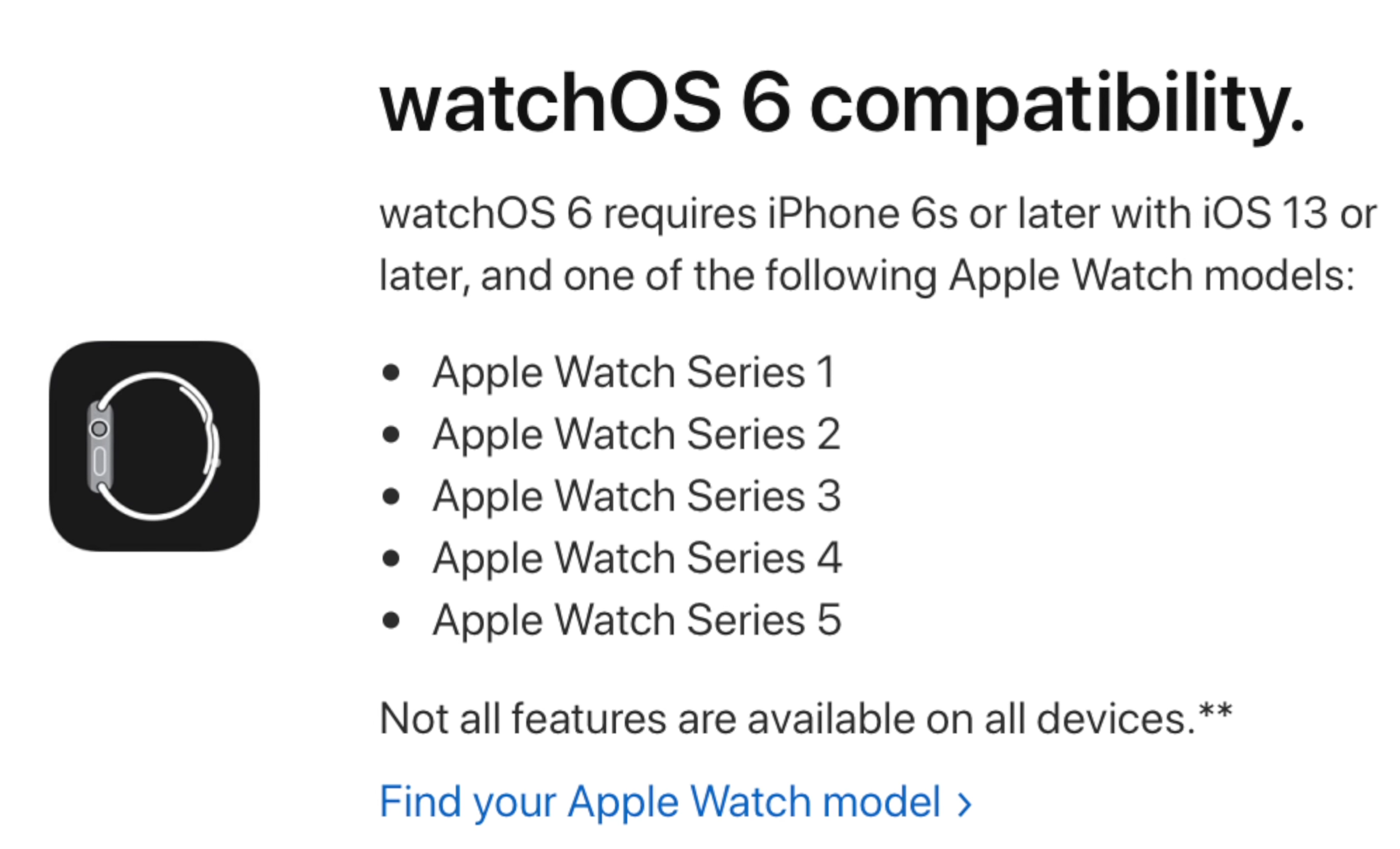
According to ‘The Verifier’ who claims that they have some high level sources inside Apple, watchOS 7 will only work on the Apple Watch Series 3 and newer, with support for the Series 1 & 2 finally being dropped. 

Sleep Tracking

Now, the third big new feature of the Series 6 is said to be Sleep Tracking. According to some more code found my ‘9to5Mac’, Sleep Tracking will finally be included. As reported by Bloomberg, this will indeed be a feature implemented at the hardware level, rather than just being a software update that will work on older models.

Apple will need to heavily improve the Battery Life, which according to these reports, they wouldn’t be doing, at least not to the amount that will make the battery last for a week. We don’t fully know how Apple will address this, but it is likely that they will use a new low power Chip that will monitor the sound and the movement alongside your heart-rate, when you are asleep. Chances are that you will have to charge it in the morning, before you go to work, as you will need to wear the Apple Watch while you’re sleeping in order for Sleep Tracking to work. 

What would TouchID on an Apple Watch look like?

What would TouchID on an Apple Watch look like?

TouchID

A very strange report, coming from ‘The Verifier’ once again, claims that the Series 6 could be getting TouchID. This would either be integrated into the Crown or even integrated into the Display panel itself. That would be amazing but, they’re also saying that this could be a 2021 feature and might just be something that the Series 7 will come with. 

Kids Mode 

Additionally, ‘9to5Mac’ found references in the leaked iOS 14 code to a brand new Kids Mode, which will replace the current activity rings with something more suitable for kids. Rather than tracking the amount of calories burned, these will just track the amount of movement and will be tweaked with a child’s’ activity pattern in mind. This is a watchOS 7 feature so it will very likely come to all the models from the Series 3 upwards. 

Improved Water Resistance

Finally, Ming-Chi-Kuo reported that the Series 6 will be getting an improved Water Resistance. At the moment, we get up to 50m submersion, which is pretty nuts. However, Apple themselves state on their own website that you shouldn’t use it for scuba diving or any other activities that involve high velocity water or submersion below shallow depth.  This could be fixed with the Series 6. 


Battery Life

Battery Life is said to be improved with the Series 6, now that we’re getting Sleep Tracking. Whether this is done by just increasing the Battery size, or by the new microLED Display, or even both, we do not know. But, Apple will have to do something as the Battery Life on the Series 5 was noticeably worse than on the Series 4 before it. 


Release Date 

And finally, when it comes to the Release Date, we would expect pretty much the same as always, September 2020. However, this year we might actually see a slight delay because of the current outbreak situation. With this in mind,  it could be pushed to November, or in the worst case scenario, to March 2021 or further, although I don’t think it would be delayed that heavily.


Conclusion

So, in the end, what are my thoughts on the Apple Watch Series 6?

Well, it looks like the biggest new feature that most of you will care about will be Sleep Tracking. Aside from that, things such as the new Watch Faces, the Oxygen Level Meter and Kids Mode are likely to be added to some of the previous Apple Watch models as well.

If you were hoping for a major redesign, you might have to wait until the Series 7, or even later, until we finally get something similar to our render.

Apple Watch Series 5 - Review


Let me give you some context before I begin on this article, I’ve been a huge Apple Watch fan myself. I couldn’t wait for the Apple Watch to be released, I even made a few Leaks & Rumors episodes on the “iWatch”, way before it even got announced.

I then used the original for a year, the Series 2 for two years, the Series 3 for three weeks as I ended up returning it since the improvements weren’t big enough from the Series 2. I then used the Series 4 for a year and now I’ve got the Series 5.

But rather than just doing a usual review of the Series 5, I want to to talk about my entire Apple Watch experience in general

So get those snacks and drinks ready and here are the five main roles of the Apple Watch for me!


WRIST PHONE

The ability to make calls on the Apple Watch means that it almost negates the need for a phone

The ability to make calls on the Apple Watch means that it almost negates the need for a phone

So starting off the Apple Watch is essentially a smartphone attached to your wrist. I have the Series 5 with Cellular support which means that it’s always connected even when you’re not on WiFi or close to you iPhone. I can make or receive phone calls, I can navigate maps, I can check my emails and constantly get notified whenever I get any new messages on social media.

Really, aside from a Camera, the Apple Watch is a full fledged smartphone attached to your wrist. Especially now with watchOS 6, we have a the full Apple Watch App store directly on the Apple Watch, so you no longer need your iPhone to download apps to it as you can do it directly from the watch itself.

However, even though it has pretty much all the functionality that a smartphone has, it is not a smartphone replacement, as you do need an iPhone to set it up and it does not work on Android in any way.

In my case, I did end up leaving my iPhone behind quite a few times when I would go out and just take my Apple Watch. I actually felt even more connected with the real world, because I didn’t have a display to constantly check, yet still getting important notifications and the ability to make a phone call, in case of an emergency. 

The only thing that I felt I was missing from having my iPhone with me, was the camera, but aside from that, this a smartphone attached to your wrist.


PERSONAL DOCTOR

I use the phrase loosely but the Series 5, just like Series 4 before it, features the 2nd generation Heart Rate monitor, which is faster and more reliable than the 1st generation that the first three Apple Watches had. 

The 2nd gen Heart Rate monitor measures your heart rate constantly, but you can check it manually.

The 2nd gen Heart Rate monitor measures your heart rate constantly, but you can check it manually.

Your heart rate is measured every few minutes and constantly, whenever you’re doing a workout. On top of this, the Series 4 and 5 can also take your ECG (Electrocardiogram), you know that graph that shows you exactly how your heart beats, yeah that one! 

And according to multiple tests and studies the HR monitor and ECG Meter are as accurate as the actual medical devices used in hospitals which is very impressive.  Now, there are now some other smartwatches that can do this, some hybrid watches from Withings and the Samsung Galaxy Watch Active 2, but the Apple Watch was the first one to have this functionality with the Series 4. 

And there are a few more things that the Series 5 can do.

The Series 4 for example had something called ‘Fall Detection’, where if you fell over and didn’t move, it would automatically call the emergency services. This is extremely useful and in some cases it even save some lives. There were quite a few articles of incidents like this happening. The same thing applies to the ECG meter. The Apple Watch can detect Atrial Fibrillation, which is a heart condition that cases an irregular and abnormally fast heart rate. Quite a few users have reported that after the Apple Watch gave them the message that Atrial Fibrillation was detected in their heart they went to the doctor who immediately ran some tests on the patients and found that they needed immediate surgery. And this ended up saving their lives.

So the Apple Watch can actually save lives just on its own, which is something that regular tech devices don’t usually do. 

Now, the Series 5 did actually get a big improvement over the Series 4’s life saving capabilities and you can now make SOS calls even outside of the country that you bought it from. With the Series 4, it only had cellular antennas for the country that you bought it from, which meant that if you were using it in a different country roaming wouldn’t work at all. But with the Series 5 is does work for SOS calls only! So now if you’re on holiday in Spain or somewhere and you fall or get injured, your Apple Watch will automatically call the local emergency services! 

The new compass feature will come in handy if you get lost and have no cellular signal

The new compass feature will come in handy if you get lost and have no cellular signal

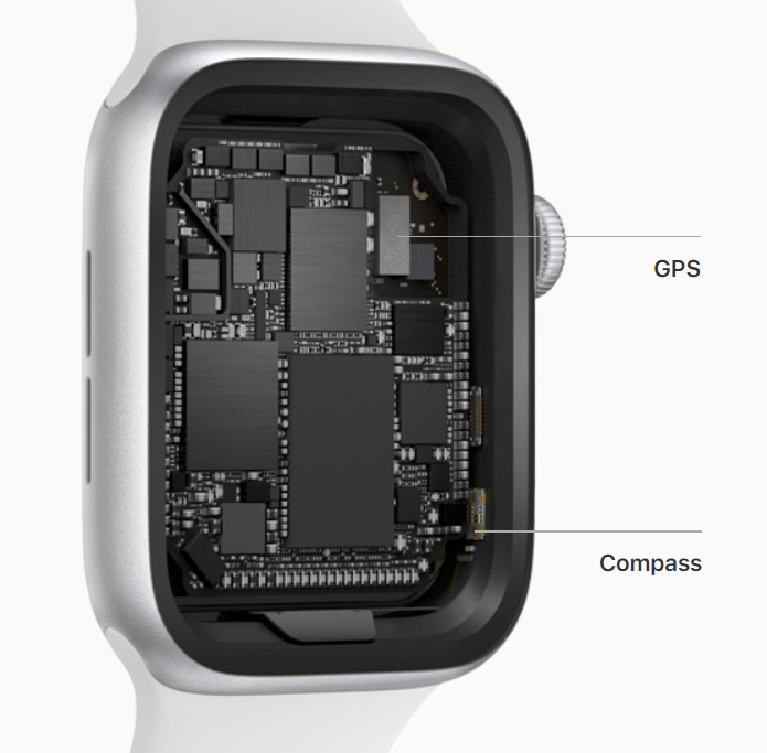
Something else that was added to the Series 5 was a built-in compass. This is something that we’ve had on smartphones since the iPhone 3Gs came out in 2009 10 years ago, but this is the first time we’ve had it on the Apple Watch. What this does is that it allows you to see the direction that you’re facing, compared to magnetic north. In Maps you can now see the exact direction that you’re facing, which is extremely useful if you do use the Apple Watch to quickly navigate the streets. In addition you can also have the separate compass app, which is again very useful for when you’re outdoors, and let’s say you maybe get lost and you have no cellular signal this can help you get back on your track. 

GYM COACH

The third main role of the Apple Watch is being your personal Gym Coach.

You have the famous activity ring, where the Blue ring represents the time you stood up, the red ring represents how much movement you did during the day, while the yellow ring represents the actual workouts and heavy duty exercises that you’ve done during the day. The idea is that you fill all three, every day, in order to stay in shape and be healthy. You do get achievements for completing these, so the Apple Watch always tries to keep you motivated.

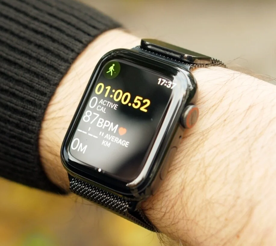
The workout app allows you to track workouts including your working heart rate, length of workout and calories burnt

The workout app allows you to track workouts including your working heart rate, length of workout and calories burnt

Then when you do go to the gym, you do have a built-in dedicated workouts app that has a ton of different workouts to choose from, from running, to walking, cycling, and then you can even add some more specific ones such as Tennis or American Football. The Apple Watch will even sync up with some gym equipment in order to save the data from those running speeds and distances, for example, onto the Watch. Once you’re in a workout it will constantly track your HR, the amount of calories you’ve burnt and you can easily go to your favourite songs by swiping left and right to play some music.

Speaking of music, the Apple Watch will connect to your Bluetooth headphones, no matter which ones you have, so you don’t need to have AirPods by the way. Although the AirPods with this is fire! 

Also even if you do not have the cellular model of the Apple Watch, you can in fact download music directly onto your Apple Watch for offline playback. You can easily do this from the Apple Watch app on your iPhone, and the Series 5 also has 32GB of internal storage up from 16GB on the Series 4, so now you can store twice the number of songs.

The Series 5 is now water resistant up to 50M

The Series 5 is now water resistant up to 50M

Something else which is useful when it comes to exercise and the Apple Watches is that starting from the Series 2, all Apple Watches are now water resistant up to 50M of depth. This means you can easily take them swimming, even diving. I’ve had them in sea water and they were absolutely fine! Before you go into the water you activate the water mode or the swimming workout in the workouts app, and then when you get out of the water you rotate the crown and the Apple Watch will make a noise and eject the water that got inside, really cool stuff! 

So the Apple Watch is perfect for swimming and doing any outdoor or indoor activities. But with the built-in GPS and cellular, this is also the perfect device to carry around you for when you’re running.


PERSONAL DESIGNER

Now one of my favourite features of the Apple Watch is that you can really make it your own. Which funnily enough is quite the opposite of what Apple stands for. Apple has usually been the company that offered one All-In-One Desktop design, one laptop design, one phone design and one tablet design.

But recently they’ve started becoming more accepting to the fact that everyone wants a slightly different thing. So we now have three iMac models to choose from, two sizes for the regular one and the iMac Pro which unfortunately, aside from the colour, the design is identical. There are also two laptop choices now the MacBook Pro and the Air, each in multiple colours, and two different sizes for the Pro. We now have four iPhones to choose from, again each in multiple colour options, and even multiple sizes in the case of the iPhone 8 and iPhone 11 Pro. And finally we also have four different iPads to choose from now, each in multiple colours and even 2 sizes for the iPad Pro. 

So Apple’s finally offering us more and more choice. But really, there is no other Apple product that offers more choice than the Apple Watch does.

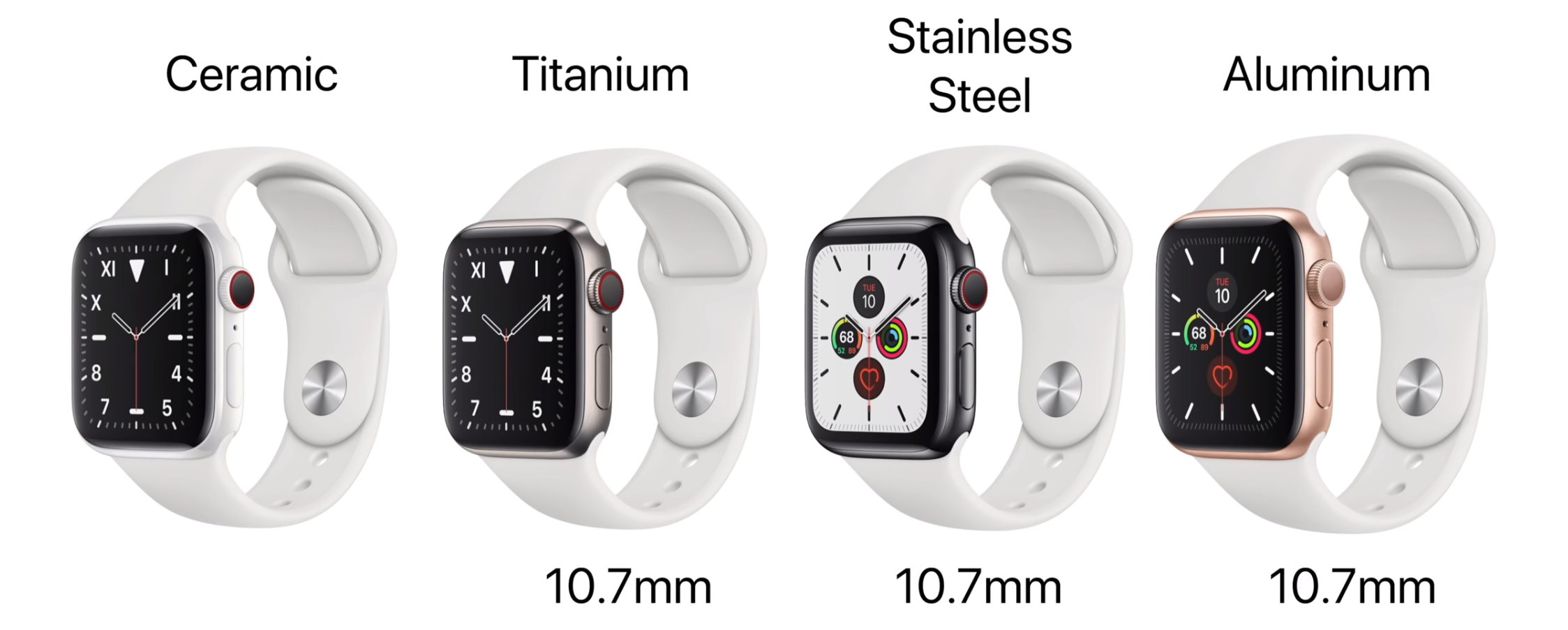
The different case materials you can purchase the Series 5 in (From top left: Aluminium, Ceramic, Stainless Steel, Titanium)

The different case materials you can purchase the Series 5 in (From top left: Aluminium, Ceramic, Stainless Steel, Titanium)

First off you choose the size, 40mm or 44mm case. Then you choose the material that that case is made from, and here you have four materials; Aluminium, Stainless Steel, Titanium and Ceramic. And the first 3 even come in multiple colours to chose from. Aluminium comes in Silver, Space Grey and Gold. Stainless Steel comes in Silver, Space Black and Gold and Titanium comes in Regular and Space Black. 

The Titanium is the brand new casing material now and it’s a bit of an odd one because it’s more expensive than the Stainless Steel models are but it sits right in between the Aluminium and the Stainless Steel model, when it comes to looks and feels. It is lighter than the Stainless Steel model is, but slightly heavier than the Aluminium. For example, for the 44mm model, the Aluminium weighs 36.5g, the Titanium is 41.7g and the Stainless Steel is 47.8g. Personally I couldn’t really tell that much of a different between the two in terms of weight. Even when it comes to the texture, the Titanium one looks closer to the Aluminium than to the Stainless Steel. The Stainlesss Steel has this glossy and in my opinion more premium look to it, so the black stainless steel is my favourite Apple Watch case. 

But like I said, you do have nine different case colours and materials to chose from, so you get plenty of choice. 

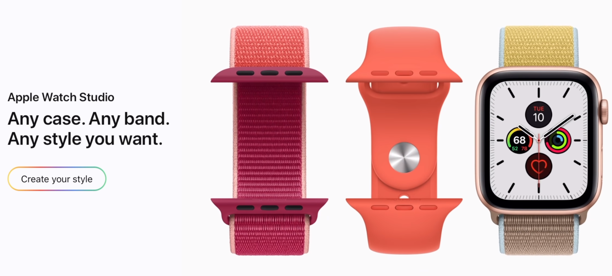
And then you have the bands. So not only are the bands fully compatible with every generation of the Apple Watch ever released but Apple offers eight different bands to choose from, each with multiple colour options which Apple also refreshes every few months or so. But even if you don’t like Apple’s selection that’s fine, you don’t even have to stick with Apple’s own bands. There are many other 3rd party options that not only offer better quality that Apple’s own bands, but also an even larger selection, such as BandWerk.

TIME KEEPER

And finally the 5th big feature for me, when it comes to the Apple Watch is that it’s the a very good time keeper. You get thirty one Watch Faces to choose from, with more and more being added in every watchOS update, which is in September every year. Not only that, but whenever you select a watch face, you can customise it even more. You can change the style of it, the size of the actual clock on some of them, the colour of the second hand, there is just a ton you can do with them

The watch face is entirely customisable so you can put whatever you like on it using third party apps

The watch face is entirely customisable so you can put whatever you like on it using third party apps

On top of this you can even add complications, which are basically widgets onto the watch faces themselves, to get not just quicker access to things such as workouts or music, but also have more information displayed on the watch face. Other things you can get are things like when it is going to rain, the UV Index, Podcasts, pretty much anything you want. And yes, you can even add complications for the 3rd party apps that you have installed, so the selection here is just massive! 

In Always-On mode the clock face with dim and go into a black and white version of your watch face to conserve battery

In Always-On mode the clock face with dim and go into a black and white version of your watch face to conserve battery

Now the Series 5 did finally add something quite big in terms of keeping time, and that is an Always On Display. Now, there is a lot of fuss about this, however Android smartwatches have had this for many years now so it’s nothing new for a smartwatch, but it Is definitely new for the Apple Watch. The way it works is that when you’re putting the Apple Watch to sleep manually or it just goes to sleep by itself the display won’t turn off anymore, instead it will still show you the watch-face, just with a lower brightness. Also, if you have a bright watch face, with lots of colour and white accents, your watch face will slightly change and the animations will be turned off, in the Always-On Display. Apple did include an LTPO display or a low power display in this Apple Watch to make the Always-On Display possible, but what Apple didn’t mention is that the Series 4 also had this very same display technology.

So then why don’t we have an Always-On-Display in the Apple Watch Series 4? 

Well the Series 4 lacks the new display controller that allows the Series 5 to dynamically adjust the refresh rate from 60Hz down to just 1Hz. This means that when you’re not using it, in Always-On mode, the Apple Watch will refresh its display every second, rather than 60 time a second, like it normally does, and this does help conserve batter life.

Speaking of the battery life, at the end of the day with my Series 4 I had about 60% battery life left which was nuts! This meant that in quite a few cases, I even used my Apple Watch for two days straight without charging it. With the Series 5 however, with the Always-On Display on, in my first few days I only had about 15% left at the end of the day which was quite bad. That was without me even going to workout, because if I did that, especially with GPS and cellular turned on, it would’ve died on me mid-day.

However, after about 1-2 weeks of use the battery life started improving considerably. So now, I actually end up the day with about 50% batter left. Still not as good as my Series 4 was, but much much better than my Series 5 was in the first few days. 

So if you’re experiencing issues with the battery life, just use it for a few days until all the files get indexed, and it will improve.


CONCLUSION

Ok, so in the end…should you get an Apple Watch Series 5?

Well, if you already have a Series 4 – absolutely not. You’re just getting an always on display and a compass which you’ll probably never use, so it’s just not worth it for that.

But if you have a Series 3 or earlier – the Series 5 is a very VERY good upgrade.

Not only are you getting a brand new design, a larger display, but you also get the ECG meter, an improved HR monitor, fall detection, a much faster processor which the Series 5 also has btw – yes the Series 4 and 5 have the exact same processor. 

And you’re also getting the always on display.

Now if you don’t have an Apple Watch at all, again the Series 5 is a very strong choice since now we finally have that always on display that many android smartphones have had.

But if you don’t need one right away, the Series 6 will very likely come with a brand new design, next September.

Apple Watch 5 - The Watch We've All Been Waiting For!


This is the Apple Watch Series 5 and we have it in both Titanium as well as Black Stainless Steel. This is it, the Apple Watch that we’ve all been waiting for since it now has an Always-On-Display.

Shout out to BandWerk who make some amazing Apple Watch Straps for sending the Black Stainless Steel for me personally.

So let’s unbox both of these, the Apple Watch Edition in Titanium and the Black Stainless Steel and I’ll give you my thoughts on both in this article as well! 


UNBOXING

Design comparison between the Apple Watch Edition box (Top) and Stainless Steel Model box (Bottom)

Design comparison between the Apple Watch Edition box (Top) and Stainless Steel Model box (Bottom)

So taking a look at both boxes, the Apple Watch Edition has a bold Apple Watch text in black on the front, whereas the Stainless Steel model just has a white indented logo and text, and that’s it.

On the sides we don’t really have anything aside from the pull tab and on the back we get a listing of what we get included inside, alongside the Apple Watch model. 

Ok, so let’s unbox these up, starting with the Stainless Steel model.

So opening up that butterfly style packaging and we get 2 boxes inside. We get the actual Apple Watch box and the band, which in this case is the Black Sport Band with a black stainless steel PIN as well. It isn’t really a perfect deep black, like the old Apple Watch sport bands were, it’s more of like a dark space grey instead, but it still looks really nice on the Stainless Steel Apple Watch.

Opening up the actual Apple Watch box and we get a booklet which includes a quick start guide, the warranty and the safety guide, but no Apple stickers at all.

The Stainless Steel and Edition models charger comes with a stainless steel charger

The Stainless Steel and Edition models charger comes with a stainless steel charger

We then get the charging cable, UBS A to the magnetic head that attaches to the Apple Watch, and also the charger itself, which in the UK is this very compact and portable travel adaptor that also folds the pins inside. Really nice! Now, if you get a stainless steel or edition model, the back and the sides of the charger would be made our of stainless steel as well, rather than plastic like we get on the aluminium models. It has no impact on the functionality, its just a cosmetic upgrade.

And then finally we get the Apple Watch Series 5 which comes in a microfiber pouch which actually matches the colour of the watch and that’s it for the stainless steel one.

Now the unboxing experience for the edition is similar but slightly different.

The inside of that butterfly cardboard that holds the watch box and the band box together has a black inside rather than the white one that we get with the aluminium and stainless steel models. 

We get the quick-start guide which does say ‘Apple Watch Edition’ on it and it seems to be more detailed that the Stainless steel one, and it also matches the colour of the watch inside.

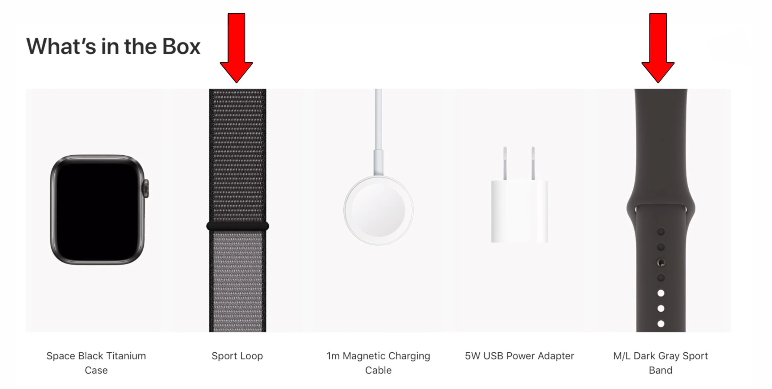
Then with the Apple Watch Edition Box, we the booklet which is noticeably thicker than the stainless steel one. It seems like we actually get a free band inside this Apple Watch Edition Booklet. In my case its a Dark Grey Sport Band which matches the colour of my Watch.

Like previous models, the Series 5 comes in a microfiber pouch

Like previous models, the Series 5 comes in a microfiber pouch

So you get that one with the Black Titanium, you get a Light Grey Sport Band with the regular Titanium and you get a Soft White Sport band if you go with the Ceramic Apple Watch. All all of these band colours are exclusive to the Apple Watch Edition. You cannot buy this separately as of right now.

But that’s pretty much everything in terms of exclusive Apple Watch Edition content. Aside from this we get the same charging cable, the same charger and we now get the Titanium Apple Watch in its own pouch, a dark grey one which looks pretty sleek, and that’s it for the Black Titanium Apple Watch Edition.

FIRST IMPRESSIONS

So I’ve been playing around with these for the past few days and this is what I think about both so far. 

Design comparison between the Series 4 and Series 5

Design comparison between the Series 4 and Series 5

The stainless steel model looks identical to my Series 4. Same dimensions, same thickness, same casing material, so holding them next to one another and you really wouldn’t be able to tell the difference

The titanium one is a new casing material and it looks good for the most part. I do like the brushed metallic look of the Titanium a lot, you can get the titanium in silver as well, which is titanium’s natural colour, I just prefer black It’s a weird one because it looks and feels like a matte stainless steel. It’s got that cold feel to it, unlike the aluminium which feels warm. So I do like that. But at the same time, it’s not as shiny as the stainless steel one is. It’s literally in between the aluminium and the steel in terms of how the casing material looks and feels like. 

Personally, I still prefer the stainless steel. The reason for this is because of the seamless transition between the glossy black display and the glossy back stainless steel case. It just looks as if it was all made from a single block of metal, and you don’t really get this with any other Apple Watch.

Weight comparison between the Stainless Steel model (Left) and the Titanium (Right)

Weight comparison between the Stainless Steel model (Left) and the Titanium (Right)

But something that you might be able to tell is the weight difference between the two. The stainless steel model weighs 47.9g compared to 41.8g on the titanium. It’s not as noticeable as I expected but holding both in my hands I can tell that the titanium is slightly lighter.

Now, probably the best part about the Apple Watch Series 5 is that it still uses the exact same mechanism for the bands. Yes same exact one that we’ve had since the original Apple Watch was unveiled back in September 2014, five years ago. Personally I think that this is just amazing! This means that all of your bands will still perfectly fit on your Series 5.

FUNCTIONALITY & FEATURES

The main new feature of this watch is the Always-On Display. Now the way it works is that it has a low power LTPO display which the Series 4 also had, but the Series 5 does have a new display controller that allows it to switch the refresh rate to as low as 1Hz, down from the usual 60. 

So when you tilt your wrist back, or even put your palm over the display to put it into sleep, rather than the display going black it still shows you the full watch face, only slightly dimmed. 

In cases where you do have a watch face with a lot of movement, like the Toy Story face or one that has a lot of bright areas like the white ones do, the colours would get inverted so that everything’s black, since on OLED displays, when pixels display black they’re actually turned off, so they consume 0 energy. 

Now, the display would be way dimmer in Always-On than it is normally, so you are losing that brightness but at least you have a display that’s always on, something that Android watches have had for many years now, and something that’s been the main lacking feature on the Apple Watch.

For your own privacy you can enable this blur effect which would hide notifications when using the Always-On Display

For your own privacy you can enable this blur effect which would hide notifications when using the Always-On Display

And having an Always-On display is just amazing. You no longer have to tilt your wrist to see the time or your notifications, and if you’re worried about your privacy, you can enable a blur effect which blurs all your upcoming notifications when the watch is in sleep, with the Always-On display on.

So how does that affect the battery life you may ask?

Well, Apple’s claiming up to 18 hours of battery life on the Series 5, which is identical to the Series 4, but I can honestly say that it’s nowhere near that. My Series 4 lasted me for two days easily, and by the end of the second day I had about 20% or so left, meaning my Series 4 consumed about 40% of battery life per day.

The Series 5 with the Always-On display on was at 63% by 3:30pm. Which means that by the end of the day, this will be at around 30% or so. So it can last a day but definitely not two days like my Series 4 easily could.

Also I’m a pretty light user myself. I almost always have DND enabled since I get a ton of notifications and I’d be constantly spammed by my Apple Watch otherwise. And I usually don’t fill my yellow ring. I know, I don’t exercise as much as I should which is bad, but at least now you know how I actually use my watch. Personally its mostly for time tracking, and when I do get notifications I just wipe down to see all of them and that’s mostly it.

So if you’re a heavy user and you use cellular, GPS, you listen to music, go out for a run and you plan on this lasting you for an entire day it won’t.

I also went on Apple’s battery page for the Apple Watch, where they detail all the tests that they’ve done in order to achieve that 18 hour battery life and there’s no mention at all of the Always-On display. They don’t mention if it was turned on or off, which kinda makes me believe that it was with the display off, otherwise they would’ve mentioned it because it’s a bragging right in the end. 

Yes, you can in fact turn the Always-On display off from the settings, but in that case this will just be a Series 4 with a compass and that’s it. 

The compass feature, new to the Series 5

The compass feature, new to the Series 5

Speaking of the compass it’s pretty amazing! It not only shows the exact direction you’re facing but also the inclination, the ground elevation as well as your actual coordinates, so your latitude and longitude.This is quite amazing for if you get lost in the woods for example, just make sure that you turn that Always-On display off to save your battery.

But aside from these 3 features the new Titanium casing material, the Always-On display and the compass, there’s nothing really new to this watch. Even performance wise the Series 5 has the same CPU and GPU as we have in the Series 4. So performance wise, the Series 4 and 5 are identical.


CONCLUSION

So based off the few days I have had with this I would say that if you have a Series 4 don’t upgrade to this as there really isn’t much more on offer than what you get with Series 4. On the other hand, if you have a Series 3 or earlier, I do think that this is a really good upgrade and would encourage you to try it.

This wasn’t the full in-depth review by the way, that’s still coming in a few weeks after I get to test this out even more, see how the battery life really is and maybe Apple will even release a software update in the meantime.

Apple Watch Series 5 - 20 Things You Didn't Know!


Apple has just had their September 2019 Event and they’ve not only launched the brand new iPhone 11’s but also a brand new Apple Watch Series 5.

We have done a video on the channel about ‘40 Interesting Things You Probably Didn’t Know About The iPhone 11’s’ so definitely make sure to check that out in case you want to learn more about the iPhones, but in this article it’s all about the Apple Watch!

So here are 20 Things You Probably Didn’t Know about the Apple Watch Series 5!


1. Always On Display

The new Always-On Display means the watch face will always be visible unlike before (Source: Apple)

The new Always-On Display means the watch face will always be visible unlike before (Source: Apple)

So the first new feature of the Series 5 and also the main feature is that we finally have an Always-On Display.

This is something that Android smartwatches have had for years now and it was, in my opinion, the main downside of the Apple Watch, the fact that you could not see the time unless you twisted your wrist or tapped on the display.

But that’s not an issue anymore because we now have that Always-On Display. So you’ll always be able to see the watch face at all times on your Apple Watch, it would be at a lower brightness but when you tilt your wrist, that’s when the full brightness would be enabled.


2. LTPO Display

The new LTPO (Low Temperature Poly-silicon and Oxide) Panel allows for varying refresh rates and in conjunction with a low-power driver and ambient light sensor the panel can stay on for up to 18 hours (Source: Apple)

The new LTPO (Low Temperature Poly-silicon and Oxide) Panel allows for varying refresh rates and in conjunction with a low-power driver and ambient light sensor the panel can stay on for up to 18 hours (Source: Apple)

But that is something most of you probably already knew about. So why did it take Apple so many years to do this and how have they done it in the end? 

Well, unlike most of the Android smartwatches that use the exact same 60Hz refresh rate when in Always-On Mode, the Apple Watch Series 5 now features an LTPO display that can adjust its refresh rate, anywhere from 60Hz down to even 1Hz. 1Hz means that it will only refresh once every second, which is realistically what you need in an Always-On Display. You don’t care about fluid animations or smooth effects , you just want to see the time and that’s it.

This in combination with a brand new low power driver, improved power management on the chip, and a new ambient light sensor means the Apple Watch Series 5 actually gets the exact same battery life as the Series 4 did before it. 


3. Battery Life

Speaking of the battery life, Apple claims up to 18 hours of battery life on the Series 5 which is the same battery life we had on the Series 4, as mentioned before.

However, my Series 4 could easily last me for 2 days, sometimes even 2 and a half. This is mostly because since I get a ton of notifications I mostly keep mine on Do Not Disturb Mode or Silent Mode, which does help improve battery life. So with my usage I’m very happy with the battery life on the Series 4 and therefore the Series 5 as well, since they do have the same battery life.

However if you go out on a run for example and you only take you Apple Watch with you and you have Cellular Enabled, GPS enabled, maybe you’re even tracking your run in the workouts app and even have the AirPods with you, in that case the battery would only last you for about 3 to 4 hours.

So definitely do keep that in mind!


4. Storing Music

Storing music on Apple Watches has been a feature since the first iteration of Watches

Storing music on Apple Watches has been a feature since the first iteration of Watches

Not a lot of people know this but you can actually just take your Apple Watch and your AirPods out and about and listen to music without your iPhone, even if you do not have a Cellular Enabled Apple Watch.

You can do this my manually downloading music to your Apple Watch. You just go to the Apple Watch app on your iPhone, go to Music and just add your favourite playlists and albums to your Apple Watch. It’s as easy as that.


5. Storage

How the storing music thing works is that your Apple Watch actually has a fair bit of storage inside. Older models had 8GB, the Series 4 had 16GB of storage, but the Series 5 now has 32GB of storage. A bit funny how the iPhone “Pro” that costs 3 times as much and is an actual phone, only has 64GB.


6. Compass

The new Compass chip allows the Series 5 to give you additional support when using maps or if you get lost in the wilderness (Source: Apple)

The new Compass chip allows the Series 5 to give you additional support when using maps or if you get lost in the wilderness (Source: Apple)

Now another new feature to the Series 5 is the Compass. This is a new chip that’s inside your Apple Watch that lets it see the direction that it’s facing when compared to magnetic north. This is something quite common in smartphones but not a lot of smartwatches have this.

The advantage of the compass is that 1. You can now see the direction that you’re facing in the maps app, rather than just having a dot and 2. You have a separate dedicated compass app so that when you’re traveling if you somehow get lost and have no cellular signal for maps you can at least use the compass and get some sort of direction. Really useful stuff!

7. No Roaming

But do you know what is not useful when you’re traveling to a different country? Not being able to use roaming on your Apple Watch. Yes, the cellular features of your cellular Apple Watch are restricted to the country that you bought it from, which really sucks.


8. International SOS

However what doesn’t suck is that the Series 5 does in fact support international SOS calls.

So if you are in a different country travelling and something happens to you, even if you do not have internet access or the ability to make standard calls on your Apple Watch, you will still be able to make emergency SOS calls outside of the country that you bought it from, which is something that the Series 4 didn’t support.


9. W3 Chip

This new Series 5 actually still has the exact same W3 wireless chip that we had in the Series 4. The W3 is the chip that handles Bluetooth and WiFi connections so the faster this chip is the faster your Apple Watch would communicate to your iPhone, your AirPods and your Mac.

The W3 chip that we got with the Series 4 already introduced Bluetooth 5.0 so there wasn’t that much of an improvement that Apple could do, hence why they stuck with the same W3 chip in the Series 4.


10. S5 Chip

The powerhouse of the Series 5, the S5 chip, is almost identical to the S4 chip in the previous model from 2 years ago (Source: Apple)

The powerhouse of the Series 5, the S5 chip, is almost identical to the S4 chip in the previous model from 2 years ago (Source: Apple)

Speaking of the same chips. The Apple S5 chip which powers the Apple Watch Series 5 is almost identical to the S4 chip that was powering the Series 4. It is still 2 times more powerful than the S3 inside the Series 3 so the only improvements here are the addition of the Compass as a separate chip on the SOC, and the controller for the LTPO display.


11. Apple Watch Edition

Do any of you remember the Apple Watch Edition? The pure Gold $17,000 Apple Watch that Apple was selling with the original Apple Watch and they ended up discontinuing because it just wasn’t selling well?

Well, they now brought the edition back, kind of. They did have it with the Series 2 and 3, they had a ceramic version which was of course significantly less expensive than the gold option but they did remove that with the Series 4 and now the Apple Watch Edition is back with the Series 5!

The luxury Apple Watch Edition watches had previously been discontinued due to a lack of sales(Source: Apple)

The luxury Apple Watch Edition watches had previously been discontinued due to a lack of sales

(Source: Apple)


12. Ceramic

The Ceramic Series 5 with a Lemon Leather Loop (Source: Apple)

The Ceramic Series 5 with a Lemon Leather Loop (Source: Apple)

And with the Apple Watch Edition the Apple Watch Ceramic is also making a come back! This is the same casing style that we had before and I do think that it looks absolutely stunning!

We have a black crown which contrasts perfectly with the back bezels of the display and the white ceramic case. Also this is the most premium and most expensive Apple Watch that Apple offers with a starting price of $1,300.

In addition to that it is the most durable Apple Watch that Apple sells, as Ceramic is 4 times harder than stainless steel, of which the Black Stainless Steel finish is still my favourite model. 


13. Thickness

Now if you go for the Ceramic model your Apple Watch would actually be slightly thicker. All other models measure in at 10.7mm, while the ceramic one is 11mm.

(Source: Apple)

(Source: Apple)

14. Titanium

The Titanium model of the Series 5 (Source: Apple)

The Titanium model of the Series 5 (Source: Apple)

We also get another new material which is Titanium. This is something that we haven’t had on Apple Watches before.

Now, Titanium as a material is lighter than stainless steel but also stronger, which means that the Titanium Apple Watch is a very good blend between the Aluminium and the Stainless Steel models.

It comes in 2 colors, Space Black and the regular Silver Titanium. But they look like the Aluminum one just with a brushed texture to them. They’re not as shiny as the Stainless Steel and personally I don’t think I would get the Titanium one. I’ve already ordered one for review but my personal one would still be black stainless steel.

Also the Titanium Apple Watch is $100 or £100 more than the Stainless Steel and personally I don’t think it’s worth it. If you want a light watch just go with the Aluminum, it looks almost the same as the Titanium ones.


15. Apple Watch Studio

This section is something that I’ve been waiting for for years and it is finally here!

You can now customize the Apple Watch with any casing and band that you want and order it! Before you had pre-made configurations by Apple and you could only order those. Now the watch itself and the band gets shipped separately as separate products and this is how Apple is able to make this level of customization possible.

With Apple’s new Apple Watch Studio, you can design the perfect watch for you (Source: Apple)

With Apple’s new Apple Watch Studio, you can design the perfect watch for you (Source: Apple)


16. Extra Band

However if you do decide to go for an Apple Watch Edition you actually get 2 free bands inside the box. You get a sport band as well as a sport loop band both of which costs $50.

So you actually get those $100 extra that you’ve spent on the Titanium, upgrading from the Stainless steel back or $50 since the Stainless Steel will come with a band of your choice.

You will now get 2 bands in the box on specific models of the Series 5, the Titanium and Ceramic(Source: Apple)

You will now get 2 bands in the box on specific models of the Series 5, the Titanium and Ceramic

(Source: Apple)


17. Up to 32G

Now, if you decide to take your Apple Watch in a spin in a fighter jet the Series 5 will sustain up to 32G of acceleration. So while you’ll probably faint the Apple Watch will keep on ticking.


18. Nike Edition

Buy purchasing the Nike Edition Apple Watch you get access to exclusive watch faces like this one (Source: Apple)

Buy purchasing the Nike Edition Apple Watch you get access to exclusive watch faces like this one (Source: Apple)

If you plan on getting the Aluminium version of the Apple Watch don’t, get the Nike Edition instead. The Nike Edition is the same Aluminum version of the Apple Watch but comes with a more unique watch band, the Nike perforated sport band, which you can also buy separately.

But the most important thing here is that it does come with some unique Nike watch faces which you can only get on the Nike version of the Apple Watch and not on the other ones, and guess what? It costs the same as the regular Aluminium models so there’s no reason not to get the Nike edition instead of the regular Aluminium version.


19. Series 3

If you’re looking for an inexpensive alternative to the Series 5 but with the experience of the Series 5, the Series 3 now starts from $200 (£200) brand new (Source: Apple)

If you’re looking for an inexpensive alternative to the Series 5 but with the experience of the Series 5, the Series 3 now starts from $200 (£200) brand new (Source: Apple)

But probably an even better deal is getting an Apple Watch Series 4 refurbished or an Apple Watch Series 3, which now starts from $200 brand new!

Yes, it does come with a smaller display and the slightly outdated design but you still get the exact same Apple Watch experience; a very fast processor, a speaker, ‘Hey Siri’ support and even 50m water resistance for swimming.

The display is just as bright, at 1000 nits so you’re not really missing out on much and it’s half the price of the Series 5.


20. WatchOS 6 Features

Finally, during the September event Apple made it look as if the new watch faces or features such as cycle tracking are only available to the Series 5.

But nope, the Series 4, 3, 2 and even 1 support watchOS 6 so you’ll get most of the watchOS 6 features anyways, including the brand new watch faces on your previous Apple Watches as well!

Regardless of the model of Apple Watch you have, it will be compatible with watchOS 6 (Source: Apple)

Regardless of the model of Apple Watch you have, it will be compatible with watchOS 6 (Source: Apple)


So there you have it, 20 things you may or may not have known about the Apple Watch Series 5. Which of these did you know and what was the most interesting point? Let us know in the comments!