Unboxings

The Smart Watch with a 2-Week Battery Life!

You might have seen our videos on the brand new Huawei P40 Pro. The Smartphone that currently has the best and most impressive Camera out there. Huawei has reached out once again, sponsoring the above video, and have sent over their brand new Huawei GT 2e Smart Watch. As always, all opinions remain my own, it’s just that it’s highly likely that the video wouldn’t have happened if Huawei didn’t partner with us. 

I’m going to tell you some of the features right now, and you have to guess in the comments how much this Smart Watch costs:

  • A 46mm Case

  • A 1.39 inch OLED Display

  • GPS

  • Sleep Tracking

  • Automatic Workout Detection 

  • Real-Time HR Monitoring

  • A 50m Water Resistance 

  • Oxygen Level Meter

  • Works with any Smartphone out there, no matter what OS you’re running.

  • Two-Week Battery Life. Not two days, but two full weeks whilst utilising all of the Smart Watches’ features.

Impressed? Well, wait until you hear the rest! Without any further ado, here’s everything you need to know, in terms of the Huawei Watch GT 2e.


Unboxing

First things first, the unboxing experience is pretty straight forward. The GT 2e comes in a very stylish looking black box, inside of which we get the Watch itself, followed by a USB type A to USB type C Charging Cable, the main Smart Watch Charger and a Magnetic Charger. This will automatically attach to the Smart Watch, so there is no need to fiddle around with aligning it or anything like that. We also get the Quick Start Guide and that’s pretty much it.

To get started, you need to download Huawei Health, which you can find on all mobile app stores. You might also need to download Huawei Mobile Services if you have a non-Huawei Smartphone. But once you have those two, it’s pretty straight forward.

When it comes to a Smart Watch, there are six things that I personally care about the most, these are: Design, Customisability, Fitness Features, Battery Life, Special Features & Value. So, how does the Watch GT 2e perform in each of these categories?


Design

Starting off with the design, the GT 2e resembles Huawei’s recently released Watch GT 2. The only difference being that this is more sporty and it is aimed at people who are always on the move, or just younger people in general, as we do get multiple colour options.

You can chop & change the Bands, but I am a big fan of Huawei’s own.

You can chop & change the Bands, but I am a big fan of Huawei’s own.

We get Graphite Black, which is the one we have, with a black 316L Stainless Steel Body and a Black Sport Band. Then we have the Lava Red model, followed by the Mint Green and Icy White, both of which come with a Silver 316L Stainless Steel Frame. The Band is now integrated into the Body. So, while you can indeed remove the Band and replace it if you choose to do so, the Band continues the flow of the GT 2e’s design and it does look really nice, especially on my model. It looks as if they were made from the same material.

Also, the GT 2e has an Integrated Glass Display, meaning that the border is actually underneath the glass, so if you run your finger over the face of the Smart Watch, it all feels like one single piece. The Display itself is also laminated, so there’s no visible gap between the Display and the glass. I really do like the way this Smart Watch looks from the front, definitely one of my favourites design wise!

Speaking of the Display, we get a 1.39” AMOLED Display, with a Resolution of 454x454 and a PPI of 326. This Display is razor sharp so you don’t have to worry about seeing any Pixels on it at all. We don’t really have anything on the sides, aside from the two buttons. The top one being used for bringing up the App Menu, while the bottom one can be customised into opening a custom app. By default it is set to opening up the Workouts app, which is what I would recommend most people leave it set to.

Finally, on the back we an array of four Sensors, which are used for measuring your heart-rate and the amount of Oxygen in your blood, which I will get back to when I’m talking about health and fitness. 

Overall, it’s a very sleek looking Smart Watch that weighs just 43g, without the strap, so it’s very lightweight and perfect for anyone who’s into sports and wants a lightweight Smart Watch that also looks great on the wrist.


Customisation 

How much can you actually customise the GT 2e? Well, you get four models to choose from, which are all 46mm in size. You can indeed change the Bands, as they have a traditional Smart Watch Band mechanism, but I would say the genuine Huawei bands look the best. This is how the Smart Watch was designed, so that the Band continues the design of the Smart Watch. So the customisation with the Bands is pretty limited.

In terms of Watch Faces you get 12 different Watch Faces pre-installed but if you want to get some more, you can just open up the Huawei Health app and from there, you can find literally hundreds of them. These were created either by Huawei or by other members in the community. They’re all absolutely free, so you don’t need to pay for any of these, and there are so many of them that I kept on scrolling and it took me quite some time until I reached the end of the Watch Face list.

I just wish that they were organised in some way because it was quite difficult finding what I was looking for, they were all just… there. But if you care about having a large selection of Watch Faces, you get plenty of them to choose from, with even more to come. With some of these you can indeed change the Widgets and what they show, to something else. However, most of the Watch Faces are fixed and you cannot really change them in any other way.


Fitness Features

Now, moving on to fitness features, this is by far the GT 2e’s strongest point. Aside from the lightweight Body and the sporty look, the GT 2e also has a 50M Water Resistance. If you’re a swimmer, or even a diver, it can easily handle that. You can take a shower or a bath with it, that’s all fine.

On top of this, the GT 2e supports tracking for 100 different types of work-out, including automatic workout detection for outdoor running, outdoor walking, indoor walking, indoor running, elliptical and rowing.  You also have a built-in GPS, meaning that if you go out for a run, without your phone, the watch will still be able to accurately track your run and put that on the map for you. 

Screenshot 2020-04-23 at 12.53.34.png

It also comes with a HR Monitor, which supports real-time Heart-Rate Monitoring. The GT 2e can essentially constantly measure your heart-rate, as opposed to measuring it every 10 minutes or so, like most Smart Watches do. It also supports Heart-Rate Monitoring while you’re swimming, which for me is new. I haven’t seen this in any Smart Watch before as the water usually affects the Heart-Rate Monitor, but this doesn’t seem to be an issue for the GT 2e. If your heart-rate is too high or too low for more than ten minutes, you will get a notification to alert you of that.

Moving on, something very unique about this Smart Watch that very few on the market can do, is that the GT 2e can also measure the amount of Oxygen in your blood, as opposed to just your heart-rate. This actually got introduced in an April software update. It allows you to see the percentage of Oxygen in your blood. If this is above 90%, you’re good. If it’s below that, then you either need to take a break from exercising or you might even have a medical condition. 

It’s such a great feature to have, as a lack of Oxygen can cause fatigue. So if you’re feeling tired, it might be because the room that you’re in isn’t Oxygenated well enough, and this Smart Watch can make you aware of that. These are excellent fitness tracking capabilities, with the GT 2e. 


Battery Life

Like I mentioned before, the fourth important thing for me in a Smart Watch is the Battery Life. Most Smart Watches last for a day, very few last for two days and there are even fewer that can last you for weeks. Even these have to enter this Ultra Power Saving Mode, which disables pretty much everything and only shows you the time on a Display that no longer has a backlight. 

Somehow, Huawei managed to get two weeks of Battery Life out of this. This is two full weeks without even enabling the Power Saving Mode, which this Smart Watch doesn’t even have because it just doesn’t need one. How on earth has Huawei achieved two weeks of Battery Life when others can only do a single day? Well, there are a few reasons.

First of all, the GT 2e runs on Huawei’s own Operating System. Second, there are no third party apps supported. Everything that this Smart Watch can do is already built into it. You cannot download any more apps or any more functionality. This means that Huawei does have full control over the software experience. Finally, number three, the GT 2e is powered by Huawei’s own Kirin A1 Processor, which is Huawei’s first wearable Chip featuring Dual Bluetooth 5.1 as well as an Ultra Low Power Management Unit. So, this is why we get a two-week Battery Life. No third party apps and both the software and the hardware is fully made by Huawei.


Special Features

So far, we get a Smart Watch with an insane Battery Life and some of the best fitness capabilities that I have seen on a Smart Watch. It’s just that you have no third party app support and customisation, in terms of the Bands, is pretty limited. So, what special features does it come with?

Firstly, it works with any Mobile OS. You just need to download Huawei’s health app and you’re good to go. Just to make it clear, even if you don’t have any third party apps, you will still get notifications from your apps. It’s just that you can only see them and you cannot respond to them, but you’ll still get them.

The extra-long Battery Life really adds to the Sleep Tracking feature.

The extra-long Battery Life really adds to the Sleep Tracking feature.

Secondly, this is definitely the biggest special feature, we finally get Sleep Tracking thanks to that two-week Battery Life. While you’re sleeping, the GT 2e will measure your heart-rate and breathing in real-time and then provide you with eight sleep quality reports with suggestions on how to improve your sleep quality.  This is definitely my favourite feature on it and something that I wasn’t able to experience before with any other Smart Watch that I’ve used. 

We also get 24/7 Stress Monitoring, which will provide some advice on how to live a healthier, stress-free life. 

We do get some really cool small extra features that definitely do make this an even better Smart Watch. Things such as an Always-On Display, the ability to control your music straight from your Smart Watch, a remote shutter for your Huawei Smartphone’s Camera as well as the ability to locate your phone. A few more apps that the GT 2e has are: a Barometer for measuring the altitude, a compass for finding your direction, a weather app, a breathing app and more. 


Value 

Finally, how much does the GT 2e cost and what is the overall value that you’re getting from it? Well, the GT 2e is now on sale and it costs £160 in the UK! Now, that’s significantly less than what I was expecting it to cost. It’s almost half the price of other Smart Watches or even more than that in some cases. 

While you are not getting as much customisability in terms of Bands, Watch Faces and apps, like you would do with some other Smart Watches, you are indeed getting one of the very best for fitness capabilities out there. It has the ability to measure your heart-rate while you’re swimming, 50M Water Resistance, a real time HR Monitor, an Oxygen & Stress level Meter as well as GPS. Of course, you’re still getting all notifications from your phone, right on your wrist. On top of this, you also get an insane two-week Battery Life with sleep tracking capabilities. 

If you’re looking to get one, I’ve left a link in the description of the video. If you use the coupon code AZONEoFTECH, you also get a £20 discount. Offer valid until April 30th 2020. 

The Best Laptop for Students?

HONOR reached out and wanted us to show you their brand new MagicBook Laptop. They claimed that this is the very best Laptop for students and it does have some very unique features which no other Laptop has. We are going to run you through all the specifications, all the features and everything that this Laptop can do, then you can decide if the new HONOR MagicBook is a good option for you!


What We Will Cover

As most of you were, or probably still are students, the most important factors when buying a Laptop for University are: 

1. The Portability – You need this to be a lightweight Laptop that you can easily take it to classes. 

2. The Battery Life – You cannot have this last for two hours, you need this to last for pretty much an entire day. 

3. The Display - This has to be pretty good, both in terms of its size and also in terms of its sharpness. The last thing you want is a horrible Display that you need to look at all day. 

4. The Keyboard - You’ll (hopefully) be doing a lot of typing, so the Keyboard is extremely important. 

5. The Performance - This depends on what you are studying. If you’re into Computer Science, Animation or Graphic Design, you need your Laptop to be able to handle all of that.

6. The Price - No student wants to spend a ton on a Laptop, unless your parents buy it for you, then it doesn’t really matter. However, as a student who bought my own gear, from my own hard earned money, I know how important it is to get all of the above for a good price.


1) The Portability

Starting off with the Portability, the new HONOR MagicBook 14 is… well…a 14” Laptop, but it’s footprint is just about the same, or even smaller than some 13” Laptops. It weighs in at just 1.38kg and is just 15.9mm thick. It is not the lightest Laptop on the market but it is still one of the thinnest. You’ll see why that is, when we get to the Performance section, we think you’ll be quite impressed. 

One of the more compact Laptops on the market right now.

One of the more compact Laptops on the market right now.

Just to give you guys an idea on how light this really is, we can lift and hold it with just two fingers and, when this is in a bag, you almost don’t feel it at all. Sometimes we thought that the bag was empty and had to stop and check that is was still there. So, if you’re a student, the HONOR MagicBook 14 is great for Portability.

Also, it’s not just the Portability that’s great about the MagicBook 14, it also looks stunning. It comes in a full Aluminum build, which also has a matt finish, so no need to worry about fingerprints and smudges. On top of this, the MagicBook 14 also has this beautiful diamond-cut Chamfered Edge Frame that shines in blue whenever you shine some light on it. We absolutely love this effect, it almost gives you the impression that it has an LED strip all around the body. 


2) Battery Life

When it comes to the Battery Life, you get 10 hours for things such as web-browsing and office work. This is what most students will be doing, so you can pretty much get an all-day battery life in this scenario. But, the MagicBook does indeed come with two very special battery related features that students would absolutely love. 

When it comes to charging, one size fits all

When it comes to charging, one size fits all

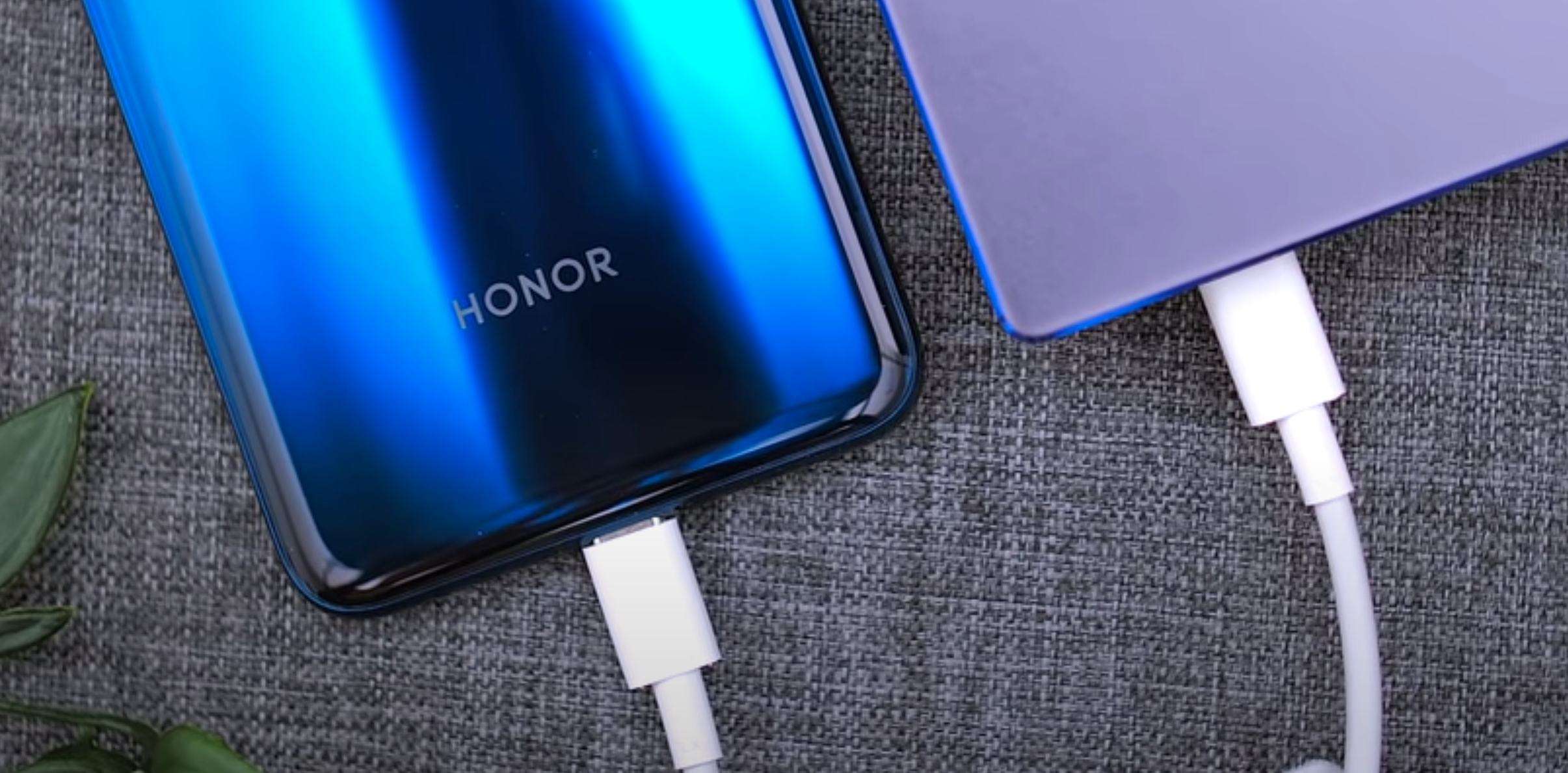
The first one being the fact that it comes with a USB Type C Port for charging. This means that if you have any modern Smartphone, you can actually use your Smartphone Charger to charge your Laptop as well (and vice-versa). On top of this, you can even buy a USB Type C Battery Bank and charge the MagicBook from there, if you’re out in the wilds and you have no power socket anywhere near you.

But what is probably our favourite feature of this laptop is the fact that you get this very powerful 65W Charger with it, which also supports Fast Charging. Normally, Laptops take around three to four hours to fully charge, depending on the model of course, but the MagicBook 14 can charge to close to 50% in just 30 minutes. This means that if you’re running late for class and you just have a few minutes to top off, you can easily get a few more hours of usage out of it. With most other Laptops, this would not be possible at all.


3) Display

The MagicBook 14, as the name implies, comes with a 14” Display. This is a 1920x1080 Resolution Display with a 16:9 Aspect Ratio. We do like the fact that it’s 14 inches in size and the Bezels are insanely thin. However, the bottom Bezel looks more like on a traditional Laptop. We would’ve loved to see those thin Bezels on all four sides, but this would’ve resulted in the Keyboard or the Trackpad being sacrificed. A 16:10 Display would have solved this to some extent, as it is taller. 

Regardless, it is a pretty nice Display with about 300-400 Nits of Brightness, which is also laminated with an anti-reflective coating. It’s not a Touch-Screen, in case you’re wondering, but the Display can go full flat so you get 180 degrees of tilt here, perfect for any viewing experience. 


4) Keyboard

The Keyboard is where it gets really interesting. We have a Scissor-Type Keyboard mechanism, pretty standard on most Laptops. The keys themselves are quite thin, but they do provide significantly more travel than the Butterfly Keyboard that we’ve had on MacBooks for so many years now. The Keyboard is also backlit so you can easily type at night, which is always a nice feature to have.

A fresh take on a Web-Cam, stashed away at the top of the Keyboard

A fresh take on a Web-Cam, stashed away at the top of the Keyboard

You might have noticed that there is no visible Camera on this. This is because HONOR actually hid it inside the Keyboard. All you have to do to bring it up, is to press on the Camera key. If you were ever concerned about someone spying on you through the Webcam, this is really the best approach there is. The Camera is always hidden unless you want it visible. 

Also, our next favourite thing about this Keyboard is that you also have a built-in Fingerprint Reader. It’s built into the power button, so you can always use that to unlock your Laptop, so no need to type in your password. 


5) Performance

The MagicBook actually comes with an AMD Processor, the Ryzen 5 3500U in the case of our unit and this is a pretty powerful Chip. It’s a 15W Processor with a base clock of 2.1GHz and Turbo up to 3.7GHz, this is also a Quad-Core Processor. 

We also get 16GB of 2400MHz DDR4 Memory as well as an AMD GPU. This is an integrated GPU, the RX Vega 8, but it’s actually quite powerful when it comes to the Performance, for an integrated GPU. You can indeed play some games in low to medium settings, at 1080p Resolution and get a decent FPS. If you’re into photo editing and even some 1080p or light-weight 4K video editing, the MagicBook can even handle that.

The MagicBook 14 also comes with a unique S-Shaped Blade design for the Fan, with 49% more Blades than in competitor Laptops. This gives you a 28% better Fan performance, while Heat Dissipation is also increased by up to 38%, according to HONOR. We also get a very good selection of Ports here. We get one USB Type C, one USB Type A, one HDMI, another USB type A on the other side and a 3.5mm Headphone Jack

‘Magic-Link’ is one of the stand-out features on this Laptop

‘Magic-Link’ is one of the stand-out features on this Laptop

But probably one of the coolest things that this Laptop can do is something called Magic-Link. If you have an HONOR or Huawei Smartphone, you can just hold it close to the HONOR Magic Link sticker on the MagicBook and it will instantly open up the EMUI Desktop on your Laptop. Long story short, this lets you control your Smartphone using your Laptop, but you can transfer photos and files directly to your MagicBook. It actually works like magic. You just open up your Photo Gallery app and drag them from your Smartphone onto your Laptop and they instantly transfer. This is honestly the best phone-to-laptop sync tool that we’ve ever seen. It’s fast, it’s powerful and it’s extremely easy and intuitive to use. 


6) Price

Having said all of this. What is the price of the MagicBook? Well, we’re guessing most of you would expect this to cost around £1200 or around £1000 at least, but that’s not really the case here.

We mentioned Price as one of the most important things for a student that buys a new Laptop and definitely the best news here is that the HONOR MagicBook 14 only costs £550. 


Conclusion

In the end, what are our final thoughts on the MagicBook 14 and who should get this? 

First off all, this is a very portable Laptop that not only offers a great all-day Battery Life but it also gives you some insanely fast Charging. If you’re the kind of person that’s always on the go, and you need that Portability and Battery Life, the MagicBook 14 is definitely for you.

Also, if you are a student, this is an amazing choice as it costs pretty much half of what you would expect a good student Laptop to cost. You get a great selection of Ports and a Quad-Core Processor, alongside a very powerful integrated GPU, which can handle everything from photo editing to lightweight video editing & gaming.

The Webcam, which is hidden inside the Keyboard, as well as the Fingerprint Reader, make this a very good option for anyone concerned about their privacy.

iPad Pro (2020) - The Future of Computing?

Apple has finally updated the iPad Pro, their highest end iPad, which hasn’t seen an update since 2018. So, without any further ado, here are our initial impressions with Apple’s highest end iPad for 2020! 

Apple released the iPad Pro Third Generation back in October 2018 and this was the biggest change the iPad had since the iPad itself launched in 2010. The home button finally went away, we got FaceID and on-screen gestures, so this iPad was essentially the equivalent to the iPhone X. It was that big of a change.

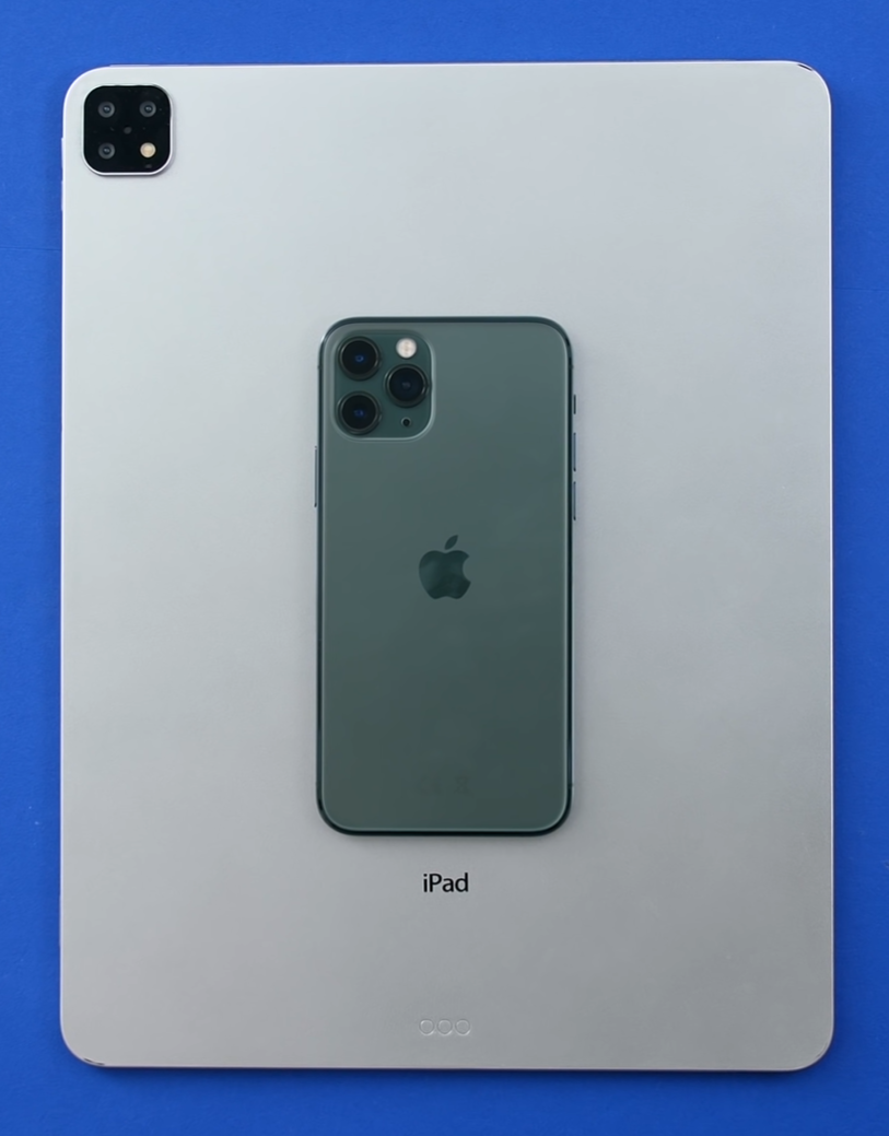
Now, Apple has usually updated their iPad every year, but for whatever reason, we didn’t get a new iPad in 2019. This was quite strange because we got an iPad Pro Fourth Generation mock-up from our friend Sonny Dickson, we even did a full video on that back in September 2019. It featured a larger, Triple Lens Camera Module but no other visual changes apart from that. But, fast-forward six months and we finally got that iPad Pro.


Unboxing

When we take a look at the box, we get a very similar style on the front with just the screen of the iPad, like we did with the 2018 model. They did change the wallpaper this time, although we actually prefer the way the previous box looked as it made the iPad’s Bezels look thinner, since the wallpaper was black. They do look quite thick on this one. On the top and bottom, we get an Apple logo which matches the colour of the iPad that’s inside. On the sides we get iPad Pro branding, which also matches the colour of the iPad.

When it comes to stickers, there’s a stark contrast in Apple’s approach.

When it comes to stickers, there’s a stark contrast in Apple’s approach.

On the back, we get a listing of everything that’s inside, plus the capacity, which in our case is 128GB. It also makes note of the fact that this is the second generation of the 11” iPad Pro. For whatever reason, Apple isn’t calling this the Fourth Generation iPad Pro, even though they were following this trend with previous iPad Pro releases.

When we open up the box and we get the iPad itself. We then get a booklet, which contains the Apple stickers that don’t seem to match the colour of the iPad. Apple is honestly so inconsistent with these stickers. Not all of their products include them, like the Apple Watch for example, and some do match the colour of your device, like with the MacBook Air and Mac Pro. However, some don’t, such as with the MacBook Pro and even the iPhone.

Aside from this, we get the Warranty & Safety Guide as well as the Quick Start Guide, which includes some tips on how to navigate the iPad (button placement and so on). We get a USB-C to USB-C Cable because the iPad Pro, unlike the iPhones, do have a USB-C Port, just like the MacBooks. We also get a Fast Charger, which is the same 18W USB C Charger that we get with the iPhones. What we really like about this Charger is just how compact it is. The UK plug has these collapsible feet, which makes it perfect for traveling, so good job Apple! That’s pretty much all we get inside the box, quite a straight-forward experience so now, here’s what you need to know about this iPad. 


Weight & Camera

In terms of design, it looks pretty much identical to the 2018 model. We have the same Bezel sizes, the same colour options, the same exact thickness, the same everything actually, aside from two things.

The first being the weight. The 2018 11” iPad Pro was 468 Grams, while this new one is 471 Grams. The WiFi & Cellular model is 473 Grams. Definitely not something that you’ll be able to tell but it is there. The second visual difference is the Camera Module. We now get a much larger Camera Module compared to before, which now houses a second Camera Module. These modules are very similar to the Cameras that we get on the iPhone 11. Not the 11 Pro, but the regular iPhone 11. 

Spot the difference?

Spot the difference?

The Main Module is basically identical, while the second module is an Ultra-Wide Angle Module. However, unlike the iPhone 11 & 11 Pro, both of which have a 12MP 120 degree Field of View Module, the iPad Pro 2020 has a 10MP 125 degree Field of View Module. So, the Resolution is a bit lower but with a higher Field of View. We also get a brighter True Tone flash but that’s pretty much it. The module itself is actually smaller than on the iPhone 11 Pro but it is a bit bigger than the mock-up that we showed to you in September 2019. On that mock-up, we had three Camera modules, wheres here we only (sort of) have two.

There is actually a third module, which is this almost invisible black circle and is what is called a ToF Camera. Apple is calling this a LiDAR Sensor but it’s essentially the exact same thing. This Sensor emits laser beams which get bounced around the environment and then get picked up again by the Sensor. Then, based on the time it takes for the beams to get reflected back and the angle at which they get reflected, the iPad can essentially create a 3D map of the environment. The FaceID Camera on the iPhone X and newer, even the FaceID camera on the 2018 & 2020 iPad Pro, already have this functionality. It’s just that now we have it on the back as well. 

So, you might be wondering why do we have it on the back? Well, it’s not for scanning faces but for scanning and mapping in the environment in 3D. The biggest difference between this and FaceID, is that unlike FaceID, which works at about 30cm-40cm max, the LiDAR Module on the back of the iPad works at up to 5m, which is a huge difference. This is how it can map the environment in 3D so accurately. Apple even went as far as calling this the best device for AR, in the world!

Unfortunately, there aren’t that many AR apps in the first place and even the ones that we do have, do not yet take advantage of this yet. They need to use ARKit 3.5, which just got released, to take full advantage of the new LiDAR sensor. Until then, we still get improved Object Tracking in apps such as Ikea Place, but when it comes to object and people Occlusion, that would require an update. 

The only place where the LiDAR sensor is taken use of accordingly, is in Apple’s own Measure App. Now, when you measure something, not only will it instantly allow you to measure an object without having to calibrate the app first, but the circle that you use to measure will actually follow an object’s shape. So, if you have a table or a wall, it would automatically detect those and sit flat on them, whereas on the iPhone, this circle would actually go through objects, it would not detect them. Definitely stay tuned for our full in-depth review, a few weeks from now, after we get to spend more time with this and hopefully by then, we’ll also get some updates to the current AR apps.


Specifications

Aside from the weight and the new Camera, something else that’s different on this new iPad is the Processor and the RAM.

In terms of the RAM, we now get 6GB all across the board. Before, we got 4GB on all models except for the 1TB model, which did indeed come with 6GB of RAM. We’ve never really had any RAM management issues on our 2018 iPad Pro. Interesting enough, the iPhone 11 Pro Max has been a completely different story, even though they both have 4GB of RAM.  6GB of RAM should make this iPad a bit more future proof than the last model. 

A breakdown of the Processors that we’ve had in past releases.

A breakdown of the Processors that we’ve had in past releases.

With the CPU, we get the brand new Apple A12Z Processor. Now, this is interesting because this is the first time since 2010, when Apple launched their first A-series Processor (the A4 on the iPhone) that they’ve added a new name into the mix. Previous iPads have had the A8X, the A9X, A10X, and the A12X. The addition of ‘X’ signifies a more powerful version of the regular CPU models that we got inside the iPhones. Long story short, the only difference between the A12X , which is was what we got in 2018 iPad Pro, and the A12Z, is that the ‘Z’ has eight GPU Cores, while the X from the 2018 model has seven GPU Cores.

Fun fact, the A12X was also manufactured with eight Cores but had one of the Cores disabled. This is how CPU manufacturing works. Only about 60% of the CPU’s manufactured are even usable. From this 60% batch, very few have all of the Cores working perfectly. So, the ones that have issues get rebranded into different Processors, with some of the Cores disabled. The same thing applies to GPU’s. If you buy an RTX 2060, that’s actually a 2080 that had a few manufacturing issues and they disabled some of the Cores.

It seems to us that Apple is just using the exact same A12X CPU, but they’re using a higher quality version of it, that has all the Cores working perfectly. Aside from this, we do get improved microphones. Apple’s calling these ‘studio quality’ microphones. We get WiFi 6 but aside from this, this is still pretty much the exact same iPad.

One thing that we do get which is actually a pretty nice thing to have, is higher base Storage. We go from 64GB ,up to 128GB for the same price, which is nice. For most people, 128GB is generally good enough, however this is definitely not the case with 64GB, especially when you consider that Apple’s calling this a “Pro” device. 


The Magic Keyboard

New device, same old 1:1 pricing for US & UK consumers.

New device, same old 1:1 pricing for US & UK consumers.

Probably the biggest upgrade by far, is this new Magic Keyboard. It not only gives you a similar typing experience to the 16” MacBook Pro, but you also get a Trackpad, which is now fully supported in iPadOS.

But, this keyboard costs $300 (£300 in the UK), so it’s crazy expensive. For the price of this Keyboard and an iPad Pro, you actually end up spending more than you would for a MacBook Air. We would say the MacBook Air is just so much more worth it since you get macOS, which is still far superior to iPadOS in terms of what you can do with it.

Also, this keyboard does work on the previous model as well, which is great. If you have an older iPad Pro or a non-Pro iPad, Logitech released some new Keyboards for those iPads, which also have a Trackpad included, so you’re not really missing out on anything here. 


Conclusion

We would say that the best thing about this iPad, is that it made the 2018 model cheaper! You can find it extremely cheap online now.

But, there is said to be a second iPad Pro coming out around November or so. This will feature the brand new Apple A14X Processor, which will be based on a 5nm process and it should give us some major performance improvements. We’ve even seen reports that Apple will be including a miniLED display into this iPad, or at least the high-end 12.9” version, which will give us Black Levels similar to an OLED Display. Apple’s Pro Display XDR is using miniLED. We have 576 Dimming Zones, but the iPad Pro is said to have thousands. So we’re really looking forward to that.

Huawei P40 Pro - First Impressions

The Huawei P40 Pro is here and we’ve managed to get some hands-on. In this article, we’ll go through our first impressions and see how it stacks up against some of its’ main competitors in key areas such as Display, Camera, Specifications and Apps. Also, be sure to check out the video we’ve posted on the channel, which also includes our live unboxing of the new Huawei P40 Pro.


Display

The Build Quality and feel is as good as you would expect from a high-end, flagship Smartphone.

The Build Quality and feel is as good as you would expect from a high-end, flagship Smartphone.

When it comes to the Design and the overall size, the P40 Pro seems to be very similar to the Galaxy S10+ from last year. We do, however, get a larger Display on the P40 Pro, which is 6.58”, compared to the 6.4” display that the S10+ had. We really do like the way it feels in the hand, it’s got a very nice weight to it. In terms of Design & Build Quality, it feels very premium and we are very impressed.

When it comes to the Display, this is a 2640x1200 Resolution OLED Display, with DCI-P3 Coverage, HDR10+ Support as well as a 90Hz Refresh Rate. We do have a fairly large Front-Facing Camera Cutout, the reason being that we get a large 32MP Sensor, with an f/2.2 Aperture, and a ToF Sensor.

As with the iPhone X onwards and the Google Pixel 4, the P40 Pro also features an advanced face unlock system. On top of this, we also have an in-display Optical Fingerprint Reader, so the same as on the OnePlus 7T Pro. This makes the Huawei P40 Pro the only 2020 flagship right now that has both an in-display Fingerprint Reader as well as an advanced facial recognition system, on the front. But what makes this phone so unique, is the Camera.


Camera

One of our main issues with the S20 Ultra is the Camera, but this is where the P40 Pro excels.

One of our main issues with the S20 Ultra is the Camera, but this is where the P40 Pro excels.

The P40 Pro comes with a 50MP 1/1.28” Sensor, which is even larger than the 108MP 1/1.33” Sensor that we have on the S20 Ultra. So, at the moment, this is the largest Sensor on any Smartphone. The larger the Sensor, the better it is in low light and also the more natural Bokeh. The module at the top, is a 40MP Ultra-Wide Angle Module, while the module below it, is an 12MP Telephoto Module, very similar to that Periscope Module that we also got in last year’s P30 Pro. We also have 5x Optical Zoom and 50x Digital Zoom. We’ve done a few tests against the S20 Ultra, which in theory should have a much better Telephoto Module, with up to 100x Digital Zoom. However, it turns out that the P40 Pro was actually much sharper at 50x. 

The P40 Pro also comes with Leica Optics. In case you don’t know, Leica is one of the most famous manufacturers of Lenses in the world. They make some of the best ones on the market, so it’s pretty amazing to see a partnership between such a well known Camera Gear Manufacturer and a Smartphone Manufacturer. 

We don’t have 8K Video on this, but that’s fine because at the moment, 8K recording quality is pretty poor, at least when it comes to Frame-Rate and Dynamic Range. However, we do have 4K at 60FPS as well as autofocus with the Front-Facing Camera. We are extremely excited to be testing out this Camera so, if you guys want to see an in-depth blind Camera comparison, then definitely subscribe and hit the notification bell to be the first to see that video as soon as it comes out.


Specifications

At 40W, this makes the P40 Pro the fastest Wireless Charging Smartphone on the market.

At 40W, this makes the P40 Pro the fastest Wireless Charging Smartphone on the market.

In terms of the Specifications, the P40 Pro comes with the Kirin 990 Processor, which is based on a 7nm+ Process. This is Huawei’s most powerful Processor, as well as 8GB of RAM.  We also get 128GB of Storage, as well as Nano Memory Support. This is Huawei’s proprietary microSD card but with this, you can expand the Storage by up to 256GB. Fast charging has also been improved, we now get 40W Fast Wired Charging, as well as 40W Wireless Charging, which makes this the fastest wireless charging on any smartphone out there, at the moment. In fact, there are zero wireless chargers that even have this speed right now.  Reverse wireless charging is also here, which is something that Huawei was the first to introduce to the market, with the Mate 20 Pro.

The P40 Pro also features the most insane level of Slow-Motion ever, for a Smartphone. So, just to give you guys an idea, the iPhone 11 Pro Max can do 240FPS Slow Motion, the S20 Ultra can do 480FPS Slow Motion (960FPS is only available on the S20 & S20+, not the S20 Ultra). The P40 Pro can do 7680FPS, which is just ridiculous, take a look for yourselves!


Google Apps

Now, some of you might be wondering how you would get Google apps on this? Is the Google Play store still available? The answer is…kind of. Right out of the box, you do not have any Google apps on this. You can still side-load them if you know what you’re doing, it’s not really that difficult to do really, so you can indeed get them working this way.

Despite recent events, you can still get all of your favourite apps on the Huawei P40 Pro.

Despite recent events, you can still get all of your favourite apps on the Huawei P40 Pro.

But, Huawei has launched their ‘AppGallery’ app, which is their own App Store and it turns out that you can actually find a lot of popular apps on there right now. Microsoft Office, Snapchat, Telegram, TikTok, Asphalt 9 and many more apps that you might be familiar with from the Google Play store are already here, with many more to come. 

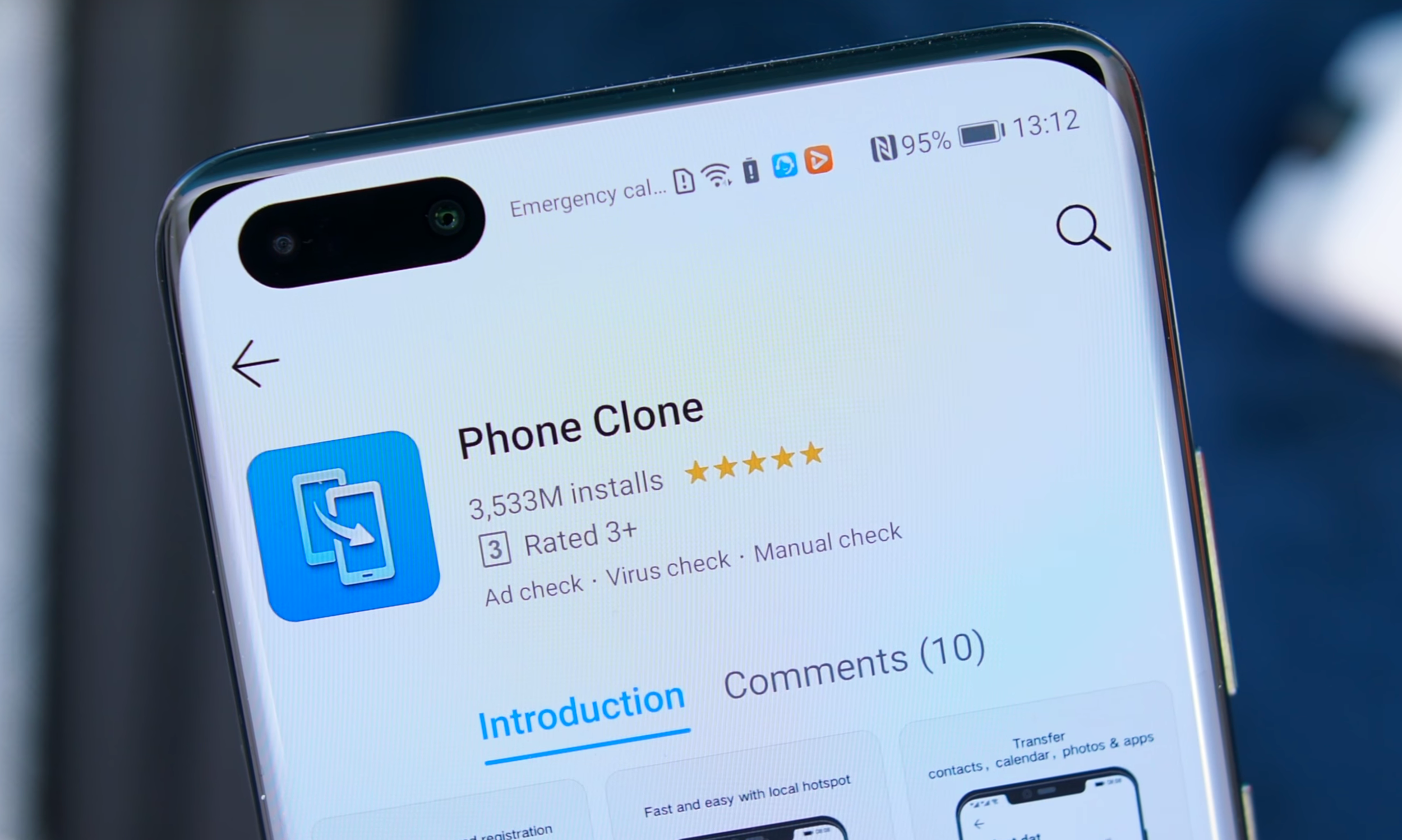
Additionally, you can have something called ‘PhoneClone’, which transfers all of your data from your current phone, onto the P40. If you’re wondering about apps, PhoneClone will automatically find the PlayStore apps on the Huawei AppGallery and download them from there and, if it cannot find the apps on the Playstore, it would actually copy the app and transfer it directly to the P40 Pro. This is a pretty smart-way to get your apps transferred and it’s such an easy process. 

What are your comments & thoughts on the P40 Pro?

MacBook Pro 16" - My Thoughts


So you’re probably wondering why this is only coming out now, well that’s because this was completely out of stock in the UK, even from day one all the configurations were out of stock. However, we finally have it and this is my live unboxing and reaction to the 16” MacBook Pro!

There is a bit more to this in the video so I would recommend watching that for further insights, the article below is just some overview thoughts.


The first thing that I want to cover here is just how close this MacBook Pro looks and feels like, to the 2012 Retina generation of MacBook Pros.

In terms of the dimensions it’s 1.62cm thick compared to the 1.8cm that the 2012 Retina MacBook Pro’s were or 1.55cm that the 15” 2016 generation was. It’s 35.79cm wide compared to 35.89 on the 2012 model, and 34.93 on the 2016 generation. And it’s  also 24.59cm tall compared to 24.71cm on the 2012 model and 24.07 on the 15” 2016 model. Finally, it’s quite heavy, at 2kg compared to 2.02kg of the 2012 model and 1.83kg on the 15” 2016 model. So if you weren’t that bothered by the size and the weight of the Retina Generation of MacBooks from 2012-2015 then this would be perfect for you. But in my case, I do need something that’s more portable and easy to carry around, so for my use case scenario, this 16” is actually a downgrade. 

The new keys on the 16” have more travel but less stability

The new keys on the 16” have more travel but less stability

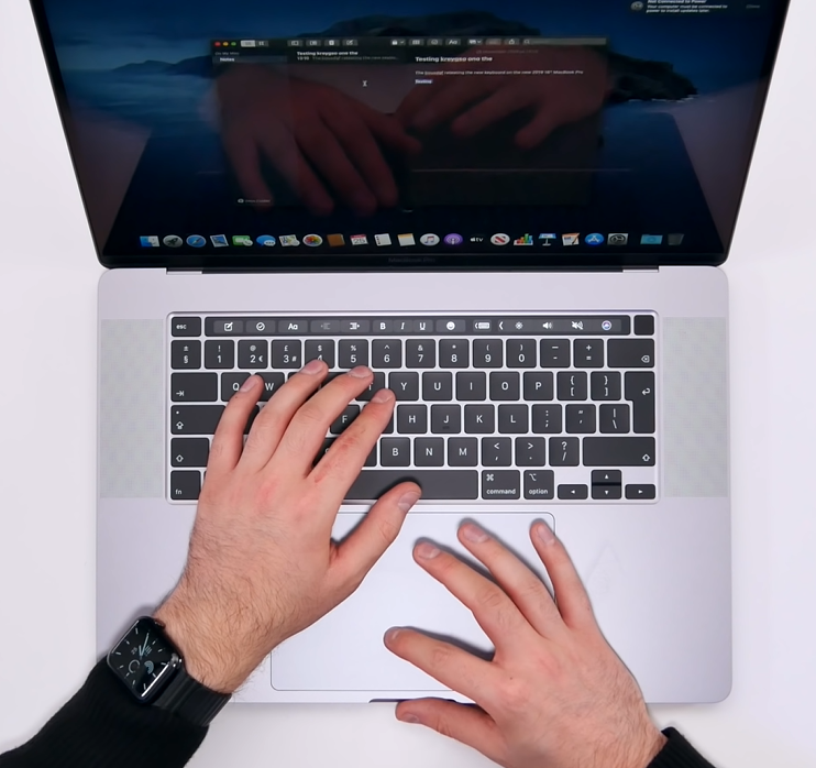
Now, when it comes to the keyboard, it feels great! Finally feels like a regular keyboard that you would get in a laptop todays, and It’s got a very similar typing experience to the 2012-2015 generation of MacBook Pros. This is because it uses the same scissor mechanism switches, rather than the butterfly switches. This does mean that the keys themselves are not as stable as the butterfly switches, so they do have more wobble to them, but they feel so much better than the butterfly switches, when it comes to key travel and overall typing experience. I’m happy to say that the keyboard is finally fixed! It’s just that, Apple should’ve done in 2017, with the 2017 MacBook Pro, after the huge backlash that the 2016 models got, rather than wait until the end of 2019.

Now, when it comes to the display it’s slightly larger now, 16” from 15.4” but the size difference isn’t as noticeable as I expected, so the 15” is still fine in terms of display size. However, what I have noticed is that going back to my 15”, the bezels looked gigantic, even though the 16” only had slightly thinner bezels on the sides and top, it did make the 15” look ancient. I do like the fact that you can adjust the refresh rate, which is useful for professional video workflows. In addition, we also get a slightly higher resolution display now of 3072x1920 up from 2880x1800, this means we also get a slight PPI bump to 226 from 220, but that difference is so small that you won’t even notice it.

Where you will notice a difference is in terms of Retina scaling. We now have a default scaling of 1792x1120 up from the 1680x1050 that we had on the 15” model, and you can bump this to 2048x1280 up from 1920x1200. So you do get quite a bit more virtual space to play with, when it comes to organising windows, apps, tabs and so on.

And something that I’ve been wanting for years has finally been implemented! Yes, we finally have less space between the touchbar and the display, meaning that the whole MacBook Pro looks a bit more well thought of. This also means that we now get a larger palm rest for when you’re typing. 

The dedicated escape key is nice, love having that, and I also love having a dedicated button for TouchID. Also Apple has coated the TouchID button so that it matches the other keys, even though this is made out of glass, whereas the regular keys are made of out of soft plastic. Love this attention to detail!

However, as much as I like the little things, the whole Macbook Pro looks to me like an afterthought design wise. It looks like Apple took what was great from the old 2012 Retina MacBook Pros and slammed those onto the 15” design, without really re-designing the whole thing from scratch. 

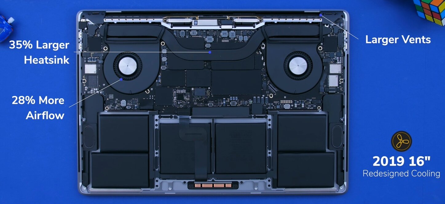
But spec wise and cooling wise, this is where we get the big improvements. The cooling system has been improved, as we now have larger vents. The heatsink is also 35% larger, so we now get 28% more airflow which is always great to see in a laptop. CPU wise we do have the exact same Intel 9th generation H series processors, that we got with the 2019 15” model back in May. So the Intel 9980HK CPU is the highest option that we have. This is an 8-core processor with a base clock of 2.4GHz, that can (in theory) turbo boost to 5GHz, but you’ll never see those speeds in a laptop, but rather around 3GHz or so for both the 2019 15” and the new 16”. The 16” will actually achieve slightly better performance, thanks to the improved cooling.

A tear-down showing the improved cooling system

A tear-down showing the improved cooling system

But really, the big difference here is in terms of the GPU. The Vega 20 GPU that we got with the November 2018 MacBook Pro’s was a gigantic upgrade over the Polaris graphics, so the 460, 560 and 560X that we had before, and now we get AMD”s brand new RDNA/Navi architecture which is an even bigger bump, over the Vega 20. So if you’re into motion graphics, video editing, game development or pretty much everything that requires a high end GPU, then this is a pretty massive upgrade. 

So overall, I’m quite happy with what Apple has done with this MacBook Pro. It fixed all the major issues and complaints that users had, such as the keyboard, the cooling and the GPU performance, while also adding things such as a larger display, thinner bezels, improved microphones, improved speakers and even an improved battery life with up to 11 hours now, up from the standard 10 hours that MacBooks used to get.

However, I’m not sure if this is a new generation. I say this because it doesn’t feel like one, but rather a “fixed” 15” MacBook Pro. And while it is heavier and thicker and more difficult to carry around, I do honestly think that for creators, that trade-off is well well worth it.

So there are my first impressions of this device. This was not my full review by any means, that’s coming in around a month or so, once I get to spend more time with this, so that’s going to be crazy detailed with video editing tests, thermals and everything you need to know.

AirPods Pro - Unboxing, Noise Cancelling, Sound Test & More!


Yesterday we put out our 20 things you didn’t know article and video, explaining all the things you may not have known about the latest addition to the AirPods line-up, and today we have the AirPods Pro in the studio!

So grab those snacks and drinks and check out my live reaction and unboxing in the video above and have a read of three things I wanted to try out first on the AirPods Pro!


COMFORTABILITY

First things first, you can definitely feel them in your ears, so they’re nothing like Apple mentioned where you wouldn’t even notice them thanks to the new vent. You’ll definitely notice them right away, I can tell you that. 

Between the AirPods and the AirPods Pro, the Pros are a bit more comfortable, but that’s mainly because of the smaller size, so you don’t really feel the long foot touching your ear. Also, since they do have the rubber seals, they do secure far better than the regular AirPods do.

By taking the Ear Tip test you can see if you have the right rubber seal in

By taking the Ear Tip test you can see if you have the right rubber seal in

Inside the box you get three sizes of rubber seals; small, medium and large, but they all come with the medium ones pre-installed. I found that the medium ones work best for me, but here’s a Pro tip, once you pair the AirPods with your iPhone you can go into the bluetooth settings and then tap on the i icon, of your AirPods Pro’s and then you get into a menu which allows you to do an Ear Tip Fit Test so you can get the right size. What this does is that it will play a sound and the outwards facing microphone will read how much of that sound escapes from your ear. And if that’s too much, it will give you a message that you need to try a different size ear tip. 

I haven’t seen any other earphones that can do this, so props to Apple for implementing such a system.
Speaking of system, there’s a weird proprietary system of mounting the rubber ear tips. To remove them you have to pull really hard to the point where you think you’re about to break them. However, putting them on is very easy as they just click into place. 


ACTIVE NOISE CANCELLATION

So the biggest new feature that you get with the AirPods Pro’s is of course, noise cancellation. Now this is done both passive and well as actively. It’s done passive via the silicone ear tips that I mentioned before and then actively in a pretty smart way. The three microphones detect the background noise and then the AirPods themselves emit a sound of an opposite frequency in order to eliminate that background noise.

And it actually works extremely well, at least for in-ear earbuds. I mean they’re not as good as actual over the head noise cancelling headphones would be, but still I was very impressed with how well this worked. 

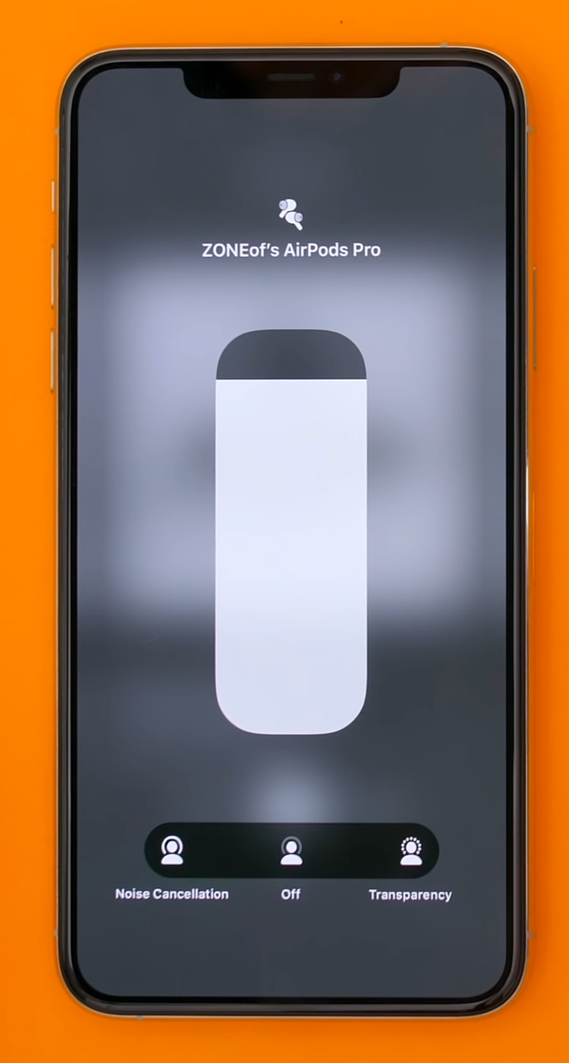
If you go to your volume option, with the AirPods Pro in, you will get the options to switch between the three options.

If you go to your volume option, with the AirPods Pro in, you will get the options to switch between the three options.

Now if you force touch on the Volume bar on your iPhone once they’ve been paired, you can switch between these three modes; Noise Cancellation, then Off and then Transparency mode. Think of this as the level of background noise that’s removed. So when transparency mode is on, the microphones will actually transmit the audio from the outside, back into your ears, in order to re-create that feeling of open-back headphones that the original AirPods had. And it’s not quite the same thing but it’s still pretty impressive. It’s in between in-ear headphones and the original AirPods. Then the off mode, is very similar to regular in-ear headphones where the seal is created by the silicone ear tips and then finally noise cancellation is the one where the AirPods will try to remove as much background noise as they can.

Now, when noise cancelling is on, they do give you that feeling of having a lot of air pressure inside your ears. Basically the same feeling that you get when you’re in a plane. But once I disable noise cancelling or turn on Transparency mode, that feeling is pretty much entirely gone. So I do find them a bit uncomfortable because of this feeling when I’m using noise cancellation, guess it will just take me a while getting use to it.

You also have that pressure sensitive button which is really cool! You see, it’s not really a physical button, it’s just a capacitive touch pad. However when you press it the AirPods Pro’s will actually make this clicking sound to give you the impression that it actually clicks!

And from there you have the three commands that I’ve mentioned before; tap once to pause, double tap to skip to the next song and triple tap to go to the previous song. And if you hold that bar, you can switch between the Noise Cancelling Mode and the Transparency mode, and you can also add an Off mode by going into the bluetooth menu options. 

You can even ask Siri to turn on an off Noise Cancelling or Transparency Mode, so that works as well, alongside the ability to invoke Siri by saying the ‘Hey Siri’ command.


SOUND QUALITY

Finally, when it comes to the actual sound quality, it’s pretty good! It’s much better than the original AirPods, the bass is stronger, the voice is clearer.

But the original AirPods weren’t that well known for their sound quality anyway. So if those were a 6/10, these are probably about a 9. They’re a noticeable upgrade, but that’s mostly due to the noise cancellation which removes all the background noise so that you can focus on your music. So that’s pretty much what makes them sound so much better than the original AirPods did.

There is no real point in getting the AirPods Pro if you have an Android device as the sound quality is much poorer

There is no real point in getting the AirPods Pro if you have an Android device as the sound quality is much poorer

And as a conclusion, I love them. It’s pretty amazing having active noise cancelling earbuds that are this small. The Sony ones are very good as well, but the charging case is just gigantic. 

Also, if you have an Android phone just forget about getting these because the volume would be unbearably low. 

Other than that, they’re great and a huge step up from the original AirPods. But are they £250 / $250 good? Not fully sure just yet, a few more days of testing and I will have a verdict for you.

Google Pixel 4 - Announced!


Google's October 2019 Event is over, and being a Pixel 3XL owner I was hoping for some improvements on what I felt was a pretty decent phone. There had been many many leaks on this phone and basically all of them were right. You can check out our article on the Final Leaks and Rumors surrounding the Pixel 4 if you like to see for yourself. If not, let me give you the rundown. 

Also check out Daniels live reaction unboxing at the video above.


DESIGN

The limited edition ‘Oh So Orange’ Pixel 4 (Source: Rabbit TV)

The limited edition ‘Oh So Orange’ Pixel 4 (Source: Rabbit TV)

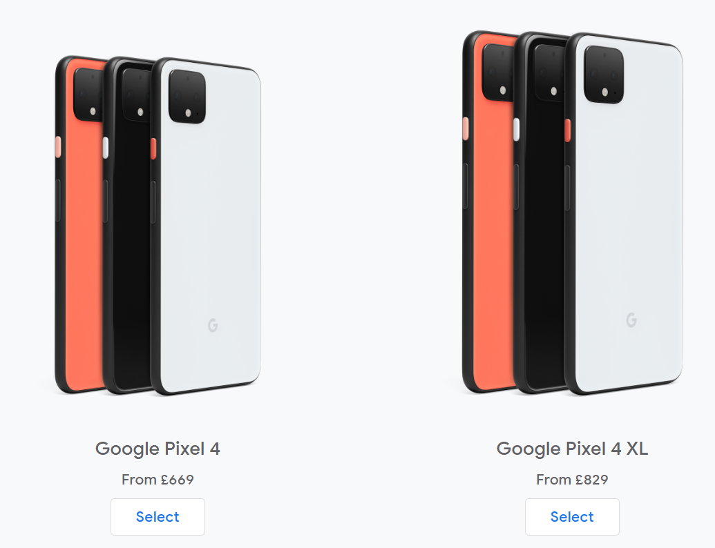
The design is exactly as we had seen, block colour body rather than the dual tone, with a black camera module on the back, no large notch on the front for the XL, but instead a larger forehead which house some of the newer features to the Pixel of the Soli Radar chip and the Face Unlock Flood Illuminator. It is also coming in the colours that we thought it would do; ‘Just Black’, ‘Clearly White’ and the limited edition ‘Oh So Orange’.

In terms of the screen we are getting a 90Hz refresh rate OLED display on both, with the Pixel 4 having a 5.7” display, up 0.2” from the 3, and the Pixel 4XL will have the same size screen as the 3 XL with 6.3”. Both the phones are going to be slightly larger than their predecessors, with the 4 being 1.5mm taller than the 3 and the 4XL being 2.4mm larger than the 3XL.


CAMERA

So we are getting minor changes to both the actual build of the phone and the screen on the phone. But what I personally look for in a phone is a good camera, and with the Pixel 3XL having an extremely good camera, I was excited to see what improvements were going to be made. Unfortunately I was let down.

The hardware on this is no huge improvement over my current Pixel. Whilst we are getting a new camera module on the back, with a 16MP main camera and a 12.2MP secondary camera, we still have no Wide Angle but a new telephoto lens! That’s right, we hoped they wouldn’t do it, we didn’t want to believe the leaks but they were right. Come on Google, why do we still not have one? We touched on this in our Leaks and Rumors Article but you can always zoom in post, but you cannot take a wide angle image without a wide angle lens! In addition, we were right in thinking that there was going to be a single camera on the front, which is only 8MP, so no real improvements here, and it can only do 1080p at 30FPS. The Pixel 3 could do that, so why Google isnt trying to match both Samsung and Apple, who are able to do 4K on the front facing cameras, I don’t know. In terms of the rest of the video capabilities here you are, they are pretty much the same as the 3 but some are locked to specific FPSs:

Rear Camera

  • 4K @ 30FPS

  • 720P @ 240FPS

  • 1080P @ 30, 60 and 120 FPS

Front Camera

  • 1080P @ 30FPS

I am hoping that there are some major improvements when it comes to the software of the Pixel 4’s camera that would make up for the lack of improvement in the hardware. But whether those software improvements will come to the 3’s as well, we will have to wait and see.

Something new that is coming with the camera though is the Astrophotography, which was further shown off at the event. What this appears to be is an extended Night Sight of soughts but this astrophotography requires a 4 minute exposure time in order to take the image, so unless you want to stand perfectly still while it takes the picture, I’d suggest getting a tripod for it, unless you want to be in the picture, in which case you will have to stand still for the entire exposure time. Personally I see this as quite a gimmick but I could be surprised.

An example image of the Astrophotography from the Pixel 4 (Source: 9to5Google)

An example image of the Astrophotography from the Pixel 4 (Source: 9to5Google)

CPU & RAM

So whilst all the leaks have been right so far there was something that we did get wrong, the CPU. We thought that these were going to come with the Snapdragon 855+, which is essentially an overclocked 855. However, we are not getting any overclock at all, and are instead getting the Snapdragon 855 regular, which is the same processor you find in an S10. However, although that sounds great, the S10 had the best CPU at the time seeing as the S10 was released in March and the 855 was released in December of last year, but the Pixel could have had the 855+ which was released in July.

But we did get the RAM correct, with 6GB up from 4 on the 3XL. This is another questionable move, seeing as many phones come with 12GB of RAM nowadays.


PRICE

We also got the prices wrong, and in a good way this time. So from the leaks it looked like we were going to have to spend £730 for the 4 and £1,000 for the XL, but luckily those were overestimated prices and instead the Pixel 4 will start at £669, and the XL at £829. But whether that makes up for the lack of improvements, we will have to get one and find out!

The Pre-Order prices the for 4 and 4XL (Source: Google)

The Pre-Order prices the for 4 and 4XL (Source: Google)


CONCLUSION

So in the end I am not massively impressed. The design to me isn’t great, we are getting no huge improvements in performance or camera, and the only large camera update to me seems gimmicky but I am interested to see what kind of pictures it produces.

Until I have seen one for myself and had a go with it, I personally wouldn’t look to upgrade from my 3XL as there simply isn’t enough to make me want to upgrade, and if anything now could be the time to get a Pixel 3 if you’ve been wanting one as the price is sure to drop.

OnePlus 7T Pro Unboxing - The Best Android Smartphone of 2019?


OnePlus has sent over this special mystery package and I have a pretty good idea of one thing that’s inside of this but this package is huge so there’s probably quite a few things inside.

So without any further ado, here’s my unboxing and my first impressions of the OnePlus 7T Pro!


UNBOXING

Ok, so we get this big red box, this is the OnePlus 7T Pro Media Pack, which means that if you’re just buying the 7T Pro from the Store, you wouldn’t really be getting this unfortunately,as this is something that only the reviewers get.

Now when you compare the 7T Pro Media Pack to the one that we got just a few months ago with the 7 Pro, you can see how much bigger this one really is. It’s significantly larger and thicker as well and I think that it also looks better, with that full on red look.

So OnePlus logo on the front and nothing else really on the sides and the back.

Taking off the sleeve takes us to the actual box. Now I think that this one’s really cool, it’s got the ‘Never Settle’ logo on the front, but the front also slides away in this butterfly like style and the contents of the box are revealed.

An example of the drawing styles in the Media Pack that comes in this box

An example of the drawing styles in the Media Pack that comes in this box

The first thing here is this black OnePlus sleeve which seems to contains the OnePlus 7 Pro booklet. This is essentially a guide made for reviewers, so that they get accustomed with all the new features that the OnePlus 7T Pro comes with, and they’ve actually changed the style significantly, from the one that the OnePlus 7 Pro used to come with. There’s no actual images of the phone itself, just drawings and graphics, which I do like! Whoever designed it should get a promotion! This is just a brilliant job and the whole booklet is made out the same cardboard like paper that the box is also made from. So it’s a much thicker and textured paper, than what we got before with the 7 Pro reviewers guide. Also inside the booklet we get a OnePlus branded cleaning cloth - which I don’t think I’ll ever open. This is way too precious to open. This has also had a design change as we now have this landscape cloth rather than the portrait style one that we had before.

Removing that and we get 2 compartments. I opened the one on the right first, since the one on the left seems to be the box for the 7T Pro. Inside of that we get 3 cases for the OnePlus 7 Pro. So we get a Sandstone case and 2 which from the outside look pretty much the same, but they’re actually quite different. They’re both part of the Karbon series of cases, but one is the Karbon Protective Case while the other is the Karbon Bumper case, which does offer more protection to the frame of the phone. I just love both, the feeling on the back is just incredible, but I prefer the Bumper One. It’s a bit weird to explain as it’s made from one piece of plastic, however, the back is more solid while the edge is made from rubber, but there’s no seam line or anything. It’s all just made from one block or at least merged together in a perfect manner.

The size difference between the OnePlus 7T Pro Box (Left) and the 7 Pro (Right)

The size difference between the OnePlus 7T Pro Box (Left) and the 7 Pro (Right)

Then finally we get to the actual OnePlus 7T Pro box. The first thing I noticed about this box is that it’s very tall. Comparing this to the OnePlus 7 Pro box, this is about 25% taller, however it’s also not as wide or as thick as the 7 Pro box. Now, I actually prefer this design, it’s much sleeker, not just in terms of the form factor but also in terms of the style of the box. We have a red box with the message “This is the OnePlus 7T Pro. It is the culmination of all our design and engineering efforts and crafted for those, who like us, always strive for the very best”.

On the sides we get the OnePlus 7T Pro branding, nothing on the top and bottom and on the back we get color (Haze Blue), the Capacity (256GB) as well as the RAM (8GB). Then on the bottom of this box we have ‘Never Settle’.

So once we have removed the phone what else do we get? Well, we get this very long booklet that says OnePlus on it, and inside that we get quite a few things; another card that says invitation on it, which has a message from Pete Lau, the Founder & CEO of OnePlus. We then get three OnePlus stickers, all different. We then get two manuals, one being a quick start guide that also shows you the layout of the phone, and the other one being the warranty and the safety guide. 

There is also another cases in here too, a silicone case just like with the 7 Pro which is really nice to see OnePlus including this in the box, giving day 1 protection!

We then get another card with the sim eject tool, the charging cable which is the same iconic OnePlus red and white cable, definitely the best looking charging cable out there, and we finally get the Warp Charge 30T charger which actually looks identical to the 7 Pro charger, same design, same size, even the exact same specifications and the exact same model number, yet the 7T Pro can charge 23% faster than the 7 Pro could. It seems like the reason for this speed increase is actually some optimisations done in software or it could be thanks to the new processor which I’ll talk about just in a minute. 

Ok, so that’s pretty much it when it comes to the MediaPack. The box was indeed bigger but we actually got less stuff than with the 7 Pro MediaPack, which also included the Bullet Wireless 2 Headphones as well as a OnePlus Car Charger. However, we did get 3 cases this time round, rather than just 2.

THE PHONE

Ok, so now let’s remove the plastic wrap from the 7T Pro and take a look at the actual phone!

Design wise, it looks pretty much identical to the 7 Pro from just a few months ago. We have the same exact bezel sizes, the same display, the same display resolution at 3120x1440, the same 516 PPI. It also has the same 90Hz refresh rate, as well as the same camera system, the same haptic engine and I’ll promise that this is the last time I’ll say “the same” in this article.

Holding these in my hand it’s pretty much impossible to tell which is which from the front.

But in that case, what’s different?

The new Haze Blue 7T Pro, the small black mark next to the camera is the Macro shot assistant

The new Haze Blue 7T Pro, the small black mark next to the camera is the Macro shot assistant

Well, 7 things really.

First off we do get a new colour called the Haze Blue which replaces the Nebula Blue that the 7 Pro came in. It’s a bit lighter than the Nebula Blue and it also reflects more light so it’s a bit shinier. Personally I like both. 

Then the second change is the processor. We now have the Snapdragon 855+ compared to the 855 that the 7 Pro had. The GPU is now 15% faster which means slightly higher FPS in some more demanding games like Call of Duty mobile for example. 

Thirdly there is a new addition next to the camera module, which is for the new Macro mode that this phone now has. Essentially you can get as close as 2.5cm from an object and it will still focus, where most phones will fail. Here’s an example of how close the 7T Pro can focus vs the iPhone 11 Pro that’s all blurry here so this is perfect for photographing insects or plants or just textures in general. 

Then the fourth edition is that the battery is slightly larger at 4085mAh compared to 4000mAh, mostly for that 855+ chip which is essentially an overclocked 855 in the end.

Fifth. If you ever used the Reading Mode on the 7 Pro, on the 7T Pro now allows you to use it in Full Colour mode rather than just Black & White.

Sixth. The 7T Pro comes with Android 10 right out of the box. The 7 Pro will also be getting Android 10 soon, I don’t have it on my unit just yet, but it should be here by the end of the month.

And finally seventh we actually do get a faster fast charge with Warp Charge 30T, which like I said before is 23% faster than on the 7 Pro.


CONCLUSION

So in the end, the OnePlus 7T Pro is a very small upgrade over the 7 Pro that we got back at the end of May, just four and a bit months ago. However, I don’t think that that’s necessarily a bad thing. 

The 7 Pro was already an amazing smartphone. Pretty much the best android phone overall, especially considering the price and the 7T Pro is now an even better version of that. Yes, it still doesn’t have a camera that’s as good as the Note 10’s or the iPhone 11 Pro’s, but it does have a very usable and good camera for the price which by the way OnePlus has improved a ton with software updates which they’ve been slamming in a few times a month. 

If you add that to the insanely fast UI, with the near stock android experience, day two updates right after Pixel phones, that 90Hz refresh rate display, and no notch or display cutouts at all, all for $670 or £650 less than what the regular iPhone 11 costs! Well, you guys have what’s probably the best all round android phone of 2019!

iPad Pro 4 (2019) - Early Preview


So I got a pretty special package in the mail. This supposedly contains a preview of the next iPad Pro, the 2019 iPad Pro 4th generation, and without further adieu let’s open this up and see what we have inside! 


UNBOXING & FIRST IMPRESSIONS

So opening up this box and inside we get this iPad mock-up wrapped in bubble wrap. The one I have is the 12.9” mode, which is the same dimensions that we currently have now with that model. But taking a look at the front nothing really has changed, we get the same design style, the same bezel sizes. The side frame is once again appears to be identical to the one we have now, same thickness as well.

Like this years iPhone’s the iPad Pro 4 is expected to come with a triple camera module

Like this years iPhone’s the iPad Pro 4 is expected to come with a triple camera module

So really, the only new thing about this iPad, is on the back, which has a fairly massive triple lens camera module. This is coming from the single module camera that we’ve had so far on pretty much every single iPad model, including the recent 3rd generation iPad Pro.

Now something that I’ve noticed is that the camera module itself is a bit smaller than the camera module on the iPhone 11’s. This usually means a trade-off in some regard but to be honest I wouldn’t expect Apple to manufacture a separate triple lens camera module just for this 2019 iPad Pro.

So what’s likely the case here, is that they just managed to reduce the footprint of the camera unit, by spacing out the camera components better since an iPad does have significantly more space inside, compared to an iPhone.

Now having that triple lens module on an iPad Pro might seem like overkill, and it kinda is. However what this means is that if you’re the kind of person that edits photos taken with the iPhone on the iPad Pro, like I do a lot of the time when I’m travelling then you won’t need to use AirDrop to constantly transfer your photos, since you can just take them with the iPad Pro instead.


BATTERY & RAM PREDICTIONS

So although we get a pretty big upgrade in the camera module, there must be something else to warrant upgrading to this right? Well from what we know it would appear that the battery life is also getting a huge upgrade.

Its highly likely that the iPad will feature the A13X Processor that is also found in the iPhone 11s

Its highly likely that the iPad will feature the A13X Processor that is also found in the iPhone 11s

The new iPad Pro is will be getting the Apple A13 processor, the A13X even, which will be Apple’s most powerful mobile processor by far! For context, the 2018 iPad Pro with the A12X processor scored 5106 SC and 17156 MC in Geekbench 4, which is just nuts! The iPhone 11 Pro Max for example, with the Apple A13 processor, scores 5411 SC and 13883MC, again in Geekbench 4. So the SC is even higher than the iPad Pro 2018’s, it’s just that the multicore and the compute GPU scores are lower. It is very likely that this will be the case again. The A13X will have an even higher SC than the iPhone 11 Pro does, probably at around 5700 or so and the MC should be around 19000 or so, while the GPU will be further improved. 

But just like I said before, the biggest improvement that we are getting with the A13 processor isn’t necessarily the performance gains, but the battery life. The iPad Pro should be getting about 2 hours extra battery life, if not even more than that, thanks to this A13 processor.

Now, something that Apple has added to the new Apple Watch Series 5, is an LTPO display and a new display controller that can adjust the refresh rate from 60Hz down to even 1Hz. The iPad Pro can already do something similar. It has a Pro-Motion display which also adjusts the refresh rate from 120Hz to 24Hz, depending on the content that you’re watching but it cannot go lower than 24Hz. Apple could implement the same display technology and the new display controller from the Apple Watch to let the iPad go as low as 1Hz and improve the battery life thanks to that as well.

Now, with the iPhone 11 Pro’s, we still have 4GB of RAM unfortunately. I know that some of you will say that “oh, iOS doesn’t need more than that because it’s very well optimised”, and while that is true, my Note 10+ which has 12GB of RAM, can keep many more apps open in the background compared to my iPhone 11 Pro which does have to reload certain apps quite often.

So with the iPad Pro 2019 I am personally expecting 6GB of RAM as standard, just like we had in 2018 with the 1TB models.


SCREEN PREDICTIONS

The thing that I want to see the most on the iPad, is an OLED display. Same Super Retina XDR that we have on the iPhone 11 Pro’s. That would look insane on an iPad!

But don’t get your hopes up for 2019. We have seen a recent report from Ming-Chi-Kuo yesterday, who claims that Apple will be releasing Mini-LED displays for iPad & MacBooks in 2020 and 2021. Now Mini-LED should not be confused to Micro-LED, which is the next display innovation after OLED. MicroLED is the future of displays, but it won’t be coming out until a few years from now. 

Mini-LED is what Apple already uses on their Pro XDR Display for the Mac Pro, and that one uses 576 full array local dimming zones. So it’s in between LCD  and OLED. It’s an LCD technology with a lot of dimming zones so you can still get deep black levels and high brightness but you only have 576 dimmable zones rather than 20.4 million zones like you would have if the Pro XDR Display had an OLED panel. Kuo claims that the new iPad Pro’s with the Mini-LED displays will launch in Q4 2020, with the MacBook Pros following in Q1 and Q2 2021. So this year’s iPad will have the same display as in 2018 for the most part. 

A quick breakdown of the differences between LCD, Mini-LED, and OLED

A quick breakdown of the differences between LCD, Mini-LED, and OLED

THINGS THAT NEED FIXING

Well, the current iPad Pro 2018 model does have 2 issues, which Apple should be looking to fix.

Some previous models of iPads came bent out the box (Source: MacRumors)

Some previous models of iPads came bent out the box (Source: MacRumors)

The 1st one being Bend Gate. If you remember the iPad has the Apple Pencil connector on one side and the microphone port on the other, which greatly reduces the structural rigidity of the iPad itself. This means that not only will it easily bend when you put stress on that point, but more importantly if you’re carrying it in a tight backpack with lots of stuff in, there’s a high change that when you remove it from the backpack it will be bent. I’ve even seen some cases where this iPad Pro came bent out of the box brand new, and in a lot of those cases Apple even refused to replace or repair it, because they considered it to be something that the user has done.

Now on the mock-up I’ve noticed that it still has the microphone port in the middle of the frame. The Apple Pencil charging pad seems to be in the middle as well, maybe slightly off, but visually at least I cannot see any changes and improvements from the 2018 model. Now there is a chance that Apple alters the construction of the aluminium back to make it more durable and less prone to bending. Apple have done this in the past, like the move from the iPhone 6 to the 6S with 7000 series aluminium, which is the strongest aluminium on the market that manufacturers can use. But overall, I cant guarantee that this will be altered before the release.

Scuffgate occurred when the Apple Pencil was eroding the area around its place on the iPad

Scuffgate occurred when the Apple Pencil was eroding the area around its place on the iPad

Then the 2nd issue that we’ve had is the Scuff Gate issue. This is actually something that affects more users than the Bend Gate issue. Essentially if you have the new iPad and the 2nd generation Apple Pencil, after a few weeks or months of use, you’ll notice that the pencil has started scratching and eroding the actual aluminium frame of the iPad. The reason why this happens is because the magnets aren’t strong enough to hold the top and bottom portions of the pencil, they only hold the middle of it. This means that it will slightly move, either in your bag or when you’re carrying the iPad in your hand, and this slight movement of the pencil will cause the aluminium frame to be eroded. This is something else that Apple will not replace your iPad for. I did ask Apple about this and they’re classifying this as cosmetic damage, even though it’s a fault in the iPad itself. In my opinion, and I’m sure you’d agree, using the Apple Pencil which is a 1st party accessory, shouldn’t damage your iPad in any way.

So these 2 issues, the Bend Gate and the Scuff Gate are something that I do expect Apple to address with this new iPad Pro.


CONCLUSION

In terms of the release date for this 2019 iPad, it appears very likely to be the end of October, at a special Apple event where Apple will also unveil the new MacBook Pro 16” redesign. We’ve had some reports claiming this to be released in March, but personally since this will be a fairly small update, an October release it what looks to be the most likely scenario from my perspective as well. 

The Triple Lens camera module is really the only noticeable upgrade and we could kinda say the same about the iPhone 11 Pro’s. But then we got some pretty big upgrades that no one was expecting, such as the significantly improved battery life, the 4m water resistance, the speaker improvements and more.

So I do think that Apple will have some more exciting features to talk about, when it comes to this new iPad, we will just have to wait and see.

Apple Watch 5 - The Watch We've All Been Waiting For!


This is the Apple Watch Series 5 and we have it in both Titanium as well as Black Stainless Steel. This is it, the Apple Watch that we’ve all been waiting for since it now has an Always-On-Display.

Shout out to BandWerk who make some amazing Apple Watch Straps for sending the Black Stainless Steel for me personally.

So let’s unbox both of these, the Apple Watch Edition in Titanium and the Black Stainless Steel and I’ll give you my thoughts on both in this article as well! 


UNBOXING

Design comparison between the Apple Watch Edition box (Top) and Stainless Steel Model box (Bottom)

Design comparison between the Apple Watch Edition box (Top) and Stainless Steel Model box (Bottom)

So taking a look at both boxes, the Apple Watch Edition has a bold Apple Watch text in black on the front, whereas the Stainless Steel model just has a white indented logo and text, and that’s it.

On the sides we don’t really have anything aside from the pull tab and on the back we get a listing of what we get included inside, alongside the Apple Watch model. 

Ok, so let’s unbox these up, starting with the Stainless Steel model.

So opening up that butterfly style packaging and we get 2 boxes inside. We get the actual Apple Watch box and the band, which in this case is the Black Sport Band with a black stainless steel PIN as well. It isn’t really a perfect deep black, like the old Apple Watch sport bands were, it’s more of like a dark space grey instead, but it still looks really nice on the Stainless Steel Apple Watch.

Opening up the actual Apple Watch box and we get a booklet which includes a quick start guide, the warranty and the safety guide, but no Apple stickers at all.

The Stainless Steel and Edition models charger comes with a stainless steel charger

The Stainless Steel and Edition models charger comes with a stainless steel charger

We then get the charging cable, UBS A to the magnetic head that attaches to the Apple Watch, and also the charger itself, which in the UK is this very compact and portable travel adaptor that also folds the pins inside. Really nice! Now, if you get a stainless steel or edition model, the back and the sides of the charger would be made our of stainless steel as well, rather than plastic like we get on the aluminium models. It has no impact on the functionality, its just a cosmetic upgrade.

And then finally we get the Apple Watch Series 5 which comes in a microfiber pouch which actually matches the colour of the watch and that’s it for the stainless steel one.

Now the unboxing experience for the edition is similar but slightly different.

The inside of that butterfly cardboard that holds the watch box and the band box together has a black inside rather than the white one that we get with the aluminium and stainless steel models. 

We get the quick-start guide which does say ‘Apple Watch Edition’ on it and it seems to be more detailed that the Stainless steel one, and it also matches the colour of the watch inside.

Then with the Apple Watch Edition Box, we the booklet which is noticeably thicker than the stainless steel one. It seems like we actually get a free band inside this Apple Watch Edition Booklet. In my case its a Dark Grey Sport Band which matches the colour of my Watch.

Like previous models, the Series 5 comes in a microfiber pouch

Like previous models, the Series 5 comes in a microfiber pouch

So you get that one with the Black Titanium, you get a Light Grey Sport Band with the regular Titanium and you get a Soft White Sport band if you go with the Ceramic Apple Watch. All all of these band colours are exclusive to the Apple Watch Edition. You cannot buy this separately as of right now.

But that’s pretty much everything in terms of exclusive Apple Watch Edition content. Aside from this we get the same charging cable, the same charger and we now get the Titanium Apple Watch in its own pouch, a dark grey one which looks pretty sleek, and that’s it for the Black Titanium Apple Watch Edition.

FIRST IMPRESSIONS

So I’ve been playing around with these for the past few days and this is what I think about both so far. 

Design comparison between the Series 4 and Series 5

Design comparison between the Series 4 and Series 5

The stainless steel model looks identical to my Series 4. Same dimensions, same thickness, same casing material, so holding them next to one another and you really wouldn’t be able to tell the difference

The titanium one is a new casing material and it looks good for the most part. I do like the brushed metallic look of the Titanium a lot, you can get the titanium in silver as well, which is titanium’s natural colour, I just prefer black It’s a weird one because it looks and feels like a matte stainless steel. It’s got that cold feel to it, unlike the aluminium which feels warm. So I do like that. But at the same time, it’s not as shiny as the stainless steel one is. It’s literally in between the aluminium and the steel in terms of how the casing material looks and feels like. 

Personally, I still prefer the stainless steel. The reason for this is because of the seamless transition between the glossy black display and the glossy back stainless steel case. It just looks as if it was all made from a single block of metal, and you don’t really get this with any other Apple Watch.

Weight comparison between the Stainless Steel model (Left) and the Titanium (Right)

Weight comparison between the Stainless Steel model (Left) and the Titanium (Right)

But something that you might be able to tell is the weight difference between the two. The stainless steel model weighs 47.9g compared to 41.8g on the titanium. It’s not as noticeable as I expected but holding both in my hands I can tell that the titanium is slightly lighter.

Now, probably the best part about the Apple Watch Series 5 is that it still uses the exact same mechanism for the bands. Yes same exact one that we’ve had since the original Apple Watch was unveiled back in September 2014, five years ago. Personally I think that this is just amazing! This means that all of your bands will still perfectly fit on your Series 5.

FUNCTIONALITY & FEATURES

The main new feature of this watch is the Always-On Display. Now the way it works is that it has a low power LTPO display which the Series 4 also had, but the Series 5 does have a new display controller that allows it to switch the refresh rate to as low as 1Hz, down from the usual 60. 

So when you tilt your wrist back, or even put your palm over the display to put it into sleep, rather than the display going black it still shows you the full watch face, only slightly dimmed. 

In cases where you do have a watch face with a lot of movement, like the Toy Story face or one that has a lot of bright areas like the white ones do, the colours would get inverted so that everything’s black, since on OLED displays, when pixels display black they’re actually turned off, so they consume 0 energy. 

Now, the display would be way dimmer in Always-On than it is normally, so you are losing that brightness but at least you have a display that’s always on, something that Android watches have had for many years now, and something that’s been the main lacking feature on the Apple Watch.

For your own privacy you can enable this blur effect which would hide notifications when using the Always-On Display

For your own privacy you can enable this blur effect which would hide notifications when using the Always-On Display

And having an Always-On display is just amazing. You no longer have to tilt your wrist to see the time or your notifications, and if you’re worried about your privacy, you can enable a blur effect which blurs all your upcoming notifications when the watch is in sleep, with the Always-On display on.

So how does that affect the battery life you may ask?

Well, Apple’s claiming up to 18 hours of battery life on the Series 5, which is identical to the Series 4, but I can honestly say that it’s nowhere near that. My Series 4 lasted me for two days easily, and by the end of the second day I had about 20% or so left, meaning my Series 4 consumed about 40% of battery life per day.

The Series 5 with the Always-On display on was at 63% by 3:30pm. Which means that by the end of the day, this will be at around 30% or so. So it can last a day but definitely not two days like my Series 4 easily could.

Also I’m a pretty light user myself. I almost always have DND enabled since I get a ton of notifications and I’d be constantly spammed by my Apple Watch otherwise. And I usually don’t fill my yellow ring. I know, I don’t exercise as much as I should which is bad, but at least now you know how I actually use my watch. Personally its mostly for time tracking, and when I do get notifications I just wipe down to see all of them and that’s mostly it.

So if you’re a heavy user and you use cellular, GPS, you listen to music, go out for a run and you plan on this lasting you for an entire day it won’t.

I also went on Apple’s battery page for the Apple Watch, where they detail all the tests that they’ve done in order to achieve that 18 hour battery life and there’s no mention at all of the Always-On display. They don’t mention if it was turned on or off, which kinda makes me believe that it was with the display off, otherwise they would’ve mentioned it because it’s a bragging right in the end. 

Yes, you can in fact turn the Always-On display off from the settings, but in that case this will just be a Series 4 with a compass and that’s it. 

The compass feature, new to the Series 5

The compass feature, new to the Series 5

Speaking of the compass it’s pretty amazing! It not only shows the exact direction you’re facing but also the inclination, the ground elevation as well as your actual coordinates, so your latitude and longitude.This is quite amazing for if you get lost in the woods for example, just make sure that you turn that Always-On display off to save your battery.

But aside from these 3 features the new Titanium casing material, the Always-On display and the compass, there’s nothing really new to this watch. Even performance wise the Series 5 has the same CPU and GPU as we have in the Series 4. So performance wise, the Series 4 and 5 are identical.


CONCLUSION

So based off the few days I have had with this I would say that if you have a Series 4 don’t upgrade to this as there really isn’t much more on offer than what you get with Series 4. On the other hand, if you have a Series 3 or earlier, I do think that this is a really good upgrade and would encourage you to try it.

This wasn’t the full in-depth review by the way, that’s still coming in a few weeks after I get to test this out even more, see how the battery life really is and maybe Apple will even release a software update in the meantime.

iPhone 11 Unboxing - This is the iPhone to get!


In yesterday’s article, I took a first look at the iPhone 11 Pro & the Pro Max so if you haven’t read it, you should certainly check it out! 

But in this article I’ll be unboxing and taking a first look at the regular iPhone 11 and telling you why I think that this is the iPhone to get, for most people!


BOX

Ok, so first off the iPhone 11 comes in 6 colors. We have the standard White & Black. We have Green, Purple, Red, as well as Yellow. Last year we had the blue XR and this year we got the yellow one as I think that’s the 2nd best color after Red. 

Like previous models, the iPhone 11 comes in a white box, with an image of the phone on the front

Like previous models, the iPhone 11 comes in a white box, with an image of the phone on the front

And taking a look at the box, the iPhone 11 comes in the same white box that we have seen in previous years. On the front we have a picture of the actual iPhone that you’ll find inside, the yellow one in this case. Some of the elements of the box are actually raised or indented, for example the camera modules are raised, the aluminium frame and so on. It’s a really nice touch!

Then on the sides we have the iPhone logo, there’s no number or anything on this at all, and it does shine in the color of iPhone that you bought, so yellow in this case. Another thing that shines is the Apple logo on the top and bottom of the box which also has that yellow glow to it. Finally on the back of the box, we have the capacity, along with a list of what is included inside.

Now, I do find it quite odd how the iPhone 11 box is noticeably thicker than the 11 Pro’s box, even though we get the exact same accessories inside. So we get the standard booklet, which includes the quick start guide, the sim eject tool, the warranty and the safety guide as well as a pair of Apple stickers. It would’ve been so nice if the stickers actually matched the color of iPhone, like it does on the 12” MacBook but we only have white stickers, just like we have on the iPhone 11 Pro’s. Aside from this, we get a pair of lightning headphones, a USB type A to lightning cable. With the Pro’s we do get a USB type C to lightning cable but both iPhone still have a lightning port. Finally we get the same 5W charger that we have seen in previous years, but the regular iPhone 11 does support fast charging, so you’ll have to buy a fast charger separately, like the 18W one that comes as standard with the Pro’s.

IMPRESSIONS

The new design of the iPhone 11 appears to be a blend of the X and the 6

The new design of the iPhone 11 appears to be a blend of the X and the 6

First off I’ve got to be honest, I’m not really a fan of this design. It’s basically a merge between the iPhone 6’s design from 2014, that the iPhone 6S, 7 and 8 all had, and the brand new iPhone X’s design. The bezels are still as big as on the XR which looks pretty bad on a 2019 phone, especially if you add a case to this.

Now if you thought that the iPhone  11 Pro’s were thick, coming in at 0.5mm thicker than the XS from last year, well the 11 is even thicker than the Pro’s, measuring in at 8.3mm, so it does feel very bulky in the hand.

The colours and the brightness on the Pro’s (Left) are significantly better than on the 11 (Right)

The colours and the brightness on the Pro’s (Left) are significantly better than on the 11 (Right)

The display on this is still an LCD display which again is very odd to see on a phone that still costs $700 or £730, so it’s not a cheap device by any means. So comparing the display to the 11 Pro’s display there is a noticeable difference between the two. The 11 Pros’ display has significantly better contrast, and colors just pop instantly. Everything is also sharper since we have a QHD+ display compared to not even a 1080p panel on the regular iPhone 11. It’s not necessarily a bad display but on a $700 phone this should’ve been OLED. I’m sorry Apple but the Pixel 3a which costs $400 comes with a much higher resolution display, that’s also an OLED panel. 

But those are pretty much all the negatives I have to say about this phone. The outdated design and the display.

Aside from that, it’s actually very very good.

It’s got the same A13 Chip processor as the iPhone 11 Pro’s. We also have 4GB of RAM on this, again, just like on the Pro’s. 4GB has now been officially confirmed on the Pro’s, unfortunately it’s not 6 or 4+2 where 2GB would be dedicated to the camera. So I find it so interesting how Apple promotes the performance on the Pro’s so much when the regular 11 has exactly the same level of performance, which is great! You get the same performance on the entry level iPhone 11 as you do with the much more expensive iPhone 11 Pro’s.

It also comes with fast charging support,even though we don’t have that fast charger included the the box, as I mentioned earlier.

As well as all those we get new and improved speakers, with special audio and dolby vision support, just like the iPhone 11 Pro’s do.  Now, when comparing the 11 and the Pro’s sound quality. They’re actually very very similar. The Pro Max is definitely the best one but between the smaller Pro and the 11, I couldn’t really tell the difference.

Haptic touch is also the same one as on the 11 Pro’s, now that 3D touch got removed from the Pro’s and not only that, but the regular iPhone 11 also come with WiFi 6, just like the iPhone Pro’s.


CAMERA

When it comes to the camera system, we now get a dual camera module, one more than the single module that we had on the XR.

The 11 (Right) is missing the Zoom Module that we get on the Pro’s (Right)

The 11 (Right) is missing the Zoom Module that we get on the Pro’s (Right)

Now, on the Pro’s we have triple lens camera module, up from the dual one that we had on the XS’s. So we have the regular module, which Apple’s calling the wide, we have the zoom module and we have the wide angle module, which Apple’s calling the ultra wide.

On the 11 we’re missing the zoom module. Now, we did have a lot of leaks in the past, that suggested the 11 would be missing the wide-angle and getting the zoom instead. However, the way we have it now is just perfect. Zoom can always be simulated through software and digital zoom, but a wide angle shot is impossible to simulate through software, unless you take a panorama but even that won’t be as zoomed out as a wide angle shot would be.

So for the most part we get the exact same camera we have on the iPhone 11 Pro’s, we have the exact same regular module and the exact same wide angle camera.

In addition, most of the camera features are also there as well, such as the Night Mode, the ability to take portrait mode shots on pets and objects, so not just people. 

We have the same brighter True Tone flash as well as the exact same improved SmartHDR processing that the 11 Pro got over the XS, thanks to that Apple A13 processor.

The front facing camera is very impressive as well. We now have a 12MP sensor, up from the 7MP one that we had before. This not only means that we can now shoot 4K video at 60fps, which is a first not just in an iPhone but in any smartphone on the front camera. But not only does the front facing video just looks stunning, but it’s also wider when compared to the XS and yes, we have the exact same front camera here, as on the 11 Pro.

Turning the phone landscape whilst in the Selfie camera will trigger wide selfie

Turning the phone landscape whilst in the Selfie camera will trigger wide selfie

Something else that’s cool is when you rotate your phone in landscape, it switches to the full resolution of the sensor, and lets you take some even wider shots, thanks to that extra 5MP resolution.

Now normally your selfies would be 7MP in resolution so they will be automatically cropped from that 12MP resolution that the front camera has. However you don’t get any image distortion, like you get on something like Pixel 3XL that does have a wide angle lens on the front. 

So really, the only feature that you’re missing on the 11, camera wise, is the lack of that zoom module. But you can still zoom in digitally, your shots won’t be as good of course. Apart from they’re the exact same cameras as on the Pro’s.

PRO VS REGULAR

So both the Pro and the Regular 11 are pretty similar, but one big difference is the price. The 11 costs $700, while the 11 Pro costs $1000, a significant $300 difference between the two, with which you could buy an Apple Watch Series 4, or the Series 3 which now costs $200, or even save towards a Series 5 which costs $400.

But in that case, why does the Pro even exist, and what extras does it offer over the regular 11?

Well, just 4 things really.

A comparison between the frames of the 11 (Left) and the Pro (Right)

A comparison between the frames of the 11 (Left) and the Pro (Right)

The 1st one is a more premium design. We still get the glass on the front and back which Apple is still calling the toughest glass in a smartphone. The only difference here is that with the 11 Pro’s we get a matte glass back and a glossy camera cutout, whereas on the 11 we get a glossy glass back and a matte camera cutout - so quite the opposite here. Also the frame of the phone is made out of aluminum on the 11 compared to stainless steel on the 11 Pro’s.

The 2nd improvement that you’re getting with the 11 Pro’s is that display that I mentioned before which is in my opinion the biggest improvement. High resolution, brighter 800 nit vs 625 nit panel when outdoors, better color reproduction, better HDR content playback and of course OLED versus LCD.  But the 11’s display still supports DCI-P3 color gamut, just like the MacBook Pro’s do, so it’s still a very good display for an LCD panel.

Unfortunately YouTube still doesn’t allow you to view videos in higher than 1080p on Apple devices, due to Apple’s lack of support for Google’s VP9 codec, which means that you’re not really missing out on as much as you would think. 

The 3rd reason to get the 11 Pro would be for that zoom or telephoto lens which, personally, I don’t think is a strong enough reason to upgrade.

Finally, the 4th reason is the battery life. The iPhone XR already had an amazing battery life last year. In fact, it even lasted more than the more expensive iPhone XS & XS Max did. In fact lot of people, even other tech reviewers that I know, chose the iPhone XR over the XS Max, just because of that improved battery life.

But this year the iPhone 11 offers 1 hour more than the XR did last year, so it’s even better. However, the 11 Pro gives you 1 extra hour over the 11 does when playing back video, and the 11 Pro Max offers you 2 extra hours over the regular 11 , again when playing back video. So if you need the best possible battery life that would now be the 11 Pro Max. 

A breakdown of the battery lives of each of the new iPhones

A breakdown of the battery lives of each of the new iPhones

Now there are a few more differences between the two, like the improved water resistance up to 4M compared 2M on the iPhone 11 Pro’s, or up to 512GB of storage on the Pros, but these 4 categories; design, display, zoom camera and battery are the biggest ones.


CONCLUSION

So whilst the Pro does have a few benefits over the Regular, I’m not sure if it’s enough. If you just need a new iPhone and you don’t want to spend $1000 on a new phone the regular iPhone 11 does the majority of the things that the Pro does.

But if you are looking for a new phone and you’re open minded about Android, there are many other options that are even better than the 11 is, like the Galaxy S10e or the S10, which now costs even less than the 11 does and offers you a triple lens camera module that’s very similar in quality, a much better OLED display with no notch and an in-display fingerprint reader. I think that’s the best deal for a smartphone today. Of course you also have phones such as the OnePlus 7 Pro which for the same price offer you an even better display with a 90Hz refresh rate, no bloatware, and a full-screen display with no notches or cutouts at all.

But if you’re looking for just a new iPhone the iPhone 11 is certainly the most worth it over its counterparts!

iPhone 11 PRO - Unboxing, Camera Test & My Initial Impressions


So we finally have the iPhone 11’s in the office! I have the iPhone 11, the iPhone 11 Pro & the iPhone 11 Pro Max! This is the first time I’m seeing them in person, so without any further ado here is the unboxing and my first thoughts on the iPhone 11 Pro & the iPhone 11 Pro Max!


BOX

Ok, so taking a look at the boxes they both come in a black box now, to showcase that Premium Pro name now. They also come with a protective plastic wrap which is very easy to remove now thanks to a new pull tab that Apple started including with the iPhone X’s. Personally, I absolutely love the way these boxes look. They remind be a lot of the iPhone 2G, 3G and 3Gs boxes from back in the day. Those were the last black iPhone boxes that we got. Now, we did get a dark space grey box with the iPhone 8 which was quite cool, but these ones look so much better.

The design of the boxes has changed from the previous white boxes

The design of the boxes has changed from the previous white boxes

On the front of the boxes we have an image of the iPhone 11 Pro which matches the color of the iPhone inside, so Space Grey in the case of my 11 Pro Max and Midnight Green for the smaller 11 Pro. And like previous iPhone boxes, the iPhone 3G’s indented home button for example, we get 3D indentations of the actual phone on the box. The camera modules are raised a bit so you can actually feel them, and same goes for the stainless steel frame! Really cool.  On the side of the box we have an iPhone branding, no 11 name or anything like that, and what’s really cool about this is that the logo shimmers in the color of your iPhone.

We then have an Apple logo on the top and bottom which also shimmers in the color of the iPhone that’s inside and finally, on the back we get the capacity, 64 & 256GB in my case, as well as a listing with everything we get inside.

Upon opening up the box, the iPhone 11 Pro just sitting there. Interesting enough there is no plastic wrap on the back anymore. There’s just the one on the front, that now says Apple Inc alongside Apple’s address on it. We get the booklet, that includes the quick start guide with gestures, the Sim Eject Tool, the warranty and the safety guide, as well as some Apple stickers which unfortunately do not match the color of your iPhone like they do on the 12” MacBook which would’ve been nice. 

We also get a pair of lightning headphones, a USB type C to lightning cable, a first for an iPhone. Unfortunately we still have lightning on the iPhone but the charger,  is now the new 18W charger which is significantly chunkier than the previous model, but it does offer significantly faster charging than the previous 5W charger that came in the box. However, despite being chunkier it is actually very compact. You can fold its feet for the UK model at least, which you couldn’t do before  and since this is 18W, it can easily charge an iPad Pro as well. Quite a useful thing to carry around! 

Everything you get inside of the iPhone 11 Pro Max box

Everything you get inside of the iPhone 11 Pro Max box

IMPRESSIONS

Now I’ve been playing around with the iPhone 11 Pro Max for a bit now and here’s what I think.

First of all, the back feels weird. Feels as if you have a silicone skin on it. It’s smoother than the frosted glass back that the OnePlus 7 Pro has for example, and certainly something that we’ve never had on iPhones. But I do like the Matte Space Grey look of it! Especially with that centered Apple logo which I’ve actually come to like a lot more than the previous logo which was always towards the top of the phone. I think it has a very sleek look. 

The Space Grey (Left) compared to the Midnight Green (Right) iPhone

The Space Grey (Left) compared to the Midnight Green (Right) iPhone

I’m not fully sure what to say about the Midnight Green color. From certain angles, the back just looks identical to the Space Grey one, at least to my Color Blind eyes. It’s only when you put them next to one another, can you really tell the difference between the two. The stainless steel frame on the Midnight Green 11 Pro does have this yellowish/green look to it, so that’s quite an obvious difference between the two. 

So design aside, what about actually using the phone? Is there anything different that I’ve noticed from my XS Max?

Well, the display is brighter, but only when you manually max out the brightness and compare the two side by side, can you actually notice a difference. However if you’re watching HDR content there is a noticeable difference between the Pro Max and the XS Max. I did also noticed the display being warmer, even with True Tone turned off.

The speakers appear to have had a pretty big upgrade! I was really impressed when I heard the difference between my 11 Pro Max and my XS Max. Not only was the 11 Pro Max louder but the vocals were so much easier to hear and clearer.

The Haptic Engine to me feels exactly the same as on the XS. Same haptic response, same strength, same everything. However the lack of 3D touch was very noticeable to me. Having to hold on icons for that 3D touch functionality makes everything so much slower. However, the only place were I was using 3D touch on a more frequent basis was in the control center and the lock screen, but if you compare the XS Max and the 11 Pro Max side by side, you can see how much slower it really is.

I didn’t really get to test out the battery life, because I only just got this today so definitely follow on Twitter @ZONEofTECH where I’ll post some updates as to its battery performance. Although I’m expecting it to be significantly better than the XS Max was, which for me could never last me an entire day of use.

CAMERA

Before we get into the camera properly, a quick tip. When you get a new iPhone always make sure that you go into the settings app and then camera and enable 4K60, because by default you’re stuck at 1080p for some unknown reason. This way you get the maximum amount of quality out of this camera.

Ok, so the front camera is very impressive on this. All the shots were perfectly exposed and sharp the colors were accurate and now you can rotate the phone in landscape and you get this wider field of view. Apple’s doing this by using a higher resolution 12MP sensor from the 7MP that we had before but because they haven’t added a wide angle lens, we actually don’t get any distortion, just a wider image which is pretty cool! 

The video on the front camera is also amazing! 4K60, which is some thing that’s never been done on a phone, so that’s extremely nice to see on the 11 Pro, considering that the XS’s only had 1080p video recording, so there were already far behind the competition which had QHD and 4K30 on the front already.

Other than that, FaceID does unlock faster but the difference is smaller than you would expect, since iOS 13 does make unlocking with FaceID faster on the iPhone XS as well.

Then on the back we get that triple lens camera system that you’ve all heard about. 

What I really like about this is how insanely smooth the transition between the lenses really is! You wouldn’t believe how much you can zoom out! It’s still not on par with the Huawei P30 Pro but very impressive!

Now, there is a bit of noticeable frame-blending that Apple is adding when transitioning between the lenses because they all have a different field of view, and for the most part you won’t be able to notice that, unless you do the transition between the lenses very very slowly.

In terms of the camera quality, I was very impressed with the consistent look that the photos got, between each of the lenses, but something that did shift quite a bit was the white balance. So it really does depend.

Even video recorded with the ultra wide lens comes out very stable.

Now, it would be hard to not talk about Night Mode. So here’s an example taken in our studio comparing the iPhone XS Max, which doesn’t have a Night Mode feature, and iPhone 11 Pro Max, a true night and day difference! Its great to see that Apple are finally catching up with this feature. I’m just a bit disappointed that the Night mode is an exclusive feature to the iPhone 11’s, even though all the other iPhones could easily do this, since it’s mostly a software feature. 

The Night Mode on the new iPhone makes such a huge difference to low light photography

The Night Mode on the new iPhone makes such a huge difference to low light photography

So overall, with that 3rd wide angle module, improved HDR video recording, and the significantly improved front facing camera, the 11 Pro’s have big improvements in the camera department. And I’m extremely happy about that because the camera is actually what I care about the most in a smartphone!


CONCLUSION

In the end the biggest improvement that the 11 Pro got over the XS is in the camera department, and while I do find the camera to be the most important thing for me in a smartphone, I don’t think that this upgrade is enough to warrant an upgrade from the XS. 

The 11 Pro in my opinion is what the XS should’ve been. S models of the iPhones have always had a speed improvement, a significant camera improvement as well as a brand new unique features, while keeping the same design. Pretty much exactly what the 11 Pro is, to the XS.