Unboxing

Huawei P40 Pro - First Impressions

The Huawei P40 Pro is here and we’ve managed to get some hands-on. In this article, we’ll go through our first impressions and see how it stacks up against some of its’ main competitors in key areas such as Display, Camera, Specifications and Apps. Also, be sure to check out the video we’ve posted on the channel, which also includes our live unboxing of the new Huawei P40 Pro.


Display

The Build Quality and feel is as good as you would expect from a high-end, flagship Smartphone.

The Build Quality and feel is as good as you would expect from a high-end, flagship Smartphone.

When it comes to the Design and the overall size, the P40 Pro seems to be very similar to the Galaxy S10+ from last year. We do, however, get a larger Display on the P40 Pro, which is 6.58”, compared to the 6.4” display that the S10+ had. We really do like the way it feels in the hand, it’s got a very nice weight to it. In terms of Design & Build Quality, it feels very premium and we are very impressed.

When it comes to the Display, this is a 2640x1200 Resolution OLED Display, with DCI-P3 Coverage, HDR10+ Support as well as a 90Hz Refresh Rate. We do have a fairly large Front-Facing Camera Cutout, the reason being that we get a large 32MP Sensor, with an f/2.2 Aperture, and a ToF Sensor.

As with the iPhone X onwards and the Google Pixel 4, the P40 Pro also features an advanced face unlock system. On top of this, we also have an in-display Optical Fingerprint Reader, so the same as on the OnePlus 7T Pro. This makes the Huawei P40 Pro the only 2020 flagship right now that has both an in-display Fingerprint Reader as well as an advanced facial recognition system, on the front. But what makes this phone so unique, is the Camera.


Camera

One of our main issues with the S20 Ultra is the Camera, but this is where the P40 Pro excels.

One of our main issues with the S20 Ultra is the Camera, but this is where the P40 Pro excels.

The P40 Pro comes with a 50MP 1/1.28” Sensor, which is even larger than the 108MP 1/1.33” Sensor that we have on the S20 Ultra. So, at the moment, this is the largest Sensor on any Smartphone. The larger the Sensor, the better it is in low light and also the more natural Bokeh. The module at the top, is a 40MP Ultra-Wide Angle Module, while the module below it, is an 12MP Telephoto Module, very similar to that Periscope Module that we also got in last year’s P30 Pro. We also have 5x Optical Zoom and 50x Digital Zoom. We’ve done a few tests against the S20 Ultra, which in theory should have a much better Telephoto Module, with up to 100x Digital Zoom. However, it turns out that the P40 Pro was actually much sharper at 50x. 

The P40 Pro also comes with Leica Optics. In case you don’t know, Leica is one of the most famous manufacturers of Lenses in the world. They make some of the best ones on the market, so it’s pretty amazing to see a partnership between such a well known Camera Gear Manufacturer and a Smartphone Manufacturer. 

We don’t have 8K Video on this, but that’s fine because at the moment, 8K recording quality is pretty poor, at least when it comes to Frame-Rate and Dynamic Range. However, we do have 4K at 60FPS as well as autofocus with the Front-Facing Camera. We are extremely excited to be testing out this Camera so, if you guys want to see an in-depth blind Camera comparison, then definitely subscribe and hit the notification bell to be the first to see that video as soon as it comes out.


Specifications

At 40W, this makes the P40 Pro the fastest Wireless Charging Smartphone on the market.

At 40W, this makes the P40 Pro the fastest Wireless Charging Smartphone on the market.

In terms of the Specifications, the P40 Pro comes with the Kirin 990 Processor, which is based on a 7nm+ Process. This is Huawei’s most powerful Processor, as well as 8GB of RAM.  We also get 128GB of Storage, as well as Nano Memory Support. This is Huawei’s proprietary microSD card but with this, you can expand the Storage by up to 256GB. Fast charging has also been improved, we now get 40W Fast Wired Charging, as well as 40W Wireless Charging, which makes this the fastest wireless charging on any smartphone out there, at the moment. In fact, there are zero wireless chargers that even have this speed right now.  Reverse wireless charging is also here, which is something that Huawei was the first to introduce to the market, with the Mate 20 Pro.

The P40 Pro also features the most insane level of Slow-Motion ever, for a Smartphone. So, just to give you guys an idea, the iPhone 11 Pro Max can do 240FPS Slow Motion, the S20 Ultra can do 480FPS Slow Motion (960FPS is only available on the S20 & S20+, not the S20 Ultra). The P40 Pro can do 7680FPS, which is just ridiculous, take a look for yourselves!


Google Apps

Now, some of you might be wondering how you would get Google apps on this? Is the Google Play store still available? The answer is…kind of. Right out of the box, you do not have any Google apps on this. You can still side-load them if you know what you’re doing, it’s not really that difficult to do really, so you can indeed get them working this way.

Despite recent events, you can still get all of your favourite apps on the Huawei P40 Pro.

Despite recent events, you can still get all of your favourite apps on the Huawei P40 Pro.

But, Huawei has launched their ‘AppGallery’ app, which is their own App Store and it turns out that you can actually find a lot of popular apps on there right now. Microsoft Office, Snapchat, Telegram, TikTok, Asphalt 9 and many more apps that you might be familiar with from the Google Play store are already here, with many more to come. 

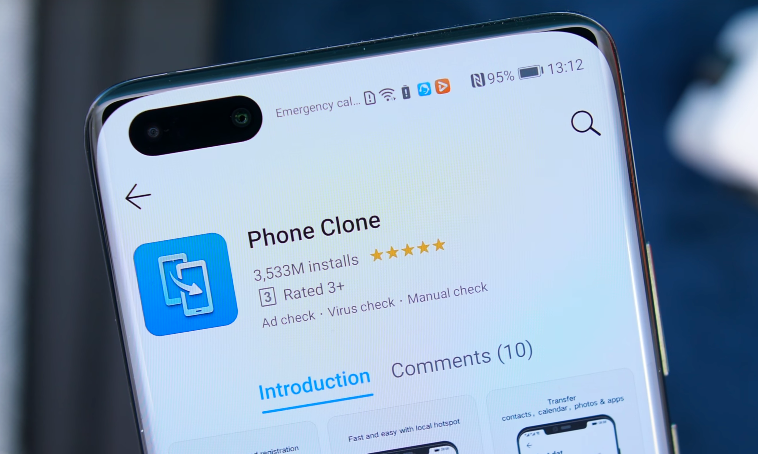
Additionally, you can have something called ‘PhoneClone’, which transfers all of your data from your current phone, onto the P40. If you’re wondering about apps, PhoneClone will automatically find the PlayStore apps on the Huawei AppGallery and download them from there and, if it cannot find the apps on the Playstore, it would actually copy the app and transfer it directly to the P40 Pro. This is a pretty smart-way to get your apps transferred and it’s such an easy process. 

What are your comments & thoughts on the P40 Pro?

iPhone 11 PRO - Unboxing, Camera Test & My Initial Impressions


So we finally have the iPhone 11’s in the office! I have the iPhone 11, the iPhone 11 Pro & the iPhone 11 Pro Max! This is the first time I’m seeing them in person, so without any further ado here is the unboxing and my first thoughts on the iPhone 11 Pro & the iPhone 11 Pro Max!


BOX

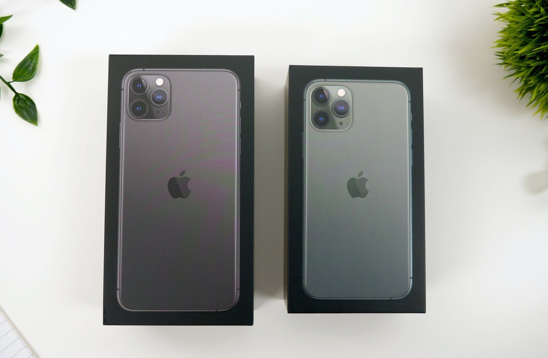
Ok, so taking a look at the boxes they both come in a black box now, to showcase that Premium Pro name now. They also come with a protective plastic wrap which is very easy to remove now thanks to a new pull tab that Apple started including with the iPhone X’s. Personally, I absolutely love the way these boxes look. They remind be a lot of the iPhone 2G, 3G and 3Gs boxes from back in the day. Those were the last black iPhone boxes that we got. Now, we did get a dark space grey box with the iPhone 8 which was quite cool, but these ones look so much better.

The design of the boxes has changed from the previous white boxes

The design of the boxes has changed from the previous white boxes

On the front of the boxes we have an image of the iPhone 11 Pro which matches the color of the iPhone inside, so Space Grey in the case of my 11 Pro Max and Midnight Green for the smaller 11 Pro. And like previous iPhone boxes, the iPhone 3G’s indented home button for example, we get 3D indentations of the actual phone on the box. The camera modules are raised a bit so you can actually feel them, and same goes for the stainless steel frame! Really cool.  On the side of the box we have an iPhone branding, no 11 name or anything like that, and what’s really cool about this is that the logo shimmers in the color of your iPhone.

We then have an Apple logo on the top and bottom which also shimmers in the color of the iPhone that’s inside and finally, on the back we get the capacity, 64 & 256GB in my case, as well as a listing with everything we get inside.

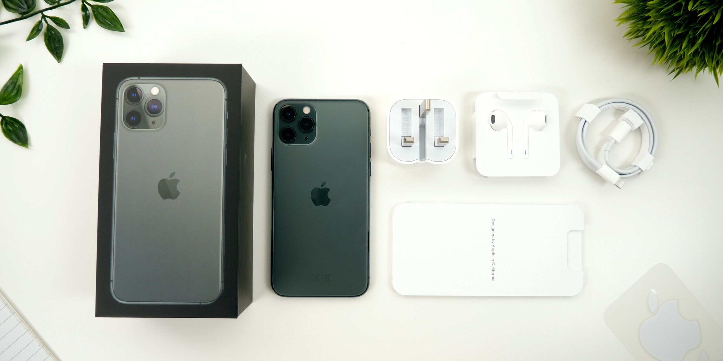
Upon opening up the box, the iPhone 11 Pro just sitting there. Interesting enough there is no plastic wrap on the back anymore. There’s just the one on the front, that now says Apple Inc alongside Apple’s address on it. We get the booklet, that includes the quick start guide with gestures, the Sim Eject Tool, the warranty and the safety guide, as well as some Apple stickers which unfortunately do not match the color of your iPhone like they do on the 12” MacBook which would’ve been nice. 

We also get a pair of lightning headphones, a USB type C to lightning cable, a first for an iPhone. Unfortunately we still have lightning on the iPhone but the charger,  is now the new 18W charger which is significantly chunkier than the previous model, but it does offer significantly faster charging than the previous 5W charger that came in the box. However, despite being chunkier it is actually very compact. You can fold its feet for the UK model at least, which you couldn’t do before  and since this is 18W, it can easily charge an iPad Pro as well. Quite a useful thing to carry around! 

Everything you get inside of the iPhone 11 Pro Max box

Everything you get inside of the iPhone 11 Pro Max box

IMPRESSIONS

Now I’ve been playing around with the iPhone 11 Pro Max for a bit now and here’s what I think.

First of all, the back feels weird. Feels as if you have a silicone skin on it. It’s smoother than the frosted glass back that the OnePlus 7 Pro has for example, and certainly something that we’ve never had on iPhones. But I do like the Matte Space Grey look of it! Especially with that centered Apple logo which I’ve actually come to like a lot more than the previous logo which was always towards the top of the phone. I think it has a very sleek look. 

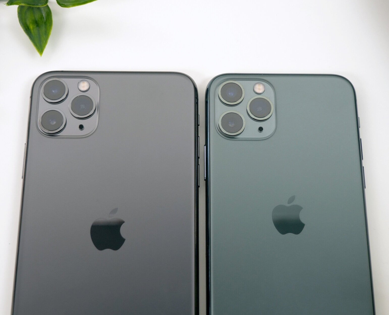
The Space Grey (Left) compared to the Midnight Green (Right) iPhone

The Space Grey (Left) compared to the Midnight Green (Right) iPhone

I’m not fully sure what to say about the Midnight Green color. From certain angles, the back just looks identical to the Space Grey one, at least to my Color Blind eyes. It’s only when you put them next to one another, can you really tell the difference between the two. The stainless steel frame on the Midnight Green 11 Pro does have this yellowish/green look to it, so that’s quite an obvious difference between the two. 

So design aside, what about actually using the phone? Is there anything different that I’ve noticed from my XS Max?

Well, the display is brighter, but only when you manually max out the brightness and compare the two side by side, can you actually notice a difference. However if you’re watching HDR content there is a noticeable difference between the Pro Max and the XS Max. I did also noticed the display being warmer, even with True Tone turned off.

The speakers appear to have had a pretty big upgrade! I was really impressed when I heard the difference between my 11 Pro Max and my XS Max. Not only was the 11 Pro Max louder but the vocals were so much easier to hear and clearer.

The Haptic Engine to me feels exactly the same as on the XS. Same haptic response, same strength, same everything. However the lack of 3D touch was very noticeable to me. Having to hold on icons for that 3D touch functionality makes everything so much slower. However, the only place were I was using 3D touch on a more frequent basis was in the control center and the lock screen, but if you compare the XS Max and the 11 Pro Max side by side, you can see how much slower it really is.

I didn’t really get to test out the battery life, because I only just got this today so definitely follow on Twitter @ZONEofTECH where I’ll post some updates as to its battery performance. Although I’m expecting it to be significantly better than the XS Max was, which for me could never last me an entire day of use.

CAMERA

Before we get into the camera properly, a quick tip. When you get a new iPhone always make sure that you go into the settings app and then camera and enable 4K60, because by default you’re stuck at 1080p for some unknown reason. This way you get the maximum amount of quality out of this camera.

Ok, so the front camera is very impressive on this. All the shots were perfectly exposed and sharp the colors were accurate and now you can rotate the phone in landscape and you get this wider field of view. Apple’s doing this by using a higher resolution 12MP sensor from the 7MP that we had before but because they haven’t added a wide angle lens, we actually don’t get any distortion, just a wider image which is pretty cool! 

The video on the front camera is also amazing! 4K60, which is some thing that’s never been done on a phone, so that’s extremely nice to see on the 11 Pro, considering that the XS’s only had 1080p video recording, so there were already far behind the competition which had QHD and 4K30 on the front already.

Other than that, FaceID does unlock faster but the difference is smaller than you would expect, since iOS 13 does make unlocking with FaceID faster on the iPhone XS as well.

Then on the back we get that triple lens camera system that you’ve all heard about. 

What I really like about this is how insanely smooth the transition between the lenses really is! You wouldn’t believe how much you can zoom out! It’s still not on par with the Huawei P30 Pro but very impressive!

Now, there is a bit of noticeable frame-blending that Apple is adding when transitioning between the lenses because they all have a different field of view, and for the most part you won’t be able to notice that, unless you do the transition between the lenses very very slowly.

In terms of the camera quality, I was very impressed with the consistent look that the photos got, between each of the lenses, but something that did shift quite a bit was the white balance. So it really does depend.

Even video recorded with the ultra wide lens comes out very stable.

Now, it would be hard to not talk about Night Mode. So here’s an example taken in our studio comparing the iPhone XS Max, which doesn’t have a Night Mode feature, and iPhone 11 Pro Max, a true night and day difference! Its great to see that Apple are finally catching up with this feature. I’m just a bit disappointed that the Night mode is an exclusive feature to the iPhone 11’s, even though all the other iPhones could easily do this, since it’s mostly a software feature. 

The Night Mode on the new iPhone makes such a huge difference to low light photography

The Night Mode on the new iPhone makes such a huge difference to low light photography

So overall, with that 3rd wide angle module, improved HDR video recording, and the significantly improved front facing camera, the 11 Pro’s have big improvements in the camera department. And I’m extremely happy about that because the camera is actually what I care about the most in a smartphone!


CONCLUSION

In the end the biggest improvement that the 11 Pro got over the XS is in the camera department, and while I do find the camera to be the most important thing for me in a smartphone, I don’t think that this upgrade is enough to warrant an upgrade from the XS. 

The 11 Pro in my opinion is what the XS should’ve been. S models of the iPhones have always had a speed improvement, a significant camera improvement as well as a brand new unique features, while keeping the same design. Pretty much exactly what the 11 Pro is, to the XS.