Camera

Samsung Galaxy Note 20 Ultra - FULL Review (after 2 months of use)

I’ve been using the Samsung Galaxy Note 20 Ultra for almost two months now and during this time, I’ve tested it to its fullest and now I am finally ready to give you guys the full, in-depth ZONEofTECH Review.

As you probably know, I test my devices for about a month, sometimes even more, before publishing our Review. So, even-though we’re never the first, we do try to make our Reviews as comprehensive as possible.

Therefore, this Review contains nine different sections:

  • Lineup 

  • Design

  • Display

  • Camera

  • Performance

  • Special Features

  • Software

  • Battery Life

  • Value

Spoiler alert, the Note 20 Ultra is literally the highest-end, non-foldable Smartphone that you can buy right now, but it does have some issues. Get all those snacks ready, drinks as well, sit back and relax as this is going to be quite the Review. 


Line-up

Starting off with the line-up and just like last year, where Samsung had two models of the Galaxy Note (the Note 10 & the Note 10+), Samsung now has the Note 20 and the Note 20 Ultra, with the ‘Ultra’ being the new ‘Plus’. This year, there are far more differences between the two models than in 2019.

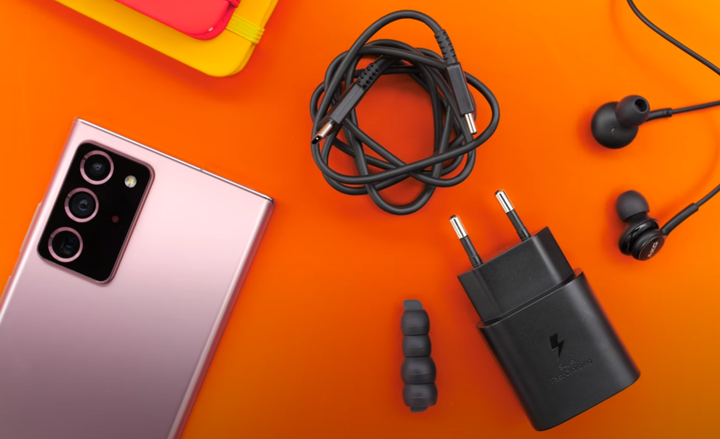
Not quite iPhone 12 levels of barebones, but the box contents have been slimmed down.

Not quite iPhone 12 levels of barebones, but the box contents have been slimmed down.

The regular Note 20 comes with a 1080p Display with a 60Hz Refresh Rate, an inferior Camera, a higher latency for the S-Pen and, more importantly, it comes with a Plastic back. All this for $1,000. It is pretty safe to say, do not buy the Note 20. I feel like the only reason why that Phone exists, is to push consumers to buy the Note 20 Ultra, which offers so much more, for $300 more. 

Unfortunately, this year, Samsung has cut down on the stuff you get inside the box by quite a lot. Even with the Note 20 Ultra, there are no S-Pen tips in the box anymore, which I find quite odd. There are also no Headphones if you live in the US. You do still get headphones everywhere else though.  You don’t get the case in Europe and the US, but you do actually get it in some other regions. Definitely keep this in mind, that Samsung is offering different things for different versions of this Phone, as it will be a recurring theme throughout the Review.


Design

Design wise, I was a massive fan of the Note 10+ from last year. That squared-off look and those sharp corners made it, in my eyes, the most beautiful Phone ever made. The Note 20 Ultra is even better now.

Gone is that super shiny and finger-printy Glass on the back and instead we get a Frosted Glass back, just like the iPhone 11 Pro’s, the Pixel 4, the OnePlus Phones and some others as well. The Samsung text on the back is engraved and it has a different texture than the rest of the Phone. For some reason, there is actually an engraved PO Number on the back of the Phone, which is quite interesting and funny at the same time.  Unfortunately, we only get this Frosted Glass back on the Mystic Bronze colour. If you get the Black or the White one, they still come with regular Glass, which is a bummer for me as those would have been my personal colour choices. 

Samsung has changed the position of the S-Pen, it is now on the left rather than on the right-hand side, which is quite inconvenient if you’re right handed so I’m actually not a fan of this at all. What I am a massive fan of though, is having both the Power and the Volume Buttons on the right-hand side. This way you avoid taking accidental screenshots, like you do on the iPhone, I can’t believe they still haven’t fixed that. 

Not that it was small to begin with, but the Display size has increased.

Not that it was small to begin with, but the Display size has increased.

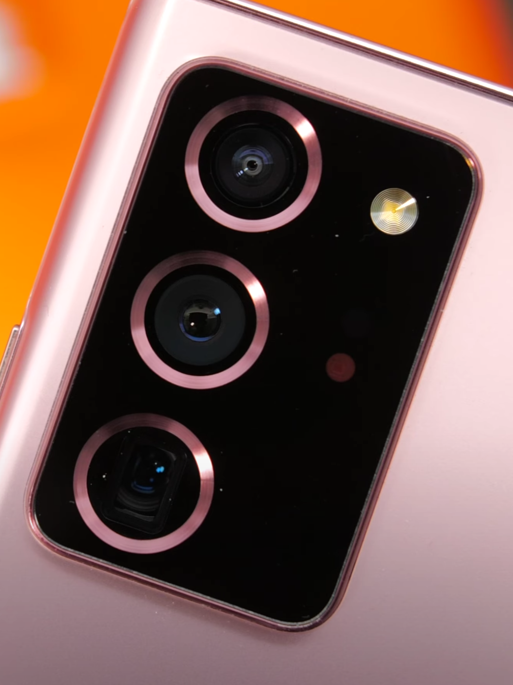
Aside from the texture on the back of the Mystic Bronze unit, Samsung has also updated the Camera Module’s Design. We get a similar style to what the S20 Ultra came with, more about the Camera once we get to that section, but now we also get these beautiful metal rings that surround the Modules which also match the colour of the Phone. Something else that I like about this Camera Module, which is just humongous in terms of both the size and the thickness, is that I can actually rest my finger underneath it and kinda use it as a pop-socket. This makes the entire Phone much more comfortable and easier to use. I’m not sure if this was intended by Samsung or not, but it is definitely a welcome ‘feature’.

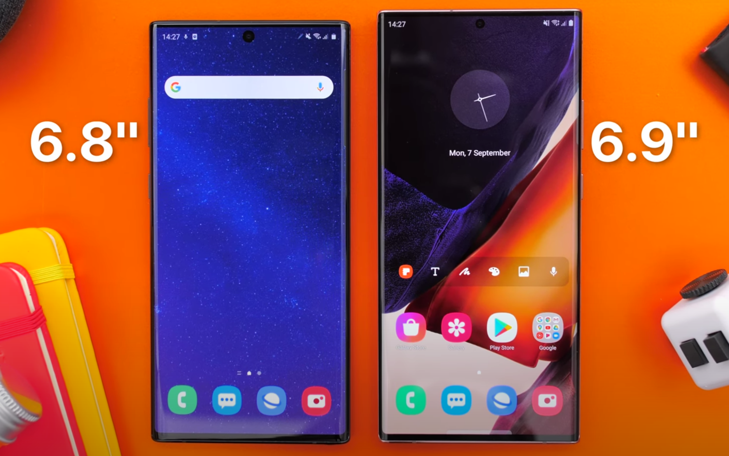
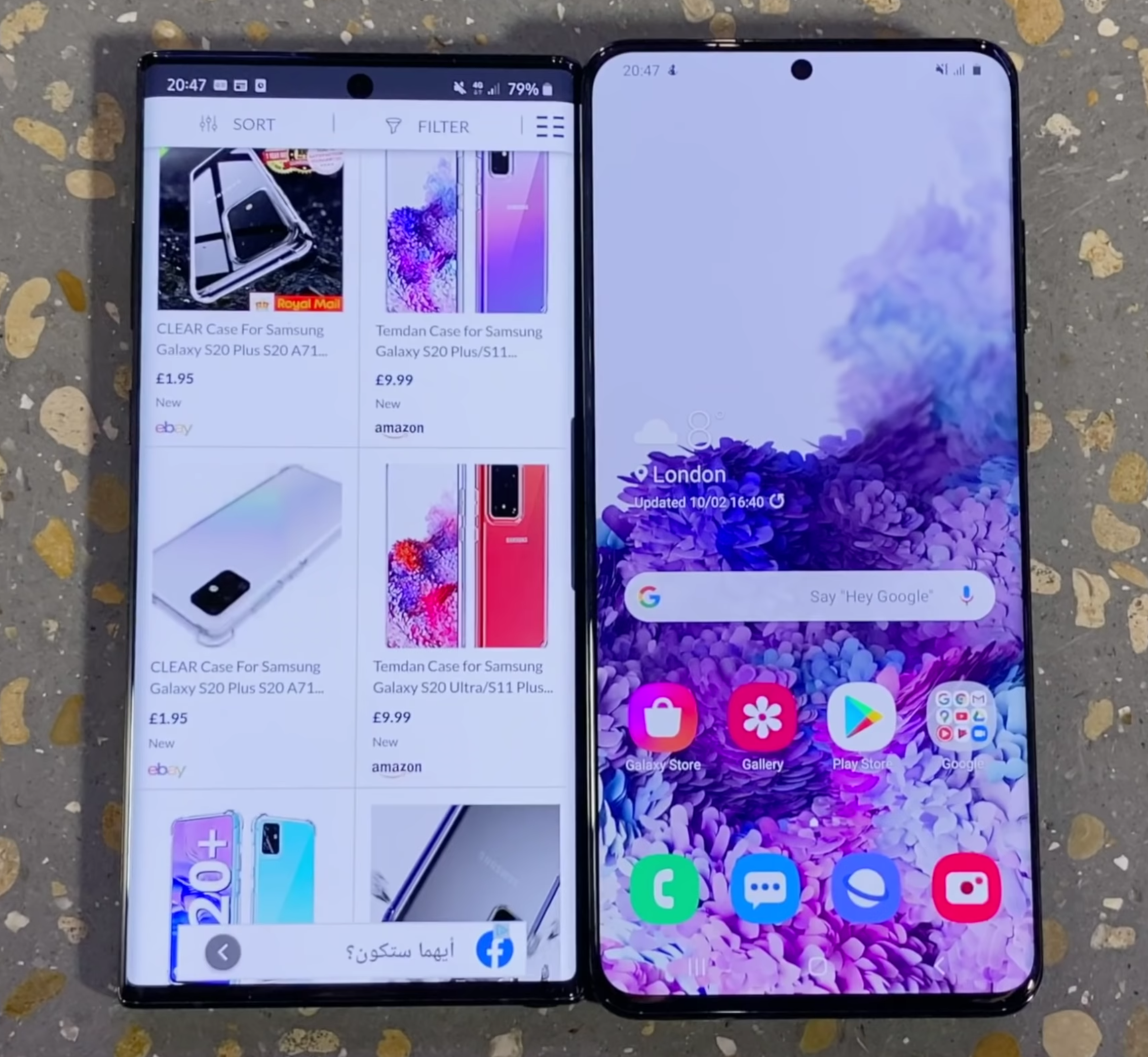
Now, I have to say, if you’re not into big Phones, then this is not the Phone for you by any means. With a massive 6.9” Display, up from the already big 6.8” Panel of the Note 10+ from last year, a 0.2mm increase in thickness as well as a 12g increase in weight, the Note 20 Ultra is noticeably bulkier than the Note 10+. This is without me even taking that super thick Camera Module into consideration. Speaking of that Module, the Note 20 Ultra now wobbles on the table like crazy, because of it. So, if you’re the kind of person that uses their Phone flat on the table a lot, you still can on the Note 20 Ultra, it’s just that it is going to be super frustrating because of that wobble. 

Also, when you compare the Note 20 Ultra against some of the other big Smartphones on the market, such as the iPhone 11 Pro Max, the S20 Ultra and the Huawei P40 Pro, the Note 20 Ultra is still the big boy here. Also, whilst I am indeed a big fan of the squared-off form factor, it did end up hurting my palms after using it.

Overall, I do think that this is the most beautiful Phone on the market right now. Both from the front, with that full screen Bezel-less Display, as well as from the back, with that new Frosted Glass look. 

My only complaints Design wise are, firstly, the fact that the Frosted Glass look can only be found on the Mystic Bronze colour and also, with it so big and having those squared-off edges, it is honestly the most uncomfortable Phone I’ve ever held in my hands.


Display

So, what about the actual Display? Well, just like with the Design, I do consider this to be the most impressive Display on any Smartphone at the moment. Not only is it larger now, but it is also taller, meaning that it can display more vertical content as well as being brighter. Samsung claims that it can go up to 1,500 Nits of peak Brightness, as opposed to about 1,250 Nits on the Note 10+.

We’ve used our professional XRite Display calibration & measure tool, measuring a peak Brightness on a 100% White Window of 977 compared to 530 on the Note 10+, or 780 on the iPhone 11 Pro Max. This is similar to what you would get outdoors, when browsing a website, as those do usually have a white background. DisplayMatte measured this Display up to 1,609 Nits of Brightness on a 10% White Window. Outdoors, I haven’t really been able to notice that much of an improvement over my iPhone 11 Pro Max. The Note 20 Ultra was perfectly visible outdoors though, even in direct sunlight, but it wasn’t noticeably brighter over any of the previous Phones that I’ve used before, at least not to my eyes.

The Note 20 Ultra, same as the Galaxy S20 series, now has a 120Hz Refresh Rate. As with the S20 series, you have to turn down the Resolution to 1080p if you want to use 120Hz. It still cannot do full Resolution at 120Hz, like the OnePlus 8 Pro (and many other Smartphones) can, which is a bit of a bummer. The good news however, is that I wasn’t able to see that much of a downgrade in Sharpness when using this in 1080p mode. Text is indeed a bit blurrier but not by as much as I was expecting.

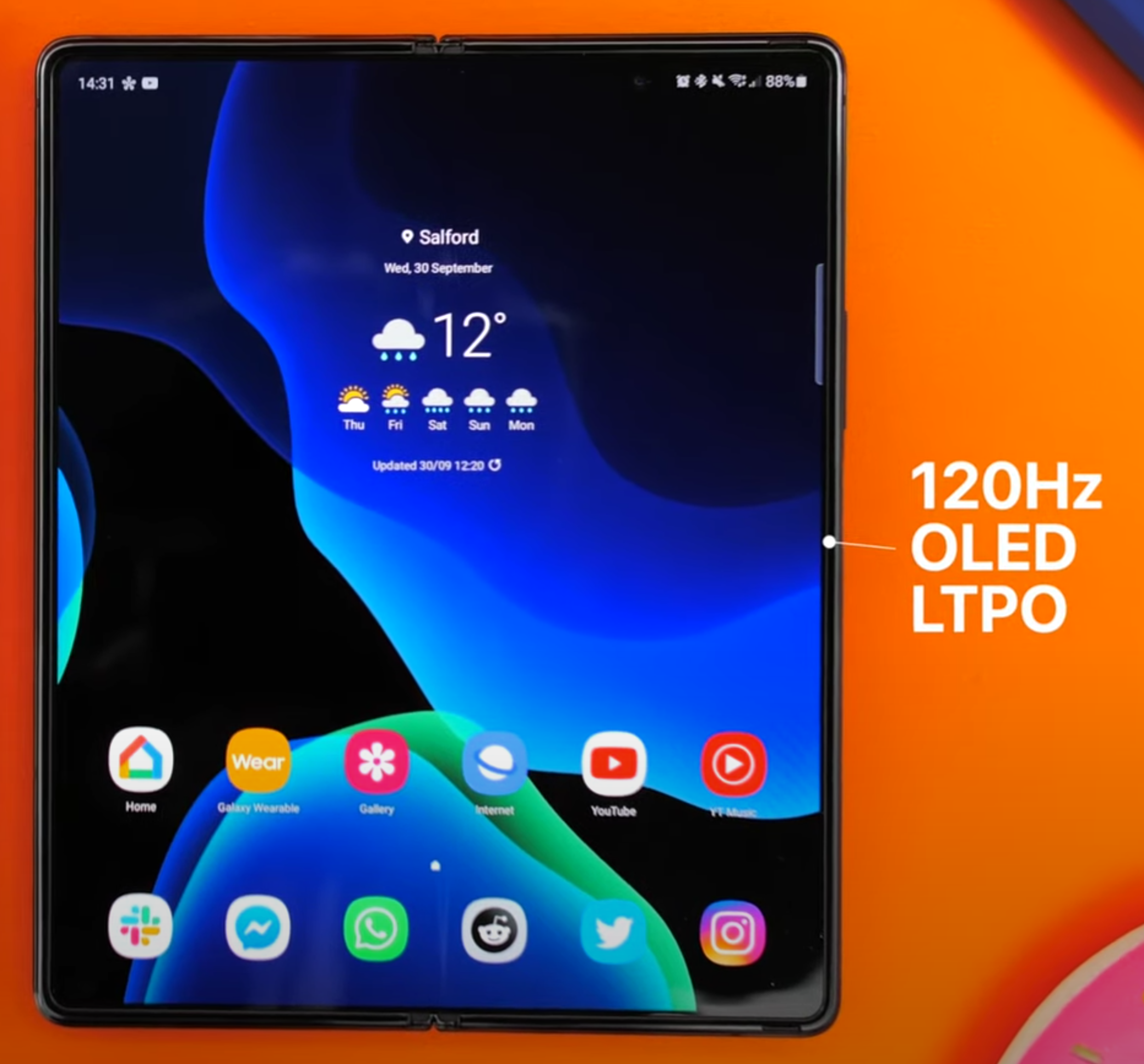
The Z Fold 2 is the only other Smartphone to have this quality of Display.

The Z Fold 2 is the only other Smartphone to have this quality of Display.

Something new with the Note 20 Ultra, is the LTPO Panel, making this and the Galaxy Z Fold 2 the only two Smartphones out right now that come with a 120Hz OLED LTPO Display. What this means is that the Note 20 Ultra can dynamically adjust its Refresh Rate from 1Hz, all the way up to 120Hz, based on the content that you’re watching, which does help preserve the Battery.

I also love how the Display is still curved here too. I know that some people prefer having a flat Display, like we got on the regular Note 20 or the S20 Ultra, but personally I really do like the way this Display looks. Also, I haven’t really had any accidental touch rejection issues with the Note 20 Ultra, maybe just a few when watching videos on YouTube, but nothing major. Let me know in the comments if you prefer having a flat or a curved Display.

The colours on this are absolutely outstanding. The fact that we get an even higher brightness really shows the most when you’re playing back HDR content, HDR video on this simply looks breath-taking. Overall, I would very confidently say that this is the best screen on any Smartphone out right now. It’s very bright, colours are incredible and the viewing angles are superb on this. HDR content is noticeably better than the same content being played back on the iPhone 11 Pro Max or even the S20 Ultra from just a few months ago.

Now, something that this Display comes with, is Gorilla Glass 7, aka Gorilla Glass Victus. This provides up to a 2m drop resistance, up from 1.6m, as well as double the scratch resistance of Gorilla Glass 6. It’s not perfect, it’s not scratch-proof, but it is a noticeable improvement over anything that I’ve used in the past. My only complaint regarding the Display is the fact that we still don’t have 120Hz at Native Resolution. Other than that, this is the best Display that I’ve seen on a Phone. 


Camera

So, what about the Camera? Well, buckle up because I have a lot to say here.

The Camera on the Note 20 Ultra is mostly identical to the one on the S20 Ultra, and that’s a good thing, right? If you’re aware of the S20 Ultra, you’re probably also aware of the very negative Reviews that this Phone received. There were two reasons for why that was. Firstly, the price. At a starting price of $1,400 and with promises such as a 108MP Resolution camera, 100X Space Zoom, 8K Video Recording and more, this Phone seemed like it was going to be the god of all Phones. Especially the Camera. Unfortunately, it had a lot of issues, with the main one being the Camera.

That 108MP Module was very poor in Low Light, it had focusing issues, 100x Space Zoom was basically unusable at 100x Zoom as everything looked like water-paint and 8K Video Recording was nice, but it was choppy. Not even to mention the pretty serious HDR Processing issues that it had to the point here the Galaxy Note 10 and S10 from a year prior, actually had a better Dynamic Range with many other Reviewers complaining about this too. 

With all of this, you would expect Samsung to just completely revamp the Camera in the Note 20 Ultra, but it turns out, this is mostly the exact same Camera that the S20 Ultra had. Luckily though, Samsung has actually fixed most of the issues this time. The Main Module is literally the exact same 108MP Sensor that we got with the S20 Ultra. Night Mode has been significantly improved, even photos of the Moon have a gigantic improvement from where the S20 Ultra was, at launch. Even when it comes to Low Light video, the Note 20 Ultra does indeed look better than the S20 Ultra did, 8K Video Recording is about the same, it’s sharp but still choppy, so I wouldn’t really be using this myself. 

There are a lot of similarities to the S20 Camera, but it’s not all bad news.

There are a lot of similarities to the S20 Camera, but it’s not all bad news.

HDR Processing has also been significantly improved. The Dynamic Range still isn’t as good as on the iPhone 11 Pro Max or the Pixel 4 XL, but it is a major improvement over the S20 Ultra. My main issue was really that Dynamic Range, so I’m glad to see that this has gotten a big improvement over the S20 Ultra’s Processing. 

Something that I also absolutely love about this 108MP Main Module is that you get a natural Depth of Field, pretty much Portrait Mode but fully done through hardware, rather than through software. Photos taken on this Phone literally look like photos taken on a DSLR or Mirrorless Camera, they’re that good. You can also take photos in 108MP Resolution, which results in some insanely sharp photos. 

Unfortunately, the CPU isn’t fast enough to process the 108MP photos that quick and also do all the machine learning required to make them look better. So, you’ll notice that all the 108MP photos will lack that HDR Processing all together, the shadows will often be crushed and the highlights overexposed. The regular 12MP photos, which are actually using an 8:1 Pixel Binning method to combine eight pixels into one, don’t have this issue.

Another issue that the S20 Ultra had, was Focusing. That massive 108MP Sensor lacks the Dual Pixel Autofocus that made Samsung Phones the fastest on the market, in terms of Focusing, since the Galaxy S7 from 2016. We still don’t have Dual Pixel Autofocus now, but Samsung has indeed added a Laser Module for Focusing that has fixed most of the Focusing issues. The only time when it still struggles to Focus, is when you zoom in as the Laser would not be able to be used if you’re that far away from the subject. But it does work pretty well for anything that’s around 2-5m away from you. Overall, definitely a noticeable improvement in Focusing Speed, over the S20 Ultra. 

When it comes to the Telephoto Module, this one sees the biggest changes from the S20 Ultra Module. Resolution wise, this used to be a 48MP Module, but it is now a 12MP Module, meaning that it is much better in Low Light. But you do lose a lot of that Digital Zoom capability. Optically, the S20 Ultra had a 4x Zoom Module, while the Note 20 Ultra now has a 5x. What this means is that photos taken at 5x Zoom, and even at 10x, should actually look sharper than on the S20 Ultra. 

However, the S20 Ultra seemed to consistently take better zoom photos, which I was not expecting. My only guess is that maybe that 48MP Resolution on the S20 Ultra’s Telephoto Module actually matters more than the 1x increase in the Optical Zoom that the Note 20 Ultra brought to the table. 

Interestingly enough, Samsung has actually removed the 100x Zoom capability from the Note 20 Ultra, so the highest you can do now is 50x. I almost never used the 50x Zoom, at least not for photos as they’re not usable at that zoom level. But, I did use them once to see what some food vans had on their menu from my flat, which I couldn’t see with my naked eye. This is a much better use case for that 50x Zoom, being able to read signs from far away. 

The Front Camera is unchanged from the Note 10+ from last year, but it can do 4K60.

The Front Camera is unchanged from the Note 10+ from last year, but it can do 4K60.

Finally, the third Module on the back is the Ultra Wide Angle Module, which is identical to the one on the S20 Ultra. It’s 12MP in Resolution, with an f/2.2 Aperture Lens. Combined with the new and improved Image Processing, we get the most impressive Ultra-Wide Angle shots that I’ve ever seen on a Phone, even more impressive than on the iPhone 11 Pro Max. Aside from this, I absolutely love the fact that you can take Night Mode shots using any of the Lenses. 

Samsung has now added a Pro Video Mode, which is amazing for Mobile Video Shooters, but you can only use it with the Main Module and not the Telephoto or the Ultra-Wide for whatever reason. The same thing applies to the Pro Photo Mode.

That’s a big issue for me and then another big issue is that you cannot record 4K60 Video from any of the other Modules, you can only do 4K60 from the Main Module on the back. What’s worse is that not only can you not switch between Lenses when shooting Video, but even when you’re not recording, if you want to see all three Lens options, you need to go into the Camera Settings and drop the FPS to 30. Samsung, please just release an update where we can still see all three Modules and if we select the Ultra-Wide or the Telephoto, the Frame Rate gets automatically capped to 30. I hate having to go into the Settings.

As long as I have to disable 4K60 for all but one of the three Lenses on this Phone, I cannot call this a 4K60 device. I ended up just leaving it set to 4K30, which is of course not ideal. 

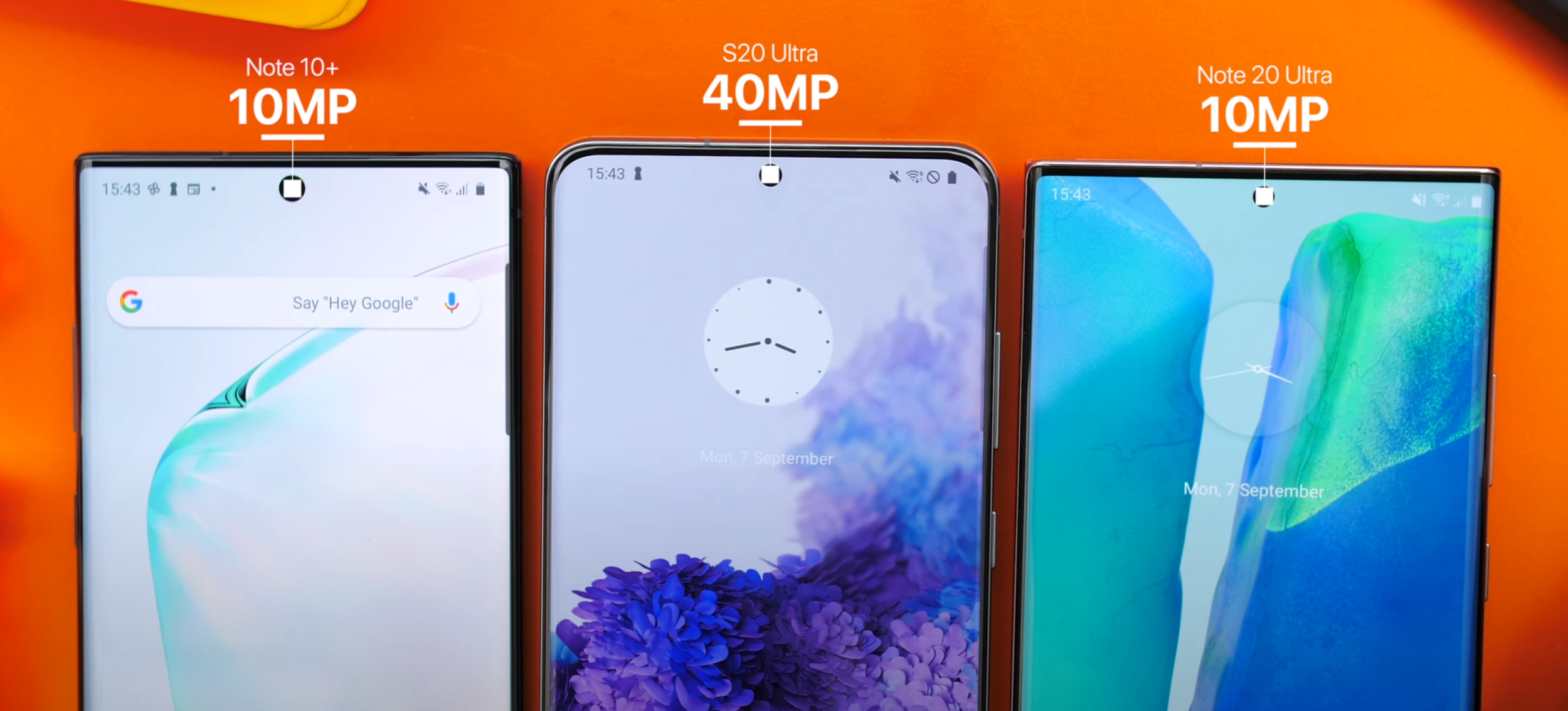
The Front Camera is good, it has too dropped in Resolution to a 10MP Sensor, the same Module as on the Note 10+ from last year as opposed to the 40MP Module that the S20 Ultra got. The Front Camera Cut-out is now smaller than on the Note 10+, so I do really like that. Selfies are still sharp, very well exposed and HDR Processing on the front is surprisingly well done. Additionally, the Front Camera can actually do 4K60. 

Overall, the Main Camera Module is very good, only suffering from some occasional Dynamic Range issues, but nothing as severe as what the S20 Ultra had. The Zoom Module is the best I’ve seen on any Smartphone so far and the same goes for the Ultra-Wide Angle Module. My only major complaints here are not being able to use the Pro Modes on any of the non-Main Lenses and not being able to do 4K60 Video on all the Lenses on the back. Oh, and 8K Video Recording is still a gimmick, as it’s still capped at 24FPS.


Performance

Moving on to the Performance, this is where I have some pretty unfortunate news. As you may be aware, there are different configurations of this Phone, which depend on which region you’re in. 

Some units come with the Exynos 990 Processor, mainly the ones made for the International market, while some units come with the much better Snapdragon 865+ Processor. This not only gives you 20% better Performance, which is a very gigantic difference, but it also runs cooler while giving you a better Battery Life. That’s absolutely nuts! 

The drop in Frames between the two models (credit: XEETECHCARE)

The drop in Frames between the two models (credit: XEETECHCARE)

Even with the S20 line, there was a lot of backlash from consumers on the fact that the Exynos 990 models were slower, ran hotter and had a worse Battery Life than the Snapdragon 865 models. But now with the Note 20 Ultra, Samsung has bridged that gap even more by including the even more powerful Snapdragon 865+ variant in the US variants, while keeping the international models with the same Exynos 990. Not only that, but JerryRigEverything and iFixIt have both found that Samsung even uses two different cooling systems in the Note 20 Ultra’s, some copper based and others Graphite based. Probably the worst part is that in some regions, like India or Pakistan, you actually get less RAM (8GB compared to 12GB), while in the US you only get 128GB of base Storage, as opposed to 256GB like you get everywhere else. Long story short, it’s a mess!

The Note 20 Ultra is the Frankenstein of all Phones and depending on where you buy itfrom, you’ll end up with some very different components, some of which are inferior. Our model is the Exynos 990 version, with 12GB of RAM and 256GB of Storage. Personally, I haven’t really had any Performance issues on this, it’s been running perfectly smooth, but what I have indeed had issues with, was overheating.

On a number of occasions, I’ve found that my Note 20 Ultra was running so hot that I could barely even hold it in my hand. At one point, it was just sitting in my hiking back, I took it out and because it was constantly searching for a signal, it got so hot that I had to literally put it back in my backpack as I couldn’t even have it in my jeans pocket. This overheating, combined with the already weaker Performance of the Exynos 990, results in games getting up to 20FPS less on the Exynos variants, when compared to the Snapdragon 865+ model.

Luckily, I’m not a big gamer myself, but it is very frustrating knowing that you can get an inferior Note 20 Ultra depending on the region that you’re based in, while not necessarily paying less for it.


Special Features

Moving on to Special Features, the Note 20 Ultra is literally packed to its teeth with features. You cannot get a Phone that’s more equipped than this.

Water Resistance, Wireless Charging, Reverse Wireless Charging, 5G and a Haptic Engine that now seems even better than the one on the Note 10+ from last year, resulting in one of the best typing experiences on a Smartphone. It also has some great, powerful Speakers. The Note 20 Ultra offers basically anything that you can think of.

The S-Pen is a major selling point for the Note 20 Ultra

The S-Pen is a major selling point for the Note 20 Ultra

But the main reason why you would want to get a Note over a standard Galaxy S Phone, or any other Phone for that matter, is the S-Pen. Samsung offers the best stylus experience on a Phone and the Note 20 Ultra is now even better than the Note 10+. The latency is now lower, at just 9ms down from 45ms, so everything feels incredibly smooth and pretty much just like writing on a piece of paper. There’s also a predictive algorithm now to make things even smoother, but I have noticed that sometimes it does indeed make the line jump, so I do think that it needs a bit more tweaking. There are a few new air gestures that the S-Pen supports now, allowing you to go back, go home and open up the multi-tasking menu just by using the S-Pen in the air, which is pretty cool.

I’m not a big hand-written notes taker myself, but where I have found myself using the S-Pen a lot was when using Photoshop or Lightroom. Being able to just use it as a brush or even as a small pointer to adjust the tools and brush size was absolutely amazing. However, because of that massive Camera Module, you cannot really use the S-Pen while the Note is flat on the table because of how much it will wobble, which I think is a massive downgrade to the S-Pen experience overall.

But something that is actually a big upgrade, is in terms of DeX. DeX being this Desktop UI that Samsung Phones will boot in once you connect them to an External Monitor. It’s an extremely underrated feature. Now, the Note 20 Ultra supports Wireless Dex, meaning that if you have a TV that supports the latest version of MiraCast, you can cast directly to your TV and then use your Samsung Phone as a Trackpad and Keyboard. You could also hook up external peripherals and kinda use this as your Desktop replacement to some extent.

You can run the Desktop version of Chrome as well as Microsoft Office so for some people, DeX can indeed replace their Computer. You can also open up all of your Android Apps in windowed and full-screen. I am a big fan of DeX, even though I don’t personally use it as much. 


Software

When it comes to the Software Experience, the Note 20 Ultra runs on Android 10, with Samsung’s OneUI 2.5 Skin. I have to say, TouchWiz from back in the Galaxy S4 and S5 era was the most infamous Skin on any Android Phone, it was slow and laggy. OneUI 2.5 is for me at least, the best Skin on any Smartphone right now.

This is one of the best skins we’ve seen on any Android Phone.

This is one of the best skins we’ve seen on any Android Phone.

It’s very fast, very fluid. The design is great and the reason why it is called OneUI is because you can use it with one hand, to some extent at least. My favourite part about OneUI is that you can have App Folders in the App Drawer too. This way, you can have a very minimalist Home-Screen while also having App Folders easily accessible for when you need them.

Also, Samsung allows you to run three Apps at the same time, with one being a picture-in-picture overlay, which makes this Phone, in combination with the S-Pen, one of the best Smartphones for productivity work. You can lock Apps in memory, you can have YouTube Player in the background in a tiny pop-up window if you have YouTube Premium, it’s just so good.

But…it’s not perfect. It does have some occasional Frame Rate drops when it comes to animations and I’m not a fan of the way Notifications are displayed at all. Some end up being in non-chronological order. In my case, where I get hundreds of Notifications per day, which I cannot really disable, it ends up being a complete mess and really difficult finding what I’m looking for. 


Battery Life

Battery Life is not a strong point for the Note 2 Ultra

Battery Life is not a strong point for the Note 2 Ultra

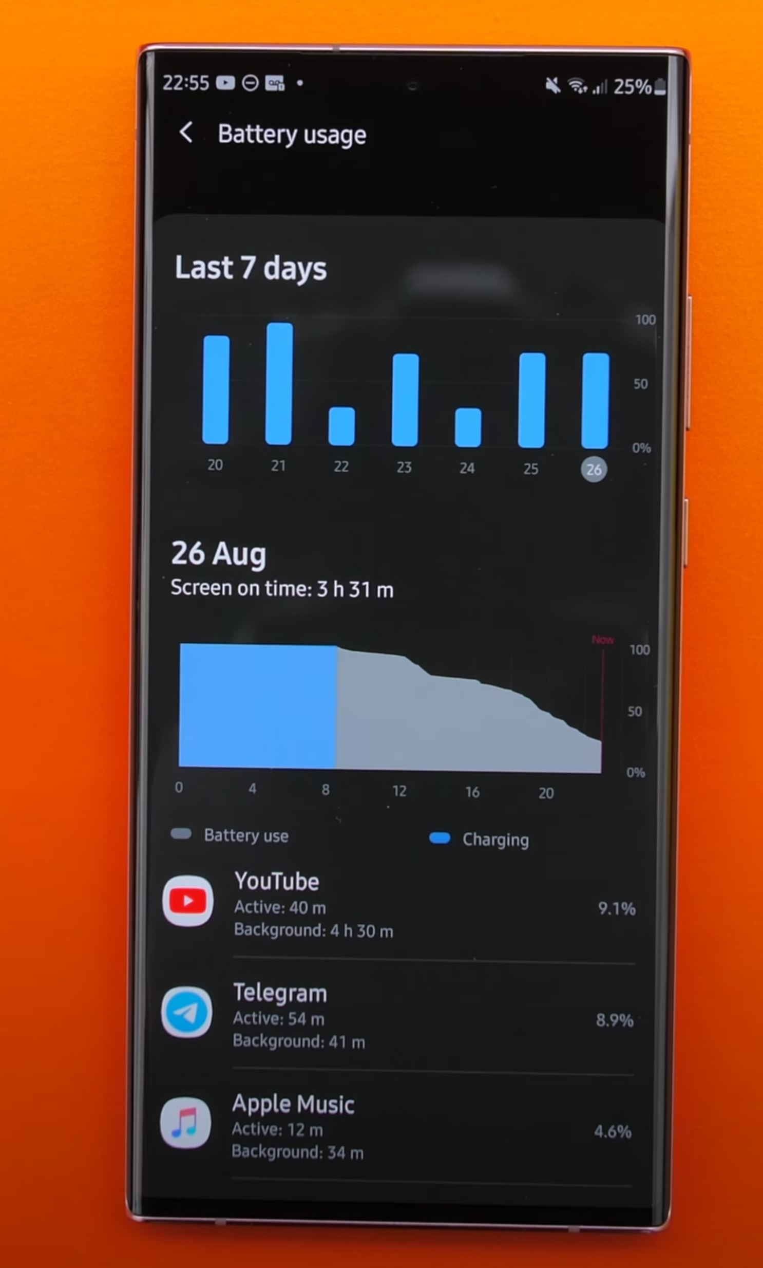
The Note 20 Ultra come with a 4500mAh Battery, this is 500mAh less than the S20 Ultra came with. But, we do have that LTPO Display, which does indeed save some Battery Life. From my usage, it was just about the same as on the S20 Ultra. But that doesn’t mean it was great.

I was getting about 3-4 hours of screen-on time, which was pretty bad, even after multiple weeks of use. On my Fold 2 for example, I’m easily getting around eight hours or so. I do have the Exynos variant and have heard that the Snapdragon variant isn’t quite as bad, but the Exynos variant is just not as good as it should be. Luckily, we still have Fast Charging but this has now dropped to 25W from 45W, like we had on the S20 Ultra. The good news is that it still charges to around 50% in just 30 minutes, so I don’t have any complaints in terms of that. 


Value

So in the end, is the Note 20 Ultra actually worth it? Well, I can confidently say that if you’re looking for a non-foldable Smartphone, this is the best one that you can buy. You get an outstanding Display, an incredible Design, great Cameras and all the features that you can think of. 

But, you will have to pay for all of that. At a starting price of $1,300 or £1,180, the Note 20 Ultra costs as much as a pretty good Laptop and it isn’t that far off from the Galaxy Z Flip, which costs £1,300. You can even find the original Galaxy Fold for about £600-£800 or so, on eBay.

At that point you’ll have to decide. Do you want the ultimate standard Smartphone experience or do you pay a bit more and get into the Foldable Smartphone market? If you do decide to go for the Note 20 Ultra, try to get the Snapdragon 865+ variant as you’ll get a better Battery Life, more Performance, a better Gaming experience as well as a cooler device.

Would we switch to the Huawei P40 Pro?

Huawei not only sent over two Huawei P40 Pro’s, one in Black and the other in the new Silver Frost colour, but they also wanted us to test this for an entire week and give you our thoughts on it. 

You’ve probably seen the Unboxing and our First Impressions of the P40 Pro, but now it’s time to dive in a little deeper into what this phone can do. Just a small spoiler, the Huawei P40 Pro has the very best Camera on any Smartphone out right now and getting all of your apps across is surprisingly easily. We were shocked to see that we could pretty much clone an entire Galaxy Fold onto the P40 Pro with ease.

But we’re getting carried away, so here is everything you need to know in terms of the P40 Pro when it comes to the: Design, Display, Camera, Performance, Special Features, Battery Life & Value.


Apps

First things first, something that you’re all probably wondering, and something that we were definitely wondering when we got the P40 Pro, was how do we transfer apps? Google Apps & Services are no longer supported so how are we going to use apps on the P40 Pro? Well, to our surprise, it was actually extremely easy.

When you set up your P40 Pro, you will be get asked to download the Phone Clone tool on your other Smartphone. This tool will basically transfer pretty much every single app from your old phone, onto your P40 Pro. We were quite impressed that we had Instagram, Amazon, Philips Hue, Call of Duty mobile and even Apple Music. On top of this, you do have Huawei’s AppGallery which also has most popular apps, such as Tiktok, Snapchat, Amazon, Microsoft Office, Telegram, Fortnite, Asphalt 9 and more already on it. More apps are also being added every single day.

If there is indeed an app that you weren’t able to transfer and that you couldn’t find on Huawei’s AppGallery, you can always download the individual APK’s from official sources or download Third Party app stores and get them from there.


Design

In terms of the design, there are three models of the Huawei P40. We have the regular P40, which comes with a 6.1” Display and a Triple Lens Camera Module. We then have the P40 Pro, the one that we have, which comes with a 6.58” Display and a Quad Camera Module Array. Finally, we have the P40 Pro+, which will be launching in June, this has the same 6.58” Display but with a Penta Camera Module Array. Probably the best news here is that, no matter which one you buy, you will still get the same Sensor on the Main Camera. This is, at the moment, the biggest Sensor on any Smartphone on the market.

The P40 Pro looks & feels like a premium, high-end device.

The P40 Pro looks & feels like a premium, high-end device.

When we had a look at the P40 Pro, we have to say, we really do like this design. It’s not too big, not too small, it’s pretty much the perfect size to be able to use it with one hand, without necessarily sacrificing the Display size. We do have a similar design style to what we’ve seen on other Android phones, with a Dual Front-Facing Camera Cutout, but what’s quite unique about the P40 Pro is that it is one of the few Smartphones to implement a Waterfall design. This means that, unlike some Smartphones that just have curved sides, the top and the bottom are also curved. 

The Display however, doesn’t go until the end of the glass. Instead, it ends way before it. We would’ve loved to see a Waterfall Display and not just Waterfall Glass, but we guess this would’ve caused some serious accidental touch issues, so we’re not surprised that Huawei hasn’t done it.

Holding that Display in place, is a polished metal frame that matches the colour of your phone. On the bottom we have the SIM Card slot, which also holds Huawei’s proprietary NM Card, which can expand the 256GB Internal Storage by up to another 256GB.

On the right-hand side, we have the power button and the volume button, on the left-hand side we have nothing and finally on the top, we have a Microphone Port as well as an IR Blaster. Smartphones used to have this back in the day but pretty much all of them removed it. It allows you to control your TV, your DVD player and pretty much anything that has an IR Receiver. We’re glad to see that Huawei still has one, as it’s such a great feature to have.

Finally, on the back we have the Quad-Camera Module Array which we’ll be covering in the Camera section. This is one of our favourite backs, on a Smartphone, ever. You probably know that we’re a big fan of Frosted Glass backs on Smartphones, the P40 Pro is no exception. While you can indeed still get it in Black if that’s what you like, the Silver Frost back looks absolutely stunning. It is pretty much fingerprint proof and the colour of the back does slightly change depending on the angle at which the light hits it.

Also, it’s probably worth noting that the P40 Pro, even though it has the biggest Sensor on any Smartphone, the Camera bump isn’t as big or as thick as on other Smartphones, so the table wobble is much less than you would expect.


Display

Moving on to the Display, the P40 Pro comes with a 2640x1200 Resolution Display, with a PPI of 441. This is an OLED Display, with a DCI-P3 Colour Gamut and HDR10, so if you’re into photo editing and grading, this is a perfect Display for that. Not only that, but Huawei also added a 90Hz Refresh Rate, making this display 50% smoother than any other regular 60Hz panel out there. 


Camera

Moving on to the Camera, this is by far the P40 Pro’s key selling feature, and probably the main reason that people would want to go for the P40 Pro. So, here are a few reasons why the Camera on this phone just blows everything else out of the water.

Largest Sensor on any Smartphone

This has the largest Sensor or any Smartphone to date. It has a 1/1.28 inch Sensor with 2.44µm size pixels with a 50MP Resolution. The larger the pixels, the more light they can capture and the better the phone is in Low Light.

RYYB  Sensor

Rather than the sub-pixels on the Sensor being in the standard RGGB (Red-Green-Green-Blue) sub-pixels, the P40 Pro has a RYYB (Red-Yellow-Yellow-Blue) arrangement. This, according to Huawei, lets 40% more light in, which, combined with the massive Sensor size itself, makes the P40 Pro the best Smartphone Camera in Low Light…ever.

Best in Low Light

The P40 Pro makes something that was barely even visible with the naked eye and turns it into daylight. It pretty much works like magic and you don’t even need to have Night Mode enabled because, thanks to that massive Sensor, the P40 Pro is capable of achieving great shots like the ones we have featured in our video, where the competition struggles severely. 

Usually, Smartphones have an ISO of 1600 or 3200 in the most extreme cases, but the P40 Pro has up to 51200 which can be bumped even higher to 409,600.

What was the biggest let down with the S20 Ultra, is the main selling point for the Huawei P40 Pro.

What was the biggest let down with the S20 Ultra, is the main selling point for the Huawei P40 Pro.

Natural Bokeh

Now some of you might be familiar with how DSLR Cameras can get these very nice Depth of Field shots, where the subject is perfectly in focus and the background is all blurred out. This is caused by both the Lens itself as well as the size of the Sensor. Since the P40 Pro has such a massive Sensor, you can actually get shots with a very impressive Bokeh or Depth of Field, even when you’re not using Portrait Mode at all. This means that the background separation would be perfect, as this is done through hardware, rather than software. 

Leica Lenses 

Now, like we said, aside from the Sensor itself, the Lens also makes a very big difference and the P40 Pro uses Leica Lenses. Leica being one of the world’s most well-known Camera and Lens manufacturers. They make high-end Lenses for DSLR Cameras and they’ve teamed up with Huawei to make the Lenses used on the P40 Pro’s Camera.

Best 50x Zoom

The P40 Pro comes with a 12MP Periscope Camera Module that gives us 5x Optical Zoom and 50X Digital Zoom. We compared this Zoom against another Smartphone that has 100x Space Zoom and it turns out that Huawei’s 50x Module was significantly better than that other 100x Module. This seems to be the sharpest Zoom on any Smartphone that we’ve used. You can even use Night Mode on the Telephoto Module as well. 

Cinematic Ultra-Wide 

Then we have one more Module, which is a 40MP Ultra-Wide Angle Module. Huawei’s calling this a Cine Camera, which was specifically designed for video. We have to say, the video looks stunning on this, Stabilisation is great and Low Light performance, even on the Wide Angle Module, is just outstanding. The P40 Pro is also the best Smartphone that we’ve used for Low Light video. 

100% Pixels for Autofocusing

Finally, the last thing that makes this Camera so unique is that unlike some of the competition, that use Sensors almost as big as the P40 Pro but have some serious Autofocusing issues, the P40 Pro uses 100% of the pixels on the Sensor for Focusing and because of this, Focusing is pretty much instant, we haven’t had a single issue with Focusing on the P40 Pro. 

The P40 Pro really makes a splash when it comes to Slow-Motion.

The P40 Pro really makes a splash when it comes to Slow-Motion.

A few more things that we want to mention when it comes to the Camera, is that we also get a Depth Sensor on the back, for improving Portrait Mode photography and the Front-Facing Camera is really good as well. It’s a 32MP Selfie Camera and the Low Light is outstanding there too. 

Slowest Slow-Motion

Then the P40 Pro, also has the best Slow Motion on any Smartphone on the market right now. Usually Smartphones top out at 240FPS Slow Motion, with some being capable of doing 960FPS, but the P40 Pro can actually do 7680fps Slow Motion whilst also being much clearer than the competition. 

Best Time-Lapse

The P40 Pro can also do 4K Time-Lapses, whereas other Smartphones are limited to 1080p Time-Lapses. This is pretty much the best Camera that we’ve ever used on a Smartphone. Definitely comment down below if you want to see a blind Camera Comparison against some of the other high-end Smartphones, similar to the ones we’ve done in the past! 


Performance

Performance on the P40 Pro has been great. It comes with Huawei’s own Kirin 990 Processor, which is their highest-end model, as well as the Mali G76 GPU, 8GB of RAM and 256GB of Storage.

To be honest, that 90Hz Refresh Rate Display makes everything buttery smooth. We haven’t experienced any lag or any slowdowns whatsoever, performance has been perfect. 


Special Features

The best of both worlds.

The best of both worlds.

Aside from all the Camera features, there are a few more features that make the P40 Pro quite a unique device.

For example, not only do we have an in-display Fingerprint Reader, but we also have a true Depth Sensing Camera on the front. Similar to FaceID, we have an advanced face unlock system on the front, making the P40 Pro the only 2020 flagship so far to have both an in-display Fingerprint Reader and the true Depth Sensing Camera on the front. 

We also have IP68 Water Resistance, a Haptic Engine for when you’re typing an navigating the phone, full-onscreen Navigational Gestures, WiFi 6, Bluetooth 5.1, a Gravity Sensor, that IR Blaster than we mentioned before, a Bone Conduction earpiece because we don’t have any earpiece cut-out on the top, as well as 5G and we even get an Always-On Display, which is one of our favourite features ever, on a Smartphone.


Battery Life

When it comes to the battery itself, the P40 Pro comes with a 4200 mAh Battery and it also supports 40W Fast Charging right out of the box. As well as this, it supports 27W Wireless Charging and Reverse Wireless Charging, which means that you can not only charge other devices from the back of the P40 Pro, but you can also charge other Smartphones as well. 


Value

When it comes to Value, the P40 Pro costs £900 in the UK. This is expensive but still more affordable than pretty much all of the competition. 

So, if you’re looking for the very best Smartphone Camera out there, this is the one. You will have to go through some hoops and do a bit of tweaking to get all of your stuff working, but the good news is that most apps did indeed work right out of the box. This will only get better once more and more apps start coming to Huawei’s AppGallery.

Samsung Galaxy S20 - 40 Things You Didn't Know!

The Samsung Galaxy S20 is now here. This is, by far, one of the biggest changes that Samsung has ever made to their line of smartphones. We now have things such as a 100x Zoom camera module, 8K video recording, a massive 5000mAh battery as well as a an extremely fluid 120Hz display.

But, there are a few things that Samsung didn’t tell you about the S20’s, here are 40 of them!


1 - Our First Samsung Event!

Screenshot 2020-03-11 at 11.54.10.png

Even-though this is not related to the S20’s directly, we got invited to the event ourselves, meaning that we attended the Unpacked 2020 Event in London.  This was our first ever Samsung event, so huge thanks to Samsung for having us.

We did get the chance to see all S20’s in person and play with them for quite a bit, which is the reason why we do have some personal thoughts to share in this article as well.


2 - 120Hz Limit

Honestly, this 120Hz refresh rate makes the S20’s feel years ahead in terms of performance. We could definitely tell that it was more fluid than even the OnePlus 7T Pro, which has a 90Hz display. 

However, there is one catch. You cannot use the new 120Hz refresh rate when the display is running at full resolution. You have to switch to FHD+, otherwise you’ll have to stick to 60Hz, which is a shame.


3 - 240Hz

Aside from that 120Hz panel, the touch input actually samples at a whopping 240Hz. Meaning that touch inputs would be twice as accurate as before. 


4 - Haptic Engine 

Next up, all three S20 models use the new Haptic Engine that the Note 10 introduced. This means that you can essentially feel a response back, for example with the Alarm Wheel in the Settings or when you take a photo. This basically makes your phone’s software more like hardware in a weird sort of way.


5 - Charge Time

The S20 Ultra now gets the extremely fast 45W charging that the Note 10+ introduced. So, even with that enormous 5000mAh battery, the Ultra will still be able to fully charge in just over an hour, which is pretty nuts. The other S20’s still get improved Fast Charging, up to 25W from the S10’s 15W. Which will get you up to 50% in just less than 30 minutes.


6 - Actual Zoom 

Now, one of the most unique new features about the S20’s (especially the Ultra) is that unbelievable 100X Zoom camera. There is quite a lot of confusion on this so to clarify, the 100x Zoom is not optical zoom, it is digital.

The S20 Ultra essentially has 10x “Hybrid Zoom” and around 5x Optical Zoom which is still a big improvement from the 2x that we had before. The remaining zoom up to 100x is done digitally, thanks to that massive 108MP main sensor. The other S20’s still have an impressive zoom level as well. They both have 30x Digital Zoom.


7 - Periscope Camera

Credit: Samsung

Credit: Samsung

The reason the S20 Ultra can achieve 5x Optical Zoom is thanks to a new camera module called a Periscope Camera. Essentially, Samsung added a bunch of lenses that can heavily magnify the image. The only problem is that the camera module would stick out about 1cm from then entire phone which no-one wants. So, to fix that, they positioned the camera module horizontally, on its side and then they’re using a mirror to reflect the light from the outside of the phone, through the lenses and finally to the sensor. This works in the exact same way that a periscope from a submarine works. Pretty cool stuff! 


8 - Actual Picture Size

Now, taking a 12MP photo on a phone, usually takes up about 2MB, or so of space. This means that taking a photo with that massive 108MP image on the S20 Ultra, should take up close to 20MB, which is a considerable amount, especially if you’re the kind of person that takes loads of photos. Well, luckily this won’t be the case, because the photos taken with that 108MP sensor will actually be 12MP photos.


9 - Pixel Binning

This is because Samsung will be using something called Pixel Binning technology and essentially combining nine pixels into one. (108MP/9 = 12MP). Samsung also claims that this will provide better low light performance and we did get to experience this in person, and we have to say, the S20 Ultra’s low light is miles better than what we have on the Pixel 4.


10 - Improved Low Light

While we’re speaking about the camera, the low light performance will be improved substantially on the regular S20’s. This is because, even-though they only have a 12MP sensor, as opposed to the massive 108MP sensor of the S20 Ultra, they are indeed newer sensors with larger pixels of 1.8μm. On the S10, they were 1.4μm pixels.


11 - Biggest Camera Upgrade since S7

Ever since the Galaxy S7, Samsung has been using the exact same sensor specs. Yes, they were new sensors every year with slight tweaks, but the sensor size and the pixel size has remained the same from the S7 to the S10.  The only major camera improvement that we got on the main module was with the S9 and that switchable aperture camera. Most of the improvements were done through software. However, this is finally changing with all three models of the S20. 


12 - Goodbye Jack

Something that’s also changing is that we no longer have an MP3 jack, which is something that the Note 10’s got rid off. 


13 - GalaxyBuds+

However, Samsung has launched a new version of their GalaxyBuds headphones, the GalaxyBuds+. Unfortunately, they do not feature any crazy new features, like active noise cancellation or anything like that. Instead, they focus on improving the sound quality and improving the microphone quality whilst almost doubling the battery life to 22 hours. 


14 - GalaxyBuds+ iOS

Samsung has now released the iOS app for the Galaxy Buds. So, if you have an iPhone, the Galaxy Buds will integrate much better into your ecosystem.


15 - Storage Speed

Another big improvement that will make the S20’s feel so fast is the storage speed. All S20 models feature UFS 3.0 storage, compared to UFS 2.1 on the S10’s. Therefore, as with the Note 10, we’ll get double the read and write speeds, to just over 1GB/s read, which is insane! 


16 - microSD

Speaking of storage, all three models of the S20 will keep the microSD card slot. This is pretty amazing because you can actually get a 1TB microSD card and have up to 1.5TB on the S20 Ultra or 1.1TB on the other two S20’s.


17 - Storage Options

This is because, while all three S20’s will come with 128GB of storage as default, the S20 Ultra will have a second storage option of 512GB. Some might not appreciate Samsung not offering more than 128GB on the S20 and S20+. However, keep in mind that you do have that microSD card slot, in case you do need more storage for things such as apps and music.


18 - RAM 

When it comes to the RAM, the standard S20 comes with 8GB of RAM, which is the same as the S10 and S10+ from last year. The S20+ comes with 12GB of RAM, which is the same as the Note 10+ from last year. The S20 Ultra comes with either 12GB of RAM if you go for the 128GB model or a whopping 16GB of RAM if you choose the 512GB storage model. 

Most people don’t even have that in their laptops, so having 16GB of RAM in a phone, is just crazy! Also, all three S20 models will get LPDDR5 memory, which is the latest standard in memory with even lower power consumption than LPDDR4. 


19 - No 4G

Last year the S10e, the S10 and the S10+ all came with 4G and then we had another version of the S10, the S10 5G which had… 5G. This year, things are quite a bit different. The S20 and S20+ both come with 4G and 5G variants. And there’s not that big of a price difference between the two. The S20 Ultra on the other hand, only comes in 5G, which is probably why Samsung decided to pack such as massive 5000 mAh battery in that phone.


20 -  Faster 5G

If you really care about 5G, the Ultra does get mmWave 5G, which is the true next-gen 5G, while the other two S20’s get high band 5G, which is quite a bit slower.


21 - World’s First 8K

We can now record 8K footage on a smartphone for the first time, with limitations.

We can now record 8K footage on a smartphone for the first time, with limitations.

Now, going back to the cameras for a bit, all three S20’s have a very unique feature, the ability to record 8K video. This means that these are the world’s first smartphones that are able to capture 8K footage. Even-though the bitrate isn’t the highest and the frame-rate is limited to just 24FPS. It is still very impressive to have a phone capable of recording this.


So, if you did happen to purchase an 8K TV recently, then getting a Galaxy S20 might actually be a very good idea due to the lack of 8K content, 8K TV’s rely on upscaling 4K footage, whereas now with the S20, you’ll be able to take native 8K footage to watch on your 8K TV.


22 - 8K Requirements

Now, 8K has a resolution of 7680x4320. Meaning that if you want to shoot 8K footage, you need to have at LEAST a 33MP sensor.  Well that’s fine because the S20 Ultra has a 108MP sensor but, what about the other two S20’s? How can they shoot 8K content when they only have a 12 MP sensor?

Well, it turns out that while the S20 Ultra uses the main 108MP sensor, to record 8K footage, the other two S20’s actually use the zoom module instead, which is 64MP in resolution. 


23 - S20: No Optical Zoom

Because of this, Samsung actually removed the zoom lens from the zoom lens module, as they didn’t want you to only be able to shoot 8K content when you are really zoomed in. Therefore, the zoom on the S20 and the S20+ is purely digital and thanks to that massive 64MP sensor, you can zoom in quite a lot and still get a pretty sharp image. 


24 - Video Pro Mode

Samsung also added a Pro-Mode for video, meaning that you can now change the aperture, ISO and shutter speed when recording video as well. 


25 - New Ultra Wide Module

Now, something that needed quite a bit of improvement on the S10’s, was the Ultra Wide Angle module. Luckily, all S20’s now come with a brand new module.  A 12MP module, from the 16MP that we had before, which also has larger 1.4 μm pixels, compared to the 1 μm that we had on the S10. This results in better low light performance with the Ultra Wide module. 


26 - Wobble King

Unfortunately, because of that gigantic camera module, the S20 Ultra wobbles like crazy when it’s on the table. It was pretty much impossible to use while sitting flat, so that’s something to keep in mind.


27 - Chunk King

Something else to keep in mind, is just how thick the Ultra is. At 8.8mm thick, the Ultra is one of the thickest flagship smartphones on the market right now. However, the camera module is around double the thickness of the one on the iPhone 11 Pro Max and because of that, it’s much thicker than you would expect, especially if you put a case on it. 


28 - Goodbye Edge

Something that we’ve immediately noticed when using these phones is that the display is now flat, unlike previous Samsung phones from the S6 Edge, which had a curved display. The Ultra does have slightly more curve to it than the regular S20, but they all have 2.5D glass now, just like the iPhone and the Pixel 4. So you can gladly say goodbye to accidental touches.


29 - Goodbye f.1.5

Also, remember that switchable f/1.5 – f/2.4 aperture that we got with the S9? Well, that’s now gone entirely on all three S20 models and we now get a smaller f/1.8 aperture. 


30 - Smaller Camera Cutout

Additionally. you can say goodbye to the dual camera module cutout on the front that the S10+ and the S10 5G had. We now get a single camera cutout on all three models of the S20, which also happens to be smaller than on the Note 10+.


31 - Bezels

Speaking of bezels, it looks to us that the Note 10+ actually has a thinner chin and thinner bezels on the sides, thanks to those curved edges. Let me know in the comments if you think that’s the case as well.


32 - Goodbye Bixby

Have you noticed that the Bixby Button is now gone? Thank you Samsung!


33 - AirDrop

The S20’s all come with AirDrop now. It’s called QuickShare and you can quickly…share…items between multiple Samsung devices.


34 - New Aspect Ratio

All the S20’s now feature a noticeably taller 20:9 aspect ratio, compared to the 19:9 that we had before on the S10’s.

Meaning that even though these phones aren’t that much wider to hold in the hand, they are quite a bit taller and more difficult to use with one hand, as you cannot really reach to the top. 

Right: The S20 compared to the Note 10+

Screenshot 2020-03-11 at 11.58.10.png

35 - CPU Differences

Also, you will get a different CPU based on where you buy your S20 from.

If you buy it from the US or Canada, you would get the new Snapdragon 865, whereas if you buy it from anywhere else, you’ll get it with Samsung’s own Exynos 990. 


36 - Google Camera App

They’re both almost identical CPU’s, however, if you do get the Snapdragon version, you’ll actually be able to install the Pixel Camera app and get that Google style of image processing, if you’re really into that. 


37 - Weight

We have to say, the S20 Ultra is quite a heavy phone. At 222 grams, it is one of the heaviest flagships on the market, however, the iPhone 11 Pro Max is still heavier at 226 grams. 


38 - All Lenses 

Something really cool about the S20’s is the Single Take mode, which allows  you to use all the lenses on the back to take a photo and then you can pick which photo to use at the very end.  


39 - OneUI 2

Also, all the new software features, such as the improved night mode and more that we get with all the S20’s will be available on the S10’s as well, with a future software update. 


40 - S20 is enough

And finally, if you’ve been eyeing up the Ultra and you think that you have to get the Ultra for the best features, you actually don’t! In fact ,the regular S20 has all of the main features of the S20 Ultra. It’s just that you don’t get that insane 100x Zoom, you just get 30x, which let’s be honest, for most people that’s more than enough. 

Pixel 4XL vs iPhone 11 Pro Max vs Samsung Galaxy Note 10+ vs OnePlus 7T Pro - Blind Camera Comparison!


The Google Pixel 3 had some of the best camera abilities on a smartphone at the time of its release. Now the Google Pixel 4 has an additional lens on the back and one less on the front.

We compared it to the most recent releases from Apple, Samsung, and OnePlus to see how it would compare. You can check out our full blind camera comparison above, but here are a few of the shots from the test. Let us know which ones you prefer and why in the comments!

Also, the order of the phones in this article are not the order of the phones in the blind comparison.


FRONT CAMERA - WIDE SELFIE

OnePlus 7T Pro

OnePlus 7T Pro

Samsung Galaxy Note 10+

Samsung Galaxy Note 10+

Pixel 4XL

Pixel 4XL

iPhone 11 Pro Max

iPhone 11 Pro Max


REAR CAMERA - PORTRAIT MODE

OnePlus 7T Pro

OnePlus 7T Pro

Samsung Galaxy Note 10+

Samsung Galaxy Note 10+

Pixel 4XL

Pixel 4XL

iPhone 11 Pro Max

iPhone 11 Pro Max

REAR CAMERA - HDR (High Dynamic Range)

OnePlus 7T Pro

OnePlus 7T Pro

Samsung Galaxy Note 10+

Samsung Galaxy Note 10+

Pixel 4XL

Pixel 4XL

iPhone 11 Pro Max

iPhone 11 Pro Max


REAR CAMERA - ZOOM

OnePlus 7T Pro

OnePlus 7T Pro

Samsung Galaxy Note 10+

Samsung Galaxy Note 10+

Pixel 4XL

Pixel 4XL

iPhone 11 Pro Max

iPhone 11 Pro Max

REAR CAMERA - FOOD

OnePlus 7T Pro

OnePlus 7T Pro

Samsung Galaxy Note 10+

Samsung Galaxy Note 10+

Pixel 4XL

Pixel 4XL

iPhone 11 Pro Max

iPhone 11 Pro Max


REAR CAMERA - ASTROPHOTOGRAPHY

OnePlus 7T Pro

OnePlus 7T Pro

Samsung Galaxy Note 10+

Samsung Galaxy Note 10+

Pixel 4XL

Pixel 4XL

iPhone 11 Pro Max

iPhone 11 Pro Max


So which one did you like overall? Don’t forget to watch the full camera comparison to make your full decision, as there are 30 different tests for each camera!

iPhone 11 PRO - Unboxing, Camera Test & My Initial Impressions


So we finally have the iPhone 11’s in the office! I have the iPhone 11, the iPhone 11 Pro & the iPhone 11 Pro Max! This is the first time I’m seeing them in person, so without any further ado here is the unboxing and my first thoughts on the iPhone 11 Pro & the iPhone 11 Pro Max!


BOX

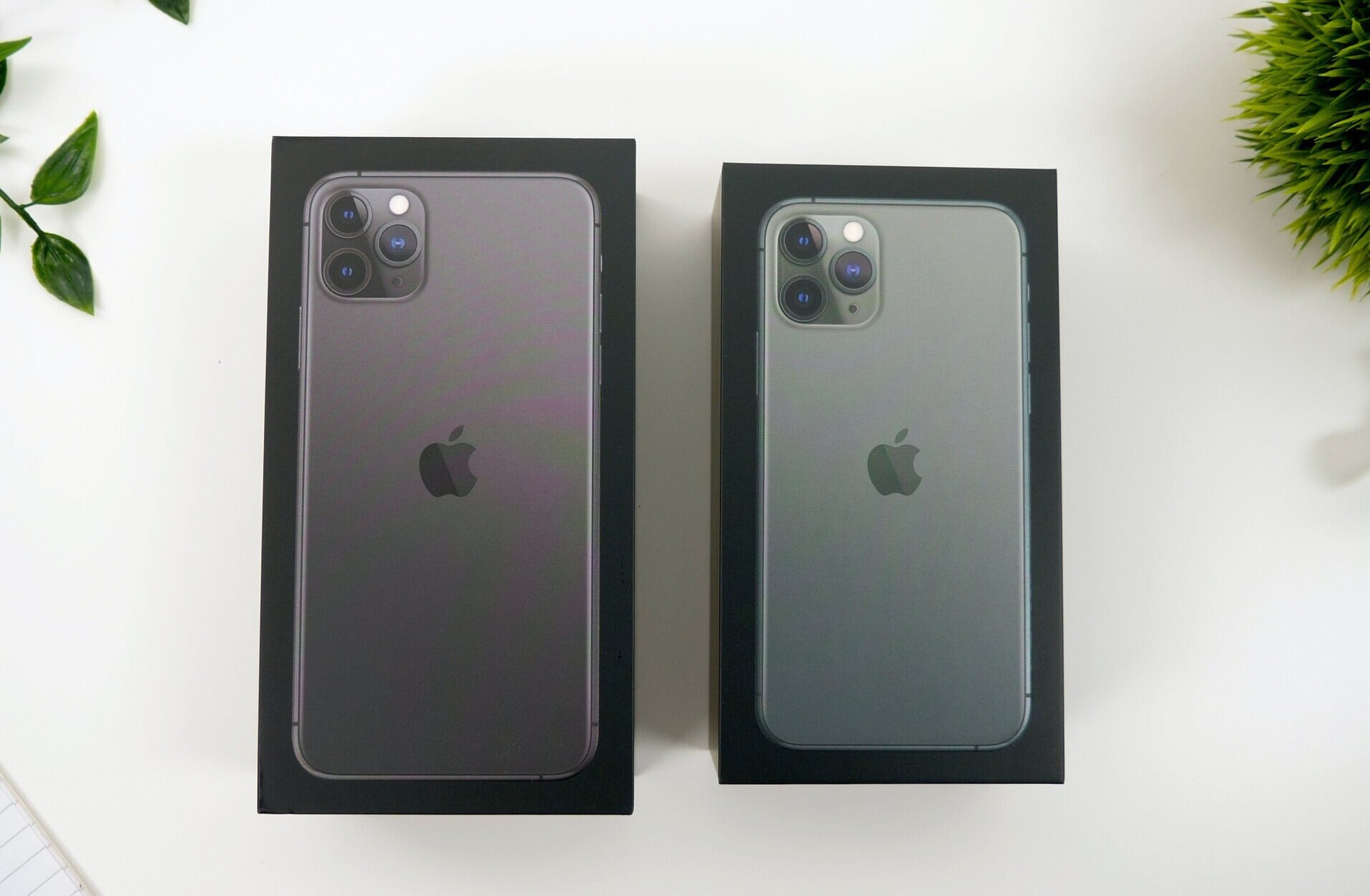
Ok, so taking a look at the boxes they both come in a black box now, to showcase that Premium Pro name now. They also come with a protective plastic wrap which is very easy to remove now thanks to a new pull tab that Apple started including with the iPhone X’s. Personally, I absolutely love the way these boxes look. They remind be a lot of the iPhone 2G, 3G and 3Gs boxes from back in the day. Those were the last black iPhone boxes that we got. Now, we did get a dark space grey box with the iPhone 8 which was quite cool, but these ones look so much better.

The design of the boxes has changed from the previous white boxes

The design of the boxes has changed from the previous white boxes

On the front of the boxes we have an image of the iPhone 11 Pro which matches the color of the iPhone inside, so Space Grey in the case of my 11 Pro Max and Midnight Green for the smaller 11 Pro. And like previous iPhone boxes, the iPhone 3G’s indented home button for example, we get 3D indentations of the actual phone on the box. The camera modules are raised a bit so you can actually feel them, and same goes for the stainless steel frame! Really cool.  On the side of the box we have an iPhone branding, no 11 name or anything like that, and what’s really cool about this is that the logo shimmers in the color of your iPhone.

We then have an Apple logo on the top and bottom which also shimmers in the color of the iPhone that’s inside and finally, on the back we get the capacity, 64 & 256GB in my case, as well as a listing with everything we get inside.

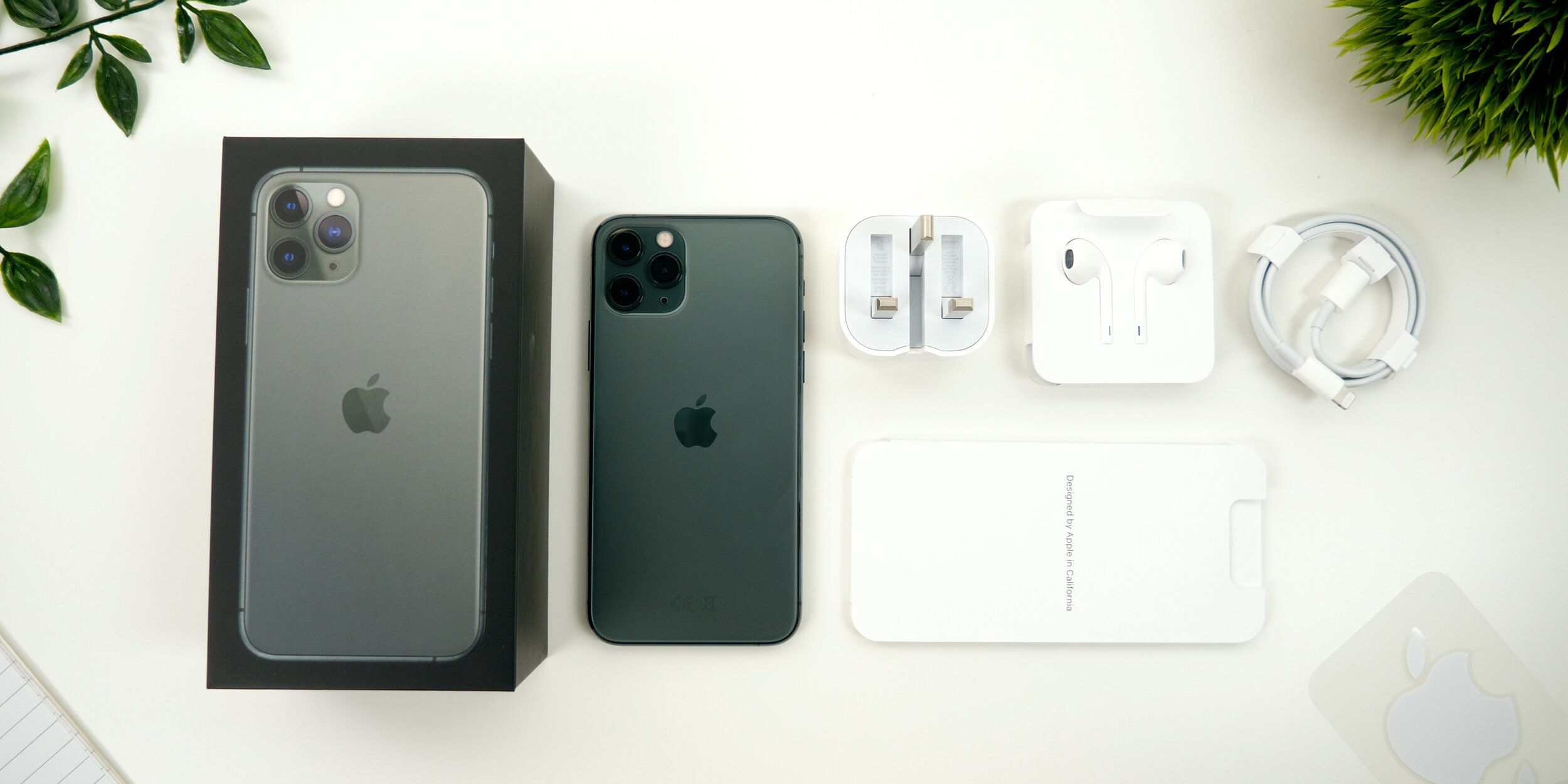
Upon opening up the box, the iPhone 11 Pro just sitting there. Interesting enough there is no plastic wrap on the back anymore. There’s just the one on the front, that now says Apple Inc alongside Apple’s address on it. We get the booklet, that includes the quick start guide with gestures, the Sim Eject Tool, the warranty and the safety guide, as well as some Apple stickers which unfortunately do not match the color of your iPhone like they do on the 12” MacBook which would’ve been nice. 

We also get a pair of lightning headphones, a USB type C to lightning cable, a first for an iPhone. Unfortunately we still have lightning on the iPhone but the charger,  is now the new 18W charger which is significantly chunkier than the previous model, but it does offer significantly faster charging than the previous 5W charger that came in the box. However, despite being chunkier it is actually very compact. You can fold its feet for the UK model at least, which you couldn’t do before  and since this is 18W, it can easily charge an iPad Pro as well. Quite a useful thing to carry around! 

Everything you get inside of the iPhone 11 Pro Max box

Everything you get inside of the iPhone 11 Pro Max box

IMPRESSIONS

Now I’ve been playing around with the iPhone 11 Pro Max for a bit now and here’s what I think.

First of all, the back feels weird. Feels as if you have a silicone skin on it. It’s smoother than the frosted glass back that the OnePlus 7 Pro has for example, and certainly something that we’ve never had on iPhones. But I do like the Matte Space Grey look of it! Especially with that centered Apple logo which I’ve actually come to like a lot more than the previous logo which was always towards the top of the phone. I think it has a very sleek look. 

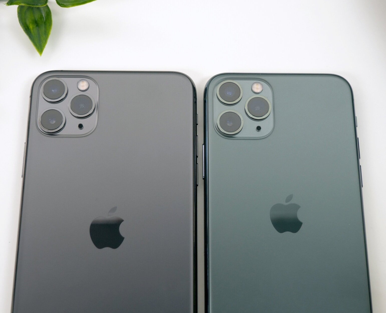
The Space Grey (Left) compared to the Midnight Green (Right) iPhone

The Space Grey (Left) compared to the Midnight Green (Right) iPhone

I’m not fully sure what to say about the Midnight Green color. From certain angles, the back just looks identical to the Space Grey one, at least to my Color Blind eyes. It’s only when you put them next to one another, can you really tell the difference between the two. The stainless steel frame on the Midnight Green 11 Pro does have this yellowish/green look to it, so that’s quite an obvious difference between the two. 

So design aside, what about actually using the phone? Is there anything different that I’ve noticed from my XS Max?

Well, the display is brighter, but only when you manually max out the brightness and compare the two side by side, can you actually notice a difference. However if you’re watching HDR content there is a noticeable difference between the Pro Max and the XS Max. I did also noticed the display being warmer, even with True Tone turned off.

The speakers appear to have had a pretty big upgrade! I was really impressed when I heard the difference between my 11 Pro Max and my XS Max. Not only was the 11 Pro Max louder but the vocals were so much easier to hear and clearer.

The Haptic Engine to me feels exactly the same as on the XS. Same haptic response, same strength, same everything. However the lack of 3D touch was very noticeable to me. Having to hold on icons for that 3D touch functionality makes everything so much slower. However, the only place were I was using 3D touch on a more frequent basis was in the control center and the lock screen, but if you compare the XS Max and the 11 Pro Max side by side, you can see how much slower it really is.

I didn’t really get to test out the battery life, because I only just got this today so definitely follow on Twitter @ZONEofTECH where I’ll post some updates as to its battery performance. Although I’m expecting it to be significantly better than the XS Max was, which for me could never last me an entire day of use.

CAMERA

Before we get into the camera properly, a quick tip. When you get a new iPhone always make sure that you go into the settings app and then camera and enable 4K60, because by default you’re stuck at 1080p for some unknown reason. This way you get the maximum amount of quality out of this camera.

Ok, so the front camera is very impressive on this. All the shots were perfectly exposed and sharp the colors were accurate and now you can rotate the phone in landscape and you get this wider field of view. Apple’s doing this by using a higher resolution 12MP sensor from the 7MP that we had before but because they haven’t added a wide angle lens, we actually don’t get any distortion, just a wider image which is pretty cool! 

The video on the front camera is also amazing! 4K60, which is some thing that’s never been done on a phone, so that’s extremely nice to see on the 11 Pro, considering that the XS’s only had 1080p video recording, so there were already far behind the competition which had QHD and 4K30 on the front already.

Other than that, FaceID does unlock faster but the difference is smaller than you would expect, since iOS 13 does make unlocking with FaceID faster on the iPhone XS as well.

Then on the back we get that triple lens camera system that you’ve all heard about. 

What I really like about this is how insanely smooth the transition between the lenses really is! You wouldn’t believe how much you can zoom out! It’s still not on par with the Huawei P30 Pro but very impressive!

Now, there is a bit of noticeable frame-blending that Apple is adding when transitioning between the lenses because they all have a different field of view, and for the most part you won’t be able to notice that, unless you do the transition between the lenses very very slowly.

In terms of the camera quality, I was very impressed with the consistent look that the photos got, between each of the lenses, but something that did shift quite a bit was the white balance. So it really does depend.

Even video recorded with the ultra wide lens comes out very stable.

Now, it would be hard to not talk about Night Mode. So here’s an example taken in our studio comparing the iPhone XS Max, which doesn’t have a Night Mode feature, and iPhone 11 Pro Max, a true night and day difference! Its great to see that Apple are finally catching up with this feature. I’m just a bit disappointed that the Night mode is an exclusive feature to the iPhone 11’s, even though all the other iPhones could easily do this, since it’s mostly a software feature. 

The Night Mode on the new iPhone makes such a huge difference to low light photography

The Night Mode on the new iPhone makes such a huge difference to low light photography

So overall, with that 3rd wide angle module, improved HDR video recording, and the significantly improved front facing camera, the 11 Pro’s have big improvements in the camera department. And I’m extremely happy about that because the camera is actually what I care about the most in a smartphone!


CONCLUSION

In the end the biggest improvement that the 11 Pro got over the XS is in the camera department, and while I do find the camera to be the most important thing for me in a smartphone, I don’t think that this upgrade is enough to warrant an upgrade from the XS. 

The 11 Pro in my opinion is what the XS should’ve been. S models of the iPhones have always had a speed improvement, a significant camera improvement as well as a brand new unique features, while keeping the same design. Pretty much exactly what the 11 Pro is, to the XS.