Galaxy

Samsung Galaxy Fold 2 - The iPhone 12 Killer?

As some of you might know, the Samsung Galaxy Fold has been a true game-changer for me. It has finally re-ignited my excitement for new Smartphones because, ever since the first iPhone, Smartphones haven’t really changed that much, aside from just getting larger Displays, thinner Bezels and better Cameras. The Fold finally delivered something new. An innovative experience unlike anything I’ve seen since 2008, when I got my iPhone 3G.

You can watch our full Review video on the Galaxy Fold, where I talk about how much this has changed the way I use a Smartphone. The Galaxy Fold is now my main Smartphone that I use, so this why I am so excited for the Fold 2. The improvements that we’re getting are gigantic in every single way, so without any further ado, here are all the latest Leaks & Rumors and everything we know so far, in terms of the Samsung Galaxy Fold 2!


Design

Design wise, Max Weinbach reports that Samsung could release three models of the Galaxy Fold 2. This is just a rumour and not 100% confirmed. According to Max, one Fold 2 model would have an Ultra Thin Glass Display, so just like the Galaxy Z Flip, while the other two would be lower-end and would have the same plastic Display as the original Fold.   Apparently, the code-names for these are ‘Winner2’ and ‘Champ’.

Now, just to make it clear, the Z Flip did not have a regular Glass Display, ‘JerryRigEverything’ showed us that the Z Flip did have a plastic layer on top of that ultra-thin Glass Display and that plastic layer, if it was damaged, would render the Display useless. At the end of the day, they both break as easily so it doesn’t really matter if one’s plastic or if one has glass underneath that plastic layer. 

Max also says that Samsung could release a Fold 2e, priced at just $1100. That would be insane as this would be a Foldable Tablet, which is the way Foldables should be. There’s no point in folding a regular Smartphone other than to look cool. But anyway, having a Foldable Tablet, for just $1100, when the Fold 1 was $2000, would finally bring Foldable Smartphones to the every-day consumer, that’s so awesome! According to Max, Samsung will be making some tradeoffs, in terms of the number of Cameras and the Outer Display, which will either be smaller or even removed entirely.

Industry insider Ross Young tells a similar story. Samsung will be selling a Galaxy Fold at just $1100 but rather than this being the Fold Lite that Max talked about, this would be a Fold Special Edition, which will literally just be a Galaxy Fold 1 at a lower price. This is so Samsung could get rid of the remaining inventory. Now, both Ross and Max are very reliable sources, so I believe that they’re both correct and in that case, we would essentially get two models of the Fold 2, with that Fold 1 Special Edition as well.

The design of the original Fold was a breath of fresh air, but can it be better?

The design of the original Fold was a breath of fresh air, but can it be better?

Max Weinbach has also now reported a few more details about the Fold Lite recently, saying that it would be 4G only and that it would come with 256GB of Storage, rather than 512GB. He also said that it would come in two colours, Mirror Black and Mirror Purple. The Display would be just plastic, like previously reported, and Max also says that it would be equipped with a mix of 2018, 2019 and 2020 parts. It would also have a smaller Outer Display, similar to the one on the Z Flip. It will be available internationally and come with the Snapdragon 865 Processor, an Aluminium & Glass Enclosure (rather than Stainless Steel and Glass) and the price is again said to be $1100. So, we have both the Fold Lite and the Fold 1 Special Edition at $1100, which is a bit odd. I don’t really see Samsung selling both at the same price, but we’ll see. What’s definitely looking to be certain for now is that Samsung will indeed have at least one affordable Galaxy Fold 2 model at around that $1100 price point.

Now, what about the actual high-end Galaxy Fold 2? The one that likely has that ‘Champ’ codename. Well, design wise, my main complaint with the Fold 1 was that it was extremely think when closed. At 17.1mm at its thickest point, the Fold was almost as thick as a Nokia 3310, when closed.

However, if you take a look at the Hinge, you can probably tell that the Fold doesn’t actually close flat. Instead, the Hinge itself has this wedge shape, meaning that if the Fold were to close perfectly flat, it would be much thinner, at 15.7mm thick. The Galaxy Z Flip for example, which was released after the Galaxy Fold, does indeed use a brand new Hinge design, which not only closes almost flat but it also has these fibres inside that help keep dust out. Overall, they would add to the durability of the Fold significantly.

Now, my second complaint with the Fold 1 was that the Outer Display being way too small. The Bezels on that Outer Display are also just way too big. Luckily, this will also be improved with the Fold 2. According to Max Weinbach, the Fold 2 will have an Infinity V Display on the front, meaning that the Bezels would now be removed pretty much entirely. We’ll have a Full-Screen Display, which would only be interrupted by that single ‘V’-shaped Front-Facing Camera Cutout. That would be such a big change in just a year. The Display is also reported to be getting wider. Ross Young reports that the Main Display would now be a 7.59” Panel, up from the 7.3” Panel that we had before. So, the whole device is getting a bit wider.

In terms of the colours, Max Weinbach claims that it would come in Blue, Silver, Gold, Pink as well as Black, with both Ceramic and Stainless Steel finishes.  So, Samsung is definitely planning on making the Fold 2 a bit more fun and even more premium at the same time. 


Display

Right, let’s get into some juicy Display specifics.

We’ll get that 7.59” Panel on the inside with a 2213x1689 Resolution, again according to Ross Young, a well known Display Analyst. The PPI would be 372 and the Refresh Rate would be 120Hz, which is amazing.

120Hz on a Foldable Smartphone would be insane and not something that we would have expected on the second generation.

120Hz on a Foldable Smartphone would be insane and not something that we would have expected on the second generation.

Not only that, but it will also be an LTPO Panel, which will consume significantly less power and also allow for a Variable Refresh Rate, which the S20 line didn’t get. Interestingly enough, Ross Young also claims that the iPhone 12 won’t have LTPO, meaning that Samsung will have a big advantage with the Fold 2 and the Note 20, over the upcoming iPhones. We would be able to have any refresh rate from 1 - 120Hz, whenever we want. 

Aside from the larger Display, the higher Resolution, the 120Hz adjustable Refresh Rate and the UTG Panel, another big Display improvement is that we no longer get that massive Notch on the top right. Instead, we would have a single Camera Cutout, just like on the Galaxy S20’s. We don’t really know if this would be centred or to the side, but if I were to guess, I would say that it would very likely be to the side. As you know, the Fold would fold in the middle, so you cannot really have a Camera there. This is why we’ve modelled ours with the Punch-Hole Camera to the right.

When it comes to the Outer Display’s specifics, according to Ross Young, this would be a 6.23” Display. A massive size increase from the 4.6” Panel that we had on the original Fold. The Resolution is said to be 2267x819, another massive upgrade. However, the Refresh Rate will be 60Hz. 

So, some pretty big improvements when it comes to the Display and honestly, I wasn’t even asking for 120Hz, just a larger Outer Display. It’s pretty amazing to see that Samsung will be bringing such a massive upgrade to the Fold 2.


Camera

Moving on to the Camera, the Fold 1 had some pretty good Cameras. It had six Cameras: one front Camera on the Outer Display, two front Cameras on the Inner Display and then three more on the back. Now, these Cameras were exactly the same ones as we got in the Galaxy S10+, which were outstanding, but now we’re in 2020 and those Cameras are indeed a bit outdated.

So, as expected, the Fold 2  will come with the same Cameras that the S20 came with. Luckily, it won’t come with the S20 Ultra’s Cameras but instead, the S20+’s Cameras.  The S20 Ultra did have a ton of issues with the Camera, ranging from very poor Low-Light performance, especially when recording video, to focusing issues including blown out highlights and crushed shadows. I covered all of that in the full S20 Ultra Review, so make sure you check it out in case you missed it. But the Fold 2, just like the S20+, won’t have any of those issues.This means that, on the front, we would have the same 10MP, f/2.2 Module that is capable of recording in 4K60, just like on the S20 & S20+.

Don’t worry, we won’t be getting the S20 Ultra’s Camera system.

Don’t worry, we won’t be getting the S20 Ultra’s Camera system.

The same goes for the Inner Display. It’ll just be one Camera and no Notch with multiple Modules or anything like that. Finally, on the back, the Main Module would be a 12MP, f/1.8 Module with Dual Pixel Autofocus. Then, according to Ross, it seems like we’ll have a 16MP Ultra-Wide Module, as opposed to the 12MP Ultra-Wide Module on the S20’s. That Ultra-Wide Module is usually pretty bad in Low-Light, so a lower Megapixel count is actually preferred here.

Finally, the third Module would be the 64MP Telephoto Module with an f/2.0 Aperture. This is the same one that the S20 and S20+ featured, which will allow you to zoom-in digitally, up to 30x. Not only that, but you can use this Module to take some very high Resolution 64MP photos as well as record 8K video. 

So, from the looks of it, aside from that Ultra-Wide Angle Module, which looks to be identical to the one from the S10 and Galaxy Fold 1, we are getting the exact same Camera system as on the S20 & S20+.


Performance

In terms of the specs, the Fold 2 is said to come with the Snapdragon 865. Now, we don’t know if Samsung will also release another variant, with the Exynos 990 Processor, but I really hope they don’t.

The Snapdragon 865 variants of the S20’s have all significantly outperformed the Exynos 990 variants in both performance as well as Battery Life. Even when it came to heat management, the Snapdragon models were always on top. The Fold 1 only came with a Snapdragon Processor, so I really do hope that this is the case again with the Fold 2. With the RAM, we don’t have a confirmation on this just yet, but it’s likely going to be the same 12GB that we had on the Fold 1, possibly even with 16GB on the high-end model. Storage is expected to remain the same at 512GB, but the Fold Lite is said to come in 256GB as well.


Special Features

Moving on to the special features, there are a few things that I would’ve loved to see in the Fold 1, such as Water Resistance, Dust Resistance and an S-Pen. Samsung is actually bringing one of those to the Fold 2 and that is…the S-Pen!

The original Fold had very few short-comings but the ones it had, made it quite fragile.

The original Fold had very few short-comings but the ones it had, made it quite fragile.

According to Max Weinbach, the Fold 2 will actually come with an S-Pen, a new form of S-Pen that is. This makes me think that Samsung has come up with a softer S-Pen that won’t damage that thin plastic foil on the screen that’s required for the Fold 2 to work. This could be another reason why the Fold 2 is getting larger, to make room. This was also reported by Ross Young, so S-Pen support is looking very likely now.

Aside from this, unfortunately, we wouldn’t be getting any other massive changes. In fact, we might even see some accessories removed from the box, such as the USB C to USB C adapter and possibly even the GalaxyBuds. If not on the high-end model, definitely on the Lite. There’s still no Water Resistance, still no dust protection and still no microSD card. But, the Ceramic Frame should now make the Fold 2 look and feel even more premium than before.


Battery

In terms of the Battery, the Fold 1 came with a fairly small 4380mAh Battery, considering that it had a massive 7.3” Display on the inside. But, thanks to that Snapdragon, and not Exynos, Processor, the Fold actually lasted for pretty much an entire day of use, for me. This is pretty much on par with my iPhone 11 Pro Max so I don’t really have anything to complain about, in terms of that.

The Battery will be getting larger with the Fold 2. However, we don’t yet know the exact specifics. Considering that we’re also getting an S-Pen inside, I would be surprised if the Battery ends up being any bigger than 4800mAh.

Fast Charging will be improved from 15W to 25W, just like on the S20’s. It could even be 45W like the S20 Ultra, however the Charger that you’ll get inside the box would likely still be a 25W Charger. Wireless Charging is still there at 15W and Reverse Wireless Charging will still be at 9W, just like on the S20’s. 


Release Date

So, what about the release date? When is the Fold 2 coming out?

Well, according to Ross Young, the Fold 2 will be announced alongside the Galaxy Note 20 in August, which would make a lot of sense since the Fold 2 will also have an S-Pen, just like the Note line. In terms of when it would ship, this is set to be in September 2020. This way it would also compete with the new iPhone 12’s.


Price 

And finally, you’re all probably wondering, how much will the Fold 2 cost? The Fold 1 was already an extremely expensive device, at $1980.

Well, according to Ross Young, the price will be between $1780 and $1980, making it possibly $200 cheaper than the original Fold. That’s pretty nuts. We’re getting a larger Outer Display, thinner Bezels, a larger Inner Display, no Notch, a 120Hz Refresh Rate, improved Cameras, a faster Processor, an S-Pen and it’s cheaper? We love seeing that.

Also, we should not forget about the other two Folds. The Fold Lite and the Fold 1 at a new, lower price. The Fold Lite looks likely that it will be at that $1100 price-point. So, there you go, the era of Foldables is about to hit on a pretty big scale.

Samsung Galaxy Fold (2020) - Long Term In-Depth Review

Ever since the original iPhone came out in 2007, completely changing the Cell-Phone industry, Smartphones haven’t really changed that much. Sure, we did get OLED Displays, Dual, Triple, Quad and even Penta Camera Modules, but the idea of a Smartphone has remained the same. It’s essentially this block of glass that we carry with us all the time, which helps us communicate with each other and accomplish our daily tasks on the go. 

But, that block has remained just a block since 2007. Displays started getting larger and Bezels started becoming thinner to the point where we now have Smartphones that are just a massive Displays, and nothing else. However, we’ve now reached a point where there’s only so much we can do with that Form-Factor. 

You might have noticed that since 2017, when Apple and Samsung added a Full-Screen Display to their Smartphones, the design has remained almost unchanged. So, when I started hearing all the rumors about Foldable Smartphones, I got very excited because we were finally going to get something new. I am very glad to say that I’ve been using a Samsung Galaxy Fold for more than a month now as my Daily Driver and this has completely changed my view on Smartphones. I honestly would not be able to go back to a standard one, after using the Fold. So, here is my Full In-Depth Review of the Samsung Galaxy Fold! 


First of all, you’re all probably wondering, why are you reviewing the Galaxy Fold now? This Smartphone was originally teased in November 2018, fully unveiled in February 2019 and was released in September 2019. Well, it’s simple.. I finally got my hands on one.

Ironically, we were actually one of the first channels to talk about the Galaxy Fold. We started making videos on this back in 2017, three years ago. Samsung has been working on Foldable Display technology for the past nine (or more) years now. They showed us their first Foldable Display prototypes back at CES 2011. They then showed us a now famous TV ad where someone was folding a Tablet into a smaller Phone and then unfolding it back into a Tablet, back in 2014. 

When I heard about the leaks & rumors that Samsung was finally working on a Foldable Smartphone that they would sell, I was extremely exited for this future. That’s why we made so many ‘Leaks & Rumors’ episodes on this, just because I was so hyped for something new.

The general design of most Smartphones has been pretty much the same for the past few years.

The general design of most Smartphones has been pretty much the same for the past few years.

Then, right after the February 2019 unveil, they started sending over a few Review units to some of the biggest tech channels in the world. We didn’t get one, but luckily this was the first generation that had a ton of issues and was literally breaking after just a few hours of use. Samsung postponed the release, redesigned the Hinge, even the Display to some extent, and then fully released it seven months later, in September 2019.

That’s when Samsung started sending loads of Review units to a ton of larger, and smaller, Reviewers. Unfortunately, we weren’t on that list and even though I tried my very best to get ahold of one, Samsung UK just didn’t want to send us one. It was also almost impossible to buy as it wasn’t in stock pretty much every single time I checked, so we just skipped making videos on it because we couldn’t get ahold of one.

I did go to IFA 2019, in September, and I did go to Samsung’s booth, but we got kicked out because the whole place was closing down. I was about 10cm away from the Fold and I just couldn’t touch it.  Then, in October 2019, about a month after the Fold came out, I attended the OnePlus 7T launch event, in London. Emkwan, a great guy who also runs the Em Kwan Reviews tech channel, had a Galaxy Fold. He let me use that for a good 15 minutes and I was impressed. It was unlike anything I’ve ever seen before, but it felt like a prototype device.

Fast forward a few months and when Samsung finally sent over the Galaxy S20 Ultra Review unit, they also sent over a Samsung Galaxy Fold for me to check out. While the S20 Ultra ended up being the most disappointing Smartphone I’ve ever used, the Galaxy Fold ended up being the most outstanding Smartphone I’ve ever used. I used it as my daily driver for two weeks, after which Samsung asked for it back. So, I went and bought my own, just because I loved it so much. The Fold has now replaced my iPhone 11 Pro Max as my daily driver and I have loads to say about it.


Design

With the Design, the Galaxy Fold is unlike anything I’ve ever seen before. On the outside, when the Fold is closed, you have this very weird looking Phone that reminds me of the old Nokia 7280, if you guys remember that? That very odd phone that was extremely tall and had this very small and narrow Display. The Fold, when closed, is sort of like that. It has an extremely small 4.6” Display, with a very tall 21:9 Aspect Ratio some insanely massive Bezels, they’re even putting the Bezels of the very first iPhone to shame. It’s crazy thick as well, at 17.1mm at the thickest point and 15.7mm at the thinnest, the Galaxy Fold is actually very comparable to a Nokia 3310, which had a thickness of 22mm. 

I really wish that Samsung would redesign the Hinge so that it would close perfectly flat. This way, the Smartphone would be 1.4mm thinner. Samsung has improved the Hinge heavily with the Z Flip, which closes almost entirely flat. I’m confident that when the Fold 2 launches, it will also have a design similar to that. 

Is it a Smartphone? Is it a Tablet? Well, it’s both (sort of).

Is it a Smartphone? Is it a Tablet? Well, it’s both (sort of).

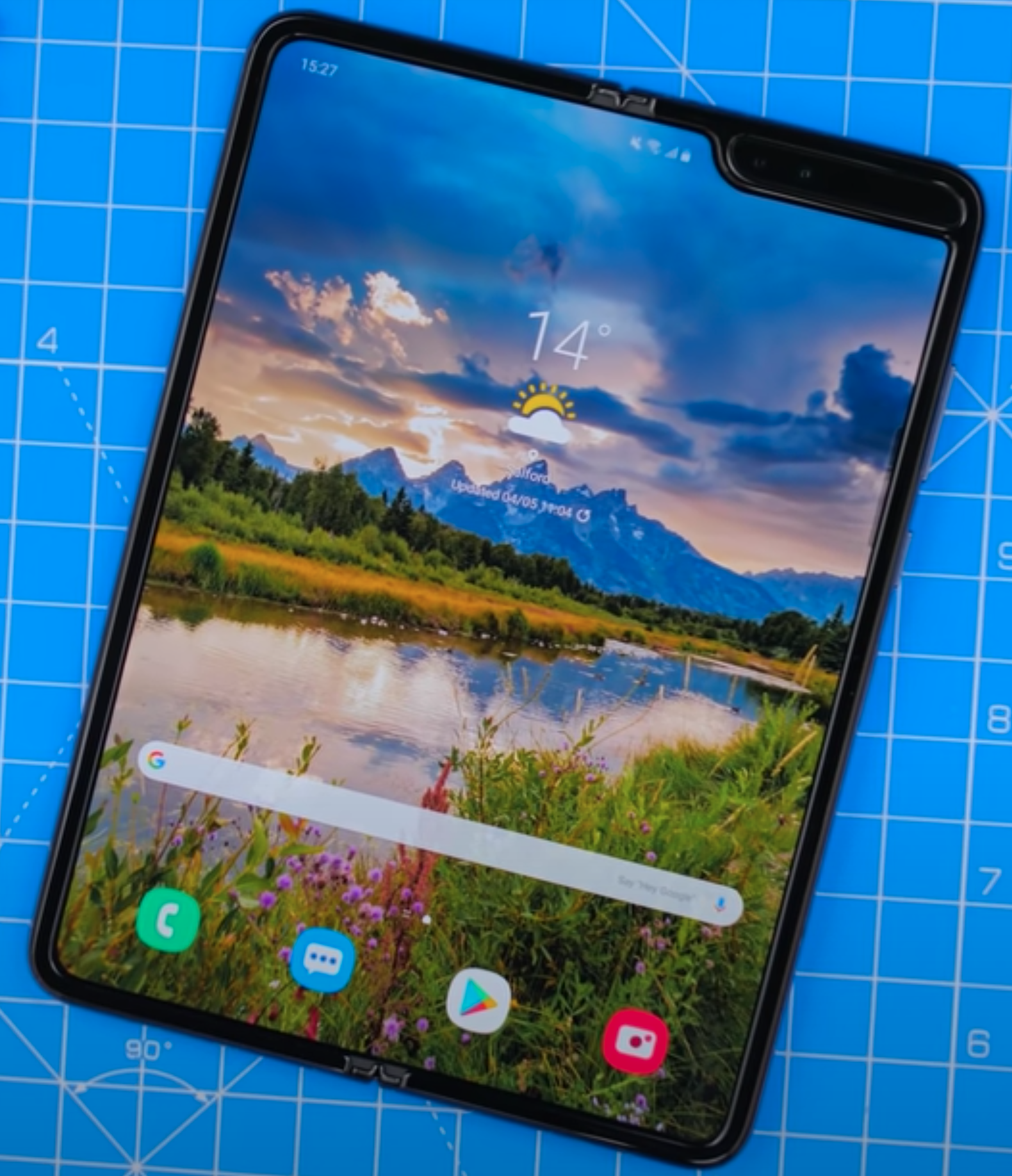
Once you unfold it, that’s where the magic happens as you’re greeted with a massive 7.3” Display with a 4.2:3 Aspect Ratio, which is absolutely gorgeous to look at. The Fold now becomes much thinner at just 6.9mm, making it considerably thinner than even the S20 Ultra, for example. So, while the Fold does indeed look very outdated from the Front, when compared to other Smartphones, once you open it, that’s when it truly shows its value. Having what is essentially the equivalent of an iPad Mini right in your pocket, is just unbelievable. 
Now, because of how small the Outer Display is and how massive the Bezels are, you can indeed use the Fold closed with one hand, which is perfect for when you’re outdoors and in a hurry. However, I found that unless I really had to, I was using the Fold purely in Tablet Mode. I was really only using the outer Display when I was out shopping and I had my shopping bag in my other hand. But other than that, this is a Foldable Tablet and not a Foldable Phone.

On the bottom, we have the Speaker, a Microphone and the USB C Charging Port. On the right, we have the Fingerprint Sensor, which strangely enough is actually not built into the Display or even the Power Button, like on many other Smartphones. It is instead a separate Sensor. We then have the Power Button as well as the Volume Buttons. On the top, we have another Microphone and the second Speaker. Finally, on the left, we have the SIM Slot, which only supports a Single Nano-Sim.

In terms of how the Fold fits in my pocket, it does feel gigantic. It’s almost like carrying a TV Remote all of the time, just one that’s a bit thinner than usual. It’s also very heavy, at 263g, the Fold is one of the heaviest “Smartphones” that you can carry in your pocket in 2020. The Huawei Mate XS is a bit heavier though, at 300g. I personally don’t have a problem with how thick and heavy it is in my pocket, mostly because of how much this Smartphone has to offer. For now, I’m ok with that tradeoff.

But something that I do want to mention here is that accessories are pretty hard to find. While D-Brand do make a few Skins and Spigen do make some Cases, other than that, you’re pretty much out of luck. If you’re looking for a car mount when open, the Fold is just too big for a regular Smartphone mount, so you’ll need to buy a Tablet mount. When it is closed, the Fold is just too narrow. It will definitely take some time until accessory makers will start making accessories for Foldable Smartphones, so until then, choices are pretty limited. 


Display

Moving on to the Display, we have a 4.6” AMOLED, 21:9 Aspect Ratio, 720x1680 Resolution Display with a PPI of 399 on the outside. On the inside, there is a 7.3” AMOLED, 4.2:3 Aspect Ratio, 2152x1536 Resolution Display with a PPI of 362. Some of you might be wondering, why hasn’t Samsung made the Fold so that it folds on the outside? This way, you would’ve been able to use half of that massive Inner Display, as the outer Display. Huawei has done it on the Mate X, so why hasn’t Samsung done the same?

Well, you see, glass doesn’t fold. In order for the Inner Display to fold, Samsung would have had to use a plastic Display. Even on the new Galaxy Z Flip, where Samsung claims that they’re using glass, JerryRigEverything showed that it’s still just plastic in the end. Plastic is also far more susceptible to scratches and damage, than glass. This is why we had those big warning signs when we unboxed the Phone and is why Samsung chose to have that very sensitive plastic Display on the inside. If they had put it on the outside, any keys, coins or anything sharp in your pocket, could’ve permanently damaged the Display. This way, since it folds on the inside, it is always protected. The Display on the outside is standard Gorilla Glass, similar to what you would find on regular Smartphones.

You can set preferences for the App Switch on an App-by-App basis.

You can set preferences for the App Switch on an App-by-App basis.

So, how does the App Switch work? By default, if you have an App open on the Outer Display and you open up the Fold, that App will continue on the Inner Display. When you close the Inner Display, just like on those old Clamshell Smartphones, it would shut that Display off. If you go into the Settings, you can indeed enable continuity on an app-by-app basis so that when you close the Inner Display, the app continues on the Outer Display too. YouTube, for example, works flawlessly and many others do as well. You can have a video playing on the Inner Display, close it, and it will continue playing back on the Outer Display right from where it left off.

I’m using a tool called ‘GoodLock’. Harry, our Video Creative & 3D Concept Designer, who also has a Fold himself, recommended that App to me. With GoodLock you can force all Apps to continue to the outer Display, which is what I’ve done and it works really well.

Interestingly enough, Samsung’s Launcher is considering each Display as a separate device, in a way. They both have their own specific Home-Screens so even when you change the Wallpaper, you have to do it for the Home-Screen and the Lock-Screen of each Display. So in that case, you have four Wallpapers that you can assign. However, if you use a third party Launcher, both Displays will match, in terms of App layout.

Also, pro tip, I highly recommend adjusting the text size to ‘Small’. This way, not only will the DPI Scaling be higher, but some Apps (such as Chrome) would recognise the Fold as a Tablet, rather than a Smartphone. You would get a Tablet UI with Browser Tabs and more.

Other than that, both Displays are a standard 60Hz Panel, so no high Refresh Rate here. However, both Displays have excellent Colour Reproduction. The Brightness is good too, but I do wish that the Inner Display could go brighter, to match the Brightness of the S20 line for example. We measured the peak Brightness on a Full-Screen White Window, using the ‘Xrite i1Display Plus’ Professional Display Calibrator.

Now, since this is a folding device, there is a crease in the middle. Personally, that never really bothered me. I do feel that it’s there and I do see it at certain angles but it hasn’t really been an issue for me. It’s been like the Notch on the iPhone or the Camera Cutout, where you get used to it very quickly.

Speaking of Notches, for those of you who thought that the iPhone or the Pixel 3 XL had the biggest Notch out there, think again because the Galaxy Fold has one humongous Notch on the inside. This holds the Dual Front-Facing Camera as well as the Light Sensor, it’s pretty massive. I did forget about this after using it, it just took me way longer to forget that this massive Notch was there, compared to the crease.


Camera

When it comes to the Camera. The Galaxy Fold doesn’t have a Single Camera, but instead it comes with six Cameras, which sounds crazy. On the front, when the Fold is closed, we have a 10MP Selfie Camera, which has an f/2.2 Aperture and 1.22μm Pixels. This is literally the exact same Front-Facing Camera Sensor as on the regular Galaxy S10, just with a smaller f/2.2 Aperture, rather than f/1.9.

When we open up the Fold, on the inside, we have Two more Selfie Cameras. The one on the left is the same Camera as on the outside. On the right we have an 8MP RGB Depth Camera, with 1.12μm Pixels and an f/1.9 Aperture. Essentially, on the Inside Display, we get the same Front Camera System as on the Galaxy S10+ from last year, with that Depth Sensor. 

Despite being pretty similar to the S10, the Cameras on the Fold hold up very nicely. They’re certainly better than the S20 Ultra’s.

Despite being pretty similar to the S10, the Cameras on the Fold hold up very nicely. They’re certainly better than the S20 Ultra’s.

So, that’s three Cameras so far. On the back, we get three more, which are the exact same Camera Systems as on the Galaxy S10 line, from last year. That means that we’re getting a 12MP Main Camera with that Variable f/1.5-f/2.4 Aperture and 1.4μm Pixels. We then get a 12MP Telephoto (Zoom) Module, with an f/2.4 Aperture and 1μm Pixels and finally, we’re also getting a 16MP Ultra Wide Angle Module with an f/2.2 Aperture and 1μm Pixels. While this might seem quite disappointing, when you compare it to the 108MP Sensor of the S20 Ultra, or the 100X Space Zoom of the Ultra, the results actually point to the contrary. I’m not going to cover the Ultra’s Camera as I’ve already done that in the S20 Ultra Review. But ironically, the Fold, with last year’s Cameras, is actually performing better than the Ultra does.

Night shots are better. Night video is better. HDR Processing doesn’t have any of the issues, such as the crushed blacks and blown out Highlights that the Ultra has. So overall, this is a very good Camera. The regular S20 does indeed have better Cameras than this with, not just 8K video recording, but also 4K 60 on the Front, where the Fold is limited to 4K 30. But, most people don’t care about those and for how good this Camera is, it will easily satisfy all of your needs.

Also, another pro–tip, on the Fold you can easily install the Google Camera APK and get those awesome Pixel style photos, just like on a Pixel 4. Unfortunately, since this isn’t an official App that you can install, but rather a tweak, it would only work on the small Outer Display. 


Performance

When it comes to the performance, unlike the regular Galaxy line, which comes with either a Snapdragon or an Exynos Processor based on the region that you buy it from, the Fold only comes with a Snapdragon Processor. This is pretty awesome. There have been many issues with the Exynos versions of Samsung Smartphones ranging from Battery Life issues, to performance issues and even Camera issues. I talk about those comprehensively in my S20 Ultra Review so once again, definitely give that a watch.

But, I’m glad to say that none of those are an issue with the Fold, having that Snapdragon Processor is the reason why we can indeed run the Google Camera APK. This wouldn’t have worked if we had an Exynos variant. So, thanks to the Snapdragon 855 Processor, as well as 12GB of RAM, performance on the Fold has been excellent. Things are snappy and Navigation is fast & fluid. Since you have those 12GB of RAM, I haven’t had any issues with Apps closing in the background and in fact, you can even lock certain Apps in the background so that they never reload and always stay open. 


Software

But performance really means nothing if you cannot take full use of that power. I’m happy to say that the Fold fully utilises that performance, which combined with massive 7.3” Display, you can open three Apps at the same time and use them fully. You can even have one more as a floating App, for a total of four. These can all be running at the very same time and all of them are usable in real time.

You might think that I’m always on my Smartphone because…I review Smartphones, but that’s actually not the case at all. I spent almost my entire day in front of my computer, I only use my Smartphone when I’m at home and even then, I still prefer using my Laptop. However, when I’m traveling or on the go, this is when I spend all of my time on a Smartphone. This isn’t just for communicating but also for doing actual work such as replying to emails, setting up my calendar and scheduling content, all of that. Because of this, I need a large-screen Smartphone.

The Fold runs Android 10 and gets more than enough updates to keep it going.

The Fold runs Android 10 and gets more than enough updates to keep it going.

I remember this one specific time, when I was travelling to IFA last September and I had a PDF with all of my activities for the week. I had to put events from that PDF onto my Calendar. But, on my iPhone, I couldn’t do that at all because you cannot run split-screen Apps. You have to constantly go back and forward between them and remember the info that you had in the previous one, which is an absolute nightmare. This is why I was always using my Note 10+, whenever I was traveling, because of that massive Display & S-Pen. The Fold is just an even bigger Note 10+, which is even more perfect for what I do. This is really the best productivity based Smartphone, I just wish it had an S-Pen.

Samsung’s OneUI 2.0 looks incredible. It’s by far my favourite Android Skin. I love the ability to have Folders in the App Drawer as well as on my Home-Screen as it gives me an extra layer of customisation. One-handed usability is also there as you are able to bring down the Notification Panel by swiping down anywhere on the screen.

Samsung have finally started releasing more updates for their Smartphones. The Fold now runs on Android 10 and while it is not getting as many updates as the Note or the Galaxy S line, it is still receiving more updates than all of my other Android Smartphones, with the exception of Pixel and OnePlus devices.

Probably the best part about OneUI is DeX. So, when you connect the Fold to a monitor, it would boot into this Desktop UI Mode where you can connect a Keyboard, a Mouse and really use the Fold like you would use your desktop PC. You can run the Desktop versions of Chrome and Microsoft Office, so if you can’t be bothered buying a PC for your home, the Fold can actually replace three devices now. It’s a Smartphone, a Tablet and a Desktop PC (for very casual users).

My only complaint, software wise, is that the the Wallpaper sometimes glitches out and sometimes I do have some frame-drops. I didn’t really had this before the Android 10 update, so I’m hoping that these would be fixed in a future software update. But, nothing too major.


Special Features

Moving on to special features, let’s talk about the ones that the Fold lacks because there’s quite a few of those. To start with, the Galaxy Fold has no Water Resistance at all. Because of that Hinge design, Samsung couldn’t water-proof this Smartphone, meaning that if rain drops hit it, it’s as good as dead. To add to that, there is no Dust Resistance either. This reminds me of Smartphones back in 2015, way before Water and Dust Resistance was even a thing.

Also, unlike the Galaxy S or Galaxy Note lines, there is no SD Card slot at all on the Fold and, like you’ve heard before, you only get support for one physical SIM. The second SIM that you add has to be an eSIM. The good news is that you get an insane 512GB of Storage and there is no higher-end version of the Fold, there’s the baseline and that’s it. This also has UFS 3.0 Storage, which is insanely fast with speeds of over 1Gb/s. 

Despite all that it can do, the current Fold is still very easily damaged.

Despite all that it can do, the current Fold is still very easily damaged.

The vibration motor is very good. It seems to be the exact same one as in the Galaxy Note 10+ and the S20’s. You get an actual Haptic response every time to type or when you hit a toggle in the Settings. It gives you the impression that you’re actually pressing physical buttons on the screen. 

We do get 5G, sub-6GHz and mmWave 5G, which is great. You also get something called ‘Samsung Concierge’ and ‘SamsungCare+’ with the Fold, meaning that you have access to exclusive 24/7 Help. Samsung will replace your Display for free during the first year as well as fix or replace the entire Smartphone if you’re having any issues with it or even if you accidentally drop or break it.

However, you do have to register for SamsungCare+ manually, which is quite bad in my opinion. You have 30 days to do so and in my case, I tried registering but the website is all glitched and I couldn’t click the next button to actually register. I’ve been in talks with Samsung support, but hey don’t now what the issue is and they’re currently looking into it. My only complaint here, aside from the SamsungCare+ registration, are that the Fingerprint Reader is slow and very difficult to find. So, I’m pretty much using FaceUnlock exclusively on my Fold. 

The S-Pen would’ve been perfect on a device like this. We don’t have one but we’ve seen tons of leaks & rumors that the Fold 2 will indeed come with one. 


Battery 

Battery Life has been excellent, even with that fairly small 4380mAh Battery. It can easily last me through an entire day and we get Fast Charging, Wireless Charging and Reverse Wireless Charging, for charging things like those Galaxy Buds that we got in the box. 


Value 

In the end, is the Galaxy Fold worth it? Right now, no. But that’s because the Fold 2 is coming out very soon. We’ll have a video on that in the upcoming weeks so definitely subscribe and hit the bell icon for that. 

But as a whole package, the Fold offers something that no other Smartphone offers. It offers a Tablet that you can put in your pocket. The Screen-Size is perfect for reading and for emailing. The typing is great, I love the more squared off Form-Factor and in the end, like I said, this is the perfect device for productivity.  So, if you’re a CEO or a business person, there’s nothing better than this.

For the average person, unless you can get this for a very good deal, paying $2000 for it isn’t worth it at all. Also, keep in mind that you have to be extra careful with this Smartphone. But, I’m personally extremely happy with my Fold and I’m genuinely looking forward to the future. Because you see, this is the future of Smartphones. Just like the first iPhone, the Fold isn’t perfect but it lays the foundation for what’s yet to come.

Pixel 4XL vs iPhone 11 Pro Max vs Samsung Galaxy Note 10+ vs OnePlus 7T Pro - Blind Camera Comparison!


The Google Pixel 3 had some of the best camera abilities on a smartphone at the time of its release. Now the Google Pixel 4 has an additional lens on the back and one less on the front.

We compared it to the most recent releases from Apple, Samsung, and OnePlus to see how it would compare. You can check out our full blind camera comparison above, but here are a few of the shots from the test. Let us know which ones you prefer and why in the comments!

Also, the order of the phones in this article are not the order of the phones in the blind comparison.


FRONT CAMERA - WIDE SELFIE

OnePlus 7T Pro

OnePlus 7T Pro

Samsung Galaxy Note 10+

Samsung Galaxy Note 10+

Pixel 4XL

Pixel 4XL

iPhone 11 Pro Max

iPhone 11 Pro Max


REAR CAMERA - PORTRAIT MODE

OnePlus 7T Pro

OnePlus 7T Pro

Samsung Galaxy Note 10+

Samsung Galaxy Note 10+

Pixel 4XL

Pixel 4XL

iPhone 11 Pro Max

iPhone 11 Pro Max

REAR CAMERA - HDR (High Dynamic Range)

OnePlus 7T Pro

OnePlus 7T Pro

Samsung Galaxy Note 10+

Samsung Galaxy Note 10+

Pixel 4XL

Pixel 4XL

iPhone 11 Pro Max

iPhone 11 Pro Max


REAR CAMERA - ZOOM

OnePlus 7T Pro

OnePlus 7T Pro

Samsung Galaxy Note 10+

Samsung Galaxy Note 10+

Pixel 4XL

Pixel 4XL

iPhone 11 Pro Max

iPhone 11 Pro Max

REAR CAMERA - FOOD

OnePlus 7T Pro

OnePlus 7T Pro

Samsung Galaxy Note 10+

Samsung Galaxy Note 10+

Pixel 4XL

Pixel 4XL

iPhone 11 Pro Max

iPhone 11 Pro Max


REAR CAMERA - ASTROPHOTOGRAPHY

OnePlus 7T Pro

OnePlus 7T Pro

Samsung Galaxy Note 10+

Samsung Galaxy Note 10+

Pixel 4XL

Pixel 4XL

iPhone 11 Pro Max

iPhone 11 Pro Max


So which one did you like overall? Don’t forget to watch the full camera comparison to make your full decision, as there are 30 different tests for each camera!

iPhone 11 Pro Max VS Samsung Galaxy Note 10 Plus - Which One to Get?


Apple has just unveiled the new iPhone 11’s this week. And we got 3 of them. The iPhone 11 is the successor to the iPhone XR. The iPhone 11 Pro is the successor to the iPhone XS, and the iPhone 11 Pro Max is the successor to the iPhone XS Max.

So let’s see how the iPhone 11 Pro Max compares to Samsung’s own flagship, the Galaxy Note 10+ and see which one is actually worth getting.

This article is split into 7 different sections: Design, Display, Camera, Performance, Special Features, Battery & Price, so get those snacks ready and heres everything you need to know!


DESIGN

Ok, so starting off with the design these 2 phones are very different. 

The Note 10+ is noticeably taller and also wider than the iPhone 11 Pro is, and while they’re both pretty much impossible to use in one hand, just because of how massive they are, the Note 10+ is even more difficult to handle.

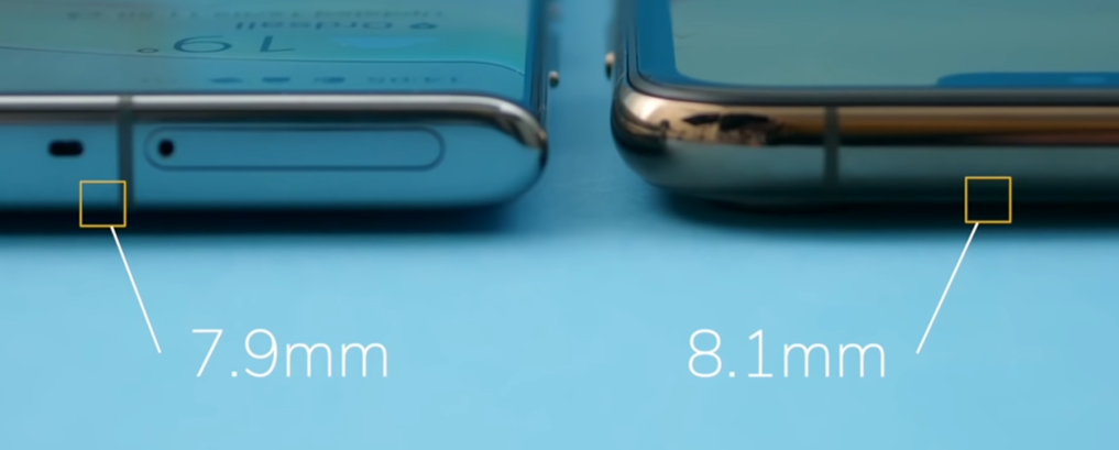
The Note 10+ (Left) is only 0.2mm thinner than the iPhone 11 Pro Max, but its curved design makes it feel even thinner.

The Note 10+ (Left) is only 0.2mm thinner than the iPhone 11 Pro Max, but its curved design makes it feel even thinner.

However, the Note 10+ is quite a bit thinner than the iPhone is, measuring 7.9m m vs 8.1mm, which is noticeable in the hand mostly because of the curved front and back that the Note has, as opposed to the flat design on the iPhone.

The iPhone does have some more premium materials so to say, with a full stainless steel frame, as opposed to polished aluminium. We also get what Apple’s calling the world’s most durable glass in a smartphone on the front and back, and we also get a matte glass back rather than the glossy glass that we get on the Note.

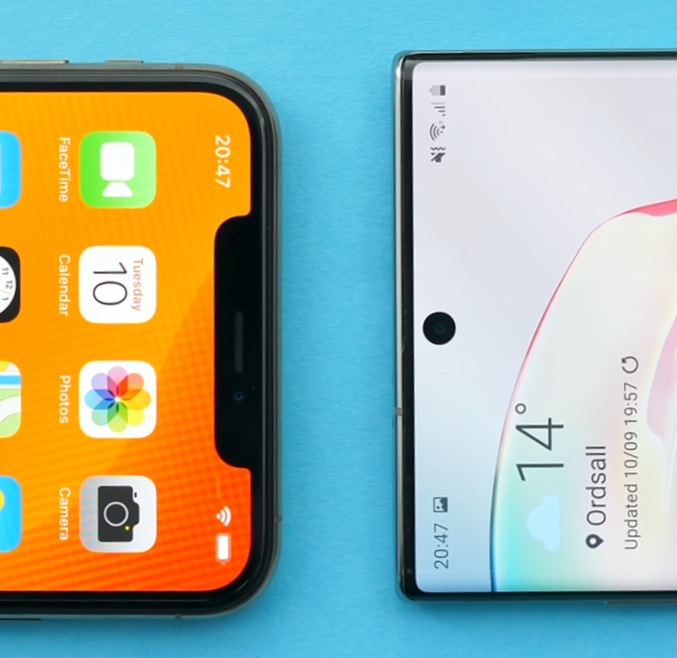
The smaller camera cutout on the Note (Right) means you have more screen real estate to view content

The smaller camera cutout on the Note (Right) means you have more screen real estate to view content

However, just looking at the design alone the Note 10 just looks better. Not only does it have noticeably thinner bezels than the iPhone does but it also only has a very tiny camera module cutout in the middle of the display and that’s it. There’s no massive notch taking up almost the entirely of the top portion of the display, like it does on the iPhone.

This is also the 3rd generation of iPhone’s with the exact same design! Samsung however has updated their design every single year. That’s the reason why the iPhone is starting to look old and outdated since it looks the same as the 2018 and 2017 models.

Now if we take a look on the back we have 3 camera modules on both but Samsung’s modules are vertically aligned, while on the iPhone we have this nest of modules. It honestly looks like a kitchen hob.

So whilst you might prefer the design of the iPhone but there is no denying that the Note has a much more modern design, and definitely takes this one. 


DISPLAY

Moving on to the display, Apple has now updated the display on the iPhone 11 Pro’s and they’re calling this the Super Retina XDR display. Essentially we now get a higher brightness of 1200 nits vs 1000 nits in HDR content and 800 nits vs 625 on the XS Max when outdoors, and we also get double the contrast to 2M:1 from 1M:1.

So that’s pretty impressive but, fun fact, this is actually the exact display panel technology that Samsung already uses in the Note 10+. Same exact panel the only differences are the resolution and the size. So resolution wise the Note 10+ features a 3040x1440 resolution panel at 498PPI, whilst the iPhone 11 Pro Max features a 2688x1242 resolution panel at 458PPI, so the iPhone has a slightly lower resolution display. 

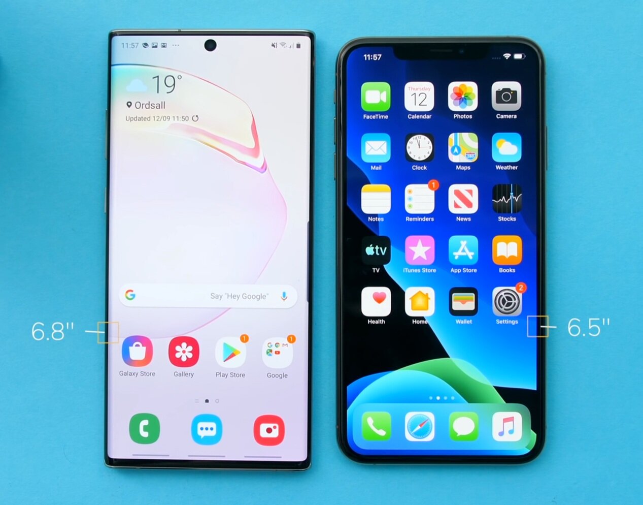
The 6.8” display, coupled with the smaller bezels means that the Note (Left) is the best display on the market right now

The 6.8” display, coupled with the smaller bezels means that the Note (Left) is the best display on the market right now

But that’s not really something that you’ll be able to notice that easily between the two, however what you’ll definitely be able to notice right away, is the display size. We have a 6.5” panel on the iPhone compared to 6.8” panel on the Note 10+. Add that to the fact that we have an almost invisible camera cutout, and the Note 10+’s display is just so much better. You get to see more content, with less obstructions. The Note 10+ is just the best smartphone out right now, for viewing content. 

Also, if you care about HDR content, both support HDR content but the Note 10+ also supports HDR10+, while the iPhone supports Dolby Vision.

So, display wise the Note 10+ takes this one as well. 

CAMERA

The camera layouts of the Note (Left) and iPhone (Right)

The camera layouts of the Note (Left) and iPhone (Right)

Now on to the camera, both phones now have a triple lens camera module on the back. This means that you have your regular lens, you have a telephoto or zoom lens, and then you also have the brand new wide angle lens which lets you capture so much more in the shot. 

Wide angle is something that we didn’t have on iPhones before, so the iPhone 11 Pro is the first iPhone to feature one, but this is something that we’ve had on android phones for years now. However what Apple does very well here, is that unlike the Note which uses very different sensors for these 3 cameras, Apple tried to match them up as close as they could and only touched the lenses.  In fact, Apple even factory calibrates the 3 modules in order for them to be a close as possible in terms of color and exposure, and the calibration is also done automatically in the background, before you even take a shot. 

What this means is that you can smoothly transition between the 3 lenses, and it will feel as if you’re only using one lens with a ton of zoom capabilities. In addition, all the shots would be identical between the 3 cameras in terms of color and exposure, unlike the Note 10 which will produce very different results based on the lens that you use. Now that is just incredible! No other smartphone manufacturer has done this before, so this is indeed a key selling feature of this new iPhone.

Also all 3 iPhone camera modules support 4K 60 video recording, unlike the Note 10+ on which just the main lens supports 4K 60 for whatever reason. And you can also preview and I believe even record with all the camera modules on the iPhone at the same time, using 3rd party apps such as FilmicPro.

So, as you can probably tell, the camera is the main selling feature of the iPhone.

Apple is using that insanely powerful A13 processor, which I’ll talk about in a second, to process every frame of the 4K 60 video, add noise reduction, exposure compensation, color correction and more, in real time! And because of this, the iPhone 11 Pro Max has the best video recording capabilities of any smartphone on the market right now. Even the front camera, can now record in 4K 60 fps as well, as opposed to 4K 30 on the Note 10+.

The flash is brighter on the iPhone too, we have a QUAD-LED flash compared to a single flash. The telephoto lens is also better, since it is not only a larger sensor than on the Note but also an f/2.0 aperture rather than the f/2.1 on the Note, so it can let more light onto the sensor. However, the Note does have an f/1.5 aperture main lens which activates in low light and lets more light to the sensor than the f/1.8 aperture main camera on the iPhone does. But they both feature a night mode now, so low light photography is pretty good on both.

We will be doing a full camera comparison between these two so make sure you keep an eye on the channel for more on that.


PERFORMANCE

When you talk about the performance of these two phones you have to take into account that even the Apple A12 processor from the iPhone XS that was released a year ago, is still more powerful than the Snapdragon 855, and even the brand new Exynos 9825 that Samsung has just added to their Note 10+ a month ago. But the iPhone 11 Pro Max now comes with the Apple A13 processor which is even more powerful than the A12 was, which means the Pro Max is now 2 years ahead of the Note 10+ in terms of the raw performance.

However, the Note 10+ comes with 12GB of RAM compared to 4GB of RAM on the iPhone 11 Pro Max. There were some reports that the Pro Max might have 6GB but that’s not confirmed as of yet. Now, my Note 10+ can easily keep a ton of apps open in the background, even apps that I opened 3 days ago. My iPhone XS Max on the other hand, which has 4GB of RAM, struggles to keep open apps that I opened just a few hours ago, and I’m pretty certain that this issue will still be present, to a lesser extent of course, even with 6GB of RAM.

So raw performance is much better on the iPhone, RAM management is better on the Note.

Split screen capabilities on the Note mean that it is a great tool for business users

Split screen capabilities on the Note mean that it is a great tool for business users

Now you can have a quantum processor in your smartphone, but that won’t matter at all, if it’s not being used to its full potential and you do have some amazing camera features and a lot of high end games that do take advantage of that extremely powerful processor on the iPhone. However I personally use my phone for either social media or productivity when I’m on the go and the iPhone 11 Pro Max still does not have any split screen support which, for me at least, is a huge deal breaker.

When I went to IFA last week, I had to create a calendar schedule based on some events that I had in a PDF. On the Note it was extremely easy to do that, I just opened both the calendar and the PDF viewer side by side and created the events. If I had the iPhone that would’ve been a pain since I would have had to constantly switch back and forth between the apps and remember what I had in the previous one. Not only that, but you can actually have 3 apps open on the Note at the same time, with one of them being S-Notes or even a video-pop-up and in that case have 4 apps. On the iPhone you’re restricted to 1 app which for me, as a business user means that it is not a Pro device in any way.

With the addition of a monitor, and a Bluetooth mouse and keyboard, Samsung phones, including the Note can be used like desktop PCs

With the addition of a monitor, and a Bluetooth mouse and keyboard, Samsung phones, including the Note can be used like desktop PCs

Speaking of a Pro Device, you can actually connect your Note to an external display and boot into something called DeX. DeX mode turns your UI that you see on the monitor into something similar to windows. This way you get a full desktop experience with full desktop apps such Chrome and Microsoft Office, and if you attach a wireless keyboard and mouse and there you go, you have now turned your smartphone into a desktop PC experience. Again, this is something that you cannot do with the iPhone.

So overall, even though the iPhone is more powerful than the Note you can do more things with the Note and for me, that’s what matters the most.

SPECIAL FEATURES

But what about Special Features? Do these phones have any unique selling points that the other one does not? Well yes, they both do.

Let’s start with the Note 10 shall we?

We have microSD card support, which lets you expand the storage even more, to up to 512GB of extra storage, fairly inexpensively. We also get 256GB of storage on the baseline model rather than 64GB on the iPhone

Editing in Lightroom is super easy with the S-Pen

Editing in Lightroom is super easy with the S-Pen

Then there’s the S-Pen, the built-in stylus that sits inside your phone which you can of course take it out whenever you want to and use it for sketching, signing documents, or my favourite, photo editing in Lightroom. It’s amazing to have such a precise tool with you for when you want to do any photo editing on the go.

We also have a TOF (time-of-flight) sensor on the back, which is basically what Apple uses on the front. A 3D depth sensing camera. Apple uses this for FaceID and unlocking the phone, while Samsung uses this on the back for improving the portrait mode and also for 3D scanning objects, which doesn’t really work that well, but hey, it’s there.

There is also an in-display fingerprint reader on the Note and probably one of my favourite features, reverse wireless charging. This means that you can place other wireless charging devices like the AirPods 2 or even an iPhone on the back of the Note 10 and it will charge, just like that! This was supposed to be coming to the iPhone 11’s but it got removed in the end.

Always-On is something that has been on androids for a while now, but has only just been added to the Apple Watch Series 5 and not yet on the iPhone

Always-On is something that has been on androids for a while now, but has only just been added to the Apple Watch Series 5 and not yet on the iPhone

And we also get another one of my favourite features on the Note, which is an always on display. Apple still doesn’t have this on the iPhones but they’ve just added it to the Apple Watch Series 5. Now what this does is that it shows you the time and your notifications on the display, all the time. So you dont have to tap it or lift the phone or anything like that, and I absolutely love it! It’s pretty much like having a smart desk clock! Love it!

Finally the Note 10 does have a USB C port compared to the lightning port Apple still has on the iPhone.

But what does the iPhone have that the Note doesnt?

Aside from the obvious FaceID, we do have a 120Hz input rate for the touch screen. However, this is not a 120Hz refresh rate panel, but your taps are registered much more accurately than on the Note. 

Water Resistance is also better on the iPhone, up to 4m for 30 minutes rather than 1.5m for 30 minutes on the Note 10. 

Apple also removed 3D Touch and added an improved haptic engine. They already had the best haptic engine in a smartphone, although the Note was extremely close to the iPhone’s. But now the iPhone 11 Pro Max’s should be even better. 

The iPhone also has a brand new U1 chip with will allow you to very precisely locate other devices that also have the U1 chip with a margin of error of just 5cm. This will especially be useful when Apple releases the Tile like trackers by the end of the year.

But that’s pretty much it in terms of special features that the iPhone has. Really the biggest advantage, or disadvantage, of having an iPhone is the Apple ecosystem. You do get locked into it very quickly but it is indeed the best ecosystem there is. Especially if you buy an Apple Watch and a Mac and AirPods, it’s just amazing how fast and smooth they can all communicate, rather than being completely separate devices. 


BATTERY

So with all of those features and processes, how do the batteries compare? And which one will last you longer on a quick charge?

Well on paper the Note does have a larger battery with 4300mAh compared 3500mAh on the iPhone 11 Pro Max. But the Note 10+ also has a larger display which does require more power and lets not forget the S-Pen that’s always charging inside your phone.

They do both support fast charging, up to about 50% in 30 minutes which is good and we finally have a fast charger bundled inside the box of the iPhone which we didn’t have before. However, the Note 10+ can be charged to full in just over an hour, and if you buy an even more powerful 45W charger from Samsung, it can be fully Charged in just 40 minutes which is nuts! 

Now, Apple does claim that this new iPhone 11 Pro Max lasts 5 hours more than the iPhone Xs Max did, so I’m extremely curious to testing that out. Definitely stay tuned for the full in-depth review in a few weeks and I’ll be covering my experience with the battery life in detail.

PRICE

So, so far the iPhone won in the Performance and Camera sections (at least on paper), while the Note has won in the Design, Display and Special Features, and the Battery was a tie for now. But having said all this, how much are they?

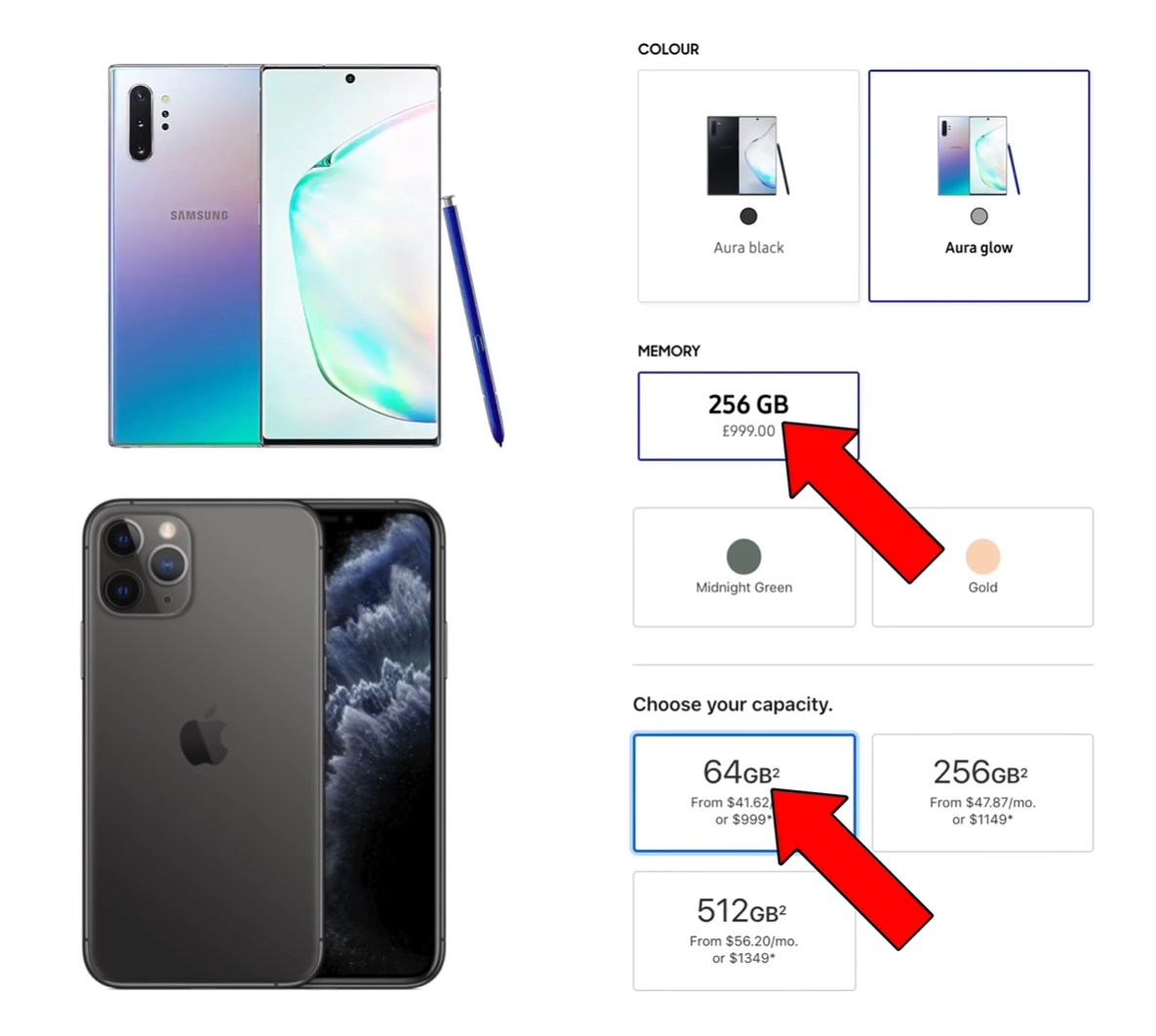
The 64GB model of the iPhone 11 Pro Max is the same price as the 256GB model of the Note 10+

The 64GB model of the iPhone 11 Pro Max is the same price as the 256GB model of the Note 10+

Well, the Note 10+ costs $1100 in the US and £1000 in the UK for the baseline 256GB option. The iPhone 11 Pro Max costs $1100, so same price as the Note in the US, but £1150 in the UK, so £150 more. Hower this is only for the baseline 64GB model and not the 256GB variant. The Pro Max, for the 256GB option costs a whopping £1,299 in the UK, which is nearly £300 more than the Note, and $1,249 in the US, so only $150 more.


CONCLUSION

So, having said all that, what do I think? Who won?

Well there’s no denying that the Note 10+ is the better phone. It not only offers you more features and higher end components but it also does that at a lower price.

However, iOS is still more polished with better app support and more quality apps in general. And if you’re into the Apple ecosystem already, the iPhone’s the better option for you. I’m really curious to testing out that camera so definitely stay tuned for more videos and articles on the iPhone 11 Pro once it officially released on the 20th of September.

Let us know in the comments below which one you thought was better!

Samsung Galaxy S10+ Review


I’ve been using the Samsung Galaxy S10+ for the past 2 months now and I’m simply in love with this device. More so than with any other smartphone that I’ve used.

The Galaxy S10+ is sitting in my pocket at the time of writing this, which not a lot of devices get to do. It’s actually replaced my iPhone XS Max as my main device for these past 2 months and here’s my full in-depth review of the Samsung Galaxy S10+!


DESIGN

This year we are lucky enough to have three S10’s to choose from; the S10+, the S10 and S10e and, whilst this is a review of the S10+, I am just going to go over a few differences in design between the models now.

In terms of display size we get a 5.8” one on the S10e, 6.1” on the S10 and 6.4” on the S10+. Now the S10e does have a flat display rather than the curved ones we get on the S10 and S10+, and the S10+ is the only one with a dual camera cut-out on the front which allows it to have better 3D depth mapping.

Now back to the S10+, the design of this phone is absolutely outstanding. This is, in my eyes at least, the best looking smartphone on the market by far! We get some extremely thin bezels on this phone. The top frame is barely even there, and the speaker is now built into that frame. The sides of the phone are curved, and whilst this does impact usability, which I’ll cover in the software section of this video, it makes the phone absolutely stunning to look at.

The Prism Green S10

The Prism Green S10

The backs of these phones also look amazing. You can get all the S10’s in many colors, some are unfortunately exclusive to only a few countries. The Prism Black and Prism White ones are available pretty much everywhere so you can at least pick those up, and you also have variants such as the Prism Green, like our regular S10 which Vodafone UK provided for us to show in the video, so shout out to Vodafone for that!

But probably the best part about the design of the S10+ is that camera cut-out itself!

There’s no notch at all on the S10+ and we instead get a single cut-out for the front camera, which Samsung has managed to integrate the actual display panel itself! It is really impressive to see how the display wrapped around the camera cut-out, and that portion of the display does support touch input, so you’re not really missing out on anything here.

Many users have started making wallpapers that embrace the cut-out rather than hiding it. There is a Wall-E wallpaper for example just looks incredible, and many of them were made by the community and even Samsung themselves, to fully take advantage of that camera cut-out.

I honestly think that this is one the best things that happened to a smartphone in a while. Apple tries to hide the notch on their iPhones, whereas Samsung’s doing quite the opposite. 

Now the only small “complaint” that I have regarding the S10’s design, is the chin. Not the fact that it’s big, because it’s almost the same size as on the iPhone XS Max, making it the 2nd thinnest chin on the market right now, but the fact that it’s not the same size as the top bezel so it stands out quite easily.

Other than that, in my opinion, this is the most beautiful phone on the market and just a joy to look at! 


DISPLAY

Let's great straight to the point on this. This is by far the best display on any smartphone on the market right now! I don’t mean just on a smartphone either, but on any device in general. It’s one of those things that you have to see in person, to fully comprehend how good it really is. 

It’s a 6.4” 3040x1440 OLED display, with an aspect ratio of 19:9 and a pixel density of 522PPI. It’s got gorilla glass 6, and probably the best part about it, is that it can display HDR10+ content. If you are not aware of what this is it means the display can go as bright as 1000 nits, which is just insane on a smartphone.

Also, if you’re coming from an iPhone, Android does support Google’s VP9 codec, meaning you can watch 1440p videos on YouTube, rather than being restricted to just 1080p, like on Apple Products. So not only is the display higher res, but YouTube renders at a higher quality as well and it’s just an incredible experience for watching content.


CAMERA

Now the camera is unfortunately where some of the downsides of this phone start, but they aren’t major.

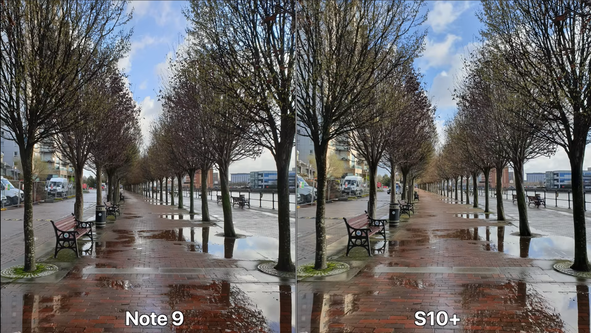
The difference in camera quality between the Note 9 and S10+

The difference in camera quality between the Note 9 and S10+

Whilst you do get a 3rd camera module on the back, which is a wide angle module, meaning you can capture significantly more in the shot than you could with the regular module, the image quality itself hasn’t changed that much from the Note 9 or even the Samsung Galaxy S9 from a year before. In fact, looking at the camera specs, they seem to be using the exact same modules.

Samsung has updated their image processing so the HDR shots especially look better but they’re still not better than on the Pixel 3 XL or the iPhone XS Max in a lot of cases. RAW image processing is good, but again nothing compared to the iPhone XS Max which has the best dynamic range on any smartphone today. 

On the video side, we did get a massive upgrade and that is the fact that you can now record for an unlimited amount of time, which was limited to just 5 minutes of 4K60, or 10 minutes of 4K30 before. That didn’t make a lot of sense, especially considering how much storage you can have in this phone, but I’m glad to see this restriction being removed. 

Slow motion is good if you only care about the result. It can shoot in up to 960fps in 720p, but the slow motion movement detection it done automatically and, at the time of writing this, manual mode is glitched. Long story short, recording the quick balloon pop scene in the video took about 5-6 attempts on the S10+, whereas the iPhone XS Max and the Google Pixel 3 XL nailed it the first time. So it’s very frustrating recording slow-motion on the S10, but when it does work, the result is pretty good. 

However, there are a few weird things with this camera. Take the fact that you cannot use the wide-angle lens or the telephoto lens when recording video, unless you switch to 4K30. 4k60 doesn’t work with the wide-angle for example. Why is it like this? I have no idea, it doesn’t make any sense at all for Samsung to limit this. 

Now don’t get the wrong idea, I’m not saying that this camera is bad. On the contrary, the S10+ has the best smartphone camera on the market, same spot as the Google Pixel 3, the iPhone XS Max or the Huawei P30 Pro, but they all have different ups and downs.

Take the iPhone XS Max for example, it excels in video and dynamic range when it comes to photos. The Pixel 3 has some amazingly good HDR shots and an insane Night Mode. The Huawei P30 Pro has that 5x or even 50x zoom, and an even better Night Mode. Then the S10+ has, in my opinion, the best wide angle camera on a smartphone today, the best front facing camera for video, since it can do 4K video on the front and it can take some outstanding shots with little to no tweaking required. 

In the end, there’s no perfect smartphone camera, but the Galaxy S10+ one is definitely as good as the competition, just in some other areas. 

PERFORMANCE

Performance wise though, this thing is a beast! It comes with the Qualcomm Snapdragon 855 in US and Canada and Samsung’s own Exynos 9820 in Europe and Asia, and this year, it seems like the Snapdragon models are a better choice. They are not only faster but they also offer a better battery life.

Since we’re UK based, we got the Exynos model and personally my experience with the S10+’s performance has been really good. I haven’t really had any major lag or freezes on the S10+, unlike what I used to get on the older Samsung models. My iPhone XS Max completely froze 3 times in the past 2 weeks alone, to the point where I had to force restart the device since the touchscreen was completely unresponsive, and I’ve never had that with the S10+. 

The cooling pipe in the S10+ (Source: JerryRigEverything)

The cooling pipe in the S10+ (Source: JerryRigEverything)

Yes, it’s not as powerful as an iPhone XS Max is, but it can easily handle all the everyday tasks extremely well so I’ve very pleased in this regard. And the fact that it comes with 8GB of RAM by default, and even 12GB on the higher end 1TB storage model, means that you’ll never have an issue keeping apps open in the background. 

Heck, it even has a vapor cooling pipe to keep the temperatures low during gaming or video editing, which both the regular S10 or the S10e lack.


SOFTWARE

But performance is nothing without a good software experience and I’m pleased to say that the S10+ has the best software experience I’ve seen in a Samsung phone.

The new OneUI is a huge improvement over the previous Samsung Experience UI. Not only do you get this really cool system-wide dark theme, but the whole idea behind Samsung’s OneUI is that you can use it with one hand and everything is gestures based now. So you can swipe down from the home screen to access the notification panel, and even the brightness slider. You swipe up in the middle to go home, you swipe up on the right-hand side to go back, and you swipe up on the left hand side to open up the multitasking bar.

I mean they’re not the best gestures out there, they are better than the Pixel but they are still slide up gestures of the previous buttons rather than something that was designed specifically with the lack of buttons in mind, like the swipe left and right that we have on the iPhone.

Now something that I do like is the fact that you can have folders on the app drawer. You can basically have the entire iOS app UI with a swipe up of a finger and then you can keep the home screen clean and simple, with just a few icons and a few essential widgets.

The Samsung Edge Panel allows you to quickly access your favourite apps

The Samsung Edge Panel allows you to quickly access your favourite apps

I also love Samsung’s Edge Panel that gives you a few extra apps when you swipe from the side of the phone, this is brilliant and extremely useful to have! You can even have tools here, contacts for example, and way more things than just apps. 

However there are a few things I dislike about this software apart from the slightly clunky gestures.

My main issue with the software is with accidental touch rejection. It’s pretty bad and that’s because of the curved display which makes it very easy for your palm to touch some of the icons on the edge. This was improved from the S9 to the Note 9, when Samsung made the edges less curved on the Note 9 and the accidental touches were almost fixed entirely but the edges are now back to being really curved on the S10+, which does make the phone looks nice but it also severely impacts the usability. So I ended up randomly liking comments or tweets, pausing YouTube videos, skipping videos quite a number of times. 

I also dislike the scrolling. There’s no bounce effect like we have on iOS, so everything feels very unnatural and nothing feels as smooth or as fluid as an iPhone does. This doesn’t apply to all Android phones to be honest. For example my Pixel handles a slide gesture much better than my S10 does which constantly struggles with this, mostly because of the curved display which is really annoying! 

Animations don’t feels as smooth as iOS either. Everything feels a bit choppy and unnatural, so if you’re coming from iOS this is something you’ll notice right away. 

And of course, there’s the updates. Samsung is usually about a year late when it comes to updates and even when they do release an update, such as the recent Night mode for the camera, not all S10’s get it at the same time. For example, I still don’t have it on my personal S10, yet the review unit from Vodafone does. Samsung did improve their update cycle and they have launched OneUI on the Note 9, S9, Note 8, even the S8 have it, which is great and all but it’s still far behind Google Pixel phones which get day 1 updates, or OnePlus phones which also get updated just a few weeks or months after Google phones.

SPECIAL FEATURES

This phone is the swiss army knife of smartphones when it comes to special features. It comes with pretty much everything you would need in a smartphone. 

It’s one of the few smartphones to still support a microSD card slot, so you can expand the top of the line 1TB model with up to 512GB of additional storage and have 1.5TB of storage in a smartphone which is just insane!

It doesn’t come with UFS 3.0 storage, which only the Galaxy Fold and the OnePlus 7 Pro have so that’s a bit disappointing, considering that those are Samsung’s own chips which would’ve given the S10+ read speeds of close to 3GB/s up from about 1.5GB/s and write speeds would have almost double as well.

But we do get a ton more features. We get an always-on display which is fully customisable. We also get a notification ring that goes around the camera cut-out, which was recently added in an update.

It does come IP68 water resistance, which same as on every other water resistant phone, but it is not covered under warranty.

We get dual stereo speakers, which are much louder than on something like an iPhone XS Max, and also a headphone jack which is really useful to have if you’re not fully invested into the wireless headphone ecosystem.

The S10’s can now reverse wireless charge any device that accepts wireless charging, like the Pixel 3XL for example

The S10’s can now reverse wireless charge any device that accepts wireless charging, like the Pixel 3XL for example

If you are though, Samsung has also released the Galaxy Buds, which are their answer to Apple’s 2nd generation AirPods. They isolate the sounds much better than the AirPods but their sound isn’t as full as the AirPods. The microphone on the Buds is pretty bad, but they do offer better controls than the AirPods, and probably the best part about them is that you can charge them on the back of your S10!

Yes, the S10 now has reverse wireless charging, so you can charge anything that supports wireless charging; your Galaxy Watch, your Galaxy Buds, or even an iPhone. Also, wireless charging is now even faster on the S10, with up to 12W charging, so that’s great. It can get to 33% in just 30 minutes of charge using fast charge, which is pretty impressive considering it’s large 4100mAH battery. 

The S10 is also one of the world’s first smartphones to feature WiFi 6 or WiFI 802.11ax, the brand new standard that can get theoretical speeds of up to 10Gb/s! There’s very few WiFi 6 routers and networks out there, but this is great for futureproofing. Also if you want 5G, Samsung will be selling that 5G variant of the S10+, which not only comes with 5G but also a larger 6.7” display as well as an extra 4th camera module. 

But there are 2 outstanding features on this phone which not a lot of reviewers talk about and these are by far the most impressive things on any smartphone.

By connected your Samsung phone to an external monitor you can enter DeX mode

By connected your Samsung phone to an external monitor you can enter DeX mode

The first one is DeX. So with the S10, you can use the USB type C port, which is also USB 3.1, and connect it to an external monitor. Once you do that, it boots into this DeX mode, which looks very similar to a Window 10 experience. So you have all of your apps here in full screen, and apps such as Microsoft Office and Chrome work just as they do on your full desktop computer. You can even attach a wireless mouse and a wireless keyboard and basically transform your S10 into a desktop computer whenever you get back home from work. I find this is absolutely amazing! If you’re the kind of person that mostly uses their smartphone and nothing else, being able to use this as a full desktop PC when you get home is not just convenient, but it’s also far more affordable than buying a new computer. 

The 2nd big unique feature is VR. Samsung has the best mobile VR on the market right now. The GearVR which also comes with a motion controller is something that I recommend to every S10 user to get. The GearVR is made in partnership with Oculus so you have full access to thousand of Oculus apps and games and with the S10’s gorgeous 3K OLED display, everything looks stunning!. It’s something that honestly all of you need to try out! It’s that big of a game changer. 

|You can now unlock the S10 and S10+ using the in-display fingerprint reader (Source: Samsung)

|You can now unlock the S10 and S10+ using the in-display fingerprint reader (Source: Samsung)

Finally, we wouldn’t be talking about Special Features without mentioning the Fingerprint Reader. On previous Samsung phones, ever since the S8, we’ve had it on the back, which I was never a fan of. The one on the Note 9 was good, and much easier to reach since it was placed in the middle, rather than to the side. But I would have still preferred a Facial Recognition system like Apple uses on their iPhones or a fingerprint reader on the front. And this is exactly what Samsung has done with the S10. We’ve seen this rumored and leaked, ever since the S8, Samsung using an optical fingerprint reader but for whatever reason they never did. Even the S10 uses an Ultrasonic fingerprint reader, which is far more advanced than an optical one since it doesn’t need any light in order for it to work. Now my experience with this fingerprint reader has been ok. It’s definitely slower than a dedicated fingerprint reader and it doesn’t work as often as FaceID does on the iPhones. Initially it was working just 6/10 times for me, so I added my finger multiple times and now it works 8-9/10 times. Tip for those of you who have trouble with the fingerprint reader. But for me, I would always pick the S10’s fingerprint reader over one that’s on the back of the phone. This is Samsung’s first gen in-display fingerprint reader though, and I’m pretty confident that’s going to get even better with future software updates and new Galaxy phones as well. 


BATTERY

How the UI looks in the ‘Ultra Power Saving’ mode

How the UI looks in the ‘Ultra Power Saving’ mode

I found the battery life has been amazing for me. It can easily last me for a full day of use, even when I’m travelling and I’m a really heavy user.

The S10 also has this adaptive power saving mode that limits background usage of certain apps, based on what, how and when you use your. You can also manually toggle that Ultra Power Saving mode, which is not called anymore but it still works in a similar way, where the entire UI is black and you have this simplified UI where you can only use a few essential apps but the battery can last you for a few days, or even weeks by doing this. This with the S10+’s fast wireless charging and fast wired charging, and that 4100mAh battery means that this phone has given me the best battery life so far.


CONCLUSION

Ok, so what are my overall thoughts on the S10+?

Honestly, this is by far the best smartphone on the market right now, keep in mind that this is coming from someone who mostly uses Apple products. 

This is an amazing device with a stunning display, outstanding battery life, a very versatile camera and even the price of it is really good. On Samsung’s website, the S10+ starts from £900 for the 128GB model that also comes with 8GB of RAM, which is £200 less than an iPhone XS Max which only comes with 64GB of storage, no microSD card and a fraction of the features that the S10+ comes it.

The iPhone does offer a more fluid and optimised experience, everything just flows more nicely and if you’re heavily invested into the Apple ecosystem, then that’s a better choice. But for me, since I recently got an iPad Pro as well, I still have iOS for some things meaning that using an S10, an iPad and a MacBook is actually doable.

Also, since you cannot even use 2 apps at the same time on a £1100 iPhone XS Max for example, which you can easily do on the S10, the S10 is also a much better productivity tool that fits right in your pocket.