Samsung Galaxy

Samsung Galaxy S20 Ultra - The Complete Review! (1 Month Later)

Finally, we have a smartphone that ticks every single box! That Smartphone, is the S20 Ultra. It comes with:

  • A 108MP Camera, which has nine times the Resolution of the iPhone 11 Pro Max and most flagships Smartphones out there.

  • 100X Space Zoom, when most Smartphones feature just 2X Optical or 10X Digital.

  • A massive 6.9”, 3200x1440, Ultra-Wide 20:9 Aspect Ratio Display with a 120Hz Refresh Rate, compared to the 60Hz of most other Smartphones.

  • It features the second largest Sensor on any Smartphone, right after the Huawei P40 Pro.

  • 8K Video Recording.

  • A 40MP Front-Facing Camera.

  • A gigantic 5000mAh Battery.

  • 45W Fast Charging.

  • 15W Wireless Charging.

  • 9W Reverse Wireless Charging.

  • An Always-On Display.

  • 12GB of RAM.

  • Up to 1.5TB of Storage and you can even turn it into a Desktop PC, thanks to Samsung Dex.

The S20 Ultra is the god of all Smartphones and it is by far the most amazing Smartphone that I have ever used! Or at least…this is how I was hoping I would start this Review.

You see, the Galaxy S10 from last year was one of my favourite Smartphones ever. The S10 was so perfect for me, that I ended up using it as my daily driver for almost three full months, even replacing my iPhone for that period of time. Then, the Galaxy Note 10+ came out, which was an even more perfected S10, with an even bigger Display and an S-Pen. In my Review of the Note 10+, I even called it the best Smartphone ever made. I was honestly so happy with the Note 10+, just because it could do every single thing that I wanted from a Smartphone and more.

So, when I heard that the S20 Ultra would come out, with that insane 108MP Camera and 120Hz Display, I was just counting the days until this would release. We made so many videos on the S20 Ultra way before it was even announced, we made ‘Leaks & Rumors’ episodes, Concepts and I even attended the S20 launch event, which was my first ever Samsung event, and I was honestly so hyped about this Smartphone. I was eagerly awaiting the S20 Ultra launch. I don’t remember the last time I was so excited about a Smartphone, it was probably in 2017 when the big iPhone X launched. 

However, rather than this being the ultimate Smartphone, as it looks to be, judging from the specs, it ended up being the most disappointing that I have ever ever used. On paper, they make this Smartphone look like it came from five years into the future. However, every single one of these specs has a major flaw and this Smartphone cannot deliver on any of its big promises. I’ve been using the S20 Ultra as my daily driver for the past month or so, so here is my full, honest Review of the S20 Ultra covering the Design, Display, Camera, Performance, Special Features, Battery and Value!


I mentioned that I finally attended my first Samsung event, I managed to see the unveil of the S20 line and the Galaxy Z Flip in person, which further sparked by insane hype about this Smartphone. After the event ended, just like everyone else, I was waiting for my Review Unit from Samsung.

The recent ‘Unpacked’ event was the first time we had attended an actual Samsung reveal.

The recent ‘Unpacked’ event was the first time we had attended an actual Samsung reveal.

However, while others started receiving very early units, we didn’t get anything. I kept being promised by Samsung that they would send one over as soon as possible, however, other channels, even smaller creators, got it, while we were left without a unit. About two weeks pass and most Reviews of the S20 Ultra started coming out already and pretty much all of them were very negative, which further crushed my hype for this Smartphone.

Now, Samsung did end up sending us a unit, so thank you Samsung, but that one actually arrived a full month after everyone else got it. It even got delivered at the exact same time as our Retail Unit of the S20 Ultra, which we bought and even that got delayed by an entire week, due to stock issues. 

So, we got the S20 Ultra about a month after everyone else already posted their Full Review, seeing all of those negative Reviews and getting this so late pretty much killed all of my excitement. This is why we haven’t done a single video with the S20’s yet, just because we got it so late, compared to everyone else. But still, I wanted to make this Full Review, so I’ve put the S20 Ultra through its paces and here’s what I found. 


Design

Design wise, from the front, the S20 Ultra does look outstanding. The Bezels are extremely thin, even thinner than on the S10 and Note 10. The Camera Cutout is now even smaller than before and it is now in the centre, just like on the Note 10. You honestly forget about it after just a few minutes and you just get impressed in that massive 6.9” Display.

Comparing it to the iPhone 11 Pro Max, the Ultra looks light-years ahead. It just looks so futuristic without that massive Notch and those extremely thin Bezels. The back, however, isn’t as pretty. That’s not necessarily because of that massive Camera Module, but mostly because of the colours, we only get Grey and Black colour options. The Grey is just a regular Grey so nothing really too special here, but the Black is actually pretty bad. There’s no shimmer to it or anything, it’s just a fingerprint magnet. It actually reminds me a lot of our fake Galaxy mock-ups. It looks so much like cheap plastic.  Samsung used to have some amazing colours with the Note and S10 last year but for some reason, those didn’t translate to the Ultra. Not only that, but most Smartphones in 2020 started adding a Frosted Glass back.

The Ultra is very bulky, even without that mammoth Camera Module.

The Ultra is very bulky, even without that mammoth Camera Module.

The iPhones have it, the Pixels have it, OnePlus has it, Huawei has it with the P40 Pro and many others do as well. A Frosted Glass back not only makes it look so much better, but it removes the issue of fingerprints and smudges almost entirely. I’m quite surprised that Samsung still hasn’t done that. 

Now, leaving the back aside, there are three design issues that I really do have to mention, the first one being the table wobble. So, because of how massive and deep this Camera Module is, you’ll notice that when the Ultra is sitting flat on the table, it will wobble like crazy. If you’re the kind of person that likes using your Smartphone when it’s sitting flat, you can forget about that with the Ultra. 

Secondly, the Ultra is very thick at 8.8mm for just the body alone, not even to mention the Camera Module. The Ultra is pretty much the thickest non-folding, flagship Smartphone on the market right now. If you add a case, to remove that table wobble issue and flatten out the Camera Module, it will make this Smartphone even thicker. 

Lastly, this Smartphone is also pretty heavy. At 222g, it is one of the heaviest Smartphones on the market and while it’s actually 4 grams lighter than the iPhone 11 Pro Max, it does feel top heavy to me. I always feel like I’m about to drop this Smartphone and that Camera Module is so big that you’ll always end up touching it. So, great design on the front, but a very bulky and big Smartphone overall.


Display

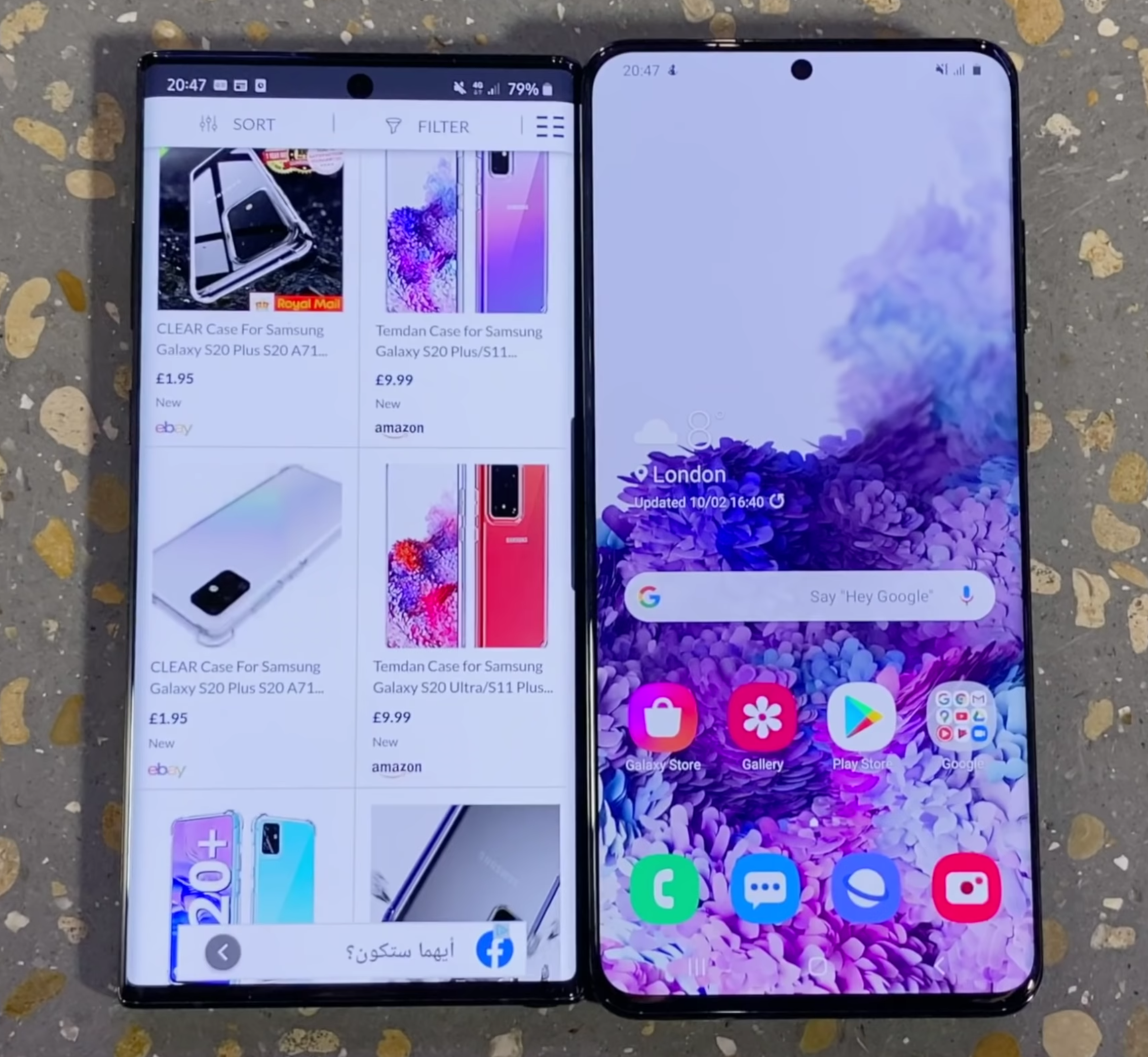
Moving on to the Display, we now get a massive 6.9” Display, up from the 6.7” Panel that the S10 5G had, or the 6.8” Display that the Note 10+ had. But, this size increase is mostly due to its extra height.  We now have a taller 20:9 Aspect Ratio, compared to 19:9 like we had before, it actually doesn’t feel as big as you would expect. In fact, the entire Smartphone is not as wide as the Note 10+ was, meaning that, compared to the Note, it is actually more comfortable to use. I really do like this.

This is a very high quality Display, but it has some notable limitations.

This is a very high quality Display, but it has some notable limitations.

Also, the Glass is almost flat now, Samsung pretty much killed their ‘Edge’ Display with the S20 line. Design wise, I do prefer the Note 10+ over the S20 Ultra. Also, thanks to the flatter Display, there are no more accidental touches at all with this Smartphone, so Samsung definitely gets a plus for that. Resolution wise, we get a 3200x1440 Resolution Display, which translates to 511PPI. The Colour Reproduction is excellent and the Brightness is very good, maxing out at 1300 Nits. So overall, the S20 Ultra has one of the highest quality Displays in a Smartphone.

Now, aside from the Resolution and Aspect Ratio, something else that’s new this year is the Refresh Rate. We now get a 120Hz Display, compared to the 60Hz Panel that we got before. This means that the S20 Ultra can now Display up to 120FPS, compared to 60FPS like on most other Smartphones. Not only will games run twice more fluid on the Ultra, compared to let’s say, the iPhone 11 Pro Max, but animations, scrolling and just using the Smartphone in general will feel so much snappier than ever before.

But, this is where the first main disappointment with this Smartphone kicks in. Unlike the OnePlus 8 Pro for example, which runs at 120HZ at full Resolution, the S20 Ultra can only run at 120Hz when the Display is in 1080p. This wouldn’t really be an issue if this Display was any smaller but, on a massive 6.9” Display, 1080p will make the text look a bit blurry. So, you’ll have to choose, you’ll either want a fluid but blurry experience, or you’ll want a not so fluid but sharp experience. There’s always a trade-off.

Also, OnePlus for example, added a 10-bit Display Panel on the 8 Pro, which can display over 1 billion colours, compared to the 16 million colours that the S20 Ultra can display. OnePlus also added an MEMC Chip, which adds extra frames in videos, bringing them to 120FPS from 30FPS for example. So, even though OnePlus actually uses a Samsung Display, it seems like it is a higher quality Panel than what Samsung themselves have put in their highest-end Smartphone.


Camera

So, speaking of disappointments, let’s talk about the biggest one there is and that is…the Camera.

Where do we even start?

Where do we even start?

About a month before the S20 Ultra was even announced, we made a video called “S20 Ultra – Why I’m concerned”, in which I talked about why that 108MP Sensor that the S20 Ultra will come with, might not be a great idea. My point here was that a Camera Sensor is just like a chessboard, it’s a fixed area, inside of which you have multiple squares. These squares are actually the Pixels on the Sensor. The larger the Pixels are, the more light they can capture. Now, if you want to add multiple squares, nine times the amount of squares in the case of the Ultra, they will have to become nine times smaller in order for all of them to fit. This means that they will capture nine times less light and long story short, the Camera would be very bad in Low-Light.

To combat this issue, Samsung increased the chessboard size, or the Sensor size in this case, from 1/2.55” like we had on the Note 10+, to 1/1.33”. This was a massive increase, pretty much double the size. This was a pretty big deal for Samsung as we hadn’t had a larger Sensor since the Galaxy S7 in 2016, Samsung had been using the exact same Camera specs. The only problem, and this is where my scepticism was regarding this Camera, was that the Xiaomi Mi Note 10 also used the same 108MP Sensor from Samsung. It is the same size, has same specs and this is a mid-range Smartphone that costs three to four times less than the Ultra. That 108MP Camera inside of it wasn’t great either.

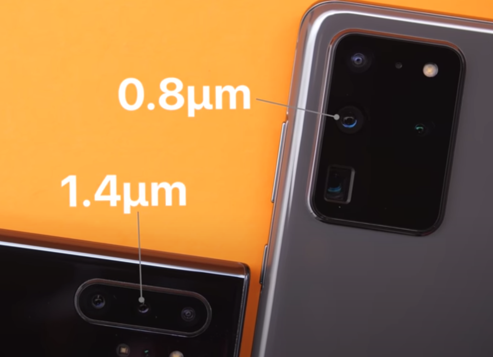
Photos were indeed sharp, but only when the Camera had a ton of light. If you didn’t have tons of sunlight, the Camera was pretty bad. Now, Samsung did claim that they were doing something a bit different on the Ultra, where they would actually combine nine Pixels on the Sensor, into one, for much better Low-Light performance via something they called ‘NonaBinning’. But, I just wasn’t buying it. The Pixels on the Sensor are still 0.8 Microns in size, compared to 1.4 Microns on the Note 10+ for example. So, the Pixels were almost twice as small. That video of me being skeptical about the Samsung Camera before release got quite a lot of dislikes and I’m sorry to tell you but…I was right.

The Variable Aperture Module is a notable loss on the Ultra.

The Variable Aperture Module is a notable loss on the Ultra.

Even with Samsung’s ‘NonaBinning’, this Camera just isn’t great at all. Low-Light performance is noticeably worse than the iPhone 11 Pro Max, or even the S10 from last year. Low-Light shots on the Ultra, as I expected, are very bad, they are extremely noisy and unfortunately video performance in Low-Light is even worse. As a video is essentially a sequence of 30 or 60 photos every second, the Processor isn’t fast enough to reduce the noise in real time, so video ends up being even noisier than the Low-Light photos. Low-Light video just falls apart entirely on the Ultra because of those extremely tiny Pixels on the Sensor.

Remember that really cool Variable Aperture Module, the f/1.5-f/2.4 Module that the S9 introduced? Well, that’s now gone and all we’re left with is a fixed f/1.8 Aperture Module, which is another reason why this Smartphone does not excel in Low-Light. 

So pretty bad Low-Light performance but, the day-time performance should at least be good, right? Unfortunately, that’s pretty bad as well. The HDR Processing on this Smartphone is close to non-existent, Shadows get completely crushed and Highlights get blown out almost every single time. I don’t remember the last time we had a Smartphone that was this bad in terms of HDR Processing. These photos remind me of pre-HDR Smartphones from around 2012-2013 or so. 

The Ultra makes the Moon look like it really is made of cheese.

The Ultra makes the Moon look like it really is made of cheese.

Also, the Ultra doesn’t really take 108MP photos. All of the photos that you take are using that Pixel Binning/NonaBinning merge that I talked about before, so they’re all 12MP photos unless you have the 108MP Mode specifically enabled. While the 108MP photos do look very good, the HDR Processing is actually even worse on the 108MP photos, things are definitely not looking great for the S20 Ultra’s Camera. Something has to be good about this Camera, what about that 100X Zoom or at least the 8K video? 

Samsung is using a Periscope Camera inside the Ultra, which is a genius solution of putting a Telephoto Lens inside the thin body of a Smartphone, they actually positioned the Telephoto Camera to the side and they’re using a mirror to direct the light onto the Sensor. But you don’t get 100X Optical zoom, that would really be ridiculous. Instead, you get about 4X Optical Zoom, which is really only twice the Zoom level of the iPhone 11 Pro Max for example, and then the rest of the Zoom is all Digital, thanks to the 48MP Resolution of the Telephoto Sensor and that 108MP Resolution Main Sensor.

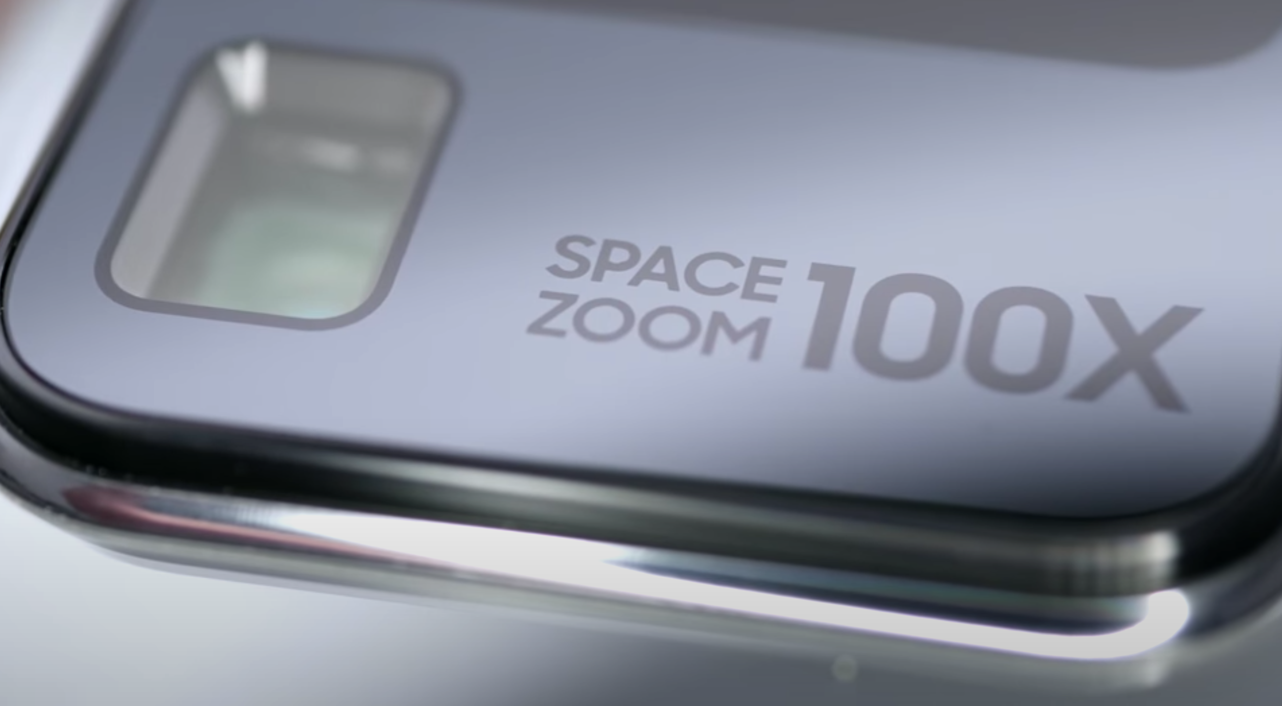
Long story short, 10X Hybrid Zoom on this Smartphone is actually pretty impressive, the 30X is OK but I wouldn’t really use it on an Instagram Post. Anything more than 30X, especially 50X or 100X, is borderline unusable. Images end up looking like Oil Paintings and Samsung should’ve really marketed this as 10X Zoom, rather than literally printing 100X Space Zoom on the back of the Smartphone, this would’ve been so much better received. But instead, Samsung hyped this Smartphone up so much to the point where the 100X Space Zoom is pretty much a meme.

I was a bit sceptical when, at the event, Samsung didn’t show us a single photo of the night sky or at least the Moon, even-though the branding on this camera was 100X Space Zoom. 

Printing that on the Ultra may not have been the best idea.

Printing that on the Ultra may not have been the best idea.

Now, there are two more things that I want to mention regarding the Zoom Camera. The first one being that if you just want to use the Telephoto Module, the Standard Zoom is now 5X, so if you want to Zoom in just a bit, that would be Digital Zoom and not Optical. Portrait Mode is now done with the Main Lens because of that. Secondly, the Telephoto Module is actually a very slow Lens now. It is an f/3.5 Aperture Module, which combined with the fact that it is a 48MP Sensor, explains why this Module is pretty much unusable in Low-Light, or any light that’s not direct Sunlight.

So, what about that 8K video? It’s pretty sharp but it is only at 24FPS and I have a feeling that sometimes it even drops below that, just because it does look pretty choppy every now and then. The HDR Processing is again very poor in this Mode and the Bit-Rate is quite low as well. After the recent updates, it is now around 50-70Mb/s, but for 8K video, you would expect that to be much much higher, at least 150Mb/s, considering that the Storage inside the S20 Ultra is indeed capable of this. But, just to make matters worse, the focusing on this Smartphone is one of the worst I’ve seen in years. First of all, the S20 Ultra, because of that massive Sensor, now lacks the incredible Dual Pixel Autofocus that we’ve had on Samsung Smartphones for years. We just have Phase Detection Autofocus, which is quite slow.

The problem here is that when recording video, it focus hunts a lot. Getting a focused subject with this Smartphone is quite tricky. On top of this, based on how big the Sensor is, and while you do get some incredibly natural Depth of Field straight from the Camera’s hardware, this only makes the Focusing issue even worse. Now, close-ups would look incredibly blurry when compared to other ones.

You still get a whole lot with the regular S20 (Shibe not included).

You still get a whole lot with the regular S20 (Shibe not included).

Also, aside from Focusing, Low-Light and HDR issues, something else that got a downgrade is Slow-Motion. We no longer get Samsung’s iconic 960FPS Slow-Motion, this is now just 480FPS on the Ultra and then digitally enhanced up to 960FPS. Fun fact, the regular S20 and the S20+ don’t have any of these issues. They still have a 12MP Main Sensor, which is also larger than last year, but Low-Light performance on those is just incredible because the Pixels themselves are not as small as on the Ultra. Autofocusing works just fine because we still have Dual Pixel Autofocus and we still get a massive 64MP Sensor as the Secondary Camera, which you can also use to take full 64MP photos.

So, the S20 and S20+ do have a much better Camera than the Ultra, ironically. It’s just that you’re missing out on that 4X Optical Zoom and instead you now just have Digital Zoom all around. The only actual Camera improvement that the S20 Ultra gets over the other S20’s, is when it comes to the Front-Facing Camera. This is now a 40MP Sensor, up from the 10MP Sensor that we have on the other S20’s, and the selfies on this are razor sharp but aside from that, this is pretty much it. 

Now, I do have to give props to Samsung for releasing a ton of software updates on the Ultra, which did improve the Camera. But, at the same time, issues such as the Autofocusing or Low-Light performance are hardware limitations of that massive 108MP Sensor, which won’t be fixable through software updates. 


Performance

Ok, the Camera is a disappointment. Ironically, this was supposed to be the biggest feature of this Smartphone. But now, what about the performance?

Well, just like the years before, there are two different models of the S20 Ultra. If you buy one from the US, Canada or South Korea, you get the Snapdragon 865 Processor, which is the most powerful Processor in an Android Smartphone right now. But, if you buy it from anywhere else, you’ll get Samsung’s own Exynos 990 Processor inside. While on paper they look almost identical, they’re actually not.

Long story short, there is now a massive difference between these two Chips, not just in terms of overall performance but also in terms of the Battery Life.  Unfortunately, for most people, the Exynos model is actually the bad one.

If you’re in the US, Canada or South Korea, you will be getting the higher-end Processor.

If you’re in the US, Canada or South Korea, you will be getting the higher-end Processor.

Arun, or ‘MrWhoseTheBoss’, compared the two side-by-side. There, he found that the Snapdragon model was up to 20% faster. Not only that, but the Camera performance is also better on the Snapdragon variant, thanks to an improved Image Signal Processor. This is weird because if anything, the Exynos model should’ve had the best Camera performance as that’s a Samsung made CPU and that 108MP Sensor is also a Samsung made Sensor. Arun also found that the Battery Life was up to two hours longer on the Snapdragon model. So, to make matters worse, the Exynos variant is pretty much the nail in the coffin here.

My experience, performance wise, with the Ultra has been great, I do have to mention that. Those 12GB of RAM and that UFS 3.0 Storage, combined with that 120Hz Refresh Rate, make it one of the fastest Smartphones I’ve ever used. Still, the OnePlus 8 Pro felt much smoother and more responsive. 


Special Features

Moving on to the special features, the biggest one here is probably the new Haptic Engine. This is now the same one that Samsung used in the Galaxy Note 10+ last year and it is brilliant.  I do find Samsung’s implementation of Haptic Touch in the OS to be the very best on any Smartphone out there. You get these small tap backs when you go into the Settings, take a photo or even when you type on the Keyboard. It’s just incredible. But other than that, there’s really nothing extra that we get from the Note. 

The Always-On Display is still there, as is Reverse Wireless Charging and pretty much all of the features that you would expect from a Smartphone. We now we get 5G as well, this is mmWave 5G. Aside from the S-Pen, this Smartphone has the most features of any Smartphone on the market. It’s just too bad it’s lacking on the essentials. 


Battery

On my Exynos model, with my use-case, I was getting around five hours of screen-on time, which isn’t great. This was with 120Hz enabled, but do keep in mind that this was on 1080p Resolution. That was similar to the Battery Life that I got with my S10+ after about two months, or so, of use. It’s fine, but it could be so much better.


Value

Having said all this. Is the S20 Ultra worth it? If this thing was $800/£800, maybe. But, it’s actually $1400, or £1200.

At that price point, the Ultra is now the most expensive non-foldable Smartphone on the market that you can buy. Also, this is just for the baseline 128GB of Storage model and you don’t even get a Case inside the box. Well, you get one in the US but not in the UK, which for this price, this really sucks. You don’t even get the USB C to USB A Adapter anymore, so you’re actually getting less than what you got with the S10 last year. 

When an iPhone SE, which costs $400, more than three times less, takes better photos that a Smartphone that’s supposed to be the Camera King, I’m sorry but no one should be buying the Ultra.  However, the regular S20 is actually a very good deal. At $900, you get a better Camera than the Ultra and you also get most of the features that the Ultra has. 

Samsung Galaxy S20 - 40 Things You Didn't Know!

The Samsung Galaxy S20 is now here. This is, by far, one of the biggest changes that Samsung has ever made to their line of smartphones. We now have things such as a 100x Zoom camera module, 8K video recording, a massive 5000mAh battery as well as a an extremely fluid 120Hz display.

But, there are a few things that Samsung didn’t tell you about the S20’s, here are 40 of them!


1 - Our First Samsung Event!

Screenshot 2020-03-11 at 11.54.10.png

Even-though this is not related to the S20’s directly, we got invited to the event ourselves, meaning that we attended the Unpacked 2020 Event in London.  This was our first ever Samsung event, so huge thanks to Samsung for having us.

We did get the chance to see all S20’s in person and play with them for quite a bit, which is the reason why we do have some personal thoughts to share in this article as well.


2 - 120Hz Limit

Honestly, this 120Hz refresh rate makes the S20’s feel years ahead in terms of performance. We could definitely tell that it was more fluid than even the OnePlus 7T Pro, which has a 90Hz display. 

However, there is one catch. You cannot use the new 120Hz refresh rate when the display is running at full resolution. You have to switch to FHD+, otherwise you’ll have to stick to 60Hz, which is a shame.


3 - 240Hz

Aside from that 120Hz panel, the touch input actually samples at a whopping 240Hz. Meaning that touch inputs would be twice as accurate as before. 


4 - Haptic Engine 

Next up, all three S20 models use the new Haptic Engine that the Note 10 introduced. This means that you can essentially feel a response back, for example with the Alarm Wheel in the Settings or when you take a photo. This basically makes your phone’s software more like hardware in a weird sort of way.


5 - Charge Time

The S20 Ultra now gets the extremely fast 45W charging that the Note 10+ introduced. So, even with that enormous 5000mAh battery, the Ultra will still be able to fully charge in just over an hour, which is pretty nuts. The other S20’s still get improved Fast Charging, up to 25W from the S10’s 15W. Which will get you up to 50% in just less than 30 minutes.


6 - Actual Zoom 

Now, one of the most unique new features about the S20’s (especially the Ultra) is that unbelievable 100X Zoom camera. There is quite a lot of confusion on this so to clarify, the 100x Zoom is not optical zoom, it is digital.

The S20 Ultra essentially has 10x “Hybrid Zoom” and around 5x Optical Zoom which is still a big improvement from the 2x that we had before. The remaining zoom up to 100x is done digitally, thanks to that massive 108MP main sensor. The other S20’s still have an impressive zoom level as well. They both have 30x Digital Zoom.


7 - Periscope Camera

Credit: Samsung

Credit: Samsung

The reason the S20 Ultra can achieve 5x Optical Zoom is thanks to a new camera module called a Periscope Camera. Essentially, Samsung added a bunch of lenses that can heavily magnify the image. The only problem is that the camera module would stick out about 1cm from then entire phone which no-one wants. So, to fix that, they positioned the camera module horizontally, on its side and then they’re using a mirror to reflect the light from the outside of the phone, through the lenses and finally to the sensor. This works in the exact same way that a periscope from a submarine works. Pretty cool stuff! 


8 - Actual Picture Size

Now, taking a 12MP photo on a phone, usually takes up about 2MB, or so of space. This means that taking a photo with that massive 108MP image on the S20 Ultra, should take up close to 20MB, which is a considerable amount, especially if you’re the kind of person that takes loads of photos. Well, luckily this won’t be the case, because the photos taken with that 108MP sensor will actually be 12MP photos.


9 - Pixel Binning

This is because Samsung will be using something called Pixel Binning technology and essentially combining nine pixels into one. (108MP/9 = 12MP). Samsung also claims that this will provide better low light performance and we did get to experience this in person, and we have to say, the S20 Ultra’s low light is miles better than what we have on the Pixel 4.


10 - Improved Low Light

While we’re speaking about the camera, the low light performance will be improved substantially on the regular S20’s. This is because, even-though they only have a 12MP sensor, as opposed to the massive 108MP sensor of the S20 Ultra, they are indeed newer sensors with larger pixels of 1.8μm. On the S10, they were 1.4μm pixels.


11 - Biggest Camera Upgrade since S7

Ever since the Galaxy S7, Samsung has been using the exact same sensor specs. Yes, they were new sensors every year with slight tweaks, but the sensor size and the pixel size has remained the same from the S7 to the S10.  The only major camera improvement that we got on the main module was with the S9 and that switchable aperture camera. Most of the improvements were done through software. However, this is finally changing with all three models of the S20. 


12 - Goodbye Jack

Something that’s also changing is that we no longer have an MP3 jack, which is something that the Note 10’s got rid off. 


13 - GalaxyBuds+

However, Samsung has launched a new version of their GalaxyBuds headphones, the GalaxyBuds+. Unfortunately, they do not feature any crazy new features, like active noise cancellation or anything like that. Instead, they focus on improving the sound quality and improving the microphone quality whilst almost doubling the battery life to 22 hours. 


14 - GalaxyBuds+ iOS

Samsung has now released the iOS app for the Galaxy Buds. So, if you have an iPhone, the Galaxy Buds will integrate much better into your ecosystem.


15 - Storage Speed

Another big improvement that will make the S20’s feel so fast is the storage speed. All S20 models feature UFS 3.0 storage, compared to UFS 2.1 on the S10’s. Therefore, as with the Note 10, we’ll get double the read and write speeds, to just over 1GB/s read, which is insane! 


16 - microSD

Speaking of storage, all three models of the S20 will keep the microSD card slot. This is pretty amazing because you can actually get a 1TB microSD card and have up to 1.5TB on the S20 Ultra or 1.1TB on the other two S20’s.


17 - Storage Options

This is because, while all three S20’s will come with 128GB of storage as default, the S20 Ultra will have a second storage option of 512GB. Some might not appreciate Samsung not offering more than 128GB on the S20 and S20+. However, keep in mind that you do have that microSD card slot, in case you do need more storage for things such as apps and music.


18 - RAM 

When it comes to the RAM, the standard S20 comes with 8GB of RAM, which is the same as the S10 and S10+ from last year. The S20+ comes with 12GB of RAM, which is the same as the Note 10+ from last year. The S20 Ultra comes with either 12GB of RAM if you go for the 128GB model or a whopping 16GB of RAM if you choose the 512GB storage model. 

Most people don’t even have that in their laptops, so having 16GB of RAM in a phone, is just crazy! Also, all three S20 models will get LPDDR5 memory, which is the latest standard in memory with even lower power consumption than LPDDR4. 


19 - No 4G

Last year the S10e, the S10 and the S10+ all came with 4G and then we had another version of the S10, the S10 5G which had… 5G. This year, things are quite a bit different. The S20 and S20+ both come with 4G and 5G variants. And there’s not that big of a price difference between the two. The S20 Ultra on the other hand, only comes in 5G, which is probably why Samsung decided to pack such as massive 5000 mAh battery in that phone.


20 -  Faster 5G

If you really care about 5G, the Ultra does get mmWave 5G, which is the true next-gen 5G, while the other two S20’s get high band 5G, which is quite a bit slower.


21 - World’s First 8K

We can now record 8K footage on a smartphone for the first time, with limitations.

We can now record 8K footage on a smartphone for the first time, with limitations.

Now, going back to the cameras for a bit, all three S20’s have a very unique feature, the ability to record 8K video. This means that these are the world’s first smartphones that are able to capture 8K footage. Even-though the bitrate isn’t the highest and the frame-rate is limited to just 24FPS. It is still very impressive to have a phone capable of recording this.


So, if you did happen to purchase an 8K TV recently, then getting a Galaxy S20 might actually be a very good idea due to the lack of 8K content, 8K TV’s rely on upscaling 4K footage, whereas now with the S20, you’ll be able to take native 8K footage to watch on your 8K TV.


22 - 8K Requirements

Now, 8K has a resolution of 7680x4320. Meaning that if you want to shoot 8K footage, you need to have at LEAST a 33MP sensor.  Well that’s fine because the S20 Ultra has a 108MP sensor but, what about the other two S20’s? How can they shoot 8K content when they only have a 12 MP sensor?

Well, it turns out that while the S20 Ultra uses the main 108MP sensor, to record 8K footage, the other two S20’s actually use the zoom module instead, which is 64MP in resolution. 


23 - S20: No Optical Zoom

Because of this, Samsung actually removed the zoom lens from the zoom lens module, as they didn’t want you to only be able to shoot 8K content when you are really zoomed in. Therefore, the zoom on the S20 and the S20+ is purely digital and thanks to that massive 64MP sensor, you can zoom in quite a lot and still get a pretty sharp image. 


24 - Video Pro Mode

Samsung also added a Pro-Mode for video, meaning that you can now change the aperture, ISO and shutter speed when recording video as well. 


25 - New Ultra Wide Module

Now, something that needed quite a bit of improvement on the S10’s, was the Ultra Wide Angle module. Luckily, all S20’s now come with a brand new module.  A 12MP module, from the 16MP that we had before, which also has larger 1.4 μm pixels, compared to the 1 μm that we had on the S10. This results in better low light performance with the Ultra Wide module. 


26 - Wobble King

Unfortunately, because of that gigantic camera module, the S20 Ultra wobbles like crazy when it’s on the table. It was pretty much impossible to use while sitting flat, so that’s something to keep in mind.


27 - Chunk King

Something else to keep in mind, is just how thick the Ultra is. At 8.8mm thick, the Ultra is one of the thickest flagship smartphones on the market right now. However, the camera module is around double the thickness of the one on the iPhone 11 Pro Max and because of that, it’s much thicker than you would expect, especially if you put a case on it. 


28 - Goodbye Edge

Something that we’ve immediately noticed when using these phones is that the display is now flat, unlike previous Samsung phones from the S6 Edge, which had a curved display. The Ultra does have slightly more curve to it than the regular S20, but they all have 2.5D glass now, just like the iPhone and the Pixel 4. So you can gladly say goodbye to accidental touches.


29 - Goodbye f.1.5

Also, remember that switchable f/1.5 – f/2.4 aperture that we got with the S9? Well, that’s now gone entirely on all three S20 models and we now get a smaller f/1.8 aperture. 


30 - Smaller Camera Cutout

Additionally. you can say goodbye to the dual camera module cutout on the front that the S10+ and the S10 5G had. We now get a single camera cutout on all three models of the S20, which also happens to be smaller than on the Note 10+.


31 - Bezels

Speaking of bezels, it looks to us that the Note 10+ actually has a thinner chin and thinner bezels on the sides, thanks to those curved edges. Let me know in the comments if you think that’s the case as well.


32 - Goodbye Bixby

Have you noticed that the Bixby Button is now gone? Thank you Samsung!


33 - AirDrop

The S20’s all come with AirDrop now. It’s called QuickShare and you can quickly…share…items between multiple Samsung devices.


34 - New Aspect Ratio

All the S20’s now feature a noticeably taller 20:9 aspect ratio, compared to the 19:9 that we had before on the S10’s.

Meaning that even though these phones aren’t that much wider to hold in the hand, they are quite a bit taller and more difficult to use with one hand, as you cannot really reach to the top. 

Right: The S20 compared to the Note 10+

Screenshot 2020-03-11 at 11.58.10.png

35 - CPU Differences

Also, you will get a different CPU based on where you buy your S20 from.

If you buy it from the US or Canada, you would get the new Snapdragon 865, whereas if you buy it from anywhere else, you’ll get it with Samsung’s own Exynos 990. 


36 - Google Camera App

They’re both almost identical CPU’s, however, if you do get the Snapdragon version, you’ll actually be able to install the Pixel Camera app and get that Google style of image processing, if you’re really into that. 


37 - Weight

We have to say, the S20 Ultra is quite a heavy phone. At 222 grams, it is one of the heaviest flagships on the market, however, the iPhone 11 Pro Max is still heavier at 226 grams. 


38 - All Lenses 

Something really cool about the S20’s is the Single Take mode, which allows  you to use all the lenses on the back to take a photo and then you can pick which photo to use at the very end.  


39 - OneUI 2

Also, all the new software features, such as the improved night mode and more that we get with all the S20’s will be available on the S10’s as well, with a future software update. 


40 - S20 is enough

And finally, if you’ve been eyeing up the Ultra and you think that you have to get the Ultra for the best features, you actually don’t! In fact ,the regular S20 has all of the main features of the S20 Ultra. It’s just that you don’t get that insane 100x Zoom, you just get 30x, which let’s be honest, for most people that’s more than enough. 

THIS is the Samsung Galaxy S11!


The Samsung Galaxy S11 has been leaked and it is going to have that massive Penta camera module on the back which seems to be even bigger than the on the iPhone 11 Pro Max. So without further adieu, these are all the latest Leaks & Rumors on the Samsung Galaxy S11!


The S11 has been leaked quite heavily and we even did a full video and article about two weeks ago, covering everything we knew up until that point. That video and article was split into eight different sections covering everything from; Display, Display, Battery, Special Features, Camera & more. So if you want to get a very detailed look at the S11, do check those out first, since this one is mostly focused on just the more recent leaks.

Recently the biggest leaks have been coming from OnLeaks. OnLeaks has had some pretty outstanding track record in the past, up to the point where if does post a leak or especially a full render, we can probably bet that that’s exactly how that phone will look like, and the S11 is no exception. 

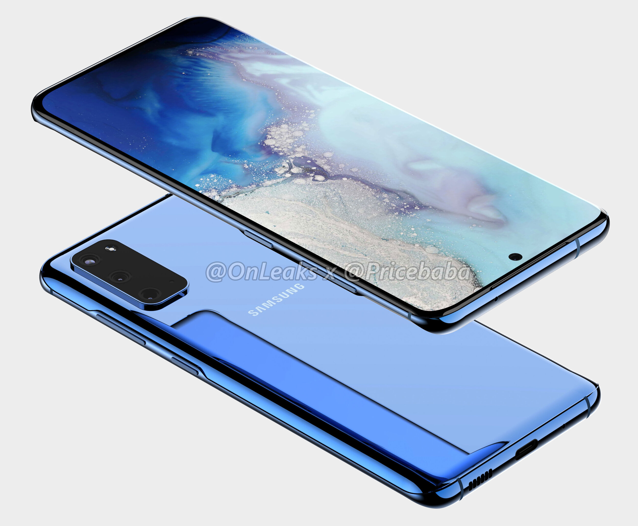
A concept render of the S11e (Source: OnLeaks & Pricebaba)

A concept render of the S11e (Source: OnLeaks & Pricebaba)

On November the 23rd, OnLeaks teamed up with Pricebaba to give us a first look at the Samsung Galaxy S11e, the lowest end model of the S11 lineup. As you can probably tell, the S11e is a gigantic departure from the S10e that we got last year. We no longer get thicker bezels and a flat display, but instead, some very thin bezels and a curved display as well. Then on the line of the display, the size of it got a pretty big bump, from 5.8 inches to 6.2, making the S11e even bigger than the regular Galaxy S10 was last year. The aspect ratio has also been increased to 20:9, from the previous 19:9. This means that it will be noticeably taller than the S10e. In addition, the camera cutout is now in the middle, similar to how it is on the Note 10, rather than to the right like the S10’s had it. We also seem to be getting a triple lens camera module, from the dual lens one that we had before. The Bixby button has been removed, so the only buttons that we now have are the power button and the volume buttons. Now, on the S10e we did have an fingerprint reader built into the power button, rather than the in-display fingerprint reader that the more expensive S10 and S10+ had. But I cannot see any fingerprint reader embedded into the power button, which means that the S11e will very likely get an in-display fingerprint reader. 

Also, I really really love this blue colour from OnLeaks’s render. Considering that it’s in the render itself, it’s very likely that this will indeed be one of the colour options that Samsung will have for the S11e. Personally, I actually think that that is my favourite shade of blue that I’ve ever seen on a smartphone. But of course that is just a render, so that shade of blue will most certainly look a bit different in real life.

So, the S11e looks pretty stunning. If Samsung prices this well, then this will be one of the best selling smartphones of 2020, because it just nails everything so so well.

Now, on November the 22nd, OnLeaks teamed up with another tech website, in this case 91mobiles and showed us the Galaxy S11, which would be the second offering in the S11 lineup. This is actually the one that we based our own concept on, and the S11 does have a few changes from the S11e. 

A concept render of the S11 (Source: OnLeaks & 91Mobiles)

A concept render of the S11 (Source: OnLeaks & 91Mobiles)

First, the bezels do appear to be thinner than on the S11e. Especially if you take a look at the side bezels, there seems to be a very noticeable difference there. In addition, the top and bottom bezels also appear to be a bit thinner than on the S11e. The edges do seem to be a bit more curved on the S11 compared to the S11e. Overall, while I think the S11e still looks amazing, design wise the S11 does have a slightly more modern design. 

Like the S11e we also get a larger display now with the S11. We get a 6.7” panel up from the 6.1” that the S10 came with, so that’s a gigantic increase in the display size. This makes the S11 even bigger than the S10+ was last year and actually the exact same display size as the gigantic S10 5G had. 

But then on the back is where we get the even bigger changes. Rather than three camera modules, we get five modules as the one on the bottom right is actually for the microphone. This means we get a penta camera module, and a microphone, and a flash all in that gigantic camera set up on the back. Personally, I don’t really have a problem with this as long as the camera quality is improved, and the good news is that it will actually be significantly improved! So the main camera module would be upgraded from the S10’s 12MP module to an insane 108MP one! This is Samsung’s latest and greatest smartphone camera sensor, at least in terms of resolution. This new sensor is quite massive not just in terms of the resolution but also in terms of its physical size. Compared to the previous sensor which measured in at 1cm diagonally, this one is 1.91cm, so pretty much double the size which could easily be the reason as to why Samsung has such a gigantic camera module on the back of the S11. But as most of you know, or at least hopefully know, that megapixels don’t means quality. They just mean more resolution so you can zoom in more, that’s it.

Think of a sensor as a chess board, a grid where the size of the board is the size of the sensor and each squares inside are actually the pixels. If you increase the number of pixels, you need to make them smaller, otherwise they won’t fit on the board. But here’s the thing, pixels capture photons or light particles and the larger the pixels are the more photons or light they can capture. Therefore, if you want a sensor to be good in low light you need to have a few mega pixels as possible, otherwise the pixels would be so small that they would barely be able to capture any light and the images would be extremely soft and blurry in low light. This is why high end phones such as the iPhones, the Samsung Galaxy phones, even the Google pixels have always had a 12MP camera, and why mid-range phones from Xiaomi, OnePlus, Oppo added 48MP, 64MP and now even 108MP modules with the Xiaomi Mi Note 10, because just having a larger mega-pixel count does make it sound better which is extremely important to have in the mid-range category, but that doesn’t necessarily mean that it is better.

So I am a bit worried in terms of the low light performance on the S11, considering that the Xiaomi Mi Note 10, which has the exact same 108MP sensor by the way, didn’t really have the best results in low light or even day light. What I mean by this is that if it was slightly cloudy, the results weren’t that great. So I do hope that Samsung optimises this heavily in software.

We’re also getting 8K video recording in up to 30 fps. Yes, 8K video on a phone, we barely even have any professional cameras that can do 8K and Samsung will be the first to support it on a phone! I guess that this is also a way for Samsung to promote and sell their new 8K TV’s now that they also have a phone that can film content for that TV.

Now, so far I’ve only talked about the main module, but we do have a few more modules. So the top and bottom ones would be the zoom and the ultra wide angle modules. The zoom module is actually expected to offer a 10x optical zoom, or lossless zoom, in combination with that 108MP sensor which is pretty impressive. We would then have a digital zoom of up to 50x, so this camera would be very similar to the zoom capabilities that we got with the Huawei P30 Pro. Then we also have two more modules which we don’t yet know what they are for. Some of you might think that they’re TOF, or time-of-flight sensors, similar to what the Note 10+ had, but you’ll see why that’s very likely not the case in just a bit.

So I personally think that one of them is a Macro lens, as quite a lot of mid-range smartphones did include a macro module in 2019, so I do see Samsung including one in the S11 as well and then the second one could be a depth sensor, for improving portrait mode photography with the back facing camera. So that’s what I think, and the reason why I believe that these are not TOF sensors is because OneLeaks also leaked the big S11+.

With the S11+ we get the same design on the front as the regular S11, just with an even larger 6.9” display, making this even bigger than the Note 10+, so this will be a mammoth of a phone.

A concept render of the S11+ (Source: OnLeaks & CashKaro.com)

A concept render of the S11+ (Source: OnLeaks & CashKaro.com)

Then on the back, the camera module itself will be even bigger than on the regular S11 and the camera modules themselves are arranged in a very different way than they are on the S11. We get five main modules, just like on the S11, but then we also get two dots which to me look to be either dual microphones or two TOF sensors. They’re a bit small to be time of flight sensors, but at the same time, there is no cutout in the glass itself for them to be microphones, so they could be either or. Now, when it comes to the front facing camera, this will very likely be upgraded to a 4K 60fps camera so that it matches frame-rate that the iPhone 11 Pro can do, as at the moment the S10 can only do 4K 30fps with the front camera.

The headphone jack will also be removed from the S11’s, just like with the Note 10+. This means that if you want to used wired headphones you would either have to use a dongle, which will probably not come bundled in the box, or you can also use wireless headphones such as the Galaxy Buds 2, which will also be launching alongside the S11. 

Speaking of sound, the top speaker grill is expected to be even thinner than on the Note 10+, which was absolutely minuscule. It was so thin you could barely see it and since the headphone jack is being removed we might be getting dual speakers on the bottom. However, on OnLeaks’s render we only have one speaker grill and one microphone port. In our render, we did add a second speaker grill though. 

Now as a complete 180 on all of that, IceUniverse who’s also a pretty well known leaker at this point, did say that OneLeaks’s rendeers are not 100% correct. He says that the final version will be more beautiful than this so we’ll have to wait and see. OnLeaks has had a very good track record in the past, so my guess is that it will the final design, it’s just that Samsung will be making some more tweaks here and there, until February, shrinking down the camera module a bit for example, or maybe even re-ordering the camera lenses, but the main idea of its design should be very similar to the one we’ve seen.

THIS is the Samsung Galaxy Fold 2!


Samsung is leading the innovation game when it comes to smartphones right now. The Galaxy Fold was one of the most innovative smartphones of the past 10 years, I’d actually go as far as to say that the Galaxy Fold is the most innovative smartphone since the iPhone came out back in 2007.

This is the first actual foldable phone, that came from a major smartphone manufacturer. A phone that’s technically a tablet and then folds in half into something that’s much more portable. Now, yes the Huawei Mate X is in many ways even more innovative but that’s not out just yet, so Samsung Galaxy Fold was and still is one of the most unique phones to ever see the light of day.

In fact, Samsung’s already working on the second generation Fold, the Fold 2 for a release in 2020, so get those snacks ready and here’s everything we know so far, about the Fold 2!


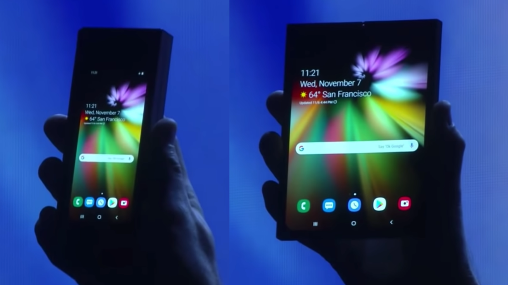
Ok, so the first Galaxy Fold was not a flawless product. It was first teased at Samsung’s Developers Conference, back in November 2018 and back then, we couldn’t really see much.

When it was first shown off, the design of the Fold was hard to determine thanks to the darkened stage

When it was first shown off, the design of the Fold was hard to determine thanks to the darkened stage

All that Samsung showed us was a phone that had a very small outer display that unfolded into a larger tablet. The issue with it was that you couldn’t really see anything in terms of its design, since I believe the Fold was in a case and the scene was made dark on purpose, so that you couldn’t really tell what Samsung’s new innovative phone was.

But this was something that was leaked and rumoured and hyped so much! We even made videos on this back in 2017, on the Foldable Galaxy X, and back then our concepts weren’t that great, but I think we’ve evolved a ton since. 

Anyway, a few months later and in February 2019, the  Fold was officially unveiled by Samsung. Full design, full specs and shortly after, reviewers have gotten their hands on it and they found out that it broke extremely easily. You see, since the display was made out of plastic, any dust or debris that got under the display, killed it off instantly. So Samsung cancelled the release, in order to redesign the Fold and they’ve made a few tweaks, they’ve tested it thoroughly and finally re-released it in September 2019, almost an entire year since the November 2018 tease. 

And the reviews have now been quite positive.  I mean, you could literally kill the display with your fingernail, since the display was still made out of plastic, but at least it now as more difficult for dust and debris to get under the display. This is thanks to that screen-protector layer that a lot of reviewers ended up removing, now being attached under the frame of the phone.

So so far so good, but now we’re in November 2019, just in time for Samsung’s 2019 Developers Conference and they’ve actually released a video titled “A New Form Factor for Foldable Smartphones”. This video is pretty much pointing at the next thing to come after the Galaxy Fold. The video starts with the Galaxy Fold but then they increase the display size and turn it into what looks to be a similar to our Galaxy S11 concept, where we have that very tall 20:9 aspect ratio display and just a central camera cutout. But what’s really interesting about this folding phone is that instead of folding horizontally like the Galaxy Fold does, it actually folds vertically. 

But probably one of the biggest differences is that instead of being a foldable tablet that folds into a phone, this is essentially a regular phone that folds in half, like those old clam shell phones did back in the days of OG cellphones. Now, this is a pretty interesting approach, because I personally find foldable tablets to more way more useful than foldable phones. I mean what would the point of the Fold 2 be, if it’s just a regular smartphone that folds in half? I guess the fact that you can hang up on phone-calls in a really cool way but aside from that, a foldable phone is actually worse from a functional standpoint than a non foldable phone. The reason I say this is because when you fold it in half, whilst you do decrease the height of it by half, but you also increase the thickness of it by two. So rather than having a long thin sheet of metal in your pocket, you would have a short and fat piece of meal and I’m personally not into that. 

However, it seems like there might just be a market for these types of devices.

The new Moto Razr of 2019 (Source: TechRadar)

The new Moto Razr of 2019 (Source: TechRadar)

Do you guys remember the famous Motorola Razr phone? That iconic clam shell smartphone that had a colour display on the back and an extremely thin form factor, for its time at least back in 2005. I never had one myself but I was in middle school back then and one classmate had one and I was always so interested in it, but my parents couldn’t afford buying me one so I never had one. This was back when Motorola was one of the best and most popular cell phone manufacturers. 

Well last week Motorola unveiled the new Moto Razr 2019 which is still a clam shell phone but with a more modern twist to it. So it now has a full-screen display and that’s the one that also folds now, pretty nuts when you realise how far we’ve come since. 

In my opinion, the Moto Razr 2019 is very close to what the Galaxy Fold 2 will look like. It will be a clamshell style foldable phone, rather than a foldable tablet like the Fold 1 was. However I actually do believe that this Fold 2 will not be called Fold 2 and instead something else. The Fold E or something along those lines. The reason for this is mainly because if you look back at Samsung’s teaser video, towards the end, they show both the Galaxy Fold 1 and the unreleased one as well, making me think that it won’t replace the current Fold but rather add onto the lineup.

I do think that this is a great choice! You see, by having two foldable devices, or even more if Samsung decides to expand on the lineup in the future, customers get even more choice at different price-levels as well. We all know that the Galaxy Fold is crazy expensive, at close to £2000 in the UK there’s not many people buying this. However, the Fold E or whatever this new fold will be called, should start at a much more reasonable price. The Moto Razr 2019 would cost $1500, compared to $2000 and even £2000 that the Galaxy Fold 1 costs. Therefore it would make a lot of sense for this Fold E to start from $1500 or so. 

News website, TheBell from South Korea which had some fairly good track record in the past when it comes to unreleased products, reports that the Galaxy Fold 2 is currently in development and uses the code name Bloom and that it will actually be released in April 2020.

And considering that the Fold that Samsung has teased looks pretty much identical to the S11 leaks, this could even be a variant of the S11. The S11 Fold? I think that’s a very plausible scenario, but that’s just my personal prediction but we’ll see if that turns out to be true.

Also the S11 event will be in late February, which will point to a March release for the S11, so April for the Fold E/S11 Fold doesn’t seem that unlikely either. 

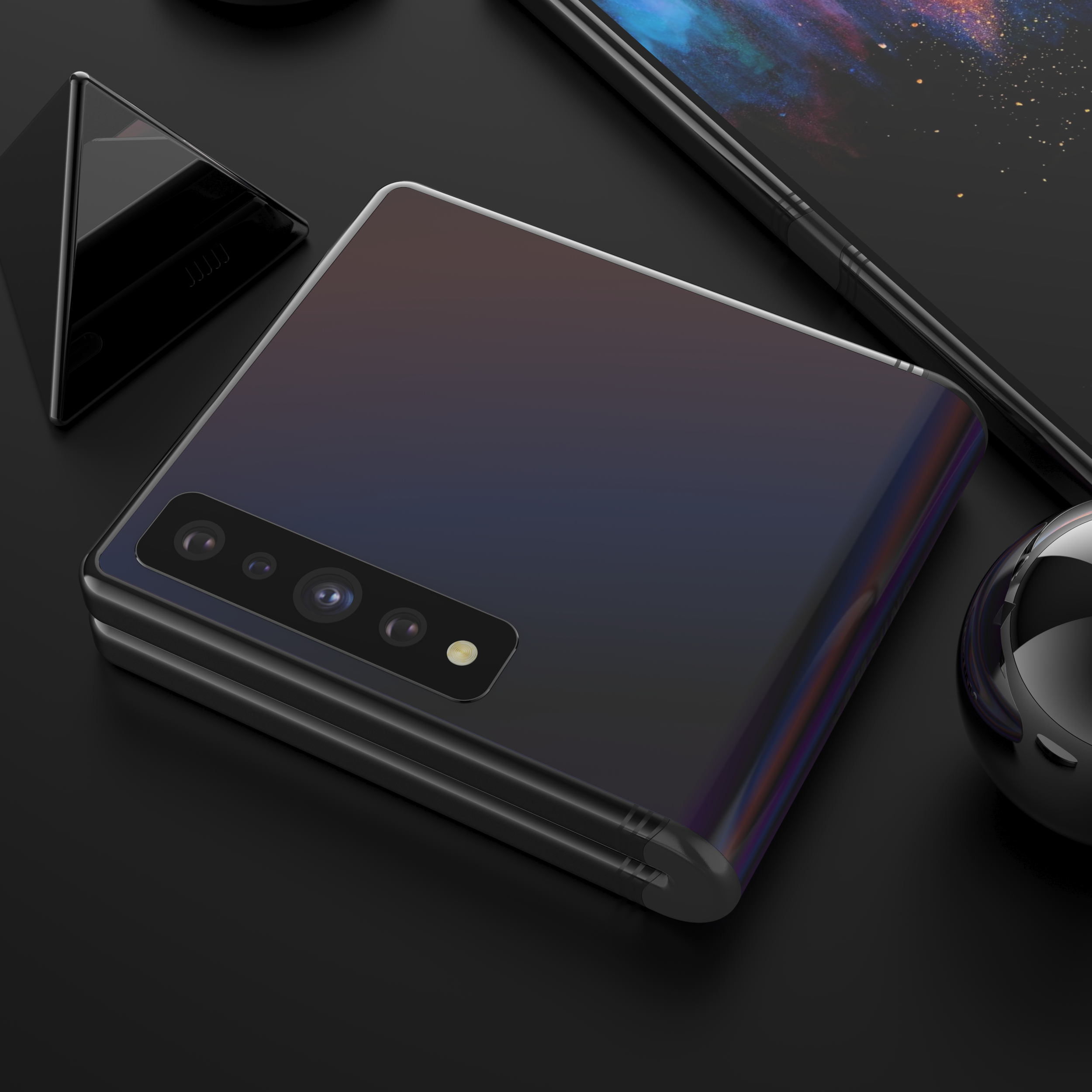
Our concept of the Galaxy Fold 2 showing the clam shell hinge idea

Our concept of the Galaxy Fold 2 showing the clam shell hinge idea

Now, we’ve actually made our very own concept of the Galaxy Fold 2, based on all the leaks that we’ve had and even one of Samsung’s patents that does shows a foldable clam shell style smartphone. We’ve based this off of the Galaxy S11+ design, that comes with a gigantic 6.9” display size, with that single camera cutout in the middle. We have new Quad-Camera module on the back, which now adds the brand new 108MP sensor, just like on the S11, and we’ve modelled the hinge in quite a unique way.

Rather than doing it like Samsung has done it with the Fold 1, we’ve done it in a similar way to how Motorola has done it with the 2019 Razr, where the mechanism is actually on the inside, and then it’s protected and sealed by this rubber hinge on the outside. This means that the phone still preserves its water and dust resistance, unlike the Fold 1 which lacked both of those. Also, this is the same style hinge that Samsung has in one of their Galaxy Fold patents that do show a smartphone that folds vertically. 

Now, comparing that design to the Moto Razr 2019, the Moto Razr does have a more usable design, as we do have another display on the back. Even though it’s a very small display, which is just being used for seeing incoming notifications and reading quick messages, at least you do have that. From the looks of it, the new version of the Galaxy Fold will not have any display on its back, however there are a few Samsung patents that do show this display folding both ways and that would be quite cool, being able to fold the fold on its back and have two mini-displays in this case. However, I dont see this having any major functionality for me at least, as I still prefer the idea of a foldable tablet, than a modern clam shell phone. 

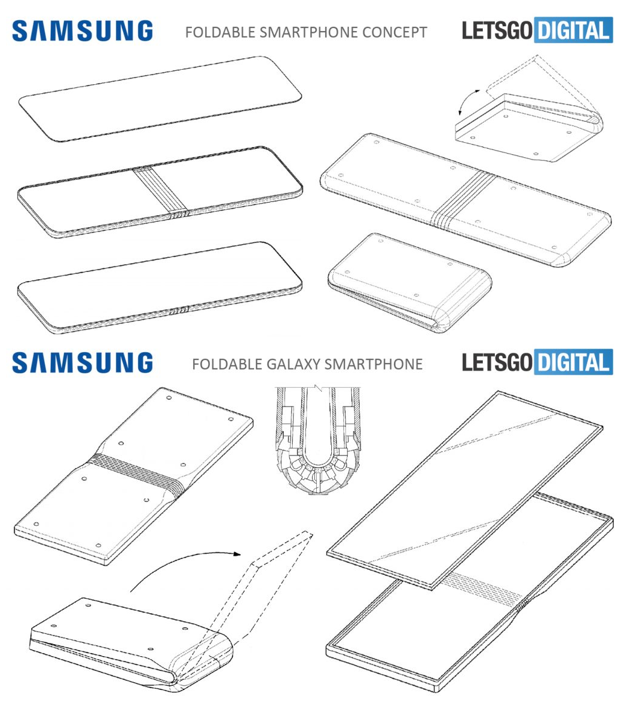
Now, interesting enough, there is a second patent that shows something completely different. This one was found by tech website LetsGoDigital and it shows what appears to be a foldable Galaxy Tab S rather than a Galaxy Fold 2. We have what looks to be a very big tablet sized display, with a fairly thick frame all across it, but I genuinely would pick this over the gigantic side notch that the Galaxy Fold 1 has, and we also seem to have a large display on the front to go with that.

The fold patents as seen on Letsgodigital (Source: Letsgodigital)

The fold patents as seen on Letsgodigital (Source: Letsgodigital)

We also have two more patents , also found by LetsGoDigital that show something similar to the Galaxy Fold 1. Just with a thinner notch, and even a massive display that would actually fold vertically, rather than having mostly the same functionality as the Fold 1 does. So judging by all of these patents, it seems like Samsung is experimenting with different approaches to folding phones. A foldable Galaxy S11, a foldable Galaxy Tab S, a Galaxy Fold that folds vertically and possibly some even more form factors that we haven’t yet seen leaked.

So I’m really looking forward to seeing more foldable devices. I do hope however that the industry doesn’t start making “cool” foldable phones like a clam shell phone is rather than truly useful foldable devices, like a foldable tablet would be.

Samsung Galaxy S11 - FULL Leaks and Rumors!


The Samsung Galaxy S11 is coming out in just three months, so we’re not that far away for the official release, and luckily the S11 will actually be one of the biggest changes that Samsung has ever made to their products! 

We’re getting some gigantic camera improvements, the displays are getting even better, alongside some unique and exclusive features.

So get that popcorn ready and here’s everything we know so far about the S11, on the Design, Display, Camera, Performance, Special Features, Battery, Release Date & Price!


DESIGN

Ok, so starting off with the design, unlike Apple Samsung is actually updates the design of their phones, every single year.

The big redesign is usually every two years, but we still get some small changes with every new generation. For example the S6 was the first Galaxy S smartphone that came with a premium build of glass on the front and back, and a metal frame. The S7 was a more refined version of the S6, the S8 had a brand new design, the S9 was a more refined version of the S8’s design with slightly thinner bezels, and the S10 was a brand new design once again. Therefore it makes sense for the S11 to be a more refined version of the S10, rather than a completely new design.

IceUniverse reported on the 27th of October that the design and configuration of the Galaxy S11 has been finalised and the leak season will now begin. 

BenGeskin’s S11 renders (Back) compared to the S10’s (Front)

BenGeskin’s S11 renders (Back) compared to the S10’s (Front)

BenGeskin posted a render of how the S11’s will compare to the S10, and as you can see, they’re taller than the S10’s and all of them have a single central camera module now, rather than the module to the right, that the S10’s had, and the dual camera module to the right that the S10+ had.

In terms of the models there will be three S11’s. So just like with the S10’s we would have the S11e, the S11 and the S11+. MySmartPrice reports, based on information received by leakster Ishan Agarwal, that the S11 and S11+ will come in Black, Grey and Blue, while the S11e will come in Blue, Grey and Pink. These are some very interesting choices. I’m quite surprised to see Samsung remove White from their offering, as White and Black have always been the default colours. Grey would probably be the one that would be the equivalent to the White colour the most. So I’m guessing that it would have some sort of shine to it, similar to the back colours of the Note 10, where if you look at it from an angle, it would turn into a different colour. I personally believe that all the colours on the S11’s would come with that glowing shimmer effect that changes based on how the light hits it. 

But that’s pretty much it when it comes to the design. We’ll have a very similar look to the S10’s, just longer, with a central camera module and no more headphone jack, but a 2nd speaker grill on the bottom instead. The microSD card slot will still be there as well.


DISPLAY

Moving on to the display, EvLeaks, one of the original leakers has posted some details about these.

Apparently, the S11e will come with a 6.4” display, the S11 will come with a 6.7” display, while the S11+ will come with a gigantic 6.9” panel. Now these are actually a very big jump from the S10’s, that came with a 5.8” in the case of the S10e, a 6.1” display in the case of the S10, and a 6.4” display in the case of the S10+. So it seems like the smallest S11, the S11e, will actually be bigger than the S10+.

Our renders of the S11 showing the new screen sizes

Our renders of the S11 showing the new screen sizes

Now, there are a few contradictory reports on the S11e’s display size, where some reports are saying that it will come with a 6.4” display, and some are saying that it would be a 6.2”. Evleaks even mentioned that himself. My guess is that it will be a 6.2” panel, otherwise the jump in the display size would be just too dramatic and people who just preferred having a smaller display, would be out of luck if that’s the case.

Now, the good news is that the phones will not be getting any wider, instead they will be getting taller. Luckily Samsung’s OneUI is actually optimised for one finger use, and having all the UI elements accessible from the middle of the display will help in making these gigantic S11 phones more easily usable. 

Now, because of that taller display, we will also be getting a wider aspect ratio of 20:9 compared to 19:9 which was what we had on the S10 and the Note 10. It won’t be as wide as the Sony Xperia 1, which has a 21:9 aspect ratio, but it will be close. This will make it much better for watching wide aspect ratio videos and movies, so I wouldn’t be surprised if Samsung launches their own Galaxy Movies store or something along those lines. 

The patent granted to Samsung for SAMOLED found by LetsGoDigital

The patent granted to Samsung for SAMOLED found by LetsGoDigital

But regardless of that, Samsung will very likely call this display AMOLED Cinema or something along those lines. Now, LetsGoDigital actually found a patent that Samsung had just been granted this week, on a display called SAMOLED. Samsung already has their Super AMOLED branding, so this could either be a new branding, or it could just be Samsung next generation of displays. We’ve seen the current generation being introduced with the S10, and this generation featured a much higher brightness of over 1000 nits alongside a physical cutout in their display, for the camera module. The Note 10+ featured the Samsung generation of AMOLED panel that the S10 had and even the iPhone 11 Pro’s had the exact same panel.

Now, EvLeaks has also stated that all three models will have curved-edge displays, unlike the S10e from last year which was the only one with a flat panel. And the bezels are also getting thinner this year, even thinner than the ones we had on the S10. The S11e will probably have thicker bezels, at least when it comes to the top and the bottom ones, just so that it looks more inferior to the S11’s considering the lower price that the S11e will have. 

CAMERA

Now, when it comes to the camera this is actually where the biggest change will be. 

In our Samsung Galaxy Note 10+ Review, I did mention an interesting fact that not a lot of people seem to have been aware of, which was that the fact that Samsung has actually had the exact same sensor specs, since the Galaxy S7. Yes, Samsung did indeed have the switchable aperture with the S9, and the dual and triple lens camera module with the S9 and the S10, but the main module has actually remained the same since the S7 from 2016.

The headline from Samsung’s Newsroom reporting the 108MP sensor (Source: Samsung)

The headline from Samsung’s Newsroom reporting the 108MP sensor (Source: Samsung)

However, in August 2019, Samsung has unveiled their brand new 108MP smartphone sensor which is actually a very big deal. Not only does this have some insanely high level of detail with nine times more resolution than the current 12MP sensor, but the sensor itself it 1.91cm In size, compared to the 1cm sensor that we had before. So this sensor is almost twice the size of the current one and it does need to be bigger, because otherwise the pixels would be so small in that 108MP sensor, that low light shots would look unusable. 

This is actually pretty much confirmed at this point. XDA developers have even found code in the OneUI 2.0 beta, specifically in the Samsung camera app itself that shows support for a resolution of 12000x9000 photos, or 108MP photos if you do the math, and also support for that 20:9 aspect ratio that I was talking about before.

Now the only question that remains is, is Samsung going to use this 108MP module as the main module, or are they going to use it as a secondary module? Well, realistically they will probably use it as the main module, but I’m keeping my hopes high that Samsung will actually just use it as a secondary module and still keep a 12MP main module for low light shots. I only say this because the 108MP sensor will be noticeably worse in low light than even the Galaxy S7, unless of course Samsung does some magic in software and they release a new night mode, specifically designed for this new 108MP sensor. 

Our concept showing the 108MP sensor integrated into the 4 camera module set up

Our concept showing the 108MP sensor integrated into the 4 camera module set up

On our concept, we actually added the 108MP module as an extra module, meaning we’d have four modules; the 12MP night mode module, the zoom module, the wide angle module, and the 108MP module

Also, just so that you’re aware, you won’t be taking 108MP photos with this camera. You will very likely be able to do that in the Pro-Mode, but regular shots will just use that massive sensor to capture more detail and the final image would still be around 12-16MP. Otherwise, taking 108MP photos will just murder your storage. 

But apart from that, now would also be a really good time for Samsung to add 6K or even 8K video recording to this, as the CPU does indeed support that. This would definitely the biggest camera change that we’ve ever had in a Samsung phone.

And we have seen some reports that the zoom capabilities would be greatly improved as well, with possibly a 3x optical zoom camera from the 2, and the remaining zoom would be achieved with that 108MP sensor, which means you will have around a 10X lossless zoom and even up to 30-50X with digital zoom, so very similar to what Huawei did with the P30 Pro.

When it comes to the Front Camera, if you’re worried about the lack of a depth sensor that the S10+ had, you don’t need to worry about that, since the Note 10+ had pretty much the same quality front portrait mode shots as the S10+ did, with just a single camera.


PERFORMANCE

Now, when it comes to the Performance, same as before, we’ll be getting two different CPU modules.

The US & Canada variants will come with the new Snapdragon 865, while the International models will come with the Exynos 990.

The Snapdragon 865 hasn’t been officially unveiled just yet, it’s expected to be unveiled in early December, but according to the leaks the CPU performance will be increased by 20%, while the GPU will get a 17% to 20% bump from the 855, so that’s an even smaller jump from the 855+.

The Exynos 990 is essentially the 9830, just with a different name. Now this one has been officially unveiled and it does support up to a 108MP camera, up to 8K30 video recording, as well as LPDDR5 memory. 

Now, Samsung will be dropping their custom Exynos cores from future Exynos processors, but that’s a story for a whole different article.

RAM wise, 12MP of RAM is pretty much what the S11+ will come with and then 8GB and 6GB are expected on the S11 and S11e.

SPECIAL FEATURES

So aside from the camera and display, there’s not a lot else in terms of special features.

We are getting 5G once again and EvLeaks reports that the S11e and S11 will come in both 4G and 5G variants, while the S11+ will only come with 5G. This means that the S11+ will be one crazy expensive phone.

The headphone jack is likely to be removed from the S11, but that will mean an extra speaker grill

The headphone jack is likely to be removed from the S11, but that will mean an extra speaker grill

The headphone jack is being removed, just like on the Note 10. Unfortunately, with the Note 10, we didn’t get any headphone jack adapter in the box. I really do hope that Samsung does include one with the S11, especially since the Galaxy S series is more popular. Otherwise, you’ll have to buy a separate adapter yourself, or stick to wireless headphones. Speaking of wireless headphones, Ishan Agarwal reported for mysmartprice that the Galaxy Buds 2, with the codename R175, are in development and that they will come in Blue, Pink, Black and White. I do hope that Samsung adds Active Noise cancellation to the Galaxy Buds 2, so that they can compete with the AirPods Pro’s, fingers crossed that they also keep the same price, in that case they would be by far the best wireless headphones on the market. 

Even if we do lose the headphone jack, we do get an extra speaker grill, so the sound quality would be further improved with the S11.

And finally we haven’t included this in our concept but the S11’s will very likely feature the same TOF depth sensor on the back, just like the Note 10+ did. This is for improving the portrait mode photography with the back camera and for AR.


BATTERY

The battery likely for the new S11 (Source: SafetyKorea)

The battery likely for the new S11 (Source: SafetyKorea)

It does seem like we would be getting some very big improvements to the battery. GalaxyClub found a listing on SafetyKorea of a few unreleased Samsung smartphone batteries, and they have the model number ‘EB-GB980ABY L’, which could really be any Samsung phone to be honest. However, when you consider the S10 model numbers, these were SM-G970, 973 and 975. So it would make a lot of sense for the S11e’s model number to be SM-G980, and in that case this battery leak would be for the S11e.

And this appears to be a 4000mAh battery, which would be a gigantic leap from the 3100mAh battery that the S10e had, which means that the S11+ should approach 5000mAh. 

Now another improvement that’s we’ll see here is the SuperFast charge that the Note 10 got. The 45W fast charging which is the fastest fast charge on any smartphone to date.


RELEASE DATE

In regards to the release date, the unveil would be as usual in Mid-Late February, while the delivery and the in-store release would be in early March. This has been confirmed by EvLeaks as well.

PRICE

And finally, when it comes to the price, these would not be cheap phones by any means. 

The S11+ should cost around the same as the Note 10+ does now, so $1100 if not even $1200. While the S11 should be around the same price as the S10+, so $999 and the S11e should be around $650, $100 more than what the S10e costs. The prices haven’t been leaked, these are my personal predictions based on what Samsung has priced their phones in the past. 

So if you don’t care about the camera that much, and you don’t need that insane new 108MP sensor, then picking up an S10 or an S10+ is actually a very good idea. They have the same design, mostly the same display and an even smaller form factor. 

Note 10 Plus FULL REVIEW - The Best Tech Product of 2019!


Every few years there’s this one product that comes out that changes my perspective on tech entirely. You see tech today, mostly smartphones, are quite boring. They all look almost the same, they do the same things, and after using so many smartphones over the years, it’s become quite rare for me to get excited and truly enjoy using a new smartphone, like I used to when I got my first iPhone the 3G, or my Galaxy S4 or my 2013 Retina MacBook Pro. Those were devices that I’ve enjoyed using so much.

But nowadays it’s very hard for me to get excited and hyped about new smartphones, since nothing really changes. However the Note 10+ is a bit of a different story. This has been for me, by far the most enjoyable smartphone I’ve used in years and the second most enjoyable piece of tech of 2019 for me, right after the Oculus Quest.

So, get some popcorn and drinks ready and here’s my full in-depth review of the Galaxy Note 10+, after two months of use, as my daily driver.


DESIGN

Ok, so starting with the design, the Note 10+ is by far my favourite looking phone ever! I’ve enjoyed using the S10+ a lot, and even that was my daily driver for around 2-3 months, until the OnePlus 7 Pro came out but the Note 10 for me at least, looks so much better.

A design comparison between the Note 10+ (Left) and S10+ (Right)

A design comparison between the Note 10+ (Left) and S10+ (Right)

It’s got a more squared off design when compared to the S10+, even thinner bezels, and a smaller camera cutout. It just looks about a year ahead of the S10+ in terms of the looks, even though it only came out five months after. 

Then if you compare it side by side to the iPhone 11 Pro Max, the Note looks about two years ahead in terms of the design! There’s no notch, much thinner bezels on the sides and the top, and the bottom ones are almost identical as well. 

I would say that the only phone on the market right now that might look better than the Note, at least for me, is the OnePlus 7 Pro and the OnePlus 7T Pro. These phones have no camera cutout at all, but they do have slightly thicker bezels all around the phone. 

So design wise, I’m very much into this phone. It is a bit uncomfortable to hold and use, I can definitely say that. You see, because of the squared off shape the corners of the phone will feel a bit sharp in your palm, when compared to the corners of the S10+ for example, which are more rounded.

Add that massive 6.8” display to this and you can probably tell that the Note 10+ is closer to a small tablet in size. It’s definitely the biggest phone that I have ever used and I actually love it! Clearly not a one-handed smartphone but for viewing content and productivity, this is the best one there is.


DISPLAY

Speaking of viewing content, let's talk about the display.

The Note 10+ comes with a gigantic 6.8” display, which is also Samsung’s latest generation of AMOLED panels for smartphones, which is actually the same display generation that the iPhone 11 Pro Max also uses. It’s a 3040x1440 resolution panel, with a 498 PPI so it’s very sharp. It supports HDR10+ and full DCI-P3 coverage, and it’s honestly the most gorgeous smartphone display that I’ve ever seen.

Outdoor screen brightness comparison between the iPhone 11 Pro Max (Left) and Note 10+ (Right)

Outdoor screen brightness comparison between the iPhone 11 Pro Max (Left) and Note 10+ (Right)

Now displaymatte actually gave the crown to the iPhone 11 Pro’s display, which does indeed get brighter outdoors in direct sunlight, when compared to the Note. And same goes for manual brightness you can bump the iPhone 11 Pro higher than you can with the Note. But they both go up to around 1200 nits when playing HDR content, so that’s all good. 

However, I can honestly tell you when seeing both in person, indoors at least, the Note 10+’s display does look better. The colours are punchier, and whilst the brightness is lower than on the iPhone it’s not that noticeable indoors as it is outdoors. When you also add in the fact that you can watch videos on YouTube in higher than 1080p, which you cannot do on the iPhone, makes the Note 10+’s display for me at least, the best display on any smartphone for watching videos and reading content. 

We’ve actually bought a professional display colour calibration tool and here are the results that we got out of the Note 10+’s display. On a white surface with a maxed out manual brightness, we got 349 nits, while on the exact same image on the iPhone 11 Pro Max, maxed out brightness again, we got 524 nits.

When it comes to the camera punch hole, I honestly forgot that it was even there after about 10 minutes or so of use, so honestly don’t worry about it. I even like it more than on my S10+ since it’s smaller and also centred and Samsung and the Community have made some amazing wallpapers just for Note 10!

CAMERA

Now, when it comes to the camera it’s pretty good! It’s definitely in the top 3, right after the iPhone 11 Pro’s camera.

So it’s got three lenses on the back; a regular module, a zoom module, and a wide angle module. As well as some extra features which I’ll cover in the Special Features section of this video. I won’t go into too much detail here as we’ve already done two insanely detailed camera comparisons between the Note 10+ and the Pixel 4, the iPhone 11 Pro Max and the OnePlus 7T Pro, the most recent of which I’ll link right here.

And those include thirty individual test categories, each with multiple camera samples ranging from; macro Shots, to HDR front and back, stabilization in 4K, stabilisation with the wide angle, portrait mode, slow motion, timelapse, panorama, night mode, night mode with zoom and night mode with telephoto and many more. So if you do want to see how this camera performs, do check those videos out!

But long story short, it’s got the second best video recording capabilities in the phone, right after the iPhone 11 Pro Max. So It cannot do 4K 60 with the wide angle lens or 4K 60 with the front, but other than that, this is an amazing camera.

The wide angle is even better than on the iPhone, mostly because it bumps the highlights, shadows, and the vibrancy even more and for me at least, the images were slightly more pleasing to the eye. Night mode shots were very good, not as good as on the Pixel 4 or iPhone 11 Pro but pretty close. It definitely has the best portrait mode when it comes to the background separation, thanks to the extra TOF sensors, which I’ll cover more in just a bit. Where the Note 10+ excels is really just regular photos. HDR shots taken indoors and outdoors are just stunning, so if you care a lot about the camera the Note 10+ will not disappoint.

You can see an example of each of these below:

The only disappointment that I do have with this camera is that it’s very similar to the S10. Aside from the zoom module which now has an f/2.1 aperture from the f/2.4, the main camera is the exact same camera as on the S10, which fun fact, was the exact same camera as on the S9, and the S8, and the S7. I mean yes, Samsung has released brand new image sensors for these phones and they have improved the image processing over the years, so the pictures have improved from each generation, but the sensor specs have remained exactly the same since the S7. We have the same 12MP resolution 1/2.55 inch sensor with 1.4 micron sized pixels, with dual pixel technology on the sensor for focusing.

However there are rumors that are suggesting that Samsung may release a new generation of cameras with the Galaxy S11. Therefore if you’re holding off getting a new phone, and camera is your number one focus, the S11 will be a pretty big jump in camera quality from the Note and you should wait for that.


PERFORMANCE

Ok, so now, what about the performance? Well, it’s pretty good for the most part.

The Exynos 9825 chip is new to the Galaxy line, as the S10 came with the 9820 (Source: Digital Trends)

The Exynos 9825 chip is new to the Galaxy line, as the S10 came with the 9820 (Source: Digital Trends)

We have pretty much the best specs you can have on an android phone today. We have the Exynos 9825, which is actually a brand new processor from the 9820 that we got with the Galaxy S10 just five months before. So this is now based on a new 7nm process now and in benchmarks at least, this is the processor that scores the highest, in an android phone at least.

Now, if you get the US variant of the Note 10, it will come with Snapdragon 855 and interestingly enough not the 855+ like it was rumoured to come with, and like what the OnePlus 7T & 7T Pro come with, which is a bit of a let down. But the 855+ is just an overclocked 855 anyways, so you’re not really missing out on much.

We also get 256GB of storage as the baseline model and 12GB of RAM by default which is just nuts on a phone! RAM management on this has just been incredible. In a lot of cases, I opened an app that I had open a few days before and it was still there perfectly loaded in the background and perfectly usable!

So I’m very impressed with the RAM management and overall performance on the Note 10, however it’s not perfect. I did have quite a few stutters and app crashes on my Note, definitely way more than I’ve had on my iPhone or Pixel, but the thing is that this phone comes with so many features, that a few crashes and slow downs here are there, are passable for me at least.

SPECIAL FEATURES

Apps Edge on the Note 10+ allows you to quickly access your choice of apps

Apps Edge on the Note 10+ allows you to quickly access your choice of apps

First off, Samsung’s skin OneUI is just amazing! Design-wise, I like it the most out of any other Android Skins, even more than OnePlus’s OxygenOS or the Pixel Launcher. The reason for this is mostly because it looks very clean and it also offers a lot of customisation. Aside from changing the icons, the text font, the wallpaper to an actual video, and even the always on display style, something that as far as I’m aware no other launcher can do, is having app folders inside of Apps Edge. This means that you can essentially have an iPhone style home-screen in the app drawer, while keeping your home-screen very very clean.  And you also have this edge panel which allows you to easily access apps and tools, with a swipe from the right side of your screen. Some people might call this a gimmick but personally, I actually ended up using this feature a lot, keeping most of my delivery apps there, my alarm, and the apps that I use quite frequently that I just don’t want to have on my home-screen. Samsung has also sped up their update cycle quite a bit. OneUI 2.0 is coming very soon, with Android 10 support, and the Beta is already out on the S10. This means that the S10 and the Note 10 will then be the world’s third manufacturers to release Android 10, right after Google and OnePlus, which is pretty amazing to hear, especially when it comes to a Samsung phone.

But it’s not just that, we also get a ton of special features that we don’t really get on many other phones.

We do have an always on display which Apple still lacks on the iPhone, and this is also noticeably better than Google’s always on display, since it does give you a ton of more customisation options. 

We also have a microSD card slot for adding even 1TB of extra storage to this, for a total of 1.5TB which is just a complete overkill on a phone but hey, if you store a ton of games and have all of your movies locally, then the Note is the perfect phone for this.

The Note also comes with reverse wireless charging, which allows you to now only charge another phone from the back of it but also charge wireless accessories such as the Samsung Galaxy Buds, or even the AirPods, from the back of the Note 10. What’s ironic is that you cannot do this if you have AirPods and the newest iPhone 11 Pro. 

Speaking of wireless, one of the new features that the Note 10+ comes with is WiFi 802.11ax, also known as WiFi 6, which is pretty huge. WiFi 5 or 802.11 ac, which is the current standard that most devices use, launched back in 2014, so there’s a 5 year technology leap in between the two. WiFi 6 gives you a theoretical speed of up to 9.6Gb/s or 1.2GB/s which is just incredible! But the best part about WiFi 6 is that if you have a lot of WiFi 6 enabled devices, and a WiFi 6 router as well, they will manage themselves much better than WiFi 5 could and pretty much get rid of any traffic congestion entirely.

Along with improved speaker quality, the water resistance is still here, with IP68 certification for up to a 1.5m submersion up to 30 min. I’ve taken multiple Samsung phones with me to the seaside and the pool and I’ve never had an issue with any of them breaking but if they do break from water damage, do keep in mind that this isn’t covered under warranty. 

Now aside from these features, there are three more that are unique to the Note and these three are the features that truly make the Note a one-of-a-kind phone.

The S-Pen is certainly a useful tool but may go unused after a while by some consumers

The S-Pen is certainly a useful tool but may go unused after a while by some consumers

The first one being of course the S-Pen. This is the built-in stylus that Samsung has in their Note line of smartphones, and this year it gets an accelerometer and gyroscope so that you can control some apps, such as the camera app, with gestures in the air, which is pretty cool. But honestly, I found myself not using the S-Pen after the first few days, mostly because of the app support. Don’t get me wrong, it’s not bad but if you want to use the S-Pen to its fullest you need to use Samsung Notes. The problem here is that it only works on Android, so no desktop or cloud app for your laptop or tablet, and it only works on Samsung devices. Which kinda turns the Note 10 into a physical notebook, where you only have your notes on that specific device. You can still use the S-Pen in OneNotes or Google Keep, but it’s just not as fluid and the functionality is still far better with Samsung Notes. Also since I’m always much faster at taking notes with a keyboard than I am with a pen, I found myself avoiding to use the S-Pen unless I was editing photos. For me, this has been by far the best functionality of the S-Pen. If you use it in Lightroom and Photoshop Express for masking things, making a selection, or even just adjusting the highlights dial for example it is such an amazing thing to have right in your pocket! 

The second big new features is that TOF (time-of-flight) sensor right next to the camera, which allows the Note to not only take some amazing portrait mode shots, like I mentioned before, of both people and objects, but you can also use it to 3D scan objects. This is a very cool thing to do but it doesn’t really work that well, and same as the S-Pen, I only found myself using this once or twice and never used it again since. 

But the third unique feature is pretty big, and that is DeX! When you connect your Note 10 to a monitor via USB C, it will actually boot into a desktop UI mode, and then you can connect a mouse and keyboard and literally use this similar to how you would use a Windows PC. You have full access to desktop apps such as Microsoft Office and Google Chrome so that’s pretty amazing! So if you’re the kind of person that mostly uses their smartphone and doesn’t really need a full laptop or a desktop PC, then getting a Samsung phone with DeX is a pretty good option. All Samsung phones from the S8 onwards do support DeX, although the S8 and Note 8 do need a separate dock.

But the Note 10 can actually do an extra thing that previous Samsung phones couldn’t. You can now connect it to your laptop as well, and open up the DeX UI on your laptop. Personally, I don’t really get the point of you doing that since one, you do need a cable and two, the whole point of DeX is to turn your smartphone into a PC. But if you’re already carrying a PC then what’s the point? But if you do care about this feature, the S10 did get a recent update to support this as well! 

So as you can see, the Note 10+ is packed with features! There’s not a single smartphone on the market that has more features than this phone does, and while some of them are indeed gimmicks, like drawing with the S-Pen in AR, at least you do get a ton for what you’re paying for! 

Now Samsung has actually removed the headphones jack from the Note 10, making this their first major smartphone to lack the 3.5mm jack. For me this hasn’t really been an issue at all, since I do use wireless headphones all the time, but I do see why some people might be outraged especially when Samsung didn’t include a 3.5mm to USB-C adapter in the box, meaning you do have to buy it separately now. 

BATTERY LIFE

So with all those special features in mind, the huge display on this thing, and the internals, how is the battery?

Well it is actually pretty great! The Note 10+ comes with a 4300mAh battery and it can easily last me through a full day of use, unless I’m travelling. When I’m travelling I’m always on my phone and I haven’t found a phone yet that can last me a whole day in that case. But for my day to day use, the Note 10+ can even last me two days, so it’s been pretty amazing for me.

We also have a much faster fast charging of up to 45 Watts! Yes, the Note 10+ has the fastest charge on any smartphone on the market right now! Now out of the box, we do not get that 45W charger, so you need to buy that separately from Samsung, but we do get a 25W fast charger which can charge the Note up to 50% is just about 30min which is pretty amazing. You can get a full charge in around an hour and twenty minutes or so. With that 45W charger you get a full charge in around forty five minutes or so from what I’ve seen.


VALUE

So in the end is the Note 10+ worth it?

Well, the Note 10+ costs £1000 or $1100 in the US, which is actually the exact same price than the iPhone 11 Pro Max starts at. However you get so much more with the Note, the 256GB compared to the 64GB of storage, as well as microSD card expansion. 12GB of RAM compared to 4GB. A larger display, and the ability to play 4K videos on YouTube compared to just 1080p. The S-Pen, reverse wireless charging and so much more, the Note 10 is the true Swiss army knife of smartphones, and I would recommend this to anyone who wants the ultimate experience in a smartphone! 

Samsung does have the smaller Note 10 variant which I didn’t really talk about since the true new Note this year is the Note 10+.

Pixel 4XL vs iPhone 11 Pro Max vs Samsung Galaxy Note 10+ vs OnePlus 7T Pro - Blind Camera Comparison!


The Google Pixel 3 had some of the best camera abilities on a smartphone at the time of its release. Now the Google Pixel 4 has an additional lens on the back and one less on the front.

We compared it to the most recent releases from Apple, Samsung, and OnePlus to see how it would compare. You can check out our full blind camera comparison above, but here are a few of the shots from the test. Let us know which ones you prefer and why in the comments!

Also, the order of the phones in this article are not the order of the phones in the blind comparison.


FRONT CAMERA - WIDE SELFIE

OnePlus 7T Pro

OnePlus 7T Pro

Samsung Galaxy Note 10+

Samsung Galaxy Note 10+

Pixel 4XL

Pixel 4XL

iPhone 11 Pro Max

iPhone 11 Pro Max


REAR CAMERA - PORTRAIT MODE

OnePlus 7T Pro

OnePlus 7T Pro

Samsung Galaxy Note 10+

Samsung Galaxy Note 10+

Pixel 4XL

Pixel 4XL

iPhone 11 Pro Max

iPhone 11 Pro Max

REAR CAMERA - HDR (High Dynamic Range)

OnePlus 7T Pro

OnePlus 7T Pro

Samsung Galaxy Note 10+

Samsung Galaxy Note 10+

Pixel 4XL

Pixel 4XL

iPhone 11 Pro Max

iPhone 11 Pro Max


REAR CAMERA - ZOOM

OnePlus 7T Pro

OnePlus 7T Pro

Samsung Galaxy Note 10+

Samsung Galaxy Note 10+

Pixel 4XL

Pixel 4XL

iPhone 11 Pro Max

iPhone 11 Pro Max

REAR CAMERA - FOOD

OnePlus 7T Pro

OnePlus 7T Pro

Samsung Galaxy Note 10+

Samsung Galaxy Note 10+

Pixel 4XL

Pixel 4XL

iPhone 11 Pro Max

iPhone 11 Pro Max


REAR CAMERA - ASTROPHOTOGRAPHY

OnePlus 7T Pro

OnePlus 7T Pro

Samsung Galaxy Note 10+

Samsung Galaxy Note 10+

Pixel 4XL

Pixel 4XL

iPhone 11 Pro Max

iPhone 11 Pro Max


So which one did you like overall? Don’t forget to watch the full camera comparison to make your full decision, as there are 30 different tests for each camera!