iOS 14

iOS 14 Review - Biggest Change Since 2007!

Every year in June, Apple announces a new version of iOS, iPadOS, watchOS and macOS. We also have tvOS but come on, no one really cares about that.

This year, we had a few leaks that iOS 14 would bring a new Fitness App to the table, alongside possibly a new list view for the Home-Screen, but that was pretty much it. However, it turns out that iOS 14 is actually pretty much the biggest change that the iPhone has had since the introduction of the very first iPhone, back in 2007. This version of iOS (4) brought the ability to change the Wallpaper, as well as multitasking support. Then, iOS 7 redesigned the whole look and now iOS 14 allows you to have more than just Icons on the Home-Screen. 

It introduces Widgets and an App Library UI, amongst many massive features, making it a gigantic update. I’ve already covered over 40 big changes in our previous video, but now that I actually got a chance to use iOS 14 on my actual iPhone for a few days, I wanted to talk about my personal experience and how it actually is to use iOS 14, iPadOS and watchOS 7. So, without further ado, here is my iOS 14 experience!


iOS 14

Starting off with iOS 14 and the biggest feature that we got were the Home-Screen Widgets.

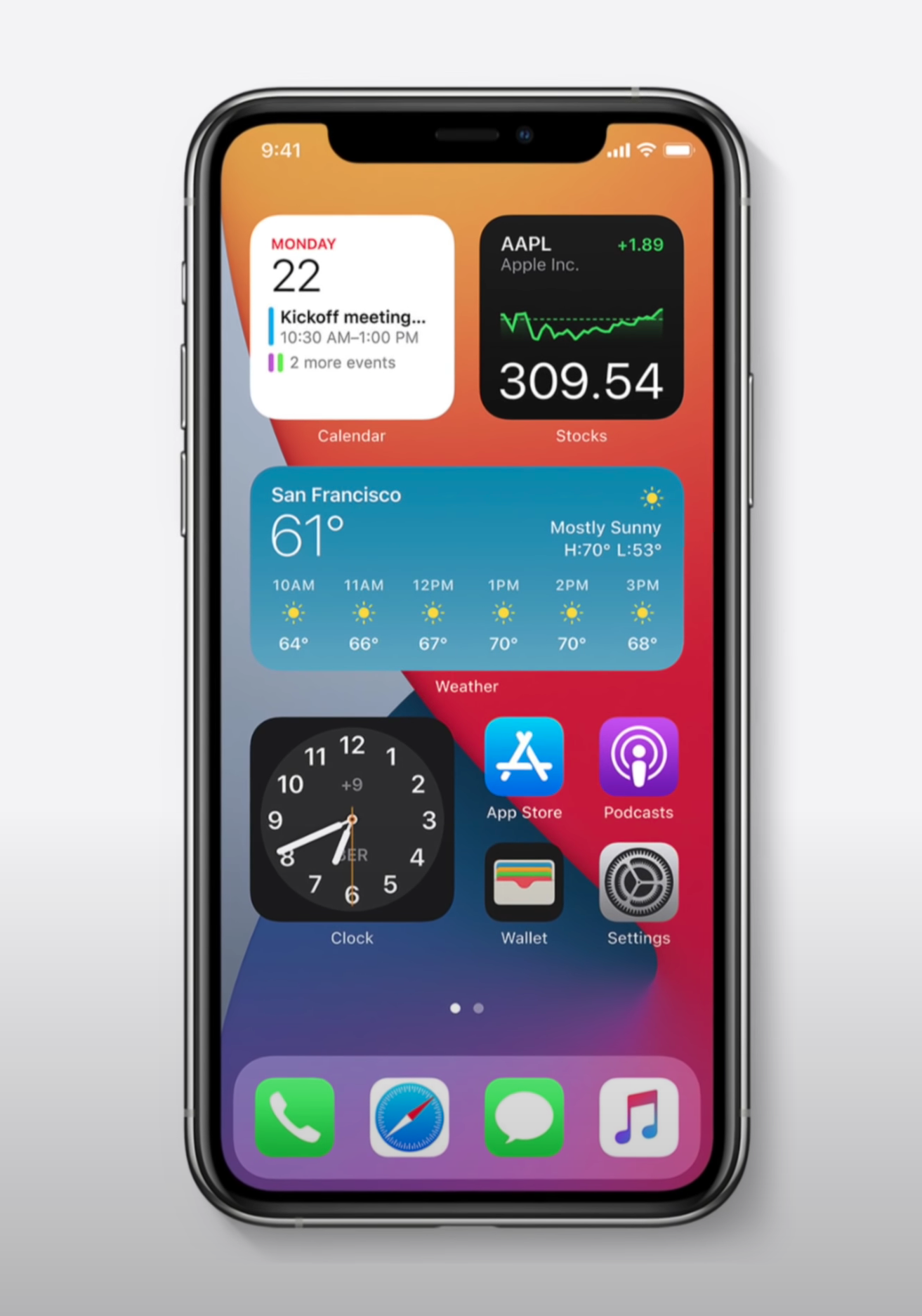
Now, we did kind of have Widget support with iOS 8, which came out in 2014. But these Widgets were only viewable in the Notification Centre. In more recent versions of iOS, you had to swipe right from the Home-Screen in order to see them, which was not that convenient. But now with iOS 14, you can place Widgets pretty much anywhere you want on the Home-Screen, which reminds me of Android.

This is so much cleaner, on the face of it.

This is so much cleaner, on the face of it.

In fact, Widgets support has been my number one most requested feature in iOS and it’s been one of the major reasons why I keep gravitating towards Android, whenever a major new device comes out. However, unlike on Android where you can basically place a Widget anywhere you want, on iOS they work in the same way as Apps do. They still magnetically attach to other Apps, which means that you just cannot have Widgets on the top, empty space in the middle and Apps on the bottom. You can only place Widgets where you already have Apps, which is a bit of a bummer.  

Also, you always need to have two rows of Apps between Widgets. For whatever reason, you just cannot have one single row, probably because Apple is using a 4x4 App Square for each small Widget. Something cool that I’ve noticed is that now you can just hold your finger anywhere on the Home-Screen to activate the Jiggle Mode, this is what it’s called internally. You also get this nice Haptic Response when you’ve done that. 

In order to add Widgets, you just press on the ‘Plus’ Button in the top right corner, you then get a bunch of automatic Widget suggestions, based on the Apps that you use the most. Once you scroll down, you get to this list of all the Apps that support Widgets. Since the Widget system has been completely redesigned in iOS 14, Apps will need to implement these Home-Screen Widgets, which is the reason why right now, only a few First-Party Apps support them. But then, it’s pretty straight forward. You select a Widget and then you get to choose between three or even four different sizes, in the case of Notes. Unfortunately, you cannot resize a Widget once you’ve placed it. In order to change the size of it, you’ll have to remove it and add it again. 

Now, if you choose to go for a small Widget, then that Widget would not be intractable. The moment you tap it, you would be taken to that App. Whereas if you have a larger Widget, with more UI elements, then you can click one of those elements to get taken to that specific function in the App. You can also hold on a Widget and then edit it with things such as changing the location that the Weather App shows you, the Note that’s currently displayed in the Notes Widgets and so on. 

You can also drag one Widget on top of another, to have a stack of multiple Widgets that you scroll through. It might be useful for some users, but for me personally, I like having all my information visible at a glance. I do prefer having all of my Widgets un-stacked and visible all the time.

Yes, ‘Jiggle Mode’ is the actual term for it.

Yes, ‘Jiggle Mode’ is the actual term for it.

Overall, I really do like the Home-Screen Widgets a lot and I just cannot wait for more Developers to start creating their very own Widgets. I predict that I would be changing my Home-Screen almost daily when that happens, by playing around with different Widget layouts. But unfortunately, Widgets are far from perfect. 

You cannot position them anywhere on the Home-Screen, for some reason Apple still kept the previous Widget View from iOS 13. Meaning that you can still swipe right from the Home-Screen and get this very long scrollable list with all of your Widgets. I just think that they should remove this because it just complicates things way too much for the average user. Having two places where you can have the same Widgets is just not ok. But wait, it gets even weirder.

In the Widget Panel, you can still hold to make them jiggle and then you have the same ‘Plus’ symbol, from where you can add more of them. It turns out that if you scroll down you still have the ‘Edit’ Button, from where you can add all the iOS 13 style Widgets here. Now, I really do hope that Apple fixes this in a future Beta Version. I do think that it will be fixed by the time iOS 14 launches, especially since all Widgets will be converted to the new style.

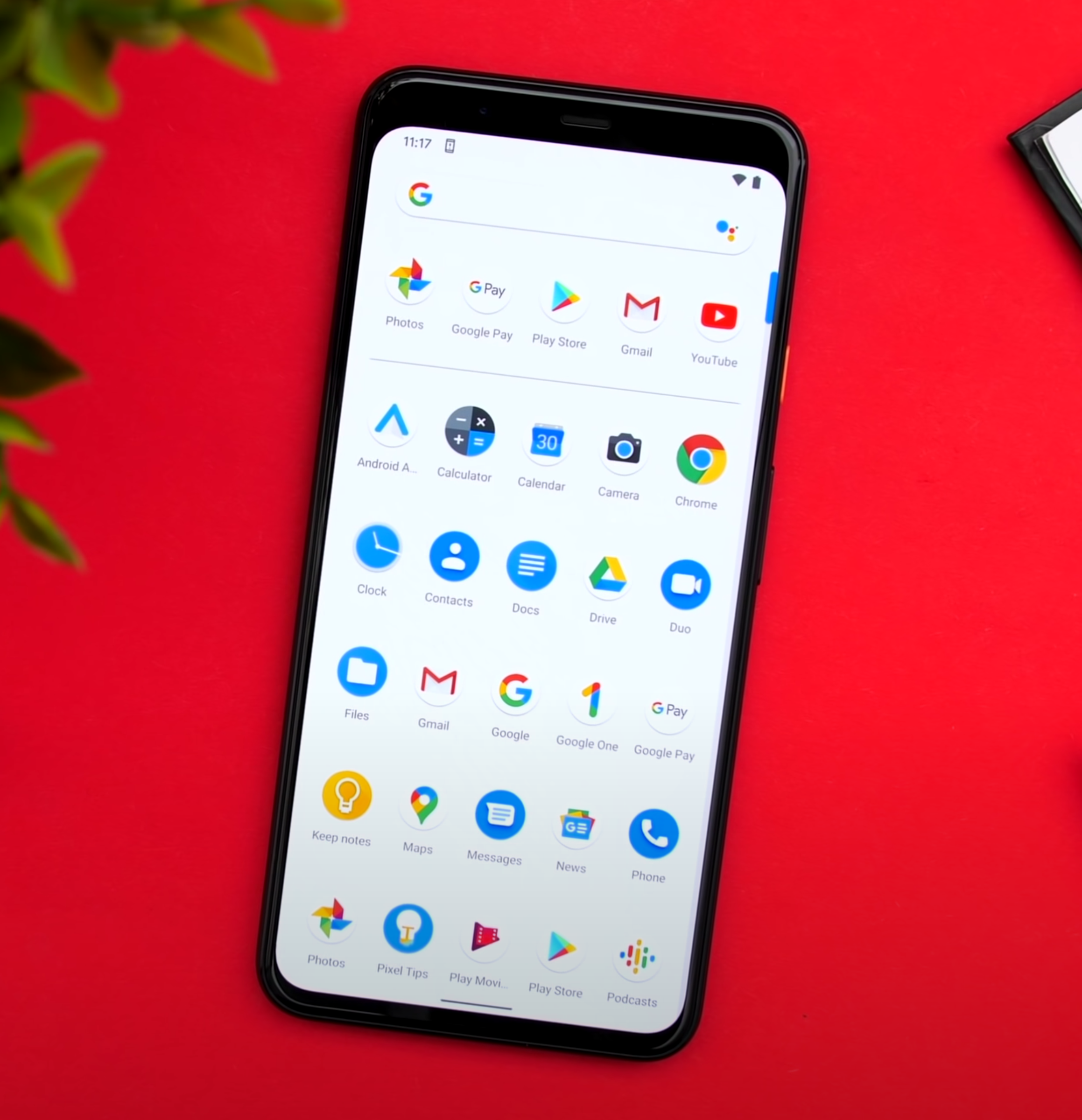
The second big new feature in iOS 14, is the App Library. Just like on Android again, where this is called the App Drawer, if you swipe left from your last Home-Screen, you can access the App Library, which is really just like the Launcher on Mac. A collection of all of your Apps installed on your iPhone. While I do like this idea a lot, unfortunately there are many issues and inconsistencies that I’ve found with the App Library. For example, on stock Android you get this App Drawer which lists and sorts all of your Apps alphabetically. Personally, I’m not really a fan of this as I do prefer having my Apps in Folders, which Samsung actually allows you to do in their own Android skin. which I love. Apple is somewhere in the middle.

The App Library does create App Folders, but those Folders are created automatically for you. There’s no way you can change that which means that finding a specific App can be quite tricky. Apple, please give us the option to rename and organise the Folders, as that would help a ton! 

Another mainstay on Android has come to iOS in the form of the ‘App Library’.

Another mainstay on Android has come to iOS in the form of the ‘App Library’.

The way it works now is kind of pointless as I can still better organise all of my Apps, by having custom Folders on the Home-Screen. Also, opening those Folders in the App Library is very confusing as well. Unlike the Folders on the Home-Screen, if you tap on an App, it just launches it. So, you need to press on the bottom right Icon that shows multiple Apps, in order to open up the Folder. Ok, so you’re probably wondering, what happens if you delete an App from the Home-Screen? Does it go to the App Library or does it get removed? So, once you get into Jiggle Mode, the ‘Delete’ option has been renamed into ‘Remove App’ and once you press that, you’ll be asked if you want to delete the App or add it to the App Library. Which again, is extremely confusing because all your Apps are already in the App Library anyway. I think this should be renamed into “Hide App” and “Remove App”. 

Back to the App Library. If you swipe up, you get this list view in alphabetical order, with all of your Apps. This is sort of like on Android and then you can scroll through them or even search through them, which I can already do that in Spotlight Search, but at least we get this list view, which I am a fan of. Those are the two big changes in iOS 14, Widgets and the App Library. While I do love both, I do feel like iOS is becoming a bit of a mess now. You can swipe right to access the Widget Panel which you can also add to your Home-Screen anyway. You can then swipe down to access the search functionality which you can also access by swiping left from your last Home Screen, but that search is only for Apps, whereas the swipe down search is for everything. I just feel like it needs a lot of polish as right now, it’s like a notebook full of ideas, instead of an organised Operating System.

There have also been a few extra things that I have noticed, which I do really want to point out. First off, the stability has actually been very good. I haven’t had any system crashes or anything really. It was a bit slow at first but after it indexed all the Apps, things got back to normal. It was so good that I even installed it on my personal iPhone and from all the Betas that I’ve used over the past ten years or so, iOS 14 is definitely the most stable. Battery life has been affected, but it’s nothing too severe.

The double-tap on the back functionality allows you to select a specific function that your iPhone will execute, once you double or triple-tap on the back. The way it works is that it uses your iPhone’s motion sensors to detect the tap on the back. However, because of this, my double tap functionality also got activated a few times when I laid my iPhone flat on my desk. The good news is that you can also have custom Siri short-cuts on this, meaning that you can pretty much assign anything you want to this double or triple tap Gestures. I’ve set mine to launch the Camera App as iOS still doesn’t have a quick Camera Launch functionality on the Volume or the Power Button. These gestures are a bit finicky to activate, but when they do work, it’s a pretty nice feature to have. 

A long-awaiting and welcome new feature, is 4K YouTube Content.

A long-awaiting and welcome new feature, is 4K YouTube Content.

Also, you can finally watch 4K YouTube content now, after so many years.

The reason why we couldn’t do it before was because Apple wasn’t using Google’s VP9 Codec and Google wasn’t using the h.265 that Apple was using. But now that the new AV1 Codec has been agreed to by both Apple and Google, and iOS 14 supports AV1, 4K playback is finally possible on Apple devices. But there is a catch. Google only seems to be using AV1 for 4K HDR videos, meaning that you can only watch 4K videos that are HDR. Otherwise, they’ll still be 1080p. I really hope that this gets fixed.

Speaking of things that need to get fixed. There’s now a way to adjust the exposure in the Camera App separately from the Focus, which is pretty great! We’ve had this in some third-party Apps as well. However, the way it currently works in iOS 14 has to be the most unintuitive way that I’ve seen. You can still adjust it via the up/down Slider when you’re focusing, but now you also have this Exposure Meter. The thing is, once you adjust it, there’s no reset button and you can increase/decrease the Brightness the same old way while the exposure meter is set to a custom value and that value won’t change. However, I’m pretty sure that this is a glitch though. 

In the Weather App, you can now see the AirQuality Index, which is pretty nice. Probably my favourite feature that I’ve found is that now you can hold the Navigation Buttons to go back to a specific previous category.  This really helps for when you’re buried deep into the Settings and you don’t want to keep going back and back until you get to where you want to be.

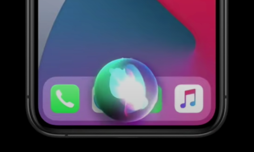
Siri now has a brand new UI, which I do like. You can now summon her without blocking the entire Display. However, what I don’t like is that you cannot interact with your Phone, whilst using Siri. Other than that, it’s more or less the same Siri as before. This UI now applies to whenever you’re getting a call. Rather than this blocking your entire Display, you get this notification-style window which you can even dismiss and continue doing your own thing.

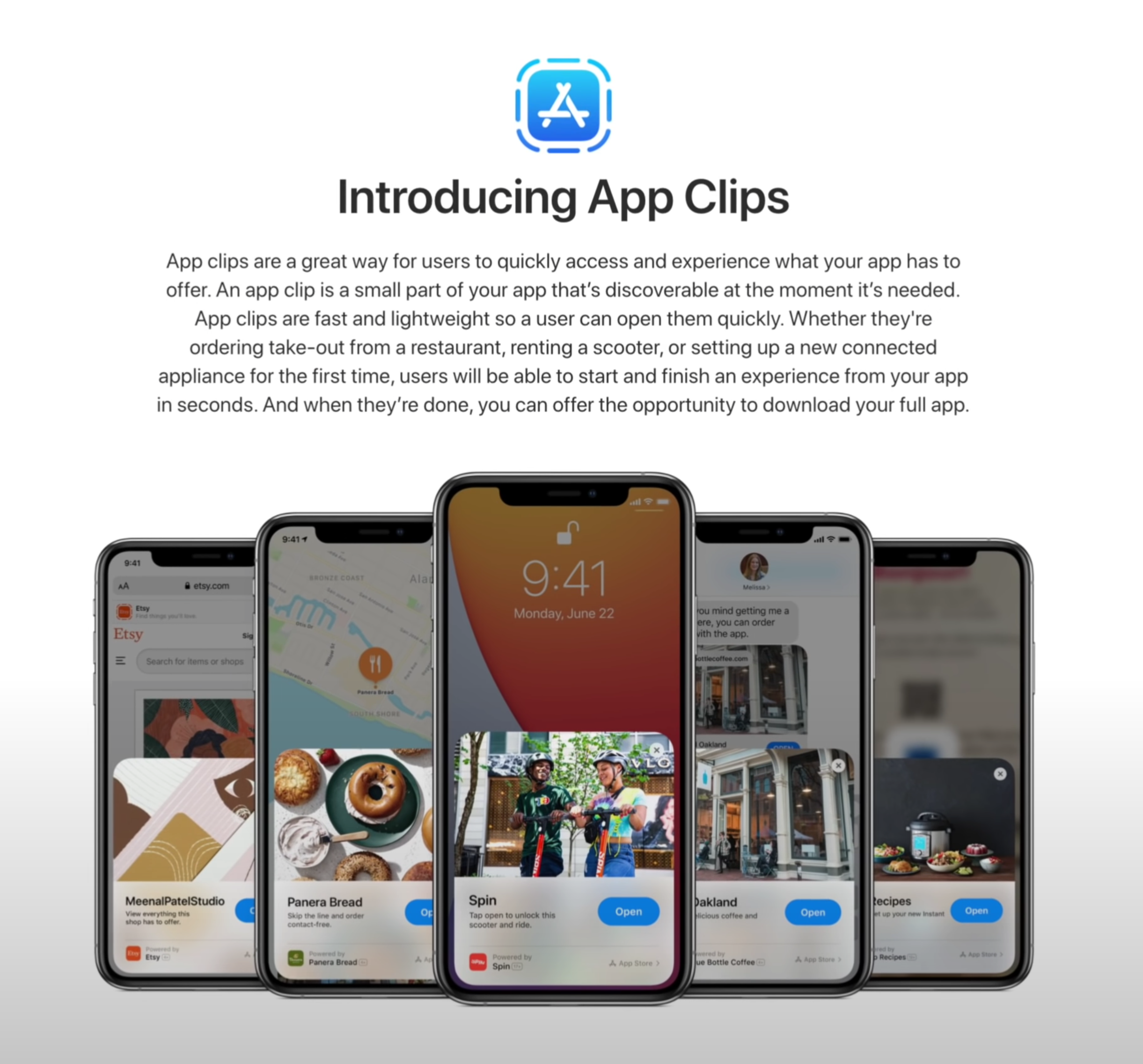
‘App Clips’ is another thing that we’re looking forward to testing in the future.

‘App Clips’ is another thing that we’re looking forward to testing in the future.

Control Centre now allows you to show individual Accessories and Scenes from the Home App. Unfortunately, you cannot customise which Scenes or Accessories it shows you as this has all been automated, based on the ones that you use the most.

If you’re wondering how the AirPods pro sound, with that new 7.1 Surround Sound support, I won’t be able to tell you that because it seems that this is not available in Beta 1 just yet. Picture-in-Picture is though and it works just as you would expect it to, kind of. It doesn't work in the YouTube App so you have to be playing a video in Safari in order for that to work. But, it does work for Face-Time now, meaning that the person that you’re speaking to won’t get a black screen every time you go to check a Notification, but instead they’ll get to see you all the time, ands likewise.

Of course, there are many more features, such as App Clips, which I cannot test just yet. In terms of the big changes that I have noticed, these would be the main ones. 


watchOS 7

Moving on to watchOS 7, by far the biggest change here is Sleep Tracking and…I’m quite disappointed. The way it works is that you have this Sleep App and you select how many hours of sleep you want to get and when you need to wake up, it will then tell you when you have to go to bed. Right before that, you’ll have a ‘Wind Down’ period, which is usually around 45 minutes. This is when DND will automatically be enabled and that’s pretty much it. 

Your Apple Watch will estimate the Battery Life it would have, when you go to bed, and if that amount would be less than 30%, you’ll get a Notification to charge it. The only problem is that I never got that Notification, which I’m assuming will get fixed in the final version. Not only that, but Automatic Sleep Detection never worked for me. I had to manually put my Watch into Sleep Mode, rather than this being enabled automatically based on the sleep times that I’ve set it to. Again, I’m guessing that this will be fixed when iOS 14 comes out.

But probably my main issue with Sleep Mode is that you cannot really see your sleep stats, unless you go into the Health App and into the ‘Sleep’ section of that. Moreover, it doesn’t even tell you much, just the time you were in bed, which is literally based on when you tapped the ‘bed-time’ Icon and the time you were asleep. There are no mentions of sleep quality, REM data or anything like that. An App such as Sleep Cycle is so much better than the native Sleep Tracking is, as of right now.

Native Sleep Tracking will now be a thing, but there are already alternatives that do it better.

Native Sleep Tracking will now be a thing, but there are already alternatives that do it better.

Also, you’re probably wondering how much Battery Life it drains in Sleep Mode. Well, in my case, I had 51% Battery when I went to bed and 37% when I woke up about six-seven hours later. A 14% drop is actually very good, I just really hope that the Sleep Tracking gets smarter by the time this gets released. 

There is a new hand-wash feature which would show you a timer when it detects that you’re washing your hands. That’s not working just yet, or at least I could never get it to work, on my Apple Watch. 

Aside from that, the only new Watch-Face that we get, is the Chronograph Pro, which includes a Tachymeter that you can use to measure the speed that you are traveling at. I just wish this also had a digital version. You can also have complications on the X-Large Face, which is pretty nice to have and you can also add a Colour Filter to the ‘Photos’ Watch-Face. I also really do like how Apple has redesigned the Watch-Face customisation page and they now show you the colour selector on the right of the Face, rather than inside the Watch-Face.

There’s a new Workout for Dancing, but this was actually in watchOS 6. It was hidden in ‘Others’ and I’ve used it all the time for when I was playing ‘BeatSaber’. I’m not fully sure what’s new with this, possibly improved tracking?  But that’s pretty much it in terms of big, noticeable changes.


iPadOS 14

Finally, there’s also iPadOS 14, which is a very small update. Aside from ‘Scribble’, there’s nothing really that stood out to me. In fact, we don’t even get the Widgets from iOS, there’s still stuck in the Side Panel and we don’t have the App Library at all, which is extremely inconsistent.

While I do believe that these will be added by the time iPadOS releases, Craig Federighi indicated to Marques that this is how they’ve intended to release iPadOS 14, for now. So, we’ll see.

But that’s about it, macOS does have a lot of changes as well, just like iOS 14 did, but that’s an entire video in itself.

iOS 14 - 40+ New Massive Changes!

WWDC… how amazing it was. We got the expected ARM transition, macOS Big Sur (not so expected), a full OS redesign that is the biggest change since macOS X and of course there was iOS 14, another gigantic change.

There were not any hardware releases, so no new iMac or AirTags. According to a Jon Prosser and a few others, Apple was planning to announce new hardware but for some reason fairly recently, they decided to push all of that into Q3 or Q4 of 2020. In this video, we’re fully focusing on iOS 14 and covering not 5, not 10 but over 40 big changes!


1) Widgets!

It’s been a long time coming. Credit: Apple

It’s been a long time coming. Credit: Apple

I’ve been wanting for this since I first got my Galaxy S4, in 2013. This has been a feature on Android since Day One, we sort of got it last year in iPad OS but it’s now finally here in iOS 14.

With the Widgets API, Developers can create their own Widgets. They will work in a similar way to how they currently work in the Notifications Panel, but you can have them on the Home-Screen and re-size them. You can even have multiple Widgets behind the same Widgets and then swipe between all the ones stacked there. Overall, this is a gigantic change to iOS, which I cannot wait to use.


2) App Library! 

Multiple Home-Screens are still there but you can now compact all of them into something called ‘AppLibrary’, which is sort of like the AppDrawer on Android. Swipe left and you get a list of your Folders with all your Apps. You can search Apps and scroll that list alphabetically, making it much easier to find the Apps that you need. 


3) Back Gestures

There’s now Gestures on the back of the iPhone, just double and triple tap and you can customise those for different actions, I would personally recommend Screenshot.


4) Fixed Calls

No more blocking up the UI. Regular Calls & Facetime Calls, or any other sort of Call, now don’t take up your entire screen. Instead, they now pop-up just like a Notification Card does.


5) AirPods Auto-Switch

You can Auto-Switch between your devices. It uses Gyroscope data to tell when you’ve picked up a new device and the Headphones switch to that, which is amazing.


6) AirPods 7.1 Support 

This is for AirPods Pro only. It includes Spacial Audio that creates a theatre experience, 7.1 Support and Dolby Atmos.


7) Siri Overlay

Siri no longer takes up the whole Display, but it does disable it for now.

Siri no longer takes up the whole Display, but it does disable it for now.

Same as with Calls, this doesn’t take up the entire screen anymore.

It will appear as a Card on the bottom. The only problem is that you cannot interact with the Display at the moment.


8) Smarter Siri 

Siri now knows 20 times more facts. The Web Answers are improved and she can send Audio Messages as well now. 


9) PiP Video

We had this on the iPad, now we have it on the iPhone as well, this is PiP Video from Safari and supported Apps. I believe my S4 from 2013 had this, but it’s good to finally have it on the iPhone as well.


10) Unlock Your Car

Open your Car Door using the iPhone. This only works with 2021 BMW series 5 at the moment but more cars will be included. You can give people full access and also works in iOS 13. Future versions will take advantage of the U1 Chip so that your car can unlock even when your iPhone is in your pocket or bag. 


11) Spotlight Search

This now works just like on the Mac, it no longer blocks the entire Display. Instead, you get this floating Search Bar and you can search anything now, from Apps to Web Searches.


12) AppClips

No App? No problem. Credit: Apple

No App? No problem. Credit: Apple

This is really cool. You go to a Store and if there’s a QR Code or an NFC Tag, you can still use their App to get reward points and so on, without having the App installed. It’s like a small version of that specific App, without having to install the full version. You only use it when you need it. For example, if you’re at a parking space and you need to get this App to pay, there’s no need to install that App anymore, AppClips would solve that issue.


13) Smarter Maps

Rich detail is coming to the UK, Ireland and Canada and overall accuracy has been improved. There’s guides for what to eat and where to watch movies, just like on Google Maps. Congestion and Green Zones are now included. 


14) Cycling Support

On the same subject, you will also get messages for when you’re going uphill or for when you’ll have to take the stairs.


15) EV Routing

If you have an EV, it will automatically link to that car and it will plan your route accordingly, if you’ll need a charge part-way through. 


16) Translate App

To me it looks like Google Translate but it can also work completely offline as it uses on-device machine learning. It only supports 11 languages so far though. 


17) iMessage Improvements

Chats have become far more intuitive. Credit: Apple

Chats have become far more intuitive. Credit: Apple

Your pinned conversations and most recent Messages will be on top. Group conversations have also been improved, you can just tap on a person and highlight all messages referring to that person alone, with in-line replies in groups as well as mentions.


18) Adaptive Lightning

During working hours, your lights would have a cool temperature and a warm temperature at night. This is thanks to the Home App.


19) Activity Zones & Face Recognition

You can set Activity Zones in Cameras so you get notified when there’s movement in that specific region. Also, Face Recognition works with faces that you’ve tagged in the Photos App. 


20) Safari Passwords

There is now an automatic warning if your password isn’t secure. 


21) Safari Privacy Report

Just tap the Privacy Report to see how websites track your data. 


22) CarPlay Wallpapers

How was this not a thing before. It looks so much nicer now, I don’t have a car, so…moving on.


23) Exposure Control

In the Camera App, you can now control the Exposure separately from the Focus, just like you could in third-party Apps. 


24) ARKit 4

Location Anchors are present, which allows for directional icons and art to be placed in specific parts of the world. Everyone looking at those places will get the icons that those Developers placed.


25) Default Apps

You can set a default email and browser App, I would have liked Calendar too though. 


26) Weather Forecasts

Dark Sky has long been one of the best weather Apps out there. Credit: Apple

Dark Sky has long been one of the best weather Apps out there. Credit: Apple

There’s now minute-by-minute forecasts in the US, thanks to Dark Sky. Apple purchased this App this year, I believe. It’s the best weather App in my opinion.


27) Voice Memos

Improve the sound quality of your recordings with a single tap. This utilises AI Processing. 


28) QuickTake Video

This is now available on the iPhone XS & XR, not just the iPhone 11’s.


29) Emoji Search

You can finally search for Emoji’s, just like on the Mac. Finally!


30) AirPods API 

Developers can take advantage of the Gyroscope Sensors from the AirPods, which will be useful in some audio Apps and Games.


31) AirPods Battery Notifications

Screenshot 2020-06-26 at 15.55.35.png

You will get a message when your Battery is low and you need to charge them. 


32) Selfies Flip

You can choose if you want your Selfies to be mirrored or not. 


33) New Fitness App

Unlike the leaked one, there are no actual fitness plans that you can take or workout guides yet. This App is just the renamed Activity App, which now includes more workout data, that’s it.


34) Sleep Tracking 

You can do this on the Apple Watch now but if you don’t have one, you can kind of do it on the iPhone. Sleep Mode dims the screen, turns on DND Mode and tells you when to wind down in order to get the desired hours of sleep for the next day.


35) Recording Indicator

There’s now an indicator when your Front Camera or Microphone is being used by a third party App. On the Macs, you have the LED indicator for the Front Camera, but you never had anything like this on iOS, until now. 


36) FindMy - 3rd Party Support

Third-party Accessory support in the ‘FindMy’ App. This would help companies such as Tile survive, once Apple releases their own AirTag. 


37) YouTube 4K?

AppleTV now supports it. It’s not available on iOS just yet, but it might be coming in future beta versions.


38) APFS in Files 

The Files App now supports an external SSD that’s formatted as an APFS Drive. 


39) Spotify on the HomePod

Third-party Music Apps will now be supported on the HomePod.


40) Night Mode

You now get a Gyroscope preview to better centre your shots and you can even cancel a Night Mode shot mid-way through.


41) Video Frame-Rate

Screenshot 2020-06-26 at 15.56.29.png

Toggles to switch in the Camera App are now available on all of the iPhones, not just the 11’s.


42) Supported Devices

All devices that supported iOS 13, are still supported here. This includes the iPhone SE and 6S as well as anything newer. These were only the biggest changes, there’s been hundreds in total. A video on macOS Big Sur and ARM will be coming up next. 

What other videos do you want to see?

iPhone 12 Pro & iOS 14 – Final Details Revealed?

We haven’t really made a Leaks & Rumors episode on the 2020 iPhones in more than a month now. Mostly because there wasn’t anything new to talk about. But, we’ve got a ton of fresh new leaks to talk about now, most of them from just the past week alone, coming from Jon Prosser from ‘FrontPageTech’. I don’t know how he did it but he’s pretty much the person with the highest amount of inside news on Apple at the moment.

So, here’s everything new in terms of the 2020 iPhones! 


iPhone SE (Second Generation) 

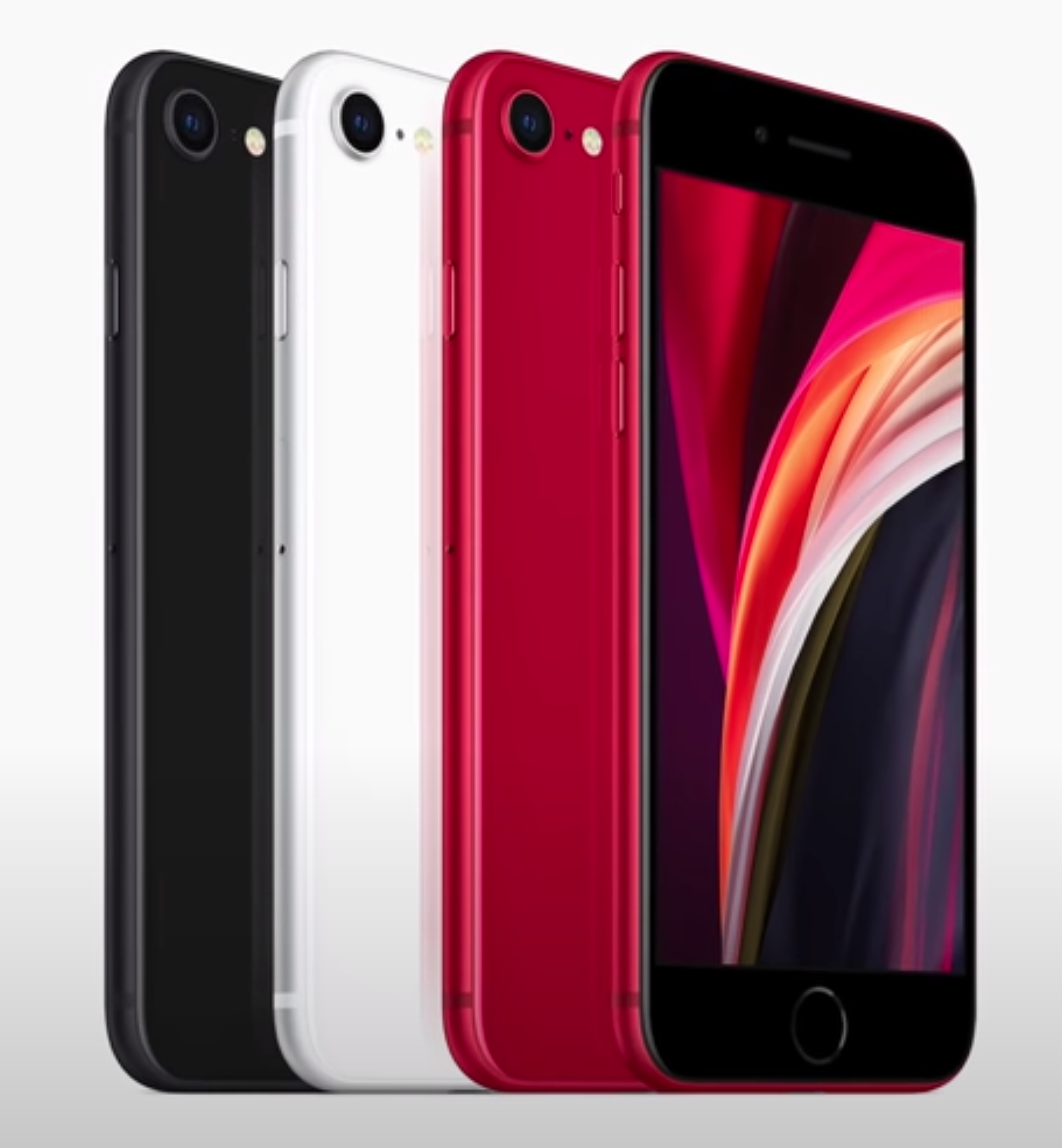
First things first, Apple has now unveiled what we thought was going to be the iPhone 9. This is the one we were talking about for so long, it is essentially the iPhone SE 2. Only, it isn’t called the iPhone 9 or the iPhone SE 2, but instead they called it the iPhone SE…Second Generation.

I personally think that iPhone 9 would’ve been the perfect name as this would be the last iPhone to feature the old pre-iPhone X design and Apple has yet to use the iPhone 9 naming scheme. But at the same time, calling this the iPhone SE means that Apple is not necessarily considering this inferior to the iPhone 11. They seemingly just consider it something different.

The iPhone 9, or the iPhone SE Second Generation as it is being called by Apple, is our first iPhone of 2020.

The iPhone 9, or the iPhone SE Second Generation as it is being called by Apple, is our first iPhone of 2020.

The iPhone SE Second Generation is essentially just an iPhone 8, but with upgraded internals. We have the same design on the front as the iPhone 8, 7, 6s & 6, so we’re getting a six year old design here. But, we are getting some very nice specs.

To start with, we’re getting Apple’s most powerful iPhone Chip, the Apple A11. The same CPU as found in the iPhone 11 & 11 Pro’s. We’re also getting an improved Camera, which looks to be the same Module as the Main on the iPhone 11 & 11 Pro. Don’t quote me on this because I do need to get it and test it to confirm that.

That’s pretty much it. Other than that, this is an iPhone 8. The only other difference being that this iPhone only costs $400 / £420 in the UK. The UK market is getting a slap in the face again. It is almost half the price of the iPhone 11, which starts at $700, so if you don’t care about having an outdated design and you just want a very affordable iPhone (price can actually go down further if you trade in your old phone) with the very best performance and almost the same quality Camera as on an iPhone 11 Pro, then this is a perfect deal.

We’ll be making a more in-depth video about the iPhone SE Second Generation, once we get it ourselves, so stay tuned for that. Subscribe and hit the bell so you don’t miss out. 


AirPower

Then, at number two, AirPower is apparently making a comeback. You know, the Wireless Charging Mat that Apple kept on postponing and then eventually cancelled? We may be seeing that after all.

Essentially, AirPower was a fairly revolutionary Wireless Charger. On pretty much every single Wireless Charger out there, you need to position your Smartphone on a specific spot because that’s where the Wireless Charging Coil is located. Apple, on the other hand, wanted you to be able to place your Smartphone, Apple Watch or even your AirPods literally anywhere on the Mat. In order for you to be able to do that, the Mat needed a ton of Charging Coils. I’m not talking about two, three or even five, the AirPower Mat was developed with over 20 different Coils in mind. But, these Coils generated a lot of heat, which made an AirPower Mat a safety hazard to use, so it got cancelled. 

How will the AirPower solve the overheating issues that has prevented it from being released so far?

How will the AirPower solve the overheating issues that has prevented it from being released so far?

Well, it seems like it might have been revived! According to Jon Prosser, Apple’s Sharing & Proximity Team are receiving prototype units of something called C68, which looks a lot like the AirPower Mat. Not only that, but apparently this new AirPower Mat actually has an Apple A11 Processor inside that’s being used to dynamically manage heat. An Apple A11, inside of a Wireless Charger! 

The A11 is what the iPhone X from 2017 used and it is still one of the most powerful Chips in the mobile industry. According to Jon, because the Apple Watch uses a proprietary charging method, when you placed the Apple Watch on charge while other devices were also on the Mat, the AirPower would combust because the Watch required so much power. The A11 can tell when the temperature drops and it can wait until that happens before diverting power to charging the Apple Watch. It’s a pretty genius solution but I’m not so sure if this is indeed the answer. 

I’m saying this because firstly, having an A11 Chip inside what is essentially just a Wireless Charger means that the price of it will sky-rocket and secondly, it’s not like the Mat won’t overheat. It’s just that the A11 will put some devices on hold, in terms of charging, until the temperatures go down. This means that if you need a quick charge of your Apple Watch and your iPhone is also charging, you might not even be able to charge your Apple Watch at all, if the A11 Chip decides that is the safest case.

I still think that the best approach here would be to have marked spots on the Mat, where you can place your devices. These spots will also be magnetised so that the devices snap into place once they’re close.


iOS 14

Next up, we have some updates to iOS 14. In case you missed it, we did an iOS 14 video back in March that covered every single thing we knew up until that point, in terms of iOS 14. Definitely do give that video a watch, in case you want to know more about it. But since that video of ours went live, a few more details have emerged.

Reports from ‘9to5Mac’ indicate that Apple is working on improving iCloud Keychain on iOS to make it compete better with apps such as ‘1Password’ or ‘LastPass’. Apparently, users will now be warned if their passwords are being reused, so that they can change them if they’re using one multiple times. Users will also be getting some sort of new 2-Factor Authentication that will let you log into a website using just iCloud Keychain, rather than using SMS or Email. But keep in mind, this will still be 2-Factor Authentication.

Twitter user ‘DongleBookPro’ shared a few more details about iOS 14. The first one being that Apple seems to be working with car manufactures, such as BMW, to allow you to use the iPhone itself as a car key. It won’t work with all models, just with a few select ones, but this will apparently be called CarKey. 

‘DongleBookPro’ also shared some iOS 14 images. One, with how the new Wallpaper selection would work, which has been reported previously. It seems that now, we would be able to tweak the current Wallpaper. It seems like the stock iOS 13 Wallpaper has four different variants, one of them being a gradient. The ability to turn them into gradients seems to be applicable to all of Apple’s first party Wallpapers. They’re calling it a Smart Gradient.

Aside from this, Dongle also shared an image of how the Wallpaper selection screen will look, with Wallpapers now grouped into Collections. You can also have some photos of your own there, which is great. Third party apps should be supported as well, according to some of the earlier leaks that we’ve seen before.

Now, there’s one more thing about iOS 14 that I want to share here and it is coming from Jon Prosser. We’ve heard some rumors that Apple might be implementing a new list view on the iPhone, similar to the one that we have on the Apple Watch. But now it seems that Apple is indeed considering Widgets on iOS. Jon is saying that there are currently no internal builds featuring Widgets, but it is something that Apple is internally working on. They’re also considering third-party Widgets in the Control Centre. Now, Jon did say that this is probably something likely to come in iOS 15 rather than iOS 14. We’ll have to wait and see. 

But, I’ve had two massive requests for iOS, for so many years now. One of them being an Always-On Display. Android Smartphones have had this for so many years now and it’s a complete game-changer. The ability to see the time and the notifications on your Display, all the time, even when your phone is in sleep, is so useful.  But for some reason, we never got that on the iPhone. Now that the Apple Watch finally got it with the Series 5, I would bet that Apple is at least considering adding an Always-On Display to the iPhone as well.

You may soon be able to use some popular apps without actually needing to have them installed, such as Twitter.

You may soon be able to use some popular apps without actually needing to have them installed, such as Twitter.

My second request was on-screen Widgets. This is something that we’ve had on Android Smartphones for years. The iPhone Home-Screens have pretty much remained unchanged since the very first iPhone launched, back in 2007 (13 years ago). We can now change the Wallpaper but aside from that, and the fact that we can put apps in folders, which Apple added in iOS 4 back in 2010, we cannot really change anything.  Widgets will allow us to see the Weather, Calendar, To-Do List and more, right on the Home-Screen without even having to open up those apps.

Apple did indeed add Widgets, but only to the Notification Panel in iOS 13, on the iPad, with iPadOS. They finally added Home-Screen Widgets, but it only works in Landscape Mode and it is a separate panel on the Home-Screen, rather than something that’s embedded into it.

It seems like we will have to wait a bit longer and see if this does happen, but if it does, it will be a pretty massive change for iOS functionality wise, which is something that we haven’t seen since iOS 4, back in 2010.

The last piece of news that we have on iOS 14 comes from 9to5Mac. They claim that they’re developing a new feature called “Clips”, which will allow us to use an app without necessarily having it installed. A good example of this would be when you’re on a web page and you’re opening up a Twitter link. Normally this will just take you to the Twitter browser, the same applies to YouTube where, as we all know, the UI is really messed up. Well, with this new Clips API, you will pretty much get the same experience as if you actually had the app installed. It’s just that you won’t need to actually have it installed, which is pretty cool.


iPhone 12 Pro 

Now, onto the good stuff, the iPhone 12. The biggest thing here is that we finally know the final design of this year’s iPhone.

We’re getting four iPhone 12 models this year. A 5.4” model, which will be the smallest one. This will be even smaller than the 5.8” iPhone X, XS or iPhone 11 Pro and this one will come with two Camera Modules, the Apple A14 Processor and 5G, as well as an Aluminium Body. Then, we have a 6.1” iPhone, similar in size to the regular iPhone 11, this will also come with two Camera Modules, the A14, 5G and an Aluminium Body too. We have another 6,1” iPhone, a Pro model this time. This will still come with the A14, 5G, only three Camera Modules as well as that LiDAR Module that the iPad Pro just got. This will have a Stainless Steel, rather than an Aluminium, Body. Finally, we have a 6.7” iPhone, another Pro model. This will come with the A14, 5G, three Camera Modules, LiDAR and that Stainless Steel Body as well. In summary, two regular and two ‘Pro’ models.

All models are indeed said to come with an OLED Display, so finally no more LCD. All models are said to come with a smaller Notch as well as a Squared-Off Frame, similar to the one that we got on the 2018 iPad Pro. So, we’re finally getting a return to that iPhone 4 & iPhone 5 style design, which was definitely my favourite. This had been initially reported by Ming-Chi Kuo, but has now confirmed by Bloomberg as well. 

Remember the iOS 14 Widgets image that Jon Prosser shared? Well, it seems like that image is coming from Twitter user Fudge (@choco_bit).  This gives us a really good idea of what the smaller Notch would look like. It looks to me that it’s about half the size of the Notch on the current iPhones.

Unfortunately, the Bezels still seem to be the same size. I was really hoping that these would be getting a bit thinner, as iPhones now have one of the thickest Bezels / Border on any Smartphone now and they’re already looking quite outdated when compared to the competition. But, keep in mind that this is not a Press render, it is what looks to be an iOS icon, which means that the Bezels might indeed be bit thinner on the actual iPhone 12.

Follow our second Instagram account @ZONEofCONCEPTS for more models on upcoming releases.

Follow our second Instagram account @ZONEofCONCEPTS for more models on upcoming releases.

Anyway, Fudge also shared an image of the back of the iPhone and from this one we can see that the LiDAR Sensor has been added as a fourth Module, just like we envisioned in our very own concept months ago. Funnily enough, we modelled this concept back in October 2019 and at that time, we only knew that Apple was going to add a ToF Camera. We didn’t know where and how it would be positioned. So, we fully modelled ours based on what made the most amount of sense. A fourth module in that Camera Array alongside a Flash in the middle, for even Light Exposure, and a Microphone just under it for a consistent design. It seems like we were pretty much spot on.

So, this is what the iPhone 12’s would look like. A Flat Frame, just like on the 2018 and 2020 iPad Pro’s, which would be made out of Aluminium on the non-pro models, just like on the iPhone 5 and SE, and full Stainless Steel on the Pro models. We also get a smaller Notch, at least in terms of its length, and two new Display sizes, a 5.4” and a 6.7” as well as a Quad Camera Module on the back, with that brand new LiDAR Sensor.

We have seen multiple reports that the iPhone 12’s could indeed be delayed up to October or so, but there are many reports on this, some saying that they will be delayed while other are saying that they’re still scheduled for a September release. If I were to put my money on any of these, I would say that the regular iPhone 12’s will be released in September, while the Pro models would be released a bit later, around October. This would just be because of that LiDAR Module, which is a brand new component to manufacture.