The Last of Us: Part II - Full Review (Spoilers)

This is going to be my Full Review of ‘The Last of Us: Part II’ and this will include FULL SPOILERS for the game, so if you haven’t played it yet, I would highly suggest you do so and check out the Story Trailer above if you haven’t already.

The first thing you might notice is that… I’m not Daniel. I normally deal with Marketing and other assorted behind the scenes stuff at ZONEofTECH but as the resident Video Game nerd, I felt that I couldn’t let this opportunity go to waste. Whether you like this game or not, it’s impact and scale has been massive and if nothing else, has sparked a lot of discussion.

I had planned to put this out a little earlier but as it became clear how divisive and polarised the online Gaming Community had become after the game launched, I felt like I needed to finish the Story first and experience everything for myself before giving a more well-rounded and considered opinion. So, here it is (thanks to Sony for sending us over a code).


A (not so) Lost Legacy

Naughty Dog had a big reputation to live up with the ‘The Last of Us: Part II’ (Image: Pinterest)

Naughty Dog had a big reputation to live up with the ‘The Last of Us: Part II’ (Image: Pinterest)

Naughty Dog have a rich history of producing some of the most memorable and technically impressive games out there. From ‘Crash Bandicoot’, ‘Jak & Daxter’ to ‘Uncharted’, there is no doubt that these guys are capable of producing Video Games that are of the absolute top-tier. With this in mind, and that the first game of the ‘Last of Us’ series was arguably the game of its Console Generation, there was an expectation to deliver something of equal, if not higher, magnitude.

Playstation have also built themselves an extensive library of exceptional exclusives, such as the most recent ‘God of War’, ‘Horizon Zero Dawn’ and ‘Spider-Man’ to name a few. Sony also produce the new ‘Spider-Man’ movies with Tom Holland who, coincidentally, will be portraying Nathan Drake in the upcoming ‘Uncharted’ movie. All of this adds to expectation for Naughty Dog. This game has been built up to the point where anything less than absolute perfection is deemed a failure by the more hardcore segments of the fan-base, this is where the problem starts.


The Giraffe in the Room

Let’s just get right into it and address the story, which has set the internet on fire over the past week or so. I will warn you one more time for SPOILERS, avert your eyes if you plan to play it yourself. 

The catalyst that sets this game in motion is Joel’s death at the hands of a new character, Abby. He is quite viciously beaten to death with a golf club, staying alive just long enough for Ellie to burst in and watch him die. This is after having his leg damn near blown off by the character who we are made to play with for around half of the entire game afterwards. I have seen a lot of anger towards this, with people saying that Joel deserved better. But Joel did some dark things and made a lot of enemies in the first game so, while I do agree that the manner in which he was killed off was a little gratuitous, I can understand why this had to happen the way that it did. The game is very deliberately pushing a certain narrative at this point, the overkill and ambiguity surrounding this event is meant to invoke anger from the player. Joel saved Abby from an Infected Horde and she does this, why?

Some of the trailers led us to believe some things about the game, which turned out to not be the case (Image: Den of Geek).

Some of the trailers led us to believe some things about the game, which turned out to not be the case (Image: Den of Geek).

This is seemingly unjustified and puts you in Ellies head, goading you to carry on and get the guys who killed Joel for reasons we don’t yet know. But we do know they deserve what they get, right? What follows is a slow descent into Ellie’s personal own rainy, Pacific North-Western Hell, with her state of mind deteriorating, methods becoming more brutal and the people she cares about paying the price for her personal vendetta. She eventually gets what she wants, coming face-face with Abby around half-way through the game. 

The Story then does a complete u-turn and makes you play through the timeline again as Abby, with the people who killed Joel. This time however, you’re dealing with on ongoing Faction War between the Washington Liberation Front (who have de facto control of the City after overthrowing the Military) and the Seraphites (referred to as ‘Scars’ by the WLF). These ‘Scars’ are painted as savage, religious fanatics who want to pull down the existing power structures and establish their own new world with the teachings of their revered founder, a God-like figure in their eyes. We encounter them as Ellie but don’t really explore their role until we play as Abby.

We also explore the motives for Abby wanting Joel dead and as it turns out, her Father was the Doctor that Joel killed while rescuing Ellie from the Firefly Hospital in the first game. Her group are also ex-Fireflies, fuelling the flames. As we explore Abby’s past and the journey she takes to Jackson, I began to empathise with, and see the depth of a character I vilified for so long. It completely changed the way I viewed the game. I hate what Abby did, but I get it. Her character arc was superbly laid out.

Was all of that worth it in the end? (Image: GamesRadar).

Was all of that worth it in the end? (Image: GamesRadar).

The game mirrors the Ellie & Abby characters and by the time it all comes to a head again, both characters have very similar motives for doing what they are doing and it’s impossible to say who’s ultimately in the right. There are secondary female characters on each side who have differing fates from the same scenario, at this point the Writers are almost literally hitting you over the head with that metaphorical mirror. This is all about perspective. In this world, there is no such thing as heroes or villains in the traditional sense, which is fresh from a story-telling point of view because, whilst I love Marvel movies and the like, there’s enough of that around right now. Everyone is a villain or a hero to someone else, depending on what side you’re on. Even the Seraphites, they serve as a metaphor for overcoming certain Social issues, but that’s a discussion within itself.

In the end, Ellie still can’t let go and the game ends with her worse off than before, insinuating that this cycle of revenge that she found herself in did more damage than her actual loss did in the first place. This was an exceptional Story told expertly well, but with a game like this, you’ll never please every single player. I am glad Naughty Dog took this direction though, seemingly embracing the fact that the game was going to get criticised one way or another and just made a game that they felt was real and authentic. I feel like the game justifies its existence and pushes the narrative forward in a way which is true to the identity of the first iteration. That being said, I do feel some of the ‘Jump-Scare’ moments were predictable & repetitive and that the whole back-story behind Joel’s big secret reveal should not have been cut into a flashback. Additionally, I would be very interested to see how this game would have played if it was laid out chronologically. This is not a comprehensive run-down of the entire Story as that would literally take me pages on pages to say in full, I will say again, try to experience the full thing first-hand.

Onto topics that are little less contentious, I’m going to avoid splitting this off into sections as each technical aspect of this game feeds so well into the other that it’s sometimes difficult to draw the line. I’ll start with the first thing you notice, the Graphics. I would say this is second only to the PS4 remaster of ‘Shadow of the Colossus’, in my opinion. From the snowy Mountains of Jackson to the ruined City of Seattle, every scene in this game looks like it was pulled straight out of a big-budget Hollywood film and shot on a Camera, rather than digitally manufactured.

The game couples huge set-pieces with the most acute details (Image: USgamer).

The game couples huge set-pieces with the most acute details (Image: USgamer).

It’s massive too. Each tiny part of this world has been meticulously crafted and it does not suffer from that sheer scale. There are scenes that make the world feel huge, the buildings in Seattle for instance, but then you look around and notice all of the other tiny little things that are there. Some of my favourite moments, from a Graphics standpoint, were ones that made use of Naughty Dog’s talents with Water & Snow Effects. It’s the small details in their behaviour and how they interact so fluidly with what the player is doing and what is happening in the game that give that added layer of immersion. When I first loaded up the game and saw that Main Menu, it had me sold there and then.

The Weather Effects are put to equally good use too. You might notice that Rain, Wind, Thunder, Fog and Lighting is used at very specific points, this is the game very subtly trying to make you feel or act in a certain way. It is devices like this that help guide you through certain points in the game and are a good way of showing you what to do without being explicit. The Lighting is particularly well-done, it’s not over-produced and comes across as natural to the point where you forget to take special notice of it, just because of how well it fits in to every part of the game.

I will give a special shout-out to the Gun Customisation too, the detail in those close-up scenes on the Workbench is straight-up ridiculous. The transitions between these areas are seem-less and at no point did I feel that a menu or a cutscene really took me out of the game. The Infected themselves are just horrifying, but in the best possible way. It speaks a lot about character design when an enemy can make you feel physically ill. There’s one in particular that’ll stick with me, but I’ll leave that one for you to discover.

The boat chapters helped showcase some very technically impressive environments (Image: Evening Standard).

The boat chapters helped showcase some very technically impressive environments (Image: Evening Standard).

If you’ve played the first game, then it won’t take you long to get into the flow of this one, many of the systems are similar (Weapons, Crafting, Exploration etc). However, especially when you’re playing as Ellie, the game is just so much faster than the first one. Combat is fluid and refined from what we saw in the last game, it’s fast-paced and the environment is put to good use in terms of the animations, some areas might allow you to be bit more creative with how you take down some enemy types. My only complaint is that the Companion AI can sometimes be a little dumb in their movement and is invisible to enemies, even when clearly in their line of sight. Generally speaking though, the Enemy AI Pathing is well thought out, it’s sometimes unpredictable in a good way so you really have to keep your bearings.

Resource management is key, especially on the higher difficulties where they become increasingly sparse. Enemy types can be varied in certain encounters, including: Runners, Clickers, Bloaters, Stalkers, Armed Human NPC’s and Dogs amongst others. The game really makes you think about how to engage and pushes you to utilise everything around you in order to survive. Plus, using all of your Ammo on lighter enemies can have an effect down the line when you find yourself up against something heavier, with only your knife or a wooden board (this happened to me more than it really should have).

There’s a lot to see, too much for just one play-through (Image: GosuNoob).

There’s a lot to see, too much for just one play-through (Image: GosuNoob).

The levels have a lot more verticality to them to really help flush out the amount that you can see, do and find, making these threats ever-present. This is a ‘Last of Us’ game, so be sure to open up every drawer and look in every corner, there’s always something else that you haven’t seen. My play-through was roughly 32 hours, 10 hours of which was just me looking around a cleared area for Resources & Collectibles. I did start to go slightly insane at points as there are a grand total of 266 Collectibles to find across the 11 Acts/45 Chapters. There are also several PlayStation Easter Eggs scattered around, including Nathan Drake’s Ring, a Precursor Orb from ‘Jak & Daxter’ and a few of the fat PS3’s (as the world effectively ended in 2013) here and there. Also, pro-tip, always expect the worst when resources seem to getting more common and pay attention to what the game gives you, because it might be an indicator that you will need them very soon. Also, they are scattered throughout the world as you would expect them to be in real-life. For example, you will find Cloth in Bedrooms, Alcohol in Bars, Supplements in Bathrooms, Parts in Garages and so on. These are the little details which you might think are pretty common sense, but make the experience so much more real.

Realism is a huge aspect of this game and a lot of that comes through Audio. The Sound Design is immense and use of Music is well-placed and used to flush out the world that extra step further. The Guitar is one of the key symbols of the game and is Ellie’s strongest link to Joel, its integration in terms of the Controls is also very intuitive and unique. It almost makes me feel like I can play the Guitar (which I can’t), this leads into another massive part of this Games’ production, which Accessibility. If you’re hard of Hearing, Blind or have Physical Disabilities, there are features in this game that can allow you to still enjoy & experience it. I saw a video on Twitter of a young man who was Blind, playing the game. It was one of the more wholesome things that I saw on this subject and goes to show how awesome Video Games are, with the impact that they can have.

32 hours well spent (Image: Dexerto)

32 hours well spent (Image: Dexerto)

I could honestly write a full on Book about this game, if given the time, but now I have to find a way to sum this up and not waffle on and on for hours. In Summary, this is not a game that I can that you will ‘enjoy’ the whole time, so to speak. This game is designed to make you think, question and feel, which is the hallmark trait of any worthwhile experience in my view. The ending was ambiguous, but this is the end of Part 2, not the end of the Story. There is still surely more to come with series and judging by Naughty Dog’s history, I have a theory that there will be four ‘Parts’ to this in total. We will see.

The Game is certainly re-playable, with fluid & brutal Gameplay, that level of production and a compelling Story, you will have no problem going through this game a second time while still getting that same sense of fulfilment. Naughty Dog are a victim of their own absurdly high bar, with how this game is being generally received outside of Critics. But I would definitely recommend playing this game, even if you know what happens and have seen a lot of Reviews saying otherwise. I won’t put a number on this, but I can categorically say that the 30 plus hours I spent in that world were worth my time, albeit exhausting, and deserves to be experienced by as many people as possible.


The Future of the Mac - Explained!

Every once in a while, usually once per decade or so, there is one big change that happens in tech that affects everything. Not just that, but it also affects our everyday lives.

A good example would be the introduction of the first iPhone back in 2007, which literally changed how future Phones looked and functioned to this very day. Samsung’s Flexible Display Technology from 2011 allowed us to have the Foldable Smartphones that we have today, with many more to come in the future. Tesla’s Autopilot has redefined, and will continue to redefine, the car industry. Now…there is another big change just around the corner and this time, it’s all about the Processor.

So, get ready for a bit more of a technical video and have those snacks ready and enjoy!


Up until 2006, Apple Macs were using PowerPC Processors. PowerPC were a type of Reduced Instruction Set Architecture Processors, which were created in 1991 by, ironically, Apple, IBM and Motorola. This was also known as the AIM Alliance. 

The whole idea behind PowerPC Processors was for them to be affordable to the average consumer, rather than for high-end business computers. Additionally, they were intended to not just be very powerful for the average user, but also allow Programmers to very quickly and easily write Code for them. This was all good. From 1994 up until 2006, Apple had only been using PowerPC Processors. But at WWDC 2005, Steve Jobs went on stage to make a big announcement. He announced that Apple will be moving from PowerPC Processors, to Intel Processors.

The main reason for this was ‘Performance per Watt. He said that PowerPC Processors gave Macs around 15 Units of Performance per Watt, whereas Intel was giving them 70 Units, almost five times as much. This is why Apple switched from PowerPC, to Intel Processors. Intel’s Chips were more powerful and also consumed less energy, meaning that their machines could be thinner and more portable, which was very important back then. Devices back then were not as thin and portable as they are now.

Apple’s Processors haven’t always come from Intel

Apple’s Processors haven’t always come from Intel

Now, switching to a new Processor, especially when it has a different Architecture, is extremely difficult and PowerPC and Intel were both based on a completely different Architectures. PowerPC CPU’s were based on the POWER Instruction Set Architecture, whereas Intel CPU’s were based on the x86-64 Architecture. What this means was that they were speaking completely different languages. 

This also meant that every single new program had to be re-written from scratch, but macOS in itself was not capable of running on Intel Processors unless of course, they had a Translator. That Translator was called Rosetta, named after the stone that helped us translate Ancient Egyptian, as the top half of it was written in ancient Egyptian, whilst the bottom half was written in ancient Greek. Anyway, Rosetta translated PowerPC instructions into x86-64 instructions, which meant that most, but not all programs that were developed for the PowerPC era, could actually run on Intel based Macs without the need for a full re-write.

It wasn’t perfect, just like when you’re translating between two different languages, some expressions just won’t translate that well. So, while PowerPC Apps could run on Intel Macs, Native Apps that were designed for Intel Macs first would always run better. That transition actually went very smoothly and fast forward 14 years and up until this point, Apple has kept on using Intel Processors in all of their Macs.

However, Apple is now switching from Intel, to their own Apple Series of Processors and this change will be even bigger than the last one. 


Why?

Why switch? Isn’t Intel the market leader when it comes to CPU’s? They are in terms of sales, but they’ve been having some serious issues in the last few years.

You see, the way a CPU works is that they have these tiny Transistors that can pass electrical current through them, which the CPU then reads as one’s and zero’s. Modern CPU’s have billions of Transistors and the smaller and thinner these are, the faster they can pass the current through and therefore, the faster the CPU. It’s like driving a car from NY to LA to deliver a package, compared to driving from your house to your neighbour’s house, to deliver the same package. Obviously, the package will get to your neighbour’s house much faster as the distance is smaller, CPU’s work in the same way.

Apple will soon be making Processors with Transistors that are only twice as thick as Human DNA.

Apple will soon be making Processors with Transistors that are only twice as thick as Human DNA.

The size at which the Transistors inside a Processor are measured at is just in a few Nano-Metres. Intel has been using a 14nm manufacturing process and just to give you an idea of how thin those Transistors are, a human hair is around 90,000nm in thickness. A single strand of human DNA is 2.5nm. Intel’s has been manufacturing transistors at 14nm, which is pretty incredible. But, Intel has been releasing 14nm CPU’s since 2014 and they’ve been trying to switch to 10nm, the next step in the manufacturing process, since. They’ve only been able to do it in 2019. 
Apple, on the other hand, switched to 10nm in 2017, two years ahead of Intel. Not only that, but Apple has since switched to 7nm in 2018 and will switch to 5nm in 2020, with the upcoming Apple A14 Processors. Apple is already three generations ahead of Intel when it comes to the manufacturing process. To be more accurate, TSMC is, they are the actual manufacturers for Apple’s CPU’s. Additionally, AMD is also manufacturing on a 7nm process now, being two generations ahead of Intel. 

Intel launched 10nm in 2019, but even now in 2020, only ‘Y’ & ‘U’ Series Mobile CPU’s come with it. Desktop and high-end Laptop Processors, such as the H-Series that you would find on a 16” MacBook Pro for example, those are still based on a 14nm process.

Even if you take a look at the 10nm ‘Y’ & ‘U’ Series Processors, not even all of the models are based on the 10nm process, some are still 14nm CPU’s. It’s so horribly confusing. The whole point of Intel’s 10th Generation Processors was to finally switch to 10nm, but they’ve only done that on around 20% of their 10th Generation CPU’s, the rest are still 14nm. AMD Processors now out-perform Intel quite substantially and they even do it at a lower price. 

Not only that, but Apple has improved their own Processors so much, that even the 2018 iPad Pro now out-performs most Laptop Processors from Intel. The iPad Pro has significantly better performance than a 2020 baseline 13” MacBook Pro, it’s even better than the higher-end model. The iPad Pro is also significantly thinner than a Laptop and it does not even have a Fan in it, it is all passively cooled, whereas Laptops need to have gigantic Cooling Systems.

The new iPad Pro is a great example of what Apple can achieve with their own technology.

The new iPad Pro is a great example of what Apple can achieve with their own technology.

These are the two main reasons why Apple wants to move away from Intel. They want better Performance and they want that Performance at a lower power consumption than at what Intel offers, which means that they can make way more portable devices with a significantly better Battery Life. Imagine having an iMac that’s as thin as an iPad Pro, or a MacBook Pro that lasts for 20 hours, or more, on a single charge.

But, there is one more reason why Apple wants to switch now. Unlike 2005, when they were just looking for better performance at a lower power consumption, Apple now has the iPhone and the iPad, none of which they had back in 2005. Those devices also run on Apple’s own Processors, which means that Apple can now unify their entire line of devices and have any APPS run on the iPhone, the iPad and on the Mac natively, with no changes in the code required. This means that you’ll be able to run any iPhone App directly on your Mac including Instagram, Facebook Messenger or basically anything. 

Moreover, Mac Apps such as Final Cut Pro X and Logic Pro X will also able to run on iPhone and iPad. In fact, Apple even showed FCP X running on a Mac Mini with an Apple A12Z Processor, the same Processor as in the iPad Pro 2020. While it did have 16GB of RAM, compared to the 6GB on the iPad, and the CPU was likely cooled too, it could actually play three streams of 4K ProRes with effects at the same time, without dropping any frames at all. A 16” MacBook Pro can run around 11 streams of 4K ProRes, which is quite a bit more, this would also be ProRes RAW. But, keep in mind that the A12Z is just a Tablet Processor. Apple already mentioned that they’re working on multiple variants of their own CPU’s to be used in Macs, which Apple hasn’t really showed yet.

Credit: Apple

Credit: Apple

However, they did show us this graph that compared their Processors to the current devices that Apple is offering. Whilst Apple’s range is quite big, we can indeed tell that they are developing Laptop Processors that are just on par with Intel’s lowest-end Desktop Processors, while also having less power consumption than Intel’s current Laptop Processors .That equates to a 12” MacBook or a MacBook Air with a 20 hour Battery Life, having more performance than the regular iMac. Now, if we take a look at the upper part of this graph, we can see that Apple’s even aiming to make Processors better than any Desktop Processors that Intel has now, with just a bit more power consumption than a current Laptop.

These are very bold claims but I do believe that they can pull this off, especially if we take a look at what they’ve already achieved with the iPad alone.

Ok, so now that we’ve covered the ‘Why’, what about the ‘How’?


How?

To help this transition, Apple is bringing back Rosetta. Credit: Apple

To help this transition, Apple is bringing back Rosetta. Credit: Apple

MacOS Big Sur, which is coming out later this year, will be the first macOS that has been developed for both x86-64 Intel Processors and ARM Processors (ARM being the Architecture that Apple’s using for their own Chips). Apple will be using the same Rosetta tool that they used back in 2006 to switch from PowerPC to Intel, which is now called Rosetta 2 and will translate x86-x64 Code, into ARM code. This means that you’ll still be able to run all of your Intel software on future ARM Macs.

Native apps will still run much better, FCP X was a good example and Apple has also shown Photoshop as well as Lightroom, which were both running extremely smooth. Lightroom was able to open up a massive library of RAW photos without any lag or slowdown whatsoever. On the Mac, I always get the beachball and some lag here and there whenever I do that, so that’s crazy.


When?

You’re probably wondering, when is this transition going to happen and how would you be impacted?

We could soon be looking at one unified system for the Mac line-up.

We could soon be looking at one unified system for the Mac line-up.

Well, Apple has said that this transition would take two years. Meaning that by the end of 2022, we should have an Apple Processor in every single Mac that Apple sells, from the MacBook Air, all the way up to the Mac Pro, which is nuts. ARM CPU’s have never been designed for sustained workloads but it seems that this concept has been proven wrong, ‘The Verge’ reports that Japan has developed a supercomputer using ARM Processors and it turns out that this is now the fastest computer in the entire world, with it also being 2.8 times faster than the previous most powerful supercomputer in the world. So, ARM is definitely looking very promising. 

Now, Intel based Macs will still be supported for a number of years, but if you do plan on getting a Mac now, I would highly highly advise you to wait until the end of the year when Apple would be releasing their first Mac with an Apple Processor. Ming-Chi Kuo says that it will be a new 13” MacBook Pro. I’m fine with that, so I can’t wait! 


MacOS big Sur

I just want to touch a bit on macOS Big Sur. This is really the biggest software update since macOS Yosemite, which changed up the design significantly from the previous design language that macOS Mavricks used. ‘Big Sur’ is an even bigger change as it adds a ton of elements from the iPhone and the iPad, to macOS. We even get things such as Control Centre and the same iOS-style Toggles.

While I do really like this design a lot, it kind of looks like it was made for Touch Input first because, well, it was. The iOS UI was made for Touch Input rather than Mouse Input. So, the fact that Apple’s adding the exact same design language and the same UI style makes me think that maybe we will see a TouchScreen Mac in the not too distant future. That would be pretty amazing.

I wouldn’t exactly call this a ‘Unified Design’. Credit: Apple

I wouldn’t exactly call this a ‘Unified Design’. Credit: Apple

The start-up sound is back, which is quite interesting to see, alongside a ton of design elements from iOS. These include the Notification Panel and the indicator that shows amount of battery you have left in hours, is now back. They’ve also just cleaned up the entire UI a lot.

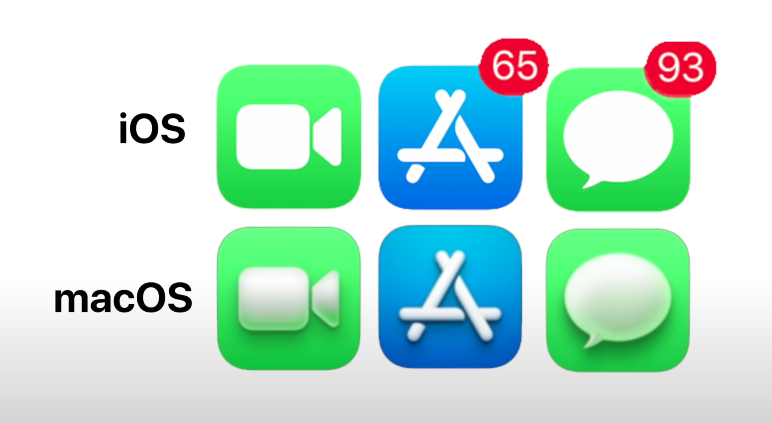
I do have two main concerns regarding Big Sur’s design. Firstly, the UI elements and how they just don’t feel right, they were designed for Touch Input. My second concern is the Icons. Apple is calling this a unified design, but they don’t look the same. They all have this weird shadow that is on the inside, very strange. We don’t have this on iOS and it just looks as if different Icons were designed by different people. The ‘Reminders’ Icon has no shadow at all, whereas the ‘Messages’ Icon does. Hopefully Apple fixes this by October, when macOS Big Sur is said to be released to the public. 

Anyway, I’m definitely looking forward to the future of the Mac and this transition will shape the entire tech industry. It will end up forcing more companies to innovate into the Mobile CPU space and of course, forcing Intel to do something about their CPU offering because at this point, AMD is ahead and it seems like Apple is now ahead as well.

The BEST TV (2020) - For PS5 & Xbox Series X!

The PS5 and the new Xbox Series X will both be out around November 2020, so now is a very good time to buy a new TV. This is pretty much the best one on the market, especially if you’re into Gaming.

Ok, so a bit of a background story first. My previous TV was an LG B7 OLED. This TV came out in 2017, hence the ‘7’, and it was the lowest-end OLED TV from LG, but that was fine because all of the other models still had the same OLED Panel and the same CPU. The only real difference was that the C7, E7 and W7 had a nicer Design and improved Speakers, that was it.

I bought this TV in mid-2018 for about £1,500, which was quite a good deal, and I’ve been very happy with it. I didn’t really plan to upgrade to the 2018 models as they were mostly the same. The 2019 models were using almost the same OLED Panel again and the 2020 models had some minor improvements, so I didn’t really see myself upgrading for a few more years.

Well, LG HQ actually got in touch and they’ve sent me the brand new LG CX, which just came out now, in 2020. Massive thanks to LG for sending this over. I have to say, it turns out that the CX is a massive upgrade over my B7 and here is why I genuinely believe that this TV is the best TV that money can buy, for the next-gen Consoles. 


4K OLED 

So, number one, this is a 4K OLED TV.

OLED is really the highest-end TV technology on the market right now. The only other technology that’s superior is microLED, but that’s still a few years away from being available for consumers. Samsung is indeed working on that Wall TV but until microLED becomes a real thing, OLED is the best.

Don’t be fooled by Samsungs ‘QLED’ Branding, OLED is definitely the superior technology.

Don’t be fooled by Samsungs ‘QLED’ Branding, OLED is definitely the superior technology.

Some of you might have heard of QLED, which is what Samsung calls their high-end TV’s. Spoiler though, QLED is still LCD, it is not OLED or anything like that. Essentially, on an LCD Display, the Pixels only provide the Colour and not the Brightness. This means that you would need a Backlight in order to be able to see anything on the screen. This Backlight not only makes the TV’s very thick, but it also means that when you want to display Black, the Backlight would still have to be fully on and would therefore look grey-ish, they wouldn’t be pure Black.

On OLED Displays, the Pixels provide both the Colour and the Brightness, so you can turn each of these 8 million Pixels off individually and get perfect Black Levels and an infinite Contrast. It’s the best picture quality that you can get right now. 


120Hz

Now, the second reason why this TV is so good for Gaming is that it supports 120Hz, meaning that it can display up to 120FPS in a game, which is something that both the PS5 and the Xbox Series X will support.

A little bit of downgrade, but it makes almost zero difference.

A little bit of downgrade, but it makes almost zero difference.

There have been some TV’s, mostly OLED TV’s from LG before, which have also supported 120Hz. However those ones, like my B7, did not have HDMI 2.1, which meant that while Netflix content could run at 120Hz, all the inputs going into the TV were limited to 4K 60, rather than 4K 120 like we have now. Not only that, but the CX can do 10-bit at 4:4:4 Chroma, which is pretty nuts. However, this is actually a bit of a downgrade from the LG C9 from last year, which could also accept a 12-bit signal. This is because the HDMI Bandwidth has been downgraded from 48Gb/s to 40Gb/s.

My friend Vincent Theo from ‘HDTV test’ did a very detailed Review of the CX and talked about this more in-depth, so if you want to know what this all means, I highly recommend watching his content if you’re looking for the best TV Reviews on YouTube. Long story short, this won’t affect you at all, as 10-bit already displays over 1 billion colours compared to the usual 64 million colours on 8-bit Displays. The Panel is still a 10-bit Panel anyway, it’s just that having a 12-bit signal would have resulted in slightly better Gradients when it comes to Banding. A very minor thing, which I did want to point out. But no need to worry, the PS5 and the Xbox Series X will be fully utilised by using this TV.


Response Time 

Now, the next most important thing about a Gaming Monitor, or a TV, is the Response Time. This is the amount of time it takes for the Monitor to switch the Pixels from one state to another, after it receives an input.

This TV could easily be used as a Gaming Monitor, especially the smaller variants.

This TV could easily be used as a Gaming Monitor, especially the smaller variants.

Gamers prefer extremely quick Response Times, ideally 1ms. Unfortunately, TV’s have typically always had around 30-40ms and around 20ms for the very best TV’s on the market. Well, not anymore. The LG CX 2020 has a 1ms Response Time, on par with all the highest-end Gaming Monitors out there. Anything that I do on my Controller translates pretty much instantly to the TV, Modern Warfare (Warzone) feels like it’s had a massive upgrade. It feels incredibly responsive and it’s pretty much the same experience as playing on a high-end Gaming Monitor.

Not only that, but the CX supports both NVIDIA GSync and AMD Freesync, so if you decide to hook this up to a PC, you can actually use it as a Gaming Monitor. Since this is a massive OLED Panel, the Gaming experience would be even better, even when compared to a standard Gaming Monitor. LG does have a smaller 49” model, which is more suitable for PC Gamers as it’s smaller. If you care about a fast and competitive Gaming experience, the CX is the best TV on the market for this. 


HDR Performance 

Another important thing about any Gaming TV is the HDR Performance. 

The CX supports Dolby Vision, HDR 10, HLG and pretty much all the main HDR modes. But, thanks to the brand new Alpha 9 Gen 3 Processor, the Brightness of HDR Content, when in Game Mode, has been significantly improved. With my B7, HDR Gaming was pretty dim to the point where if I was playing anything during the day, I could barely see anything on the screen. But on the CX, the difference in HDR Performance is night and day. Even when in HDR Game Mode, the screen stays just as bright as when it is not in HDR Game Mode. In fact, it was so bright that I had to turn down the Brightness as it was bothering my eyes. 

This was probably the biggest improvement over my old B7.

This was probably the biggest improvement over my old B7.

Not only is the CX significantly brighter in HDR Game Mode, but we also have a new HDR option called ‘HGIG’. What this is, is a brand new HDR standard where the Games themselves send the HDR Metadata directly to the TV, through the Games Console. What this means is that you’ll get a perfect HDR image without having to calibrate the image, as it will always be calibrated as the Game Designers intended. There are only a few games that do support it but for the ones that do, such as Spider-Man and Modern Warfare, the results are incredible.
So, this is why this TV is perfect for the next-gen Consoles. You get a 4K OLED Display with a 120Hz Refresh Rate, 1ms Response Time, NVIDIA G-Sync & AMD FreeSync Support and this brand new HGIG HDR Standard, on top of an already bright HDR representation.

But, there are a few more other things that I really love about this TV.


Smart Home

For example, not only does it have an AI Voice Assistant, but it even allows you to set-up your Smart-Home Accessories and control them from there, with full support for the Google Assistant and Alexa. You have this massive digital hub where you can control your entire home, which is really cool.


AppleTV & AirPlay

The CX also supports both Apple AirPlay, which means that you can stream content to it directly from an Apple device, and an integrated version of the AppleTV App, meaning that there’s no need for you to buy a separate Apple TV Box. I haven’t even used my Apple TV at all, since I got this TV.


Magic Remote

Not something that you might normally think about for a TV, but it makes a huge difference.

Not something that you might normally think about for a TV, but it makes a huge difference.

Probably my favourite part about this TV, is LG’s Magic Remote. LG has had this for a few years now, you essentially get a Mouse Cursor that you can control by just waving the Remote in the air. It honestly works so well that now it’s simply a joy to navigate through the TV Menus. Even typing text with this Remote is incredible, it’s just like using a Mouse on a digital, on-screen Keyboard. The Remote itself also has dedicated Buttons for Netflix and Amazon Prime Video, which allow you to instantly access the Apps, there’s really no need for an AppleTV at all anymore. 


WebOS

Also, the UI on LG TV’s is just brilliant. You get this Navigation Bar on the bottom, which contains all of your Apps and you even get a dedicated App Store from where you can download even more. The catalogue of Apps isn’t that massive, but you can still find all of your most popular TV Streaming Services. 


Sound

The sound on this is very good and you can even enable AI Sound, which will dramatically improve the sound quality based on the content that you’re watching. Also, the TV Remote itself has a Microphone which can monitor the sound levels of the TV and adjust those based on that as well, pretty smart.


Design

Finally, you cannot talk about a modern TV without talking about its Design. The CX is basically all screen. There are no Bezels at all aside from the very slim screen border, but that’s it. It looks absolutely stunning. 

Out of the current range of OLED TV’s, the CX is the best value for money.

Out of the current range of OLED TV’s, the CX is the best value for money.

I also love the stand, which is made out of Machined Metal, it looks very sleek, premium and the TV itself is also crazy thin. It does get quite thick towards the bottom, as that’s where all the components are located, but I do still think that this is one of the best looking TV’s on the market. So there you go, my In-Depth Review of the brand new LG CX 2020. The TV which I consider to be the best for Gaming, in 2020.

Ok, but…why not get the BX which is less expensive? Well, the BX comes with a weaker Processor, which means that the HDR Processing won’t be as good on the BX, as it is on the CX. All of the higher-end models like the EX or the WX still have the same image quality and processing power as the CX, it’s just that those are wall mounted. 

There’s honestly nothing negative that I can see about this TV, aside from the price. It’s quite expensive but OLED TV’s have dropped in price over the years. Again, massive thanks to LG for sending over this amazing TV!

iOS 14 - 40+ New Massive Changes!

WWDC… how amazing it was. We got the expected ARM transition, macOS Big Sur (not so expected), a full OS redesign that is the biggest change since macOS X and of course there was iOS 14, another gigantic change.

There were not any hardware releases, so no new iMac or AirTags. According to a Jon Prosser and a few others, Apple was planning to announce new hardware but for some reason fairly recently, they decided to push all of that into Q3 or Q4 of 2020. In this video, we’re fully focusing on iOS 14 and covering not 5, not 10 but over 40 big changes!


1) Widgets!

It’s been a long time coming. Credit: Apple

It’s been a long time coming. Credit: Apple

I’ve been wanting for this since I first got my Galaxy S4, in 2013. This has been a feature on Android since Day One, we sort of got it last year in iPad OS but it’s now finally here in iOS 14.

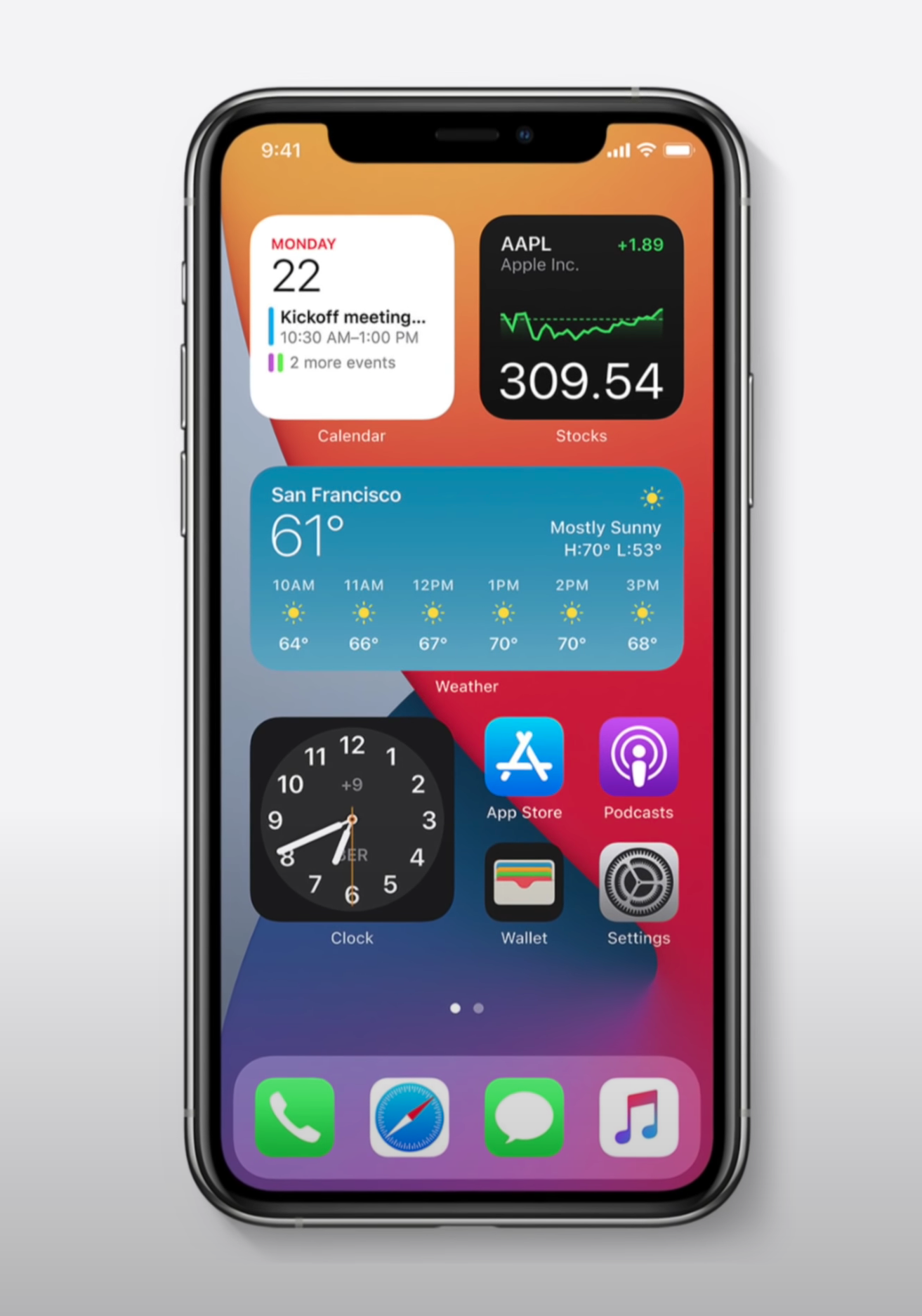
With the Widgets API, Developers can create their own Widgets. They will work in a similar way to how they currently work in the Notifications Panel, but you can have them on the Home-Screen and re-size them. You can even have multiple Widgets behind the same Widgets and then swipe between all the ones stacked there. Overall, this is a gigantic change to iOS, which I cannot wait to use.


2) App Library! 

Multiple Home-Screens are still there but you can now compact all of them into something called ‘AppLibrary’, which is sort of like the AppDrawer on Android. Swipe left and you get a list of your Folders with all your Apps. You can search Apps and scroll that list alphabetically, making it much easier to find the Apps that you need. 


3) Back Gestures

There’s now Gestures on the back of the iPhone, just double and triple tap and you can customise those for different actions, I would personally recommend Screenshot.


4) Fixed Calls

No more blocking up the UI. Regular Calls & Facetime Calls, or any other sort of Call, now don’t take up your entire screen. Instead, they now pop-up just like a Notification Card does.


5) AirPods Auto-Switch

You can Auto-Switch between your devices. It uses Gyroscope data to tell when you’ve picked up a new device and the Headphones switch to that, which is amazing.


6) AirPods 7.1 Support 

This is for AirPods Pro only. It includes Spacial Audio that creates a theatre experience, 7.1 Support and Dolby Atmos.


7) Siri Overlay

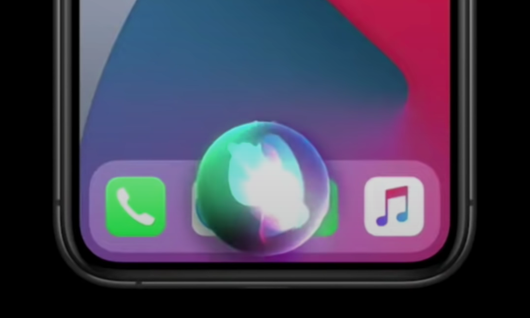
Siri no longer takes up the whole Display, but it does disable it for now.

Siri no longer takes up the whole Display, but it does disable it for now.

Same as with Calls, this doesn’t take up the entire screen anymore.

It will appear as a Card on the bottom. The only problem is that you cannot interact with the Display at the moment.


8) Smarter Siri 

Siri now knows 20 times more facts. The Web Answers are improved and she can send Audio Messages as well now. 


9) PiP Video

We had this on the iPad, now we have it on the iPhone as well, this is PiP Video from Safari and supported Apps. I believe my S4 from 2013 had this, but it’s good to finally have it on the iPhone as well.


10) Unlock Your Car

Open your Car Door using the iPhone. This only works with 2021 BMW series 5 at the moment but more cars will be included. You can give people full access and also works in iOS 13. Future versions will take advantage of the U1 Chip so that your car can unlock even when your iPhone is in your pocket or bag. 


11) Spotlight Search

This now works just like on the Mac, it no longer blocks the entire Display. Instead, you get this floating Search Bar and you can search anything now, from Apps to Web Searches.


12) AppClips

No App? No problem. Credit: Apple

No App? No problem. Credit: Apple

This is really cool. You go to a Store and if there’s a QR Code or an NFC Tag, you can still use their App to get reward points and so on, without having the App installed. It’s like a small version of that specific App, without having to install the full version. You only use it when you need it. For example, if you’re at a parking space and you need to get this App to pay, there’s no need to install that App anymore, AppClips would solve that issue.


13) Smarter Maps

Rich detail is coming to the UK, Ireland and Canada and overall accuracy has been improved. There’s guides for what to eat and where to watch movies, just like on Google Maps. Congestion and Green Zones are now included. 


14) Cycling Support

On the same subject, you will also get messages for when you’re going uphill or for when you’ll have to take the stairs.


15) EV Routing

If you have an EV, it will automatically link to that car and it will plan your route accordingly, if you’ll need a charge part-way through. 


16) Translate App

To me it looks like Google Translate but it can also work completely offline as it uses on-device machine learning. It only supports 11 languages so far though. 


17) iMessage Improvements

Chats have become far more intuitive. Credit: Apple

Chats have become far more intuitive. Credit: Apple

Your pinned conversations and most recent Messages will be on top. Group conversations have also been improved, you can just tap on a person and highlight all messages referring to that person alone, with in-line replies in groups as well as mentions.


18) Adaptive Lightning

During working hours, your lights would have a cool temperature and a warm temperature at night. This is thanks to the Home App.


19) Activity Zones & Face Recognition

You can set Activity Zones in Cameras so you get notified when there’s movement in that specific region. Also, Face Recognition works with faces that you’ve tagged in the Photos App. 


20) Safari Passwords

There is now an automatic warning if your password isn’t secure. 


21) Safari Privacy Report

Just tap the Privacy Report to see how websites track your data. 


22) CarPlay Wallpapers

How was this not a thing before. It looks so much nicer now, I don’t have a car, so…moving on.


23) Exposure Control

In the Camera App, you can now control the Exposure separately from the Focus, just like you could in third-party Apps. 


24) ARKit 4

Location Anchors are present, which allows for directional icons and art to be placed in specific parts of the world. Everyone looking at those places will get the icons that those Developers placed.


25) Default Apps

You can set a default email and browser App, I would have liked Calendar too though. 


26) Weather Forecasts

Dark Sky has long been one of the best weather Apps out there. Credit: Apple

Dark Sky has long been one of the best weather Apps out there. Credit: Apple

There’s now minute-by-minute forecasts in the US, thanks to Dark Sky. Apple purchased this App this year, I believe. It’s the best weather App in my opinion.


27) Voice Memos

Improve the sound quality of your recordings with a single tap. This utilises AI Processing. 


28) QuickTake Video

This is now available on the iPhone XS & XR, not just the iPhone 11’s.


29) Emoji Search

You can finally search for Emoji’s, just like on the Mac. Finally!


30) AirPods API 

Developers can take advantage of the Gyroscope Sensors from the AirPods, which will be useful in some audio Apps and Games.


31) AirPods Battery Notifications

Screenshot 2020-06-26 at 15.55.35.png

You will get a message when your Battery is low and you need to charge them. 


32) Selfies Flip

You can choose if you want your Selfies to be mirrored or not. 


33) New Fitness App

Unlike the leaked one, there are no actual fitness plans that you can take or workout guides yet. This App is just the renamed Activity App, which now includes more workout data, that’s it.


34) Sleep Tracking 

You can do this on the Apple Watch now but if you don’t have one, you can kind of do it on the iPhone. Sleep Mode dims the screen, turns on DND Mode and tells you when to wind down in order to get the desired hours of sleep for the next day.


35) Recording Indicator

There’s now an indicator when your Front Camera or Microphone is being used by a third party App. On the Macs, you have the LED indicator for the Front Camera, but you never had anything like this on iOS, until now. 


36) FindMy - 3rd Party Support

Third-party Accessory support in the ‘FindMy’ App. This would help companies such as Tile survive, once Apple releases their own AirTag. 


37) YouTube 4K?

AppleTV now supports it. It’s not available on iOS just yet, but it might be coming in future beta versions.


38) APFS in Files 

The Files App now supports an external SSD that’s formatted as an APFS Drive. 


39) Spotify on the HomePod

Third-party Music Apps will now be supported on the HomePod.


40) Night Mode

You now get a Gyroscope preview to better centre your shots and you can even cancel a Night Mode shot mid-way through.


41) Video Frame-Rate

Screenshot 2020-06-26 at 15.56.29.png

Toggles to switch in the Camera App are now available on all of the iPhones, not just the 11’s.


42) Supported Devices

All devices that supported iOS 13, are still supported here. This includes the iPhone SE and 6S as well as anything newer. These were only the biggest changes, there’s been hundreds in total. A video on macOS Big Sur and ARM will be coming up next. 

What other videos do you want to see?

PS5 (2020) - Everything You Need to Know!

So, just like that, Sony has showed us the actual design of the PS5, alongside a ton of games. Now that we know what it will look like, what games it will play and how well it would run those games, here are my thoughts on the PS5. This will be covering everything that Sony has talked about so far and why I’m really looking forward to the PS5.

Grab some snacks, and enjoy! 


PS5 Design

Number one probably sounds a bit lame because it is really the least important part of a Games Console, which is the Design.

Sony has had two major PS5 events, the first one being in March where Mark Cerny, the PS5’s Lead System Architect, talked about the specs and how the entire system was built. The second big event was just last week, when Sony revealed the full design of the PS5.

We’ve made a number of concepts of how we imagined the PS5 would look. We were also the first ones in the world to reveal an actual photo of the PS5’s DevKit, back in October 2019. I know that there are already a bunch of memes floating around but, I actually really like this Design. It kind of reminds me of Eve, from Wall-E. It’s got that very futuristic and minimalistic look to it, with that Glossy Black middle and then the two Matte White slabs surrounding it. You might remember me saying that the Panda Pixel 2 XL was my favourite colour scheme on any Smartphone and this is pretty much the same. You could say it’s the Playstation 5: Storm-Trooper Edition, I love it!

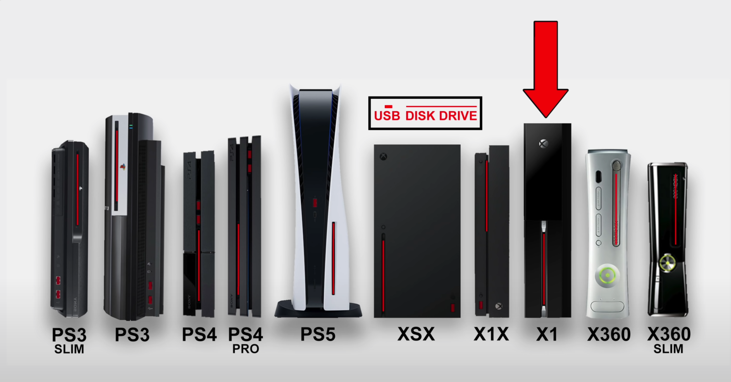
Compared to the Xbox Series X, the Xbox has a more mature and classic look, which some may prefer. I like both actually, but I just think that the PS5 would look a bit more interesting and futuristic in my Living-Room, whilst the Xbox would just blend in better. Also, a few people have calculated the actual size of the PS5, based on the Disk-Drive size and the USB Port, and it turns out that it’s actually massive. It dwarfs the PS4 Pro, the Xbox One X and even the Xbox Series X. This makes it, I believe, the tallest Games Console ever made.

This is how the PS5 stacks up to its predecessors & main competitor (Credit: The Verge).

This is how the PS5 stacks up to its predecessors & main competitor (Credit: The Verge).

Now, the Xbox is more of like a box, so it is fatter than the PS5, which is tall and thin. The good news is that you can indeed use the PS5 on its side as well, which would make it look even weirder. In a way it kind of resembles our latest concept, on its side. But you can use it in any Orientation that you wish, just like you can with the Xbox.

Something that I was really not expecting to see with the PS5, is more than one model. We’ve heard the rumors that Microsoft is planning at least two models of the Xbox Series X, with Lockhart and Scarlett, but unlike the Xbox, the PS5 will have two models that would have identical performance between them. The only difference is that the less expensive one does not have a Blu-Ray Drive in it, which in my opinion also makes it look so much better and so much more uniform.

Here’s something that I want to clarify, just because of how insanely fast that SSD is, you would not be playing any games from the Disk Drive. They would just be there for the sake of you not having to download the actual games. In some cases, maybe Game Developers would store some game assets there, but I don’t even see that being the case as the speed of the Blu-Ray Disk Drive is 27MB/s, compared to the 9000MB/s or so that the SSD inside the PS5 is said to be. So, in this case, the only reason why anyone should get the disk-version of the PS5 is if you really want to play your old PS4 games and you have those games on disk. That’s literally the only reason. 

Now, just a few more things that I want to cover here. I do love the blue LED light-strip that Sony has added towards the top of the PS5, I think it looks gorgeous and we can also see the Ports now. It seems like on the front we get a USB A and a USB C Port, alongside what looks to be two physical Buttons, likely the Power Button and the Disk-Eject Button, on the model that has a Disk Drive. The other one seems to be lacking this second Button. Unfortunately, Sony hasn’t showed us any photos of the sides or the back, so we don’t know what Ports we’ll have there, but at least when it comes to the front, easily accessible Ports, both USB C and USB A are there.

Sony has also released a teaser trailer of the PS5’s UI and they said that it will be completely re-imagined and that no single Pixel will be left untouched. I really do hope that they don’t change it too much as the PS4’s UI was already regarded as the very best. It was easy to navigate and very easy to understand. I just hope that they don’t ruin that for the sake of redesigning it. 


Controller

The second thing that I’m really looking forward to, is the brand new Controller.

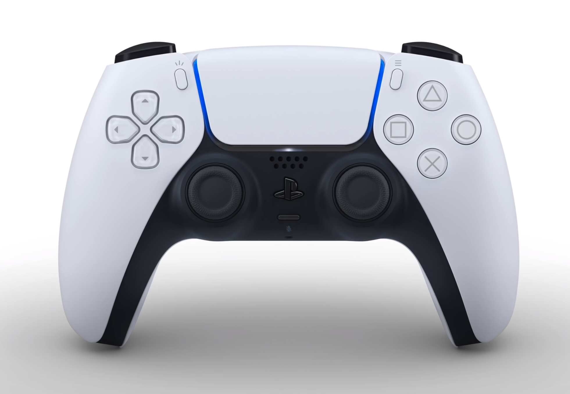
You see, rather than Sony calling this the DualShock 5, they decided to go for a brand new name, the DualSense. There’s actually a very good reason for this name. The main feature of this new Controller, aside from the new Design that I’ll cover in just a minute, is that it has a full Haptic Engine built into it.

We can’t wait to get our hands on this… literally (Credit: PlayStation)

We can’t wait to get our hands on this… literally (Credit: PlayStation)

On high-end Smartphones, like the iPhone 11, Pixel 4, Galaxy S20’s and many more, you get a Haptic Engine which gives you the impression that the Buttons that you see on the screen are actual physical Buttons that you can actually feel. The new DualSense controller now does just that. It can apparently mimic the feel of sand, grass, water, dirt and more, immersing you so much more into the game. The Haptic Engine on Smartphones today are already incredible, so having an even better Haptic Engine in a device such as a game Controller should definitely be game-changing.

Sony also added Adaptive Triggers to this Controller, meaning that the Triggers would provide you with a different level of resistance based on what you’re doing in a game. This way, weapons in Modern Warfare for example, would actually feel very different and in combination with the Haptic Engine, they should feel closer to firing a real weapon.

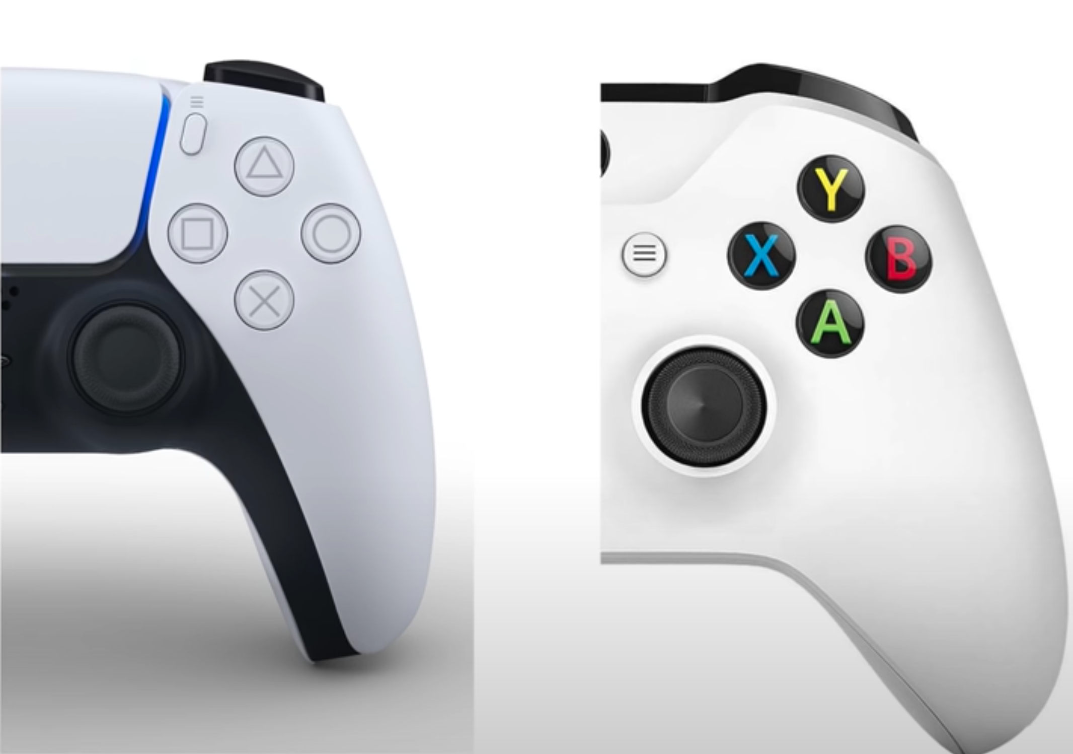
We also have a USB C Port, which not only means that you can use any charger to charge this Controller, but you’ll also be able to use an external Battery Bank. We now have a built-in Microphone, so that you can chat with your friends without the need to plug in Headphones, which of course can still be plugged in using the dedicated 3.5mm Headphone Jack. We still have a built-in Speaker as well. We also have a brand new Magnetic Connector for adding Accessories, possibly that Back Button Attachment, which should be launching at some point.

Finally, there’s the Touchpad in the middle, pretty much the same Buttons as before, just renamed, and then the dual-tone black and white design, which resembles the Design of the actual PS5 Console.


Accessories

The next thing that I’m really looking forward to, are the Accessories.

Aside from the Console and the Controller, Sony has also teased a few of the Accessories that you can purchase to go with your PS5. There’s a DualSense Charging Station, which allows you to charge two DualSense Controllers at the same time using that proprietary Magnetic Charging Port on the bottom, so no need to fiddle around with cables.

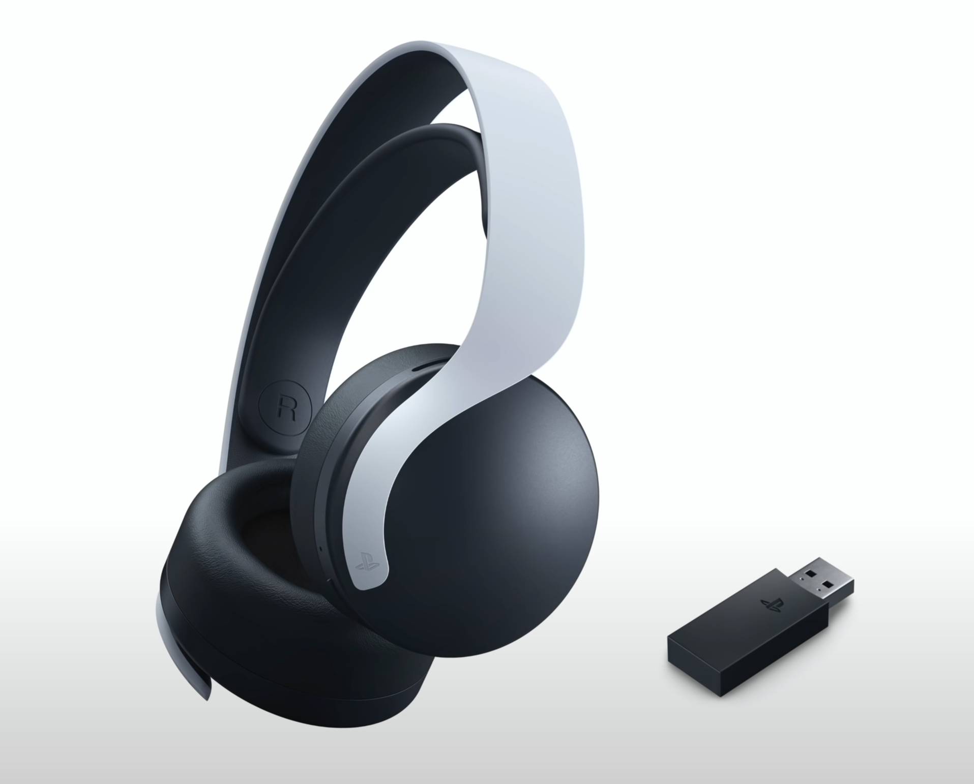
3D Audio has been something that Sony has mentioned a lot with the PS5, so this headset will be the best way to experience it at launch. (Credit: PlayStation)

3D Audio has been something that Sony has mentioned a lot with the PS5, so this headset will be the best way to experience it at launch. (Credit: PlayStation)

We also have a brand new HD Camera, which interestingly enough does have two Camera Modules. This makes me think that this would be used for the PSVR Tracking as well, or at least for some 3D functionality to some extent.

We also have one new Wireless Headset, the Pulse 3D, which would be the best way for you to experience 3D Audio on the PS5. Up until now, Sony has had a few models of their own Playstation Headsets, this time it seems like they only want to have one model, which I’m totally for.

Sony is also adding a new Media Remote as an Accessory, which will allow you to control and use the PS5 just like you would use a Smart TV Box. From the looks of it, it seems that it has four Buttons that look like they can be remapped into possibly any App that you want, such as Netflix, Amazon Prime video and so on. 

I’m pretty sure that even more Accessories will be added in the near future. There’s a new PSVR coming out in 2021, which will be a pretty big deal and we’ll likely see more colours of the Controller and possibly even the PS5 itself, not too long into the distant future either. 

Specs

Right, now onto the good stuff, the Performance. The PS5 is a gigantic leap in Performance over the PS4 and even the PS4 Pro.

In terms of the CPU, it comes with a Desktop Class AMD Processor, based on the Zen2 Architecture. We have an Eight-Core CPU at 3.5GHz, which is just light-years more powerful than the old Jaguar Architecture that we got in the PS4.

With the GPU, we get AMD’s brand new Navi 2 Architecture, which isn’t even out for PC at the moment. The GPU offers 10.28 TFLOPS in GPU Compute Power, making it 5.58 times more powerful than the PS4’s GPU and 2.44 times more powerful than the PS4 Pro’s GPU. If those numbers don’t seem high enough, in reality they’re actually even higher as RDNA with ‘X’ amount of TFLOPS is actually significantly more powerful than what it would be on GCN, with that same amount of TFLOPS.

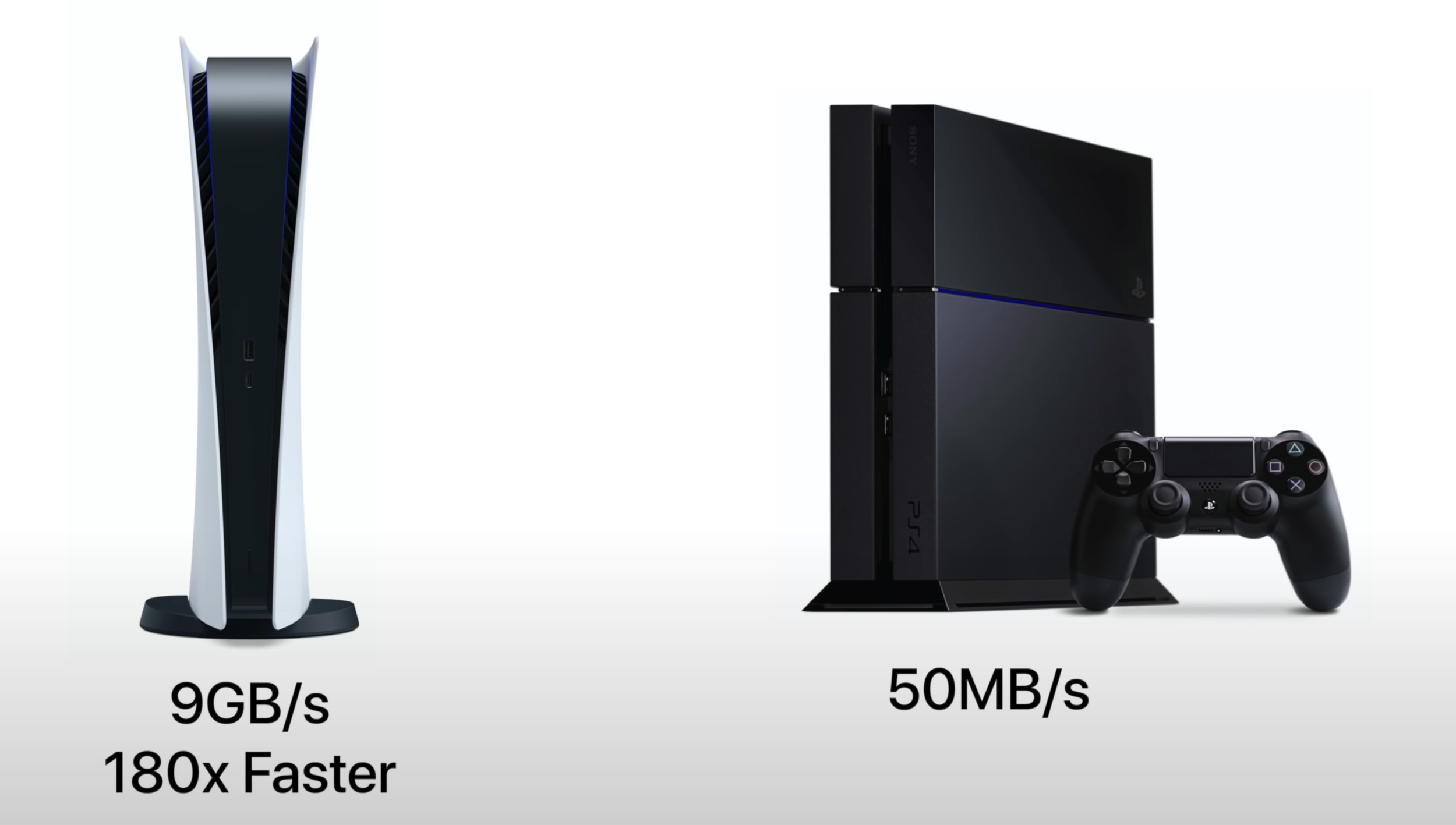
The SSD is sure to be one of the PS5’s biggest advantages over the Xbox Series X, those numbers are just ridiculous. (Credit: PlayStation)

The SSD is sure to be one of the PS5’s biggest advantages over the Xbox Series X, those numbers are just ridiculous. (Credit: PlayStation)

I’m not going to go into a super amount of detail into the specs as I’ve already covered those in a previous video, but what you need to know for now is that the CPU, in combination with the GPU, will give us true 4K gaming at 60FPS with support of up to 120FPS , as well as 8K support too. Not only that, but we’ll get things such as Ray Tracing support for extremely realistic shadows and insanely detailed 8K textures in games that would look like real-life photos. We’re also going to get 3D Audio on a hardware level, which when combined with that new Pulse 3D Headset, should give you the most immersive audio experience in gaming yet.

Epic Games has demoed their brand new Unreal Engine 5, running in real time on the PS5. Here we saw some of the most amazing graphics ever on a Console or even PC. However, this new Unreal Engine 5, which is launching in 2021, will also run on Xbox and PC as well. So, those graphics are coming to the other platforms, not just the PS5.

Performance-wise, the Xbox Series X is superior to the PS5, there’s been quite a few Developers that are currently working on games for both Consoles that have said that. However, the PS5 is much easier to develop games for and also has a much faster SSD with up to 9GB/s Compressed, when compared to 2.4GB/s that the Xbox Series X will have. The PS4 had a HDD with a Transfer Speed of around 50MB/s, so the SSD inside the PS5 is 180 times faster!

This allows for zero loading times in games and more importantly, the ability to change the game’s Design based on the SSD speed entirely. For example, in Spider-Man you have to take the Metro when you’re fast-traveling. On the PS5, that option could be removed entirely and you could also jump inside of buildings instantly, without having to transition to a loading screen just to load the assets. So, this is where the biggest advantages to the PS5 are, the SSD and the Controller.

And of course, there’s the games!


Games 

In terms of the games, what you need to know is that all of your PS4 games will work with the PS5.  If you do have the ‘Digital Only’ Version of the PS5, you might have to re-purchase the disk games that you had, Sony hasn’t confirmed this but it is very likely that this will be the case. However, if you have the Blu-Ray Disk Drive version of the PS5, you will be able to just slot in a PS4 disk and play it on the PS5.

Now, aside from just playing PS4 games, most of those PS4 games will also run much better as the PS5 will feature a Boost Mode. Essentially, the PS5’s GPU has a PS4 GPU built into it, this is how it can natively run PS4 games. However, it can also increase the clock-speeds of that GPU above of what the PS4 could do, which is what Boost Mode is. This means that you will get higher Frame-Rates as well as increased Resolution for your PS4 games. If Developers also release a patch, we would even get PS5 specific features that would take advantage of that SSD and that extra Performance.

Ok, but what about PS5 exclusive games? Well, unlike Microsoft, who will not have any exclusive games on the Xbox for at least the next two years, Sony will. In fact, most of the games that they have announced are PS5 exclusives and that’s actually a very good thing. It means that they are all fully optimised for the PS5’s hardware, rather than having to make compromises in order to support older systems as well. The first game that they showed was Gran Turismo 7, with full Ray-Tracing support and running in 4K at 60FPS. At least this is what the video itself was encoded at. The graphics looked good but I wouldn’t necessarily say that they looked completely mind blowing. Still, I’m pretty excited to see this game in person.

‘Horizon 2: Forbidden West’ & ‘Spider-Man: Miles Morales’ were a couple of our personal favourites, although GTA V received a less than welcome reception. (Credit: PlayStation)

‘Horizon 2: Forbidden West’ & ‘Spider-Man: Miles Morales’ were a couple of our personal favourites, although GTA V received a less than welcome reception. (Credit: PlayStation)

We then got a preview of the next Ratchet & Clank game, this looked like a Disney film, it looked like true next-gen. The unique thing about this game is that you can jump into a rift and get instantly teleported into a new world, a new dimension, with all assets being loaded instantly. There’s basically no loading time at all. This is why having this game run on the PS4 would be impossible without having to re-design the game-play element of it. The PS4 would not be able to load those assets that quickly.

GTA 5 was also announced and this seems to be a re-master of the PS4 re-master. The trailer has a ton of dislikes and I can definitely see why. This was already going to be supported on the PS5, thanks to Backwards Compatibility. All this is basically just a patch to increase the Resolution and Frame-Rate with a few high Resolution textures being added. However, it seems to be a much smaller change than what the PS4 version was to the PS3, as Rockstar hasn’t really shown us any side by side comparisons. The trailer that they uploaded was in 1080p, so I do understand why these dislikes are here.

There is a new Spider-Man game coming though, this is called ‘Spider-Man: Miles Morales’, which apparently is a standalone game and not an expansion. It is, however, in the same universe as the 2018 Spider-Man game and apparently this is coming out by the end of the year. It will be one of the first games to be released on the PS5. The graphics looked good but again, they didn’t look as good as the Unreal 5 Engine demo, they just looked to be at a higher Resolution with higher textures and effects quality. Also, for some reason, this trailer was in 4K but only at 30FPS, which I really hope isn’t the case for the final game. 60FPS is really the target for this generation of Consoles and if there’s a game that needs 60FPS a lot, that’s definitely Spider-Man.

Finally, the game that wowed me the most was definitely the new Horizon game - ‘Horizon 2: Forbidden West’ and this is where we can see true next-gen graphics on the PS5. It’s a pretty big leap over the already incredible looking Horizon Zero Dawn, but unfortunately we do not have a release date for that just yet.

Of course, these are just the very first games of this generation. Future games will utilise the hardware even better and they will deliver some even more outstanding graphics, these are very likely to include: GTA 6, Spider-Man 2, the next God of War and so on. 

The PS5 - Finally Revealed!

So…here it is.

We have finally got our first look at the PlayStation 5, nearly 6 months after Xbox first showed us the Xbox Series X at last years’ Game Awards. Sony has certainly kept us waiting and they left it right to the very end of their 75 minute showcase to reveal the final design, although there were a few teasers scattered between the Trailers.

We’ve linked the main event above but if you want to check out the entire livestream, check out the official PlayStation YouTube channel for Gameplay & Trailers for games including:

Screenshot 2020-06-12 at 14.37.50.png
  • GTA V - PS5 Edition

  • Spider-Man - Miles Morales

  • Gran Turismo 7

  • Ratchet & Clank: Rift Apart

  • Project Athia

  • Stray

  • Returnal

  • Sackboy

  • Destruction Allstars

  • Kena

  • Goodbye Volcano High

  • Oddworld: Soulstorm

  • Ghostwire Tokyo

  • JETT: The Far Shore

  • Godfall

  • Solar Ash

  • Astro’s Playroom

  • Bugsnax

  • Demon Souls

  • DEATHLOOP

  • Resident Evil 8: Village

  • Pragmata

  • Horizon: Forbidden West

We also saw two separate models of the PS5, a standard model with a 4K Blu-Ray Drive and a Digital Edition, without any form of Disk Drive at all. We still don’t have word on a price for either model or an exact release date, but one thing that we certainly know is that this is going to be big, in every sense of the word.

We’ll have a video up on the channel next week, so make sure you’re Subscribed and have that Notification Bell turned on so you don’t miss it!

iPad Pro vs MacBook Pro 13 (2020) - Which One's the Real Laptop?

Over the past few months, there have been two devices that I’ve been using a ton. The iPad Pro with the brand new Magic Keyboard, which has actually now become my home computer and a full Laptop replacement for when I’m on the go. Also, I’ve also been using the new 13” 2020 MacBook Pro, which has now replaced my 15” MacBook Pro from 2019.

The Full In-Depth Review of the 13” 2020 MacBook Pro is coming out the week following this video but until then, here’s the answer to the question that a lot of you have been asking. Should you buy an iPad Pro with the Magic Keyboard, which is finally a true Laptop replacement now, or should you get the MacBook Pro 13”?

Well, get all those snacks ready and buckle up because this is going to be a very detailed comparison. We’ll be covering everything from the Design, Display, Keyboard, Trackpad, Camera, Microphones, Speakers, Performance, Battery Life and the Value! 


Design

Starting off with the Design, these two devices couldn’t be any more different. The MacBook Pro was born to be a Laptop, while the iPad Pro was born to be a Tablet, which then became a Laptop.

In terms of which one looks better, this is very subjective because if you’re looking for a more traditional Laptop, the MacBook Pro is the winner here. You get a full Aluminium and Glass Unibody build, which is extremely sturdy and premium. But, if you’re looking for something that’s a bit more versatile, the iPad Pro is indeed the winner here. With that floating design, the iPad Pro definitely looks more futuristic. But with the Magic Keyboard itself, it doesn’t feel as premium as the MacBook Pro does. I’m not referring to the actual Keys, but the material that surrounds them. 

On the iPad Pro we have this Silicone/Rubber material, while it does indeed protect the iPad, you don’t get that ultra-premium feel that the MacBook Pro gives you. Also, this material gets smudged extremely easy, after even just a few hours of use. So, the iPad Pro will look very used, in a matter of hours, while the MacBook Pro will keep on looking brand new for years as it has a full metal body. So overall, the MacBook Pro does look and feel like a more premium device.

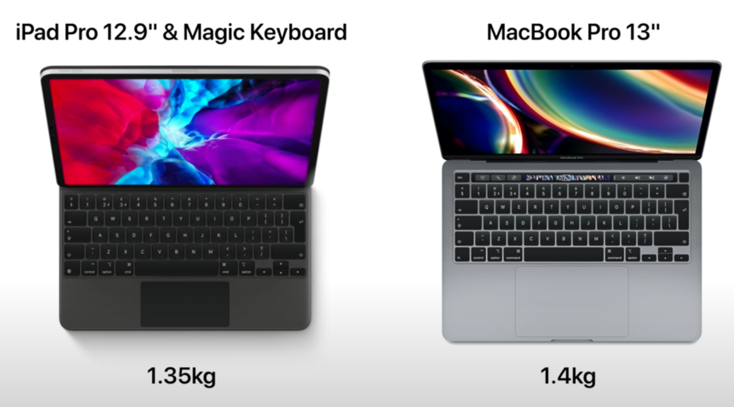
The iPad Pro 12.9” weighs roughly the same, and is slightly thicker than the MacBook Pro 13”. But it is much more versatile.

The iPad Pro 12.9” weighs roughly the same, and is slightly thicker than the MacBook Pro 13”. But it is much more versatile.

But which one is more usable? Well, the iPad Pro has a significant advantage here. You see, not only does the iPad Pro support Touch Input, but you can easily remove it from the Keyboard Case and use it just like a Tablet in Landscape or even Portrait mode, whenever you wish. You can use the iPad Pro with the Apple Pencil as well, you can use it as an External Monitor for your MacBook Pro, none of which you can do with a Mac. You also have FaceID, compared to the TouchID unlock on the MacBook Pro and I have to say, FaceID is significantly superior. The moment you tap the screen or even a Key on the Keyboard, the iPad instantly unlocks.

Same goes for when you’re filling in passwords or using Apple Pay, the iPad Pro is a massive improvement over a MacBook Pro. The MacBook Pro is just a traditional Laptop, whereas the iPad Pro is this brand new modular device that you can use in any shape or form you want, it’s a magical device.

When it comes to the Portability, the iPad Pro comes in two sizes, the 11” and 12.9”. The MacBook Pro comes in 13” and 16”. So, if we compare both 13” sizes of both devices, the iPad Pro on its own weighs 641g, while the MacBook Pro 13” weighs 1.4kg. However, if we add in the Magic Keyboard to the 12.9” iPad Pro, it ends up being 1.35kg, almost as heavy as the MacBook Pro is. The 11” iPad Pro, with the Magic Keyboard, weighs 1.07kg, so that’s much lighter. However, both iPad Pro’s are actually slightly thicker than the 13” MacBook Pro. So, just because of how much more versatile and flexible the iPad is to use, I have to give the design award to the iPad Pro. 


Display

So now, what about the Display? Well, both the iPad Pro and the MacBook Pro have an outstanding Display Panel. 

They’re both LCD displays, but they’re IPS Panels, meaning that they have an almost 180 Degree viewing angle. They both have a DCI P3 Panel, which can display around 25% more colours, when compared to a standard sRGB Display. They’re very good Displays, the best LCD Displays that you can find on a Laptop or a Tablet. But, the iPad Pro’s Display is actually superior in three ways.

The iPad Pro’s biggest advantage, with the Display, is definitely that Dynamic Refresh Rate.

The iPad Pro’s biggest advantage, with the Display, is definitely that Dynamic Refresh Rate.

Firstly, the Bezels are much thinner on the iPad Pro. This means that the iPad Pro’s Display not only looks better and more futuristic, but if you get the 12.9” iPad Pro, it would be noticeably smaller than the Display on the MacBook Pro 13”, even-though they’re almost the same physical size.

Secondly, the iPad Pro’s Display is actually brighter, with a peak brightness of 600 Nits, compared to around 500 Nits on the MacBook Pro. This means that if you plan on using either of these outdoors, the iPad Pro is a much better option.

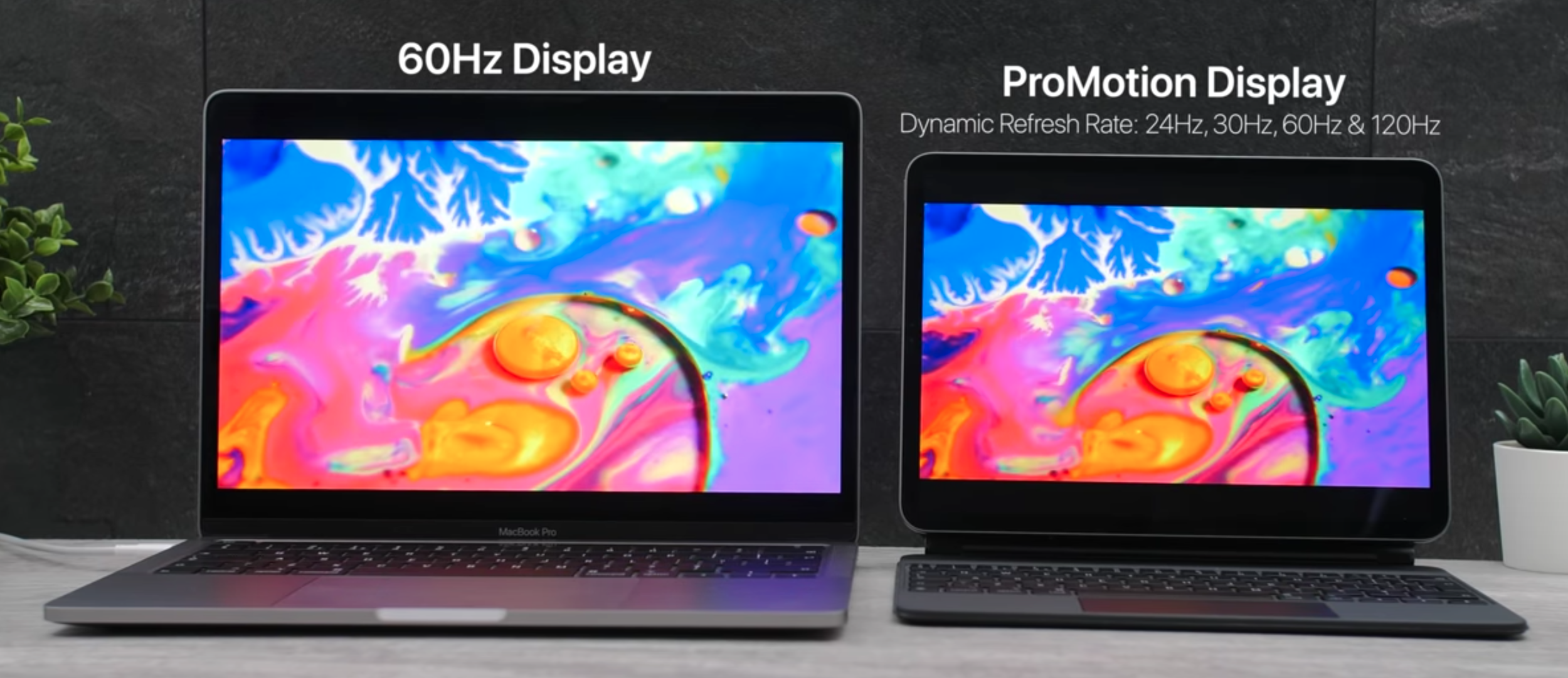
Lastly, the iPad Pro also has a ProMotion Display, which can adjust its Refresh Rate from 24Hz, 30Hz, 60Hz and all the way up to 120Hz, depending on the content that you’re watching. The MacBook Pro has a fixed 60Hz Refresh Rate Display. I have to say, this is by far the biggest advantage of the iPad Pro. Everything that you do on the iPad Pro feels so smooth. The thing is, my MacBook Pro does drop a lot of frames when scrolling and navigating through the UI. The animations don’t always run at 60FPS, so when they drop to 50FPS or even 40FPS and then you compare that to the iPad Pro, which always runs at 120FPS in the UI, the difference is just gigantic. Because of this, I have to give the Display win to the iPad Pro.


Keyboard & Trackpad

Next up, we have the Keyboard and the Trackpad.

When it comes to the Keyboard, both of these devices now feature Apple’s brand new Magic Keyboard. Long gone is the disastrous Magic Keyboard that had almost no Key Travel and Apple refused to replace over a period of five years, even-though it constantly broke. This Magic Keyboard is very similar to the one that we get on the iMac Keyboards, which is also called…the Magic Keyboard.  They’re also very similar to the amazing Keyboards that we used to get on all the MacBooks up until 2015.

The difference is some areas is not quite as black & white as it might seem.

The difference is some areas is not quite as black & white as it might seem.

The difference here is that we do get larger Key-Caps and a more stable Keyboard. Both of these Keyboards are actually much better than on the 2015 MacBook Pro and even better than the current Magic Keyboards on the iMacs. But which one of these is better?

Well, the MacBook Pro definitely has a better Keyboard, which you probably expected, as this is..you know…an actual Laptop. But the thing is, it’s not actually that much better. If the MacBook Pro has a 10/10  Keyboard, the iPad Pro probably has around an 8.8/10. At least when it comes to the 11” iPad Pro, which does indeed have a much smaller Keyboard overall. I do find it to be a bit too crammed and some of the Keys also have a much smaller size in order to fit in this footprint.

The 12.9” iPad Pro has a full-size Keyboard, just like the MacBook Pro and that one’s much more comfortable to type on. But, aside from the size difference, the typing experience is almost identical between the two sizes of the iPad Pro and the MacBook Pro. You get the same 1mm of Key Travel, I actually ended up scripting almost all of my videos off of the iPad Pro, until I got this 13” MacBook Pro. The moment I started scripting on the iPad Pro, I couldn’t go back to my 2019 15” MacBook Pro, which still comes with that Butterfly Keyboard. So, the typing experience is excellent! 

One advantage that the MacBook Pro has over the iPad Pro’s Keyboard is that we do get a function row of keys. We have the Escape Key as well as the TouchBar, which gives you virtual controls based on the App that you’re using. The iPad Pro however, has none of that. If you want to adjust the volume or the brightness, you have to go into the Control Centre, which takes noticeably longer, compared to the MacBook Pro.

Both Keyboards are Backlit but the iPad Pro does not have a Key, or even a software toggle in the Control Centre, to adjust its brightness. In order to do that, you have to go all the way into the Settings and adjust it from there, which is very inconvenient. On the MacBook Pro, you just have a toggle for the Backlight built into the TouchBar, it’s very quick and convenient to adjust it.

Interestingly enough, I do find typing on the iPad Pro do be somewhat more comfortable. This is mostly because, since it is a much thinner device when open, the Chassis doesn’t hurt on your Wrists as much as they hurt on the MacBook Pro. We also have a soft rubber Chassis, compared to a full metal Chassis on the MacBook Pro, so the iPad’s Magic Keyboard is much easier on the Wrists. 

The MacBook Pro does win in both departments, but that doesn’t make the Keyboard & Trackpad on the iPad Pro bad by any means.

The MacBook Pro does win in both departments, but that doesn’t make the Keyboard & Trackpad on the iPad Pro bad by any means.

The tilt is greater on the MacBook Pro, so you can lean the Display further down, compared to the iPad Pro. The MacBook Pro is also more stable, compared to the iPad Pro, which when tilted all the way backwards, does have a tendency to tip over. Overall, the MacBook Pro does have a better Keyboard. So, what about the Trackpad?

Well, the MacBook Pro takes this one as well. Not only is the Trackpad on the MacBook Pro much bigger, but it also doesn’t physically click. Instead, there’s a Vibration Motor inside it that gives you the impression that you’ve clicked the Trackpad. This way, you have two levels of pressure, with the second one being used for the Force Click, which gives you more options when pressing on an item.

The iPad Pro uses a much smaller Trackpad, which does indeed physically click. However, unlike the Trackpad on most Windows Laptops, you can press the iPad’s Trackpad anywhere, even on the top. So, this is not a diving board mechanism but instead, the entire Trackpad can click. The Gestures are very similar on both of these, however, the iPad does have a few that are different, such as taking you Home or displaying the Notification Centre. 

Overall, the MacBook Pro has a better Keyboard, as well as a better Trackpad. But, the iPad Pro still has a better Keyboard and Trackpad than most other Laptops on the market, so they’re still very, very good. 


Camera, Microphones & Speakers

In terms of Cameras, the iPad is the clear choice.

In terms of Cameras, the iPad is the clear choice.

Moving on to the Camera, Microphones & Speakers. Firstly, the Camera is a massive win for the iPad. Not only do we have a 1080p, 60FPS Front Camera, compared to the 720p, 60FPS Camera on the MacBook Pro, but the iPad Pro also comes with an actual Camera on the back. This Camera is capable of taking some breath-taking photos, 4K60 video and overall, images and videos that are pretty much just as good as on the iPhone.  Not only that, but we also have an Ultra-Wide Angle Module as well as a LiDAR Scanner for AR Apps, on the 2020 iPad Pro. 

In case you’re wondering what the Microphones sound like, be sure to check out the test in the video. In terms of the Speakers, they’re both very good. The MacBook Pro is better as it is a larger device, but we also tested both in the full video linked at the top.


Performance

Moving on to the Performance, this is probably going to be shocking for most of you. On paper, the MacBook Pro smokes the iPad Pro. My model has an Intel 10th Generation, Quad-Core Processor, 16GB of RAM and 512GB of Storage. The iPad Pro, on the other hand, has Apple’s A12Z Processor, 6GB of RAM and 128GB of Storage. Also, the MacBook Pro has two Cooling Fans and some pretty big Air Intake and Outtake Vents, whereas the iPad Pro has no Fans, or Vents, at all. 

In a lot of ways, the iPad can go toe-to-toe with the MacBook Pro.

In a lot of ways, the iPad can go toe-to-toe with the MacBook Pro.

So, you would expect the MacBook Pro to just murder the iPad Pro when it comes to performance. But, to my surprise, it was actually the other way around! In GeekBench 5, the iPad Pro scored 1114SC and 4654MC, while the MacBook Pro 13”, with the i5 10th Generation Intel Processor, scored 1128SC and 4370MC, quite a bit lower on the Multi-Core side. Interesting, so what about the GPU?

Well, the iPad Pro 2020 scores 9547 points, while the MacBook Pro scores around 8374 points, sometimes as high as 9960 points. Long story short, it seems like they’re both pretty much identical when it comes to raw performance. In fact, the iPad Pro even appears to be slightly more powerful. If you compare it to the baseline 13” MacBook Pro, the iPad Pro is clearly more powerful when it comes to both the CPU and GPU. 

How does this translate to some real world usage? Well, in our video we had the same 4K video timeline, with the same exact 4K60 shots taken from our Panasonic GH5, and they’re pretty demanding on both of these machines, I also added some transitions and titles. This five minute timeline took 2:53 to export on the iPad and 7:27 to export on the MacBook Pro, which is a significant difference. The iPad Pro was more than 2.5x times faster than the MacBook Pro. Obviously, if you have longer and more complex projects, the iPad Pro would have an even bigger advantage. 

Now, if you’re into Gaming, and you’re wondering which of these machines is better, the iPad Pro, strangely enough, is a significantly better option. Most of the games on the App Store are Mobile Games, but you do get millions of those and they’re extremely well optimised to run on the iPad. On the MacBook Pro, there are barely any games available. This is because Apple now prefers games to use Metal instead of openGL, macOS Catalina and 32-bit games have been dropped as well. Meaning that those very few games that we had on Steam are now barely even supported, as most games were dropped.

Let’s take a look at Fortnite for example. A game that runs on both platforms. Which machine can run it better? The iPad Pro can run Fortnite in Native Resolution at 2388x1668, on EPIC settings and we’re getting just about 30FPS. That’s extremely impressive because this is literally fully maxed out. If we drop the graphics to Medium, we’re now getting around 76FPS, if we drop them all the way to Low, we’re getting 120FPS. Since the iPad has a 120Hz Display, it means that we can actually see all those individual Frames. The experience running this game on the iPad is just unbelievable, everything is crazy fluid and smooth. Even on Low Settings, I still have the 3D Resolution scaling set to 100%, so this is still running in Native Resolution.

Now, taking a look at the MacBook Pro, I’m running the game in Native Resolution again, so 2560x1600 in this case, which is slightly higher than on the iPad Pro, but not by a lot. It seems like even on Medium Settings, we’re only getting around 17FPS. The game is fully unplayable and even if we drop to Low, we’re only getting 25FPS compared to the 120FPS that the iPad Pro was getting. That’s extremely impressive for the iPad Pro, a Tablet that’s miles thinner than the MacBook Pro and also has no Cooling Fans at all. All the Cooling is done passively and we get significantly better performance for both Video-Editing and Gaming, on the iPad Pro. 

But, probably the biggest advantage to the iPad Pro is that it can run both Mobile as well as some Desktop Apps too. These include iMovie, GarageBand, Microsoft Office, Photoshop, Lightroom and more, while the MacBook Pro can only run Desktop Apps. There are a few iOS Apps that have been ported to macOS, thanks to Apple’s Catalyst Tool. So, we do have Apps such as the Home App, News, Apple TV, and more, but the UI still sucks, they’re not that easy to control as they were designed for Touch Input first. The iPad does a much better job at running Desktop Apps such as Photoshop, especially now that we have full Keyboard and Trackpad support.

The iPad Pro is not capable of properly running External Displays.

The iPad Pro is not capable of properly running External Displays.

In this case, the iPad Pro is a much better Computer, and it has replaced my MacBook Pro, right? Well...not really.

You see, there are things that the iPad Pro still cannot do. For example, if you plan on connecting multiple Monitors, the iPad Pro is just a mess, the video output doesn’t scale properly and you can only connect one Monitor. With my MacBook Pro, I have a 5K Monitor, a 4K monitor and I’m also running its internal 2K Display, all through a single Thunderbolt 3 Cable, which the iPad does not support at all. Not only that, but I can directly connect to our Thunderbolt NAS and get some insane 1-2GB/s transfer speeds, wheres the iPad is limited to using a wireless connection, via SMB, with significantly lower speeds of just around 10MB/s. 

If you want to do any App Development, there is no XCode on the iPad. Same goes for Video-Editing. Whilst LumaFusion is very good, FCP X on the Mac is still better. Plus, you can run a lot more Pro tools on the Mac, such as LogicProX, Ableton, DaVinci Resolve, Adobe Premiere and Adobe After Effects, all alongside a ton of their plugins. So, if you need any of those, the MacBook Pro is the way to go.

Now, remember when I said that I felt that my MacBook Pro 13” dropped Frames when scrolling through the UI? Well, I can use a tool called Quatrz Debug, which allows me to measure the drops. The iPad Pro on the other hand, has no way to actually measure that unless you open up the Xcode Viewer, but I couldn’t notice any lag or any slow-down whatsoever.


Battery Life

Next up, when it comes to the Battery Life, they both claim up to 10 hours of usage, which neither of these machines can achieve, unfortunately. With my usage, my MacBook Pro gets around 5-6 hours, while my iPad Pro gets around 6 hours. So, pretty much the same.You can detach the Magic Keyboard from the iPad Pro and actually get a better Battery Life that way.


Value 

Finally, having said all of this, which one is worth it the most?

The MacBook Pro starts at $1300 and for that you get a 1.4GHz Intel Core i5 Processor (8th Generation). You also get 8GB of RAM and 256GB of Storage. My MacBook Pro model is the higher-end $ 1800 model, which gets you the more powerful 2.0GHz Intel Core i5 Processor (10th Generation). With this, you get 16GB of RAM and 512GB of Storage.

The iPad Pro could end up costing you more than a baseline MacBook Pro 13”, but it could be just as good, for a lot of people.

The iPad Pro could end up costing you more than a baseline MacBook Pro 13”, but it could be just as good, for a lot of people.

The iPad Pro 11” starts from $800 for the 11” model or $1000 for the 12.9” model. If you add the Keyboard, which I’m assuming most of you will, that would bring the price of the 11” to $1100 and the 12.9” to $1350. So, the 12.9” iPad Pro, with the Keyboard, is actually more expensive than the baseline 13” MacBook Pro. Unfortunately, you only get 128GB of Storage. If you need 256GB, that would make the 13” $1200 and the 12.9” $1450.

Is the iPad Pro really worth it over a MacBook Pro? Especially considering that it is even more expensive? Well, for 90% of people, it actually is. If you don’t need to do any App Development or any high-end Video-Editing, the iPad Pro is actually a much better device than a MacBook Pro. You get a much more versatile device that supports Touch Input and Vertical or Landscape Orientation. It’s great for reading books, it’s great for browsing the web and it’s perfect for Photo-Editing and Graphic Design, thanks to the Apple Pencil.

On top of all this, it will feel way more fluid than the MacBook Pro does. I strongly believe that the iPad Pro is indeed the future. It seems like Microsoft was right from the very start! 

iPhone 13 (2021), AirPods Studio, Apple Glass & more!

We don’t even have the iPhone 12 yet, but we already have some iPhone 13 leaks. Get those snacks ready as we’ll be covering the recent iPhone 13 Leaks, Apple Glasses updates, iPhone 12 updates, AirPods Studio Headphones and so much more!


iPhone 13

Another iPhone, another Camera Module

Another iPhone, another Camera Module

Starting off with the iPhone 13, Twitter leaker Fudge (@choco_bit), who’s been accurate in the past, claims that this is the supposed layout for the iPhone 13 (Right), which would be the 2021 iPhone. He did say that we should take this with a grain of salt, since these leaks are pre-event. So, this could indeed be something that Apple is considering for the iPhone 13 lineup, it’s just that it’s way too early to know for sure if Apple would indeed go down this route.

Regardless, this is our very first look into what could materialise into the iPhone 13 and as you can see, the back is quite a bit different now. We have four Camera Modules, compared to three on the iPhone 11/12. That LiDAR Sensor, from the iPhone 12, has now been moved underneath that four Camera Array. I would say that this does make a lot of sense. If Apple were to add another Module, they would preferably add it in that Triple Camera Array, where the LiDAR Module is currently sitting on the iPhone 12’s. This would be in order to have a consistent design, so the LiDAR Module would be moved somewhere outside of that Array.

Now, you’re probably wondering, what would that fourth Camera be for? Is it a Zoom Camera? Is it one of those strange Colour Filter Cameras that OnePlus added?

Well, it is way too early to know but my personal guess is that it is some sort of Periscope Telephoto Module, similar to what Huawei and Samsung have added. It may possibly be a 5x Optical Zoom Module or something along those lines.The likelihood with a Module like that, is that you can only go from 1x to 5x, anything in between would just be Digital Zoom. However, if you keep the 2x Module and then add a 5x Module, you still retain a sharp Zoom Level in between the two. This is what I believe Apple would do, judging from this design leak.

Speaking of the Cameras, Fudge also tweeted some details about the iPhone 13 Camera System and according to him, the iPhone 13’s model number is D6x and the Main Camera would be a 64MP Module with 6x Digital Zoom. Others have done this in the past. Samsung is a very good example, they added a very high Megapixel count to their Smartphones but as a result, Low-Light Performance was affected negatively. They started having Focusing issues so, as long as you have a tiny Smartphone Sensor, adding more Pixels would just make those Pixels smaller as there’s finite room inside the Smartphone Sensor. Because of this, they would capture less light. This is why Apple is one of the last Smartphone manufacturers that kept the (now) low-res 12MP Sensor, because the lower the MP count, the bigger the Pixels are and the better the Camera is in Low-Light. Anyway, that’s just the Main Module.

Then we would have a 40MP Ultra-Wide Angle Module and a 40MP Telephoto Module with 3-5x Optical Zoom, like I was assuming, with a 15-20x Digital Zoom. These are very likely possibilities. Probably not so much in terms of the the Ultra-Wide Module as it’s already pretty bad in Low-Light, an increase in Megapixel count would just make it worse. But the Telephoto Module would benefit a lot from an increased Megapixel count.

Finally, the fourth Module would actually not be a 2x Telephoto. According to Fudge, it would be a 64MP Anamorphic Lens. So, a 2.1:1 Aspect Ratio that would give you an incredibly wide and cinematic view, especially when shooting video. But, is there really any point in having that if we already have an Ultra-Wide Module? I would say no, and Fudge pretty much agrees. He does say that we should take this with a huge amount of salt. It’s extremely likely that his sources did tell him that these are things that Apple is currently considering doing, but it doesn’t necessarily mean that it will definitely happen. We can’t be sure of that just yet. Also, it seems that Jon Prosser disagrees. He says that the Camera layout of the iPhone 13 would be identical to the iPhone 12, something that ‘LoveToDream’, another accurate leaker, disagrees with. From my understanding, both LovetoDream and Fudge get their info from a Supply Chain source, whereas Jon Prosser gets his info from Apple’s own team, this is the reason why we have some conflicts here.

Given Apples’s history with recycling old designs, we wouldn’t expect any massive changes in that single year.

Given Apples’s history with recycling old designs, we wouldn’t expect any massive changes in that single year.

Aside from that, another change that could be coming to the iPhone 13 is the Notch. As you probably all know by now, the iPhone 12 will still have the Notch. It’s just that it would be smaller, thanks to the repositioning of the Earpiece. We’ve heard some rumors that Apple could be removing the Notch from the iPhone 13 entirely, with them being in favour of a Full-Screen Display. But, knowing Apple and how they like to keep a certain design for as long as possible, I don’t see them giving up on the iPhone 12”s front design after just one year. It would be cool, but I don’t think that’s happening in 2021.

But something that is happening in 2021, is Apple finally dropping Lightning from the iPhone! However, we would not be getting USB C, which we’ve been wanting for so many years now, but instead, the iPhone 13 would have a complete Wireless Charging solution. This means that we would have no Ports on the 2021 iPhone. Instead, we would be getting something that looks like a Smart Connector, which would allow you to connect a Magnetic Charging Cable and charge the iPhone like that. This would be very similar to how the Apple Watch charges.

Now, while that is pretty neat, USB C Charging would still be preferred. Otherwise, this would still be another extra cable that you would have to carry with you, which would be just as inconvenient as it is to carry the Lightning Cable now, when all of your other devices are USB C. But the thing is, this is looking extremely likely to happen.

Fudge reported that this is indeed happening but that you would be expected to charge the iPhone wirelessly instead. Ming-Chi-Kuo has reported the exact same thing and Jon Prosser has also mentioned this as well. They are all saying that one Portless iPhone will be coming next year and that Apple will never add USB C to their iPhones. Bloomberg also reported a similar thing. That Apple will be removing the lighting connector from at least one of their iPhones, in 2021. These are four sources with a very good track-record, all reporting the exact same thing. So, it’s looking quite likely that at least one iPhone 13 would be going fully wireless next year.

So, there you go, that’s how the iPhone 13 is shaping up. This completely wireless iPhone with the same frame as the iPhone 12, possibly the same exact Notch and likely some Camera improvements, which will be focused on the Zoom functionality that is currently lacking.


iPhone 12

When it comes to this year’s iPhone, the iPhone 12, we do have some fresh updates. According to Ming-Chi-Kuo, the iPhone 12’s would not come with Headphones inside the box anymore, in order for Apple to sell more AirPods.

That does make a lot of sense, especially considering the price leaks that Jon Prosser has posted. According to Jon, the 5.4” iPhone 12, which would be the lowest-end model, would start from $650. It will come with an OLED Display, the new A14 Processor and a Dual Camera Module. That’s an insanely low price for new iPhones. The 6.1” iPhone 12 Max would cost $750, followed by the 6.1” iPhone 12 Pro, which could cost $1000, followed by the 6.7” iPhone 12 Pro Max, which would cost $1100.

After the $400 iPhone SE, it seems that the base iPhone 12 is also on the more affordable side.

After the $400 iPhone SE, it seems that the base iPhone 12 is also on the more affordable side.

Aside from the Camera Modules and the Stainless Steel build, the regular iPhone 12’s would still come with all the features that the Pro models come with. Meaning that there hasn’t been a year when Apple had a better iPhone line-up. They obviously had to make some trade-offs to keep that price low and it seems like one of these would be not including Headphones. Unfortunately, one of the other trade-offs would be the lack of any high Refresh Rate Display.

There have been a ton of conflicting reports on this, with some saying that it would have a 120Hz Display, and some saying that it would not. Long story short, according to Display Analyst Ross Young, Apple wants to include an LTPO OLED Display on the iPhone 12’s so that they can dynamically adjust the Refresh Rate from 1Hz, all the way up to 120Hz. This is just like what they’re doing on the iPad Pro, but keep in mind that the iPad Pro has an LCD Display, not an OLED.

Samsung does have 120Hz Displays for Smartphones but the Refresh Rate is fixed. This is what Samsung has been using on their own S20 line and while they’re good, the Battery Life just isn’t that great, at least not on the Exynos models. Samsung will indeed have a 120Hz LTPO OLED Panel this year but according to Ross, they are reserving it for the Galaxy Note 20 and the Galaxy Fold 2.

Apple will only be allowed to use it next year, in 2021. Which means that this year, they will have to choose between a great Battery Life and a constant 120Hz Display, it seems like they’re not choosing the 120Hz at all this year. This is mostly everything new, when it comes to the iPhone 12. 


AirPods Studio

Next up, we have some quick updates on the next-gen AirPods.

So, Jon Prosser mentioned back in May that Apple will be releasing some new over-ear Headphones, just like the Beats Solo’s or Studio. However, rather than calling these the new Beats Studio, they will be marketing these as AirPods. Which means that we would now have three variants of the AirPods. The entry level models, the AirPods Pro and these new AirPods Studio, which are codenamed B515 and will start at $350, according to Jon

Be sure to check out our second Instagram account (@ZONEofCONCEPTS) for more concepts like this one!

Be sure to check out our second Instagram account (@ZONEofCONCEPTS) for more concepts like this one!

Mark Gurman from Bloomberg released a massive report, with a ton of inside details on the new AirPods studio. According to Mark, Apple is actually working on two AirPods Studio models, a premium version with leather-like fabrics and a fitness focused model that uses lighter, breathable materials. The headband is said to be very thin, with full metal arms. Not only that, but Mark says that the ear-pads would be magnetic and that you can indeed replace them with different designs when you wish. This design would allow you to go from fitness mode to ‘pro mode’ so to say, whenever you want. Now, I’m not sure to what extent these ear-cups would be modular, since they do have a lot of tech inside and you can just buy more of these, as it would be quite pricey. I think it’s just the material surrounding it that would be modular and replaceable. 

This is how we’ve modelled our concept (Above) and we decided to base these off of the leaked iOS 14 icon. We’ve made these gigantic ear-cups, held in place by a fairly thin headband. We do have invisible touch controllers on the sides, which would allow you to adjust the volume, skip to the next song, skip to the previous song as well as invoke Siri, which you can also do by saying the magic keyword command.

At a price point of $350, Apple seems to be competing directly with Sony, Microsoft and Bose, with their line of high-end, Noise Cancelling Headphones. Sony is currently the king in this department, with their WH-1000WM3’s and I’m really curious to see if Apple can actually beat them in terms of Sound Quality and of course, Noise Cancelling. 

Personally, I’m not really into over-ear Headphones. I always find them to be way too big. They’re perfect on a plane but, aside from that, I would never use them. I do prefer in-ear Headphones, like the AirPods Pro, so do let me know down below, which team are you?


Apple Glass

Finally, just some quick updates on the Apple AR Glasses. In a previous video, I talked about those massive leaks from Jon Prosser. 

Jon Prosser also said that Apple is working on a circular version of their Glasses, which would be called the “Steve Jobs Heritage Edition” and they would be more premium and likely more expensive than the usual model. However, Mark Gurman calls this, and all of the leaks that Jon Prosser covered, as complete fiction.

All the patents we’ve sen so far point to something similar to the Oculus Quest, which we absolutely loved.

All the patents we’ve sen so far point to something similar to the Oculus Quest, which we absolutely loved.

Mark Gurman said that there are two devices in the works right now, rather than just one, this is what I’ve personally heard as well. One device is the mixed AR and VR Headset, similar to the Oculus Quest. This is called N301 according to Mark Gurman, it could be announced as early as 2021 (matching Jon’s report) and released in 2022. The other model would be those pure AR Glasses (N421), which would not launch until the end of 2022 or even 2023.

Now, we have seen a ton of Apple patents on both of these designs, but most of the patents seemed to show the Oculus Quest style Headset, rather than the true AR Glasses design that we’re all looking forward to. My guess is that it’s somewhere in between. The AR/VR Headset would launch in late 2021, like Jon reported, and then the actual AR Glasses would launch in 2022. These ones will need more tweaks, especially considering the insanely high Resolution Displays. These would be 8K Displays in each eye, if we’re going by CNET’s 2018 report on this.

So, there you go! We still have quite some time to wait until any of these come out, so do let me know, which of these products are you excited for the most?

New Razer Blade Pro 17 (2020) - 300Hz GAMING Laptop!

Welcome to something pretty different. I’ve always been a very big fan of Razer Laptops and have always considered them to be the very best Gaming Laptops that money can buy. This is not just because of their outstanding industrial design, but also because of their incredible performance, amazing Displays and of course, the stunning Razer Chroma RGB Keyboards. 

Well, this is our very first video on a Razer Laptop, we have featured the Razer Core X GPU before, but not a Razer Laptop, and what better way to start featuring Razer Laptops than to review the highest-end one that they make. This is our first look at the brand new Razer Blade Pro 17 (2020), which is likely the best Gaming Laptop that money can buy right now.


Design

Design wise, the new Razer Blade Pro 17 2020 looks pretty much identical to the 2019 model. The 2020 iteration is a spec bump rather than a complete redesign, but that’s not necessarily a bad thing. That’s because the Razer Blade Pro 17 has one of the most premium designs that I have ever seen on a Laptop.

It is made entirely out of machined metal, with an anodised finish that gives it this dark grey or even black look. It’s very sturdy and feels like a tank. Just by using this for a few minutes, I could immediately tell how high the quality of the experience was going to be, just judging by the extraordinary build quality. In a way, it reminds me of using a MacBook Pro. They both have that machined unibody look, the only difference being that the Razer Blade Pro 17 is much larger as it has as 17 inch Display and is also thicker & heavier than the MacBook Pro. You’ll see why that is, when we get to the performance section.

The Razer is built for Performance, but it still looks the part.

The Razer is built for Performance, but it still looks the part.

Razer also sent over a brand new Razer Studio, which is a beast in its own right with a full 4K OLED Display. That thing is just nuts, but definitely stay tuned for a completely separate video just on the Razer Studio 15. 

On the back we have a Razer logo which does light up, just like on the old-school MacBooks, and then on the bottom we have three massive Vents, with another Air Out-Take on the back of the Hinge. On top of that, the new Razer Blade Pro 17 also features a Vapour Chamber. So, the Cooling on this Laptop is extremely well thought-out, which it really has to be because of the insane specs that we’ll talk about in just a second.

When it comes to the Ports, on the left we have the proprietary power connector, which supports up to 230W of Power. We then have a 2.5Gb Ethernet Port which is two and a half times faster than your usual Ethernet Port, meaning that you can get wired speeds of up to 2.5Gb/s, pretty nuts. Then we get two 3.2 Gen 2 USB A Ports, a USB type C Port, (Gen 2) as well as a 3.5mm Headphone Jack. On the left we have an SD Card reader, I love seeing that. We also get a Thunderbolt 3 Port, I love seeing this even more. It can be used to connect even more powerful Desktop-Class GPU’s, 5K Monitors and more. We then have another USB A Port and a HDMI 2.0B Port, which supports 4K 60 Output as well as a Kensington Lock. So there you go, Port select wise, the Razer features everything you could wish for, which is great.

In terms of portability, the Razer Blade Pro 17 is definitely not the most portable Laptop out there. It’s pretty massive and it also weighs 2.75kg, but at the same time, there are other 17” Laptops out there that are not portable at all. You can at least put the Blade Pro 17 in your backpack when you want to take it to places. So, it is portable, just not as portable as a Razer Studio 15 or a MacBook Pro 15”/16”.


Display

When it comes to the Display, the Blade Pro 17 comes with…a 17” Display of course, which in the case of our unit, is a 1080p Panel. Now, 1080p at 17” is probably not the best idea. The Text looks noticeably blurry and it’s just nowhere near as sharp as a QHD or a 4K Laptop. But, on the upside, it is an IPS Panel with 100% sRGB coverage, so the Colour Gamut on this Display is very good, the viewing angles are great. Overall, it’s just a very good 1080p Panel, one of the best I’ve seen.

With the Blade Pro, you can get up to 10 times the FPS that you might be used to on the current Games Consoles.

With the Blade Pro, you can get up to 10 times the FPS that you might be used to on the current Games Consoles.

But, what makes this Display so special, is the Refresh Rate. On Consoles, you mostly get a 30FPS experience. On PC, 60FPS is pretty much standard and this is what gamers aim for. However, over the past two years, we started seeing more and more high Refresh Rate Monitors. These were mostly 144Hz Panels and in order to achieve 144FPS, you needed a pretty beefy GPU, something like a ‘2080’. Well, this panel isn’t 60Hz, 90Hz or even 144Hz. This Display is 300Hz, Meaning that It can display up to 300FPS in a game! That’s absolutely insane. I have done a few tests where I got around 220FPS on this Laptop and it felt unlike anything that I’ve experienced before. Everything was so smooth and so fluid, it almost felt like real life.

So, there you go. This is why we have a 1080p Panel, because if this Resolution was any higher, we wouldn’t have been able to hit 300FPS. The highest that I have seen is 270FPS, which was in Starcraft 2 with everything maxed out.

Now, if you really want, you can actually upgrade this Display to 4K. It won’t be a 300Hz Display in that case, but it will still be 120Hz, which will also support Touch-Input. It does depend on the game that you usually play but I would personally go for that. 120FPS is more than enough and unless you’re an e-sports player, a sharper 4K Display would make a more noticeable difference than the 1080p 300Hz Panel.


Keyboard & Trackpad

When it comes to the Keyboard and the Trackpad, the Trackpad is absolutely brilliant. It’s made entirely out of glass and there are no other buttons to it, it is just one piece. It is definitely one of the best Trackpads I have experienced on a Windows Laptop, with full multi-touch gestures. It’s not quite as good as on a MacBook but that’s mostly due to how well the Trackpad is optimised in macOS, compared to Windows. Overall, still a very similar experience to a Mac and one of the best Trackpads on a Windows Laptop.

It just wouldn’t be a Razer Laptop without the RGB Keyboard.

It just wouldn’t be a Razer Laptop without the RGB Keyboard.

The Keyboard on the other hand is interesting. I found the typing experience to be… I don’t wanna say bad but let’s just say that I was making more mistakes with this Keyboard, than I was on my horrible MacBook Pro Butterfly Keyboard. Most of this is just me not being used to this Keyboard but, the layout of the Keys is a bit strange. The Left Shift Key is quite narrow on the European models, even more so than on other Laptops. The Arrow Keys are similar to the ones on the MacBook Pro’s, with the Butterfly Keyboard, rather than the usual T-Shape style.

But it was mostly the typing experience that felt odd. Something about the Keys didn’t feel right, maybe that’s just me. Anyway, what definitely blew me away was the Razer Chroma RGB functionality. Every Razer Laptop comes with the built-in Razer Synapse App, from which you can adjust the Backlight of the Keys in almost any way you can imagine. You can have a specific Key light up in a specific way when you press it and really have a bunch of different styles and effects that just immerse you into the gaming experience. 

The RGB Lighting makes this one of the most unique Laptops that I have ever seen. For those of you who think that RGB is a gimmick, it might be, but it’s so cool! You can’t argue with that.


Camera, Microphones & Speakers

The stand-out feature with the Camera is definitely the Windows Hello functionality.

The stand-out feature with the Camera is definitely the Windows Hello functionality.

Now, the next most important thing in a Laptop for me are the Speakers, the Microphones and the Front-Facing Camera. The Razer Blade Pro 17 comes with a 720p Camera. The good news here is that we also get Windows Hello, meaning that we can log into Windows by just using our face, which is nice. In terms of the Speakers, they do sound good and you can check out the comparison between the 2020 Blade Pro, my MacBook Pro 15” from 2019 and the Blade Studio, in the video.


Performance

Now let’s talk about the reason why you’ll want to buy this Laptop, the performance. The new 2020 Razer Blade Pro 17, comes with the new Intel 10th generation i7-10875 Processor, which is an Eight-Core CPU with a Turbo Boost of up to 5.1GHz. This makes the Razer Blade Pro 17 one of the very first Laptops to come with an Intel 10th Generation H series Processor.

With the GPU, our unit comes with the brand new Nvidia GeForce RTX 2080 SUPER, Max-Q, with 8GB of Dedicated Video Memory. We also get 16GB of DDR4 2933MHz Memory, which is upgradable to 64GB, as well as a 512GB PCIe Flash Storage. This is combined with a free m.2 Slot, in which you can install your very own m.2 Flash Module. On paper, that sounds pretty amazing. So, how does all of this translate to some real world usage?

Despite all that the Blade Pro already has, you can add even more.

Despite all that the Blade Pro already has, you can add even more.

Well, in Doom Eternal, with everything maxed out to the teeth, we were getting an average of 240FPS. Do keep in mind that this is a flagship 2020 game, imagine what you would get in older titles. In StarCraft 2 for example, a game that I’ve never been able to play fully maxed out, the Razer Blade Pro 17 can do this at an average of 270FPS. Overwatch runs at 200FPS with everything maxed out. Fortnite runs at 120FPS with everything maxed out, I was expecting to see even better performance in Fortnite here. Finally, in Modern Warfare, more specifically in Warzone, I was getting around 130FPS with everything maxed out aside from Ray-Tracing. When I enabled Ray-Tracing, I was getting 120FPS, which is still pretty insane.

Also, as a disclaimer, I did those tests about three weeks ago with an unreleased Razer Blade Pro 17, so the Drivers weren’t even up to date. In fact, I was even getting errors that I have unsupported Drivers, yet I was still getting an insane 120-270FPS in all the games that I tested. Once the Drivers do get updated, expect those numbers to be even higher!

Temperature wise, I haven’t’ seen this Laptop exceed 75 Degrees, which is very good. It’s just that if you want to do any intensive tasks, you need to have it plugged in, otherwise you will get less than half of the performance that you get when plugged in.


Battery Life

With its size and capabilities, the Blade Pro will drain its Battery very quickly.

With its size and capabilities, the Blade Pro will drain its Battery very quickly.

When it comes to the Battery Life, I cannot really talk about that as much because my time with the machine was pretty limited and I’ve mostly used it plugged in. We do have a 70.5Whr Battery, which is fairly decent, size wise. But, the MacBook Pro 16”, which has a much smaller body, comes with a much larger 100Whr Battery.

Now, when the Blade Pro 17 was not plugged in, it would discharge basically overnight. So, standby time wasn’t great. Do keep in mind that this was with a pre-release unit though. But, considering that you need to have to plugged in, in order to achieve peak performance, I wouldn’t expect a great Battery Life out of this. Especially when you’re gaming. 


Value

Finally, when it comes to the value, is the new Razer Blade Pro 17 2020..worth it?

At a starting price of $2500/2900 Euros, which can go up to $4200/3800 Euros, the Razer Blade Pro 17 is one of the most expensive Laptops that you can buy. However, you do get an outstanding level of performance with the ability to play pretty much any game in well over 100FPS, sometimes even getting close to that 300FPS mark. Also, if you’re not a gamer and you’re into content creation and 3D modeling, the Blade Pro is still incredibly powerful for that as well.

There’s really not much to complain about it. My only wish would be that the next version would feature a QHD Display at maybe 144Hz. This is just because 4K is honestly overkill on a small 17” Display. You won’t be able to reach 4K 120, but you’ll definitely be able to reach 144fps in QHD and overall, it would be a much better experience.

Samsung Galaxy Fold 2 - The iPhone 12 Killer?

As some of you might know, the Samsung Galaxy Fold has been a true game-changer for me. It has finally re-ignited my excitement for new Smartphones because, ever since the first iPhone, Smartphones haven’t really changed that much, aside from just getting larger Displays, thinner Bezels and better Cameras. The Fold finally delivered something new. An innovative experience unlike anything I’ve seen since 2008, when I got my iPhone 3G.

You can watch our full Review video on the Galaxy Fold, where I talk about how much this has changed the way I use a Smartphone. The Galaxy Fold is now my main Smartphone that I use, so this why I am so excited for the Fold 2. The improvements that we’re getting are gigantic in every single way, so without any further ado, here are all the latest Leaks & Rumors and everything we know so far, in terms of the Samsung Galaxy Fold 2!


Design

Design wise, Max Weinbach reports that Samsung could release three models of the Galaxy Fold 2. This is just a rumour and not 100% confirmed. According to Max, one Fold 2 model would have an Ultra Thin Glass Display, so just like the Galaxy Z Flip, while the other two would be lower-end and would have the same plastic Display as the original Fold.   Apparently, the code-names for these are ‘Winner2’ and ‘Champ’.

Now, just to make it clear, the Z Flip did not have a regular Glass Display, ‘JerryRigEverything’ showed us that the Z Flip did have a plastic layer on top of that ultra-thin Glass Display and that plastic layer, if it was damaged, would render the Display useless. At the end of the day, they both break as easily so it doesn’t really matter if one’s plastic or if one has glass underneath that plastic layer. 

Max also says that Samsung could release a Fold 2e, priced at just $1100. That would be insane as this would be a Foldable Tablet, which is the way Foldables should be. There’s no point in folding a regular Smartphone other than to look cool. But anyway, having a Foldable Tablet, for just $1100, when the Fold 1 was $2000, would finally bring Foldable Smartphones to the every-day consumer, that’s so awesome! According to Max, Samsung will be making some tradeoffs, in terms of the number of Cameras and the Outer Display, which will either be smaller or even removed entirely.

Industry insider Ross Young tells a similar story. Samsung will be selling a Galaxy Fold at just $1100 but rather than this being the Fold Lite that Max talked about, this would be a Fold Special Edition, which will literally just be a Galaxy Fold 1 at a lower price. This is so Samsung could get rid of the remaining inventory. Now, both Ross and Max are very reliable sources, so I believe that they’re both correct and in that case, we would essentially get two models of the Fold 2, with that Fold 1 Special Edition as well.

The design of the original Fold was a breath of fresh air, but can it be better?

The design of the original Fold was a breath of fresh air, but can it be better?

Max Weinbach has also now reported a few more details about the Fold Lite recently, saying that it would be 4G only and that it would come with 256GB of Storage, rather than 512GB. He also said that it would come in two colours, Mirror Black and Mirror Purple. The Display would be just plastic, like previously reported, and Max also says that it would be equipped with a mix of 2018, 2019 and 2020 parts. It would also have a smaller Outer Display, similar to the one on the Z Flip. It will be available internationally and come with the Snapdragon 865 Processor, an Aluminium & Glass Enclosure (rather than Stainless Steel and Glass) and the price is again said to be $1100. So, we have both the Fold Lite and the Fold 1 Special Edition at $1100, which is a bit odd. I don’t really see Samsung selling both at the same price, but we’ll see. What’s definitely looking to be certain for now is that Samsung will indeed have at least one affordable Galaxy Fold 2 model at around that $1100 price point.

Now, what about the actual high-end Galaxy Fold 2? The one that likely has that ‘Champ’ codename. Well, design wise, my main complaint with the Fold 1 was that it was extremely think when closed. At 17.1mm at its thickest point, the Fold was almost as thick as a Nokia 3310, when closed.

However, if you take a look at the Hinge, you can probably tell that the Fold doesn’t actually close flat. Instead, the Hinge itself has this wedge shape, meaning that if the Fold were to close perfectly flat, it would be much thinner, at 15.7mm thick. The Galaxy Z Flip for example, which was released after the Galaxy Fold, does indeed use a brand new Hinge design, which not only closes almost flat but it also has these fibres inside that help keep dust out. Overall, they would add to the durability of the Fold significantly.

Now, my second complaint with the Fold 1 was that the Outer Display being way too small. The Bezels on that Outer Display are also just way too big. Luckily, this will also be improved with the Fold 2. According to Max Weinbach, the Fold 2 will have an Infinity V Display on the front, meaning that the Bezels would now be removed pretty much entirely. We’ll have a Full-Screen Display, which would only be interrupted by that single ‘V’-shaped Front-Facing Camera Cutout. That would be such a big change in just a year. The Display is also reported to be getting wider. Ross Young reports that the Main Display would now be a 7.59” Panel, up from the 7.3” Panel that we had before. So, the whole device is getting a bit wider.

In terms of the colours, Max Weinbach claims that it would come in Blue, Silver, Gold, Pink as well as Black, with both Ceramic and Stainless Steel finishes.  So, Samsung is definitely planning on making the Fold 2 a bit more fun and even more premium at the same time. 


Display

Right, let’s get into some juicy Display specifics.

We’ll get that 7.59” Panel on the inside with a 2213x1689 Resolution, again according to Ross Young, a well known Display Analyst. The PPI would be 372 and the Refresh Rate would be 120Hz, which is amazing.

120Hz on a Foldable Smartphone would be insane and not something that we would have expected on the second generation.

120Hz on a Foldable Smartphone would be insane and not something that we would have expected on the second generation.

Not only that, but it will also be an LTPO Panel, which will consume significantly less power and also allow for a Variable Refresh Rate, which the S20 line didn’t get. Interestingly enough, Ross Young also claims that the iPhone 12 won’t have LTPO, meaning that Samsung will have a big advantage with the Fold 2 and the Note 20, over the upcoming iPhones. We would be able to have any refresh rate from 1 - 120Hz, whenever we want. 

Aside from the larger Display, the higher Resolution, the 120Hz adjustable Refresh Rate and the UTG Panel, another big Display improvement is that we no longer get that massive Notch on the top right. Instead, we would have a single Camera Cutout, just like on the Galaxy S20’s. We don’t really know if this would be centred or to the side, but if I were to guess, I would say that it would very likely be to the side. As you know, the Fold would fold in the middle, so you cannot really have a Camera there. This is why we’ve modelled ours with the Punch-Hole Camera to the right.

When it comes to the Outer Display’s specifics, according to Ross Young, this would be a 6.23” Display. A massive size increase from the 4.6” Panel that we had on the original Fold. The Resolution is said to be 2267x819, another massive upgrade. However, the Refresh Rate will be 60Hz. 

So, some pretty big improvements when it comes to the Display and honestly, I wasn’t even asking for 120Hz, just a larger Outer Display. It’s pretty amazing to see that Samsung will be bringing such a massive upgrade to the Fold 2.


Camera

Moving on to the Camera, the Fold 1 had some pretty good Cameras. It had six Cameras: one front Camera on the Outer Display, two front Cameras on the Inner Display and then three more on the back. Now, these Cameras were exactly the same ones as we got in the Galaxy S10+, which were outstanding, but now we’re in 2020 and those Cameras are indeed a bit outdated.

So, as expected, the Fold 2  will come with the same Cameras that the S20 came with. Luckily, it won’t come with the S20 Ultra’s Cameras but instead, the S20+’s Cameras.  The S20 Ultra did have a ton of issues with the Camera, ranging from very poor Low-Light performance, especially when recording video, to focusing issues including blown out highlights and crushed shadows. I covered all of that in the full S20 Ultra Review, so make sure you check it out in case you missed it. But the Fold 2, just like the S20+, won’t have any of those issues.This means that, on the front, we would have the same 10MP, f/2.2 Module that is capable of recording in 4K60, just like on the S20 & S20+.

Don’t worry, we won’t be getting the S20 Ultra’s Camera system.

Don’t worry, we won’t be getting the S20 Ultra’s Camera system.

The same goes for the Inner Display. It’ll just be one Camera and no Notch with multiple Modules or anything like that. Finally, on the back, the Main Module would be a 12MP, f/1.8 Module with Dual Pixel Autofocus. Then, according to Ross, it seems like we’ll have a 16MP Ultra-Wide Module, as opposed to the 12MP Ultra-Wide Module on the S20’s. That Ultra-Wide Module is usually pretty bad in Low-Light, so a lower Megapixel count is actually preferred here.

Finally, the third Module would be the 64MP Telephoto Module with an f/2.0 Aperture. This is the same one that the S20 and S20+ featured, which will allow you to zoom-in digitally, up to 30x. Not only that, but you can use this Module to take some very high Resolution 64MP photos as well as record 8K video. 

So, from the looks of it, aside from that Ultra-Wide Angle Module, which looks to be identical to the one from the S10 and Galaxy Fold 1, we are getting the exact same Camera system as on the S20 & S20+.


Performance

In terms of the specs, the Fold 2 is said to come with the Snapdragon 865. Now, we don’t know if Samsung will also release another variant, with the Exynos 990 Processor, but I really hope they don’t.

The Snapdragon 865 variants of the S20’s have all significantly outperformed the Exynos 990 variants in both performance as well as Battery Life. Even when it came to heat management, the Snapdragon models were always on top. The Fold 1 only came with a Snapdragon Processor, so I really do hope that this is the case again with the Fold 2. With the RAM, we don’t have a confirmation on this just yet, but it’s likely going to be the same 12GB that we had on the Fold 1, possibly even with 16GB on the high-end model. Storage is expected to remain the same at 512GB, but the Fold Lite is said to come in 256GB as well.


Special Features

Moving on to the special features, there are a few things that I would’ve loved to see in the Fold 1, such as Water Resistance, Dust Resistance and an S-Pen. Samsung is actually bringing one of those to the Fold 2 and that is…the S-Pen!

The original Fold had very few short-comings but the ones it had, made it quite fragile.

The original Fold had very few short-comings but the ones it had, made it quite fragile.

According to Max Weinbach, the Fold 2 will actually come with an S-Pen, a new form of S-Pen that is. This makes me think that Samsung has come up with a softer S-Pen that won’t damage that thin plastic foil on the screen that’s required for the Fold 2 to work. This could be another reason why the Fold 2 is getting larger, to make room. This was also reported by Ross Young, so S-Pen support is looking very likely now.

Aside from this, unfortunately, we wouldn’t be getting any other massive changes. In fact, we might even see some accessories removed from the box, such as the USB C to USB C adapter and possibly even the GalaxyBuds. If not on the high-end model, definitely on the Lite. There’s still no Water Resistance, still no dust protection and still no microSD card. But, the Ceramic Frame should now make the Fold 2 look and feel even more premium than before.


Battery

In terms of the Battery, the Fold 1 came with a fairly small 4380mAh Battery, considering that it had a massive 7.3” Display on the inside. But, thanks to that Snapdragon, and not Exynos, Processor, the Fold actually lasted for pretty much an entire day of use, for me. This is pretty much on par with my iPhone 11 Pro Max so I don’t really have anything to complain about, in terms of that.

The Battery will be getting larger with the Fold 2. However, we don’t yet know the exact specifics. Considering that we’re also getting an S-Pen inside, I would be surprised if the Battery ends up being any bigger than 4800mAh.

Fast Charging will be improved from 15W to 25W, just like on the S20’s. It could even be 45W like the S20 Ultra, however the Charger that you’ll get inside the box would likely still be a 25W Charger. Wireless Charging is still there at 15W and Reverse Wireless Charging will still be at 9W, just like on the S20’s. 


Release Date

So, what about the release date? When is the Fold 2 coming out?

Well, according to Ross Young, the Fold 2 will be announced alongside the Galaxy Note 20 in August, which would make a lot of sense since the Fold 2 will also have an S-Pen, just like the Note line. In terms of when it would ship, this is set to be in September 2020. This way it would also compete with the new iPhone 12’s.


Price 

And finally, you’re all probably wondering, how much will the Fold 2 cost? The Fold 1 was already an extremely expensive device, at $1980.

Well, according to Ross Young, the price will be between $1780 and $1980, making it possibly $200 cheaper than the original Fold. That’s pretty nuts. We’re getting a larger Outer Display, thinner Bezels, a larger Inner Display, no Notch, a 120Hz Refresh Rate, improved Cameras, a faster Processor, an S-Pen and it’s cheaper? We love seeing that.

Also, we should not forget about the other two Folds. The Fold Lite and the Fold 1 at a new, lower price. The Fold Lite looks likely that it will be at that $1100 price-point. So, there you go, the era of Foldables is about to hit on a pretty big scale.

MacBook Pro 13 (2020) - 25 Things You Didn't Know!

I’ve just got my hands on the brand new 2020 13” MacBook Pro, the one that I’ve been waiting for, for a while now. But, I’m not going to open it and give you guys my first impressions just yet, that would be in a different video. In this one, I want to tell you 25 interesting things that you need to know about the new 2020 MacBook Pro!


1) Two Models

First things first, if you plan on buying a new 2020 MacBook Pro, Apple actually sells two very different models of it. If you go onto Apple’s website, you won’t be able to tell which is which, as they both look identical. But, as a matter of fact, these two models couldn’t be any more different.

The base-model starts at $1300/£1300 and then the high-end model starts at $1800/£1800. Think of these two as the iPhone 11 and the iPhone 11 Pro. While the ’11’ has most of the features that the ‘Pro’ has, the ‘Pro’ still has quite a few advantages over the ’11’ that give it its ‘Pro’ name.


2) Four vs Two Thunderbolts 

Now, since you can indeed select a low-end model and spec it out so that it ends up being more expensive than the high-end model, the easiest way to tell them apart is by looking at the number of Thunderbolt 3 Ports that they have. The low-end model will always come with two, while the high-end model will always come with four. 

I would say for most people, two is enough. But if you’re more of a power user and you need to connect a 5K Monitor, eGPU and a few HDD’s, then getting the four Port model is something that I would definitely recommend.  Also, if you have the four Port model, you would be able to charge it from either side of the Laptop. The two Port model has both Ports on the left-hand side. 


3) Baseline 8th Gen

Something else that you should know is that Apple advertises the new Intel 10th Generation Processors on these MacBooks, but the baseline model still has the 8th Generation, from last year.


4) Almost the Same 

In fact, the baseline model is pretty much identical to the 2019 model, with the exception of the Keyboard, which has now been replaced by the new scissor-style mechanism, just like we got in the 16” MacBook Pro and the 2020 MacBook Air. Finally, goodbye Butterfly!


5) Thickness

The 2020 MacBook Air is actually thicker, at its thickest point, that the latest 13” MacBook Pro.

The 2020 MacBook Air is actually thicker, at its thickest point, that the latest 13” MacBook Pro.

Interestingly enough, both models of the MacBook Pro are now thicker at 1.56cm, compared to the 1.5cm of the previous models. Fun fact, while the MacBook Air is much thinner at its thinnest point, measuring just 0.41cm, at its thickest point the Air is actually thicker than the Pro, measuring 1.61cm, compared to 1.56cm. Still, while the 13” Pro did get thicker this year, it is still noticeably thinner than the 16”, which measures 1.62cm. 

Fun fact number two, the new 2020 13” Pro is now thicker than the old 15” from 2019, which was 1.5cm thick. This thickness increase was made in order to accommodate the new Keyboard, which does have quite a bit more key travel. 


6) Weight

On top of this, the new Pro is also heavier at 1.4kg, compared to the 1.29kg of the MacBook Air or the 2kg of the 16” MacBook Pro. However, the footprint is identical to what we had on the 2019 model. 


7) Keyboard 

Speaking of the Keyboard, even though this now uses the old style Scissor-Switch mechanism, just like on the 2015 13” MacBook Pro, the Keyboard is quite a bit different.

We don’t get as much key travel, but the keys are way more stable than before. In a way, it’s sort of like the child of the Butterfly Keyboard and the old 2015 style Keyboards. I personally like it a lot and I can type so much faster from it, with way less typing errors than before. Speaking of that, if you do a lot of typing, the MacBook Air might be a much better choice.

Because of its wedge shape design, it is much more comfortable to type on as the Keyboard itself is at an angle, compared to the straight Keyboard of the MacBook Pro. 


8) Escape & TouchID

We also get a dedicated Escape Key, which is really nice to have and the TouchID Sensor is now a bit raised, just like on the MacBook Air, to bring it in line with the taller Keyboard. 


9) Smaller Trackpad

Another change that we get is in terms of the Trackpad, which is a tiny bit narrower than on the 2019 models. This is probably to prevent any accidental touches when typing. 


10) Double the Storage

You can now get double the Storage, at a price of course.

You can now get double the Storage, at a price of course.

Aside from this, we did get double the Storage on the baseline model, from 128GB, to 256GB, which is nice. Aside from that and the Keyboard, the baseline is identical to last year’s model. 

The high-end model also got double the Storage, by giving you 512GB, compared to 256GB and it also now gives you the option to bump that to 4TB of Storage, up from 2TB. The model with two Thunderbolt 3 Ports can only be configured up to 2TB. 


11) RAM Amount 

Another difference that you should be aware of is that, while the two Port model can be configured to up to 16GB of RAM, the four Port model can now be configured to up to 32GB of RAM. This is thanks to the new Intel 10th Generation Processors, which support LPDDR4X Memory.


12) RAM Speed

On top of that, while the two Thunderbolt Port model supports 2133MHz LPDDR3 Memory, the four Thunderbolt Port model supports much faster 3733MHz LPDDR4X Memory. So, if you’re into photo-editing, that faster RAM would come in handy. 


13) CPU Differences

Ok, but what about the actual CPU? Is it really worth getting the Intel 10th Generation models or is the 8th Generation enough?

On Single-Core Performance, the 2020 13” out-does the 16”.

On Single-Core Performance, the 2020 13” out-does the 16”.

Well, we actually do get around a 35% faster Single Core performance on the 10th Generation model, which is not gigantic but it is a fair gain indeed. In fact, the 13” Pro with four thunderbolt 3 Ports, even the i5 model, now scores the highest in ‘Geekbench 5’. It’s higher than even the 16” MacBook Pro and the Mac Pro, so that’s very impressive.

If you’re mostly into simple tasks that only require one Single CPU Core, you’ll definitely notice an improvement. Multi-Core performance is up by close to 20%, so overall, we are indeed getting some pretty good gains by upgrading to the four Thunderbolt 3 Port model. 


14) i5 vs i7

So, the real question here is, should you get the i5 version of the four Thunderbolt 3 Port model, or the i7?

Well, the difference between the two is pretty much negligible. While the i7 can boost up to 4.1GHz, compared to the 3.8GHz of the i5, it also has 8MB of L3 Cache, compared to 6MB. They’re both Quad-Core Processors and they’re both thermally restricted so they will never be able to sustain that turbo boost clock. This means that they are actually way more similar than you would think. 

If you plan on getting the four Thunderbolt 3 Port model, just stick with the i5. If you plan on getting the two Thunderbolt 3 Port model, it’s same story here, just stick with the base CPU. 


15) Graphics

Something that is a pretty big difference, are the Graphics. First of all, none of these have Dedicated Graphics. If you need a high-end GPU for intensive video editing, 3D modelling or even gaming, just go with the 16” Pro instead. 

Now, while the baseline model still gets the Intel Iris Plus Graphics 645, the four Thunderbolt 3 Port model gets the new Intel Iris Plus G7 Graphics, which is the highest-end Integrated Graphics that Intel make. This new Integrated GPU features improved Video Encoding and 64 Execution Units, compared to 48.  This means a pretty big boost in graphical performance in gaming and video editing. So, if you care about any of those, the four Thunderbolt 3 Port model is much better. 


16) 6K Support

Also, thanks to these new Graphics, the new 10th Generation Intel Processor and a tweaked Thunderbolt 3 interface, the four Port model can now drive a 6K Display, such as the Apple Pro Display XDR. The two Thunderbolt 3 Port model can only drive up to 5K Resolution. 

Not only that, but even the new 2020 MacBook Air, which also comes with 10th Generation Intel Processors, can drive a 6K Display, whereas the baseline 2020 MacBook Pro cannot. 


17) VS MacBook Air 

The TouchBar isn’t for everyone, but I actually quite like it.

The TouchBar isn’t for everyone, but I actually quite like it.

In that case, you might be wondering, isn’t a 2020 MacBook Air just better than the 2020 MacBook Pro? Well, not really. You see, while you do technically get a faster Processor and even G7 Graphics, the Fan on the MacBook Air isn’t connected to the CPU’s Heatsink. In English, the MacBook Air is like a high-speed car that slows down considerably after 2-3 seconds, just to cool itself down. However, the MacBook Pro, even the baseline, doesn’t have this issue at all. 

So, for very simple tasks such as web-browsing or emailing, the MacBook Air would indeed be better than the baseline MacBook Pro, once you do anything more intensive than that, the Pro will be able to sustain those higher clock-speeds for much longer. Also, the Pro does have a DCI-P3 Display, which makes it much better for photo or video editing. We also have the TouchBar, which some people like and some don’t. I do like it, so I’d rather have it included than not have it at all. 


18) Cooling 

Speaking of that Cooling, there is actually a pretty big difference between the baseline MacBook Pro and the high-end model. The two Thunderbolt 3 Port model only comes with a single Cooling Fan, while the four Port model comes with two Fans. This not only means that the four Port model will run cooler, but it will also be quicker as those two Fans don’t have to spin as fast as that single Fan. So again, if you plan on doing anything more intensive, go for the four Port model. 


19) Old WiFi

Something that I was very surprised to see, is that none of the models come with WiFi 6. In fact, not even the MacBook Air comes with it, meaning that no Macs to this day come with WiFi 6. Instead, they all come with the previous Generation WiFi 5 (or WiFi 802.11ac), which was introduced back in 2013.

This means that you will get slower WiFi speeds than on other 2020 or even 2019 Windows Laptops. What is very strange here is that the new iPhone 11’s, as well as the new iPad Pro 2020, both feature WiFi 6. It’s just Macs that Apple decided to leave it out of. Here’s a fun fact, Intel actually embedded WiFi 6 support onto their 10th Generation Processors. Now, the Chips that Intel made for Apple are exclusive to Apple, meaning that Apple had to intentionally tell Intel to remove the WiFi 6 functionality from their Chips.

My guess is that they’ve done this in order to keep the cost low as we do know that Intel does charge significantly more for their 10th Generation Processors, when compared to the 8th Generation. That could be the reason why Apple managed to double the Storage that they offered, which at the end of the day, for the end-user, is way more important than faster WiFi. 


20) Webcam

Something else that Apple hasn’t changed, is the Camera. We still get a 720p Webcam, which is pretty much a joke when compared to the 4K 60FPS Front Camera that we get with the new iPhones.

I know that the Display of a MacBook is much thinner than a Smartphone, but Apple could’ve at least added a 1080p Camera, like many other Windows Laptop manufactures have done. 


21) Microphones & Speakers 

On paper, you shouldn’t notice any difference between either model…

On paper, you shouldn’t notice any difference between either model…

The Microphones and the Speakers of these two models of the MacBook Pro are identical, at least from what Apple states on their website.

However, some Reviewers, such as Max-Tech, did tests and found out that the four Thunderbolt 3 Port model actually does indeed have noticeably better Speakers. In fact, the MacBook Air 2020 now has more Bass than the baseline 13” MacBook Pro. 


22) Base 13 vs Base Air

If you’re debating between the base Air and the base 13” Pro, for most people I would say that the base Air is more than enough. But for $300 more, the base Pro does give you a better Display that’s brighter and more colourful, you also get a TouchBar and better performance under load. But, the Air is a tiny bit lighter and thinner and also has a one hour longer Battery.  So it’s really up to what you need the most. 


23) High-End 13” vs 16”

Now, if you plan on going for the four Thunderbolt 3 Port model, this is where it gets tricky. It does cost $1800, but the moment you upgrade anything on that, you’re already better off with the baseline $2400 16” MacBook Pro. This offers you a much more powerful Six-Core Processor, a larger Display, better Battery Life and a Dedicated GPU for a massive boost in GPU performance.

So, if you plan on doing any serious work, in terms of video editing, 3D modelling or programming, just get the 16” MacBook Pro. It is significantly larger and heavier, but you do get an even bigger difference in performance. 


24) 14 Inch is Coming

For me, this MacBook Pro is almost perfect. If only it had a larger 14” Display and thinner Bezels just like Apple did with the 16” MacBook Pro. Even though we’ve seen loads of leaks & rumors on this upcoming MacBook Pro 14” this is still pretty much the exact same design.

However, recent rumors are saying that the new 14” has been pushed into 2021, so if you were on the fence about buying a new 13” Pro, it is unlikely that we’ll see another update this year.


25) I might switch

Finally, I might actually be switching to it. You see, I don’t edit videos anymore and the most intensive task that I do is Photoshop and Lightroom, which I don’t even do on a daily basis. The 13” Pro is perfect for me, especially on the go. The only question is, can it run my 5K Monitor and my 4K setup?

Find that out and much more, in the Full Review, which is coming out very soon!

PS5 (2020) DualSense Controller - This Will Change Everything!

Sony has introduced their brand new PlayStation 5 Controller. However, it’s not actually called the DualShock 5, like we all expected, but instead it is called… the DualSense.

We got hundreds of requests to make a video covering it. So, here are not just my thoughts on the PS5 controller, but also how it compares against all the previous Controllers that Sony has ever released. Without any further ado, here is the history of the PlayStation Controller. 


PlayStation 1 Controller

Originally released back in 1994, the Playstation 1 Controller was the very first Gamepad that Sony ever released and they bundled this with the original PlayStation.

Something about this just doesn’t look right.

Something about this just doesn’t look right.

It was based on the Nintendo Super NES Controller’s design, featuring four Directional Buttons as well as four Action Buttons, but instead of Sony using letters for their Action Buttons, they decided to use shapes. The ‘X’ would represent a ‘Yes’, the ‘O’ would represent a ‘No’, The ‘Square’ would represent a sheet of paper and was originally designed for being the Info Button in games, and the ‘Triangle’ represented the Point of View (or Dialogue) Button. However, unlike Nintendo’s Super NES Controller, Sony decided to add a second pair of Shoulder Buttons (L1, L2, R1 & R2). Fun fact, the US variant of the PS1 Controller was 10% larger to account for the larger hands that the average American has, compared to the average Japanese person.


Dual Analog Controller

The Dual Analog Controller took the shape that were are all now very familiar with.

The Dual Analog Controller took the shape that were are all now very familiar with.

Now, you might have noticed that something was missing from the original PS1 Controller, those were the Joysticks. Well, they were actually only added in 1997, three years later, when Sony introduced the new Dual Analog Controller. This was, for a most part, just a PS1 Controller with Dual Joysticks added to it for “more refined controls in games”, according to Sony. The Shoulder Buttons were now larger, especially the R2 & L2 Buttons. More importantly, Sony also added an Analog Button, which was used to switch between different modes. 

There were three modes that this Controller had. There was Digital Mode, which disabled the Joysticks, Analog Mode, which enabled the Joysticks, and then finally we had the Analog Joystick Mode, which emulated Sony’s separate Analog ‘Flight-Stick’ accessory. The Dual Analog Controller was indeed a pretty big upgrade and really the first ever upgrade we got in a Sony Controller.


DualShock

The DualShock 1 added those famous Vibration Motors.

The DualShock 1 added those famous Vibration Motors.

In November of the same year, Sony released another Controller, which they called DualShock. The main change from the Dual Analog controller was the fact that Sony added Vibration Feedback in order to immerse you more into the game.

Now, each game had to support Vibration Feedback, things such as punching a character, or doing an action in a game like opening a door, would trigger this vibration. Nintendo already had this with the N64’s Rumble Pack, but Sony decided to step it up a notch by adding a Vibration Motor in each of the Hand-Grips, rather than just having one main Vibration Motor.

Not only that, but these two Motors didn’t require a separate Battery to work, like Nintendo’s Rumble Pack did. Instead, they just worked inside the Controller and they were powered by the Controllers cable. So, that was pretty big, games started implementing Vibration Support heavily and we all know how important this is today. The other change that the DualShock brought to the table was even bigger Shoulder Buttons, compared to the Dual Analog.


DualShock 2

Next up, we have the DualShock 2. Originally introduced in 2000, the DualShock 2 was launched alongside the PlayStation 2. 

Pressure Sensitive Buttons opened the door for developers to experiment with games even further.

Pressure Sensitive Buttons opened the door for developers to experiment with games even further.

The main change was that the entire Controller was now black, as opposed to the grey look that we’ve had since the original PS1 Controller. Aside from this, some users reported that the Vibration Motor felt stronger in the DualShock 2, although this was never confirmed. But what we did indeed get, were Pressure Sensitive Buttons.

Essentially, aside from the Joysticks and the Start, Select, Analog, L3 and R3, the rest of the buttons were all pressure sensitive. Meaning that rather than just registering a value of ‘1’ when pressed, it would register anything between ‘0’ and ‘1’ from the moment you rested your finger on it.  This was extremely useful in Racing games, where you could accelerate just a tiny bit by only lightly pressing the Shoulder Button.


Sixaxis Controller

In 2006, with the introduction of the PlayStation 3, Sony launched the DualShock 3. Actually, just kidding, it was the Sixaxis Controller that came first.

This was the first PlayStation Controller that was completely wireless.

This was the first PlayStation Controller that was completely wireless.

Design wise, it looked almost identical to the PS2 Controller, which was released six years prior. But, the biggest change here was that it was completely wireless. You still had a cable that you would use for charging and you could keep it connected if you wanted to do so, but the Controller itself could now be used without a cable at all. It would work just as well as before.

On top of this, Sony added 6-axis Motion-Sensing Technology, hence the name of their Sixaxis Controller. This meant that the Controller could feel Rotation and Translation across the X, Y & Z axis, allowing you to, for example, control a Car by just using the Controller as steering wheel, or control a Plane by using the controller like a Yoke. It was pretty cool! 

Unfortunately, the Sixaxis functionality didn’t end up being used as much as Sony had hoped. Even to this day, 14 years later, there are very few games that do make full use of it. Also, fun-fact, Sixaxis was a palindrome, meaning that if you reverse the word, it would still spell Sixaxis. Also, Sony removed the famous Vibration Motors entirely from the Sixaxis Controller, due to a patent dispute that Sony was having.

Aside from this, the Analog button was replaced by a ‘PlayStation’ Button, which would just take you Home. The Sixaxis also included finer Shoulder Button precision, compared to the DualShock 2 Controller. 


DualShock 3

Just some of the many different iterations of the DualShock 3.

Just some of the many different iterations of the DualShock 3.

Less than a year after the new Sixaxis Controller was launched, Sony had managed to settle the patent battle against Immersion (who sued them) and because of this, they could use Vibration Feedback once more.

So, Sony released the DualShock 3, which was really just a Sixaxis Controller with the added Vibration Feedback. Aside from that, it was pretty much identical to the Sixaxis. Sony did end up releasing new colours for the DualShock 3 Controller, including White, which looked absolutely stunning. This the very first time that Sony would release multiple colour variants of their Controllers.


DualShock 4

Then, in 2013, when Sony launched the PS4, they also launched the DualShock 4. Unlike all of the previous Controllers, which all looked pretty much identical, the DualShock 4 was actually the first major change for a PlayStation Controller.

The Handles were now more rounded, longer and overall, the entire Controller was much more comfortable to hold, compared to any of the previous ones. The Joysticks were now Concave, as opposed to Convex, like the previous ones were. Personally, I did find them way more comfortable compared to the DualShock 3 Controller for example.

But, as well as this, the DualShock 4 also had some other gigantic changes. It removed the Start & Select Buttons and added a massive Touchpad instead, which could recognise multiple fingers at the same time. This was a capacitive, rather than a resistive, touch surface. It was pressable as well, so it acted as an extra Button. 
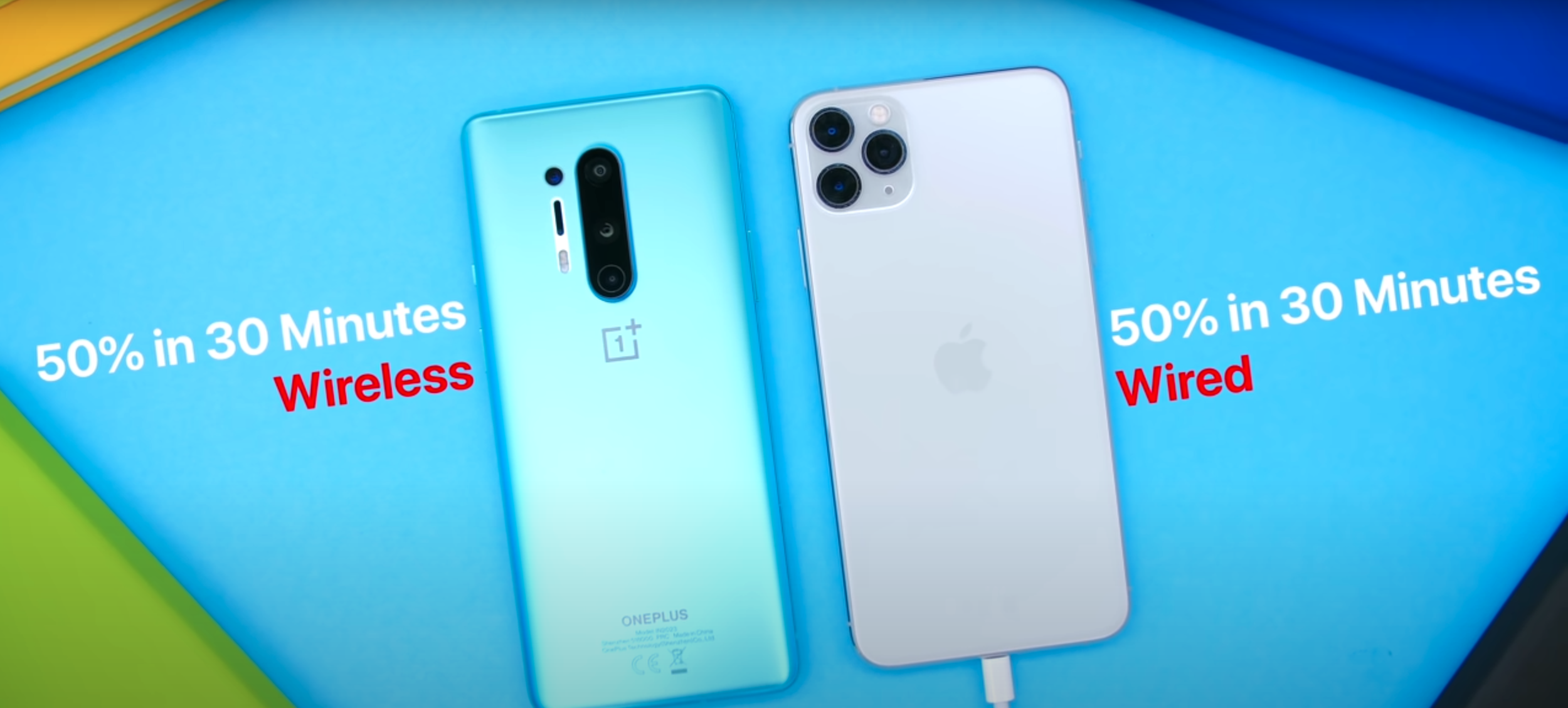
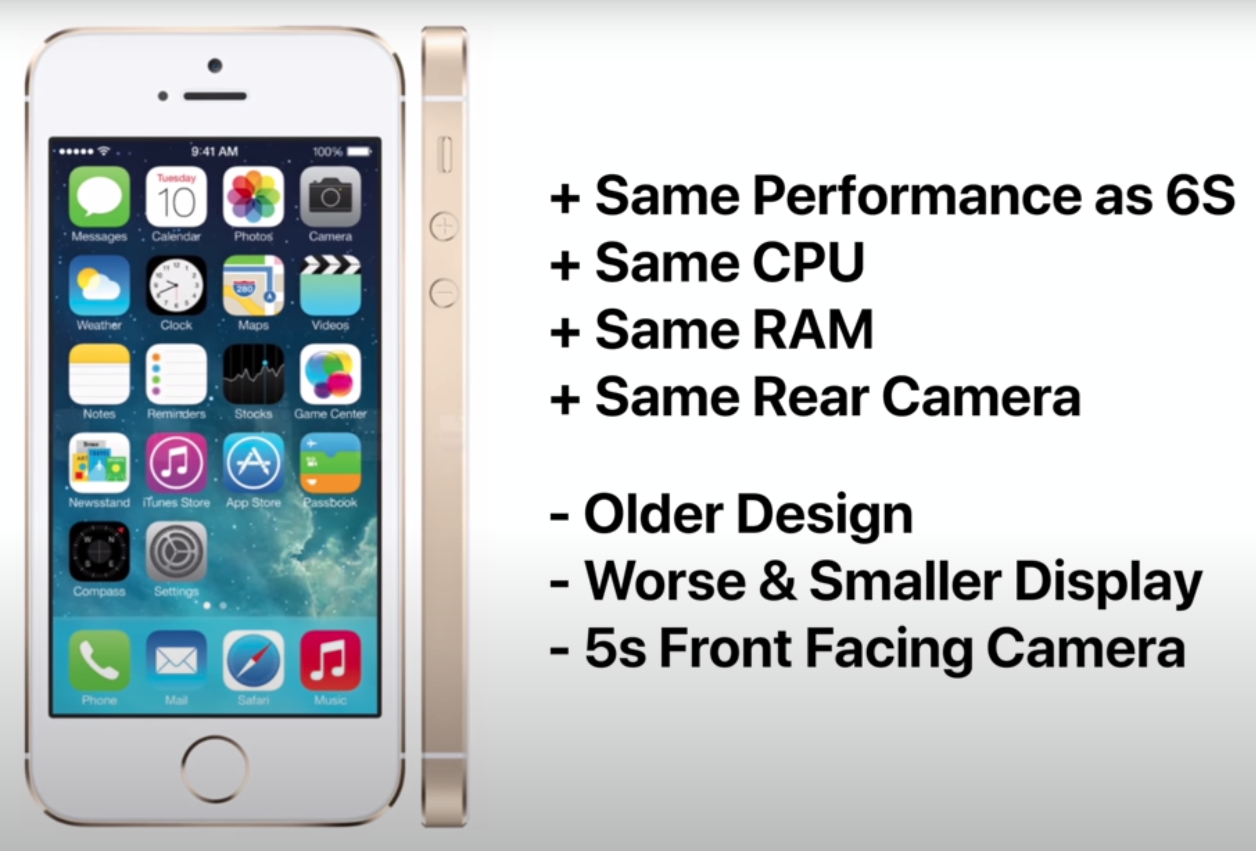
Unfortunately, just like the Sixaxis Motion-Sensing technology, the Touchpad didn’t really get used by games at all, aside from some exclusive games such as ‘Little Big Planet’ and ‘Astrobot VR’. Most games use it as a Button for the Map or the Highscore, acting in the same way as the Tab Key on PCs.

Compared to previous generations, this was a huge design leap.

Compared to previous generations, this was a huge design leap.

The other big change was that the back of the Controller had a big LED Strip. The main purpose of this was that the PlayStation 4 Camera could track its movement, you could use it in games this way. Following the PlayStationVR’s release, the light was also used by the PlayStation 4’s Camera to track the moment of the Controller, in VR. Aside from this, the light would also change its colour based on certain events in a game. For example, if your Health would run low, the light would turn red, but if you were at Full Health, the light would be green. 

The PS4 controller, also added a Speaker for sound effects. It also added a proprietary Connector for connecting things such as a Keyboard Attachment or the new Back Button Attachment. It also added a 3.5mm Headphone Jack, which allowed you to connect any set of Headphones to it, you would hear the audio from the games directly from your Controller with no noticeable lag at all. That was incredible and definitely my favourite feature ever, in any Controller. We also got a new Options Button for bringing up the Options Menu in games, as well as a new Share Button for taking screenshots and video recordings of your Gameplay. We also got a microUSB Port, a change from the miniUSB Port that we had on the DualShock 3 Controller.

Sony also expanded on the success that the coloured versions of the DualShock 3 received by releasing even more colour options for the PS4 Controller. We also saw limited editions of the PS4 that also came bundled with a limited edition Controller.  All of these improvements made the PS4 Controller a massive technological leap, compared to its predecessors.


DualShock 4 Pro

The latest version that we can currently get our hands on. This was a small tweak to the existing design.

The latest version that we can currently get our hands on. This was a small tweak to the existing design.

When Sony launched the PS4 Pro in 2016, they also released an updated version of the DualShock 4. It was still called the DualShock 4, but this was the PS4 Pro version of it. This now reflected the Light-Bar onto the Touchpad as well, so that you could also see it more easily. It also included the ability to use it via a wired USB connection, with even lower Latency than when connected wirelessly, and it also featured an improved Battery Life.


DualSense

Finally, the latest Controller that Sony has unveiled, is the Playstation 5 Controller. Interestingly enough, rather than this being called the DualShock 5, it is called the DualSense.

Design wise, just like the DualShock 4, the DualSense embraces a completely fresh design style. This time, coming in a dual-tone colour scheme. The one that Sony has showed us came in White, with Black Accents, but we do expect Sony to launch even more colour options. There will very likely be a Black Controller with White Accents as well as a few more colour variants as well.

Aside from the colour scheme, the shape of the Controller is now very different as well. It resembles the Xbox One Controller much more than ever before. It is bigger, heavier and according to Sony, it feels more premium than ever before. We still have the same Buttons as before, but all those Buttons have a glass enclosure, which again is similar to how they look on the Xbox. So, gone are the coloured Action Buttons that we’ve seen for so many years now.

The ‘Options’ and ‘Share’ Buttons are still there. The ‘Share’ has been renamed into the ‘Create’ Button but it still acts the same way. They have also been rotated slightly to make room for the larger Touchpad. Which still has the built-in LED light, but it now surrounds the Touchpad rather than being underneath it. 

Something about the DualSense looks a little familiar.

Something about the DualSense looks a little familiar.

In case you’re wondering about that back LED light, that now seems to be gone entirely, which means that the PSVR 2 will very likely use a very different tracking technology. We’ve seen multiple patents on this before, where Sony would be using a laser-based tracking system for the PSVR 2. But anyway, that’s not said to be released until at least 2021.

Another change that the DualSense comes with is USB C Port, a change from the microUSB Connector, meaning that now you can use a Smartphone charger, a Laptop charger or pretty much anything, to charge the PS5 Controller. Battery Life has been improved significantly, according to Sony. They’ve also added on-board Microphones, meaning that you can now chat without having a Microphone plugged in. Of course, the 3.5mm Headphone Jack is still there, in case you do want to add some Headphones. 

Now, let’s talk about the big changes here, the ones that will affect your Gameplay. The first ones are the brand new ‘Adaptive Pressure Sensitive’ L2 & R2 Triggers. Just like pulling a Bow-String or an actual Gun Trigger, they will be harder to push, the further you push down. This does sound very similar to what Microsoft added in their Xbox One Controller.

The biggest change, and the reason why this is called DualSense, is that it features a full Haptic Engine all throughout the Controller. Ok, but what is this exactly? You know how on modern Smartphones, such as the iPhone 11, the Pixel 4, the Samsung Galaxy S20’s, the OnePlus 8 and many others, we have an improved Vibration Motor that gives you a tactile response, whenever you press a Menu or Action Button? It essentially gives you the impression that you pressed a physical Button. Well, the PS5’s Haptic Feedback would be similar, just on Steroids. According to Sony, the Haptic Feedback is so good that you’ll be able to feel the textures on different roads. You’ll be able to feel mud, asphalt, ice and more, or even feel how different Guns shoot. From what I’ve heard, this is an absolute game changer. 

So, there you go. This is how far we’ve come from the original PS1 Controller and I’m personally really looking forward to trying the PS5 Controller out!

Samsung Galaxy Fold (2020) - Long Term In-Depth Review

Ever since the original iPhone came out in 2007, completely changing the Cell-Phone industry, Smartphones haven’t really changed that much. Sure, we did get OLED Displays, Dual, Triple, Quad and even Penta Camera Modules, but the idea of a Smartphone has remained the same. It’s essentially this block of glass that we carry with us all the time, which helps us communicate with each other and accomplish our daily tasks on the go. 

But, that block has remained just a block since 2007. Displays started getting larger and Bezels started becoming thinner to the point where we now have Smartphones that are just a massive Displays, and nothing else. However, we’ve now reached a point where there’s only so much we can do with that Form-Factor. 

You might have noticed that since 2017, when Apple and Samsung added a Full-Screen Display to their Smartphones, the design has remained almost unchanged. So, when I started hearing all the rumors about Foldable Smartphones, I got very excited because we were finally going to get something new. I am very glad to say that I’ve been using a Samsung Galaxy Fold for more than a month now as my Daily Driver and this has completely changed my view on Smartphones. I honestly would not be able to go back to a standard one, after using the Fold. So, here is my Full In-Depth Review of the Samsung Galaxy Fold! 


First of all, you’re all probably wondering, why are you reviewing the Galaxy Fold now? This Smartphone was originally teased in November 2018, fully unveiled in February 2019 and was released in September 2019. Well, it’s simple.. I finally got my hands on one.

Ironically, we were actually one of the first channels to talk about the Galaxy Fold. We started making videos on this back in 2017, three years ago. Samsung has been working on Foldable Display technology for the past nine (or more) years now. They showed us their first Foldable Display prototypes back at CES 2011. They then showed us a now famous TV ad where someone was folding a Tablet into a smaller Phone and then unfolding it back into a Tablet, back in 2014. 

When I heard about the leaks & rumors that Samsung was finally working on a Foldable Smartphone that they would sell, I was extremely exited for this future. That’s why we made so many ‘Leaks & Rumors’ episodes on this, just because I was so hyped for something new.

The general design of most Smartphones has been pretty much the same for the past few years.

The general design of most Smartphones has been pretty much the same for the past few years.

Then, right after the February 2019 unveil, they started sending over a few Review units to some of the biggest tech channels in the world. We didn’t get one, but luckily this was the first generation that had a ton of issues and was literally breaking after just a few hours of use. Samsung postponed the release, redesigned the Hinge, even the Display to some extent, and then fully released it seven months later, in September 2019.

That’s when Samsung started sending loads of Review units to a ton of larger, and smaller, Reviewers. Unfortunately, we weren’t on that list and even though I tried my very best to get ahold of one, Samsung UK just didn’t want to send us one. It was also almost impossible to buy as it wasn’t in stock pretty much every single time I checked, so we just skipped making videos on it because we couldn’t get ahold of one.

I did go to IFA 2019, in September, and I did go to Samsung’s booth, but we got kicked out because the whole place was closing down. I was about 10cm away from the Fold and I just couldn’t touch it.  Then, in October 2019, about a month after the Fold came out, I attended the OnePlus 7T launch event, in London. Emkwan, a great guy who also runs the Em Kwan Reviews tech channel, had a Galaxy Fold. He let me use that for a good 15 minutes and I was impressed. It was unlike anything I’ve ever seen before, but it felt like a prototype device.

Fast forward a few months and when Samsung finally sent over the Galaxy S20 Ultra Review unit, they also sent over a Samsung Galaxy Fold for me to check out. While the S20 Ultra ended up being the most disappointing Smartphone I’ve ever used, the Galaxy Fold ended up being the most outstanding Smartphone I’ve ever used. I used it as my daily driver for two weeks, after which Samsung asked for it back. So, I went and bought my own, just because I loved it so much. The Fold has now replaced my iPhone 11 Pro Max as my daily driver and I have loads to say about it.


Design

With the Design, the Galaxy Fold is unlike anything I’ve ever seen before. On the outside, when the Fold is closed, you have this very weird looking Phone that reminds me of the old Nokia 7280, if you guys remember that? That very odd phone that was extremely tall and had this very small and narrow Display. The Fold, when closed, is sort of like that. It has an extremely small 4.6” Display, with a very tall 21:9 Aspect Ratio some insanely massive Bezels, they’re even putting the Bezels of the very first iPhone to shame. It’s crazy thick as well, at 17.1mm at the thickest point and 15.7mm at the thinnest, the Galaxy Fold is actually very comparable to a Nokia 3310, which had a thickness of 22mm. 

I really wish that Samsung would redesign the Hinge so that it would close perfectly flat. This way, the Smartphone would be 1.4mm thinner. Samsung has improved the Hinge heavily with the Z Flip, which closes almost entirely flat. I’m confident that when the Fold 2 launches, it will also have a design similar to that. 

Is it a Smartphone? Is it a Tablet? Well, it’s both (sort of).

Is it a Smartphone? Is it a Tablet? Well, it’s both (sort of).

Once you unfold it, that’s where the magic happens as you’re greeted with a massive 7.3” Display with a 4.2:3 Aspect Ratio, which is absolutely gorgeous to look at. The Fold now becomes much thinner at just 6.9mm, making it considerably thinner than even the S20 Ultra, for example. So, while the Fold does indeed look very outdated from the Front, when compared to other Smartphones, once you open it, that’s when it truly shows its value. Having what is essentially the equivalent of an iPad Mini right in your pocket, is just unbelievable. 

Now, because of how small the Outer Display is and how massive the Bezels are, you can indeed use the Fold closed with one hand, which is perfect for when you’re outdoors and in a hurry. However, I found that unless I really had to, I was using the Fold purely in Tablet Mode. I was really only using the outer Display when I was out shopping and I had my shopping bag in my other hand. But other than that, this is a Foldable Tablet and not a Foldable Phone.

On the bottom, we have the Speaker, a Microphone and the USB C Charging Port. On the right, we have the Fingerprint Sensor, which strangely enough is actually not built into the Display or even the Power Button, like on many other Smartphones. It is instead a separate Sensor. We then have the Power Button as well as the Volume Buttons. On the top, we have another Microphone and the second Speaker. Finally, on the left, we have the SIM Slot, which only supports a Single Nano-Sim.

In terms of how the Fold fits in my pocket, it does feel gigantic. It’s almost like carrying a TV Remote all of the time, just one that’s a bit thinner than usual. It’s also very heavy, at 263g, the Fold is one of the heaviest “Smartphones” that you can carry in your pocket in 2020. The Huawei Mate XS is a bit heavier though, at 300g. I personally don’t have a problem with how thick and heavy it is in my pocket, mostly because of how much this Smartphone has to offer. For now, I’m ok with that tradeoff.

But something that I do want to mention here is that accessories are pretty hard to find. While D-Brand do make a few Skins and Spigen do make some Cases, other than that, you’re pretty much out of luck. If you’re looking for a car mount when open, the Fold is just too big for a regular Smartphone mount, so you’ll need to buy a Tablet mount. When it is closed, the Fold is just too narrow. It will definitely take some time until accessory makers will start making accessories for Foldable Smartphones, so until then, choices are pretty limited. 


Display

Moving on to the Display, we have a 4.6” AMOLED, 21:9 Aspect Ratio, 720x1680 Resolution Display with a PPI of 399 on the outside. On the inside, there is a 7.3” AMOLED, 4.2:3 Aspect Ratio, 2152x1536 Resolution Display with a PPI of 362. Some of you might be wondering, why hasn’t Samsung made the Fold so that it folds on the outside? This way, you would’ve been able to use half of that massive Inner Display, as the outer Display. Huawei has done it on the Mate X, so why hasn’t Samsung done the same?

Well, you see, glass doesn’t fold. In order for the Inner Display to fold, Samsung would have had to use a plastic Display. Even on the new Galaxy Z Flip, where Samsung claims that they’re using glass, JerryRigEverything showed that it’s still just plastic in the end. Plastic is also far more susceptible to scratches and damage, than glass. This is why we had those big warning signs when we unboxed the Phone and is why Samsung chose to have that very sensitive plastic Display on the inside. If they had put it on the outside, any keys, coins or anything sharp in your pocket, could’ve permanently damaged the Display. This way, since it folds on the inside, it is always protected. The Display on the outside is standard Gorilla Glass, similar to what you would find on regular Smartphones.

You can set preferences for the App Switch on an App-by-App basis.

You can set preferences for the App Switch on an App-by-App basis.

So, how does the App Switch work? By default, if you have an App open on the Outer Display and you open up the Fold, that App will continue on the Inner Display. When you close the Inner Display, just like on those old Clamshell Smartphones, it would shut that Display off. If you go into the Settings, you can indeed enable continuity on an app-by-app basis so that when you close the Inner Display, the app continues on the Outer Display too. YouTube, for example, works flawlessly and many others do as well. You can have a video playing on the Inner Display, close it, and it will continue playing back on the Outer Display right from where it left off.

I’m using a tool called ‘GoodLock’. Harry, our Video Creative & 3D Concept Designer, who also has a Fold himself, recommended that App to me. With GoodLock you can force all Apps to continue to the outer Display, which is what I’ve done and it works really well.

Interestingly enough, Samsung’s Launcher is considering each Display as a separate device, in a way. They both have their own specific Home-Screens so even when you change the Wallpaper, you have to do it for the Home-Screen and the Lock-Screen of each Display. So in that case, you have four Wallpapers that you can assign. However, if you use a third party Launcher, both Displays will match, in terms of App layout.

Also, pro tip, I highly recommend adjusting the text size to ‘Small’. This way, not only will the DPI Scaling be higher, but some Apps (such as Chrome) would recognise the Fold as a Tablet, rather than a Smartphone. You would get a Tablet UI with Browser Tabs and more.

Other than that, both Displays are a standard 60Hz Panel, so no high Refresh Rate here. However, both Displays have excellent Colour Reproduction. The Brightness is good too, but I do wish that the Inner Display could go brighter, to match the Brightness of the S20 line for example. We measured the peak Brightness on a Full-Screen White Window, using the ‘Xrite i1Display Plus’ Professional Display Calibrator.

Now, since this is a folding device, there is a crease in the middle. Personally, that never really bothered me. I do feel that it’s there and I do see it at certain angles but it hasn’t really been an issue for me. It’s been like the Notch on the iPhone or the Camera Cutout, where you get used to it very quickly.

Speaking of Notches, for those of you who thought that the iPhone or the Pixel 3 XL had the biggest Notch out there, think again because the Galaxy Fold has one humongous Notch on the inside. This holds the Dual Front-Facing Camera as well as the Light Sensor, it’s pretty massive. I did forget about this after using it, it just took me way longer to forget that this massive Notch was there, compared to the crease.


Camera

When it comes to the Camera. The Galaxy Fold doesn’t have a Single Camera, but instead it comes with six Cameras, which sounds crazy. On the front, when the Fold is closed, we have a 10MP Selfie Camera, which has an f/2.2 Aperture and 1.22μm Pixels. This is literally the exact same Front-Facing Camera Sensor as on the regular Galaxy S10, just with a smaller f/2.2 Aperture, rather than f/1.9.

When we open up the Fold, on the inside, we have Two more Selfie Cameras. The one on the left is the same Camera as on the outside. On the right we have an 8MP RGB Depth Camera, with 1.12μm Pixels and an f/1.9 Aperture. Essentially, on the Inside Display, we get the same Front Camera System as on the Galaxy S10+ from last year, with that Depth Sensor. 

Despite being pretty similar to the S10, the Cameras on the Fold hold up very nicely. They’re certainly better than the S20 Ultra’s.

Despite being pretty similar to the S10, the Cameras on the Fold hold up very nicely. They’re certainly better than the S20 Ultra’s.

So, that’s three Cameras so far. On the back, we get three more, which are the exact same Camera Systems as on the Galaxy S10 line, from last year. That means that we’re getting a 12MP Main Camera with that Variable f/1.5-f/2.4 Aperture and 1.4μm Pixels. We then get a 12MP Telephoto (Zoom) Module, with an f/2.4 Aperture and 1μm Pixels and finally, we’re also getting a 16MP Ultra Wide Angle Module with an f/2.2 Aperture and 1μm Pixels. While this might seem quite disappointing, when you compare it to the 108MP Sensor of the S20 Ultra, or the 100X Space Zoom of the Ultra, the results actually point to the contrary. I’m not going to cover the Ultra’s Camera as I’ve already done that in the S20 Ultra Review. But ironically, the Fold, with last year’s Cameras, is actually performing better than the Ultra does.

Night shots are better. Night video is better. HDR Processing doesn’t have any of the issues, such as the crushed blacks and blown out Highlights that the Ultra has. So overall, this is a very good Camera. The regular S20 does indeed have better Cameras than this with, not just 8K video recording, but also 4K 60 on the Front, where the Fold is limited to 4K 30. But, most people don’t care about those and for how good this Camera is, it will easily satisfy all of your needs.

Also, another pro–tip, on the Fold you can easily install the Google Camera APK and get those awesome Pixel style photos, just like on a Pixel 4. Unfortunately, since this isn’t an official App that you can install, but rather a tweak, it would only work on the small Outer Display. 


Performance

When it comes to the performance, unlike the regular Galaxy line, which comes with either a Snapdragon or an Exynos Processor based on the region that you buy it from, the Fold only comes with a Snapdragon Processor. This is pretty awesome. There have been many issues with the Exynos versions of Samsung Smartphones ranging from Battery Life issues, to performance issues and even Camera issues. I talk about those comprehensively in my S20 Ultra Review so once again, definitely give that a watch.

But, I’m glad to say that none of those are an issue with the Fold, having that Snapdragon Processor is the reason why we can indeed run the Google Camera APK. This wouldn’t have worked if we had an Exynos variant. So, thanks to the Snapdragon 855 Processor, as well as 12GB of RAM, performance on the Fold has been excellent. Things are snappy and Navigation is fast & fluid. Since you have those 12GB of RAM, I haven’t had any issues with Apps closing in the background and in fact, you can even lock certain Apps in the background so that they never reload and always stay open. 


Software

But performance really means nothing if you cannot take full use of that power. I’m happy to say that the Fold fully utilises that performance, which combined with massive 7.3” Display, you can open three Apps at the same time and use them fully. You can even have one more as a floating App, for a total of four. These can all be running at the very same time and all of them are usable in real time.

You might think that I’m always on my Smartphone because…I review Smartphones, but that’s actually not the case at all. I spent almost my entire day in front of my computer, I only use my Smartphone when I’m at home and even then, I still prefer using my Laptop. However, when I’m traveling or on the go, this is when I spend all of my time on a Smartphone. This isn’t just for communicating but also for doing actual work such as replying to emails, setting up my calendar and scheduling content, all of that. Because of this, I need a large-screen Smartphone.

The Fold runs Android 10 and gets more than enough updates to keep it going.

The Fold runs Android 10 and gets more than enough updates to keep it going.

I remember this one specific time, when I was travelling to IFA last September and I had a PDF with all of my activities for the week. I had to put events from that PDF onto my Calendar. But, on my iPhone, I couldn’t do that at all because you cannot run split-screen Apps. You have to constantly go back and forward between them and remember the info that you had in the previous one, which is an absolute nightmare. This is why I was always using my Note 10+, whenever I was traveling, because of that massive Display & S-Pen. The Fold is just an even bigger Note 10+, which is even more perfect for what I do. This is really the best productivity based Smartphone, I just wish it had an S-Pen.

Samsung’s OneUI 2.0 looks incredible. It’s by far my favourite Android Skin. I love the ability to have Folders in the App Drawer as well as on my Home-Screen as it gives me an extra layer of customisation. One-handed usability is also there as you are able to bring down the Notification Panel by swiping down anywhere on the screen.

Samsung have finally started releasing more updates for their Smartphones. The Fold now runs on Android 10 and while it is not getting as many updates as the Note or the Galaxy S line, it is still receiving more updates than all of my other Android Smartphones, with the exception of Pixel and OnePlus devices.

Probably the best part about OneUI is DeX. So, when you connect the Fold to a monitor, it would boot into this Desktop UI Mode where you can connect a Keyboard, a Mouse and really use the Fold like you would use your desktop PC. You can run the Desktop versions of Chrome and Microsoft Office, so if you can’t be bothered buying a PC for your home, the Fold can actually replace three devices now. It’s a Smartphone, a Tablet and a Desktop PC (for very casual users).

My only complaint, software wise, is that the the Wallpaper sometimes glitches out and sometimes I do have some frame-drops. I didn’t really had this before the Android 10 update, so I’m hoping that these would be fixed in a future software update. But, nothing too major.


Special Features

Moving on to special features, let’s talk about the ones that the Fold lacks because there’s quite a few of those. To start with, the Galaxy Fold has no Water Resistance at all. Because of that Hinge design, Samsung couldn’t water-proof this Smartphone, meaning that if rain drops hit it, it’s as good as dead. To add to that, there is no Dust Resistance either. This reminds me of Smartphones back in 2015, way before Water and Dust Resistance was even a thing.

Also, unlike the Galaxy S or Galaxy Note lines, there is no SD Card slot at all on the Fold and, like you’ve heard before, you only get support for one physical SIM. The second SIM that you add has to be an eSIM. The good news is that you get an insane 512GB of Storage and there is no higher-end version of the Fold, there’s the baseline and that’s it. This also has UFS 3.0 Storage, which is insanely fast with speeds of over 1Gb/s. 

Despite all that it can do, the current Fold is still very easily damaged.

Despite all that it can do, the current Fold is still very easily damaged.

The vibration motor is very good. It seems to be the exact same one as in the Galaxy Note 10+ and the S20’s. You get an actual Haptic response every time to type or when you hit a toggle in the Settings. It gives you the impression that you’re actually pressing physical buttons on the screen. 

We do get 5G, sub-6GHz and mmWave 5G, which is great. You also get something called ‘Samsung Concierge’ and ‘SamsungCare+’ with the Fold, meaning that you have access to exclusive 24/7 Help. Samsung will replace your Display for free during the first year as well as fix or replace the entire Smartphone if you’re having any issues with it or even if you accidentally drop or break it.

However, you do have to register for SamsungCare+ manually, which is quite bad in my opinion. You have 30 days to do so and in my case, I tried registering but the website is all glitched and I couldn’t click the next button to actually register. I’ve been in talks with Samsung support, but hey don’t now what the issue is and they’re currently looking into it. My only complaint here, aside from the SamsungCare+ registration, are that the Fingerprint Reader is slow and very difficult to find. So, I’m pretty much using FaceUnlock exclusively on my Fold. 

The S-Pen would’ve been perfect on a device like this. We don’t have one but we’ve seen tons of leaks & rumors that the Fold 2 will indeed come with one. 


Battery 

Battery Life has been excellent, even with that fairly small 4380mAh Battery. It can easily last me through an entire day and we get Fast Charging, Wireless Charging and Reverse Wireless Charging, for charging things like those Galaxy Buds that we got in the box. 


Value 

In the end, is the Galaxy Fold worth it? Right now, no. But that’s because the Fold 2 is coming out very soon. We’ll have a video on that in the upcoming weeks so definitely subscribe and hit the bell icon for that. 

But as a whole package, the Fold offers something that no other Smartphone offers. It offers a Tablet that you can put in your pocket. The Screen-Size is perfect for reading and for emailing. The typing is great, I love the more squared off Form-Factor and in the end, like I said, this is the perfect device for productivity.  So, if you’re a CEO or a business person, there’s nothing better than this.

For the average person, unless you can get this for a very good deal, paying $2000 for it isn’t worth it at all. Also, keep in mind that you have to be extra careful with this Smartphone. But, I’m personally extremely happy with my Fold and I’m genuinely looking forward to the future. Because you see, this is the future of Smartphones. Just like the first iPhone, the Fold isn’t perfect but it lays the foundation for what’s yet to come.

MacBook Air (2020) - Full In-Depth Review! (After 3+ Weeks of Use)

Every few years, every few decades, there is this one product that completely changes everything. A product that’s so new, so innovative that it breaks the boundaries of what we believed was even possible, one of those products was…the MacBook Air.

Originally introduced back in 2008, the MacBook Air was the thinnest Laptop in the world. It was so thin, that Steve Jobs even took it out of an envelope and the audience was amazed! Not only that, but the MacBook Air ended up giving birth to the UltraBook category of Laptops that we have now. Those very thin, light and portable Laptops that tens of millions of people own. 

Aside from being extremely thin, the original MacBook Air was extremely innovative in many other ways. It had a multi-touch Trackpad that supported the same gestures as the iPhone that was introduced a year prior. Gestures such as pinch to zoom, rotating a photo with two fingers, swiping with three fingers from one Home-Screen to another and much more. It removed the Disc Drive and featured the smallest HDD ever, in a Laptop, alongside the ability to upgrade that to a Solid-State-Drive, making the MacBook Air the world’s first Laptop to come with Flash Storage. 

An iconic reveal for an iconic device.

An iconic reveal for an iconic device.

However, the First Generation MacBook Air was flawed. The low power Intel Core 2 Duo Processor and that painfully slow 4200rpm, 80GB HDD alongside the lack of any Ports aside from a single USB 2.0 Port, a micro-DVI Port and a 3.5mm Headphone Jack made it quite unpopular at first. All that and the insanely high $1800 starting price point, which back in 2008, that was a lot. Then, just two years later in 2010, Apple released the Second Generation MacBook Air. 

This one featured a new tampered design without a pop-out slot for the Ports. It added a second USB Port on the other side, it dramatically improved the performance, thanks to Intel’s new Core 2 Duo Processors. Also, Apple now included Solid State Storage as standard on all models of this MacBook Air and dropped the price by $500, bringing it down to $1300. Not only that, but Apple also released a smaller 11-inch model, which I actually happened to have, a few years ago. This generation, the Second Generation design, was what Apple sold for the next eight years, up until 2018. I mean sure, we did get improvements in terms of performance and higher capacity Storage options, but the design has remained unchanged.

But then in 2018, we got the big new Third Generation, which finally updated the design to bring it in line with the MacBook Pro’s, which got a big update in 2016. The 12” MacBook, which was re-introduced in 2015, with that space grey thin design, sparked this new generation of MacBooks. This was the biggest update that the MacBook Air line has ever received as we finally got a Retina Display, that Butterfly Keyboard from the MacBook Pro’s, which ended up being very controversial, and we also got multiple colour options such as Space Grey & Gold, aside from just Silver. In 2019, we got a very small update to the 2018 model, with a slightly improved Butterfly Keyboard mechanism and a True Tone Display, but that was mostly it.

Now, we have the 2020 model, which I’ve been using for quite a few weeks now and I’m very comfortable giving you my full In-Depth Review on it. This was a pretty long intro, so without any further ado, here is my In-Depth MacBook Air 2020 Review, covering the Design, Display, Keyboard & Trackpad, Camera, Microphone & Speakers, Performance, Battery Life and finally, Value!


Design

Starting off with the design, I have to say, Apple Laptops are definitely my favourite and the MacBook Air is no exception. Just like the 2018 model, it is made out of a single piece of Aluminium and it comes in three colours, which are Space Grey (the one that we have) as well as Silver and Gold. If you’re planning on keeping your MacBook Air for many years, you should be aware that the Space Grey and the Gold colours have coatings on top of the Silver Aluminium. This means that if they scuff, they will reveal the Silver underneath it. Therefore, the Silver model is the most durable over-time. I’ve always taken really good care of my MacBooks and I only have a few minor scuffs on my 2015 12” MacBook and my 2017 MacBook Pro but, if you do want to get the Space Grey model, and you take very good care of it, you should be fine.

The MacBook Air still features the same teardrop shape design, where the Body gets thinner towards the front and thicker towards the back, with pretty much no body flex at all. This is really one of the sturdiest Laptops that I have ever seen. It’s pretty much a tank in terms of Build Quality,  nothing to complain about here.

For a Device with ‘Air’ in the name, this is pretty bulky.

For a Device with ‘Air’ in the name, this is pretty bulky.

But, something that definitely shocked me when I took it out of the box, was just how heavy it was. I’m coming from a 15” 2019 MacBook Pro, and I’ve used a 12” MacBook for years before that as a secondary MacBook, and the MacBook Air is very heavy compared to the 12”. It’s 1.29kg, compared to the 0.92kg of the 12” MacBook. So, if you’re coming from a 12” MacBook, the MacBook Air will feel extremely heavy. If you’re coming from a MacBook Pro 13”, you probably won’t even be able to tell the weight difference as the MacBook Pro 13” weighs 1.37kg, so they’re both extremely similar. So, while the MacBook Air is currently the lightest Laptop that Apple sells, as the 12” MacBook got discontinued, it is not as light as you would expect it to be, considering its’ ‘Air’ branding. Also, fun fact, the 2020 MacBook Air is now 40 grams heavier than the 2018 and 2019 models. 

Fun fact number two, the 2020 MacBook Air is also thicker this year, coming in at 1.61cm at its thickest point, compared to 1.55cm like the 2018 and 2019 models were.  I’ll explain why the 2020 MacBook Air is thicker and heavier, later on.

But overall, design wise, I am extremely impressed. My only two complaints here is that I wish the MacBook Air was lighter and the Bezels were thinner. When comparing the MacBook Air against something like a Dell XPS 13,  there’s a gigantic difference in terms of the Bezel sizes. The MacBook Air looks more like a 2016 Laptop, than a 2020 one. I really do hope that Apple updates the Bezels with the next model, because it’s already starting to look quite outdated. 


Display

Speaking of the Bezels, let’s talk about the Display. We have a 13.3” Display, which is very comparable to a lot of Windows Laptops. But, we do have a 16:10 Aspect Ratio, meaning that the MacBook Air, just like all the other MacBooks, has a taller Display compared to most Windows Laptops. I absolutely love this. Having more vertical screen-real estate is great for reading articles or for when you’re writing text. Some Windows Laptops, like Microsoft’s Surface Laptops or the new Dell XPS 13”, have started adding a 16:10 Aspect Ratio, but most manufacturers unfortunately didn’t.

The MacBook Air hits that sweet spot, in terms of the Display.

The MacBook Air hits that sweet spot, in terms of the Display.

In terms of Resolution, we have a 2560x1600 Resolution Display, which at 227 PPI, I cannot see any Pixels on this from the regular viewing distance. It’s an incredibly sharp Display, text looks like printed paper, it’s just a joy to look at. On the Windows side, we don’t really have Laptops with a 2K Display, it’s usually either 1080p or 4K. I find that 4K is overkill for Laptops. They’re very sharp, but 4K consumes a lot of power and the Sharpness from the regular viewing distance is almost the same as 2K. With 1080p, it does offer the most Battery Life, but I can easily tell that the Display isn’t as sharp and text is a bit too blurry for me, on a 1080p 13” Display. So, 2K is definitely the sweet-spot here and I really do hope that more manufacturers start adding such Displays, even on the Windows side as well.

Colour wise, we have 93.3% sRGB coverage, and 70.8% DCIP3 % coverage. While this is actually very good for a Laptop and one of the very best Displays on any Laptop out right now, if you’re into video editing or photo editing and you need the most colour accurate Display, just get a MacBook Pro instead. MacBook Pro’s have 100% sRGB coverage and 98.9% DCI P3 coverage, meaning that they can display about 30% more colours than the MacBook Air.

Now, I’m not saying that you cannot edit video or photos on the MacBook Air at all, you can definitely do that without any issues. But, if photo or video editing is what you do on a daily basis, then I would look at something like a MacBook Pro, just because of that even wider Colour Gamut.

The MacBook Air has just over 400 Nits of Brightness, compared to 500 Nits on the MacBook Pro or 600 Nits on the 2018 and 2020 iPad Pro’s. Now, while that is still a very high number and one of the highest on any Laptop out there (most Laptops have around 350 Nits of Brightness), again, if you’re into photo editing and you need a brighter Display or you just like working outdoors a lot, then a MacBook Pro is a better choice. But, when indoors and in most cases, 400 Nits is more than enough for me. I almost never even max out the Brightness.

Finally, the MacBook Air also features a True Tone Display. Essentially, if you enable this in the Settings, the White Point of the Display will automatically match the light around you. Just like a piece of paper, if the lights in your room are yellow, the Display will turn yellow to match that light, making it very easy on the eyes for when you’re reading or writing. I do have to manually disable this setting every single time I want to edit a photo or a video, as I do want to preserve the colour accuracy. It does get a bit annoying having to constantly remember to do that every time you want to do any colour work. I wish Apple had True Tone automatic so that it turns off when you open up Final Cut or Photoshop. 


Keyboard & Trackpad

Now, the third very important part of any Laptop, for me, is the Keyboard & Trackpad. I am very glad to say that the Keyboard has finally been improved, or should I say, completely replaced.

The troubled Butterfly Keyboard is gone, which Apple introduced with the 12” MacBook in 2015, then the MacBook Pro’s in 2016 and the MacBook Air in 2018. That Keyboard was flawed from the very start. It had almost no key travel, so it was very difficult typing on it and it broke extremely easily. Apple ended up being sued multiple times, you probably know that whole story already.

The really good news here is that we get the same Keyboard as on the new 16” MacBook Pro. This is a more standard Scissor Switch Keyboard, very similar to what we had on the Second Generation MacBook Air from 2010. The only difference being that the keys are now even more stable and they feel even better to type on, compared to the Second Generation MacBook Air.  In fact, the entire 12 page Review video was fully scripted on my MacBook Air. I even scripted a few other videos on it, including the OnePlus 8 Pro Experience and about three or four more recent videos. I have to say, the typing experience on this MacBook Air is the best I have ever had on any Laptop, even better than on the 16” MacBook Pro.

A very notable improvement, with a slightly less notable Fingerprint Reader

A very notable improvement, with a slightly less notable Fingerprint Reader

The fact that the entire MacBook is much smaller than the 16” Pro, you don’t have this massive board of Aluminium which you’re resting your palms on. Instead, you’re typing on the entire Laptop, if you know what I mean, rather than typing on a Keyboard that’s inside a gigantic Laptop. It just feels much more comfortable. Also, the fact that you have this teardrop/tapered design makes it so much more comfortable to type on as not only is the Keyboard angled when you type on it, but it doesn’t feel as sharp and raised on your wrists as a MacBook Pro does.

Also, the arrow keys are now back to being that inverted ’T’ shape. Funnily enough, the only thing that I miss about the Keyboard from my 15” 2019 MacBook Pro, is the Touchbar. Yes, I do miss having it. I mostly used it in Word for changing some text presets or for quickly adjusting the Volume or the Brightness. I wasn’t using it a lot, but now that I don’t have it anymore, I do kind of miss it. Luckily, we do have a Fingerprint Reader built into the Power Button, which is a bit recessed compared to the rest of the keys, but other than that, I really have no complaints.

The Trackpad is outstanding as well. Trackpads on Macs have always been the best ones in the industry and this is no exception. It is a bit smaller than on the 13” MacBook Pro and way smaller than on the 15” or 16” models, but it’s still larger than on most Windows Laptops. It uses a Haptic Motor underneath it, so the Trackpad doesn’t click but that Haptic Engine gives you the impression that you pressed it, even though the glass itself doesn’t move.


Camera, Microphones & Speakers 

The 2020 Air has the same Camera as the 2018 model. It’s a 720p Camera, which is far inferior to the iPad or the iPhone Camera.  I know the screen is pretty thin but Apple could’ve still added a 1080p Camera there. The quality just isn’t great.

The Microphones have been improved as we now get a Three-Mic Array with Beam-Forming. The Speakers have a deeper bass as well as support for Dolby Atmos Playback.


Performance 

Now, we get to move to the Performance section. This is where I have the most to say as, aside from the Keyboard upgrade, this is where the other big changes are.

First off, the 2020 MacBook Air is Apple’s first Mac to move onto Intel’s new 10th Generation Processors. They actually got released in September of last year, so not that new. Anyway,  we get a 10th Generation i3, i5 and i7 mode but, don’t be fooled, this is not comparable in any way to a Desktop Class i3, i5 or i7, or even a MacBook Pro’s i3, i5 and i7.  These are all Intel’s Low Powered Y Series Processors and in fact, these Chips are basically the successor to Intel’s Core M Processors, found in the 12” MacBook from back in 2015. These are all some very low power 10w Processors that don’t even require a Fan.

The big change this year is that we do get Four Cores in a MacBook Air, something that only the 15” models used to have back in the day and something that the 13” Pro added in 2018. But, if you do want the Quad-Core CPU models, those are the i5 and the i7 but not the i3. The i3 is still Dual-Core, this is the one that I have.

So which one is right for you, and should you pay extra for the i5 and the i7 models? Well, I’ll tell you straight away, don’t buy the i7 model. The performance difference between the i5 and the i7 is almost nothing, you basically get the exact same experience, for $150 less. The real question is, should you get the Dual Core i3 model or upgrade to the Quad-Core i5 model instead? 

The 2020 model looks to perform very well (on paper).

The 2020 model looks to perform very well (on paper).

Well, performance has indeed been improved from the 2019 and 2018 models, even on the base i3 model, and the Single Core performance between the two is almost identical. In fact, the MacBook Air actually scores the highest, in Single Core performance, compared to all the other Macs out there, including the 16” MacBook Pro and the Mac Pro. If you do a lot of Single Core tasks, such as word processing, browsing the web or even watching YouTube videos, you’re better off with the Dual Core i3 model as the Battery Life would actually last you longer on that one.

But if you do want to future proof it and maybe use it for a few more years, or you’re just someone that’s a bit more demanding in terms of what you do on your Laptop, I highly recommend getting the i5 model. You not only get two extra Cores for much higher Multi-Core performance, but you also get a much more powerful GPU. This is the G7 variant of the Iris Plus Graphics, which is noticeably more powerful than the G4 that you get with the i3 model. The i7 also has the G7 GPU, in case you’re wondering. 

Now, something that does directly affect GPU performance, is the amount of RAM. As Intel’s Integrated GPU uses part of your RAM as Shared Video Memory. The more RAM you have, the more memory the GPU will also have, and the better overall performance you’ll get. I highly recommend upgrading to 16GB of RAM. Mine only had 8GB of RAM and my usage was pretty much maxing that out all of the time. This meant that the system felt a bit sluggish most of the time, even when I was just scripting and had a few pages open in Safari. So, 16GB of RAM is a must. Upgrading to the i5 over the i3 isn’t a must but I would suggest that as well, if you plan on using this for more than three years. 

The RAM has had a massive boost.

The RAM has had a massive boost.

The MacBook Air now has the fastest RAM that Apple has ever put in a MacBook, this is now 3733MHz RAM, compared to the 2133MHz RAM that the 2019 MacBook Air had, or the 2666MHz that the MacBook Pro has.

By now you’re all probably wondering, how does the new MacBook Air compare to the 13” MacBook Pro? We do get what looks to be faster Processors than the Pro, we also get a much better GPU and we also get much faster RAM.

Well, I’m sorry to break it to you, but the MacBook Pro 13” is still far more powerful than the MacBook Air. Ironically, this is not because of the components, which are indeed more powerful on the MacBook Air, but because of Cooling. The MacBook Air only has one single Fan for Cooling, whereas the MacBook Pro 13” can have two Fans, if you go for the higher end model with four Thunderbolt 3 Ports. That one Fan on the MacBook Air isn’t even connected to the CPU’s Heatsink. Instead, it just randomly sits there inside the Case, as if it got disconnected and fell, because of this, thermals on this Laptop are bad. 

Whenever you’re doing something more intensive, such as video editing, the CPU gets as hot as 100 degrees on the MacBook Air, that Fan doesn’t seem to help at all and the performance takes a big hit. 

It doesn’t actually throttle, as the Clocks still remain above the base 1.1 GHz Clock on both the i3 and the i5, but it gets very close to that number when you’re doing some very intensive tasks, rather than staying at the Turbo Boost of 3.2 or 3.5GHz. This is the only reason why the MacBook Pro 13” can outperform it. 

So, why has Apple done such a thing? Why is Apple intentionally limiting the thermal performance of the MacBook Air? Is it so that you upgrade to the 13” Pro? Not necessarily.

A view from the inside.

A view from the inside.

You see, the Y series Processor that is inside the MacBook Air is actually a Fan-less design, whereas the U series Processor that is inside the 13” MacBook Pro, is not. As per Intel’s own recommendations, the MacBook Air doesn’t actually need a Fan at all, whereas the Pro does. When Apple updated the MacBook Air in 2018 with the Third Generation design, they didn’t even have to include a Fan at all, because this is the same CPU design as the Intel Core M inside the 12” MacBook, which didn’t even have a Fan at all. But Apple decided to include a Fan in the MacBook Air, just for the sake of longevity. When Intel added two more Cores and therefore more heat, Apple decided to just stick with the same Cooling as they had the year prior.

So if you plan on doing any video or photo editing, the MacBook Air can easily handle that, even 4K video editing for that matter. It’s just that the export times would be much longer compared to a 13” MacBook Pro or not even to mention a 15” or a 16” model. If this is something you do on a daily basis, just don’t buy the MacBook Air, get a MacBook Pro instead. If it’s just occasional photo and video editing that you do, the MacBook Air can still handle that quite well.

So, what about gaming? First off, don’t buy a Mac for gaming and secondly, if you do buy a Mac for gaming, don’t buy the MacBook Air. It’s literally the worst option, for gaming, out of all the Macs that Apple sell. Again, even if the GPU is far more powerful than on the 13” Pro, because of that Fan not being connected to the Heatsink, gaming performance is pretty bad on the Air. You can play some very lightweight games such as Hearthstone, but when it comes to even Fortnite or most of the SteamGames, which are actually 32-bit games and are no longer supported, you’re out of luck.

Something that I do like a lot about the MacBook Air is that it comes with two Thunderbolt 3 Ports. Thunderbolt 3 is the fastest Port on any consumer device out there right now, with speeds of up to 40Gb/s or 5GB/s.

Gaming on a Mac? We don’t recommend it.

Gaming on a Mac? We don’t recommend it.

You can not only use this to connect to Thunderbolt 3 Docks, which gives you a ton of extra Ports by just using a single Thunderbolt 3 Cable, but you can also use it to connect to a 5K Monitor, two 4K Monitors or even one 6K Monitor.  The MacBook Air does support Apple’s Pro Display XDR at full Resolution, something that ironically, not even the iMac Pro supports. This is because the iMac Pro is using an older Thunderbolt 3 Controller. 

You can also use Thunderbolt to connect an External GPU for some incredible GPU performance, which won’t be throttled. In this case you might be wondering, what’s the gaming and video editing performance?

Well, in Fortnite for example, on Native Resolution & Medium Settings, the MacBook Air was averaging around 10fps. With an eGPU attached, a Vega 64 in this case, we were getting around 60fps on average. So a pretty big difference. In FCP X for example, exporting our Blind Camera Comparison, took 1h:15min without an eGPU and just 22 minutes, with the Vega 64 eGPU attached. This was with the eGPU connected directly to the MacBook Air. If you connect it to a Monitor first and then to the Air, you would get even higher performance. 


Battery Life

What about the Battery Life? Well, Apple actually dropped the Battery Life from 12 hours, which is what we had in 2019 and 2018, to 11 hours.

The Battery is actually the exact same size as last year, 49.9 Watt-Hour. The increase in the thickness is only due to the Keyboard, which needed more space to travel and then, because the body got thicker, it also increased the weight. In terms of how much of those 11 hours I got, I personally only got about five to seven hours, seven hours at most.

My use case scenario on the MacBook Air was pretty light. I used it mostly for scripting & researching, so I had about 20 Tabs open all the time. I did a tiny bit of Photoshop work and I also had Slack open, which consumes a lot of Battery. With this use case scenario, I got about 6 hours on average. 


Value 

In the end, is the MacBook Air 2020 worth it? Well, let’s see. 

Compared to the 2019 model, we get a Quad-Core Processor option, we get a better GPU and a much better Keyboard. We also get 256GB of Storage on the baseline model, compared to 128GB like we got before. You get all of this for $100 less. The new MacBook Air starts from $1000, or £1000 in the UK. This is indeed for the Dual-Core model, the Quad-Core is $100 more, but there you go, the MacBook Air was never a better deal that it is now. 

So, for any casual user, I would highly recommend it. For people that want something more powerful and much better for regular photo and video editing, definitely consider the 13” Pro but don’t get one right now, because there will be a newer model, with that updated keyboard, coming out very very soon. So hold off for that model instead.

That 14” MacBook Pro that we’ve seen rumoured is likely to get released by June. If that is indeed the case, I might be upgrading, or downgrading, depending on how you put it, from my Eight-Core 2019 15”. 

Samsung Galaxy S20 Ultra - The Complete Review! (1 Month Later)

Finally, we have a smartphone that ticks every single box! That Smartphone, is the S20 Ultra. It comes with:

  • A 108MP Camera, which has nine times the Resolution of the iPhone 11 Pro Max and most flagships Smartphones out there.

  • 100X Space Zoom, when most Smartphones feature just 2X Optical or 10X Digital.

  • A massive 6.9”, 3200x1440, Ultra-Wide 20:9 Aspect Ratio Display with a 120Hz Refresh Rate, compared to the 60Hz of most other Smartphones.

  • It features the second largest Sensor on any Smartphone, right after the Huawei P40 Pro.

  • 8K Video Recording.

  • A 40MP Front-Facing Camera.

  • A gigantic 5000mAh Battery.

  • 45W Fast Charging.

  • 15W Wireless Charging.

  • 9W Reverse Wireless Charging.

  • An Always-On Display.

  • 12GB of RAM.

  • Up to 1.5TB of Storage and you can even turn it into a Desktop PC, thanks to Samsung Dex.

The S20 Ultra is the god of all Smartphones and it is by far the most amazing Smartphone that I have ever used! Or at least…this is how I was hoping I would start this Review.

You see, the Galaxy S10 from last year was one of my favourite Smartphones ever. The S10 was so perfect for me, that I ended up using it as my daily driver for almost three full months, even replacing my iPhone for that period of time. Then, the Galaxy Note 10+ came out, which was an even more perfected S10, with an even bigger Display and an S-Pen. In my Review of the Note 10+, I even called it the best Smartphone ever made. I was honestly so happy with the Note 10+, just because it could do every single thing that I wanted from a Smartphone and more.

So, when I heard that the S20 Ultra would come out, with that insane 108MP Camera and 120Hz Display, I was just counting the days until this would release. We made so many videos on the S20 Ultra way before it was even announced, we made ‘Leaks & Rumors’ episodes, Concepts and I even attended the S20 launch event, which was my first ever Samsung event, and I was honestly so hyped about this Smartphone. I was eagerly awaiting the S20 Ultra launch. I don’t remember the last time I was so excited about a Smartphone, it was probably in 2017 when the big iPhone X launched. 

However, rather than this being the ultimate Smartphone, as it looks to be, judging from the specs, it ended up being the most disappointing that I have ever ever used. On paper, they make this Smartphone look like it came from five years into the future. However, every single one of these specs has a major flaw and this Smartphone cannot deliver on any of its big promises. I’ve been using the S20 Ultra as my daily driver for the past month or so, so here is my full, honest Review of the S20 Ultra covering the Design, Display, Camera, Performance, Special Features, Battery and Value!


I mentioned that I finally attended my first Samsung event, I managed to see the unveil of the S20 line and the Galaxy Z Flip in person, which further sparked by insane hype about this Smartphone. After the event ended, just like everyone else, I was waiting for my Review Unit from Samsung.

The recent ‘Unpacked’ event was the first time we had attended an actual Samsung reveal.

The recent ‘Unpacked’ event was the first time we had attended an actual Samsung reveal.

However, while others started receiving very early units, we didn’t get anything. I kept being promised by Samsung that they would send one over as soon as possible, however, other channels, even smaller creators, got it, while we were left without a unit. About two weeks pass and most Reviews of the S20 Ultra started coming out already and pretty much all of them were very negative, which further crushed my hype for this Smartphone.

Now, Samsung did end up sending us a unit, so thank you Samsung, but that one actually arrived a full month after everyone else got it. It even got delivered at the exact same time as our Retail Unit of the S20 Ultra, which we bought and even that got delayed by an entire week, due to stock issues. 

So, we got the S20 Ultra about a month after everyone else already posted their Full Review, seeing all of those negative Reviews and getting this so late pretty much killed all of my excitement. This is why we haven’t done a single video with the S20’s yet, just because we got it so late, compared to everyone else. But still, I wanted to make this Full Review, so I’ve put the S20 Ultra through its paces and here’s what I found. 


Design

Design wise, from the front, the S20 Ultra does look outstanding. The Bezels are extremely thin, even thinner than on the S10 and Note 10. The Camera Cutout is now even smaller than before and it is now in the centre, just like on the Note 10. You honestly forget about it after just a few minutes and you just get impressed in that massive 6.9” Display.

Comparing it to the iPhone 11 Pro Max, the Ultra looks light-years ahead. It just looks so futuristic without that massive Notch and those extremely thin Bezels. The back, however, isn’t as pretty. That’s not necessarily because of that massive Camera Module, but mostly because of the colours, we only get Grey and Black colour options. The Grey is just a regular Grey so nothing really too special here, but the Black is actually pretty bad. There’s no shimmer to it or anything, it’s just a fingerprint magnet. It actually reminds me a lot of our fake Galaxy mock-ups. It looks so much like cheap plastic.  Samsung used to have some amazing colours with the Note and S10 last year but for some reason, those didn’t translate to the Ultra. Not only that, but most Smartphones in 2020 started adding a Frosted Glass back.

The Ultra is very bulky, even without that mammoth Camera Module.

The Ultra is very bulky, even without that mammoth Camera Module.

The iPhones have it, the Pixels have it, OnePlus has it, Huawei has it with the P40 Pro and many others do as well. A Frosted Glass back not only makes it look so much better, but it removes the issue of fingerprints and smudges almost entirely. I’m quite surprised that Samsung still hasn’t done that. 

Now, leaving the back aside, there are three design issues that I really do have to mention, the first one being the table wobble. So, because of how massive and deep this Camera Module is, you’ll notice that when the Ultra is sitting flat on the table, it will wobble like crazy. If you’re the kind of person that likes using your Smartphone when it’s sitting flat, you can forget about that with the Ultra. 

Secondly, the Ultra is very thick at 8.8mm for just the body alone, not even to mention the Camera Module. The Ultra is pretty much the thickest non-folding, flagship Smartphone on the market right now. If you add a case, to remove that table wobble issue and flatten out the Camera Module, it will make this Smartphone even thicker. 

Lastly, this Smartphone is also pretty heavy. At 222g, it is one of the heaviest Smartphones on the market and while it’s actually 4 grams lighter than the iPhone 11 Pro Max, it does feel top heavy to me. I always feel like I’m about to drop this Smartphone and that Camera Module is so big that you’ll always end up touching it. So, great design on the front, but a very bulky and big Smartphone overall.


Display

Moving on to the Display, we now get a massive 6.9” Display, up from the 6.7” Panel that the S10 5G had, or the 6.8” Display that the Note 10+ had. But, this size increase is mostly due to its extra height.  We now have a taller 20:9 Aspect Ratio, compared to 19:9 like we had before, it actually doesn’t feel as big as you would expect. In fact, the entire Smartphone is not as wide as the Note 10+ was, meaning that, compared to the Note, it is actually more comfortable to use. I really do like this.

This is a very high quality Display, but it has some notable limitations.

This is a very high quality Display, but it has some notable limitations.

Also, the Glass is almost flat now, Samsung pretty much killed their ‘Edge’ Display with the S20 line. Design wise, I do prefer the Note 10+ over the S20 Ultra. Also, thanks to the flatter Display, there are no more accidental touches at all with this Smartphone, so Samsung definitely gets a plus for that. Resolution wise, we get a 3200x1440 Resolution Display, which translates to 511PPI. The Colour Reproduction is excellent and the Brightness is very good, maxing out at 1300 Nits. So overall, the S20 Ultra has one of the highest quality Displays in a Smartphone.

Now, aside from the Resolution and Aspect Ratio, something else that’s new this year is the Refresh Rate. We now get a 120Hz Display, compared to the 60Hz Panel that we got before. This means that the S20 Ultra can now Display up to 120FPS, compared to 60FPS like on most other Smartphones. Not only will games run twice more fluid on the Ultra, compared to let’s say, the iPhone 11 Pro Max, but animations, scrolling and just using the Smartphone in general will feel so much snappier than ever before.

But, this is where the first main disappointment with this Smartphone kicks in. Unlike the OnePlus 8 Pro for example, which runs at 120HZ at full Resolution, the S20 Ultra can only run at 120Hz when the Display is in 1080p. This wouldn’t really be an issue if this Display was any smaller but, on a massive 6.9” Display, 1080p will make the text look a bit blurry. So, you’ll have to choose, you’ll either want a fluid but blurry experience, or you’ll want a not so fluid but sharp experience. There’s always a trade-off.

Also, OnePlus for example, added a 10-bit Display Panel on the 8 Pro, which can display over 1 billion colours, compared to the 16 million colours that the S20 Ultra can display. OnePlus also added an MEMC Chip, which adds extra frames in videos, bringing them to 120FPS from 30FPS for example. So, even though OnePlus actually uses a Samsung Display, it seems like it is a higher quality Panel than what Samsung themselves have put in their highest-end Smartphone.


Camera

So, speaking of disappointments, let’s talk about the biggest one there is and that is…the Camera.

Where do we even start?

Where do we even start?

About a month before the S20 Ultra was even announced, we made a video called “S20 Ultra – Why I’m concerned”, in which I talked about why that 108MP Sensor that the S20 Ultra will come with, might not be a great idea. My point here was that a Camera Sensor is just like a chessboard, it’s a fixed area, inside of which you have multiple squares. These squares are actually the Pixels on the Sensor. The larger the Pixels are, the more light they can capture. Now, if you want to add multiple squares, nine times the amount of squares in the case of the Ultra, they will have to become nine times smaller in order for all of them to fit. This means that they will capture nine times less light and long story short, the Camera would be very bad in Low-Light.

To combat this issue, Samsung increased the chessboard size, or the Sensor size in this case, from 1/2.55” like we had on the Note 10+, to 1/1.33”. This was a massive increase, pretty much double the size. This was a pretty big deal for Samsung as we hadn’t had a larger Sensor since the Galaxy S7 in 2016, Samsung had been using the exact same Camera specs. The only problem, and this is where my scepticism was regarding this Camera, was that the Xiaomi Mi Note 10 also used the same 108MP Sensor from Samsung. It is the same size, has same specs and this is a mid-range Smartphone that costs three to four times less than the Ultra. That 108MP Camera inside of it wasn’t great either.

Photos were indeed sharp, but only when the Camera had a ton of light. If you didn’t have tons of sunlight, the Camera was pretty bad. Now, Samsung did claim that they were doing something a bit different on the Ultra, where they would actually combine nine Pixels on the Sensor, into one, for much better Low-Light performance via something they called ‘NonaBinning’. But, I just wasn’t buying it. The Pixels on the Sensor are still 0.8 Microns in size, compared to 1.4 Microns on the Note 10+ for example. So, the Pixels were almost twice as small. That video of me being skeptical about the Samsung Camera before release got quite a lot of dislikes and I’m sorry to tell you but…I was right.

The Variable Aperture Module is a notable loss on the Ultra.

The Variable Aperture Module is a notable loss on the Ultra.

Even with Samsung’s ‘NonaBinning’, this Camera just isn’t great at all. Low-Light performance is noticeably worse than the iPhone 11 Pro Max, or even the S10 from last year. Low-Light shots on the Ultra, as I expected, are very bad, they are extremely noisy and unfortunately video performance in Low-Light is even worse. As a video is essentially a sequence of 30 or 60 photos every second, the Processor isn’t fast enough to reduce the noise in real time, so video ends up being even noisier than the Low-Light photos. Low-Light video just falls apart entirely on the Ultra because of those extremely tiny Pixels on the Sensor.

Remember that really cool Variable Aperture Module, the f/1.5-f/2.4 Module that the S9 introduced? Well, that’s now gone and all we’re left with is a fixed f/1.8 Aperture Module, which is another reason why this Smartphone does not excel in Low-Light. 

So pretty bad Low-Light performance but, the day-time performance should at least be good, right? Unfortunately, that’s pretty bad as well. The HDR Processing on this Smartphone is close to non-existent, Shadows get completely crushed and Highlights get blown out almost every single time. I don’t remember the last time we had a Smartphone that was this bad in terms of HDR Processing. These photos remind me of pre-HDR Smartphones from around 2012-2013 or so. 

The Ultra makes the Moon look like it really is made of cheese.

The Ultra makes the Moon look like it really is made of cheese.

Also, the Ultra doesn’t really take 108MP photos. All of the photos that you take are using that Pixel Binning/NonaBinning merge that I talked about before, so they’re all 12MP photos unless you have the 108MP Mode specifically enabled. While the 108MP photos do look very good, the HDR Processing is actually even worse on the 108MP photos, things are definitely not looking great for the S20 Ultra’s Camera. Something has to be good about this Camera, what about that 100X Zoom or at least the 8K video? 

Samsung is using a Periscope Camera inside the Ultra, which is a genius solution of putting a Telephoto Lens inside the thin body of a Smartphone, they actually positioned the Telephoto Camera to the side and they’re using a mirror to direct the light onto the Sensor. But you don’t get 100X Optical zoom, that would really be ridiculous. Instead, you get about 4X Optical Zoom, which is really only twice the Zoom level of the iPhone 11 Pro Max for example, and then the rest of the Zoom is all Digital, thanks to the 48MP Resolution of the Telephoto Sensor and that 108MP Resolution Main Sensor.

Long story short, 10X Hybrid Zoom on this Smartphone is actually pretty impressive, the 30X is OK but I wouldn’t really use it on an Instagram Post. Anything more than 30X, especially 50X or 100X, is borderline unusable. Images end up looking like Oil Paintings and Samsung should’ve really marketed this as 10X Zoom, rather than literally printing 100X Space Zoom on the back of the Smartphone, this would’ve been so much better received. But instead, Samsung hyped this Smartphone up so much to the point where the 100X Space Zoom is pretty much a meme.

I was a bit sceptical when, at the event, Samsung didn’t show us a single photo of the night sky or at least the Moon, even-though the branding on this camera was 100X Space Zoom. 

Printing that on the Ultra may not have been the best idea.

Printing that on the Ultra may not have been the best idea.

Now, there are two more things that I want to mention regarding the Zoom Camera. The first one being that if you just want to use the Telephoto Module, the Standard Zoom is now 5X, so if you want to Zoom in just a bit, that would be Digital Zoom and not Optical. Portrait Mode is now done with the Main Lens because of that. Secondly, the Telephoto Module is actually a very slow Lens now. It is an f/3.5 Aperture Module, which combined with the fact that it is a 48MP Sensor, explains why this Module is pretty much unusable in Low-Light, or any light that’s not direct Sunlight.

So, what about that 8K video? It’s pretty sharp but it is only at 24FPS and I have a feeling that sometimes it even drops below that, just because it does look pretty choppy every now and then. The HDR Processing is again very poor in this Mode and the Bit-Rate is quite low as well. After the recent updates, it is now around 50-70Mb/s, but for 8K video, you would expect that to be much much higher, at least 150Mb/s, considering that the Storage inside the S20 Ultra is indeed capable of this. But, just to make matters worse, the focusing on this Smartphone is one of the worst I’ve seen in years. First of all, the S20 Ultra, because of that massive Sensor, now lacks the incredible Dual Pixel Autofocus that we’ve had on Samsung Smartphones for years. We just have Phase Detection Autofocus, which is quite slow.

The problem here is that when recording video, it focus hunts a lot. Getting a focused subject with this Smartphone is quite tricky. On top of this, based on how big the Sensor is, and while you do get some incredibly natural Depth of Field straight from the Camera’s hardware, this only makes the Focusing issue even worse. Now, close-ups would look incredibly blurry when compared to other ones.

You still get a whole lot with the regular S20 (Shibe not included).

You still get a whole lot with the regular S20 (Shibe not included).

Also, aside from Focusing, Low-Light and HDR issues, something else that got a downgrade is Slow-Motion. We no longer get Samsung’s iconic 960FPS Slow-Motion, this is now just 480FPS on the Ultra and then digitally enhanced up to 960FPS. Fun fact, the regular S20 and the S20+ don’t have any of these issues. They still have a 12MP Main Sensor, which is also larger than last year, but Low-Light performance on those is just incredible because the Pixels themselves are not as small as on the Ultra. Autofocusing works just fine because we still have Dual Pixel Autofocus and we still get a massive 64MP Sensor as the Secondary Camera, which you can also use to take full 64MP photos.

So, the S20 and S20+ do have a much better Camera than the Ultra, ironically. It’s just that you’re missing out on that 4X Optical Zoom and instead you now just have Digital Zoom all around. The only actual Camera improvement that the S20 Ultra gets over the other S20’s, is when it comes to the Front-Facing Camera. This is now a 40MP Sensor, up from the 10MP Sensor that we have on the other S20’s, and the selfies on this are razor sharp but aside from that, this is pretty much it. 

Now, I do have to give props to Samsung for releasing a ton of software updates on the Ultra, which did improve the Camera. But, at the same time, issues such as the Autofocusing or Low-Light performance are hardware limitations of that massive 108MP Sensor, which won’t be fixable through software updates. 


Performance

Ok, the Camera is a disappointment. Ironically, this was supposed to be the biggest feature of this Smartphone. But now, what about the performance?

Well, just like the years before, there are two different models of the S20 Ultra. If you buy one from the US, Canada or South Korea, you get the Snapdragon 865 Processor, which is the most powerful Processor in an Android Smartphone right now. But, if you buy it from anywhere else, you’ll get Samsung’s own Exynos 990 Processor inside. While on paper they look almost identical, they’re actually not.

Long story short, there is now a massive difference between these two Chips, not just in terms of overall performance but also in terms of the Battery Life.  Unfortunately, for most people, the Exynos model is actually the bad one.

If you’re in the US, Canada or South Korea, you will be getting the higher-end Processor.

If you’re in the US, Canada or South Korea, you will be getting the higher-end Processor.

Arun, or ‘MrWhoseTheBoss’, compared the two side-by-side. There, he found that the Snapdragon model was up to 20% faster. Not only that, but the Camera performance is also better on the Snapdragon variant, thanks to an improved Image Signal Processor. This is weird because if anything, the Exynos model should’ve had the best Camera performance as that’s a Samsung made CPU and that 108MP Sensor is also a Samsung made Sensor. Arun also found that the Battery Life was up to two hours longer on the Snapdragon model. So, to make matters worse, the Exynos variant is pretty much the nail in the coffin here.

My experience, performance wise, with the Ultra has been great, I do have to mention that. Those 12GB of RAM and that UFS 3.0 Storage, combined with that 120Hz Refresh Rate, make it one of the fastest Smartphones I’ve ever used. Still, the OnePlus 8 Pro felt much smoother and more responsive. 


Special Features

Moving on to the special features, the biggest one here is probably the new Haptic Engine. This is now the same one that Samsung used in the Galaxy Note 10+ last year and it is brilliant.  I do find Samsung’s implementation of Haptic Touch in the OS to be the very best on any Smartphone out there. You get these small tap backs when you go into the Settings, take a photo or even when you type on the Keyboard. It’s just incredible. But other than that, there’s really nothing extra that we get from the Note. 

The Always-On Display is still there, as is Reverse Wireless Charging and pretty much all of the features that you would expect from a Smartphone. We now we get 5G as well, this is mmWave 5G. Aside from the S-Pen, this Smartphone has the most features of any Smartphone on the market. It’s just too bad it’s lacking on the essentials. 


Battery

On my Exynos model, with my use-case, I was getting around five hours of screen-on time, which isn’t great. This was with 120Hz enabled, but do keep in mind that this was on 1080p Resolution. That was similar to the Battery Life that I got with my S10+ after about two months, or so, of use. It’s fine, but it could be so much better.


Value

Having said all this. Is the S20 Ultra worth it? If this thing was $800/£800, maybe. But, it’s actually $1400, or £1200.

At that price point, the Ultra is now the most expensive non-foldable Smartphone on the market that you can buy. Also, this is just for the baseline 128GB of Storage model and you don’t even get a Case inside the box. Well, you get one in the US but not in the UK, which for this price, this really sucks. You don’t even get the USB C to USB A Adapter anymore, so you’re actually getting less than what you got with the S10 last year. 

When an iPhone SE, which costs $400, more than three times less, takes better photos that a Smartphone that’s supposed to be the Camera King, I’m sorry but no one should be buying the Ultra.  However, the regular S20 is actually a very good deal. At $900, you get a better Camera than the Ultra and you also get most of the features that the Ultra has. 

OnePlus 8 Pro - My In-Depth Experience!

The OnePlus 8 and the OnePlus 8 Pro are finally here. In case you’ve missed it, we also uploaded my live unboxing with both the OnePlus 8 and the 8 Pro’s Review Kits. This was a bit of a special unboxing because it was quite different to what you would get when you buy the phone. We got sent quite a few more things, so if you haven’t seen that video, I highly recommend watching it!

But now that I’ve spent a bit more time with these Smartphones, I’m more comfortable giving you guys my first impressions. This is not my Full Review, I need a few more weeks with them for that. But nonetheless, I do have a lot to say about both of these so, enjoy my honest first impressions.


Since I’m not fully sure if we’ll get the chance to do a Full Review, as we do have to send these back very soon, I have split this video into the same usual categories as the Full Review, but do keep in mind that some sections do require more testing. With that being said, I’ll be covering the Design, Display, Camera, Performance, Special Features, Battery & Value.


Design

Starting off with the design, same as with the OnePlus 7 and the 7T series, we get two models, the OnePlus 8 and the OnePlus 8 Pro. From the back, they both look almost identical to the 7 Pro and the 7T Pro from last year. The regular 7 and 7T did have a different Camera Module arrangement but now they both have it in the middle to make them look more similar, they look great.

This generation of OnePlus Smartphones have lost that signature Full-Screen Display.

This generation of OnePlus Smartphones have lost that signature Full-Screen Display.

We do get some new colours. In the UK, the get a new Glacial Green colour, which I personally really love. I was a big fan of the Nebula Blue colour on the 7 Pro, but I wasn’t that big of a fan of the Blue on the 7T Pro. This new Glacial Green colour is almost in between Green and Blue. It’s got that turquoise colour to it, but don’t ask me because I’m colourblind. We still have a Frosted Glass back which means that, compared to Smartphones such as the Galaxy S20’s, they will leave almost no smudges or fingerprints on the back. 

We have a Matte Aluminium Frame surrounding the Phone as well as a SIM Slot, USB C Port and a Speaker on the bottom, so no Headphone Jack at all. We get the Volume Button on the left, the Power Button on the right, as well as OnePlus’s iconic Mute Switch, and finally on the top we get a Microphone Port. For some reason, the top of the 8 Pro has a strange indentation, I’m not sure why they’ve done that, I’m definitely not a big fan of it but at least that’s one difference between the two.

The colour that you get is now specific to the specs that you get. So, if you get the higher-end models with 12GB of RAM and 256GB of Storage, those will both come in the new Glacial Green colour, whereas if you buy the standard 8GB of RAM with 128GB of Storage model, those would both come in Black.

Taking a look at the front, this is where the big changes are. We no longer get a Full-Screen Display so unfortunately, no more pop-up Camera Module this time. We now have an In-Display Camera Module, just like on many other Smartphones now. For me, this is a step backwards. I mean sure, we do get slightly thinner Bezels, especially on the sides, but having no Notch or Camera Cutout was one of the most unique things about the OnePlus 7 Pro & 7T Pro. That now seems to be gone entirely with the 8 Pro.

I do like the fact that both the 8 and the 8 Pro have pretty much the same design though, they’re also both thinner and lighter than the 7T models from last year. The regular 8 is now 8mm thin and weighs 180g, compared to the 8.1mm and 190g of the 7T. The 8 Pro is now 8.5mm thin and 199g, compared with the 8.8mm and 206g of the 7T Pro. But since they both have this tapered edge design, they will actually feel much thinner than they are. 


Display

Moving on to the Display, the regular 8 comes with a 6.55” Display, exactly the same size as the 7T’s Display from last year. The 8 Pro now comes with a larger 6.78” Display, compared to the 6.78” Display that we got with the 7 Pro and 7T Pro, last year.

In terms of Resolution, we get a 2400x1080p Display on the regular 8 and a 3168x1440p Display on the 8 Pro. This translates to 402 PPI on the regular 8 and 513 on the 8 Pro. At that PPI you cannot see any Pixels on either of them, but the higher Resolution on the Pro means that you can play 1440p YouTube content, whereas the regular 8 is restricted to just 1080p.

Another difference between the two is the Refresh Rate. Where the regular 8 has a 90Hz Refresh Rate, just like last year, the 8 Pro bumps this up to 120Hz. This is twice as fluid as some other Smartphones, like the iPhone 11 Pro Max for example. Samsung did add 120Hz to their S20’s, but you can only use this when the Display is set to 1080p Resolution, which, on the S20 Ultra especially, does look pretty blurry. The OnePlus 8 Pro can run at 120Hz at the full 3168x1440 Resolution. 

This is also a 1300 Nit Display with HDR 10+ support, OnePlus even added a MEMC Chip to the 8 Pro, this adds extra Frames to videos on YouTube, Netflix and more. This way, you can turn a 30FPS video, into a 120FPS video and make it significantly smoother. That Camera Cutout is quite small, almost as small as on the S20, you’ll forget that it’s even there in no time. 

Also, as with the OPPO Find X2, the OnePlus 8 Pro has a 10-bit Display Panel. Long story short, it can display over 1 billion colours whereas all other Smartphones, including the iPhone 11 Pro Max and the Galaxy S20’s, can only display 16 million colours. I gotta say, thanks to all of this, the 8 Pro has the best Display I have ever experienced on a Smartphone. It’s better than on the S20 Ultra and way better than on the iPhone 11 Pro Max. 


Camera

Moving on to the Camera, OnePlus Smartphones have never been known to have a great Camera. That’s always been their weak point, alongside no Water Resistance and no Wireless Charging. Well, I’m glad to say that the Cameras are much better than they ever were.

On the 7T Pro, OnePlus released a ton of software updates to improve the Image Processing and, if you’ve watched our previous blind camera comparison, you probably know that I actually blindly picked the 7T Pro as the best Smartphone Camera for Low Light shots, better than the Pixel 4 and the iPhone 11 Pro Max.

The Camera has long been a weak point for OnePlus Smartphones, but this one seems much better.

The Camera has long been a weak point for OnePlus Smartphones, but this one seems much better.

The Main Camera on both is a 48MP Sensor. But, the 8 Pro has a brand new Sensor, with 1.12 µm in 48MP Mode and 2.24 µm in 12MP (Pixel Binning) Mode.  The regular OnePlus 8 has the same Main Module as last year’s 7T Pro and 7T, with 0.8 µm The OnePlus 8 Pro also has a Telephoto Module with 3x Hybrid Zoom, not Optical. This is a Hybrid with an 8MP Resolution. The regular 8 is lacking that Module.

They both have an Ultra-Wide Angle Module. We have a 16MP Ultra-Wide Module on the regular 8, the same as last year, and a 48MP Ultra-Wide on the 8 Pro. This is actually the exact same Module as the 7T Pro’s Main Module, just with an Ultra-Wide Angle Lens.

The regular 8 has a 2MP Macro Module, whereas the 8 Pro has a Macro Mode on that 48MP Module. The motor is being adjusted so that the Lens can focus up close. If you care about Macro shots, there’s a pretty big difference between the two.

Finally, the 8 Pro also has this brand new Colour Filter Camera, which is a 5MP Resolution Camera. OnePlus hasn’t really talked about it and the only use that I’ve found is in one specific filter which turns your photos into something that looks pretty horrible. This could have easily been done through software as well so, this is pretty much as gimmicky as it can get and the only reason why this Module really exists is so that OnePlus can brag that they have a Quad-Camera Module rather than a Triple Module.

The Front Facing Camera is still a 16MP Sensor but now it has has a smaller f/2.5 Aperture compared to an f/2.0 Aperture, like we got with the 7T Pro’s pop-up Camera Module. Selfies are actually worse and the video quality is still limited to just 1080p on the front.

I did get to test out the Camera a bit. Keep in mind that this is not a Full Review, definitely hit the like button if you want to see a crazy detailed Blind Camera Comparison. Once this whole outbreak is over, we can go out and do that properly. But until then, the Camera is pretty decent. It still doesn’t compare to the iPhone 11 Pro Max but it is quite a bit better than the S20 Ultra. Mostly because the Ultra has such a disappointing Camera Module. Night Mode is actually pretty impressive on this Smartphone, with almost as good of a performance as the iPhone 11 Pro Max and again, better than the S20 Ultra.

Overall, photos are good, they’re not the best but definitely in the top five range for Smartphone Cameras. Selfies have been ok, but I feel like they can be improved with a future software update, they just looked a bit washed out and blown out. But, probably my favourite part about the 8 Pro’s Camera was that Macro Mode. This simply blows the iPhone, the S20 and even the Huawei P40 Pro out of  the water when it comes to Macro Photography.

So, while the 8 & 8 Pro definitely don’t have the best Smartphone Cameras, they do have some very good Cameras, still in my top 5 Smartphone Cameras on the market right now, especially when it comes to the Pro. 


Performance

Performance wise, this has never been an issue on OnePlus Smartphones. We get the Snapdragon 865 on both with 8GB and 12GB of RAM versions on both models as well as 128GB and 256GB of Storage. 

This is combined with UFS 3.0 and now LPDDR5 Memory on the 8 Pro, the 8 still comes with LPDDR4 Memory, but the 8 Pro feels just truly next level in terms of speed. That 120Hz Display, with 240Hz Touch Input, and the specs that I mentioned before, make it significantly smoother and faster than even the S20 Ultra. This is the fastest Smartphone that I have ever used. It’s faster than the iPhone, the Pixel, the Huawei P40 Pro, the S20 Ultra, the Fold or anything else.

I’m also a massive fan of OnePlus’s OxygenOS skin. It’s pretty much stock Android with just a few tweaks that allow you to customise it more than you can with a Pixel. OnePlus even removed their OnePlus shelf and now we just get the Google one. So, performance wise, it literally cannot get any better than this. 


Special Features

When it comes to special features, we essentially get four new big ones, out of which two are exclusive to the 8 Pro. The first one being 5G. 

This is because that Snapdragon 865 already has a 5G Modem built into it, so there’s no 4G version of it at all, we get 5G on both. This is also mmWave 5G, which is currently the fastest 5G that you can get and you get that on both. The second big new feature is WiFi 6, which we also get on both.

We then get the two new features which are exclusive to the Pro, these are IP68 Water Resistance and Wireless Charging. Water Resistance has always been missing from OnePlus Smartphones. OnePlus claimed that they still water sealed the phones but they didn’t want to pay for the IP rating, to avoid bringing the cost up, but we do have it now. It’s the standard 1.5m up to 30 minutes that we’ve seen on most other Smartphones. It is a bit lower than the iPhone 11 Pro’s 4m Water Resistance but at least we finally have it.

The OnePlus can Wirelessly Charge at the same rate of the iPhone 11 Pro Max with a Wired Charger.

The OnePlus can Wirelessly Charge at the same rate of the iPhone 11 Pro Max with a Wired Charger.

Then, we also get Wireless Charging. Finally, we have Wireless Charging on a OnePlus Smartphone! OnePlus always said that they wanted to wait until they could deliver a Wireless Charging solution that was just as fast as their insanely fast Cable Charging, and they’ve done it. The 8 Pro supports up to 30W Wireless Charging, which just to give you guys an idea of how fast that is, that is six times faster than the iPhone 11’s, not the Pro, but the regular 11’s as well as all the previous iPhone’s Cable Charging. It can charge up to 50% in just 30 minutes, which is just as fast as the iPhone 11 Pro Max’s Wired Charging.

But, there is a catch, you do have to use OnePlus’s Proprietary Charger, which costs $70/£70, in order to get that full 30W Fast Charge. You can still charge it by using regular Wireless Chargers, but the 8 Pro does not support standard Fast Wireless Charging. This means that no matter what other Wireless Charger you use, you will only get 5-7W Wireless Charging, unless you use their own Wireless Charger.  Reverse Wireless Charging is also here, which is great. 

There is no Always On Display which is not great, but OnePlus did tell me that they’re working on one for a future software update so, fingers crossed.

I have to say, the Haptics on the Pro are just insanely good. They’re right on par with the S20 Ultra and the Pixel 4. They even feel better than on the Pixel 4 or iPhone 11 Pro Max, so definitely the best Haptics on a Smartphone alongside the S20 Ultra. The Haptics on the regular 8 are pretty good as well, just not as good as on the 8 Pro. The fingerprint reader is also crazy fast. It’s still Optical but it’s literally the fastest one out there, so I can’t complain. 


Battery

In terms of the Battery size, we have a 4510mAh Battery on the 8 Pro, compared to the 4300mAh on the regular 8, so they’re actually quite similar. They both support OnePlus’s super fast WarpCharge 30T which can charge these phones, via cable charging, up to 50% in just around 20 minutes. I cannot really talk about the actual Battery Life because I haven’t used these enough for me to cover that.

Realistically, the 7T and 7 Pro from last year were good, better than the Pixel 4 for sure, but noticeably worse than the iPhone 11 Pro Max or the Note 10. They were very similar to my Exynos S20 Ultra, a Full Review on that coming soon. 

The regular 8 should be very similar to the 7T Pro from last year, or even better as it now has a larger Battery. The 8 Pro should be worse but only if you use it at 120HZ. If you drop the Resolution to 1080p and 60Hz, you should easily be able to make it throughout a day. 


Value 

Finally, we have the value. Are these two Smartphones worth it?

Well, the OnePlus 8 now costs $700/£600, up from $600/£550 that the 7T used to cost. A slight price increase in the UK and a more significant one in the US. The 8 Pro now costs $900 /£800, up from £700, the 7T Pro was not available in the US before. So, the 8 Pro has had a pretty significant price bump, by £100, meaning that it is now just $100 short of an iPhone 11 Pro. It is actually the exact same price as a Galaxy S20, even in the UK, for the 4G model.

I have to say, overall, the S20 is a much better choice. You get a much better Camera, combined with a ton of features from Samsung, such as DeX, an Always On Display, Fast Wireless Charging with any Wireless Charger and a lot more. The iPhone 11 Pro is also a better option than the 8 Pro, if you care about that Camera. If this is one of your main concerns, there are way better options out there. 

But, if you only take the occasional photo, then you’ll absolutely love the insane amount of speed and fluidity that this phone gives you. It’s honestly the king of speed. As for the regular 8, I actually do think that the 7T from last year is a better deal. So try to pick one up cheap, if you can. 

iPhone SE (2020) - 20 Things You Didn't Know!

The Second Generation of one of Apple’s most beloved products, the iPhone SE, which was originally introduced back in 2016, is finally here! The $400 flagship iPhone, kind of. This will indeed be one of Apple’s best selling iPhones of all time.

So, without any further ado, here are not 5, not 10, not 15, but 20 interesting facts about Apple’s iPhone SE 2020.


1) SE Name

Firstly, why is it called the iPhone SE? Why not, for example, iPhone 11 Lite or iPhone 9? Well, “SE” actually comes from “Special Edition”. Back when the original iPhone SE was introduced, in 2016, Apple had already released the iPhone 6S and they were just about to launch the iPhone 7. The iPhone 6S was already the Second Generation iPhone to use the new design. 

A summary of what we got with the original SE.

A summary of what we got with the original SE.

However, many people preferred the old iPhone 5 and 5S design. That and the smaller 4 inch Display, compared to the 4.7” Display that the iPhone 6 came with. So, in 2016, Apple brought back the iPhone 5. But, the iPhone 5, which came out in 2012, already had some very outdated hardware in 2016. What Apple did was put the iPhone 6S’s hardware, the most recent iPhone that they were selling, inside of the iPhone 5’s Body and called it the “iPhone SE”, or “iPhone Special Edition”. This was pretty much like buying an old classic car and refurbishing it with a brand new engine. 

We got the same performance as the 6S, same CPU, same amount of RAM and even the back Camera was identical. The only thing that you were missing out on, was the more modern design of the 6S, the larger & better Display and Front-Facing Camera, which was a bit better on the 6S. But other that that, you literally had the exact same Smartphone, just for $400, compared to the $650 that the iPhone 6S used to cost. 

After the success of the iPhone SE, consumers were eagerly awaiting the Second Generation. We had a ton of leaks on this, showing a smaller iPhone X or even an iPhone 6 Body with updated specs. We made so many videos on the iPhone SE 2, even back in January 2018, but it never ended up happening.

Instead, we got reports that it was cancelled by Apple, for whatever reason. But now we have it. More than two years after we started seeing the leaks, the iPhone SE 2020 is here. 


2) Old Cases 

Now, the second thing that you should probably know, is that since this has literally the same design as the iPhone 8 from 2017, which looks the same as the ‘7’ from 2016, the ‘6S’ from 2015 and the ‘6’ from 2014, at least from the front. Some Cases will fit, but not all of them will.

You see, the ‘SE’ and the iPhone 8 have literally the exact same thickness, at 7.3mm thick. The iPhone 7 on the other hand, and the ‘6S’, were thinner, at 7.1mm whilst the iPhone 6 was just 6.9mm. That was actually the thinnest iPhone that Apple ever made and because of this, not all cases will work. The iPhone 8 Cases will and the iPhone 7 & 6S Cases might, if they were not super tight on the Phone. However, iPhone 6 cases are likely not going to fit the iPhone SE, just because of that extra 0.4mm in thickness. 


3) Design Changes 

Design wise, from the front, you won’t be able to tell the ‘6’ from the ‘6s’, from the ‘7’, from the ‘8’ and from the ‘SE’. They all look identical. From the back, there are a few differences though. 

The ‘8’ and the ‘SE’ both have a Glass back, while the ‘7’ has a Dark Aluminium back and the ‘6S/6’ both have a Light Aluminium back.  Another change is that the Apple logo is now centred like on the iPhone 11’s, as opposed to being more towards the top, like it was on the ‘8’ and the ones before it. 


4) New Colours

Now, another design change that we get is with the colours. We get three (Black, Red and White), compared to the four colours that the iPhone 8 came in, which were Space Grey, Red, Silver and Gold. 

With the colour selection, we lose the Rose Gold option that the iPhone 8 had.

With the colour selection, we lose the Rose Gold option that the iPhone 8 had.

There are a few changes here. The Black is actually darker than Space Grey now and this is the first time, I believe, since the iPhone 6, where Apple isn’t calling an iPhone Space Grey anymore. Also, the White is now much brighter than the previous Silver colour and it also comes with a Black front now, so no more White front on the SE.

Finally, the RED colour is pretty much identical to the one that we got with the iPhone 8. The only small difference here being that before, Apple used to give a percentage of their product RED items sales to fighting HIV. Those proceedings are now going towards fighting COVID-19. 


5) 3D Touch

Something that the SE is lacking, is 3D Touch. This did get removed from all the iPhone 11’s last year and instead, Apple is just using the Haptic Engine and a long-hold to simulate 3D Touch. But if you were a big fan of Peek & Pop and those Force Touch Wallpapers, that’s pretty much gone now. Not entirely, but it just doesn’t work as well as it did before.

Strangely enough, the weight is still the same as the iPhone 8 at 148 Grams, the thickness is the same at 7.3mm and the Battery Life, which I will cover in just a second, is also the same. I’m really not sure what Apple did with that extra inside space. 


6) WiFi Speeds

The next big change is when it comes to WiFI. The iPhone SE now comes with WiFi 6, or 802.11ax, which can give you speeds of up to 9.6Gb/s, compared to around 6-7Gb/s of WiFi 802.11ac. But the biggest difference here is in terms of Bandwidth. WiFi 6 can support four times the number of devices, with longer Battery Life and much improved Network Efficiency. If you have a WiFi 6 Router and a bunch of WiFI 6 devices, they should all run incredibly smooth, even when the network is congested.  Fun fact, not even the MacBook Pro 16” got WiFI 6. The iPhone 11’s did indeed get it as well.


7) Cellular Speeds 

The Cellular Speeds have also been improved. We now have Gigabit-class LTE, so while it’s still 4G, we can now get up to 1Gb/s 4G speeds. Previously, we had a limit of around 300Mb/s. At these speeds, you don’t even need 5G. 


8) No U1

Something that the iPhone SE doesn’t apparently need, is a U1 Chip. This is the Ultra-Wide Band Positioning Chip that the iPhone 11’s added. That Chip will be used for precisely locating those upcoming Apple AirTag Trackers. The iPhone 11’s have it, but interestingly enough the 2020 iPad Pro doesn’t have it either, but that’s likely due to the fact that not as many people would be walking down the street with iPads compared to iPhones. But the ‘SE’ is an iPhone and considering how popular it will be, it’s quite a shame that we won’t get improved AirTag Tracking capabilities with it. 


9) Dual SIM 

But, something that we do get on the iPhone SE, is Dual SIM Support. Now, you don’t really have a Dual SIM Slot, it’s still a single SIM. But, the SE now supports eSIMs as well. 

You can just go into your Settings and select a Carrier from there. Not only does this make it so much easier to add a Smartphone plan but if your Smartphone does get stolen, there is no way for the thieves to remove the SIM Card and block your network connection. Which means that, as long as that iPhone is turned on, you should be able to quickly locate it using ‘FindMyiPhone’.


10) Express Card

A really cool feature that the SE comes with is called Express Card Power Reserve. There’s this feature in Apple Pay, where you can have Express Cards set up. These are essentially cases where you don’t have to scan your face or authenticate, in order to use Apple Pay.

These Express Cards are usually used for public transport. I actually used it when in London, on the London Underground.  Now, what this Express Card Power Reserve feature does is, even after your iPhone discharges completely, as in you cannot even turn it on, allow you to still scan your iPhone and get onto public transport. It essentially saves a tiny bit of power, in order to power that NFC Chip. The iPhone 11’s have this as well, pretty cool stuff. 


11) Camera System

Speaking of the iPhone 11’s, the SE has the same Camera as the iPhone 11’s do, to some extent. We don’t get the Zoom Module that the iPhone 11 Pro’s come with, or the Ultra-Wide Angle Module that both the 11 Pro’s and the regular 11 comes with, instead we get a Single Camera Module.

We only get a Single Module on the SE, but it does the job of more.

We only get a Single Module on the SE, but it does the job of more.

That Camera Module is said to be pretty much identical to the iPhone 8’s Camera, or the iPhone X’s Main Camera, so the quality there is pretty good. But, on top of that, we also get the same Image Processing as found in the iPhone 11’s, thanks to the Apple A13 Processor. Realistically, this is an even bigger improvement than just the Camera System in itself, meaning that the photos coming out of this Smartphone would look almost as stunning as they do on the highest-end iPhone 11 Pro Max. 

In fact, Apple has even shared some pictures, coming out of the iPhone SE’s Camera, and they look absolutely stunning. This might just be the very best Camera on a Smartphone at this price. The only competitor that it has, the the Pixel 3a. 


12) Video Performance 

The Video Performance is excellent as well. It still records in up to 4K60 but now we get an extended Dynamic Range, which is made possible thanks to that new Apple A13 Processor. 


13) Special Video Features

Aside from this, we also get some new video features, such as Quick Take Video. Just like on the iPhone 11’s, it lets you hold the Shutter Button and you would automatically start recording a video. We also get Stereo Audio Recording during video, which is something that we didn’t have with the iPhone 8. 


14) Portrait Mode

To my surprise, the iPhone SE also comes with Portrait Mode, which was introduced on the iPhone 7 Plus back in 2016, by the fact that it had two Camera Modules. Well, this is now all done through software, on the ‘'SE’. We only have one Single Module and this is doable in real time, thanks to that Apple A13 Processor.

Not only that, but we also get all the Portrait Mode effects that we get with the iPhone 11 Pro which, as you know, has three Camera Modules, compared to just one. We get those six effects, such as Studio, High Key Mono and so on. 


15) Front Camera

When it comes to the Front Camera, it is pretty much the same one as on the iPhone 8, which had the same Front Camera as the iPhone 7. This is a 7MP Sensor, with an f/2.2 Aperture.

There’s nothing new with the Front-Facing Camera.

There’s nothing new with the Front-Facing Camera.

Video recording is unfortunately still limited to 1080p 30 on the front, compared to 4K 60 for example, like we have on the iPhone 11’s. But something that is indeed new is that we also get all the Portrait Mode effects on the iPhone SE as well. You know, the ones that actually required the massive FaceID camera system? Portrait Mode Front, those Portrait Mode Lighting effects, those are all still there. I’m quite surprised that Apple managed to add all of this in, with just a Single Camera Module.

But, something that we don’t get are the Animojis. It seems like for now, these still require the FaceID Camera on the front, which creates a 3D Depth Map of your face. Apple cannot just do this with a Single Lens and purely through software, at least for now. But, here’s the thing, if Apple can already do Portrait Mode with just one Lens, I would happily just get rid of that entire Notch in favour of just a small Front-Facing Camera Cutout. Please don’t tell me that the only reason why Apple is keeping that is for Animoji support, please don’t. 


16) Storage

Moving on to the Storage, we still get a 64GB and 128GB option like we did with the iPhone 8, but now, we also get a 256GB model. So, if you’ve always wanted a very portable iPhone, with a ton of Storage, now is a pretty good time to get one.


17) Battery Life 

In terms of the Battery Life, even though we do get the A13 Processor, which is the same extremely power efficient Chip that the iPhone 11’s also got, we don’t really see any battery improvements. Apple’s still rating this at 13 hours of video playback, which is exactly the same as the iPhone 8, iPhone 7 and two hours more than the ‘6S’ and the ‘6’.


18) Highest Performance

Also, fun fact, I think the iPhone SE might actually be the most powerful iPhone ever made, here’s why.

It does indeed have the exact same Processor as the iPhone 11 Pro Max, the Apple A13 Chip, which is the most powerful Chip in any Smartphone on the market. But, the 11 Pro Max or even the 11 Pro, have much higher Resolution Displays. This would be a 2688x1242 Resolution Display in the case of the 11 Pro Max, compared to just 1334x750 on the ‘SE’.  This translates to 3,338,496 Pixels on the 11 Pro Max and just 1,000,500 on the ‘SE’. So, the ‘SE’ has 3.33 times less Pixels to render than the 11 Pro Max does, meaning that performance would actually be better and you would get more FPS in apps, on the ‘SE’, compared to all the other iPhones. Too bad that the Display is only 60Hz and you won’t be able to see those extra Frames. 


19) RAM

Something else that you won’t be able to see, is the amount of RAM. Apple never tells you how much RAM they have in their phones. On the 11’s, we have 4GB of RAM, which to be honest, was never enough for me. YouTube especially keeps reloading from scratch pretty much every single time I launch it.

The iPhone 12’s are said to come with 6GB of RAM, the ‘SE’ only comes with 3GB. For most people that should be fine, but I just wanted to mention it regardless as you will have half the amount of RAM, compared to the upcoming 2020 iPhones. Multitasking will not be as good on the ‘SE’.


20) Water Damage

Also, with the ‘SE’, we do have an IP68 Water Resistance of up to 1m, for up to 30 minutes. This is the same as on the iPhone 8 and 7 before it. However, as with all the iPhones before it, if it does break when it’s underwater, the warranty would not cover that.  Water Damage is a bit of an odd thing, so many manufacturers do promote it but if your Smartphone does break, they won’t cover that under warranty. 


21) Fast Charging 

Finally, I’m not sure how many of you know this, but the iPhone SE does indeed support Fast Charging, just like the iPhone 8. In the box, you only get the same painfully slow 5W Charger, but if you buy a more powerful Charger or if you simply have a MacBook Charger, all you need to do is buy a USB type C to Lightning Cable and you can get your iPhone charged to 50% in just 30 minutes.

iPhone 12 Pro & iOS 14 – Final Details Revealed?

We haven’t really made a Leaks & Rumors episode on the 2020 iPhones in more than a month now. Mostly because there wasn’t anything new to talk about. But, we’ve got a ton of fresh new leaks to talk about now, most of them from just the past week alone, coming from Jon Prosser from ‘FrontPageTech’. I don’t know how he did it but he’s pretty much the person with the highest amount of inside news on Apple at the moment.

So, here’s everything new in terms of the 2020 iPhones! 


iPhone SE (Second Generation) 

First things first, Apple has now unveiled what we thought was going to be the iPhone 9. This is the one we were talking about for so long, it is essentially the iPhone SE 2. Only, it isn’t called the iPhone 9 or the iPhone SE 2, but instead they called it the iPhone SE…Second Generation.

I personally think that iPhone 9 would’ve been the perfect name as this would be the last iPhone to feature the old pre-iPhone X design and Apple has yet to use the iPhone 9 naming scheme. But at the same time, calling this the iPhone SE means that Apple is not necessarily considering this inferior to the iPhone 11. They seemingly just consider it something different.

The iPhone 9, or the iPhone SE Second Generation as it is being called by Apple, is our first iPhone of 2020.

The iPhone 9, or the iPhone SE Second Generation as it is being called by Apple, is our first iPhone of 2020.

The iPhone SE Second Generation is essentially just an iPhone 8, but with upgraded internals. We have the same design on the front as the iPhone 8, 7, 6s & 6, so we’re getting a six year old design here. But, we are getting some very nice specs.

To start with, we’re getting Apple’s most powerful iPhone Chip, the Apple A11. The same CPU as found in the iPhone 11 & 11 Pro’s. We’re also getting an improved Camera, which looks to be the same Module as the Main on the iPhone 11 & 11 Pro. Don’t quote me on this because I do need to get it and test it to confirm that.

That’s pretty much it. Other than that, this is an iPhone 8. The only other difference being that this iPhone only costs $400 / £420 in the UK. The UK market is getting a slap in the face again. It is almost half the price of the iPhone 11, which starts at $700, so if you don’t care about having an outdated design and you just want a very affordable iPhone (price can actually go down further if you trade in your old phone) with the very best performance and almost the same quality Camera as on an iPhone 11 Pro, then this is a perfect deal.

We’ll be making a more in-depth video about the iPhone SE Second Generation, once we get it ourselves, so stay tuned for that. Subscribe and hit the bell so you don’t miss out. 


AirPower

Then, at number two, AirPower is apparently making a comeback. You know, the Wireless Charging Mat that Apple kept on postponing and then eventually cancelled? We may be seeing that after all.

Essentially, AirPower was a fairly revolutionary Wireless Charger. On pretty much every single Wireless Charger out there, you need to position your Smartphone on a specific spot because that’s where the Wireless Charging Coil is located. Apple, on the other hand, wanted you to be able to place your Smartphone, Apple Watch or even your AirPods literally anywhere on the Mat. In order for you to be able to do that, the Mat needed a ton of Charging Coils. I’m not talking about two, three or even five, the AirPower Mat was developed with over 20 different Coils in mind. But, these Coils generated a lot of heat, which made an AirPower Mat a safety hazard to use, so it got cancelled. 

How will the AirPower solve the overheating issues that has prevented it from being released so far?

How will the AirPower solve the overheating issues that has prevented it from being released so far?

Well, it seems like it might have been revived! According to Jon Prosser, Apple’s Sharing & Proximity Team are receiving prototype units of something called C68, which looks a lot like the AirPower Mat. Not only that, but apparently this new AirPower Mat actually has an Apple A11 Processor inside that’s being used to dynamically manage heat. An Apple A11, inside of a Wireless Charger! 

The A11 is what the iPhone X from 2017 used and it is still one of the most powerful Chips in the mobile industry. According to Jon, because the Apple Watch uses a proprietary charging method, when you placed the Apple Watch on charge while other devices were also on the Mat, the AirPower would combust because the Watch required so much power. The A11 can tell when the temperature drops and it can wait until that happens before diverting power to charging the Apple Watch. It’s a pretty genius solution but I’m not so sure if this is indeed the answer. 

I’m saying this because firstly, having an A11 Chip inside what is essentially just a Wireless Charger means that the price of it will sky-rocket and secondly, it’s not like the Mat won’t overheat. It’s just that the A11 will put some devices on hold, in terms of charging, until the temperatures go down. This means that if you need a quick charge of your Apple Watch and your iPhone is also charging, you might not even be able to charge your Apple Watch at all, if the A11 Chip decides that is the safest case.

I still think that the best approach here would be to have marked spots on the Mat, where you can place your devices. These spots will also be magnetised so that the devices snap into place once they’re close.


iOS 14

Next up, we have some updates to iOS 14. In case you missed it, we did an iOS 14 video back in March that covered every single thing we knew up until that point, in terms of iOS 14. Definitely do give that video a watch, in case you want to know more about it. But since that video of ours went live, a few more details have emerged.

Reports from ‘9to5Mac’ indicate that Apple is working on improving iCloud Keychain on iOS to make it compete better with apps such as ‘1Password’ or ‘LastPass’. Apparently, users will now be warned if their passwords are being reused, so that they can change them if they’re using one multiple times. Users will also be getting some sort of new 2-Factor Authentication that will let you log into a website using just iCloud Keychain, rather than using SMS or Email. But keep in mind, this will still be 2-Factor Authentication.

Twitter user ‘DongleBookPro’ shared a few more details about iOS 14. The first one being that Apple seems to be working with car manufactures, such as BMW, to allow you to use the iPhone itself as a car key. It won’t work with all models, just with a few select ones, but this will apparently be called CarKey. 

‘DongleBookPro’ also shared some iOS 14 images. One, with how the new Wallpaper selection would work, which has been reported previously. It seems that now, we would be able to tweak the current Wallpaper. It seems like the stock iOS 13 Wallpaper has four different variants, one of them being a gradient. The ability to turn them into gradients seems to be applicable to all of Apple’s first party Wallpapers. They’re calling it a Smart Gradient.

Aside from this, Dongle also shared an image of how the Wallpaper selection screen will look, with Wallpapers now grouped into Collections. You can also have some photos of your own there, which is great. Third party apps should be supported as well, according to some of the earlier leaks that we’ve seen before.

Now, there’s one more thing about iOS 14 that I want to share here and it is coming from Jon Prosser. We’ve heard some rumors that Apple might be implementing a new list view on the iPhone, similar to the one that we have on the Apple Watch. But now it seems that Apple is indeed considering Widgets on iOS. Jon is saying that there are currently no internal builds featuring Widgets, but it is something that Apple is internally working on. They’re also considering third-party Widgets in the Control Centre. Now, Jon did say that this is probably something likely to come in iOS 15 rather than iOS 14. We’ll have to wait and see. 

But, I’ve had two massive requests for iOS, for so many years now. One of them being an Always-On Display. Android Smartphones have had this for so many years now and it’s a complete game-changer. The ability to see the time and the notifications on your Display, all the time, even when your phone is in sleep, is so useful.  But for some reason, we never got that on the iPhone. Now that the Apple Watch finally got it with the Series 5, I would bet that Apple is at least considering adding an Always-On Display to the iPhone as well.

You may soon be able to use some popular apps without actually needing to have them installed, such as Twitter.

You may soon be able to use some popular apps without actually needing to have them installed, such as Twitter.

My second request was on-screen Widgets. This is something that we’ve had on Android Smartphones for years. The iPhone Home-Screens have pretty much remained unchanged since the very first iPhone launched, back in 2007 (13 years ago). We can now change the Wallpaper but aside from that, and the fact that we can put apps in folders, which Apple added in iOS 4 back in 2010, we cannot really change anything.  Widgets will allow us to see the Weather, Calendar, To-Do List and more, right on the Home-Screen without even having to open up those apps.

Apple did indeed add Widgets, but only to the Notification Panel in iOS 13, on the iPad, with iPadOS. They finally added Home-Screen Widgets, but it only works in Landscape Mode and it is a separate panel on the Home-Screen, rather than something that’s embedded into it.

It seems like we will have to wait a bit longer and see if this does happen, but if it does, it will be a pretty massive change for iOS functionality wise, which is something that we haven’t seen since iOS 4, back in 2010.

The last piece of news that we have on iOS 14 comes from 9to5Mac. They claim that they’re developing a new feature called “Clips”, which will allow us to use an app without necessarily having it installed. A good example of this would be when you’re on a web page and you’re opening up a Twitter link. Normally this will just take you to the Twitter browser, the same applies to YouTube where, as we all know, the UI is really messed up. Well, with this new Clips API, you will pretty much get the same experience as if you actually had the app installed. It’s just that you won’t need to actually have it installed, which is pretty cool.


iPhone 12 Pro 

Now, onto the good stuff, the iPhone 12. The biggest thing here is that we finally know the final design of this year’s iPhone.

We’re getting four iPhone 12 models this year. A 5.4” model, which will be the smallest one. This will be even smaller than the 5.8” iPhone X, XS or iPhone 11 Pro and this one will come with two Camera Modules, the Apple A14 Processor and 5G, as well as an Aluminium Body. Then, we have a 6.1” iPhone, similar in size to the regular iPhone 11, this will also come with two Camera Modules, the A14, 5G and an Aluminium Body too. We have another 6,1” iPhone, a Pro model this time. This will still come with the A14, 5G, only three Camera Modules as well as that LiDAR Module that the iPad Pro just got. This will have a Stainless Steel, rather than an Aluminium, Body. Finally, we have a 6.7” iPhone, another Pro model. This will come with the A14, 5G, three Camera Modules, LiDAR and that Stainless Steel Body as well. In summary, two regular and two ‘Pro’ models.

All models are indeed said to come with an OLED Display, so finally no more LCD. All models are said to come with a smaller Notch as well as a Squared-Off Frame, similar to the one that we got on the 2018 iPad Pro. So, we’re finally getting a return to that iPhone 4 & iPhone 5 style design, which was definitely my favourite. This had been initially reported by Ming-Chi Kuo, but has now confirmed by Bloomberg as well. 

Remember the iOS 14 Widgets image that Jon Prosser shared? Well, it seems like that image is coming from Twitter user Fudge (@choco_bit).  This gives us a really good idea of what the smaller Notch would look like. It looks to me that it’s about half the size of the Notch on the current iPhones.

Unfortunately, the Bezels still seem to be the same size. I was really hoping that these would be getting a bit thinner, as iPhones now have one of the thickest Bezels / Border on any Smartphone now and they’re already looking quite outdated when compared to the competition. But, keep in mind that this is not a Press render, it is what looks to be an iOS icon, which means that the Bezels might indeed be bit thinner on the actual iPhone 12.

Follow our second Instagram account @ZONEofCONCEPTS for more models on upcoming releases.

Follow our second Instagram account @ZONEofCONCEPTS for more models on upcoming releases.

Anyway, Fudge also shared an image of the back of the iPhone and from this one we can see that the LiDAR Sensor has been added as a fourth Module, just like we envisioned in our very own concept months ago. Funnily enough, we modelled this concept back in October 2019 and at that time, we only knew that Apple was going to add a ToF Camera. We didn’t know where and how it would be positioned. So, we fully modelled ours based on what made the most amount of sense. A fourth module in that Camera Array alongside a Flash in the middle, for even Light Exposure, and a Microphone just under it for a consistent design. It seems like we were pretty much spot on.

So, this is what the iPhone 12’s would look like. A Flat Frame, just like on the 2018 and 2020 iPad Pro’s, which would be made out of Aluminium on the non-pro models, just like on the iPhone 5 and SE, and full Stainless Steel on the Pro models. We also get a smaller Notch, at least in terms of its length, and two new Display sizes, a 5.4” and a 6.7” as well as a Quad Camera Module on the back, with that brand new LiDAR Sensor.

We have seen multiple reports that the iPhone 12’s could indeed be delayed up to October or so, but there are many reports on this, some saying that they will be delayed while other are saying that they’re still scheduled for a September release. If I were to put my money on any of these, I would say that the regular iPhone 12’s will be released in September, while the Pro models would be released a bit later, around October. This would just be because of that LiDAR Module, which is a brand new component to manufacture.

The Smart Watch with a 2-Week Battery Life!

You might have seen our videos on the brand new Huawei P40 Pro. The Smartphone that currently has the best and most impressive Camera out there. Huawei has reached out once again, sponsoring the above video, and have sent over their brand new Huawei GT 2e Smart Watch. As always, all opinions remain my own, it’s just that it’s highly likely that the video wouldn’t have happened if Huawei didn’t partner with us. 

I’m going to tell you some of the features right now, and you have to guess in the comments how much this Smart Watch costs:

  • A 46mm Case

  • A 1.39 inch OLED Display

  • GPS

  • Sleep Tracking

  • Automatic Workout Detection 

  • Real-Time HR Monitoring

  • A 50m Water Resistance 

  • Oxygen Level Meter

  • Works with any Smartphone out there, no matter what OS you’re running.

  • Two-Week Battery Life. Not two days, but two full weeks whilst utilising all of the Smart Watches’ features.

Impressed? Well, wait until you hear the rest! Without any further ado, here’s everything you need to know, in terms of the Huawei Watch GT 2e.


Unboxing

First things first, the unboxing experience is pretty straight forward. The GT 2e comes in a very stylish looking black box, inside of which we get the Watch itself, followed by a USB type A to USB type C Charging Cable, the main Smart Watch Charger and a Magnetic Charger. This will automatically attach to the Smart Watch, so there is no need to fiddle around with aligning it or anything like that. We also get the Quick Start Guide and that’s pretty much it.

To get started, you need to download Huawei Health, which you can find on all mobile app stores. You might also need to download Huawei Mobile Services if you have a non-Huawei Smartphone. But once you have those two, it’s pretty straight forward.

When it comes to a Smart Watch, there are six things that I personally care about the most, these are: Design, Customisability, Fitness Features, Battery Life, Special Features & Value. So, how does the Watch GT 2e perform in each of these categories?


Design

Starting off with the design, the GT 2e resembles Huawei’s recently released Watch GT 2. The only difference being that this is more sporty and it is aimed at people who are always on the move, or just younger people in general, as we do get multiple colour options.

You can chop & change the Bands, but I am a big fan of Huawei’s own.

You can chop & change the Bands, but I am a big fan of Huawei’s own.

We get Graphite Black, which is the one we have, with a black 316L Stainless Steel Body and a Black Sport Band. Then we have the Lava Red model, followed by the Mint Green and Icy White, both of which come with a Silver 316L Stainless Steel Frame. The Band is now integrated into the Body. So, while you can indeed remove the Band and replace it if you choose to do so, the Band continues the flow of the GT 2e’s design and it does look really nice, especially on my model. It looks as if they were made from the same material.

Also, the GT 2e has an Integrated Glass Display, meaning that the border is actually underneath the glass, so if you run your finger over the face of the Smart Watch, it all feels like one single piece. The Display itself is also laminated, so there’s no visible gap between the Display and the glass. I really do like the way this Smart Watch looks from the front, definitely one of my favourites design wise!

Speaking of the Display, we get a 1.39” AMOLED Display, with a Resolution of 454x454 and a PPI of 326. This Display is razor sharp so you don’t have to worry about seeing any Pixels on it at all. We don’t really have anything on the sides, aside from the two buttons. The top one being used for bringing up the App Menu, while the bottom one can be customised into opening a custom app. By default it is set to opening up the Workouts app, which is what I would recommend most people leave it set to.

Finally, on the back we an array of four Sensors, which are used for measuring your heart-rate and the amount of Oxygen in your blood, which I will get back to when I’m talking about health and fitness. 

Overall, it’s a very sleek looking Smart Watch that weighs just 43g, without the strap, so it’s very lightweight and perfect for anyone who’s into sports and wants a lightweight Smart Watch that also looks great on the wrist.


Customisation 

How much can you actually customise the GT 2e? Well, you get four models to choose from, which are all 46mm in size. You can indeed change the Bands, as they have a traditional Smart Watch Band mechanism, but I would say the genuine Huawei bands look the best. This is how the Smart Watch was designed, so that the Band continues the design of the Smart Watch. So the customisation with the Bands is pretty limited.

In terms of Watch Faces you get 12 different Watch Faces pre-installed but if you want to get some more, you can just open up the Huawei Health app and from there, you can find literally hundreds of them. These were created either by Huawei or by other members in the community. They’re all absolutely free, so you don’t need to pay for any of these, and there are so many of them that I kept on scrolling and it took me quite some time until I reached the end of the Watch Face list.

I just wish that they were organised in some way because it was quite difficult finding what I was looking for, they were all just… there. But if you care about having a large selection of Watch Faces, you get plenty of them to choose from, with even more to come. With some of these you can indeed change the Widgets and what they show, to something else. However, most of the Watch Faces are fixed and you cannot really change them in any other way.


Fitness Features

Now, moving on to fitness features, this is by far the GT 2e’s strongest point. Aside from the lightweight Body and the sporty look, the GT 2e also has a 50M Water Resistance. If you’re a swimmer, or even a diver, it can easily handle that. You can take a shower or a bath with it, that’s all fine.

On top of this, the GT 2e supports tracking for 100 different types of work-out, including automatic workout detection for outdoor running, outdoor walking, indoor walking, indoor running, elliptical and rowing.  You also have a built-in GPS, meaning that if you go out for a run, without your phone, the watch will still be able to accurately track your run and put that on the map for you. 

Screenshot 2020-04-23 at 12.53.34.png

It also comes with a HR Monitor, which supports real-time Heart-Rate Monitoring. The GT 2e can essentially constantly measure your heart-rate, as opposed to measuring it every 10 minutes or so, like most Smart Watches do. It also supports Heart-Rate Monitoring while you’re swimming, which for me is new. I haven’t seen this in any Smart Watch before as the water usually affects the Heart-Rate Monitor, but this doesn’t seem to be an issue for the GT 2e. If your heart-rate is too high or too low for more than ten minutes, you will get a notification to alert you of that.

Moving on, something very unique about this Smart Watch that very few on the market can do, is that the GT 2e can also measure the amount of Oxygen in your blood, as opposed to just your heart-rate. This actually got introduced in an April software update. It allows you to see the percentage of Oxygen in your blood. If this is above 90%, you’re good. If it’s below that, then you either need to take a break from exercising or you might even have a medical condition. 

It’s such a great feature to have, as a lack of Oxygen can cause fatigue. So if you’re feeling tired, it might be because the room that you’re in isn’t Oxygenated well enough, and this Smart Watch can make you aware of that. These are excellent fitness tracking capabilities, with the GT 2e. 


Battery Life

Like I mentioned before, the fourth important thing for me in a Smart Watch is the Battery Life. Most Smart Watches last for a day, very few last for two days and there are even fewer that can last you for weeks. Even these have to enter this Ultra Power Saving Mode, which disables pretty much everything and only shows you the time on a Display that no longer has a backlight. 

Somehow, Huawei managed to get two weeks of Battery Life out of this. This is two full weeks without even enabling the Power Saving Mode, which this Smart Watch doesn’t even have because it just doesn’t need one. How on earth has Huawei achieved two weeks of Battery Life when others can only do a single day? Well, there are a few reasons.

First of all, the GT 2e runs on Huawei’s own Operating System. Second, there are no third party apps supported. Everything that this Smart Watch can do is already built into it. You cannot download any more apps or any more functionality. This means that Huawei does have full control over the software experience. Finally, number three, the GT 2e is powered by Huawei’s own Kirin A1 Processor, which is Huawei’s first wearable Chip featuring Dual Bluetooth 5.1 as well as an Ultra Low Power Management Unit. So, this is why we get a two-week Battery Life. No third party apps and both the software and the hardware is fully made by Huawei.


Special Features

So far, we get a Smart Watch with an insane Battery Life and some of the best fitness capabilities that I have seen on a Smart Watch. It’s just that you have no third party app support and customisation, in terms of the Bands, is pretty limited. So, what special features does it come with?

Firstly, it works with any Mobile OS. You just need to download Huawei’s health app and you’re good to go. Just to make it clear, even if you don’t have any third party apps, you will still get notifications from your apps. It’s just that you can only see them and you cannot respond to them, but you’ll still get them.

The extra-long Battery Life really adds to the Sleep Tracking feature.

The extra-long Battery Life really adds to the Sleep Tracking feature.

Secondly, this is definitely the biggest special feature, we finally get Sleep Tracking thanks to that two-week Battery Life. While you’re sleeping, the GT 2e will measure your heart-rate and breathing in real-time and then provide you with eight sleep quality reports with suggestions on how to improve your sleep quality.  This is definitely my favourite feature on it and something that I wasn’t able to experience before with any other Smart Watch that I’ve used. 

We also get 24/7 Stress Monitoring, which will provide some advice on how to live a healthier, stress-free life. 

We do get some really cool small extra features that definitely do make this an even better Smart Watch. Things such as an Always-On Display, the ability to control your music straight from your Smart Watch, a remote shutter for your Huawei Smartphone’s Camera as well as the ability to locate your phone. A few more apps that the GT 2e has are: a Barometer for measuring the altitude, a compass for finding your direction, a weather app, a breathing app and more. 


Value 

Finally, how much does the GT 2e cost and what is the overall value that you’re getting from it? Well, the GT 2e is now on sale and it costs £160 in the UK! Now, that’s significantly less than what I was expecting it to cost. It’s almost half the price of other Smart Watches or even more than that in some cases. 

While you are not getting as much customisability in terms of Bands, Watch Faces and apps, like you would do with some other Smart Watches, you are indeed getting one of the very best for fitness capabilities out there. It has the ability to measure your heart-rate while you’re swimming, 50M Water Resistance, a real time HR Monitor, an Oxygen & Stress level Meter as well as GPS. Of course, you’re still getting all notifications from your phone, right on your wrist. On top of this, you also get an insane two-week Battery Life with sleep tracking capabilities. 

If you’re looking to get one, I’ve left a link in the description of the video. If you use the coupon code AZONEoFTECH, you also get a £20 discount. Offer valid until April 30th 2020. 

Apple Watch Series 6 - Finally Something New?

The Apple Watch has been one of my favourite pieces of technology, ever. I recently switched to a Samsung Galaxy Fold as my daily driver and the only thing that I miss about my iPhone, is the Apple Watch sync. 

Luckily, I still have my iPhone around but my point here is that while I can indeed switch away from iOS, there’s not really an overall better Smart Watch than the Apple Watch, at least for iOS users.  So, without further ado, here is everything we know, so far, in terms of the Apple Watch Series 6. This is set to be one of the biggest changes to ever come to the Apple Watch!


The Story So Far

I have always been a massive fan of the Apple Watch. I remember making videos on it years before it was launched, such as the ‘Leaks & Rumors’ episodes talking about every piece of information we had about Apple’s super secret project. Then we finally got it, the original Apple Watch.

But unfortunately, the first generation, which came out in 2015 and was announced back in 2014, was not great at all. It was pretty slow, the battery life wasn’t anything amazing and it was extremely expensive. Apple even sold that $17,000 18-Karat Gold model.

With the Series 2 in 2016, they dropped the Gold model, they added 50m Water Resistance, up from the 1m for up to 30 minutes that the original model had. They also increased the screen brightness to 1000 Nits, up from 500, and significantly improved the Processor. The Battery even lasted two days now and we got GPS, so the Series 2 was a very big upgrade.

The Series 3 launched in 2017, adding Cellular support so that you can get a network connection without the need for you to have your iPhone with you. It added an even faster Processor, with the S3 Chip being 70% faster than the S2, which was already twice as fast as the S1 inside the original Apple Watch.  It doubled the Internal Storage to 16GB and increased the amount of RAM to 768MB from 512MB. 

Then we had the Series 4 in 2018, which was the biggest upgrade to come to the Apple Watch since the original one was introduced. We got a new design (sort of) with a more rounded frame as well as a much larger Display. Also, it had almost the exact same body, so the screen Bezels got significantly thinner. We got another new Processor, the S4, with double the performance of the S3, an ECK Meter, an improved HR Monitor and Haptic Feedback on the Digital Crown itself. This was such a big upgrade.

Finally, last year we got the Series 5, which was essentially just a Series 4 with an Always On-Display, something that I’ve been requesting ever since the original Apple Watch. Having said all of this, the Series 6 should be a fairly big upgrade, considering that we haven’t had once since 2018.


Design

When it comes to the design, we’ve yet to see reports that state that Apple is working on a major redesign, similar to what we saw around the same time two years ago, ahead of the Series 4’s release. This means that it is extremely likely that we would see the exact same design that we’ve seen with the Series 4 and the Series 5, just possibly with some more finishes.

The Series 5 introduced Titanium as a brand new finish and also brought back Ceramic, which we hadn’t seen since the Series 3. We wouldn’t be surprised if Apple ends up introducing one more material option, or at least some different colour options, for the materials that we have now. I’m not sure about you but I think a Ceramic Forest Green or Midnight Blue would look incredible.

Regardless, there is a small possibility that Apple will indeed tweak the design. Ever since the original Apple Watch came out, we always wanted Apple to release a circular Apple Watch, we’ve actually modelled our very own. Whether Apple does this with the Series 6, Series 7 or even later, we don’t know yet.

This is our concept for the next Apple Watch, will it finally come full circle?

This is our concept for the next Apple Watch, will it finally come full circle?

We based this design off of the current Series 4 & Series 5. We kept the same design language while at the same time, making the body circular. This means that we still have the same style of the Digital Crown, with the Red Ring and the Haptic Engine. We still have the same Heart-Rate Monitor but with additional functionality, which we will be covering shortly. We still have the same iconic circular Apple Watch Faces, which now look better than ever before on a circular Display. Also, we based all of the colours on the current Apple Watch series 5 offering.

Do leave a comment down below, on what do you think about a Circular Apple Watch and if you want to see more concepts such as this, definitely subscribe and also follow our second Instagram account (@ZONEofCONCEPTS) for more 3D Concepts such as this.

But unfortunately, the Series 6 is likely to look extremely similar to the Series 5. 


Display

When it comes to the Display, ‘EconomicDailyNews’ reported back in July 2019 that the 2020 Apple Watch could be getting a microLED Display. This is something that ‘DigiTimes’ also reported back in 2018. Unfortunately, we haven’t had any more recent leaks on this, so do take this with a grain of salt.

Essentially, microLED Displays are the biggest Display innovation since OLED. This is not be confused with miniLED, which is what the November 2020 iPad Pro’s are said to feature, as well as the upcoming 16 inch MacBook Pro’s. Long story short, LCD panels are the most inferior Display technology that we have now. 

In LCD panels, the Pixels only provide the colour and not the backlight. Therefore, you need to add a separate backlight layer. This means that the Display will be thick and will consume a lot of power. Also, you cannot have perfect Black Levels, if you have a white text on top of a black surface, the backlight will still have to be fully on in order for the text to be visible, which means that blacks will always look greyish or blueish.

Then we have OLED Displays in which, unlike LCD’s, the Pixels can provide both the colour and the backlight. This means that OLED Displays can be very thin, they consume very little power and they have perfect black levels as you can individually turn the Pixels on and off. The only problem with OLED is that they can easily burn, so their life span is very limited. 

Then we have miniLED, which is a fairly new technology and is what Apple is using in their Apple Pro Display XDR. Essentially, it is still an LCD panel, but the backlight is split into multiple smaller zones, 576 in this case, which can individually turn on and off. It still has the downsides of an LCD panel but the black levels are much improved.

And finally, we have microLED, which is essentially OLED with extremely tiny inorganic LED’s, rather than organic LED’s. This means that it has all the advantages of OLED, but without the burn-in issues. Not only that, but microLED Displays can be even thinner than OLED, with even lower power consumptions while also being much brighter. These microLED Displays are really the future and the Apple Watch is indeed a very good candidate for this technology. At the moment, microLED is even more expensive than OLED, so Apple cannot implement this on devices that have a large Display. If you take a look at the first Apple Watch, it was also Apple’s very first device to come with an OLED Display. Whenever Apple is implementing microLED, it will very likely come to the Apple Watch first and is looking like it could come this year.


Specs

What other changes could we see with the next Apple Watch?

What other changes could we see with the next Apple Watch?

Moving on to the specs, the Series 6 will finally feature a bump in performance. The Series 5 did come with the Apple S5 Processor, but this was actually just an S4 with a built-in Compass and the new Display Driver for the Always-On Display. So, we actually haven’t had a performance boost, since the Apple Watch Series 4 in 2018. Here’s a fun fact, my Series 4 was perfectly smooth, I had zero issues in terms of its performance. 

However, the Series 5 actually lags on me quite a bit. It might be because of the Always-On Display. The Processor has to keep updating that all the time, albeit at just 1Hz, compared to 60Hz. But still, the CPU is running more intensively than on the Series 4 and the RAM is also used more because of the Always-On Display.

Ming-Chi-Kuo did report that the Series 6 will indeed be getting some bumps in performance. This not only includes the CPU getting faster, but apparently WiFi and Cellular speeds will also be improved. Kuo also stated that the Circuit Board will now be made out of LCP (Liquid Crystal Polymer) as opposed to Polyimide or PI. Dongshan Precision, Avary Holding and Flexium Interconnect will be the primary suppliers.


Special Features

Moving on to the Special Features, this is where we’ll see the biggest changes.

Blood Oxygen Level Meter

The first one will be a Blood Oxygen Level Meter. Based on leaked iOS 14 code that ‘9to5mac’ managed to find, we now know that Oxygen Level Saturation is something that Apple plans to include in the Series 6. Essentially, if the Oxygen in your blood has a level under 95%, you will get a notification alert, similar to how you’re now getting an alert when your heart-rate is abnormally high. Even the original Apple Watch from 2015 had hardware capable of measuring the amount of Oxygen in your blood, ‘iFixit’ found that from their teardown. 

However, for some reason, this functionality was never enabled. Some reports are saying that this is because Apple never got the FDA approval for this, so it could be that the Series 6 will now get an improved hardware version of that or watchOS 7 will actually enabled Oxygen Level Saturation measurement on all the previous Apple Watch models that support it as well.

watchOS 7

Speaking of watchOS 7, ‘9to5mac’ managed to find some more code that points towards some upcoming features. These include the ability to share your Watch Face with other users and a brand new Infograph Pro Watch Face that will include a Tachymeter, which will tell you the speed at which you’re traveling.

Aside from this we would also be getting a new Countries Flag Watch Face, which will allow you to pick a flag and have a Watch-Face on top of it. This can easily be done at the moment via the Photos Watch Face.  Speaking of the Photo Watch Face, it is said to be getting an improvement that allows you to select photos from a shared album, rather than just your own albums.

Parental Controls will also be added, as well as School-Time for restricting some Apple-Watch apps for when a child is in school. We are also said to be getting an improved Control Centre with new toggles and a brand new Architecture for apps, which will remove the extensions base for apps entirely, meaning that Apps will now fully run on the Apple Watch rather than being extensions to iPhone apps. 

According to ‘The Verifier’ who claims that they have some high level sources inside Apple, watchOS 7 will only work on the Apple Watch Series 3 and newer, with support for the Series 1 & 2 finally being dropped. 

Sleep Tracking

Now, the third big new feature of the Series 6 is said to be Sleep Tracking. According to some more code found my ‘9to5Mac’, Sleep Tracking will finally be included. As reported by Bloomberg, this will indeed be a feature implemented at the hardware level, rather than just being a software update that will work on older models.

Apple will need to heavily improve the Battery Life, which according to these reports, they wouldn’t be doing, at least not to the amount that will make the battery last for a week. We don’t fully know how Apple will address this, but it is likely that they will use a new low power Chip that will monitor the sound and the movement alongside your heart-rate, when you are asleep. Chances are that you will have to charge it in the morning, before you go to work, as you will need to wear the Apple Watch while you’re sleeping in order for Sleep Tracking to work. 

What would TouchID on an Apple Watch look like?

What would TouchID on an Apple Watch look like?

TouchID

A very strange report, coming from ‘The Verifier’ once again, claims that the Series 6 could be getting TouchID. This would either be integrated into the Crown or even integrated into the Display panel itself. That would be amazing but, they’re also saying that this could be a 2021 feature and might just be something that the Series 7 will come with. 

Kids Mode 

Additionally, ‘9to5Mac’ found references in the leaked iOS 14 code to a brand new Kids Mode, which will replace the current activity rings with something more suitable for kids. Rather than tracking the amount of calories burned, these will just track the amount of movement and will be tweaked with a child’s’ activity pattern in mind. This is a watchOS 7 feature so it will very likely come to all the models from the Series 3 upwards. 

Improved Water Resistance

Finally, Ming-Chi-Kuo reported that the Series 6 will be getting an improved Water Resistance. At the moment, we get up to 50m submersion, which is pretty nuts. However, Apple themselves state on their own website that you shouldn’t use it for scuba diving or any other activities that involve high velocity water or submersion below shallow depth.  This could be fixed with the Series 6. 


Battery Life

Battery Life is said to be improved with the Series 6, now that we’re getting Sleep Tracking. Whether this is done by just increasing the Battery size, or by the new microLED Display, or even both, we do not know. But, Apple will have to do something as the Battery Life on the Series 5 was noticeably worse than on the Series 4 before it. 


Release Date 

And finally, when it comes to the Release Date, we would expect pretty much the same as always, September 2020. However, this year we might actually see a slight delay because of the current outbreak situation. With this in mind,  it could be pushed to November, or in the worst case scenario, to March 2021 or further, although I don’t think it would be delayed that heavily.


Conclusion

So, in the end, what are my thoughts on the Apple Watch Series 6?

Well, it looks like the biggest new feature that most of you will care about will be Sleep Tracking. Aside from that, things such as the new Watch Faces, the Oxygen Level Meter and Kids Mode are likely to be added to some of the previous Apple Watch models as well.

If you were hoping for a major redesign, you might have to wait until the Series 7, or even later, until we finally get something similar to our render.