Reviews

iPad 10.2" (2019) - FULL Review!


This is iPad. Not the Air, or the Pro, this is the entry level iPad. I know that this might be a bit confusing to some, so let me explain.

Back in the days of Steve Jobs, Apple only had 1 single iPad, unsurprisingly called the iPad. Then came the iPad 2, the iPad 3, the iPad 4 and then, instead of Apple releasing the iPad 5, they revamped the entire naming scheme, and called it the iPad Air. So then we had the iPad Air 2 and then Apple killed the iPad Air naming scheme as well, releasing the iPad Pro. And then they actually brought back the iPad Air in 2019 with the iPad Air 3rd generation, and back in 2017 they also brought back the original iPad naming scheme, by launching the iPad 5th generation, and this was essentially the entry-level iPad. It didn’t have any other name, such as Air or Pro, it was the essential iPad, the one for everyone that just needed a very good tablet. In 2018, Apple released the 2nd entry level iPad, the iPad 6th generation, and now in 2019 we have the 7th generation

So, here’s my final thoughts on this iPad, covering the Design, Display, Camera, Performance, Special Features, Battery & Value!


DESIGN

Starting off with the design, and this is a bit of a weird one. The 5th gen iPad, the 1st entry level iPad from 2017, actually had the exact same design as the iPad Air 1 from 2013. We had the same thick body and the same non-laminated display, so it was really a pretty big step backwards. Then in 2018 the 2nd entry level iPad, or the 6th gen, had the exact design as the 1st one and now the 3rd entry level iPad, or the 7th gen, now finally gets a brand new design, kind of.

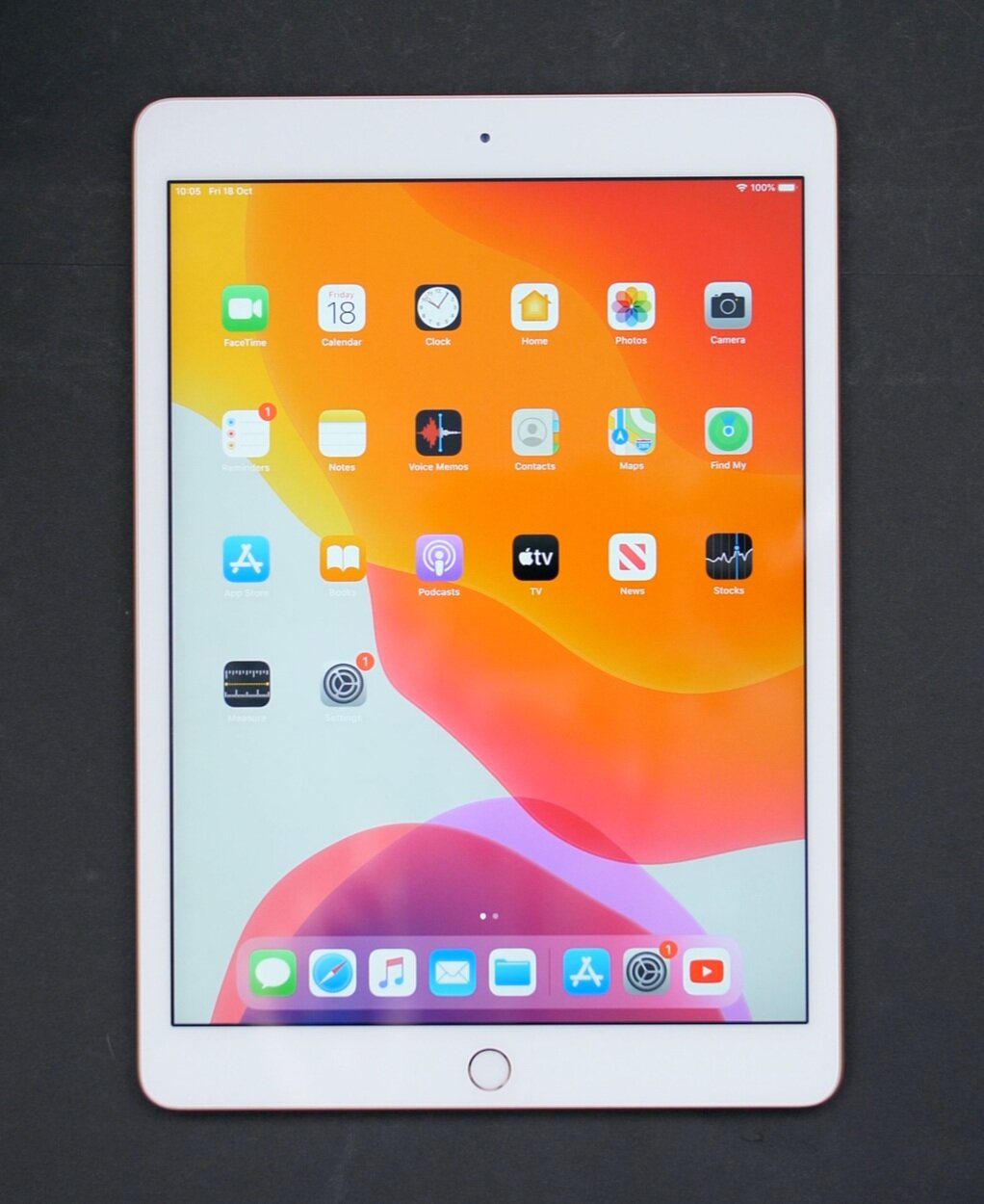
The six year old design of the 10.” iPad features thick bezels and a home button

The six year old design of the 10.” iPad features thick bezels and a home button

We still have the same 7.5mm thickness as the previous two entry-level iPads and the iPad Air 1 from 2013. So this is a fairly bulky tablet. It’s noticeably thicker than the 2019 iPad Pro which is 5.9mm, or the iPad Air 2019 which is 6.1mm. And it’s also quite heavy as well, at 483g for the WiFi only model, making it the 2nd heaviest iPad since the iPad Air 1. Only the iPad Pro 12.9” is heavier that this iPad. So using it in one hand isn’t necessarily impossible, but for me at least I found it quite uncomfortable and tiring. 

Also, the design itself is very outdated, as we still have the same thick top and bottom bezels, the same fairly thick side bezels which are even thicker than on the iPad Air 2019, and the good old home button.

Now, I did mention that this iPad got a design upgrade from last year, and that’s true. We did get a larger display. We now have a 10.2” display up from the 9.7” one that we had before. What this means is that the actual dimensions of this iPad are identical to the ones of the iPad Air 2019, same 25.6cmm height and the same 17.4cm width. The only difference between the two is the thickness difference. The Air does have a slightly larger 10.5” display, and the Pro has an 11” display, but this means that the entry level iPad does have the thickest bezels out of the three.


DISPLAY

So there is a display increase but what about the actual quality of the display? 

Well, resolution wise it’s pretty good. We have a 2160x1620 resolution panel, which has the same 264PPI as all the other iPads, aside from the Mini which has 364PPI. So it’s a very sharp and clear panel.  The brightness is very good as well. It’s 500 nits, so the same brightness as on the iPad Air. It’s not as bright as the Pro’s which get up to 600 nits but it’s still very good. However, that’s where all the positives end.

The difference between the laminated display of the Air and the non-laminated display of the 10.2”

The difference between the laminated display of the Air and the non-laminated display of the 10.2”

This display is unfortunately far behind what we get with the Air or the Pro, and that’s because it is not a laminated display. What this means is that there’s a gap in between the glass and the actual LCD panel underneath it. So it will always feel as if you’re touching a display that’s behind a windshield or a very very thick glass screen protector. This not only breaks away from the immersion but it also means that you’ll get much more reflection that you would on all the other iPads.

Aside from this, there is no True Tone display, that both the Air and the Pros have, which automatically adjusts the colour temperature to make it easier on the eyes, and we also lack a Wide Colour DCI-P3 panel, that both the Air and the Pros also have. So if you’re into professional colour grading, whilst this is a pretty good panel overall, the Air and the Pro would be much more suited for any work that requires colour accuracy. 

So, the design is indeed quite outdated but the display is the worst part about this iPad. But don’t get me wrong, it’s not a bad display, it’s just that it’s noticeably worse than even what the iPad Air 2 from 2014 had. 

CAMERA

When it comes to the camera I know that this isn’t an important feature of an iPad, since we all have smartphones with a much better camera anyways, but a camera on an iPad can be useful in cases where you want to FaceTime your family and friends, when your phone’s battery is dead and you really need something to take a photo with.

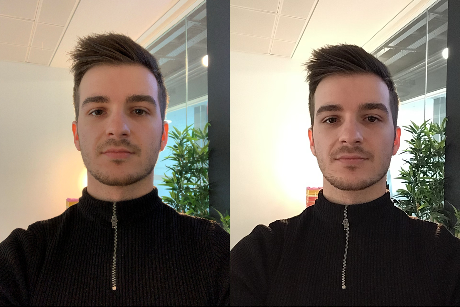
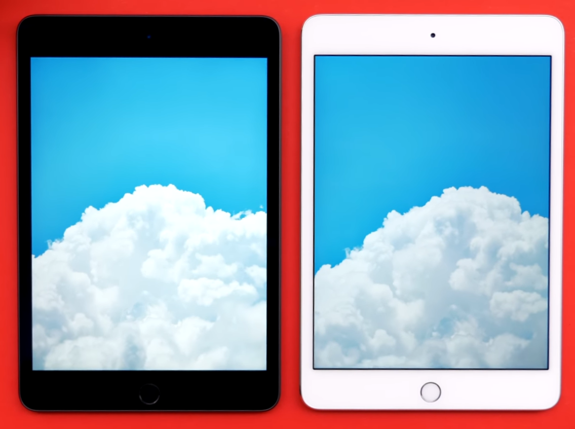
A front facing camera comparison between the iPad Pro (Left) and 10.2” iPad (Right)

A front facing camera comparison between the iPad Pro (Left) and 10.2” iPad (Right)

This iPad has a 1.2MP front facing camera, which is pretty bad when compared to the iPad Air, the iPad Pro, or the iPhone 11. Video recording on the front is capped at 720p so again, they all compare. It’s obviously not the best but considering the massive price difference between these devices, it’s pretty good.

The back facing camera is a bit better. This is essentially the same camera that the iPhone 5 had, back in 2012, 7 years ago. So it’s an 8MP sensor, f/2.4 aperture, and it can do 1080p video recording in up to 30fps.

The pictures do actually look better than on the iPhone 5, thanks to a better image processing, and yes, while this camera is so much worse than the one on the iPad Air 2019 or the latest iPad Pro , it’s still perfectly usable for that time when you do need an emergency camera to just capture a scene.


PERFORMANCE

Moving on to the performance, this is also a bit of an odd one. You see, this 7th gen iPad comes with the Apple A10 processor, the same exact processor that the iPhone 7 from 2016 came with, and the exact same chip that the iPad 6th gen from last year got. So unfortunately, we don’t get any processor upgrade with this year’s iPad, which is pretty disappointing. 

Considering that the iPhone 6 got dropped from iOS 13 support, the iPhone 6s, which comes with the Apple A9 processor, is the last supported iPhone. So, the A10 could be dropped in iOS 15, which would mean that this iPad will only get 2 years of updates, compared to 5 years for example, that the iPad Air 2 had.

Now, we did get 1 upgrade performance wise and that is 3GB of RAM, up from 2GB. This means that you can now keep more apps open in the background, and this also helps a ton when it comes to split screen multitasking.


SPECIAL FEATURES

At this point in the article I wouldn’t blame you for thinking that this iPad isn’t that impressive. It’s an iPad with a six year old design, a slightly larger display, but a non-laminated one, a seven year old camera and three year old specs. But you see, even though it looks bad on paper, the remaining three sections of this review is where it really excels.

In terms of the Special Features this iPad, same as the one from last year, supports the Apple Pencil. It doesn’t support the 2nd generation one that the 2018 iPad Pro got, and it does not have that very smooth 120Hz refresh rate Pro-Motion that the iPad Pro has, so the overall experience isn’t as good as on an iPad Pro. But at least you can use it. I’ve seen comments from actual graphic artists that were using the entry level iPad from last year to make some amazing drawings so this can actually be used for professional work. It’s just that it’s not as good as a Pro is for drawing but it’s definitely usable.

With the smart connector you can now connect keyboards like the Apple one to type with

With the smart connector you can now connect keyboards like the Apple one to type with

And something new this year, is a smart connector! Like with the iPad Air 2019, and all the iPad Pro’s, we have a smart connector which allows you to connect apple’s 1st party keyboard. Now this is actually the exact same keyboard that the 2nd gen iPad Pro 10.5” or the iPad Air 2019 use, so if you already have a keyboard for those iPads, it would work perfectly on this one. However Apple’s keyboard is very expensive, coming in at $160, pretty much half of what this entire $330 iPad costs. Not only that but there are so many better keyboards out there that work via Bluetooth, and also have a better typing experiences, such as ones from Logitech and Brydge. The Apple one is also very mushy, and aside from the fact that it’s very slim and you don’t have to charge it since it gets its power from the iPad itself through that smart connector, it doesn’t do anything extra that a 3rd party keyboard doesn’t do. However, the fact we now have Apple Pencil support and a smart connector on this entry level iPad, which used to be a key selling feature of the iPad Pro is a huge deal! 

Moving on from the keyboard, we wouldn’t be talking about special features if we didn’t talk about the biggest one out there, iPadOS. This is essentially iOS 13 but as it is on the iPad it has a new name, iPadOS, just because of how big the changes are. With iPadOS we can load full desktop pages in Safari by default, rather than getting that mobile view, which means that Google Docs on the web is now fully usable with full comments on the side, which wasn’t possible at all before on an iPad. You can now use multiple slideover apps for an even better multitasking experience, and also use multiple windows of the same app side by side, such as multiple instances of the notes app for example. There is even on-screen widgets now when you’re on the home screen in landscape, which is something that I’ve been wanting Apple to include for years.

Like with the Pro, the 10.2” will allow you to connect a games console controller to play games on it

Like with the Pro, the 10.2” will allow you to connect a games console controller to play games on it

If gaming is your thing, you can also use a PS4 or Xbox controller with this natively and play games such as Fornite, or even use the PlayStation Remote app and literally play your very own PlayStation games directly on this iPad, how insane is that! And now that Apple has launched Apple Arcade, their subscription gaming platform, you can play console quality games such as Oceanhorn 2, directly on this iPad with ease. This makes this entry level iPad pretty much a Nintendo Switch. It’s actually better than the Switch in so many ways, from raw performance to app support and the things you can actually do with this. Once Apple Arcade grows even more, we’ll get some even more high end games on this, so it’s just a matter of time. 

And probably the best part about iPadOS is that if you have a Mac with MacOS Catalina, you can also use it as a secondary monitor for your Mac, and Apple Pencil support will work as well! 

So there you go, from both a productivity and a gaming side, this iPad is an amazing tool to have.

BATTERY

Moving on to the Battery, Apple claims up to 10 hours of web browsing on this which fun fact, has actually been their claim for every single iPad model, ever since the original iPad in 2010.

So, Apple has kept that same battery life and made the iPads thinner over the years, made the displays brighter and the chips more powerful, while mentioning the same battery life over the years. I’ve never really had a battery life issue with any of my iPads over the years, but I also never got 10 hours. I mostly get around 7 hours or so, but battery life does depend on how you actually use the iPad. But do expect at least 6-7 hours out of this.


VALUE

And finally we have the value, is this iPad worth it? And my answer is yes! Definitely!

Even though it has a 6 year old design, a 6 year old display, a 7 year old camera and a 3 year old processor, it can actually do every single thing that an iPad Pro can, it’s just that it will do those things slightly slower, that’s it. And at $330, this iPad costs less than an entry level Apple Watch Series 5, which starts at $400. It’s $180 less than the iPad Air 2019 which starts at $500 and $470 less than the iPad Pro 11”. 

And because of this and the fact that like I said, this iPad can do everything that the iPad Pro can, just not as fast, I highly recommend it to everyone that just need a base iPad and doesn’t really care about any other extra features. I mean hey, you even have the exact same navigation gestures like you do on the iPad Pro. So even though that home button is there, you still have the same functionality that the iPad Pro has.

Whether you’re a student, an elder, a kid or someone new to iPads in general, this is the right iPad for you.

Apple Watch Series 5 - Review


Let me give you some context before I begin on this article, I’ve been a huge Apple Watch fan myself. I couldn’t wait for the Apple Watch to be released, I even made a few Leaks & Rumors episodes on the “iWatch”, way before it even got announced.

I then used the original for a year, the Series 2 for two years, the Series 3 for three weeks as I ended up returning it since the improvements weren’t big enough from the Series 2. I then used the Series 4 for a year and now I’ve got the Series 5.

But rather than just doing a usual review of the Series 5, I want to to talk about my entire Apple Watch experience in general

So get those snacks and drinks ready and here are the five main roles of the Apple Watch for me!


WRIST PHONE

The ability to make calls on the Apple Watch means that it almost negates the need for a phone

The ability to make calls on the Apple Watch means that it almost negates the need for a phone

So starting off the Apple Watch is essentially a smartphone attached to your wrist. I have the Series 5 with Cellular support which means that it’s always connected even when you’re not on WiFi or close to you iPhone. I can make or receive phone calls, I can navigate maps, I can check my emails and constantly get notified whenever I get any new messages on social media.

Really, aside from a Camera, the Apple Watch is a full fledged smartphone attached to your wrist. Especially now with watchOS 6, we have a the full Apple Watch App store directly on the Apple Watch, so you no longer need your iPhone to download apps to it as you can do it directly from the watch itself.

However, even though it has pretty much all the functionality that a smartphone has, it is not a smartphone replacement, as you do need an iPhone to set it up and it does not work on Android in any way.

In my case, I did end up leaving my iPhone behind quite a few times when I would go out and just take my Apple Watch. I actually felt even more connected with the real world, because I didn’t have a display to constantly check, yet still getting important notifications and the ability to make a phone call, in case of an emergency. 

The only thing that I felt I was missing from having my iPhone with me, was the camera, but aside from that, this a smartphone attached to your wrist.


PERSONAL DOCTOR

I use the phrase loosely but the Series 5, just like Series 4 before it, features the 2nd generation Heart Rate monitor, which is faster and more reliable than the 1st generation that the first three Apple Watches had. 

The 2nd gen Heart Rate monitor measures your heart rate constantly, but you can check it manually.

The 2nd gen Heart Rate monitor measures your heart rate constantly, but you can check it manually.

Your heart rate is measured every few minutes and constantly, whenever you’re doing a workout. On top of this, the Series 4 and 5 can also take your ECG (Electrocardiogram), you know that graph that shows you exactly how your heart beats, yeah that one! 

And according to multiple tests and studies the HR monitor and ECG Meter are as accurate as the actual medical devices used in hospitals which is very impressive.  Now, there are now some other smartwatches that can do this, some hybrid watches from Withings and the Samsung Galaxy Watch Active 2, but the Apple Watch was the first one to have this functionality with the Series 4. 

And there are a few more things that the Series 5 can do.

The Series 4 for example had something called ‘Fall Detection’, where if you fell over and didn’t move, it would automatically call the emergency services. This is extremely useful and in some cases it even save some lives. There were quite a few articles of incidents like this happening. The same thing applies to the ECG meter. The Apple Watch can detect Atrial Fibrillation, which is a heart condition that cases an irregular and abnormally fast heart rate. Quite a few users have reported that after the Apple Watch gave them the message that Atrial Fibrillation was detected in their heart they went to the doctor who immediately ran some tests on the patients and found that they needed immediate surgery. And this ended up saving their lives.

So the Apple Watch can actually save lives just on its own, which is something that regular tech devices don’t usually do. 

Now, the Series 5 did actually get a big improvement over the Series 4’s life saving capabilities and you can now make SOS calls even outside of the country that you bought it from. With the Series 4, it only had cellular antennas for the country that you bought it from, which meant that if you were using it in a different country roaming wouldn’t work at all. But with the Series 5 is does work for SOS calls only! So now if you’re on holiday in Spain or somewhere and you fall or get injured, your Apple Watch will automatically call the local emergency services! 

The new compass feature will come in handy if you get lost and have no cellular signal

The new compass feature will come in handy if you get lost and have no cellular signal

Something else that was added to the Series 5 was a built-in compass. This is something that we’ve had on smartphones since the iPhone 3Gs came out in 2009 10 years ago, but this is the first time we’ve had it on the Apple Watch. What this does is that it allows you to see the direction that you’re facing, compared to magnetic north. In Maps you can now see the exact direction that you’re facing, which is extremely useful if you do use the Apple Watch to quickly navigate the streets. In addition you can also have the separate compass app, which is again very useful for when you’re outdoors, and let’s say you maybe get lost and you have no cellular signal this can help you get back on your track. 

GYM COACH

The third main role of the Apple Watch is being your personal Gym Coach.

You have the famous activity ring, where the Blue ring represents the time you stood up, the red ring represents how much movement you did during the day, while the yellow ring represents the actual workouts and heavy duty exercises that you’ve done during the day. The idea is that you fill all three, every day, in order to stay in shape and be healthy. You do get achievements for completing these, so the Apple Watch always tries to keep you motivated.

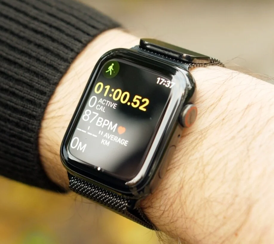
The workout app allows you to track workouts including your working heart rate, length of workout and calories burnt

The workout app allows you to track workouts including your working heart rate, length of workout and calories burnt

Then when you do go to the gym, you do have a built-in dedicated workouts app that has a ton of different workouts to choose from, from running, to walking, cycling, and then you can even add some more specific ones such as Tennis or American Football. The Apple Watch will even sync up with some gym equipment in order to save the data from those running speeds and distances, for example, onto the Watch. Once you’re in a workout it will constantly track your HR, the amount of calories you’ve burnt and you can easily go to your favourite songs by swiping left and right to play some music.

Speaking of music, the Apple Watch will connect to your Bluetooth headphones, no matter which ones you have, so you don’t need to have AirPods by the way. Although the AirPods with this is fire! 

Also even if you do not have the cellular model of the Apple Watch, you can in fact download music directly onto your Apple Watch for offline playback. You can easily do this from the Apple Watch app on your iPhone, and the Series 5 also has 32GB of internal storage up from 16GB on the Series 4, so now you can store twice the number of songs.

The Series 5 is now water resistant up to 50M

The Series 5 is now water resistant up to 50M

Something else which is useful when it comes to exercise and the Apple Watches is that starting from the Series 2, all Apple Watches are now water resistant up to 50M of depth. This means you can easily take them swimming, even diving. I’ve had them in sea water and they were absolutely fine! Before you go into the water you activate the water mode or the swimming workout in the workouts app, and then when you get out of the water you rotate the crown and the Apple Watch will make a noise and eject the water that got inside, really cool stuff! 

So the Apple Watch is perfect for swimming and doing any outdoor or indoor activities. But with the built-in GPS and cellular, this is also the perfect device to carry around you for when you’re running.


PERSONAL DESIGNER

Now one of my favourite features of the Apple Watch is that you can really make it your own. Which funnily enough is quite the opposite of what Apple stands for. Apple has usually been the company that offered one All-In-One Desktop design, one laptop design, one phone design and one tablet design.

But recently they’ve started becoming more accepting to the fact that everyone wants a slightly different thing. So we now have three iMac models to choose from, two sizes for the regular one and the iMac Pro which unfortunately, aside from the colour, the design is identical. There are also two laptop choices now the MacBook Pro and the Air, each in multiple colours, and two different sizes for the Pro. We now have four iPhones to choose from, again each in multiple colour options, and even multiple sizes in the case of the iPhone 8 and iPhone 11 Pro. And finally we also have four different iPads to choose from now, each in multiple colours and even 2 sizes for the iPad Pro. 

So Apple’s finally offering us more and more choice. But really, there is no other Apple product that offers more choice than the Apple Watch does.

The different case materials you can purchase the Series 5 in (From top left: Aluminium, Ceramic, Stainless Steel, Titanium)

The different case materials you can purchase the Series 5 in (From top left: Aluminium, Ceramic, Stainless Steel, Titanium)

First off you choose the size, 40mm or 44mm case. Then you choose the material that that case is made from, and here you have four materials; Aluminium, Stainless Steel, Titanium and Ceramic. And the first 3 even come in multiple colours to chose from. Aluminium comes in Silver, Space Grey and Gold. Stainless Steel comes in Silver, Space Black and Gold and Titanium comes in Regular and Space Black. 

The Titanium is the brand new casing material now and it’s a bit of an odd one because it’s more expensive than the Stainless Steel models are but it sits right in between the Aluminium and the Stainless Steel model, when it comes to looks and feels. It is lighter than the Stainless Steel model is, but slightly heavier than the Aluminium. For example, for the 44mm model, the Aluminium weighs 36.5g, the Titanium is 41.7g and the Stainless Steel is 47.8g. Personally I couldn’t really tell that much of a different between the two in terms of weight. Even when it comes to the texture, the Titanium one looks closer to the Aluminium than to the Stainless Steel. The Stainlesss Steel has this glossy and in my opinion more premium look to it, so the black stainless steel is my favourite Apple Watch case. 

But like I said, you do have nine different case colours and materials to chose from, so you get plenty of choice. 

And then you have the bands. So not only are the bands fully compatible with every generation of the Apple Watch ever released but Apple offers eight different bands to choose from, each with multiple colour options which Apple also refreshes every few months or so. But even if you don’t like Apple’s selection that’s fine, you don’t even have to stick with Apple’s own bands. There are many other 3rd party options that not only offer better quality that Apple’s own bands, but also an even larger selection, such as BandWerk.

TIME KEEPER

And finally the 5th big feature for me, when it comes to the Apple Watch is that it’s the a very good time keeper. You get thirty one Watch Faces to choose from, with more and more being added in every watchOS update, which is in September every year. Not only that, but whenever you select a watch face, you can customise it even more. You can change the style of it, the size of the actual clock on some of them, the colour of the second hand, there is just a ton you can do with them

The watch face is entirely customisable so you can put whatever you like on it using third party apps

The watch face is entirely customisable so you can put whatever you like on it using third party apps

On top of this you can even add complications, which are basically widgets onto the watch faces themselves, to get not just quicker access to things such as workouts or music, but also have more information displayed on the watch face. Other things you can get are things like when it is going to rain, the UV Index, Podcasts, pretty much anything you want. And yes, you can even add complications for the 3rd party apps that you have installed, so the selection here is just massive! 

In Always-On mode the clock face with dim and go into a black and white version of your watch face to conserve battery

In Always-On mode the clock face with dim and go into a black and white version of your watch face to conserve battery

Now the Series 5 did finally add something quite big in terms of keeping time, and that is an Always On Display. Now, there is a lot of fuss about this, however Android smartwatches have had this for many years now so it’s nothing new for a smartwatch, but it Is definitely new for the Apple Watch. The way it works is that when you’re putting the Apple Watch to sleep manually or it just goes to sleep by itself the display won’t turn off anymore, instead it will still show you the watch-face, just with a lower brightness. Also, if you have a bright watch face, with lots of colour and white accents, your watch face will slightly change and the animations will be turned off, in the Always-On Display. Apple did include an LTPO display or a low power display in this Apple Watch to make the Always-On Display possible, but what Apple didn’t mention is that the Series 4 also had this very same display technology.

So then why don’t we have an Always-On-Display in the Apple Watch Series 4? 

Well the Series 4 lacks the new display controller that allows the Series 5 to dynamically adjust the refresh rate from 60Hz down to just 1Hz. This means that when you’re not using it, in Always-On mode, the Apple Watch will refresh its display every second, rather than 60 time a second, like it normally does, and this does help conserve batter life.

Speaking of the battery life, at the end of the day with my Series 4 I had about 60% battery life left which was nuts! This meant that in quite a few cases, I even used my Apple Watch for two days straight without charging it. With the Series 5 however, with the Always-On Display on, in my first few days I only had about 15% left at the end of the day which was quite bad. That was without me even going to workout, because if I did that, especially with GPS and cellular turned on, it would’ve died on me mid-day.

However, after about 1-2 weeks of use the battery life started improving considerably. So now, I actually end up the day with about 50% batter left. Still not as good as my Series 4 was, but much much better than my Series 5 was in the first few days. 

So if you’re experiencing issues with the battery life, just use it for a few days until all the files get indexed, and it will improve.


CONCLUSION

Ok, so in the end…should you get an Apple Watch Series 5?

Well, if you already have a Series 4 – absolutely not. You’re just getting an always on display and a compass which you’ll probably never use, so it’s just not worth it for that.

But if you have a Series 3 or earlier – the Series 5 is a very VERY good upgrade.

Not only are you getting a brand new design, a larger display, but you also get the ECG meter, an improved HR monitor, fall detection, a much faster processor which the Series 5 also has btw – yes the Series 4 and 5 have the exact same processor. 

And you’re also getting the always on display.

Now if you don’t have an Apple Watch at all, again the Series 5 is a very strong choice since now we finally have that always on display that many android smartphones have had.

But if you don’t need one right away, the Series 6 will very likely come with a brand new design, next September.

iPhone 11 (2019) - FULL Review!


Apple used to release just a single new iPhone every year. But then in 2014 everything changed when Apple released two, rather than just one. We had the iPhone 6 and the much larger iPhone 6 Plus, for those that wanted a larger display size. From there on that’s what the lineup looked like, until 2018 when Apple added a third model, an iPhone “Lite”. This was a lower end iPhone for those that still wanted the latest specs and camera but don’t want to spend a ton on a new phone. That was the iPhone XR from 2018 which launched alongside the iPhone XS and the XS Max. 

This year Apple has done the same thing, they’ve released the iPhone 11 Pro and the 11 Pro Max which are the successors to the XS and XS Max from last year, and the iPhone 11 which is the successor to the iPhone XR from last year. As it turns out this is actually a very good iPhone and this is my full review with my final thoughts on Apple’s lowest end iPhone for 2019 which just like the Nintedo Switch Lite, ended up being better than the more expensive models. 

This article contains 7 different sections with my full thoughts on the Design, Display, Camera, Performance, Special Features, Battery Life & Value, so get all those snacks and drinks ready and enjoy!


DESIGN

Despite being the more recent model, the 11 (Right) has thicker bezels than the X (Left)

Despite being the more recent model, the 11 (Right) has thicker bezels than the X (Left)

Lets start off with the design the iPhone 11 which is a bit of a mix between the iPhone 8 and the iPhone X. What I mean by this is that it has the aluminium frame of the iPhone 8 rather than the stainless steel frame that the iPhone X and the Pro’s have, so it feels a bit less premium, but you still have that iPhone 8, 7, 6 feel in your hand. You also have the iPhone X style design on the front with the notch, however the bezels are thicker than on the iPhone X, and interesting enough the side bezels are actually thicker than on the iPhone 8. This is why this phone is a mix between the old iPhone 8 style design and the new iPhone X style design, and I have to be honest, I’m not a huge fan of this design.

The iPhone 11 Pro’s already look outdated as they are still using the exact same design from 2017 with the X so all look identical from the front, and the regular iPhone 11 looks just as outdated. This looks to me like an early 2017 design, considering that the iPhone X came out in late 2017 and already had a more modern design, when compared to the 11. Which is such a shame seeing as competitor devices like the Galaxy S10, the Note 10, the OnePlus 7 Pro and 7T Pro and many other smartphones already look so much more futuristic than the iPhones do. Just because of the lack of a notch and the full screen displays. 

Measuring 8.3mm in thickness, this is the thickest iPhone since the 4S (Left)

Measuring 8.3mm in thickness, this is the thickest iPhone since the 4S (Left)

Also the iPhone 11 is quite thick. At 8.3mm this is the thickest iPhone that Apple has released since the iPhone 4S in 2011, 8 years ago. Taking a look at the bottom of the phone, you’ll not only find a lightning port but you might also notice that the lightning port is not aligned perfectly with the screws and the speaker grill, like they are on the Pro’s for example.

Apple used to be the company that payed a lot of attention to detail, but unfortunately that hasn’t been the case for quite a few years now. 

The back however, does look better than I expected. On the mock-ups that we had it just look horrendous, but seeing it in person, on the final unit I think it looks pretty decent. I definitely prefer having the Apple logo in the middle, just like on the iPads and the MacBooks, and the camera module doesn’t look that bad either.

I do like how the inside of the camera module has the same colour as the back of the phone does, rather than being full black like it was on the mock-ups, and the glass inside the module is matte, whereas the glass on the rest of the back is glossy. Fun Fact, the iPhone 11 Pro has these reversed with a matte glass back and a glossy camera module.

But overall I’m not a big fan of this design. It’s the same one as the iPhone XR from 2018 which already had an outdated design compared to the iPhone X from 2017 and the colours are just not as vibrant as last year.


DISPLAY

Moving on to the Display, this is a bit of an odd one, since Apple gave the low end iPhone a medium sized display, rather than giving it the smallest display. We have a 6.1” display on the 11 compared to the 5.8” on the 11 Pro, and 6.5” on the 11 Pro.

To be fair it actually does make sense for it to be this way. People who want the smallest iPhone possible, still get all the features from the Pro, while people who want a cheaper iPhone still get a fairly big display, and at 6.1” this is a very good size display. It’s small enough for me to almost use it in one hand and large enough to comfortably view your content. When you compare it side by side to the 11 Pro Max, you can tell that the 11 isn’t that much shorter than the Pro Max is but it’s definitely not as wide, meaning that it’s much more comfortable to hold.

The LCD Panel on the iPhone 11 compared to the OLED panel on the Samsung Galaxy S10

The LCD Panel on the iPhone 11 compared to the OLED panel on the Samsung Galaxy S10

Now, the display on the 11 is actually the main downgrade that you’re getting from the Pro. With the 11 we get an LCD display compared to the OLED displays that we get on the Pro’s. LCD is what Apple was using before the iPhone X. In LCD displays the pixels only provide the colour and not the light source. So you need a separate back light to light the pixels up. This means that when you are displaying a scene with black in it, the back light will still be on for the other pixels and the black would have this blue-ish grey-ish look. With OLED displays, there is no back light because the pixels are the light source themselves. This means that when you’re displaying black, the pixels are actually turned off entirely for that section, and therefore you get true blacks.

Also, if you’re using Dark Mode on iOS 13 the battery life would be improved by having an OLED panel, again because the display will be turned off for the sections where black is displayed. Aside from this, thanks to the OLED display, the Pro’s have a much better contrast of 2 million to 1, vs 1400:1 on the 11. 

Colours look more vibrant as well, with the display being brighter on the Pro, up to 1200 nits in HDR content compared to 625 nits, and yes the 11 Pro’s can actually display HDR 10 content natively. The viewing angles are also better on the Pro’s thanks to that OLED display, and the resolution is also higher as well.

We have 326PPI or pixel density on the iPhone 11 compared to 458 on the 11 Pro Max. Compare that to the 550 PPI that the Samsung Galaxy S10 has, and yes there is a pretty big difference especially with the 11.

Now realistically you would not be able to tell the difference unless you look at the phones very closely. However if you watch a lot of YouTube content, then I have some bad news for you. The iPhone 11 only has a 1792 x 828 resolution display, which is actually lower than 1080p. Which means that you would not be able to play 1080p videos on YouTube. Yes, the YouTube player does let you select 1080p but that doesn’t really mean anything since the display itself is sub 1080p. Also on iOS you cannot play any YouTube videos higher than 1080p anyways, even if you have an iPhone 11 Pro Max for example. 
But comparing the Video Quality on YouTube on the 11 to the 11 Pro, you cannot really that much of a difference between the two. However, when you compare this to the regular Galaxy S10 which actually costs less than the iPhone 11 now, there is a gigantic difference between the two displays in every single way. 

So I’m not saying that this is a bad display, it’s just that it’s nowhere near as good as the iPhone Pros, or pretty much any of the android competition at this price point.


CAMERA

So so far it doesn’t look good for the iPhone 11. It comes with an outdated design and a fairly downgraded display for its price, but the good news is that that is where all the downsides end, because everything else is very good on this phone.

The camera for example is mostly the exact same one that we get on the iPhone 11 Pro’s, which is overall the best smartphone camera on the market right now.

An example Night Mode photo from the 11

An example Night Mode photo from the 11

We have full 4K 60 video recording with the front camera, which no other smartphone can do at the moment. We have a wider field of view on the front as well, so whenever you’re taking photos you can zoom out to get more into the shot which you couldn’t do before.

HDR photography has been improved and so has night shots have been improved dramatically, with a dedicated night mode that kicks in automatically.

So this is a gigantic improvement from the XS.

We also have that ultra-wide angle module which lets you capture so much more in the scene. You can even record 4K 60 video with that module, which again no other smartphone can do at the moment.

You can smoothly transition between all 3 lenses, so this is overall the best smartphone camera on the market right now.

The Note 10 also has a very good camera, even a bit better in terms of the wide angle photography but video is much better on the iPhone, and I’m very glad that the 11 got mostly the same camera as the Pro’s did. I say mostly because it is lacking the zoom or the telephoto module which is not really a big downgrade since you can always zoom in digitally, it’s just that the zoomed in photos won’t be as sharp. 


PERFORMANCE

Performance wise this is a champion as well. No really, it has the exact same Apple A13 processor that the iPhone 11 Pro’s get, which is still the fastest processor in any smartphone, and is at least an entire year ahead of the competition, if not even more than that.

In addition we now have 4GB of RAM up from 3GB, matching the amount of RAM we have on the iPhone 11 Pro’s.

In fact, because of that lower resolution display, the performance on this iPhone will actually be even better than on the Pros! And performance has been very good on my 11 Pro Max, for example the only issue that I’ve had and I still have this every now and then is RAM management. Sometimes apps keep refreshing in the background which is quite frustrating. I don’t have this issue at all on my Note 10+, but that also has 12GB of RAM compared to 4.

Make sure to watch our ultimate speed test of the iPhone 11 Pro Max versus the Note 10+, as the iPhone 11 will perform very similar to the iPhone 11 Pro Max. 


SPECIAL FEATURES

Moving on to the special features, we do actually get quite a few new ones.

Despite being the strongest glass on an iPhone, they are still susceptible to scratches

Despite being the strongest glass on an iPhone, they are still susceptible to scratches

For example, we get what Apple’s calling the strongest glass in a smartphone, which is what they have been saying for a few years now. We get this on both the Pro’s and the 11.  I already have scratches on mine and I actually ended up having my 11 Pro Max replaced because of this, but that’s actually how glass works. If you want to make a glass durable to drops you have to also make it flexible, and if you make it flexible it means that you add plastic which will make it scratch easier.

So yes, while the glass on the iPhone 11’s is way more durable to drops than older iPhones, they will still scratch. So do keep that in mind, I would consider buying a screen-protector if you haven’t already.

The water resistance has been improved on the iPhone 11’s

The water resistance has been improved on the iPhone 11’s

Aside from the improved glass, water resistance has also been improved on the 11. We now have up to 2m of depth up to 30min, from 1m for 30min which was what we had on the XR. This means that the iPhone 11 is now as water resistant as the iPhone XS was, and even more water resistant that the 8 and the X. The 11 Pro’s now have up to 4m of depth resistance, but personally I’ve submerged all of the iPhones from the 7 to the 11 Pro in swimming pools and even sea water and they were all fine. Do keep in mind that water damage is not covered under warranty. 

As well as those we also get the improved speakers that we got with the iPhone 11 Pro’s. So we get special audio playback and Dolby atmos support as well. 

But something that we do not get is a fast charger. Apple finally bundled one in the box of the iPhone 11 Pro’s but the 11 still gets that very slow 5W charger which is so annoying.


BATTERY LIFE

Speaking of chargers, let’s talk about the battery life.

So last year, ironically the iPhone XR had a better battery life than the XS & XS Max had, even though those actually had an OLED display, which was also more power efficient. The effect of this was that many people actually picked the iPhone XR over the XS’s, just because they wanted more battery life.

Well this year, things have changes.

Apple has now removed 3D touch from the iPhone 11 Pro’s and increased the battery size. Alongside the more power efficient Apple A13 chip, we get four more hours of battery life on the 11 Pro compared to the XS, and five more hours on the 11 Pro Max compared to the XS Max when playing back video. So that’s a massive improvement. But the iPhone 11 also get an improvement of one extra hour, over the XR from last year.

So while it’s not as good as the 11 Pro or Pro Max, it’s actually even better than the XR from last year which was already known to have the best battery life in any iPhone yet.


VALUE

So in the end. What are my final thoughts on the iPhone 11? 

Well, this lower end iPhone has the exact camera, aside from the zoom module, and the exact same performance that the much more expensive iPhone 11 Pro’s do. Those are the two things that are what most people care about the most in a phone; speed and camera.

So if you can look past the outdated design and lower end display I can assure you that you’ll absolutely love this phone! And at $700, $300 less than the iPhone 11 Pro and $400 less than the Pro Max, this is in my opinion the iPhone that’s worth it the most in 2019.

But is it the smartphone that’s worth it the most in 2019?

Well no, that would be the regular Galaxy S10, which offers a much better display, a more modern design than even the iPhone 11 Pro’s, and a triple lens camera module that is on par with the iPhone 11 Pro Max.

But if you’re an iPhone user this is the one that I would recommend to most people, and then you’ll have $300-$400 left to spend on AirPods or an Apple Watch.

iPhone 11 PRO - Unboxing, Camera Test & My Initial Impressions


So we finally have the iPhone 11’s in the office! I have the iPhone 11, the iPhone 11 Pro & the iPhone 11 Pro Max! This is the first time I’m seeing them in person, so without any further ado here is the unboxing and my first thoughts on the iPhone 11 Pro & the iPhone 11 Pro Max!


BOX

Ok, so taking a look at the boxes they both come in a black box now, to showcase that Premium Pro name now. They also come with a protective plastic wrap which is very easy to remove now thanks to a new pull tab that Apple started including with the iPhone X’s. Personally, I absolutely love the way these boxes look. They remind be a lot of the iPhone 2G, 3G and 3Gs boxes from back in the day. Those were the last black iPhone boxes that we got. Now, we did get a dark space grey box with the iPhone 8 which was quite cool, but these ones look so much better.

The design of the boxes has changed from the previous white boxes

The design of the boxes has changed from the previous white boxes

On the front of the boxes we have an image of the iPhone 11 Pro which matches the color of the iPhone inside, so Space Grey in the case of my 11 Pro Max and Midnight Green for the smaller 11 Pro. And like previous iPhone boxes, the iPhone 3G’s indented home button for example, we get 3D indentations of the actual phone on the box. The camera modules are raised a bit so you can actually feel them, and same goes for the stainless steel frame! Really cool.  On the side of the box we have an iPhone branding, no 11 name or anything like that, and what’s really cool about this is that the logo shimmers in the color of your iPhone.

We then have an Apple logo on the top and bottom which also shimmers in the color of the iPhone that’s inside and finally, on the back we get the capacity, 64 & 256GB in my case, as well as a listing with everything we get inside.

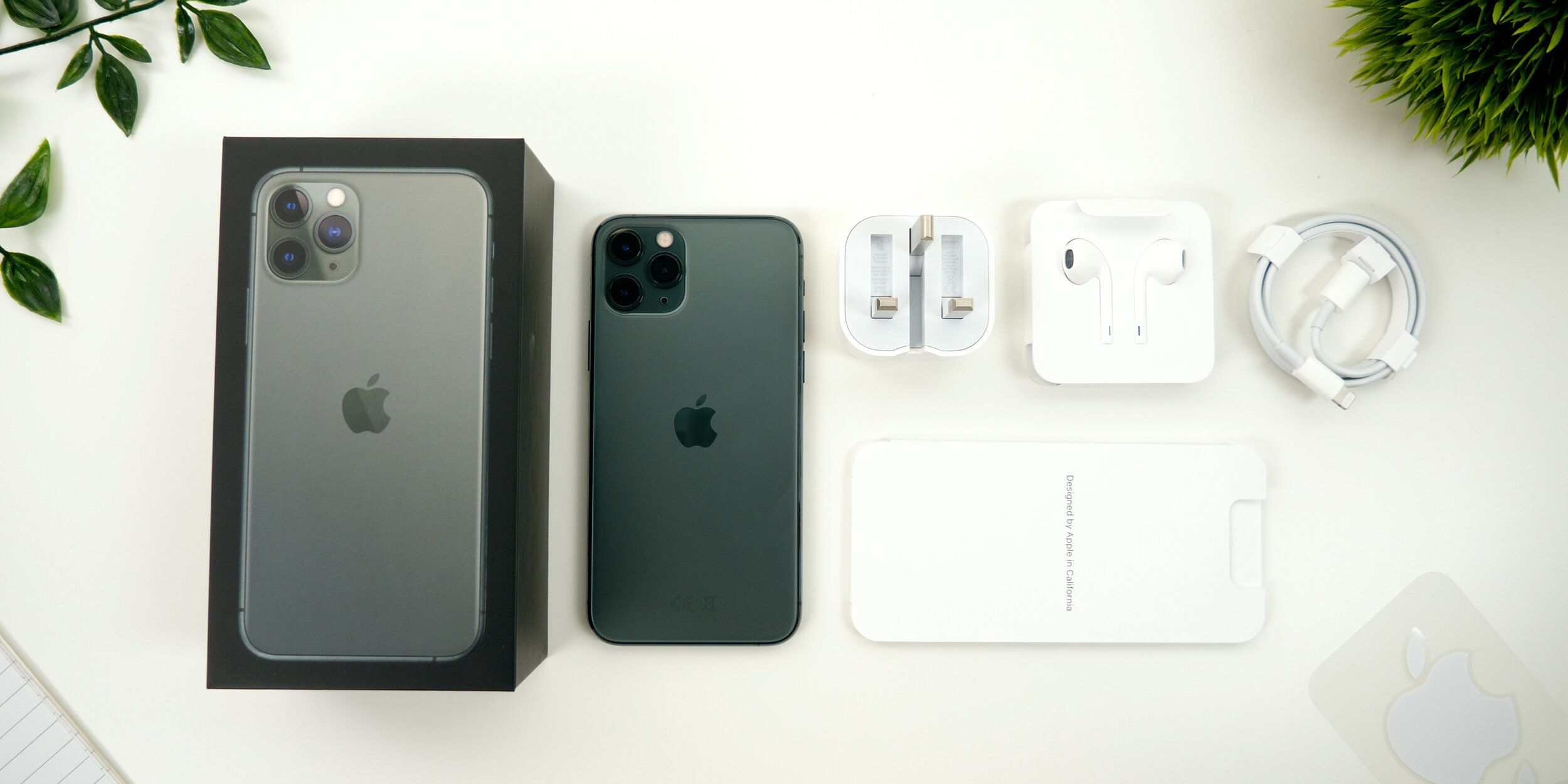
Upon opening up the box, the iPhone 11 Pro just sitting there. Interesting enough there is no plastic wrap on the back anymore. There’s just the one on the front, that now says Apple Inc alongside Apple’s address on it. We get the booklet, that includes the quick start guide with gestures, the Sim Eject Tool, the warranty and the safety guide, as well as some Apple stickers which unfortunately do not match the color of your iPhone like they do on the 12” MacBook which would’ve been nice. 

We also get a pair of lightning headphones, a USB type C to lightning cable, a first for an iPhone. Unfortunately we still have lightning on the iPhone but the charger,  is now the new 18W charger which is significantly chunkier than the previous model, but it does offer significantly faster charging than the previous 5W charger that came in the box. However, despite being chunkier it is actually very compact. You can fold its feet for the UK model at least, which you couldn’t do before  and since this is 18W, it can easily charge an iPad Pro as well. Quite a useful thing to carry around! 

Everything you get inside of the iPhone 11 Pro Max box

Everything you get inside of the iPhone 11 Pro Max box

IMPRESSIONS

Now I’ve been playing around with the iPhone 11 Pro Max for a bit now and here’s what I think.

First of all, the back feels weird. Feels as if you have a silicone skin on it. It’s smoother than the frosted glass back that the OnePlus 7 Pro has for example, and certainly something that we’ve never had on iPhones. But I do like the Matte Space Grey look of it! Especially with that centered Apple logo which I’ve actually come to like a lot more than the previous logo which was always towards the top of the phone. I think it has a very sleek look. 

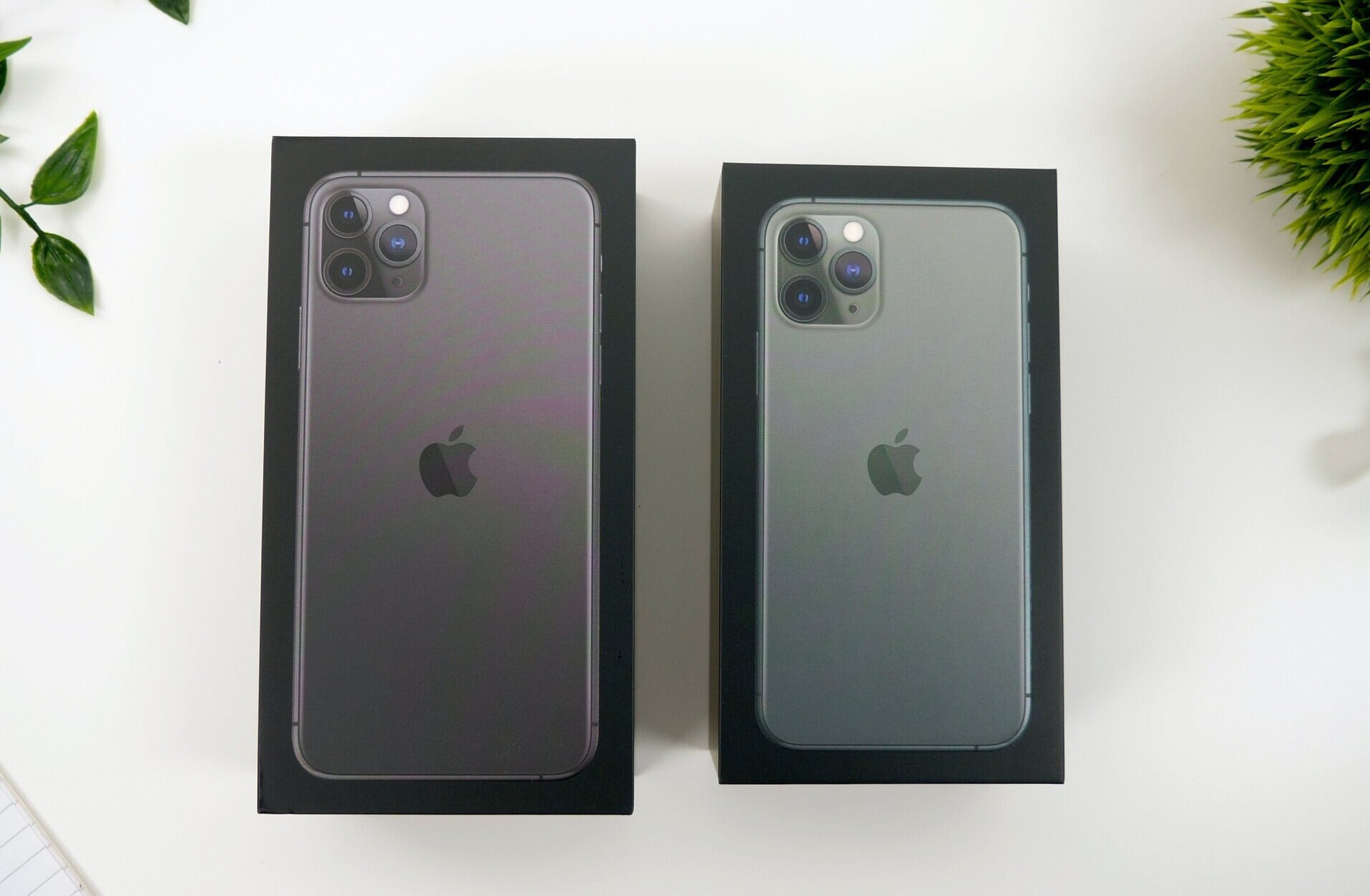
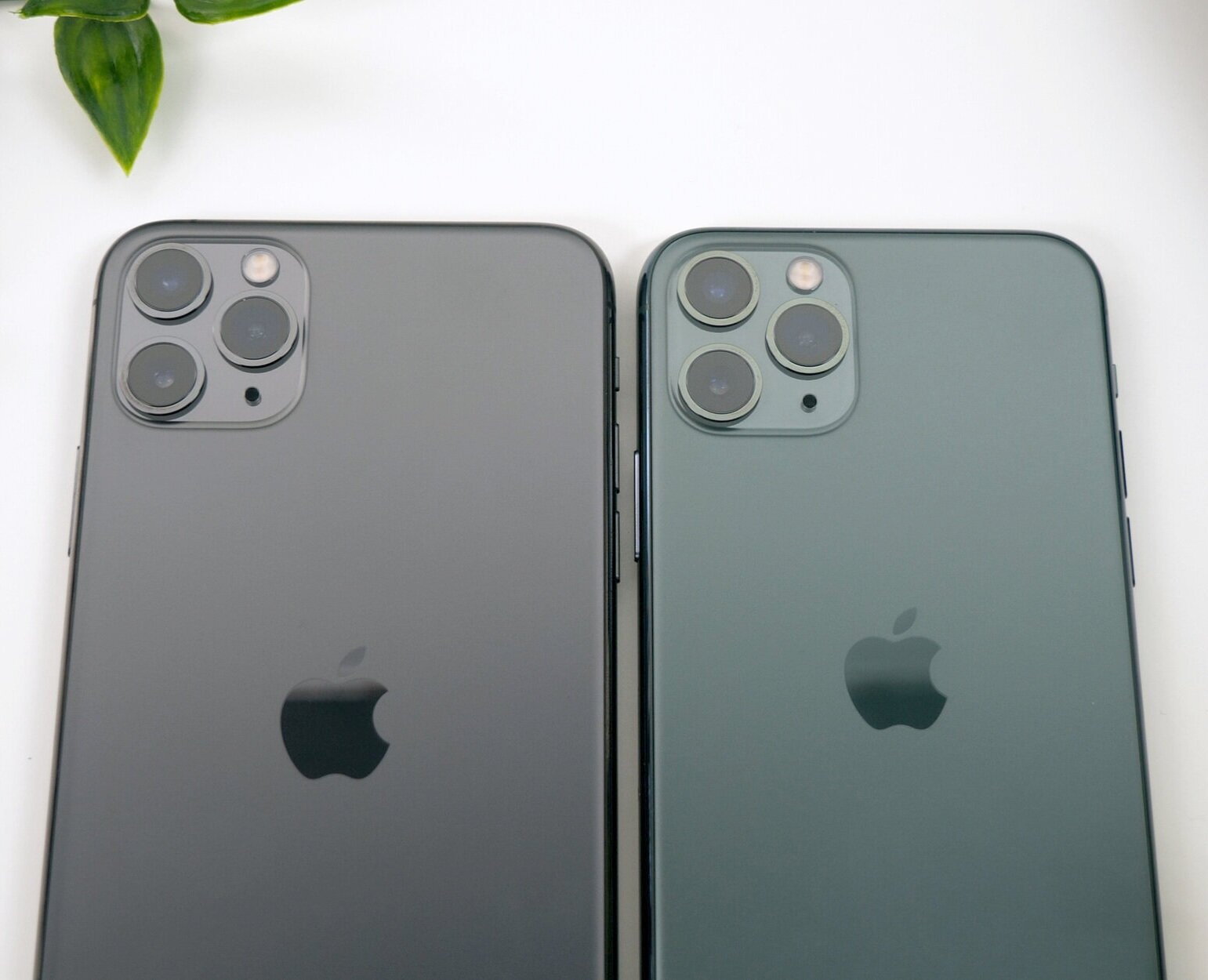
The Space Grey (Left) compared to the Midnight Green (Right) iPhone

The Space Grey (Left) compared to the Midnight Green (Right) iPhone

I’m not fully sure what to say about the Midnight Green color. From certain angles, the back just looks identical to the Space Grey one, at least to my Color Blind eyes. It’s only when you put them next to one another, can you really tell the difference between the two. The stainless steel frame on the Midnight Green 11 Pro does have this yellowish/green look to it, so that’s quite an obvious difference between the two. 

So design aside, what about actually using the phone? Is there anything different that I’ve noticed from my XS Max?

Well, the display is brighter, but only when you manually max out the brightness and compare the two side by side, can you actually notice a difference. However if you’re watching HDR content there is a noticeable difference between the Pro Max and the XS Max. I did also noticed the display being warmer, even with True Tone turned off.

The speakers appear to have had a pretty big upgrade! I was really impressed when I heard the difference between my 11 Pro Max and my XS Max. Not only was the 11 Pro Max louder but the vocals were so much easier to hear and clearer.

The Haptic Engine to me feels exactly the same as on the XS. Same haptic response, same strength, same everything. However the lack of 3D touch was very noticeable to me. Having to hold on icons for that 3D touch functionality makes everything so much slower. However, the only place were I was using 3D touch on a more frequent basis was in the control center and the lock screen, but if you compare the XS Max and the 11 Pro Max side by side, you can see how much slower it really is.

I didn’t really get to test out the battery life, because I only just got this today so definitely follow on Twitter @ZONEofTECH where I’ll post some updates as to its battery performance. Although I’m expecting it to be significantly better than the XS Max was, which for me could never last me an entire day of use.

CAMERA

Before we get into the camera properly, a quick tip. When you get a new iPhone always make sure that you go into the settings app and then camera and enable 4K60, because by default you’re stuck at 1080p for some unknown reason. This way you get the maximum amount of quality out of this camera.

Ok, so the front camera is very impressive on this. All the shots were perfectly exposed and sharp the colors were accurate and now you can rotate the phone in landscape and you get this wider field of view. Apple’s doing this by using a higher resolution 12MP sensor from the 7MP that we had before but because they haven’t added a wide angle lens, we actually don’t get any distortion, just a wider image which is pretty cool! 

The video on the front camera is also amazing! 4K60, which is some thing that’s never been done on a phone, so that’s extremely nice to see on the 11 Pro, considering that the XS’s only had 1080p video recording, so there were already far behind the competition which had QHD and 4K30 on the front already.

Other than that, FaceID does unlock faster but the difference is smaller than you would expect, since iOS 13 does make unlocking with FaceID faster on the iPhone XS as well.

Then on the back we get that triple lens camera system that you’ve all heard about. 

What I really like about this is how insanely smooth the transition between the lenses really is! You wouldn’t believe how much you can zoom out! It’s still not on par with the Huawei P30 Pro but very impressive!

Now, there is a bit of noticeable frame-blending that Apple is adding when transitioning between the lenses because they all have a different field of view, and for the most part you won’t be able to notice that, unless you do the transition between the lenses very very slowly.

In terms of the camera quality, I was very impressed with the consistent look that the photos got, between each of the lenses, but something that did shift quite a bit was the white balance. So it really does depend.

Even video recorded with the ultra wide lens comes out very stable.

Now, it would be hard to not talk about Night Mode. So here’s an example taken in our studio comparing the iPhone XS Max, which doesn’t have a Night Mode feature, and iPhone 11 Pro Max, a true night and day difference! Its great to see that Apple are finally catching up with this feature. I’m just a bit disappointed that the Night mode is an exclusive feature to the iPhone 11’s, even though all the other iPhones could easily do this, since it’s mostly a software feature. 

The Night Mode on the new iPhone makes such a huge difference to low light photography

The Night Mode on the new iPhone makes such a huge difference to low light photography

So overall, with that 3rd wide angle module, improved HDR video recording, and the significantly improved front facing camera, the 11 Pro’s have big improvements in the camera department. And I’m extremely happy about that because the camera is actually what I care about the most in a smartphone!


CONCLUSION

In the end the biggest improvement that the 11 Pro got over the XS is in the camera department, and while I do find the camera to be the most important thing for me in a smartphone, I don’t think that this upgrade is enough to warrant an upgrade from the XS. 

The 11 Pro in my opinion is what the XS should’ve been. S models of the iPhones have always had a speed improvement, a significant camera improvement as well as a brand new unique features, while keeping the same design. Pretty much exactly what the 11 Pro is, to the XS.

Oculus Quest Review


Our lives are sometimes boring. We just feel that time doesn’t move fast enough or sometimes we feel that it moves way too fast. We want to be able to do great things, travel around the world, do space walks from the ISS or maybe even travel aboard an actual advanced space craft and explore our Milky Way Galaxy at the speed of light! 

All these are things we dream of but they’re also things that 99.9% of us, will never get the chance do to.

But what if I told you that there was a way? The Oculus Quest is a VR or Virtual Reality headset. You put this on your head and you get fully transported into a virtual world and you can pretty much do anything that you can imagine.

Whats special about the Oculus compared to others on the market at the moment is that this is the first real VR that does not have a cable at all. Normally you have the VR headset connected to your PC or game console, but this one is truly wireless and it also supports 3D tracking so you can move around in your room, you can also see your hands as well, and it also tracks when you close your fingers and more.

So how does this measure up against its competitors and what do I think? Well, here is my full unbiased review of the Oculus Quest, after over two months of use!


RESOLUTION

The Oculus Quest has a resolution of 1440x1600 per eye which is quite a lot! The original Oculus Rift had 1080x1200 per eye so this is higher than that. This is also higher than the newly released Rift S which has 1280x1440 pixels per eye and this is also significantly higher than the 960x1080 that the PSVR has per eye! 

In fact, the Oculus Quest actually has a higher resolution that the much more expensive HTC Vive and it even has the exact same resolution as the Valve Index VR, which is pretty much the best VR headset that money can buy right now! There are a few Chinese ones that have 5K or 8K displays but they’re only for watching movies mostly. 

Now I have been an avid user of the PSVR, using it for over 8 months, and coming from that I could definitely notice a significant increase in resolution. You can still see the pixels on this by the way, you would need something like a 16K display per eye in order to not see any pixels at all, but this is already a major improvement from the PSVR.

However, if it sounds too good to be true, it probably is.


GRAPHICS

So following on from that thought let’s talk about the graphics.

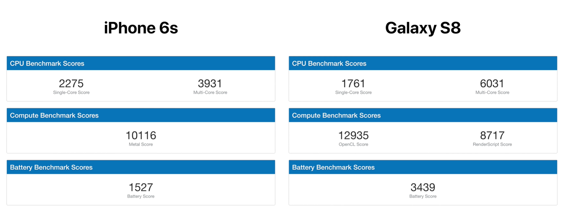
Even though we do get such a high resolution, the Oculus Quest has to run the graphics internally, using a Snapdragon 835 processor. Yes, the same processor that you would find in a Samsung Galaxy S8 from more than 2 years ago, and the S8 wasn’t a powerful phone in the first place. Performance wise, the 835 is even weaker single-core wise than an iPhone 6s from 2015. And GPU wise, it is just barely more powerful the iPhone 6s from 2015.

The Snapdragon 835 Processor found in both the Samsung Galaxy S8 and the Oculus Quest is less powerful than that of the 2015 iPhone 6s

The Snapdragon 835 Processor found in both the Samsung Galaxy S8 and the Oculus Quest is less powerful than that of the 2015 iPhone 6s

Not only that, but the Quest only has 4GB of RAM, which is pretty much the same as you can find in low to mid-range smartphones today. The Galaxy S10 or OnePlus 7 Pro for example can have up to 12GB of RAM, 3 times as much as the Quest has.

So performance wise, this headset is very very under powered. But wait, there’s more!

The severely under powered 835 CPU inside of this not only has to run the game at 72FPS with a 72Hz refresh rate, but it also has to do all the tracking of you hands and the environment in real time!

Now although that is impressive that means that games don’t even get access to the full power of this weak CPU and because of that, they never run at full resolution, at best you are looking at 1920x1080 or even lower in same cases. Whats annoying about this is that it doesn’t really matter that you have such a high resolution display when the image that’s displayed on it is a much lower resolution. So the Quest is like having a 4K display. But playing the games in 720p.

Still games such as Beat Saber, Creed & Superhot VR actually look sharper than on the PSVR! Shaper but the graphics are not that great. For example in Beat Saber, which is literally my favourite VR game, on the Quest there are no reflections on the walls, there are less sparks when the cubes are cut, and the whole thing looks more like a mobile game than a PC game. A good way to put all this is, imagine the Oculus Quest like playing in 4K but on low setting, while something like a PSVR is playing in 1080p but on epic settings.

Also something that I want to address is the frame rate. The Quest has a refresh rate of 72Hz which means that the maximum frame-rate that you can get in games is 72fps. For “proper” VR you need at least 90fps. This is why most VR headsets are even pushing for well over 90Hz now. The PSVR for example, can do 120Hz so you get almost double the frame-rate with the PSVR.

However, while I was expecting the Quest to be a very laggy experience, with a lot of motion sickness because of the lower refresh rate, that was definitely not the case. In fact, in most games I couldn’t even tell that the Quest had that much of a lower refresh rate, when compared to the PSVR. In Beat Saber for example, playing on Easy, Normal and even Hard was perfectly fine. The only time I’ve noticed the frame-rate was when playing on Expert.

Sometimes it would lag, but only slightly, maybe dropped a frame or 2 and that was a bit noticeable. Other than that, I’m quite impressed.

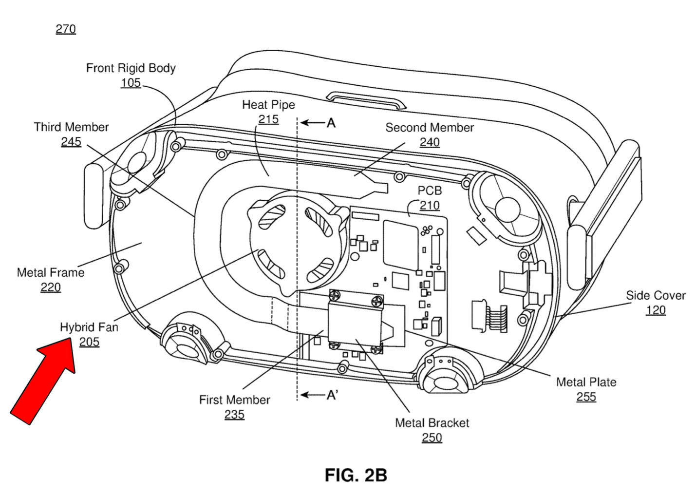
The patent of the Oculus Quest showing the cooling system, including a hybrid fan

The patent of the Oculus Quest showing the cooling system, including a hybrid fan

So how does the Quest do that? How can it render the games in 1080p or even higher, while keeping a frame rate of 72fps, and also mapping your room in 3D, and tracking your controllers in real time with that heavily under powered Snapdragon 835 processor?

Well two ways, optimisation and a fan! Yes, the Quest has a lot of thermal paste on the CPU, two individual heat pipes as well as an actual active fan in order to keep the processor cooled, because this thing is overclocked! And that overclock is how this CPU manages to handle everything!

COMFORTABILITY

But a good VR headset needs to be comfortable. So how comfortable is the Quest?

Well, the PSVR has that ring that attaches to your head and the VR itself just floats right above your face, it doesn’t really touch it at all. Which means that this PSVR is extremely comfortable! In fact, everyone that has used the PSVR and other VR headsets agrees that the PSVR is the most comfortable VR headset on the market right now.

As the Velcro straps are the only thing that hold the Quests position, some may find that it needs adjusting often to keep it in place

As the Velcro straps are the only thing that hold the Quests position, some may find that it needs adjusting often to keep it in place

So coming from that PSVR experience to the Quest was an awful experience! The Quest is by far the most uncomfortable VR that I have ever used. It is very front heavy so you constantly have to adjust it, after just 5 minutes or so. It only has a Velcro strap which is extremely basic and doesn’t even go to the bottom of your head at all.

Now there are a few mods and accessories that you can buy and make this more comfortable if you wish. You can buy an HTC Vive Pro attachement and install that, if you want to be creative.

But Oculus does not sell any 1st party accessory to make this more comfortable, which is a shame, because I honestly believe that this is the worst thing about the Quest. It’s not the graphics or the frame rate, it’s just how unpleasant this is to wear, and that’s really bad to say about a VR headset that you’re supposed to use for at least 30 minutes if not even a few hours.


TRACKING

Another very important part of any VR headset is how good the tracking is, and I’m glad to say that the tracking on the Quest is just outstanding! 

So it uses four cameras, two in the top corners and two in the bottom corners of the headset and then this is how it maps your room in 3D. I think probably my favourite part of this is that every time you put the Quest on, it will enter into Guardian mode where you can see the outside world and you just draw and outline on the floor where you want the play area to be.

Whilst wearing the Quest, if you come close to or go out of the Guardian Area the walls will start to appear like in the above image

Whilst wearing the Quest, if you come close to or go out of the Guardian Area the walls will start to appear like in the above image

The idea here is that if you step near the virtual walls that you created, you’ll get a warning, and if you put your head through that wall you can actually see the real world. Honestly, this is amazing as no other VR system does this! This way I always feel safe inside the Quest as I know that I won’t hit a piece of furniture or walk into a wall, because I’ll get warning and I can actually see the virtual walls when I come close! This is a great feature!

However, you do need to have a fairly generous space, to play in. For example, my Quest told me that my living room was too small, even though my PSVR didn’t have any problem. So in my case, I ended up activating the Virtual Walls whenever I was playing Beat Saber and I had to disable the guardian in the end, just because it was getting quite annoying. You can do that by enabling developer mode, in the Oculus app on your smartphone by the way. 

Now when it comes to the tracking on the controllers, the new Oculus Touch controllers have this ring facing you that contains IR transmitters that the cameras on the Oculus Quest pick up. These worked extremely well, especially after the July 2019 update. 

Unfortunately, the tracking does not work in a very bright environment, so you wouldn’t be able to use this outdoors and it also does not work in a very dark environment either. Now the PSVR on the other hand does work in complete darkness, which is a pretty good advantage to have.

But overall the tracking is indeed better than the PSVR, especially after the latest July update I mentioned before. In Beat Saber on Expert, the tracking lost about 2-4 blocks per song, compared to maybe 5-6 on the PSVR.

CONTROLLERS

Now I briefly touched on the controllers in the last section but there’s a lot to talk about so they have to have their own section.

They both have a joystick as well as two buttons, XY AB, and you also have two triggers, one on the back and one on the side, so you have the full experience that you have on a console controller here. 

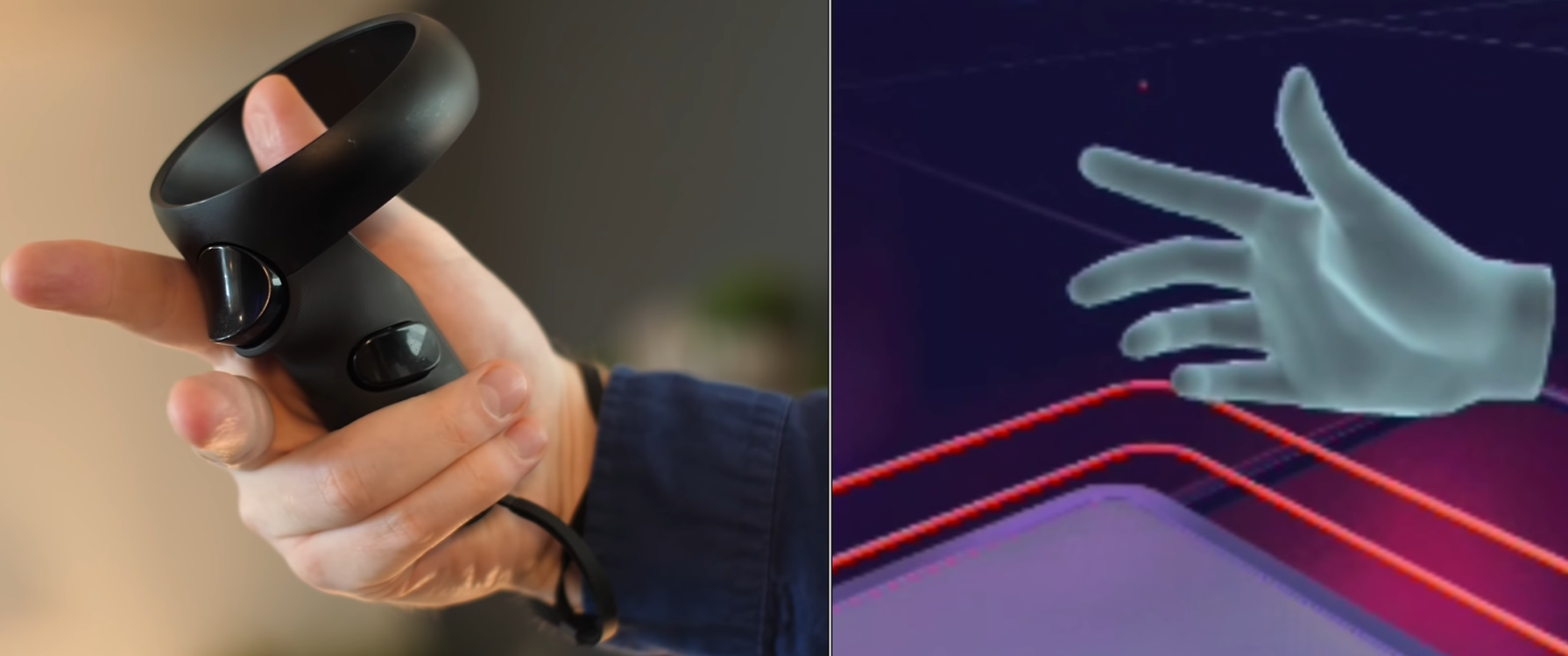
As the controllers are capacitive, you only have to place your fingers on or off the buttons and triggers on the controller for it to register

As the controllers are capacitive, you only have to place your fingers on or off the buttons and triggers on the controller for it to register

But probably the best part is that all the buttons have a capacitive sensor on them. This means that if you touch the buttons, without pressing them, this would make your fingers close. Really cool stuff! Grabbing objects in games with this is extremely intuitive. 

But there are a couple of things I dislike about these controllers.

First off, they are quite on the small side, so if you’re coming from the PSVR they’re not that easy to grip. So in Beat Saber they do not feel like swords like the PSMove controllers do, instead they feel like gloves or small objects that you hold in your hand.

They’re also very light and the vibration motor inside of these is quite weak, and the battery door kept coming off during Beat Saber gameplay which was quite annoying! So even though the tracking is great on these, in Beat Saber these are not the best controllers. The PSMove controllers are much better for Beat Saber. So what I’ve done, is that I’ve actually bought these extensions for the controllers which work amazing! They make the controllers feels almost as good as the PSMove ones by making them heavier and the vibrations feels a bit stronger as well!


GAMES

But how do those features integrate into the gaming experience I hear you ask! 

So, I’ve played a few games on this. Obviously Beat Saber which is my favourite, but also Creed, Superhot VR, Starwars Vader Immortal, Google Tilt Brush and wow! I’m extremely impressed!

You put on the Oculus Quest and it instantly turns on! And if you were previously in a game it would instantly bring you back into that game! That is amazing! There is no wait time, you can just jump right into VR when you want! 

I personally do not support unlicensed songs, but Beat Saber does support custom songs and mods on the Quest. You need to download an app called SideQuest, connect your Oculus Quest on your computer and do it from there, so a little bit more effort but it is doable. You can download and load pretty much any songs you want, which is something that you cannot do on the PSVR version. 

Now there aren’t that many games as of yet, there are about 30 or 40 but that list is constantly growing. Also I was surprised to see how little storage games occupied. I got the 64GB model for myself and that’s also the once that Oculus had sent over. But after installing about 10 or so apps and games, I still had more than 40 GB left. In fact, most Apps only take less than 500MB! So in case you’re thinking about that 128GB model don’t buy it unless you’ll also be using it to store a ton of movies.

Now something quite cool about Quest is that you can also stream your view to a TV, smartphone or tablet. By default, you can do it in the app on the device that you’ve set it up on and this is how you can show your friends what you’re doing in VR. Unfortunately there is no sound if you do it this way, but if you have a Google Chromecast you can also stream it directly to your TV and this way, you do get sound output. Unfortunately the signal was extremely poor in my case and it was constantly dropping out. But hey at least it’s doable to some extent. 

Streaming to a smartphone is just one way for your friends to see what you see through the Quest

Streaming to a smartphone is just one way for your friends to see what you see through the Quest

And speaking of sound, the Quest does have some built-in speakers which are okay. I wouldn’t use them for Beat Saber but for general sound effects and navigation and maybe Google Tilt Brush they’re fine.

The Quest does have two headphones jacks, one on each side. Oculus does supply first party headphones to purchase but I couldn’t find them in stock anywhere, but you can actually use your own headphones it’s just that you will have that annoying cable in between that would get in your way. 

Now, something that I’ve personally noticed is that the lenses on my Quest were quite blurry, even after cleaning them, they was still the same. I’ve noticed this on both my Quest and the one that Oculus had sent over so I’m not sure if this is a wide-spread issue or if this is just how the lenses on the Quest are? So unfortunately they’re a bit blurry and they also have a lot of reflections, something that I’ve never had an issue with on my PSVR or even on my Samsung GearVR headsets.

BATTERY

As I mentioned at the beginning of this review, the Quest is the first truly wireless VR headset. So whats the battery like on this?

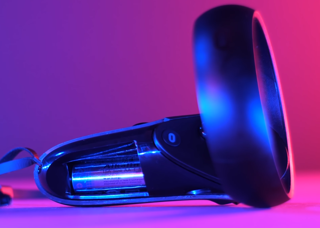
There is no way to charge the controllers whilst using them and the batteries have to be removed to recharge or replace them

There is no way to charge the controllers whilst using them and the batteries have to be removed to recharge or replace them

Well I got about 2 hours of gameplay. It does depend on what game you play, but 2-3 hours is what you should expect. I do like the fact that the charging cable is long enough for you to use the Quest while it’s charging, but I do not like the fact that the controllers do not have a charging port. Instead, you have to use AA batteries which is quite inconvenient. Everything should be rechargeable in 2019! 

Also Oculus did tell me that the 128GB is also heavier due to the larger battery. Personally I haven’t been able to verify this claim anywhere else, so from my knowledge both the 64GB and the 128GB models have exactly the same battery.


CONCLUSION

So in the end is the Oculus Quest worth it?

Honestly? Yes it definitely is! If you don’t have a VR then this is the best all round VR headset in my opinion and even if you do have a VR, you should still try this one because the joy of not having a cable anchoring you down is just incredible!

Yes the graphics are not as good as on the PSVR or any desktop VR for that matter, but they are good enough, and the fact that you can just put this thing on and you’re instantly into a game is something that you don’t have on any other system right now!

I just hope that Oculus releases a Quest Pro in the near future with a more powerful processor and a better head strap because those are my 2 main complaints, but other than that the Quest is a console category of its own. So if you haven’t upgraded to an Xbox One X or a PS4 Pro this is a much better option since it’s something completely different! I’m truly looking forward to the future of VR! 

2019 13" MacBook Pro (Baseline) Review


This is a 13” MacBook Pro that Apple has just released last week. But wait Daniel, you’ve already reviewed the 8-core 15” MacBook Pro as well as the 13” 2019 MacBook Pro, so what is this?

Well this is the $1,300 baseline model that doesn’t have a touch bar, or quad-core processors and hasn’t been updated since 2017, or at least it was until this year where it has received a massive upgrade whilst retaining the same $1,300 price point! 

So lets discuss what changes we have received this year on Apple’s baseline model.


BUILD

So first of all, it now has the same 5th generation butterfly keyboard that we got on the other 13” and 15” MacBook’s from earlier this year, with the new sturdier build which should resolve the issues that consumers were having with the previous iterations where they keys were sticking or breaking entirely.

In terms of the typing experience. It’s very similar to the 2018 MacBook Pros, with the 4th butterfly keyboard iteration, so they feel more springy and mushy than the 2017 and 2016 models but they’re also not as loud as those. So if you don’t like Apple’s butterfly keyboard because of the low key travel and lack of feedback, you won’t like this one either. If you do, then this one’s better than the last generation. 

Apple did add all 2019 MacBook’s to the keyboard replacement programme so if it breaks, Apple will replace it for free for the next 4 years, so that’s good! 

The keyboard is a very important part of any laptop so I’m glad to see that Apple improved it this year, again. 

Speaking of the keyboard, we finally have a touch bar on this! Yes the non-touch bar MacBook Pro now has a touch bar which means that Apple is no longer selling any MacBook Pros that do not come with one, which is something that they should’ve done from 2016 in my opinion.

The 13” Baseline model now features a touch bar, as well as TouchID

The 13” Baseline model now features a touch bar, as well as TouchID

This means that you get extra controls in a lot of your apps, most of which are useless since you can do them so much faster with keyboard shortcuts, but for those of you who are not familiar with keyboard shortcuts, the touch bar can indeed be very useful. If you take Photoshop for example, the touch bar gives you access to great tools such as the ability to resize a brush or swipe through the blending modes which is just amazing! 

Alongside the touch bar we also get a TouchID or fingerprint sensor! This is in my opinion even better than the touch bar since you can unlock you Mac very easily and you can also scan you finger to fill in passwords and make Apple Pay payments, so it’s an incredibly useful thing to have. 

The display also got a very welcome improvement with True Tone support. This means that the color temperature of the display is automatically adjusted so that it matches the light around you, which is amazing! This makes reading so much easier on the eyes, just make sure that you disable it before you do any photo or video editing!

Another big improvement is the addition of the T2 processor. Now this is something that now comes standard in every new Mac aside from the iMac, and it’s this tiny chip that handles a lot of the basic processes that the Intel CPU would normally handle. 

The main advantages of having the T2 are:

  • Better quality photos and video with the built-in camera.

  • Real-Time disk encryption and decryption,

  • Improved audio quality from the microphones,

  • Faster h.265 video encoding so h.265 video exports will be much faster

  • The ability to locate you Mac if its gets stolen, even when it is not connected to a WiFi network.

Unfortunately your Mac will crash more often, especially if you use Thunderbolt, but the majority of people buying this MacBook Pro wouldn’t be doing that much intense work anyways, so for most people the T2 will be a positive thing.

So, so far the new baseline $1,300 13” MacBook Pro seems to have all the features that the more expensive $1,800 model has, however there are a few features that it is missing. 

The speakers for example are identical to the 2017 model. They’re not bad my any means, in fact they’re still better than on most laptops out there but they are just not as powerful and as clear as on the 2018 and more expensive 2019 models of the 13” MacBook Pro. However, they are located right underneath the speaker grills rather than towards the bottom and then the sound being redirected – like it is on the more expensive models. 

The speakers on the baseline model are now under the speaker grills

The speakers on the baseline model are now under the speaker grills

Another lacking feature is when it comes to the Thunderbolt 3 ports. On the $1,800 model we have four whereas on this entry level model we have two. Now for most people this is more than enough, but I just miss the convenience of being able to plug accessories and charge my MacBook from either side, rather than having to do it from the left hand side all the time. 

But probably the biggest downgrade in my opinion, is in terms of the Flash Storage. It is considerably slower than the $1,800 model, with speeds averaging 505 MB/s Write vs 2750MB/s Write and 1333MB/s Read vs 2650MB/s Read. 

PERFORMANCE

Performance wise, this new entry level MacBook Pro is a significant step up from the 2017 model. 

First off we get a Quad Core processor from dual core, so we have the Intel i5 8257U 1.4GHz – 3.9GHz. Now you could upgrade this to the i7 8557U, which has a 1.7GHz base clock from 1.4GHz and can turbo boost to 4.5GHz from 3.9, but I honestly don’t recommend it since the performance is already extremely good on the stock processor.

In Geekbench 4 the 2019 model was 1.11 times faster Single Core (SC) wise and 1.87 times faster in Multi Core (SC)! That's, almost twice as fast as the previous 2017 model and only 1.13 times slower SC wise than the 2019 $1800 model and 1.1 times slower MC wise. So it is very close to the much more expensive 4 thunderbolt 3 model. 

In Cinebench R15 it got 651 points vs 705 on the $1800 maxed out model and this was actually very very close to the 2017 15” MacBook Pro which got 672 points. In Cinebench R20 it got 1628 compared to 1763 on the $1800 model and 1672 on the 15” 2017 MacBook Pro. So again very impressive results, as the baseline MacBook Pro was just 1.08 times slower than the maxed out 13” model with the quad core 2.8GHz processor.

An example of the render we use for our tests

An example of the render we use for our tests

But how does it handle 3D Rendering? Well it only took this MacBook Pro 14 minute and 16 seconds to finish the example render versus 13 minutes and 43seconds on the 2017 15” MacBook Pro. 

I was quite impressed with the temperatures that this was running at as well. The baseline 13” MacBook Pro was running at 90 degrees as the average temperature, and a clock of 2.9GHz from the base 1.4GHz clock. Comparatively, the 13” maxed out 2019 model was running at 94 degrees and a clock of 3.2GHz, whilst the 2017 15” model was running at 97 degrees and a clock of 3GHz. Now the really interesting thing here is that the 13” baseline model only has a single fan, whereas the $18,00 4 thunderbolt 3 port model has two fans, just like the 15” and the temperature and clock speeds were still very good, for a Mac at least. 

So the CPU performance is indeed very impressive on this base MacBook Pro. There’s absolutely no need to upgrade to the 1.7GHz model if the maxed out 2.7GHz 13” model is barely any faster. 

But what about the GPU performance?

As you all know the 15” MacBook Pro’s comes with a dedicated GPU, so if you’re into Video Editing, 3D Modelling, Graphic Design, Gaming or anything that requires a high end GPU you’re going to get significantly better performance from a 15” MacBook Pro.

The 13” models have an integrated GPU. The Intel Iris Plus Graphics 655 on the $1,800 4 thunderbolt 3 port model and the Intel Iris Plus Graphics 645 on this baseline. Now the integrated GPU is even more powerful the more RAM you have in your computer, since it can indeed take use of the system RAM. I am using the baseline 8GB of RAM model for this and I wanted to see how much the GPU is impacted when compared to the maxed out 13” model with 16GB of RAM. 

Firstly, the Cinebench OpenCL test where the baseline MBP was only 1.05 times slower than the maxed out 13” model, a negligible difference. In Cinebench R15, we got 54.69fps compared to 56.56fps on the maxed out 13” model, so again a negligible difference.

Now if you care about gaming, in the Unigine Heaven Benchmark we got 10.3fps versus 11.1fps, so almost the same. In actual games like Fortnite, with all the settings set to EPIC in 1680x1050 resolution, we got about 13fps in the bus drop scene compared to around 15fps.

But if both the CPU and GPU benchmarks are almost identical to the maxed out 13” model, how does it compare in Final Cut Pro X for example, when editing and exporting 4K video?

A snippet of the Final Cut Pro X Project we use for our tests

A snippet of the Final Cut Pro X Project we use for our tests

For this I used our OnePlus 7 Pro Blind Camera test, which is a very demanding 15 minute 4K project, with multiple 4K picture in picture clips and it took the baseline 13” MacBook Pro 51 minutes and 28 seconds to export this versus 50 minutes and 2 seconds on the maxed out 13” MacBook Pro. So the baseline was just 1.02 times slower. Just as a comparison, the maxed out 15” MacBook Pro exported this in just 17 minutes and 44 seconds, so that one was 2.9 times faster than the baseline 13”.

But personally I find the video editing performance in the timeline to be much more important than the actual rendering time. So looking at that in the same project we’re getting about 15-20fps playback in quality and just over 30fps in performance mode. Now, considering that the video itself is 29.97fps, the baseline 13” MBP can actually play this full project back in real time in performance, which is incredible!

But you see one of my favourite things about this new MacBook Pro are those two Thunderbolt 3 ports. Aside from just charging and connecting external HDD’s, Thunderbolt is so powerful that it allows you to connect a full 5K monitor. But if you have a Thunderbolt 3 dock such as the one from CalDigit I have in the video, you can get access to a ton of ports, with HDMI, multiple USB type A ports, while also charging your MacBook Pro, all from that single Thunderbolt 3 port.

By adding an eGPU to your set up you will get a significant improvement in the performance of your MacBook

By adding an eGPU to your set up you will get a significant improvement in the performance of your MacBook

On top of that, you can even connect an eGPU or external graphics card with an enclosure and have some insane GPU performance coming out of this tiny MacBook Pro. Using an eGPU I was able to get over 60fps in Fornite in 1080p, so an even higher resolution than before, with everything on EPIC! So actual gaming is now possible thanks to an eGPU and Thunderbolt 3. Even in Final Cut Pro X, the rendering time was reduced from 51 minutes and 28 seconds to just 34 minutes! Now that is not as fast as a 15” MacBook Pro, but it is a significant improvement of 1.5 times! So an eGPU makes a huge difference and I highly recommend getting one, especially if you have a 13” MacBook Pro that does not have a dedicated GPU.


CONCLUSION

Ok, so in the end if you’re thinking about getting a brand new Mac don’t get a MacBook Air, because it only has a dual core processor and no touch bar, get this MacBook Pro Instead. It costs $200 more, but it gives you so many more features and performance wise it’s extremely close to the maxed out $3,100 13” MacBook Pro.

OnePlus 7 Pro Review


The OnePlus 7 Pro is in my opinion the best all around Android phone that you can get and in a lot of cases, even the best smartphone that you can get! 

I tested this phone for more than a month and here is my full in-depth review with my final conclusion on the OnePlus 7 Pro!

Ok, so there are 6 sections in this review – Design, Display, Camera, Performance, Special Features & Battery Life and I want you to keep it’s $670 or £650 price point in mind throughout!


DESIGN

Starting off with the design – oh boy! I think the OnePlus 7 Pro is by far the best smartphone that you can get today, design wise.

It’s manufactured just like any other premium smartphone – we have a full metal frame surrounding the phone – it’s not stainless-steel like on the iPhone X’s and XS Max, it is actually made out of polished aluminium but it does feel very sturdy and premium. 

Both the back and front are made out of glass and they both curve around the frame in the exact same way. The transition between the black the frame and the front is almost seamless – you can still feel the frame protruding, but it feels much more unified than on the Galaxy S10+ for example. 

The glass back on the OnePlus 7 Pro

The glass back on the OnePlus 7 Pro

Now when it comes to how it feels in the hand..ehh..not that great!

Out of all the smartphones that I’ve used in 2019 – the iPhone XS Max, the S10, the S10+, the Pixel 3XL, 3a & 3a XL and even the regular OnePlus 7 – the 7 Pro feels very very chunky and a bit uncomfortable to hold in one hand – which I don’t really like.

The OnePlus 7 Pro (Left) vs the Samsung Galaxy S10+ (Right)

The OnePlus 7 Pro (Left) vs the Samsung Galaxy S10+ (Right)

Now it’s not just the massive 6.67” display that’s the cause of this, it’s also the thickness of the device. At 8.8mm thick – this is a full mm thicker than the S10+ and 1.1mm thicker than the iPhone XS Max. If you added a case to this, such as the new OnePlus Nylon Case, the 7 Pro would then measure 10mm or 1cm thick. 

In addition the OnePlus 7 Pro is also quite heavy in the hand. It weighs 206g which is 2g lighter than a XS Max but 31g heavier than an S10+.

Personally – I didn’t really notice the extra weight at all, only the thickness but some of the reviewers that I’ve spoken to, that also had the 7 Pro early, did say that they noticed the weight straight away – so that’s something to keep in mind.

The 7 Pro also comes in 3 colors; Nebula Blue, Black and Almond.

Mine’s the Nebula Blue color which I absolutely love however I usually go with black on any of my devices so that’s my personal choice, but I do think this Nebula Blue looks gorgeous, especially in the way it reflects the light. 

But there’s also that a Almond colored one which I do love a lot. I haven’t seen it in person but from the stills that I’ve seen, it looks incredible.

So design wise, even though I don’t like the thickness of the 7 Pro, I love everything else about it and I still think that this is the best designed phone on the market right now – so much better looking than the iPhone XS Max or the S10+, both of which have obstructions in the display, such as the notch or the camera cutout which take away from the viewing experience.

The 3 colors of the 7 Pro (Photo by OnePlus)

The 3 colors of the 7 Pro (Photo by OnePlus)


DISPLAY

Screen.PNG

Not only do I think that this is the best design on a smartphone at the moment, this is also the best display that I have ever seen on a smartphone to date!

So it has that larger 6.67” AMOLED panel I mentioned earlier, which is manufactured by Samsung, with a resolution of 3120x1440, making it OnePlus’s highest resolution display yet. It has a PPI of 516, quite a bit higher than the 458 on the iPhone XS Max, text is just crystal clear and everything you do on this phone simply looks stunning. And since this is an OLED panel you also get perfect black levels and amazing rich colors for when you’re watching content.

The panel itself is made from Gorilla Glass 5, not the Gorilla Glass 6 that the Galaxy S10 has. Now I do have one scratch already this is from about 3 weeks of daily use compared to my S10+ that I’ve used daily for more than 2 months and it’s still flawless.

But you see, these are not the reasons why I think that this is the best display on any smartphone. There are 2 other reasons why I think that.

The Infinity Panel is what allows the 7 Pro to have a notch less display

The Infinity Panel is what allows the 7 Pro to have a notch less display

The first being the fact that there is no notch or camera cut-out at all on this! Thanks to this, you can enjoy FULL SCREEN content without ANY interruptions at all! This is something that we were hoping for in 2020 or even later but OnePlus has already managed to do it, by using Samsung’s New Infinity Display technology.

The second reason why I think that this is by far the best display on any smartphone, is the refresh rate. You see, the 7 Pro has a 90Hz refresh rate panel vs the 60Hz that regular smartphones have. This means that you get 50% more frames for the animations that you see on the display which means that everything you do is 50% more fluid than on other smartphones. So scrolling through the menus or through a website is buttery smooth, everything feels and looks amazing! A night and day difference from a Galaxy S10 or even an iPhone XS Max.

A comparison of the displays between the OnePlus 7 Pro (Top) and the Samsung Galaxy S10+ (Bottom

A comparison of the displays between the OnePlus 7 Pro (Top) and the Samsung Galaxy S10+ (Bottom

The only downside that I found in terms of the display, is that it doesn’t get as bright as the S10’s and I’ve also found that the S10 does indeed deliver richer colors when watching content on YouTube and better HDR tone mapping but these are only noticeable when comparing the 2 side by side, other than that – this is an outstanding display!

CAMERA

Ok, time to talk about the camera because this has always been the most controversial thing about OnePlus phones. They offered great specs, great performance but the downside has always been the camera, it just didn’t compare with Google, Samsung or iPhone cameras, and with the 7 Pro it’s pretty much the exact same story. 

On the back we have a triple lens camera module, similar to the S10+ or the Huawei Mate 20 Pro or P30 Pro but we have a main 48MP f/1.6 aperture sensor. However, this never takes pictures in full 48MP resolution and instead you get 12MP images out of this. The 2nd module is an 8MP f/2.4, 3X optical zoom one, but it’s actually just 2x optical zoom and the rest is done with that 48MP sensor. This means you get 3x “lossless” zoom essentially. Finally, the 3rd module is a 16MP f/2.2 aperture wide angle module which I do like a lot, since you can get so much more in the shot.

Camera Comparison between the OnePlus 7 Pro and XS Max. Note the lack of definition on the bushes in the OnePlus 7 image

Camera Comparison between the OnePlus 7 Pro and XS Max. Note the lack of definition on the bushes in the OnePlus 7 image

In day time it’s pretty good! It’s very comparable to competition. I did find the images to be a bit too soft which is ironic considering that these should be the sharpest with that 48MP sensor, when the other 3 smartphones all have 12MP sensors.  The HDR processing is decent as well but not as good as on the competition.

The night shots were actually better than I expected, better than on the iPhone XS Max but not as good as the S10+ or Pixel 3XL.

It’s video capabilities were also really good as well. It has superb stabilisation and 4K 60 video recording, I loved taking videos on this, however it was nowhere near as good the XS Max.

So the camera hardware is pretty good, definitely not the best one out there but still good. However OnePlus did released about 3 noticeable camera upgrades since it came out including; improved HDR, Night Mode capabilities and video recording, so it is definitely a better camera now.

The OnePlus 7 Pro’s pop-up front camera

The OnePlus 7 Pro’s pop-up front camera

Ok, but what about the front facing camera? How is it or more importantly where is it? Well, in order to make that display truly notch and punch hole-less OnePlus included the camera underneath the display and it uses a motorized pop-up system in just 0.53 seconds. It does close automatically in case you drop your phone, and according to OnePlus it will withstand over 300,000 openings and closings which should last you for at least 5+ years.

You can use it to unlock the phone but it’s not as secure as a fingerprint reader, so I personally would avoid it. 

Quality wise I really do like this front facing camera. It’s a 16MP f/2.0 aperture sensor and it takes some very good shots. In some cases even better than the Pixel 3 and the iPhone XS Max.

So overall we have good hardware, but the software needs more tweaks. Luckily OnePlus is releasing constant software updates to improve the camera and considering that this is a $670 phone, the camera’s more than capable enough for that price. 


PERFORMANCE

But what about the Performance?

Well, I’m happy to say that out all of the upsides that the performance on this phone is my favourite by far!

Spec wise, this thing is fully packed. We have the Snapdragon 855 Processor, 128GB of storage as the baseline and 6GB of RAM and then you can also get a higher end 256GB version with 12GB of RAM which is absolutely nuts!

The cooling pipe found in the OnePlus 7 Pro (Source: JerryRigEverything)

The cooling pipe found in the OnePlus 7 Pro (Source: JerryRigEverything)

The 7 Pro is noticeably faster by a large margin than my S10+, Pixel 3 and even my iPhone XS Max which costs double of what the 7 Pro does. Apps launch in just a fraction of a second, and they stay open in the background for ages, I could go back 15 apps and still find the app fully open which is crazy! If you combine this with the 90Hz refresh rate display, the new UFS 3.0 storage (this makes it the only smartphone in the world which gives you read speeds up to 1.7GB/s), and OnePlus’s OxygenOS (which is slightly modified version of stock android that lets you change the accent colors, navigation bar and more), then you have the fastest smartphone on the planet! 

Also, if you’re into gaming, this is an amazing device to play your games on. With that 90Hz refresh rate panel, you can game up to 90 fps, connect gaming controllers, and you even have a 10 layer heat pipe in the 7 Pro, which helps keep temperatures down during long gaming sessions. 

Overall, performance wise, this is the best smartphone that you can get at the moment, for day to day use at least.

SPECIAL FEATURES

When it comes to Special Features the 7 Pro is lacking, but I’ll start with what the OnePlus 7 Pro does have.

First off, fast charging is insanely fast on this phone! It uses OnePlus’s proprietary Warp Charging 30 technology which charges the 7 Pro at 30 Watts and you get 50% charge in just 20 minutes which is insane! This is the fastest fast charging on any smartphone at the moment. Also the charger does come bundled inside the box, unlike Apple’s. 

We also have stereo speakers now with a side facing speaker on the bottom and then the earpiece also acts as speaker itself. The sound quality is good, not as good as the S10+ or the Xs Max, but very close.

Also, I love the fingerprint sensor on this. It’s not an ultrasonic fingerprint reader like on the S10, but an Optical one, which is inferior from a hardware perspective since it uses a camera rather than soundwaves to read your fingerprint, but it is much faster than the S10+ one. I’d say it was the fastest and most accurate fingerprint reader I’ve ever used on a smartphone to date.

OnePlus have added a new haptic engine to this which is amazing. It’s very similar to the one inside the Pixel 3 which means that you not only get haptics or small vibrations when using some UI elements, but you also get the best typing experience on any smartphone which is also thanks to that large 6.67 inch display.

You can easily mute your phone or turn vibration on using the mute switch, which only Apple uses aside of OnePlus, as far as I’m aware at least. This means using a hardware switch rather than having to do it from the UI. 

However, the 7 Pro it does lack in a lot of areas where others don’t.

For example if you really care about a headphone jack, there isn’t one here. I actually prefer wireless headphones but I can see why this could be a huge downside for some.

There’s also no microSD card support at all which again, not really a downside for me since I mostly use cloud storage and everyone should, but if you need more than 256GB then a Samsung phone is one of the last few options left. 

But the main downside here for me is that there is no wireless charging at all on the 7 Pro. Now OnePlus’s excuse for this was that their Warp Charging was much faster, which I agree it is much faster than any wireless or even wired charging standard that we have today. But after using so many smartphones with wireless charging, I’ve even installed wireless changing pads in my home and office and the fact that I cannot use my OnePlus 7 Pro with any of them is very disappointing. You might expect this from the regular OnePlus 7 but not the Pro. Yes, I know wireless charging isn’t great but it‘s extremely convenient and for convenience purposes, I’m willing to accept a slower charge. 

The Pixel (Left) has an Always On Display whereas the OnePlus 7 Pro (Right) requires a tap to wake

The Pixel (Left) has an Always On Display whereas the OnePlus 7 Pro (Right) requires a tap to wake

Another issue is that there is no Always On Display at all on this. Always On is one of my favourite features ever, in a smartphone. Being able to see the time displayed, all the time, or the notifications without having to tap the display to see them is such a brilliant thing to have. Samsung has had this for years, Google has it, even LG has it but Apple and OnePlus don’t. And whilst you can install some 3rd party Always On Display apps they will just kill your battery in a matter of 2-3 hours. I just couldn’t find one that worked well enough.

Now, there is also no official water resistance rating on this device. OnePlus did say that they did that in order to keep the cost low, which makes sense. They did add some rubber seals to the ports so technically it is water resistant to rain and splashes, but we just don’t know to what extent. So I wouldn’t use this anywhere near a swimming pool or even listen to music in the shower, like I do with my S10 or XS Max. This isn’t a big downside since manufacturers don’t cover water damage anyways, but it still gives me a piece of mind if it has an official rating. Otherwise, like I said, I tend to avoid using this near water or steam. 


BATTERY LIFE

When it comes to battery life, the 7 Pro comes with a pretty big 4000mAh battery. Which does last me for quite some time but it’s not as large as my S10+ which has a 4100mAh battery. However, it definitely lasts me longer than my XS Max does.

Having that insanely fast 50% charge in just 20 minutes is a life saver but this also means that I need to pack that Warp Charger every single time I travel with the 7 Pro because since Warp Charging is a proprietary technology, the 7 Pro does not support the more common USB type C Power Delivery standard. So you need that Warp Charger every time you travel, if you want that 50% in 20 minute charge. If you didn’t take it you could use a MacBook charger for example, but the 7 Pro would charge very slowly

But for me the biggest downside to the 7 Pro’s battery is that it doesn’t support wireless charging.

CONCLUSION

So overall what’s my opinion on the OnePlus 7 Pro?

Well, it’s definitely not perfect. It lacks many features that other high end and even some low end smartphones have today, such as wireless charging, an Always On Display or a great camera. I mean the Pixel 3a which costs half of what the 7 Pro does, has a much better camera. 

But it does have the best display in a smartphone, the best daily performance on a smartphone, the best fast charging in a smartphone and also in my opinion, the best Android Overlay in an android phone which is even better than Google’s stock android since it does give you more customisation.

And considering that it does all that at almost half of what an iPhone XS Max costs that is seriously impressive so, good job OnePlus! 

2019 15" MacBook Pro (Maxed Out) Review


This is the brand new 2019 15” MacBook Pro, and out of all the devices that I own this is my true daily driver. I have used this thing solidly for at least 12 hours a day every week day and 5 or more hours at the weekend, so in total I have used this for at least 70 hours every week, and continue to do so.

In this review I want to cover the 3 biggest change!


SPECS

Seeing as the 2019 models has the exact same design as the 2016, 17, and 18 models, there is not much to cover in that regard. But when I say this is the maxed out specs, I mean maxed out, apart from the 4TB of storage. Check out the specs of the model I am reviewing below:

  • 2.3GHz 8-Core 9th Generation Intel Core i9 Processor with Turbo Boost up to 4.8GHz

  • 32GB 2400MHz DDR4 Memory

  • Radeon Pro Vega 20 with 4GB of HBM2 Memory

  • 1TB SSD Storage

The 2019 Model hasn’t changed in design since 2016

The 2019 Model hasn’t changed in design since 2016


KEYBOARD

Ok, so in terms of the keyboard, this is Apple’s 5th butterfly design as they have been making small changes every single year since 2015.

Now Apple claimed that they changed some materials to make the keyboard significantly more reliable than before. However Apple did include the 2019 Models to their Keyboard Replacement programme on launch day, which raises doubt into how reliable these keyboards truly are. 

A teardown of the keys on the 5th Generation Keyboard (Source: iFixit)

A teardown of the keys on the 5th Generation Keyboard (Source: iFixit)

iFixit did do a full keyboard teardown and they found that Apple replaced the silicone key switch cap with one made out of nylon, so it’s a bit sturdier and most of the components had slight changes to them, which I mentioned back in my 13” Review so feel free to check that out too.

But it terms of how the keyboard feels, it is very similar to the 2018 one, but feels a tiny bit sturdier. So overall I do like typing on the 2019 15” MacBook’s the most, but it’s still a butterfly keyboard so it’s still bad in terms of key travel and tactile feedback. 


PERFORMANCE

Considering that this is the maxed out version, you’d expect the performance to be maxed out too right? Well lets have a look.

Now the difference the 2019 model has over the 2018 model is that we now get an Intel i9 9th generation 8-core processor, which is actually Intel’s fastest laptop processor to date. We also get 8-cores up from 6, 16MP L3 cache up from 12MP on the 2018 6-core models, and a base clock of 2.4GHz down from 2.9GHz but we do get a turbo boost of up to 5GHz from 4.8GHz. Now just to clarify the Turbo Clock speed is just for a single core and only when the temperature is under 60 degrees, this is what Intel’s now calling ‘Thermal Velocity Boost’. 

Unfortunately due to the still weak cooling system this model never reached 5GHz at all in my case. In fact, it even struggled to hit 4.8GHz. The highest that I’ve seen it hit was about 4.7GHz and that was only for a second or so. 

But does it throttle you might ask? Well not as much as the 2018 one did.

Now since I also have the Vega 20 Model, the cooling is indeed better, with the fans being able to reach 6000 RPM’s from 5930 and 5490 on the 2018 non-Vega MBP’s. Add that to the fact that the GPU doesn’t heat up as much as, the CPU can run cooler meaning it can actually run at a higher clock speed than the 6-core 2018 model could, even though this is an 8-core CPU.

So the temperatures were lower when using it, 87-90 degrees was the top celling compared to 98 degrees on the 2018 model, and because of this the 2019 model was also much quieter as the fans didn’t start to spin up this early. 

So how do those 2 extra cores and Vega 20 GPU translate to actual usage?

Well, let’s start out with some benchmarks first. Starting off with the CPU. 

In the Geekbench 4 Single Core CPU test, the 2019 MBP scores 2.9% higher than the 6-core 2018 MacBook Pro, 18.6% higher than 4-core 2017 MBP and 25% higher than the 4-core 2016 MBP. Then in the Multicore test, the 2019 MacBook Pro scores 24.4% higher than the 2018 model, 47.3% higher than the 2017 and 51.2% higher than the 2016. 

In Cinebench R15, the 2019 MBP scores 29.3% higher than the 2018, 48.6% higher than the 2017 and 45.4% higher than the 2016. Yes the 2017 started throttling more than the 2016 it seems. In Cinebench R20, the 2019 MBP scores 26% higher than the 2018, 46% higher than the 2017 and 42.5% higher than the 2016. 

And next up, I ran our ZONEofTECH Keyshot 8 3D Rendering benchmark, which is a very CPU intensive task, and the 2019 model was 38.2% faster than the 2018, so a very big difference there, 53.3% faster than the 2017 and 42.1% faster than the 2016. 

The temperatures were also significantly better. 75 degrees on the 2019 compared to 87 on the 2018, 97 on the 2017, and 98 on the 2016 and the clock speed was at about 2.7GHz versus 2.5GHz on the 2018 model, so very impressive so far.

Now when it comes to the GPU, in Geekbench 4 Compute, openCL test the Vega 20 2019 MacBook Pro was 24.8% faster than the 2018 with the 560X, 43.2% faster with the 2017 with the 560 and 34.6% faster than the 2016 with the 460.  However, the 2016 MacBook Pro was recently replaced by Apple with a brand new case and cleaned fans, which is why I think it’s getting higher scores than our 2017, as there might be some dust in the fans.

In CineBench R15, the 2019 MBP was 18.7% faster than the 560X 2018, 35.3% faster than the 560 from 2017 and 33.4% faster than the 460 from 2016. 

Next up we have the Unigine Heaven benchmark and here the 2019 was 38.9% faster than the 2018, 45.7% faster than the 2017 and 49.2% faster than the 2016. 

So overall CPU wise, the 2019 is about 20-40% faster than the 2018 and GPU wise we get about a 40% difference. So quite some substantial gains so far. 

Taking a look at some more real-world usage, in Final Cut Pro X I had our OnePlus 7 Pro blind camera test project and this was a massive one with a ton of 4K picture-in-picture clips, effects, titles and it was a full 15 minute 4K project. The 2019 MacBook Pro only took 16 minutes and 48 seconds to export this versus the 2018 which was 24.3% slower, the 2017 was 34.3% slower, and the 2016 was 33.8% slower. Now while 5 minutes or so doesn’t seem like much, on a bigger and more complex project, that would be substantially more and if you do this on a daily basis it will have a significant impact on your workflow.

Finally let’s have a look at the Disk performance. The 2019 and 2018 models were pretty much identical in terms of Write Speeds, 2017 and 2016 were 35.7% slower when using disk encryption. And in terms of the Read Speeds, the 2019 was identical to the 2018 and 16% faster than 2017 and 2016.

If you don’t use disk encryption for FireVault the results would be much more similar but if you do, since we have the T2 Chip on both the 2018 and 2019 models, the disk decryption is done in real time on the T2 chip itself and we get much higher IO performance. 

Now there are a few more things that I want to address. 

The 2019 model feature brand new thermal paste on its internals (Source: Snazzy Labs)

The 2019 model feature brand new thermal paste on its internals (Source: Snazzy Labs)

The reason why the 2019 is getting much better thermals isn’t just because of the faster fan speeds but also because of a brand new thermal paste. This is what I suspected in our initial video with the ‘20 Things You Didn’t Know’ but Quinn Nelson from Snazzy Labs has now confirmed this in his teardown. 

Also if you’re thinking of using an eGPU on a 15” just don’t! You’re getting far better performance from a built-in dedicated GPU such as a Vega 20, especially in apps such as Final Cut Pro X which does not yet take full advantage of a GPU. A big update will be coming in November, in order to fix that.

Additionally if you’re upgrading from the 13” MacBook Pro you can actually have up to four 4K Monitors at 60Hz, two 5K monitors at 60Hz, or one 6K Apple Pro XDR display, potentially two but that’s not confirmed as of yet. 

T2 Crashes

Aside from the keyboard and the performance I had one more thing that I wanted to address, and that was the T2 processor. 

So, to my surprise I haven’t had any T2 crashes on my 2019 for the past 2 weeks. Unfortunately I had two T2 crashes on the same day on the 2019 MacBook Pro a few days ago. Shortly after I created a return for this model as it clearly has the same T2 issues as previous ones. Yes, after almost 3 weeks of using this daily, I am now sending it back.

The article on MacRumors showing the new model names for the 7 unreleased models (Source: MacRumors)

The article on MacRumors showing the new model names for the 7 unreleased models (Source: MacRumors)

But it wasn’t just because of the T2 crashes, on the exact same day, we’ve had a leak of an ECC (Eurasian Economic Commision) filing that showed Apple registering 7 brand new models of MacBook’s. Two of which are very likely to be that brand new redesign of the MacBook Pro, that Ming-Chi-Kuo talked about with a 16” display, a redesigned cooling system, and new keyboard that seems likely to actually come out this year. So I’m really looking forward to that, and until then this baby is going back!

2019 13" MacBook Pro (Maxed Out) Review


So ever since I was young, I was really interested in Apple Laptops, MacBooks. In fact I started ZONEofTECH from a 2011 13” MacBook Pro and it was such an amazing device overall, especially after my SSD and RAM upgrade. I then upgraded to a 2013 15” MacBook Pro and I now haven’t used a 13” MacBook as my daily driver for 6 years, as I had never found them to be sufficient for what I wanted to use them for which was content creation.

So what has changed since then, and who is the MacBook actually for?


DESIGN

A design comparison between the 15” MacBook Pro (Left) and the 13” MacBook Pro (Right)

A design comparison between the 15” MacBook Pro (Left) and the 13” MacBook Pro (Right)

Now, as the 2019 model is still part of Apple’s 3rd generation of MacBook Pros, which launched in 2016, they also have the exact same design as the 2016 models. This means that we have this single block of aluminium, from which the entire MacBook was machined from and it just looks stunning! In my opinion, it is the best looking laptop on the market, especially in space grey. The 15” has those massive palm-rests, speakers and touch bar gap which I don’t like. However, the 13” looks to be what the entire design generation was based on. Yes, the bezels could be made thinner but, aside from that, this is just a stunning piece of metal to look at. 

This is also a highly portable MacBook, since it weighs just 1.37kg and has an incredibly compact form factor. So if you’re traveling around a lot or you commute to work with your laptop and you need power and portability this MacBook Pro would be the best to get. Also, if you’re coming from a MacBook Air, the 13” Pro feels exactly the same in the hand as the 2018 Air. Additionally, because of that small form factor the 13” Pro would fit perfectly on airplane table seats, or on your lap when you’re traveling by train or bus. So it’s really good for that!


DISPLAY

When it comes to the display the 13” is great! In my opinion, both the 13” and the 15” have the best display on any laptop on the market, for creating content at least.

Now, when you compare this to other laptop displays on the market spec wise it looks weak. Razer for example have OLED displays now, up to 4K, whilst Apple’s still using a QHD LCD panel. Now although that it is true, Apple’s panel is actually extremely good. It’s a 500 nit LCD panel that’s also IPS, so you get very good viewing angles. You also have 100% sRGB coverage a DCI-P3 color gamut as well. The resolution of panel is 2560x1600 but at 227PPI, and from the regular viewing distance you cannot see any pixels on this thing at all. This means that text is razor sharp and everything just looks like printing paper.

The reflectivity seems to be identical to the one on the iPad Pro’s which is just 1.8%, so reflections won’t be an issue here. 

Due to the screens 16:10 aspect ratio we get more vertical screen real-estate than traditional laptops

Due to the screens 16:10 aspect ratio we get more vertical screen real-estate than traditional laptops

Now, something that not a lot of reviewers talk about is that this is also a 16:10 aspect ratio display, rather than the traditional 16:9. So compared to more traditional laptops, you do get more vertical screen real-estate, which with a 13.3 inch panel which I really do like, especially for reading.

Speaking of reading, just like the 2018 MacBook Pro, the 2019 models also have a True Tone display. This means your display automatically adjusts the colour temperature so that it matches the ambient light conditions. So if you’re in a room with a lot of yellow light, the display would match that color, same as a piece of paper does. I do like True Tone a lot for reading and writing scripts such as this but when I’m doing any photo or video-work I need to disable it, otherwise my colors would be all messed up. Which brings me to my first issue with this MacBook and that’s that there is no way to quickly disable True Tone. Realistically it should automatically disable in photo and video apps but it doesn’t, so I have to manually go into the settings and disable it from there. Its not a major issue but it can become laborious over time.

Now, having one display is great but what if you want to use some external monitors?

Well I’m happy to say that the 13” MacBook Pro supports two 4K displays at 60Hz at the same time or one 5K display at 60Hz. There are ways to connect more monitors than just that, which I’ll cover in the Performance section but I would say that two 4K displays is what most people would use on a 13” MacBook Pro anyways. In regard to the internal display, the best scaling for retina resolution would be 1280x800 since that way, every two horizontal and every two vertical pixels make one larger “Retina” pixel. This is how retina scaling works. But 1280x800 makes everything just too big on this display, so I was using it in 1680x1050 which is the highest scaled resolution that you can natively use and I find that one to be the best overall. 

The 13” MacBook Pro can be connected to external monitors via Thunderbolt 3

The 13” MacBook Pro can be connected to external monitors via Thunderbolt 3

Well I’m happy to say that the 13” MacBook Pro supports two 4K displays at 60Hz at the same time or one 5K display at 60Hz. There are ways to connect more monitors than just that, which I’ll cover in the Performance section but I would say that two 4K displays is what most people would use on a 13” MacBook Pro anyways. In regard to the internal display, the best scaling for retina resolution would be 1280x800 since that way, every two horizontal and every two vertical pixels make one larger “Retina” pixel. This is how retina scaling works. But 1280x800 makes everything just too big on this display, so I was using it in 1680x1050 which is the highest scaled resolution that you can natively use and I find that one to be the best overall. 

Overall I do think that the display on this is brilliant. For photo editing, and video editing this is pretty much the best panel on the market for a laptop. However, I do wish that there was a way to turn off True Tone like I mentioned, and additionally I wish that the bezels were smaller, so that we could have say a 14” display in the same form factor.

KEYBOARD

So what about the keyboard? Well, it’s still using Apple’s extremely controversial Butterfly Keyboard switch with a few small improvements. Now, I do not like the Butterfly Keyboard switch, the one on the 2016 15” MacBook Pro was the worst keyboard that I have ever used. I ended up with two broken keyboards, where the keys would stop typing or they typed twice. I do not know who’s idea it was to bring the keyboard over to the Pro’s since no one was asking for them.

Apple did make a small change to the design in 2017 but it wasn’t until 2018 that we got our first big change when Apple added a silicone membrane that would keep debris out of the key switch and prevent them from breaking. This made the keyboard quieter and also added a bit more travel to it.

The new material design of the keys in should resolve the reliability issues (Source: iFixit)

The new material design of the keys in should resolve the reliability issues (Source: iFixit)

The keys on this 2019 model seem to still have that membrane but it appears to be made out of sturdier nylon which means that in theory the reliability issues should be resolved.

But in terms of how the keyboard feels, I do find it a bit sturdier than the 2018 one, which I do like but that as big of an improvement from the previous gen, as the 2018 one was, from the 2017 MacBooks.

The touch bar is still there which I do like having, I prefer having controls rather than not having them at all but realistically I almost never use it. Most of the things are just keyboard shortcuts that I can do from my keyboard much quicker but there are some useful shortcuts in Photoshop which I do like. Things such as brush size, blending modes and more, so some apps are taking good use of the touch bar, but I can count those on one finger. 


SPEAKERS

The speakers are also very good on this. They are pretty much the same as on the 2018 models, so they are much better when compared to the 2017 MacBook Pros. Now, Apple did say that they will be adding Dolby Atmos support to the 2018 MacBook Pros and later so that will be coming in macOS Catalina.


PERFORMANCE

As I mentioned earlier, the reason I switched from the 13” MacBooks was because they were not sufficient for my needs, but overall I was very impressed by the performance of the 2019 model.

It still uses Intel’s 8th gen processors compared to the 9th gen that the 15” model got. This is because Intel has yet to release an Iris Plus Graphics 9th gen CPU, which Apple needs in this machine. The model I have in the video is the maxed out 13” model with; the i7 8569U with 4 cores, base clock speed of 2.8GHz, turbo boost to up to 4.7GHz, Intel Iris Plus Graphics 655, 1.5GB of DDR4 memory, as well as 16GB of 2133MHz LPDDR3 memory. 

Small tip, the more RAM you have on this device, the more memory the integrated GPU will have and the faster it will run. So if you get this upgrade to 16GB of RAM because it will make a huge difference. 

CPU performance was really good! In Geekbench 4 we got 5,481 Single-Core (SC) and 18,904 Multi-Core (MC). The SC is actually higher than the 6-core 2018 MacBook Pro 15” so that’s very impressive and the MC performance is not that far off.  In Cinebench we got 705 points in R15 and 1763 points in R20, which is pretty much identical to the 2017 15” MBP. 

GPU wise we got 52,165 Geekbench 4 openCL which is even higher than on the 2019 15” MBP because the 13” has a better integrated GPU than the 15”, but then the 15” does have the dedicated GPU as well, which just crushes the iGPU inside the 13”. Taking a look at Cinebench we got a surprising score of 56.56FPS, just 20 FPS lower than the 2017 15” MBP with the Radeon Pro 560 dedicated GPU, which got 77.5 FPS.

So the 2019 maxed out 13” MacBook Pro is very comparable to the 2017 maxed out 15”!

The SSD performance is really good on the 13” 2019 as well. I was getting 2750 MB/s Write & 2650 MB/s Read, not as fast as the 15” 2019 with the same drive size, but very close and enough to handle all 4K workflows.

A snippet from the Final Cut Pro Project we ran on the 13” MacBook Pro with multiple 4K clips

A snippet from the Final Cut Pro Project we ran on the 13” MacBook Pro with multiple 4K clips

Speaking of, the 13” surprisingly handled 4K workflows really well. We used our Final Cut Pro project on the OnePlus 7 Pro Blind camera test which was one of our most demanding projects yet. It had lots of overlays, lots of 4K side by side clips and surprisingly the MacBook Pro 13” could play it back pretty smoothly. It’s not real time but it’s close to. But if we switched to Performance mode from Quality, the playback became even smoother. It wasn’t as fluid as a 15” MacBook Pro, but pretty good considering that this doesn’t even have a dedicated GPU at all. 

But its a different story when it comes to exporting this 15min 4K project. The 13” MacBook Pro 50 minutes to export the project, compared to just 17 minutes and 52 seconds on the 2019 15” MacBook Pro or 26 minutes on a 2017 15” MacBook Pro. So while you can edit 4K video with this, more complex projects are going to take about 3 times more to export than on a 15” model. So if you are doing that, or plan on doing that, on a daily basis this isn’t the MacBook for you. 
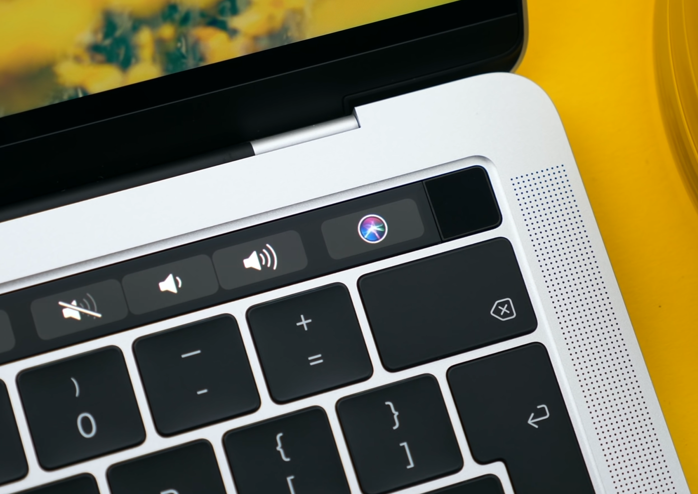
Same issue applies to 3D Rendering, this is CPU based by the way. The example render we used took 16 minutes 50 seconds to render on the 13” compare to 8 minutes and 57 seconds on the 15”.

Long story short, if you occasionally do intensive work than the 13” can handle all that, it’s just that it’s going to take it longer than it would take other laptops that have more powerful CPU’s and dedicated GPU’s.

But how does it handle games you may ask. Well in Fornite I has everything set to Epic in 1680x1050 resolution, and I was getting about 15FPS in the bus drop scene. Now you can drop these settings to Medium and drop the resolution and get over 30FPS. but realistically I wouldn’t say that this was a gaming laptop on its own. 

However, something very unique about the 13” model that no other laptops have aside from the 15” model, is four thunderbolt 3 ports. I know a lot of people complained about the lack of legacy ports but thunderbolt is the future and I’m really happy to see Apple fully implementing this across all of their computers.

With thunderbolt, you can not only connecting things such as a 5K monitor to this or 10Gb ethernet adaptor and a ton of very fast external SSD’s . Not only these but you can also connect external graphic cards via an eGPU enclosure and get an NVidia RTX 2080Ti or a Radeon Vega 64 GPU working on this!

This changes the performance entirely! From the 15FPS we were getting in Fortnite, we now pretty much get a solid 60, with an even higher resolution than before. 

Exporting times in FCP X have been reduced to just 32 minutes from 50 minute, which although still not as fast as a 15” MBP with a dedicated GPU, its still a noticeable improvement.

It does depend on the app and how well it takes full advantage of the eGPU. Final Cut Pro does not, at least not at the moment, a big update will be coming this fall. Until then DaVinci Resolve is the best option for eGPU use in video editing, and in that case you’ll see some massive performance gains, and the same applies to games that do take full advantage of the eGPU. Also by using an eGPU you can connect way more monitors to the 13”, since you’ll be connecting those directly to the GPU itself. 

So if you want to go the eGPU route, it’s probably the best laptop for it but it will be more expensive than just buying a 15” MBP which will give you better rendering times out the box. 

BATTERY

So what about the battery life on this?

Well Apple’s claiming up to 10 hours of web-browsing. I didn’t really get 10 hours, I got around 8, which is far better than 5 or so that I got with my 15”.

The reason for this is because since the 13” does not have a dedicated GPU it will last you longer. The 15” does switch to the dGPU quite a lot which kills a lot of your battery.

Now the MacBook Air will last you longer, up to 12 hours, but I would say that the 13” MacBook Pro is more than enough for most people, when it comes to the battery life.


PRICE

Now, when it comes to the price, there are a few things that I want to point out.

Only the touch bar model has an update so get that one if you’re considering this (Source: Apple)

Only the touch bar model has an update so get that one if you’re considering this (Source: Apple)

The first is only the touch bar model has been updated in 2019, the non-touch bar MacBook Pro is still the same 2017 MacBook Pro with no updates, and the same old broken keyboard so please avoid buying that! Unless you’re looking for a better MacBook Air for the same price and you don’t care about the keyboard. 

Additionally the configuration from the video costs $2900 which is $500 more than the baseline 15” model that gives you a much more powerful 6 core i7 CPU, a faster 2400MHz ram, as well as a dedicated Radeon Pro 555X GPU.

So the 13” config that I would go for would be the $2000 one which has everything on the base except for the RAM, which I’ve bumped to 16GB. 

If you do any photo or video work, you can of course bump the storage but keep in mind that if you do that, the MBP 15” would be very close in price, just with less storage.


CONCLUSION

Ok, so in the end, who is this 13” MacBook Pro for?

Well I would say that this is perfect for students. Students who study computer science who need a bit more power than the average student. Since you get a very powerful QC MacBook Pro, more powerful than what the 15’ QC MacBook Pros used to be this is the MacBook for you. It’s just that the GPU isn’t that great.
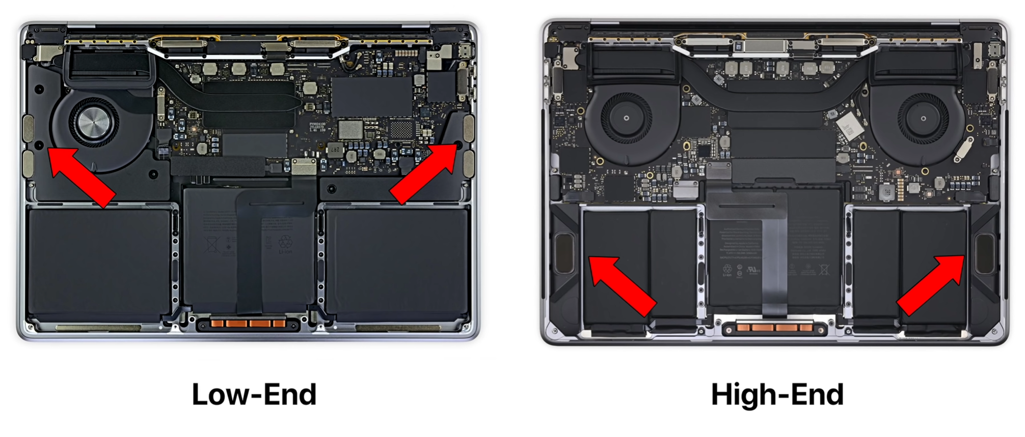
However, even if you don’t need a dedicated GPU, this could be perfect for you. Same goes for people that need a very portable laptop that can handle everything they throw at it. The 13” MacBook Pro is actually the most powerful 13” laptop that you can buy CPU wise, and with that thunderbolt expandability you can indeed connect a very powerful Desktop Graphics card which will turn it into a beast of a machine, it’s just that you’ll have to pay for that, even more than a 15” MacBook Pro which will give you better performance per cost.
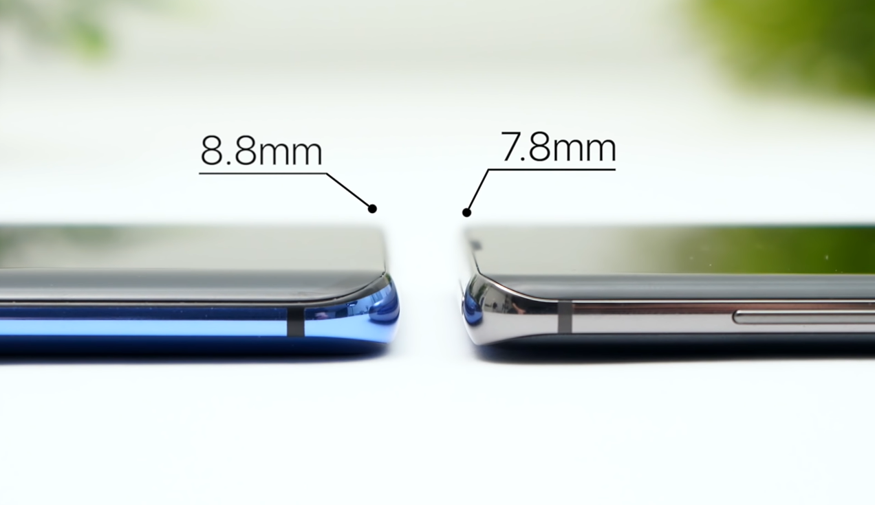

Samsung Galaxy S10+ Review


I’ve been using the Samsung Galaxy S10+ for the past 2 months now and I’m simply in love with this device. More so than with any other smartphone that I’ve used.

The Galaxy S10+ is sitting in my pocket at the time of writing this, which not a lot of devices get to do. It’s actually replaced my iPhone XS Max as my main device for these past 2 months and here’s my full in-depth review of the Samsung Galaxy S10+!


DESIGN

This year we are lucky enough to have three S10’s to choose from; the S10+, the S10 and S10e and, whilst this is a review of the S10+, I am just going to go over a few differences in design between the models now.

In terms of display size we get a 5.8” one on the S10e, 6.1” on the S10 and 6.4” on the S10+. Now the S10e does have a flat display rather than the curved ones we get on the S10 and S10+, and the S10+ is the only one with a dual camera cut-out on the front which allows it to have better 3D depth mapping.

Now back to the S10+, the design of this phone is absolutely outstanding. This is, in my eyes at least, the best looking smartphone on the market by far! We get some extremely thin bezels on this phone. The top frame is barely even there, and the speaker is now built into that frame. The sides of the phone are curved, and whilst this does impact usability, which I’ll cover in the software section of this video, it makes the phone absolutely stunning to look at.

The Prism Green S10

The Prism Green S10

The backs of these phones also look amazing. You can get all the S10’s in many colors, some are unfortunately exclusive to only a few countries. The Prism Black and Prism White ones are available pretty much everywhere so you can at least pick those up, and you also have variants such as the Prism Green, like our regular S10 which Vodafone UK provided for us to show in the video, so shout out to Vodafone for that!

But probably the best part about the design of the S10+ is that camera cut-out itself!

There’s no notch at all on the S10+ and we instead get a single cut-out for the front camera, which Samsung has managed to integrate the actual display panel itself! It is really impressive to see how the display wrapped around the camera cut-out, and that portion of the display does support touch input, so you’re not really missing out on anything here.

Many users have started making wallpapers that embrace the cut-out rather than hiding it. There is a Wall-E wallpaper for example just looks incredible, and many of them were made by the community and even Samsung themselves, to fully take advantage of that camera cut-out.

I honestly think that this is one the best things that happened to a smartphone in a while. Apple tries to hide the notch on their iPhones, whereas Samsung’s doing quite the opposite. 

Now the only small “complaint” that I have regarding the S10’s design, is the chin. Not the fact that it’s big, because it’s almost the same size as on the iPhone XS Max, making it the 2nd thinnest chin on the market right now, but the fact that it’s not the same size as the top bezel so it stands out quite easily.

Other than that, in my opinion, this is the most beautiful phone on the market and just a joy to look at! 


DISPLAY

Let's great straight to the point on this. This is by far the best display on any smartphone on the market right now! I don’t mean just on a smartphone either, but on any device in general. It’s one of those things that you have to see in person, to fully comprehend how good it really is. 

It’s a 6.4” 3040x1440 OLED display, with an aspect ratio of 19:9 and a pixel density of 522PPI. It’s got gorilla glass 6, and probably the best part about it, is that it can display HDR10+ content. If you are not aware of what this is it means the display can go as bright as 1000 nits, which is just insane on a smartphone.

Also, if you’re coming from an iPhone, Android does support Google’s VP9 codec, meaning you can watch 1440p videos on YouTube, rather than being restricted to just 1080p, like on Apple Products. So not only is the display higher res, but YouTube renders at a higher quality as well and it’s just an incredible experience for watching content.


CAMERA

Now the camera is unfortunately where some of the downsides of this phone start, but they aren’t major.

The difference in camera quality between the Note 9 and S10+

The difference in camera quality between the Note 9 and S10+

Whilst you do get a 3rd camera module on the back, which is a wide angle module, meaning you can capture significantly more in the shot than you could with the regular module, the image quality itself hasn’t changed that much from the Note 9 or even the Samsung Galaxy S9 from a year before. In fact, looking at the camera specs, they seem to be using the exact same modules.

Samsung has updated their image processing so the HDR shots especially look better but they’re still not better than on the Pixel 3 XL or the iPhone XS Max in a lot of cases. RAW image processing is good, but again nothing compared to the iPhone XS Max which has the best dynamic range on any smartphone today. 

On the video side, we did get a massive upgrade and that is the fact that you can now record for an unlimited amount of time, which was limited to just 5 minutes of 4K60, or 10 minutes of 4K30 before. That didn’t make a lot of sense, especially considering how much storage you can have in this phone, but I’m glad to see this restriction being removed. 

Slow motion is good if you only care about the result. It can shoot in up to 960fps in 720p, but the slow motion movement detection it done automatically and, at the time of writing this, manual mode is glitched. Long story short, recording the quick balloon pop scene in the video took about 5-6 attempts on the S10+, whereas the iPhone XS Max and the Google Pixel 3 XL nailed it the first time. So it’s very frustrating recording slow-motion on the S10, but when it does work, the result is pretty good. 

However, there are a few weird things with this camera. Take the fact that you cannot use the wide-angle lens or the telephoto lens when recording video, unless you switch to 4K30. 4k60 doesn’t work with the wide-angle for example. Why is it like this? I have no idea, it doesn’t make any sense at all for Samsung to limit this. 

Now don’t get the wrong idea, I’m not saying that this camera is bad. On the contrary, the S10+ has the best smartphone camera on the market, same spot as the Google Pixel 3, the iPhone XS Max or the Huawei P30 Pro, but they all have different ups and downs.

Take the iPhone XS Max for example, it excels in video and dynamic range when it comes to photos. The Pixel 3 has some amazingly good HDR shots and an insane Night Mode. The Huawei P30 Pro has that 5x or even 50x zoom, and an even better Night Mode. Then the S10+ has, in my opinion, the best wide angle camera on a smartphone today, the best front facing camera for video, since it can do 4K video on the front and it can take some outstanding shots with little to no tweaking required. 

In the end, there’s no perfect smartphone camera, but the Galaxy S10+ one is definitely as good as the competition, just in some other areas. 

PERFORMANCE

Performance wise though, this thing is a beast! It comes with the Qualcomm Snapdragon 855 in US and Canada and Samsung’s own Exynos 9820 in Europe and Asia, and this year, it seems like the Snapdragon models are a better choice. They are not only faster but they also offer a better battery life.

Since we’re UK based, we got the Exynos model and personally my experience with the S10+’s performance has been really good. I haven’t really had any major lag or freezes on the S10+, unlike what I used to get on the older Samsung models. My iPhone XS Max completely froze 3 times in the past 2 weeks alone, to the point where I had to force restart the device since the touchscreen was completely unresponsive, and I’ve never had that with the S10+. 

The cooling pipe in the S10+ (Source: JerryRigEverything)

The cooling pipe in the S10+ (Source: JerryRigEverything)

Yes, it’s not as powerful as an iPhone XS Max is, but it can easily handle all the everyday tasks extremely well so I’ve very pleased in this regard. And the fact that it comes with 8GB of RAM by default, and even 12GB on the higher end 1TB storage model, means that you’ll never have an issue keeping apps open in the background. 

Heck, it even has a vapor cooling pipe to keep the temperatures low during gaming or video editing, which both the regular S10 or the S10e lack.


SOFTWARE

But performance is nothing without a good software experience and I’m pleased to say that the S10+ has the best software experience I’ve seen in a Samsung phone.

The new OneUI is a huge improvement over the previous Samsung Experience UI. Not only do you get this really cool system-wide dark theme, but the whole idea behind Samsung’s OneUI is that you can use it with one hand and everything is gestures based now. So you can swipe down from the home screen to access the notification panel, and even the brightness slider. You swipe up in the middle to go home, you swipe up on the right-hand side to go back, and you swipe up on the left hand side to open up the multitasking bar.

I mean they’re not the best gestures out there, they are better than the Pixel but they are still slide up gestures of the previous buttons rather than something that was designed specifically with the lack of buttons in mind, like the swipe left and right that we have on the iPhone.

Now something that I do like is the fact that you can have folders on the app drawer. You can basically have the entire iOS app UI with a swipe up of a finger and then you can keep the home screen clean and simple, with just a few icons and a few essential widgets.

The Samsung Edge Panel allows you to quickly access your favourite apps

The Samsung Edge Panel allows you to quickly access your favourite apps

I also love Samsung’s Edge Panel that gives you a few extra apps when you swipe from the side of the phone, this is brilliant and extremely useful to have! You can even have tools here, contacts for example, and way more things than just apps. 

However there are a few things I dislike about this software apart from the slightly clunky gestures.

My main issue with the software is with accidental touch rejection. It’s pretty bad and that’s because of the curved display which makes it very easy for your palm to touch some of the icons on the edge. This was improved from the S9 to the Note 9, when Samsung made the edges less curved on the Note 9 and the accidental touches were almost fixed entirely but the edges are now back to being really curved on the S10+, which does make the phone looks nice but it also severely impacts the usability. So I ended up randomly liking comments or tweets, pausing YouTube videos, skipping videos quite a number of times. 

I also dislike the scrolling. There’s no bounce effect like we have on iOS, so everything feels very unnatural and nothing feels as smooth or as fluid as an iPhone does. This doesn’t apply to all Android phones to be honest. For example my Pixel handles a slide gesture much better than my S10 does which constantly struggles with this, mostly because of the curved display which is really annoying! 

Animations don’t feels as smooth as iOS either. Everything feels a bit choppy and unnatural, so if you’re coming from iOS this is something you’ll notice right away. 

And of course, there’s the updates. Samsung is usually about a year late when it comes to updates and even when they do release an update, such as the recent Night mode for the camera, not all S10’s get it at the same time. For example, I still don’t have it on my personal S10, yet the review unit from Vodafone does. Samsung did improve their update cycle and they have launched OneUI on the Note 9, S9, Note 8, even the S8 have it, which is great and all but it’s still far behind Google Pixel phones which get day 1 updates, or OnePlus phones which also get updated just a few weeks or months after Google phones.

SPECIAL FEATURES

This phone is the swiss army knife of smartphones when it comes to special features. It comes with pretty much everything you would need in a smartphone. 

It’s one of the few smartphones to still support a microSD card slot, so you can expand the top of the line 1TB model with up to 512GB of additional storage and have 1.5TB of storage in a smartphone which is just insane!

It doesn’t come with UFS 3.0 storage, which only the Galaxy Fold and the OnePlus 7 Pro have so that’s a bit disappointing, considering that those are Samsung’s own chips which would’ve given the S10+ read speeds of close to 3GB/s up from about 1.5GB/s and write speeds would have almost double as well.

But we do get a ton more features. We get an always-on display which is fully customisable. We also get a notification ring that goes around the camera cut-out, which was recently added in an update.

It does come IP68 water resistance, which same as on every other water resistant phone, but it is not covered under warranty.

We get dual stereo speakers, which are much louder than on something like an iPhone XS Max, and also a headphone jack which is really useful to have if you’re not fully invested into the wireless headphone ecosystem.

The S10’s can now reverse wireless charge any device that accepts wireless charging, like the Pixel 3XL for example

The S10’s can now reverse wireless charge any device that accepts wireless charging, like the Pixel 3XL for example

If you are though, Samsung has also released the Galaxy Buds, which are their answer to Apple’s 2nd generation AirPods. They isolate the sounds much better than the AirPods but their sound isn’t as full as the AirPods. The microphone on the Buds is pretty bad, but they do offer better controls than the AirPods, and probably the best part about them is that you can charge them on the back of your S10!

Yes, the S10 now has reverse wireless charging, so you can charge anything that supports wireless charging; your Galaxy Watch, your Galaxy Buds, or even an iPhone. Also, wireless charging is now even faster on the S10, with up to 12W charging, so that’s great. It can get to 33% in just 30 minutes of charge using fast charge, which is pretty impressive considering it’s large 4100mAH battery. 

The S10 is also one of the world’s first smartphones to feature WiFi 6 or WiFI 802.11ax, the brand new standard that can get theoretical speeds of up to 10Gb/s! There’s very few WiFi 6 routers and networks out there, but this is great for futureproofing. Also if you want 5G, Samsung will be selling that 5G variant of the S10+, which not only comes with 5G but also a larger 6.7” display as well as an extra 4th camera module. 

But there are 2 outstanding features on this phone which not a lot of reviewers talk about and these are by far the most impressive things on any smartphone.

By connected your Samsung phone to an external monitor you can enter DeX mode

By connected your Samsung phone to an external monitor you can enter DeX mode

The first one is DeX. So with the S10, you can use the USB type C port, which is also USB 3.1, and connect it to an external monitor. Once you do that, it boots into this DeX mode, which looks very similar to a Window 10 experience. So you have all of your apps here in full screen, and apps such as Microsoft Office and Chrome work just as they do on your full desktop computer. You can even attach a wireless mouse and a wireless keyboard and basically transform your S10 into a desktop computer whenever you get back home from work. I find this is absolutely amazing! If you’re the kind of person that mostly uses their smartphone and nothing else, being able to use this as a full desktop PC when you get home is not just convenient, but it’s also far more affordable than buying a new computer. 

The 2nd big unique feature is VR. Samsung has the best mobile VR on the market right now. The GearVR which also comes with a motion controller is something that I recommend to every S10 user to get. The GearVR is made in partnership with Oculus so you have full access to thousand of Oculus apps and games and with the S10’s gorgeous 3K OLED display, everything looks stunning!. It’s something that honestly all of you need to try out! It’s that big of a game changer. 

|You can now unlock the S10 and S10+ using the in-display fingerprint reader (Source: Samsung)

|You can now unlock the S10 and S10+ using the in-display fingerprint reader (Source: Samsung)

Finally, we wouldn’t be talking about Special Features without mentioning the Fingerprint Reader. On previous Samsung phones, ever since the S8, we’ve had it on the back, which I was never a fan of. The one on the Note 9 was good, and much easier to reach since it was placed in the middle, rather than to the side. But I would have still preferred a Facial Recognition system like Apple uses on their iPhones or a fingerprint reader on the front. And this is exactly what Samsung has done with the S10. We’ve seen this rumored and leaked, ever since the S8, Samsung using an optical fingerprint reader but for whatever reason they never did. Even the S10 uses an Ultrasonic fingerprint reader, which is far more advanced than an optical one since it doesn’t need any light in order for it to work. Now my experience with this fingerprint reader has been ok. It’s definitely slower than a dedicated fingerprint reader and it doesn’t work as often as FaceID does on the iPhones. Initially it was working just 6/10 times for me, so I added my finger multiple times and now it works 8-9/10 times. Tip for those of you who have trouble with the fingerprint reader. But for me, I would always pick the S10’s fingerprint reader over one that’s on the back of the phone. This is Samsung’s first gen in-display fingerprint reader though, and I’m pretty confident that’s going to get even better with future software updates and new Galaxy phones as well. 


BATTERY

How the UI looks in the ‘Ultra Power Saving’ mode

How the UI looks in the ‘Ultra Power Saving’ mode

I found the battery life has been amazing for me. It can easily last me for a full day of use, even when I’m travelling and I’m a really heavy user.

The S10 also has this adaptive power saving mode that limits background usage of certain apps, based on what, how and when you use your. You can also manually toggle that Ultra Power Saving mode, which is not called anymore but it still works in a similar way, where the entire UI is black and you have this simplified UI where you can only use a few essential apps but the battery can last you for a few days, or even weeks by doing this. This with the S10+’s fast wireless charging and fast wired charging, and that 4100mAh battery means that this phone has given me the best battery life so far.


CONCLUSION

Ok, so what are my overall thoughts on the S10+?

Honestly, this is by far the best smartphone on the market right now, keep in mind that this is coming from someone who mostly uses Apple products. 

This is an amazing device with a stunning display, outstanding battery life, a very versatile camera and even the price of it is really good. On Samsung’s website, the S10+ starts from £900 for the 128GB model that also comes with 8GB of RAM, which is £200 less than an iPhone XS Max which only comes with 64GB of storage, no microSD card and a fraction of the features that the S10+ comes it.

The iPhone does offer a more fluid and optimised experience, everything just flows more nicely and if you’re heavily invested into the Apple ecosystem, then that’s a better choice. But for me, since I recently got an iPad Pro as well, I still have iOS for some things meaning that using an S10, an iPad and a MacBook is actually doable.

Also, since you cannot even use 2 apps at the same time on a £1100 iPhone XS Max for example, which you can easily do on the S10, the S10 is also a much better productivity tool that fits right in your pocket.


iPad Mini 5 Review


Apple has revived their iPad Mini line up after 4 years of everyone, including myself, thinking it was dead. This is the brand new iPad Mini, and here are my thoughts on Apple’s smallest and most portable tablet!


HARDWARE

The Mini 5 starts at $400, which is $70 more than what the original iPad Mini used to cost back in 2012. It’s currently not the cheapest iPad that you can buy, there’s the entry level iPad which is larger, but it also comes with weaker specs and a significantly worse display.

What the iPad Mini offers compared to the Air and Pro for example, is a very compact form factor. In fact this thing is so compact that I can hold it in one hand and if you have some fairly larger pockets or a hoody it would even fit in those. I would highly recommend this if you travel a lot as it is the perfect iPad to carry on a plane or a coach trip.

Design comparison between the original iPad Mini and the Mini 5

Design comparison between the original iPad Mini and the Mini 5

My only complaint here is that whilst it is extremely portable, the design basically hasn’t changed since the first iPad Mini was launched back in 2012. The Mini 5 retains the small improvements that the Mini 4 got, like the laminated display and the thinner overall form, whilst also getting a darker shade of space grey, which does look really nice.

The edges are not reflective anymore, they’re not matte, but that’s it. We do have the exact same thick bezels as the original, which you can argue is good to have on a tablet, since you have something to hold it by, but that’s not necessarily true. The 2018 iPad Pro for example, had some insanely thin bezels and the accidental touch rejection was so good on that thing that you could hold it by the display and still use it! Now the Mini itself does have some incredible accidental touch rejection but only on the sides. So it is no problem at all if you accidentally touch the display when using this in portrait due to the thin side bezels.

Now I have seen a lot of reviewers and tech websites say that the iPhone XS Max is almost as big as an iPad Mini is, and there’s no point in getting a Mini anymore, which isn’t correct at all. 

You see the Mini has a 4:3 aspect ratio display compared to 19.5:9, which means that you can read full sized pages of a book or even comic books, without having to scroll or zoom in on the Mini. So if you’re into reading books and pretty much browsing in general, the Mini is a significant upgrade from even a large screen smartphone.

Speaking of reading, the display itself has been improved significantly over the years. We got a Retina Display with the Mini 2 and that laminated display I mentioned earlier with the Mini 4, but with the Mini 5, everything got even better.

A comparison in brightness between the iPad Mini 5 (Left) Mini 4 (Right)

A comparison in brightness between the iPad Mini 5 (Left) Mini 4 (Right)

The colors are more vibrant, with the inclusion of a DCI-P3 panel, just like on the iPad Pro so everything just pops, and the difference between the 5 and the 4 is definitely noticeable. It’s also a brighter display, which I do like a lot! It can now go up to 500 nits compared to the 350 or so we had before, so this would be a great tablet to use outdoors and on the go. At 326PPI this is also the sharpest iPad, with all the others having which 264PPI, and it does have to be that way since the Mini is smaller and you would therefore be holding it closer to your eyes.

Overall it’s a great display, I just wish that the display was larger. There’s so much room on the top and the bottom that Apple isn’t utilising which I really hope changes with the next generation’s design. 

For those of you who like taking pictures with iPads the camera’s pretty good, for an iPad Mini that is. It’s nowhere near the capabilities of the iPad Pro’s camera but the front camera is now a 7MP sensor, from the horrible 1.2MP one that we had on the Mini 4. Unfortunately the back camera isn’t that great, it’s an old 8MP sensor from a few iPhone generations ago and can only do 1080p video but the Apple A12’s processor does make a pretty big difference in terms of image processing. So if you would be using it for scanning documents and occasional photo taking, it’s more than good enough. 


PERFORMANCE

Now in terms of the iPad Mini 5’s performance and fluidity, every single iPad Mini came with the same processor that the iPhones came with a year before. The Mini 1 released in 2012 came with the Apple A5 CPU, same as in the iPhone 4S from 2011 and so on. 

But the Mini 5, instead of coming with the Apple A11 from the iPhone X, it actually comes with the A12 from the iPhone XS!  Which means the performance on this thing is incredible! Everything is buttery smooth, it maybe even more powerful than your own laptop!

I think that the best thing about having this much power in such a small tablet is that becomes literally the perfect portable gaming console. iOS games are not only the best ones on any mobile platform, in terms of graphics and how well they run on older devices, but on the Mini 5 for example, thanks to the power of the A12, you can play games such as Fortnite in native resolution at high settings and you can even attach a controller! 

Editing 4K video may be difficult with such a small display

Editing 4K video may be difficult with such a small display

With this boost in performance you can do video editing on this, even 4K video editing, but I wouldn’t really recommend it because of the small display size, but what I’m getting at is that whatever you throw at this it can easily handle it!

In terms of how well iOS runs on this, it’s still iOS so you’re very limited in terms of functionality but since the iPad Mini runs on the iPad UI rather than the iPhone UI, you can actually run multiple apps at the same time.

Apple does offer you years of day 1 updates too, the iPad Air 2 from 2014 is still fully supported 5 years after it was launched. So expect to be able to see this for many years!

It’s worth noting that iOS 13 would be coming with some major iPad UI overhaul and I am 100% sure that some, if not all of those features would be coming to the Mini 5 as well. Even with iOS 12 we got full gesture support, just like on the 2018 iPad Pro, so even if the home button is still there you can indeed use the same gestures as on the iPad Pro 2018 and fully navigate the UI which is a real plus! 

ACCESSORIES

Now this section is something that has to be discussed, and I am really happy about this, and that is that the Mini 5 now has support for the Apple Pencil.

But this is a bit of a weird one because the Apple Pencil and the Smart Keyboard have both been exclusive to the iPad Pro, as Apple’s been selling the Pro as a professional grade device. Now that they added both Apple Pencil and Smart-keyboard support to the iPad Air 3, and Apple Pencil support to the Mini, Apple is clearly moving away from the idea that only the iPad Pros should have the best features. 

I mean, it’s not the 2nd generation Apple Pencil that the iPad Pro comes with, it’s still the 1st gen one which connects very weirdly, but it is an a mazing thing to have. Unfortunately you do have to buy it separately and yes, it does feel weird using the pencil on such a small display, especially considering that the pencil itself is bigger than the entire length of the display. But it’s perfect for things such as taking notes, and drawing professional art if you so wished.


CONCLUSION

Ok so in the end, while personally I do use an iPad Pro every single day and don’t intend to switch to a Mini anytime soon, the Mini 5 is not only the best entry into the iOS ecosystem, but it is also the best small form factor tablet on the market by a wide margin.

There’s absolutely nothing that even comes close in terms of the performance, the massive app selection, the software support and the best mobile gaming experience on the market right now, especially if you connect a controller.

iPad Air 3 Review


This is the brand new iPad Air! It’s just called the iPad Air but essentially this is the 3rd generation iPad Air.

It has been almost 5 years since the iPad Air 2 was released so we should see a pretty big upgrade in every single way!

It stands in between the entry-level iPad which hasn’t been updated since 2018, which starts at $329, and the iPad Pro 2018 which starts at $800. The iPad Air starts at $500, more than half the price of the iPad Pro. But is it more than half as good?


HARDWARE

The entire iPad Air design is based of the iPad Pro 2nd gen design from 2017. This means that, when compared to the iPad Air 2, there is a noticeable design upgrade. We get a 10.5” display compared to 9.7”, and we also get significantly thinner bezels overall in a form factor that’s just a tiny bit larger. 

Design comparison between the Air 3 and the 2018 iPad Pro

Design comparison between the Air 3 and the 2018 iPad Pro

It’s not as good as the 2018 iPad Pro’s design, with those really thin bezels and no home button and FaceID, but it’s still not bad. It is still one of the best looking tablets on the market and it now comes in an even darker shade of space grey than before, which I really like. 

The display is surprisingly good. It’s almost as good as on the iPad Pro 2nd generation. We get the same DCI-P3 color gamut, so everything is incredibly vibrant, and a True-Tone display that automatically adjusts its color temperature based on the lighting conditions around it. In addition we also get the same 1.8% reflectivity, so watching videos on this looks incredible. The Air is also really easy to read outdoors as it goes up to 500 nits, the same as a MacBook Pro. It’s not as bright as the iPad Pro 2nd or 3rd gen that can go up to 600 nits, but it’s still more than enough. Overall though, I do feel that this is indeed one of the best displays on a tablet at the moment.

Now the Pro does have that Pro-Motion technology which makes everything twice as fluid, up to 120Hz fluid, but this is missing from the Air. It is a pretty big downgrade if you’re coming from a 2nd gen iPad Pro or newer, since only those have Pro-Motion, but if you’re not then this display is as fluid as any other Apple device out there. 

It’s speakers are also great. They’re not quad speakers like on the iPad Pros, but they still sound great nonetheless. 

The front camera has been upgraded so it’s the same 7MP one found in the iPad Pros, meaning your selfies and facetime calls would look better. The back camera isn’t that bad either. Unfortunately it’s not a 4K sensor like on the iPad Pros, but for 1080p 30fps videos, scanning documents and occasional shots it’s more than good enough. 

Also, I do love the fact that even though we do have a home-button on this iPad, which is the same clickable one as on the iPad Air 2 from 2014, you can still use the same gestures as on the iPad Pro 2018. Swiping up to go home and opening the multitasking makes you forget that this iPad even has a home button.


PERFORMANCE

When it comes to performance this thing is just incredible! Games run great on this. Fortnite for example runs in native resolution at 60fps and you can even pair a controller with this thing and turn it into a portable gaming console, thanks to its 3GB of RAM.

You can also edit full 4K video on this thing if you want to. It’s not as fast as exporting video as the iPad Pro is 2nd gen or 3rd gen, but let’s be honest, even the majority of people who get an iPad Pro, don’t use it for video editing anyways. The Air isn’t even considered by Apple to be a Pro device, yet it does offer even better CPU performance than the 2017 2nd generation iPad Pro. It’s got the Apple A12 processor inside of it, the same one found in the iPhone XS so it’s even more powerful than most PC laptops out there.


ACCESORIES

But definitely the biggest advantage of the iPad Air is support for both the Apple Smart-Keyboard and the Apple Pencil, which were previously exclusive to the iPad Pro. It is the same Smart-Keyboard as on the 2017 iPad Pro 2nd gen so it’s a decent keyboard, but there are better ones out there like the ones by Brydge.

To charge the 1st Gen Apple Pencil you have to insert it into the port on the bottom of the iPad

To charge the 1st Gen Apple Pencil you have to insert it into the port on the bottom of the iPad

Now the Apple Pencil we get with this is not the 2nd generation that we got with the 2018 iPad Pro. We actually get the 1st gen one that was released in 2016, which isn’t bad. However, it does charge quite weirdly and since the display refreshes at 60Hz vs 120Hz like on the Pro, it doesn’t feel as fluid as drawing on an iPad Pro. But for taking notes and even occasional drawing this is an amazing tool to have, so much better than the iPad Mini 5, since you have a much larger display. 

I just wish that the display had a bit more resistance to it since it honestly feels like drawing on a glass window.

CONCLUSION

So in the end the iPad Air is pretty good! It costs significantly less than an iPad Pro and it offers significantly more than the entry-level iPad!

However, my Pro tip would be to get the iPad Pro 2nd gen instead. You can actually find it really cheap now, even cheaper than the iPad Air. While the CPU performance is weaker than the iPad Air, the GPU is better so it’s faster at exporting videos, the camera is better on the Pro and you get a flash as well. You also get the Pro-Motion display so everything is twice as fluid, and the Apple Pencil is also a much better experience on the iPad Pro. It also offers quad speakers, so watching and listening to content is a much more enjoyable experience on the Pro.

Google Pixel Slate Review


Now I’m actually a really big fan of Google myself. I absolutely love what they are doing as a company. Pretty much all of their software products are entirely free to use, their Google Home products are definitely the best ones overall and although the Pixel’s had some issues, for the most part they’re brilliant!

But Google has recently released a tablet, well kind of. The Pixel Slate is Google’s new 2 in 1 and it’s not that great at all. Here’s why.


HARDWARE

The Pixel Slate comes with a 12.3” display, the same as on the Microsoft Surface Pro 6. It’s a 3000x2000 resolution LCD panel at 293PPI, so it’s actually sharper than an iPad Pro’s display. I would say that the display was better than that of the Surface Pro 6 as it’s brighter and the colors just pop. However, it’s not as color accurate as the iPad Pro’s display, nor does it have the 120Hz refresh rate. Overall though, it’s a great display.

The difference in bezels between the Slate (Left) and the Microsoft Surface Pro 6 (Right)

The difference in bezels between the Slate (Left) and the Microsoft Surface Pro 6 (Right)

Whilst it is a better design then the Surface Pro 6, having smaller bezels and thinner frame, the iPad Pro is even better with noticeably thinner bezels, and a much thinner, smaller form factor too.

I like the fact that there’s no camera bump and there is 0 branding aside from a slight ‘G’ logo in the top left corner. Speaking of cameras, the Pixel Slate comes

with two of them. The one on the back is an 8MP f/1.8 aperture and 1.12μm, that can record 1080p video at 30fps max and the one on the front is an 8MP f/1.9 aperture larger 1.4μm pixels. So yes, the front camera is better than the back one, but overall they’re both only ok.

The Pixel Slate also comes with dual front stereo speakers which are also ok, but they do crackle at high volume, which is something I would expect to see in a $100 tablet and not one that starts at $600. 

But something that I do really like about the Pixel Slate, is that it comes with 2 USB type C ports, one on each side, which means you can charge it whilst also connecting it to an external monitor for example.


SOFTWARE

So instead of the Pixel Slate running Android, it runs on ChromeOS. Now I personally prefer this over Android, because it’s a bit more capable and it also supports all the Android apps that your phone or Android tablets do, so it’s a win-win in my books. You can play your favourite games, you can download Photoshop and Lightroom CC, and any app that you use on your Android smartphone or tablet. Overall ChromeOS is more desktop-like than iOS is on the iPad, which does not support external HDD’s at all or extended monitors in extended mode.

However there are 3 very big issues with ChromeOS on this specific tablet.

The first is the app layout. So if you have an Android tablet you probably know how poorly Android is optimised for tablets. I found that most of the apps on the Slate would not scale properly and I ended up with a massive UI.

The second big issue is that even though ChromeOS is a more similar to a full desktop OS rather than a mobile one like iOS and Android are, there are still no high end professional apps. There is no Adobe Premiere, no Photoshop, no 3D modelling apps literally zero of the high-end tools that you would get on Windows or macOS. So while ChromeOS can do more than iOS on the iPad Pro can, most Android apps have a completely unoptimized layout and the only version of Photoshop that you can get is the mobile version.

And finally the third big issue in terms of ChromeOS on this tablet, is the performance.

You see, the Pixel Slate comes in a ton of configurations.

You can get; a Celeron CPU with 4 or 8GB of RAM, an Intel Core m3 variant with 8GB of RAM (which is the one that I have), an i5 with 8GB of ram and an i7 with 16GB of RAM.

The i5 and i7 are still m5’s and m7’s, it’s just Intel’s naming scheme which is very misleading, so these are still those low power Y series processors. 

Now performance wise, you would expect these to be really good but honestly, even the highest end Pixel Slate (the i7 model with 16GB of RAM and 256GB of storage) which costs a whopping £1,550 in the UK scores less than an iPhone X from 2017 in both Single-Core and Multi-Core!

Comparative Single and Multi-Core scores between the Pixel Slate and iPhone X

Comparative Single and Multi-Core scores between the Pixel Slate and iPhone X

So now you’re probably wondering if the top of the line £1,550 i7 model is so weak, how weak is the baseline £550 Celeron model?

Well we’re talking 1,941 for the Single-Core and 3,045 for the Multi-Core. 

Nope, that’s not a joke, this is for real! The Celeron Pixel Slate has a worse performance score than an iPhone 6S from 2015! It’s just a tiny bit more powerful than a 2014 iPhone 6, but weaker than a Samsung Galaxy S6 edge.

Now, Google sent me the m3 model, not the Celeron. But I have to say even the m3 lags like crazy! The lag on this thing reminds me of my Samsung Galaxy S4 running touchwiz and a ton of bloatware, definitely not something you should be seeing on a stock Android tablet made by Google that costs £750.

On top of all of this it also has bugs, and a lot of them at that. The Pixel Slate is the glitchiest, buggiest device I’ve had in years! For example, I was stuck on the app drawer and the Slate would not go to the desktop, no matter what I did. The back button wasn’t doing anything and neither were the gestures. I had to restart the Pixel Slate in order to fix it and guess what? It started happening again shortly after!

So why hasn’t Google included a Qualcomm processor, like the Snapdragon 845 that we have in the Pixel 3 XL to get a significantly better performance. I don’t know, honestly I have no idea. If any Google engineers are reading this, I would love to hear why you didn’t go with ARM processors as you would’ve gotten significantly better performance on this.

There’s also a couple of other things that the Pixel Slate didn’t get right, like the fact that there’s no double tap to wake on this which is a must on such a large tablet. It also doesn’t have a home button, so the only button to unlock this is the power button which also acts as the fingerprint sensor, which is cool but this means that unlocking this thing is a pain!  

ACCESORIES

By now you can probably tell that I would not recommend the Pixel Slate to anyone. But are the accessories good enough to make me change that opinion? 

Well, kind of.

The keyboard itself is much better than what you get with the iPad Pro. The keys are actual physical keys that you can feel, and typing on this isn’t bad. Aside from this, it is backlit with brightness and volume controls which you don’t get on the iPad Pro’s keyboard.

It also has a trackpad which works great, but probably the best part about is it the magnetic back which gives the Pixel Slate unlimited adjustability so you can place this at any angle that you want. This makes it light years ahead of what Apple’s offering on the iPad Pro which is not backlit, has no volume or brightness controls, no trackpad, no actual physical keys and only two adjustable angles.

The Pixel Slate Keyboard does costs £190 compared to the £179 that the Apple one costs but I personally feel that that’s okay considering that the Slate Keyboard is so much better.

The comparison in design between the Pixel Slate Keyboard (Left) and the Microsoft Surface Pro 6 Keyboard (Right)

The comparison in design between the Pixel Slate Keyboard (Left) and the Microsoft Surface Pro 6 Keyboard (Right)

However, when you compare it to Microsoft’s Surface Pro keyboard, the one that only costs £100, it doesn’t hold up. The Surface Pro’s keys feel better, the trackpad is more sturdy, and you can raise it if you want, rather than just having it lay flat like the Pixel Slate one . 

There are also no magnets on the bottom of the Pixel Slate keyboard so it doesn’t even close properly. It just slides around which isn’t the best design.

But what about the Pixelbook Pen? Is this Pen better than the competition?

The 2nd gen Apple Pencil magnetically attaches to the side of the iPad and the Surface Pen does the same. The Pixelbook Pen however, does not do that. The Apple Pencil charges automatically when it’s connected to the side of the iPad. The Pixelbook Pen, as well as the Surface Pen, both require an actual battery which I’m not a fan of at all. And the Surface Pen has a eraser on the top, whereas the Apple Pencil and the Pixelbook Pen does not.

Surface Pen (Top), Pixelbook Pen (Middle), and Apple Pencil (Bottom)

Surface Pen (Top), Pixelbook Pen (Middle), and Apple Pencil (Bottom)

So you can probably tell that the Pixelbook Pen offers the least amount of features of the three. It’s quite chunky, it doesn’t attach to the Slate, it has no eraser, and no automatic charging, it’s worse than both and whilst it costs less than the Apple Pencil it is more than the Surface Pen.


CONCLUSION

So in summary, the top of the line Pixel Slate cost more than an iPad Pro and the Surface Pro 6 whilst also being the worst one out of the three! It’s glitchy, slow, and has such a messed up app layout system going on. Sorry Google, I usually like what you’re doing and if this was £200 I could maybe overlook the issues and recommend it. But considering how expensive this is and all the issues that is has I wouldn’t recommend you pick one up.

I am hoping that Google makes the 2nd gen Slate better by putting in a better processor, a Qualcomm one and optimises ChromeOS, fix all the glitches, improve the accessories and heavily drops the price.

If you need a 2 in 1 the best one out there is still the Surface Pro 6, and if you need a great tablet, the best one out there is still the iPad Pro.

MacBook Pro Vega 20 Review


Back in July 2018 Apple silently released the new 2018 MacBook Pros, without any event or anything, it randomly appeared on their website and it turned out to be a significant upgrade over the 2017 and 2016 models. It came with an i9 6-core processor, from the i7 quad core one that we got before, it came with 32GB of RAM, the Radeon 560X GPU over the 560, a True Tone Display, an improved keyboard as well as up to 4TB of 3.2GB/s flash storage. This thing was a huge upgrade over the 2017 model.

I’ve been using it every day for 12 hours, sometimes more, for about 6 months now, so what are my overall thoughts?


BUILD

The new wrap that Apple has installed around the keys on the keyboard. Source: iFixit

The new wrap that Apple has installed around the keys on the keyboard. Source: iFixit

Like I said in the introduction, the keyboard itself has had quite a big improvement. I type a lot on my MacBook Pro and with the 2017 model I was forced to use an external keyboard but on this one I can comfortably type fast enough without making a considerable amount of spelling errors.

Apple also added a tiny wrap around the keys to protect them from any dust and debris that could get inside the switches. This makes the keys a bit quieter than before but definitely more tactile as there’s a more key travel thanks to the wraps. 

The speakers are also way better than they were before. I mean, they’re were already great on the 15” 2017 model, but now they have even more bass and they’re also louder than before. 

The new True Tone Display means that the MacBook Pro will automatically adjust the color temperature in order to match the lighting in your room and I honestly love it! It makes reading and writing so much easier on the eyes, and what’s pretty cool about it is that it also works on the TouchBar as well as with LG’s UltraFine 5K and 4K Monitors, as long as you keep the MacBook Pro’s lid open. 

The only issue that I have with True Tone (and it’s quite a big one really) is that if you do any Video or Photo Editing, it will not automatically turn itself off. Even in 1st party apps such as iMovie or Final Cut Pro X it wouldn’t automatically turn off. This means that you would need to constantly remind yourself to dig through the settings app and disable it every single time you need to edit and image or video, otherwise your whole color temperature would be messed up.

So here’s hoping Apple at least add a shortcut on the touch bar to do this!


PERFORMANCE

Ok, let’s talk about the performance. 

So aside from the 2 extra cores and 4 extra threads that we get with the 2018 models, we also get 32GB of 2400MHz DDR4 memory, which is even faster than the LPDDR3 2133MHz memory that we had in the 2017 models. The 560X is about 10-15% faster than the 560 was in 2017. So the main improvement here is in terms of the CPU and the RAM.

Now just 3 months after Apple released the 2018 MacBook Pros, they decided to release one more update. That was an additional GPU option which was the Vega 16 and Vega 20 Options, for the 15” MacBook Pros. Honestly, this broke my heart. Not just mine but everyone else’s who bought a maxed out 2018 model just month or so before. That’s because the Vega 20 models especially, are finally a massive improvement over even the 560X that we got a few weeks before. Apple could’ve at least said that they were going to release a major GPU option a few month later, or release the 2018 models in November, but nope they kept silent and screwed over everyone who bought a 2018 15” MacBook Pro.

But I digress. Anyway here’s how the 2017 compares to the 2018 560X and 2018 Vega 20: 

Geekbench 4 Single Core:

  • 2017 i7 16GB 560 - 4742

  • 2018 i9 32GB 560X - 5608

  • 2018 i9 32GB Vega 20 - 5698

Geekbench 4 Multi Core:

  • 2017 i7 16GB 560 - 15829

  • 2018 i9 32GB 560X - 23795

  • 2018 i9 32GB Vega 20 - 25086

Cinebench CPU:

  • 2017 i7 16GB 560 - 689 

  • 2018 i9 32GB 560X - 1013

  • 2018 i9 32GB Vega 20 - 1073

Disk Read Test:

  • 2017 i7 16GB 560 - 2504R MB/s 

  • 2018 i9 32GB 560X - 3106R MB/s  

  • 2018 i9 32GB Vega 20 - 3081R MB/s 

Disk Write Test:

  • 2017 i7 16GB 560 - 1587W MB/s 

  • 2018 i9 32GB 560X - 3004W MB/s 

  • 2018 i9 32GB Vega 20 2987W MB/s 

Keyshot 8:

  • 2017 i7 16GB 560 - 8:39 

  • 2018 i9 32GB 560X -  5:50

  • 2018 i9 32GB Vega 20 -5:36

The difference in internals between the VEGA and the 560X

The difference in internals between the VEGA and the 560X

Looking at this, even though both the models have the exact same CPU, it seems like the Vega 20 MBP does perform better even in CPU demanding tasks. This is because Apple has slightly redesigned the internals. I took the back covers off and you can see how much bigger the GPU is on the Vega 20 model. This is because the GPU memory is now inside the GPU itself. This is why AMD memory is called HBM2, it’s their second generation of high bandwidth memory and the only way it can be faster than the standard GDDR5 is by being placed inside the GPU rather than outside, like we have on the 560X model.  

The Vega 20 can also achieve more performance per watt than the 560X, meaning that the wattage can be lowered and therefore the GPU temperatures are lowered as well which means that in return the CPU has more room to breathe since Apple’s using a unified cooling system for both the CPU and the GPU. 

But how do they compare in GPU tests?

Cinebench GPU:

  • 2017 i7 16GB 560 -  86fps

  • 2018 i9 32GB 560X - 106fps

  • 2018 i9 32GB Vega 20 - 111fps


Heaven Benchmark:

  • 2017 i7 16GB 560 -19fps

  • 2018 i9 32GB 560X - 21fps

  • 2018 i9 32GB Vega 20 -  38fps


FCP X:

  • 2017 i7 16GB 560 - 13min 51s 

  • 2018 i9 32GB 560X - 11min 48s

  • 2018 i9 32GB Vega 20 - 10min 51s


Starcraft 2

  • 2017 i7 16GB 560 -35fps

  • 2018 i9 32GB 560X - 39fps

  • 2018 i9 32GB Vega 20 - 78fps


Fortnite

  • 2017 i7 16GB 560 - 16fps

  • 2018 i9 32GB 560X - 19fps

  • 2018 i9 32GB Vega 20 - 28fps

So CPU wise you do get a small improvement but GPU wise you get almost a two times increase in performance. So if you’re into gaming this is going to be huge improvement compared to even the 560X model. If you’re into video editing, the improvement is just about 10% on the Vega 20 compared to the 560X. 

Finally the last thing that I want to cover in this section is the T2 processor. So this is something that Apple initially added to the 2017 iMac Pro and then to all new Macs released afterwards.

Graph showing the difference in the Write speeds between the 2018 VEGA, the 2018 560X and the 2017 560

Graph showing the difference in the Write speeds between the 2018 VEGA, the 2018 560X and the 2017 560

The 2018 MacBook Pros, the 2018 MacBook Air, and the new Mac Mini all come with the T2 chip. What it is essentially is an ARM based processor, very similar to Apple’s A10 chip that’s inside the iPhone 7 and it handles all the background system processes such as; the boot sequence, the microphones, the camera processing, even the disk encryption. This is the reason why we got double the write speeds on the 2018 MacBook Pro vs the 2017 model when using FireVault.

So the T2 lifts a lot of the lighter workloads from the main Intel processor, allowing it to perform faster, and what Apple did is remarkable! They have devices that run on both the x86-64 platform as well as the ARM platform. This is something that’s even more difficult to do than a MacBook running just on an ARM processor such as Apple’s A12 or so processors.

But the downside to this is that every Mac with the T2 processor will crash a lot! I’ve had my 2018 MacBook Pro for 6 months at the time of writing this, and this thing has crashed close to 40 times already. And yes, I did lose some work in the process. It’s a nightmare to be honest. I’ve had T2 crashes with the Vega 20 MBP as well, the Mac Mini, 2 Mac Minis actually and the MacBook Air.

So unfortunately, even though Apple’s T2 processor is supposed to make your MacBook more secure, which it does, it also has a negative impact on the usability, just because of how often it crashes your system.

CONCLUSION

So overall, I do love my 2018 15” i9 560X MacBook Pro. It’s by far the best mac that I’ve used and even though it’s far from perfect, what with all the T2 crashes, but it’s still an amazing device overall. I’m using Thunderbolt 3 to its full potential, connecting directly to my server, the Mac Mini, my 5K monitor as well as sometimes my Vega 64 eGPU as well. If you’re into gaming than yes the Vega it is worth it, otherwise the 560X is still a great GPU for content creation.