MacBook Pro 16" - My Thoughts


So you’re probably wondering why this is only coming out now, well that’s because this was completely out of stock in the UK, even from day one all the configurations were out of stock. However, we finally have it and this is my live unboxing and reaction to the 16” MacBook Pro!

There is a bit more to this in the video so I would recommend watching that for further insights, the article below is just some overview thoughts.


The first thing that I want to cover here is just how close this MacBook Pro looks and feels like, to the 2012 Retina generation of MacBook Pros.

In terms of the dimensions it’s 1.62cm thick compared to the 1.8cm that the 2012 Retina MacBook Pro’s were or 1.55cm that the 15” 2016 generation was. It’s 35.79cm wide compared to 35.89 on the 2012 model, and 34.93 on the 2016 generation. And it’s  also 24.59cm tall compared to 24.71cm on the 2012 model and 24.07 on the 15” 2016 model. Finally, it’s quite heavy, at 2kg compared to 2.02kg of the 2012 model and 1.83kg on the 15” 2016 model. So if you weren’t that bothered by the size and the weight of the Retina Generation of MacBooks from 2012-2015 then this would be perfect for you. But in my case, I do need something that’s more portable and easy to carry around, so for my use case scenario, this 16” is actually a downgrade. 

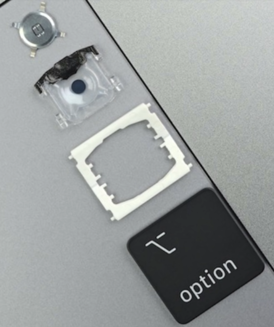
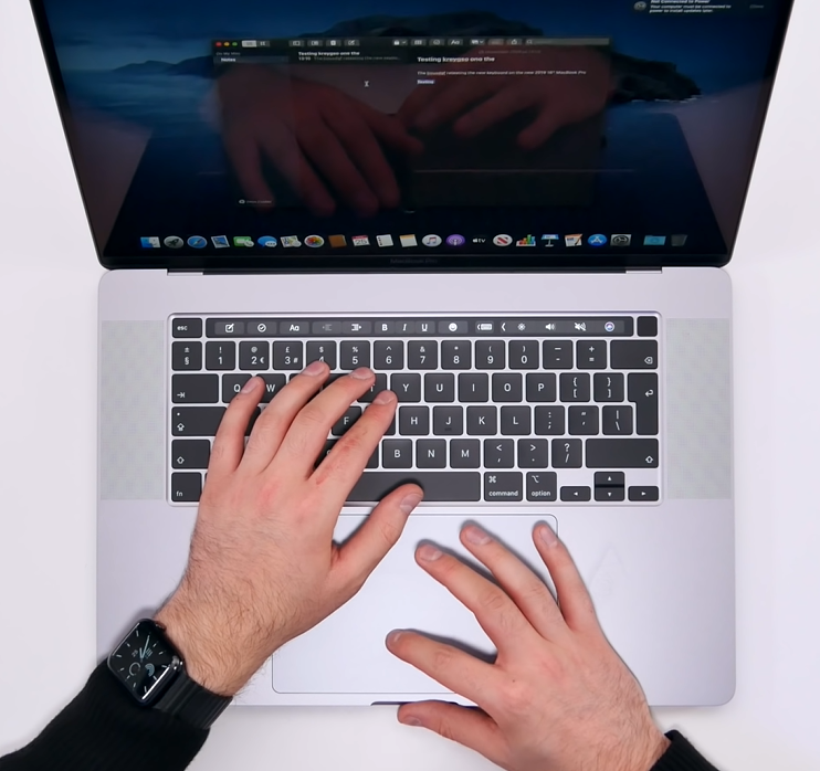
The new keys on the 16” have more travel but less stability

The new keys on the 16” have more travel but less stability

Now, when it comes to the keyboard, it feels great! Finally feels like a regular keyboard that you would get in a laptop todays, and It’s got a very similar typing experience to the 2012-2015 generation of MacBook Pros. This is because it uses the same scissor mechanism switches, rather than the butterfly switches. This does mean that the keys themselves are not as stable as the butterfly switches, so they do have more wobble to them, but they feel so much better than the butterfly switches, when it comes to key travel and overall typing experience. I’m happy to say that the keyboard is finally fixed! It’s just that, Apple should’ve done in 2017, with the 2017 MacBook Pro, after the huge backlash that the 2016 models got, rather than wait until the end of 2019.

Now, when it comes to the display it’s slightly larger now, 16” from 15.4” but the size difference isn’t as noticeable as I expected, so the 15” is still fine in terms of display size. However, what I have noticed is that going back to my 15”, the bezels looked gigantic, even though the 16” only had slightly thinner bezels on the sides and top, it did make the 15” look ancient. I do like the fact that you can adjust the refresh rate, which is useful for professional video workflows. In addition, we also get a slightly higher resolution display now of 3072x1920 up from 2880x1800, this means we also get a slight PPI bump to 226 from 220, but that difference is so small that you won’t even notice it.

Where you will notice a difference is in terms of Retina scaling. We now have a default scaling of 1792x1120 up from the 1680x1050 that we had on the 15” model, and you can bump this to 2048x1280 up from 1920x1200. So you do get quite a bit more virtual space to play with, when it comes to organising windows, apps, tabs and so on.

And something that I’ve been wanting for years has finally been implemented! Yes, we finally have less space between the touchbar and the display, meaning that the whole MacBook Pro looks a bit more well thought of. This also means that we now get a larger palm rest for when you’re typing. 

The dedicated escape key is nice, love having that, and I also love having a dedicated button for TouchID. Also Apple has coated the TouchID button so that it matches the other keys, even though this is made out of glass, whereas the regular keys are made of out of soft plastic. Love this attention to detail!

However, as much as I like the little things, the whole Macbook Pro looks to me like an afterthought design wise. It looks like Apple took what was great from the old 2012 Retina MacBook Pros and slammed those onto the 15” design, without really re-designing the whole thing from scratch. 

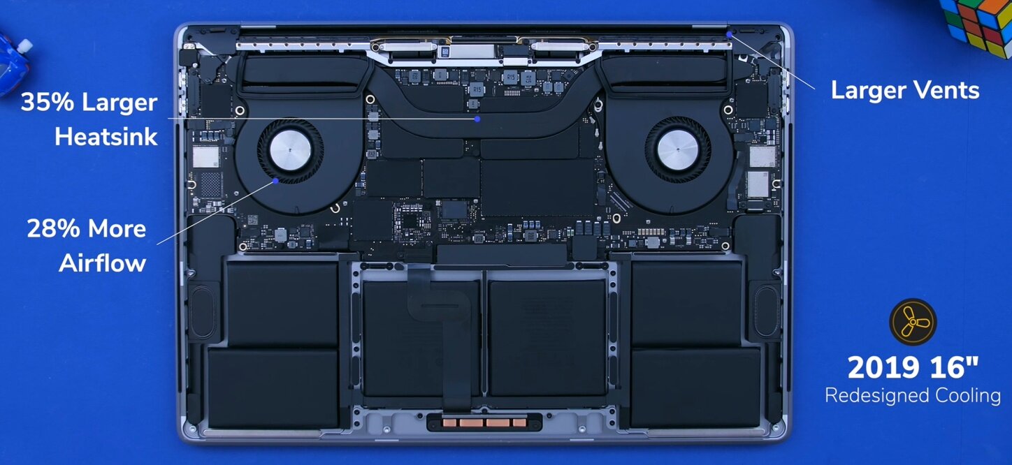
But spec wise and cooling wise, this is where we get the big improvements. The cooling system has been improved, as we now have larger vents. The heatsink is also 35% larger, so we now get 28% more airflow which is always great to see in a laptop. CPU wise we do have the exact same Intel 9th generation H series processors, that we got with the 2019 15” model back in May. So the Intel 9980HK CPU is the highest option that we have. This is an 8-core processor with a base clock of 2.4GHz, that can (in theory) turbo boost to 5GHz, but you’ll never see those speeds in a laptop, but rather around 3GHz or so for both the 2019 15” and the new 16”. The 16” will actually achieve slightly better performance, thanks to the improved cooling.

A tear-down showing the improved cooling system

A tear-down showing the improved cooling system

But really, the big difference here is in terms of the GPU. The Vega 20 GPU that we got with the November 2018 MacBook Pro’s was a gigantic upgrade over the Polaris graphics, so the 460, 560 and 560X that we had before, and now we get AMD”s brand new RDNA/Navi architecture which is an even bigger bump, over the Vega 20. So if you’re into motion graphics, video editing, game development or pretty much everything that requires a high end GPU, then this is a pretty massive upgrade. 

So overall, I’m quite happy with what Apple has done with this MacBook Pro. It fixed all the major issues and complaints that users had, such as the keyboard, the cooling and the GPU performance, while also adding things such as a larger display, thinner bezels, improved microphones, improved speakers and even an improved battery life with up to 11 hours now, up from the standard 10 hours that MacBooks used to get.

However, I’m not sure if this is a new generation. I say this because it doesn’t feel like one, but rather a “fixed” 15” MacBook Pro. And while it is heavier and thicker and more difficult to carry around, I do honestly think that for creators, that trade-off is well well worth it.

So there are my first impressions of this device. This was not my full review by any means, that’s coming in around a month or so, once I get to spend more time with this, so that’s going to be crazy detailed with video editing tests, thermals and everything you need to know.

THIS is the Samsung Galaxy Fold 2!


Samsung is leading the innovation game when it comes to smartphones right now. The Galaxy Fold was one of the most innovative smartphones of the past 10 years, I’d actually go as far as to say that the Galaxy Fold is the most innovative smartphone since the iPhone came out back in 2007.

This is the first actual foldable phone, that came from a major smartphone manufacturer. A phone that’s technically a tablet and then folds in half into something that’s much more portable. Now, yes the Huawei Mate X is in many ways even more innovative but that’s not out just yet, so Samsung Galaxy Fold was and still is one of the most unique phones to ever see the light of day.

In fact, Samsung’s already working on the second generation Fold, the Fold 2 for a release in 2020, so get those snacks ready and here’s everything we know so far, about the Fold 2!


Ok, so the first Galaxy Fold was not a flawless product. It was first teased at Samsung’s Developers Conference, back in November 2018 and back then, we couldn’t really see much.

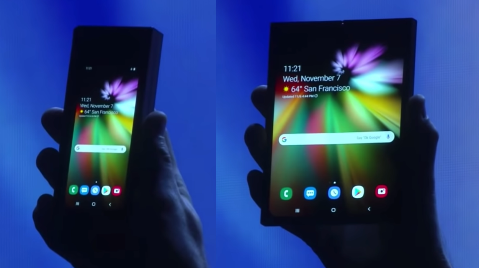
When it was first shown off, the design of the Fold was hard to determine thanks to the darkened stage

When it was first shown off, the design of the Fold was hard to determine thanks to the darkened stage

All that Samsung showed us was a phone that had a very small outer display that unfolded into a larger tablet. The issue with it was that you couldn’t really see anything in terms of its design, since I believe the Fold was in a case and the scene was made dark on purpose, so that you couldn’t really tell what Samsung’s new innovative phone was.

But this was something that was leaked and rumoured and hyped so much! We even made videos on this back in 2017, on the Foldable Galaxy X, and back then our concepts weren’t that great, but I think we’ve evolved a ton since. 

Anyway, a few months later and in February 2019, the  Fold was officially unveiled by Samsung. Full design, full specs and shortly after, reviewers have gotten their hands on it and they found out that it broke extremely easily. You see, since the display was made out of plastic, any dust or debris that got under the display, killed it off instantly. So Samsung cancelled the release, in order to redesign the Fold and they’ve made a few tweaks, they’ve tested it thoroughly and finally re-released it in September 2019, almost an entire year since the November 2018 tease. 

And the reviews have now been quite positive.  I mean, you could literally kill the display with your fingernail, since the display was still made out of plastic, but at least it now as more difficult for dust and debris to get under the display. This is thanks to that screen-protector layer that a lot of reviewers ended up removing, now being attached under the frame of the phone.

So so far so good, but now we’re in November 2019, just in time for Samsung’s 2019 Developers Conference and they’ve actually released a video titled “A New Form Factor for Foldable Smartphones”. This video is pretty much pointing at the next thing to come after the Galaxy Fold. The video starts with the Galaxy Fold but then they increase the display size and turn it into what looks to be a similar to our Galaxy S11 concept, where we have that very tall 20:9 aspect ratio display and just a central camera cutout. But what’s really interesting about this folding phone is that instead of folding horizontally like the Galaxy Fold does, it actually folds vertically. 

But probably one of the biggest differences is that instead of being a foldable tablet that folds into a phone, this is essentially a regular phone that folds in half, like those old clam shell phones did back in the days of OG cellphones. Now, this is a pretty interesting approach, because I personally find foldable tablets to more way more useful than foldable phones. I mean what would the point of the Fold 2 be, if it’s just a regular smartphone that folds in half? I guess the fact that you can hang up on phone-calls in a really cool way but aside from that, a foldable phone is actually worse from a functional standpoint than a non foldable phone. The reason I say this is because when you fold it in half, whilst you do decrease the height of it by half, but you also increase the thickness of it by two. So rather than having a long thin sheet of metal in your pocket, you would have a short and fat piece of meal and I’m personally not into that. 

However, it seems like there might just be a market for these types of devices.

The new Moto Razr of 2019 (Source: TechRadar)

The new Moto Razr of 2019 (Source: TechRadar)

Do you guys remember the famous Motorola Razr phone? That iconic clam shell smartphone that had a colour display on the back and an extremely thin form factor, for its time at least back in 2005. I never had one myself but I was in middle school back then and one classmate had one and I was always so interested in it, but my parents couldn’t afford buying me one so I never had one. This was back when Motorola was one of the best and most popular cell phone manufacturers. 

Well last week Motorola unveiled the new Moto Razr 2019 which is still a clam shell phone but with a more modern twist to it. So it now has a full-screen display and that’s the one that also folds now, pretty nuts when you realise how far we’ve come since. 

In my opinion, the Moto Razr 2019 is very close to what the Galaxy Fold 2 will look like. It will be a clamshell style foldable phone, rather than a foldable tablet like the Fold 1 was. However I actually do believe that this Fold 2 will not be called Fold 2 and instead something else. The Fold E or something along those lines. The reason for this is mainly because if you look back at Samsung’s teaser video, towards the end, they show both the Galaxy Fold 1 and the unreleased one as well, making me think that it won’t replace the current Fold but rather add onto the lineup.

I do think that this is a great choice! You see, by having two foldable devices, or even more if Samsung decides to expand on the lineup in the future, customers get even more choice at different price-levels as well. We all know that the Galaxy Fold is crazy expensive, at close to £2000 in the UK there’s not many people buying this. However, the Fold E or whatever this new fold will be called, should start at a much more reasonable price. The Moto Razr 2019 would cost $1500, compared to $2000 and even £2000 that the Galaxy Fold 1 costs. Therefore it would make a lot of sense for this Fold E to start from $1500 or so. 

News website, TheBell from South Korea which had some fairly good track record in the past when it comes to unreleased products, reports that the Galaxy Fold 2 is currently in development and uses the code name Bloom and that it will actually be released in April 2020.

And considering that the Fold that Samsung has teased looks pretty much identical to the S11 leaks, this could even be a variant of the S11. The S11 Fold? I think that’s a very plausible scenario, but that’s just my personal prediction but we’ll see if that turns out to be true.

Also the S11 event will be in late February, which will point to a March release for the S11, so April for the Fold E/S11 Fold doesn’t seem that unlikely either. 

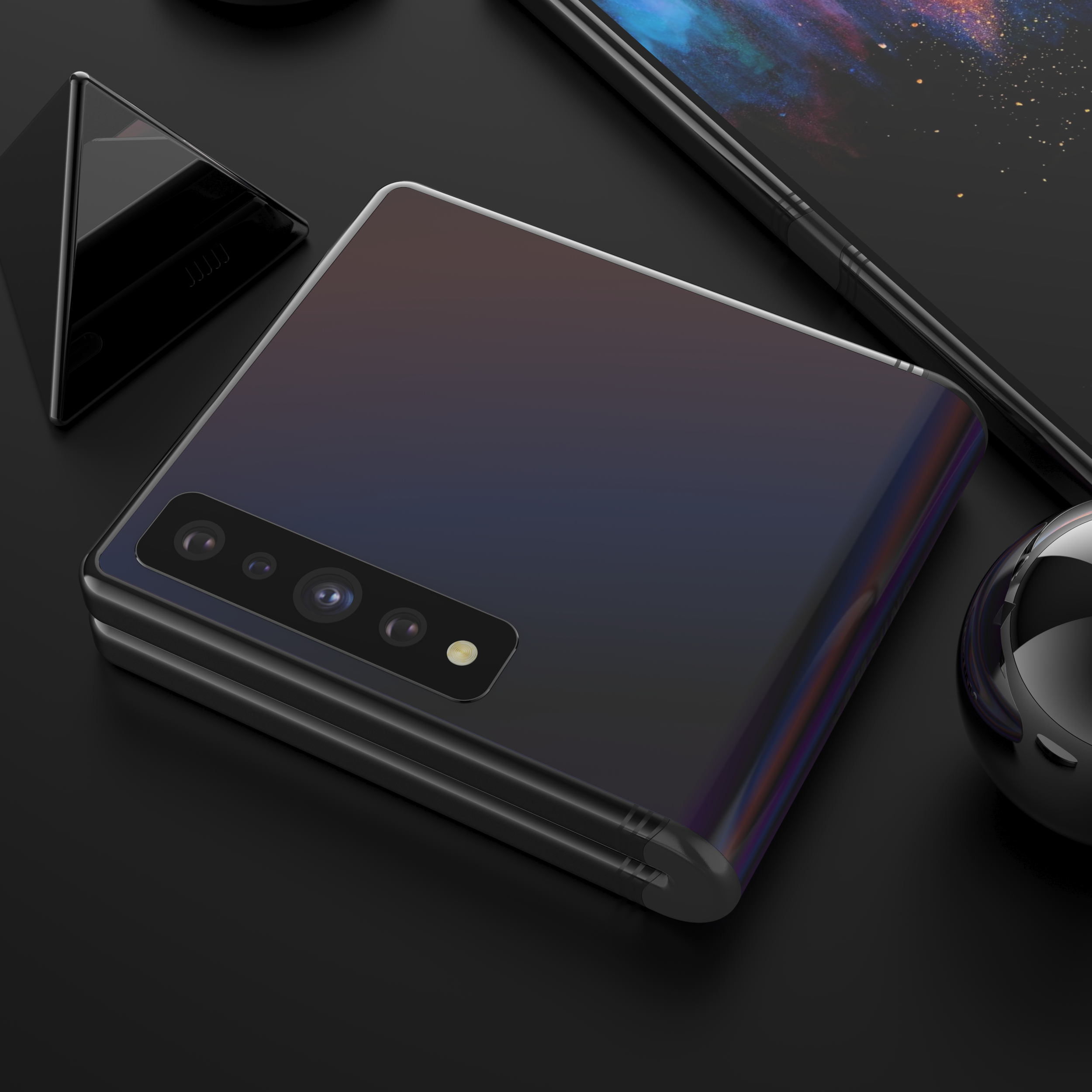
Our concept of the Galaxy Fold 2 showing the clam shell hinge idea

Our concept of the Galaxy Fold 2 showing the clam shell hinge idea

Now, we’ve actually made our very own concept of the Galaxy Fold 2, based on all the leaks that we’ve had and even one of Samsung’s patents that does shows a foldable clam shell style smartphone. We’ve based this off of the Galaxy S11+ design, that comes with a gigantic 6.9” display size, with that single camera cutout in the middle. We have new Quad-Camera module on the back, which now adds the brand new 108MP sensor, just like on the S11, and we’ve modelled the hinge in quite a unique way.

Rather than doing it like Samsung has done it with the Fold 1, we’ve done it in a similar way to how Motorola has done it with the 2019 Razr, where the mechanism is actually on the inside, and then it’s protected and sealed by this rubber hinge on the outside. This means that the phone still preserves its water and dust resistance, unlike the Fold 1 which lacked both of those. Also, this is the same style hinge that Samsung has in one of their Galaxy Fold patents that do show a smartphone that folds vertically. 

Now, comparing that design to the Moto Razr 2019, the Moto Razr does have a more usable design, as we do have another display on the back. Even though it’s a very small display, which is just being used for seeing incoming notifications and reading quick messages, at least you do have that. From the looks of it, the new version of the Galaxy Fold will not have any display on its back, however there are a few Samsung patents that do show this display folding both ways and that would be quite cool, being able to fold the fold on its back and have two mini-displays in this case. However, I dont see this having any major functionality for me at least, as I still prefer the idea of a foldable tablet, than a modern clam shell phone. 

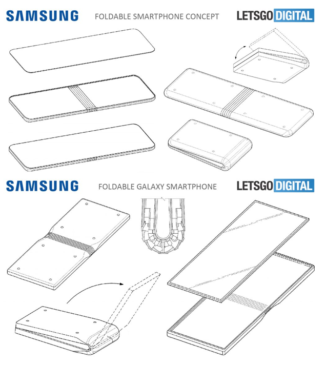
Now, interesting enough, there is a second patent that shows something completely different. This one was found by tech website LetsGoDigital and it shows what appears to be a foldable Galaxy Tab S rather than a Galaxy Fold 2. We have what looks to be a very big tablet sized display, with a fairly thick frame all across it, but I genuinely would pick this over the gigantic side notch that the Galaxy Fold 1 has, and we also seem to have a large display on the front to go with that.

The fold patents as seen on Letsgodigital (Source: Letsgodigital)

The fold patents as seen on Letsgodigital (Source: Letsgodigital)

We also have two more patents , also found by LetsGoDigital that show something similar to the Galaxy Fold 1. Just with a thinner notch, and even a massive display that would actually fold vertically, rather than having mostly the same functionality as the Fold 1 does. So judging by all of these patents, it seems like Samsung is experimenting with different approaches to folding phones. A foldable Galaxy S11, a foldable Galaxy Tab S, a Galaxy Fold that folds vertically and possibly some even more form factors that we haven’t yet seen leaked.

So I’m really looking forward to seeing more foldable devices. I do hope however that the industry doesn’t start making “cool” foldable phones like a clam shell phone is rather than truly useful foldable devices, like a foldable tablet would be.

This Laptop Has Two Displays - The ASUS ZenBook Duo!


So every few years we get one product that changes everything! We saw it back in 2007 when the first iPhone launched, we saw it back when Ultrabooks started becoming a mainstream and we’ve also seen it when 2-in-1 laptops that were both a tablet and a laptop started appearing and now it’s that time again!

So, I’m very excited to show you what ASUS believes is the future of laptops, and I actually think they’re right. I think that this is indeed where laptops are heading towards, because you see this is a brand new generation of laptops! 

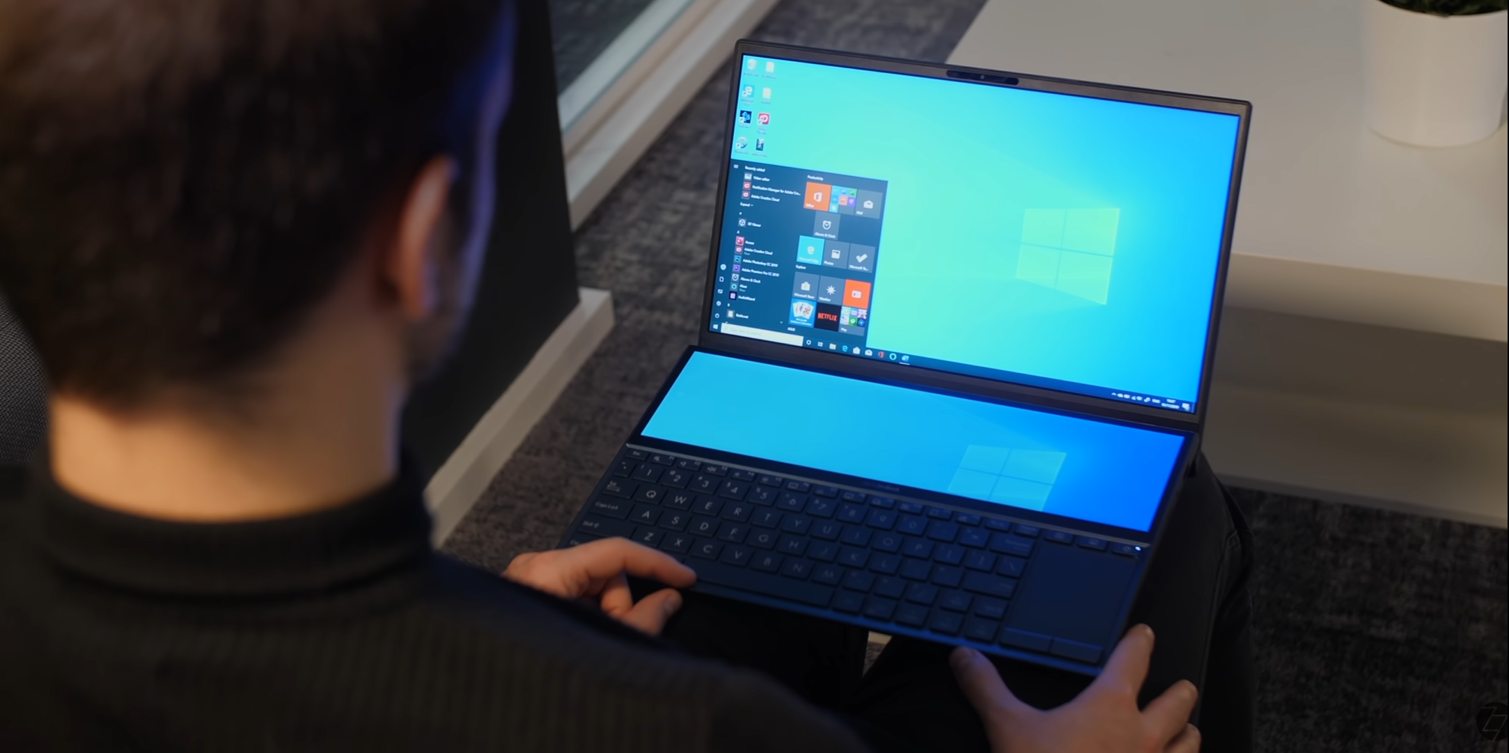
Let me introduce to you the ASUS ZenBook Duo! This laptop not only has Intel’s latest 10th generation processors but it also comes with two displays, Pen support, dedicated Nvidia graphics,an insane twenty two hour battery life and so much more! 

Also, the ZenBook Duo is actually a brand-new product that just came out, so it’s not to be confused with the ZenBook Pro Duo, which is its larger brother. The ZenBook Duo is smaller, more portable but it still comes with two displays making this the best laptop for productivity that you can easily take with you on the go, so huge thanks to ASUS for not only sending over the ASUS ZenBook Duo but also sponsoring this project!

So now, let’s take a look at what makes this laptop so special!


DUAL DISPLAYS

This is by far the main feature of this laptop, I mean it is literally in the name. 

But you see, what’s really unique about ASUS’s implementation of this secondary display is that instead of this display being sort of like a control panel for your laptop, like some other manufacturers have tried and failed, it literally is a secondary display. What I mean by this is that Windows itself sees this as a secondary monitor which means that you can do all sorts of things with it. You can drag and drop windows from the main display onto the secondary, in fact ASUS even added a dedicated button on the keyboard, so that you can easily snap an app directly on the secondary display and full-screen it at the same time. But you can also use this in extended or mirror mode. 

The second screen can be used as a place to put your colour grading tools when editing

The second screen can be used as a place to put your colour grading tools when editing

And there’s so many use cases for this display! You can use it when you’re video editing, and have your colour grading tools right there, if you’re a gamer you can have your chat boxes and discord on the secondary display, while having the game on the main screen. But probably my favourite part is that you can even merge the displays and have one massive continuous display with you anywhere you go! That’s amazing! 

But wait, there’s more! The secondary display is also a touchscreen, meaning that you can now comfortably navigate your browser tabs with just a swipe of a finger! The main display is not a touchscreen panel, but for me at least, I’m perfectly fine with that. I always find it very uncomfortable holding my arm up and using a touchscreen laptop. However, if that display is sitting flat, like the secondary display sits, it’s much more comfortable to use, as I’m not straining my arm. 

Furthermore the ASUS ZenBook Duo also supports Pen input on the secondary display, meaning that if you’re a graphic designer or someone that uses Photoshop a lot for their work, the ZenBook Duo will make your life so much easier.

There’s really not a single laptop on the market that can do this, have two displays in such as small and portable form factor.

The dual display makes for a truly unique laptop

The dual display makes for a truly unique laptop

The main display is also very good for photo and video work. It’s got 100% sRGB coverage, 1080p resolution, and you’ll see why this matters once we get to the battery life section of this video. However, my favourite part about this display is just how thin the bezels are. We have a 90% screen-to-body ratio so add this to the dual display and this looks like a laptop that truly came from the future! 

We also get FaceUnlock thanks to the built-in Windows Hello support which is made possible by the Infrared Cameras that ASUS mange to include into this very slim bezel. 

PERFORMANCE

The second feature that makes this laptop so unique, is the performance.

So, the ZenBook Pro Duo (the larger sibling of the ZenBook Duo) is pretty much a beast! That one comes with the Intel i9 9980HK, which has a 45W 8-core processor, 32GB of 2666MHz RAM, the RTX 2060, up to 1TB of PCIe flash storage and a 15.6” 4K OLED panel. But whilst it is a monster of a machine, it’s also bigger, heavier and thicker. The ASUS ZenBook Duo is not as powerful as the ZenBook Pro Duo, but it is much more portable, thinner and lighter. 

However, what surprises me is that we still get very good specs on this! You get the Intel 10th generation i7 10510U processor, which is a 15W Quad-Core CPU that can turbo up to 4.9GHz. We get 16GB of 2133MHz LPDDR3 RAM, up to 1TB of PCIe flash storage and the Nvidia MX250 graphics card. So while this isn’t as powerful as it’s bigger brother, for a 14” laptop that you can very easily take anywhere with you, having Intel’s latest U-series i7 chip, and a dedicated GPU, and two displays is just something unheard of before! 

By design the ASUS ZenBook Duo lifts its keyboard up to not only allow for better cooling but also ergonomics

By design the ASUS ZenBook Duo lifts its keyboard up to not only allow for better cooling but also ergonomics

Something that I really like about the design of the ZenBook Duo is how it also helps cool down the entire unit. So when you open up the lid the hinge actual raises the laptop close to 2cm from your desk, meaning that airflow would be just perfect on this, when you’re doing anything intensive such as gaming or rendering a video. Not only that but this hinge also puts the keyboard at an angle and the typing experience on this is actually very good. The keys have enough travel to make them easy to see even when you’re in the dark. They’re actually back-lit too by the way, and I personally like the track-pad on the right.It makes much more sense to have it there, since that’s how you use a mouse, so overall the performance, the ergonomics, and the usability of this laptop have impressed me more than any other laptop has yet.

Now, while the ZenBook Duo is not made with high end gaming in mind, you can actually play most games at 1080p on Medium settings and get 30-60fps, or even higher in some cases. So if you’re into more casual gaming the ZenBook Duo can easily handle that.

And performance in Adobe Premiere or Photoshop is great on this laptop. It can handle 4K footage in Premiere quite easily, and Photoshop on this, like I said before with the Pencil especially, is a experience you cannot really have on any other laptop, unless you have the ZenBook Pro Duo of course.


BATTERY LIFE

Now, all that performance and all those features would mean nothing on the go, if the battery life isn’t great. Now, I’m not sure how ASUS did it but it’s actually very good!

ASUS claims up to twenty two hours of battery life on this or two full days of work, but that’s only if you keep the secondary display off and keep the display brightness to just 150 nits. In a more realistic scenario you should expect around eight-ten hours of battery life at least! 

In my case, the first day I got it I fully charged it and then started installing apps on it, windows updates, games etc, and those apps were literally installing over night and the next evening, the battery was at 42% and the ZenBook Duo still had about 6 hours left.

So that’s very impressive! Of course overnight the displays were both off and the ZenBook was installing everything in the background, but still, I’m very impressed with the battery life. Even when I was using it with both displays on, the battery was still barely even dropping, whereas something like my MacBook Pro would’ve long been dead. What really helps here is that 1080p display. If we were to have a 4K panel on this, then the battery life would've been severely impacted. 


CONNECTIVITY

Now when it comes to connectivity, we not only do we get the latest Bluetooth 5.0 on this, but we also get WiFI 6, or 802.11ax, which is the next generation of WiFi, with speeds up to 9.6Gb/s. However, whats more important about this is that if you have a WiFi 6 router, and more WiFi 6 devices on your network, they will manage themselves much better than they could on WiFi 5. This means that if you have a fast connection, you will experience 0 slow-downs or traffic congestion on any of your devices. 

The selection of ports available on the ASUS ZenBook Duo

The selection of ports available on the ASUS ZenBook Duo

We also get a great selection of ports on this as well. We have the power input, a HDMI port, a USB type A which is actually USB 3.1 gen 2, and then a USB type C port which is also USB 3.1 gen 2 in terms of its speed. We then have another USB A port on the right, this one is 3.1 Gen 1, we then have the 3.5mm headphone jack, and we also get a microSD card slot, which I’m quite surprised to see as you don’t normally get this in laptops.

But since you can now easily find even 1TB microSD cards for quiet cheap, you can upgrade the storage very easily in this, or you can just use a microSD to SD Card adapter and use that card in your DSLR camera, meaning you could easily transfer your footage directly to your laptop.

I just wish that ASUS included a thunderbolt 3 port on this. It would’ve been the perfect laptop for me in that case, since I do need thunderbolt for work and thunderbolt also lets you connect an eGPU. However, if you really want this specific laptop design with a thunderbolt 3 port, then the ASUS ZenBook PRO Duo does actually have one. 

PORTABILITY

The last thing that makes this laptop so unique is just how portable it really is! At 1.5kg, this is very similar to the weight of other 13” Laptops out there.

But you see, I use two monitors at work, and whenever I’m travelling I find myself yearning for a second monitor, just because I find it much more productive to have two, and I’m very used to having two displays. Yes, you can connect a tablet to a laptop and have two displays that way, but you have to carry the tablet with you and it will also cost you a ton buying both a laptop and a tablet. 

So, to me at least, it seems like ASUS has found a solution to all those issues, and that solution is the ZenBook Duo a truly one of a kind laptop.

Samsung Galaxy S11 - FULL Leaks and Rumors!


The Samsung Galaxy S11 is coming out in just three months, so we’re not that far away for the official release, and luckily the S11 will actually be one of the biggest changes that Samsung has ever made to their products! 

We’re getting some gigantic camera improvements, the displays are getting even better, alongside some unique and exclusive features.

So get that popcorn ready and here’s everything we know so far about the S11, on the Design, Display, Camera, Performance, Special Features, Battery, Release Date & Price!


DESIGN

Ok, so starting off with the design, unlike Apple Samsung is actually updates the design of their phones, every single year.

The big redesign is usually every two years, but we still get some small changes with every new generation. For example the S6 was the first Galaxy S smartphone that came with a premium build of glass on the front and back, and a metal frame. The S7 was a more refined version of the S6, the S8 had a brand new design, the S9 was a more refined version of the S8’s design with slightly thinner bezels, and the S10 was a brand new design once again. Therefore it makes sense for the S11 to be a more refined version of the S10, rather than a completely new design.

IceUniverse reported on the 27th of October that the design and configuration of the Galaxy S11 has been finalised and the leak season will now begin. 

BenGeskin’s S11 renders (Back) compared to the S10’s (Front)

BenGeskin’s S11 renders (Back) compared to the S10’s (Front)

BenGeskin posted a render of how the S11’s will compare to the S10, and as you can see, they’re taller than the S10’s and all of them have a single central camera module now, rather than the module to the right, that the S10’s had, and the dual camera module to the right that the S10+ had.

In terms of the models there will be three S11’s. So just like with the S10’s we would have the S11e, the S11 and the S11+. MySmartPrice reports, based on information received by leakster Ishan Agarwal, that the S11 and S11+ will come in Black, Grey and Blue, while the S11e will come in Blue, Grey and Pink. These are some very interesting choices. I’m quite surprised to see Samsung remove White from their offering, as White and Black have always been the default colours. Grey would probably be the one that would be the equivalent to the White colour the most. So I’m guessing that it would have some sort of shine to it, similar to the back colours of the Note 10, where if you look at it from an angle, it would turn into a different colour. I personally believe that all the colours on the S11’s would come with that glowing shimmer effect that changes based on how the light hits it. 

But that’s pretty much it when it comes to the design. We’ll have a very similar look to the S10’s, just longer, with a central camera module and no more headphone jack, but a 2nd speaker grill on the bottom instead. The microSD card slot will still be there as well.


DISPLAY

Moving on to the display, EvLeaks, one of the original leakers has posted some details about these.

Apparently, the S11e will come with a 6.4” display, the S11 will come with a 6.7” display, while the S11+ will come with a gigantic 6.9” panel. Now these are actually a very big jump from the S10’s, that came with a 5.8” in the case of the S10e, a 6.1” display in the case of the S10, and a 6.4” display in the case of the S10+. So it seems like the smallest S11, the S11e, will actually be bigger than the S10+.

Our renders of the S11 showing the new screen sizes

Our renders of the S11 showing the new screen sizes

Now, there are a few contradictory reports on the S11e’s display size, where some reports are saying that it will come with a 6.4” display, and some are saying that it would be a 6.2”. Evleaks even mentioned that himself. My guess is that it will be a 6.2” panel, otherwise the jump in the display size would be just too dramatic and people who just preferred having a smaller display, would be out of luck if that’s the case.

Now, the good news is that the phones will not be getting any wider, instead they will be getting taller. Luckily Samsung’s OneUI is actually optimised for one finger use, and having all the UI elements accessible from the middle of the display will help in making these gigantic S11 phones more easily usable. 

Now, because of that taller display, we will also be getting a wider aspect ratio of 20:9 compared to 19:9 which was what we had on the S10 and the Note 10. It won’t be as wide as the Sony Xperia 1, which has a 21:9 aspect ratio, but it will be close. This will make it much better for watching wide aspect ratio videos and movies, so I wouldn’t be surprised if Samsung launches their own Galaxy Movies store or something along those lines. 

The patent granted to Samsung for SAMOLED found by LetsGoDigital

The patent granted to Samsung for SAMOLED found by LetsGoDigital

But regardless of that, Samsung will very likely call this display AMOLED Cinema or something along those lines. Now, LetsGoDigital actually found a patent that Samsung had just been granted this week, on a display called SAMOLED. Samsung already has their Super AMOLED branding, so this could either be a new branding, or it could just be Samsung next generation of displays. We’ve seen the current generation being introduced with the S10, and this generation featured a much higher brightness of over 1000 nits alongside a physical cutout in their display, for the camera module. The Note 10+ featured the Samsung generation of AMOLED panel that the S10 had and even the iPhone 11 Pro’s had the exact same panel.

Now, EvLeaks has also stated that all three models will have curved-edge displays, unlike the S10e from last year which was the only one with a flat panel. And the bezels are also getting thinner this year, even thinner than the ones we had on the S10. The S11e will probably have thicker bezels, at least when it comes to the top and the bottom ones, just so that it looks more inferior to the S11’s considering the lower price that the S11e will have. 

CAMERA

Now, when it comes to the camera this is actually where the biggest change will be. 

In our Samsung Galaxy Note 10+ Review, I did mention an interesting fact that not a lot of people seem to have been aware of, which was that the fact that Samsung has actually had the exact same sensor specs, since the Galaxy S7. Yes, Samsung did indeed have the switchable aperture with the S9, and the dual and triple lens camera module with the S9 and the S10, but the main module has actually remained the same since the S7 from 2016.

The headline from Samsung’s Newsroom reporting the 108MP sensor (Source: Samsung)

The headline from Samsung’s Newsroom reporting the 108MP sensor (Source: Samsung)

However, in August 2019, Samsung has unveiled their brand new 108MP smartphone sensor which is actually a very big deal. Not only does this have some insanely high level of detail with nine times more resolution than the current 12MP sensor, but the sensor itself it 1.91cm In size, compared to the 1cm sensor that we had before. So this sensor is almost twice the size of the current one and it does need to be bigger, because otherwise the pixels would be so small in that 108MP sensor, that low light shots would look unusable. 

This is actually pretty much confirmed at this point. XDA developers have even found code in the OneUI 2.0 beta, specifically in the Samsung camera app itself that shows support for a resolution of 12000x9000 photos, or 108MP photos if you do the math, and also support for that 20:9 aspect ratio that I was talking about before.

Now the only question that remains is, is Samsung going to use this 108MP module as the main module, or are they going to use it as a secondary module? Well, realistically they will probably use it as the main module, but I’m keeping my hopes high that Samsung will actually just use it as a secondary module and still keep a 12MP main module for low light shots. I only say this because the 108MP sensor will be noticeably worse in low light than even the Galaxy S7, unless of course Samsung does some magic in software and they release a new night mode, specifically designed for this new 108MP sensor. 

Our concept showing the 108MP sensor integrated into the 4 camera module set up

Our concept showing the 108MP sensor integrated into the 4 camera module set up

On our concept, we actually added the 108MP module as an extra module, meaning we’d have four modules; the 12MP night mode module, the zoom module, the wide angle module, and the 108MP module

Also, just so that you’re aware, you won’t be taking 108MP photos with this camera. You will very likely be able to do that in the Pro-Mode, but regular shots will just use that massive sensor to capture more detail and the final image would still be around 12-16MP. Otherwise, taking 108MP photos will just murder your storage. 

But apart from that, now would also be a really good time for Samsung to add 6K or even 8K video recording to this, as the CPU does indeed support that. This would definitely the biggest camera change that we’ve ever had in a Samsung phone.

And we have seen some reports that the zoom capabilities would be greatly improved as well, with possibly a 3x optical zoom camera from the 2, and the remaining zoom would be achieved with that 108MP sensor, which means you will have around a 10X lossless zoom and even up to 30-50X with digital zoom, so very similar to what Huawei did with the P30 Pro.

When it comes to the Front Camera, if you’re worried about the lack of a depth sensor that the S10+ had, you don’t need to worry about that, since the Note 10+ had pretty much the same quality front portrait mode shots as the S10+ did, with just a single camera.


PERFORMANCE

Now, when it comes to the Performance, same as before, we’ll be getting two different CPU modules.

The US & Canada variants will come with the new Snapdragon 865, while the International models will come with the Exynos 990.

The Snapdragon 865 hasn’t been officially unveiled just yet, it’s expected to be unveiled in early December, but according to the leaks the CPU performance will be increased by 20%, while the GPU will get a 17% to 20% bump from the 855, so that’s an even smaller jump from the 855+.

The Exynos 990 is essentially the 9830, just with a different name. Now this one has been officially unveiled and it does support up to a 108MP camera, up to 8K30 video recording, as well as LPDDR5 memory. 

Now, Samsung will be dropping their custom Exynos cores from future Exynos processors, but that’s a story for a whole different article.

RAM wise, 12MP of RAM is pretty much what the S11+ will come with and then 8GB and 6GB are expected on the S11 and S11e.

SPECIAL FEATURES

So aside from the camera and display, there’s not a lot else in terms of special features.

We are getting 5G once again and EvLeaks reports that the S11e and S11 will come in both 4G and 5G variants, while the S11+ will only come with 5G. This means that the S11+ will be one crazy expensive phone.

The headphone jack is likely to be removed from the S11, but that will mean an extra speaker grill

The headphone jack is likely to be removed from the S11, but that will mean an extra speaker grill

The headphone jack is being removed, just like on the Note 10. Unfortunately, with the Note 10, we didn’t get any headphone jack adapter in the box. I really do hope that Samsung does include one with the S11, especially since the Galaxy S series is more popular. Otherwise, you’ll have to buy a separate adapter yourself, or stick to wireless headphones. Speaking of wireless headphones, Ishan Agarwal reported for mysmartprice that the Galaxy Buds 2, with the codename R175, are in development and that they will come in Blue, Pink, Black and White. I do hope that Samsung adds Active Noise cancellation to the Galaxy Buds 2, so that they can compete with the AirPods Pro’s, fingers crossed that they also keep the same price, in that case they would be by far the best wireless headphones on the market. 

Even if we do lose the headphone jack, we do get an extra speaker grill, so the sound quality would be further improved with the S11.

And finally we haven’t included this in our concept but the S11’s will very likely feature the same TOF depth sensor on the back, just like the Note 10+ did. This is for improving the portrait mode photography with the back camera and for AR.


BATTERY

The battery likely for the new S11 (Source: SafetyKorea)

The battery likely for the new S11 (Source: SafetyKorea)

It does seem like we would be getting some very big improvements to the battery. GalaxyClub found a listing on SafetyKorea of a few unreleased Samsung smartphone batteries, and they have the model number ‘EB-GB980ABY L’, which could really be any Samsung phone to be honest. However, when you consider the S10 model numbers, these were SM-G970, 973 and 975. So it would make a lot of sense for the S11e’s model number to be SM-G980, and in that case this battery leak would be for the S11e.

And this appears to be a 4000mAh battery, which would be a gigantic leap from the 3100mAh battery that the S10e had, which means that the S11+ should approach 5000mAh. 

Now another improvement that’s we’ll see here is the SuperFast charge that the Note 10 got. The 45W fast charging which is the fastest fast charge on any smartphone to date.


RELEASE DATE

In regards to the release date, the unveil would be as usual in Mid-Late February, while the delivery and the in-store release would be in early March. This has been confirmed by EvLeaks as well.

PRICE

And finally, when it comes to the price, these would not be cheap phones by any means. 

The S11+ should cost around the same as the Note 10+ does now, so $1100 if not even $1200. While the S11 should be around the same price as the S10+, so $999 and the S11e should be around $650, $100 more than what the S10e costs. The prices haven’t been leaked, these are my personal predictions based on what Samsung has priced their phones in the past. 

So if you don’t care about the camera that much, and you don’t need that insane new 108MP sensor, then picking up an S10 or an S10+ is actually a very good idea. They have the same design, mostly the same display and an even smaller form factor. 

PlayStation 5 (2020) - FULL Controller LEAKED!


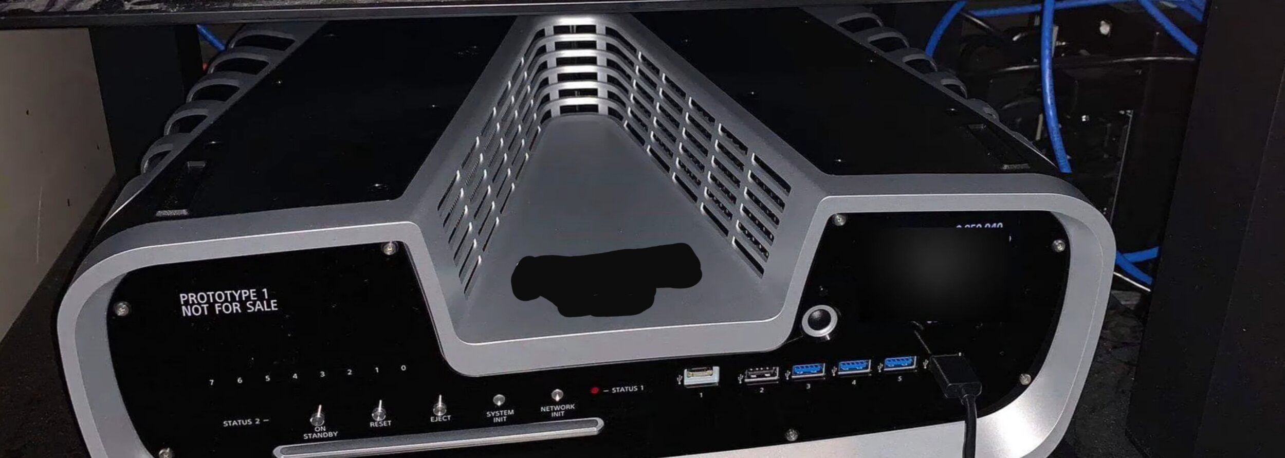
Our last PS5 video was quite a special one, because you see we got our hands on the world’s first actual photo of the PlayStation 5 dev kit! Our video actually got picked up by quite a lot of tech websites, which never really happened before, at least not to the same scale so thank you all for your support!

But now, get those snacks ready and here’s the video and article that I promised you, focused just on the PlayStation 5 controller!

If you’re a gamer then you’ll definitely enjoy this article. And if you’re not a gamer well, keep reading anyway because the PS5 will indeed be a truly revolutionary device, not just for playing the most graphically advanced games, but also for watching 4K and even 8K movies.


When playing a game there are three very important parts of every game, in my opinion at least.

1. The Story

2. How that story is being played?

3. What the story is being played with?

Now personally, I’ve always preferred a gaming controller to a mouse and keyboard. Yes a mouse is more accurate, but a controller is much more comfortable and you get motion controllers, vibrations and even touch input, all of which immerse you so much more in the game, than a regular mouse and keyboard can.

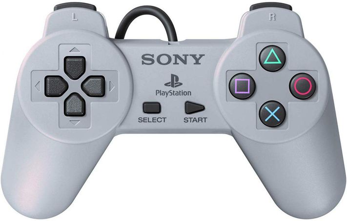
The 1st PS1 controller, the original DualShock was one of the most iconic controllers to ever be released. It had dual joysticks, symmetrical buttons which I’ve always preferred, and vibration feedback, which back in 1997 was a huge deal. 

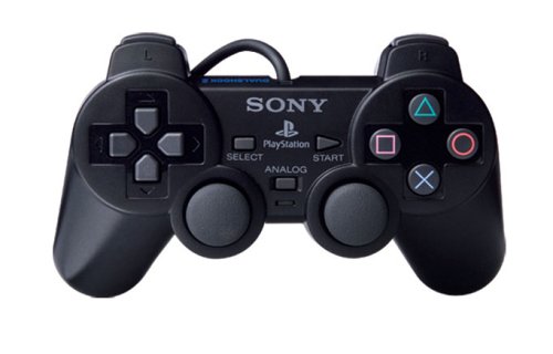
The DualShock 2 which was released with the PlayStation 2 back in 2000, wasn’t really that big of an upgrade. It had pretty much the same style design, just a bit slimmer, a bit lighter, and came in black but all the main buttons were actually pressure sensitive. So the more you pressed the triggers for example, the faster your car would start driving and things like that.

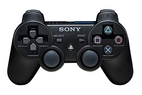
Then came with the DualShock 3 with the PlayStation 3. With this we got the first big change in a Sony controller. You see this was Sony’s first fully wireless controller, it featured 6-axis motion sensing which was basically a gyroscope that could sense the direction and the orientation that you held the controller at. With this you could play certain games that way and even use the controller itself as a racing wheel, really cool stuff! It also featured a miniUSB port for charging and connecting it to other devices, such as the PSP or even a full PC by using some 3rd party apps!

And then in 2013, when the PlayStation 4 was released, we got an even bigger update to Sony’s line of game controllers, the DualShock 4. Not only did the DualShock 4 feature the 1st big design change in a Sony controller, but it also came with a ton of major features.

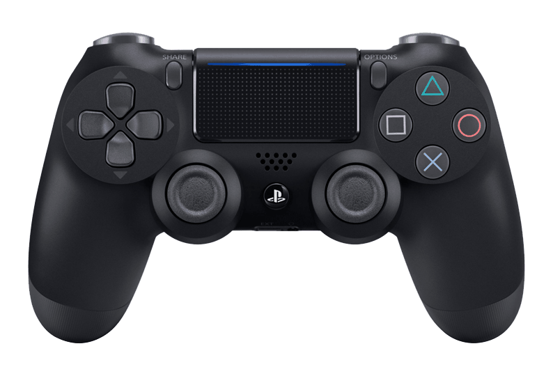
The start and select buttons were replaced with Options and Share. We also got a built-in speaker for some sound effects that the controller would play for when let’s say, you were reloading a gun. We also got an actual touch-pad on the controller, which would not only be used in games but also in the web browser as a mouse and it was also it’s own pressable button. We got redesigned joysticks that were now concave rather than convex. It came with a massive light bar on the back for not only giving you a visual feedback of what was happening in your game, if the light went red for example, you would know that your health has reached a critical point, but that light was also used for 3D depth tracking for the PlayStation Camera and the PlayStation VR headset which was released later on. We got a microUSB port from the miniUSB that we had before, and we even got something that was by far my favourite feature, a 3.5mm headphone jack! Yes, you could now plug in any headphones that you wanted directly into the controller itself! How amazing was that? 

So yes, the PS4 controller, the DualShock 4, was the biggest change ever that Sony had made. So now what do we know when it comes to the DualShock 5, the PS5’s controller?

Well, we’ve actually had a few leaked images that give us a glimpse at the PS5 controller.

This first one was posted by Ray Sekiro on Twitter and this one shows a very weird looking controller.

The leaked PS5 controller (Source: Ray Sekiro)

The leaked PS5 controller (Source: Ray Sekiro)

Probably the first two things that you’ve noticed are the weird indented shape on the bottom, as well as the integrated display panel. But there’s quite a few more things that do stand out. The directional arrow keys on the left have now been redesigned. They’re slimmer, a bit taller and the arrow symbols are now on the inside of the keys, rather than on the outside. The PlayStation square, circle, triangle and X buttons seem to be the same as before, maybe a bit more raised, but it’s quite hard to tell from this image. The Share and Options buttons are now horizontal, rather than vertical and it seems like we also have two instead of just one speaker grills on each side of the display. And I’m not sure how well you can see this but the L1 and R1 buttons seem to have been redesigned as well and they’re much larger now. It also appears that the 3.5mm headphone jack and the proprietary connector or at least a USB type C port seem to be located on the bottom of the controller, just like on the PS4 one. 

Now let’s talk about the two elephants in the room. The Display and the Shape of this controller.

So when it comes to the display, the whole idea behind it is for it to be an upgrade to the touch panel that we had with the PS4 Controller. Personally I can definitely see this happening. That display would allow you to see certain elements of a game, such as the inventory or the in-game party or chat. I do think that that would be a very useful thing to have, since at the moment if you want to chat with your friends via text, you would connect your phone to the PlayStation, but that does take some time and typing using the joystick is just a nightmare. So something like this would speed up the typing process by a lot.

The only question is, what impact will this have on the battery life? Well it should have quite a significant one. Considering that the PS4 controller is pretty well known for a not so great battery life, I don’t think things are looking that great for the PS5 controller.

The Nintendo Switch Pro has the best battery life on a controller on the market

The Nintendo Switch Pro has the best battery life on a controller on the market

However, if you look at the Nintendo Switch Pro controller, that is by far the best controller on the market when it comes to battery life right on par with the Xbox One Elite 2 controller, both offering a staggering 40 hour battery life.

But even 10 hours would be enough, as long as Sony managed to add everything that they want in this controller, and I would say that that’s perfectly doable. Especially considering that the PS4 controller uses Bluetooth 2.1 and nowadays we have Bluetooth 5.0 which is significantly more power efficient. Add this to more efficient batteries and chips and I would say that 10 hours with that included display is doable.

Now when it comes to the shape, yes it does look to be extremely uncomfortable judging by how the bottom bit is lower than the top portion. I could be wrong, but I would need to hold it in my hand to see for myself how comfortable it really is.

However, something that you should keep in mind is that this is not the final version of the PS5 controller. No, this is very likely a DevKit controller that would work alongside the developers kit that I showed you guys exclusively in a previous video. So make sure you watch that one, in case you want to learn more about the actual PlayStation 5, as this is mostly about the controller itself.

So the final version will be more polished, with a thinner design, and possibly without that indented part towards the bottom. 

Now, when I first saw that image, I did consider the fact that it might be a very well done render. However, I don’t think this is the case for two reasons.

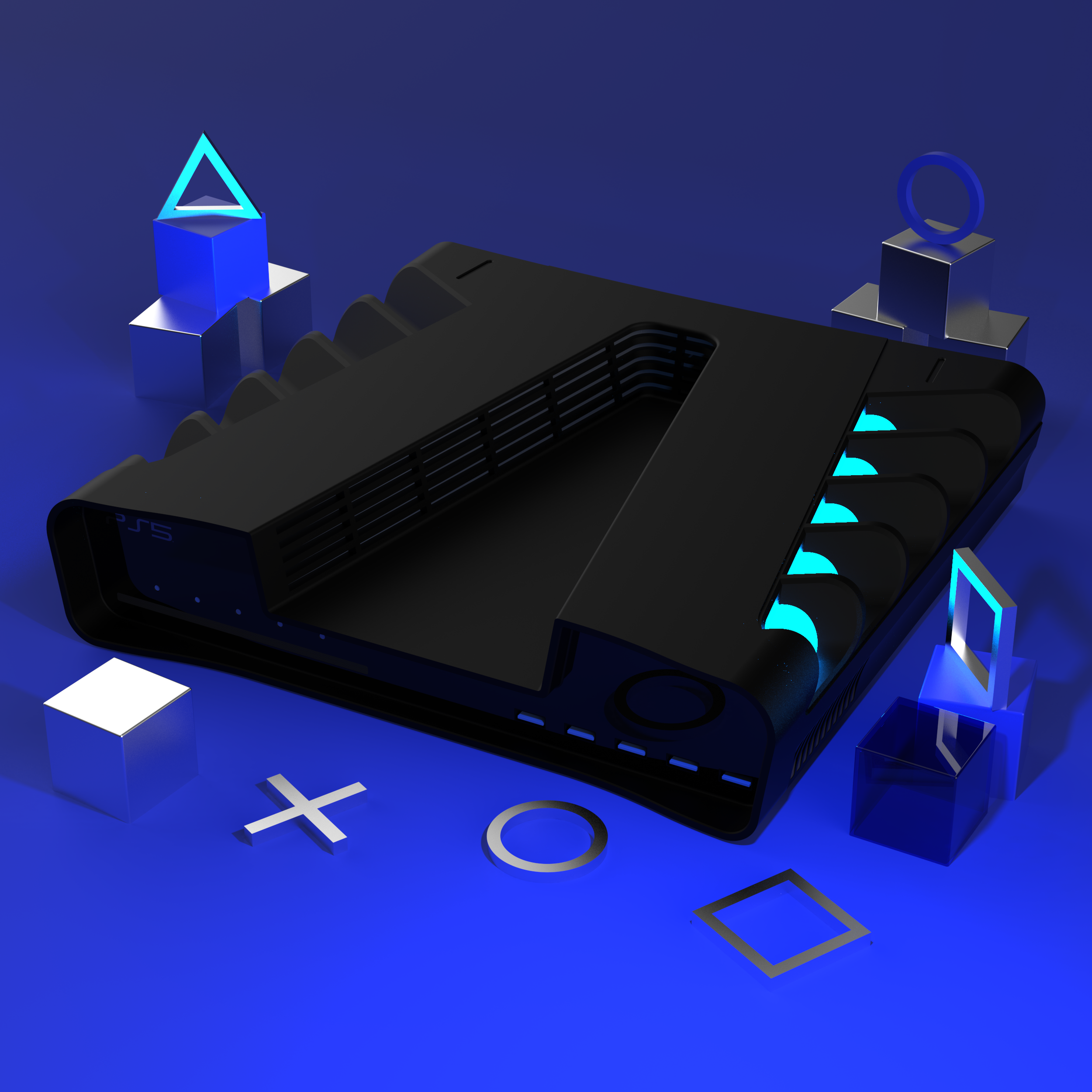
The first one being that we make 3D renders here at ZONEofTECH as well, like the PS5 one that you’ve seen. That was very well done and it’s also an extremely difficult shape to do, so if the controller image is a render, it’s probably the best one that I’ve seen.

Secondly, there were actually multiple leaked photo of this controller, from many other sources and they all look the same. Twitter user Tidux posted an image that shows this PS5 controller, and we have another image that was posted on Reddit, that again shows the same controller from a different angle. The image has been taken down from Reddit but you can see it on hothardware.com here.

Now they could all be renders made by the same person that decided to share it with random people but I don’t think that’s the case. If we take a look at an actual photo of a real PlayStation 4 dev kit controller, you can see that even this one had that big, thick and chunky form factor, and we all know how much thinner and sleeker it got with the final unit. However, the main characteristic of the controller still remained. Things like the overall design from the front, the button layout, the touch bar and even the light bar. Even though it did look more squared off in the dev-kit model.

Now we have actually made our own PS5 controller 3D model. It’s a blend of the PS4 controller and the PS5 dev kit controller. 

The ZONEofTECH PS5 Controller Render

The ZONEofTECH PS5 Controller Render

So we still have overall the same PS4 controller design, just with slightly longer handles. We do have the built-in display, the horizontal Options and Share Buttons, the light bar on the top which we’ve actually made bigger than on the PS4 one, for even easier tracking from a greater distance. We’ve implemented the dual speakers to the side of the display, and the 3.5mm headphone jack on the bottom. We did actually removed Sony’s proprietary connector, in favour of just the USB type C port on the back and that’s pretty much it!

You can see how similar it looks to the PS4 controller, yet how it incorporates the brand new features, such as the display, the speakers, and also a very unique feature that I haven’t mentioned before.

So Sony has had another interview with The Wired, back in early October, where they not only confirmed the name of the PS5 which, surprise surprise is indeed PlayStation 5, but they also confirmed the release date, Holidays 2020 alongside some exclusive details about the PS5 controller.

Mark Cerny, the lead architect on both the PS4 had the PS5, had an interview with Peter Rubin of the Wired, and Mark actually handed Rubin a PS5 controller, which according to Peter, looked very similar to the PS4 controller. According to Mark, it would be a next-generation controller as well, a change as big as the PS4 controller was from the PS3 controller.

Apparently Sony will now have a voice assistant similar to Siri, Alexa or Cortana, built into the PS5, and the controller will also have a built-in microphone to pick up that audio.

The second change that was officially confirmed are adaptive triggers that can offer varying levels of resistance based on the weapon that you use. So you’ll be able to feel the tension increasing as you pull the arrow back in a bow and different weapons having different feels on the trigger, really cool stuff!

The new haptic engine will give the user real time feedback depending on the environment they are in, like driving on dirt in Gran Turismo Sport (Source: Sony)

The new haptic engine will give the user real time feedback depending on the environment they are in, like driving on dirt in Gran Turismo Sport (Source: Sony)

And the third officially confirmed change would be a haptic engine. This would be similar to what modern smartphone use today but basically on steroids. You’ll be able to feel not just vibrations but also certain elements in a game. Peter was saying how he played a platformer game and he could actually feel things such as sand, mud, and ice on the thumbsticks. He could feel the haptic engine and the triggers offering a different type of resistance based on the environment that he was in, in the game. Peter was also shown a new version of Grand Turismo Sport running on the PS5 and he said he could fee the difference in terrain when he was driving on asphalt to when he came off the track and onto grass, sand, gravel.

If this is all true then this is incredible! I am really excited for that, although I believe the competitive gaming community would be a bit frustrated with having joysticks that constantly feel different based on what you touch and what you pick up. But this will definitely be something that the developer can enable or disable and tweak to their liking. 

Also USB type C is confirmed for the next-gen PS5 controller, which was quite expected, and Mark Cerny also confirmed the existence of a larger battery. He also confirmed that the controller is indeed heavier than a PS4 controller but still lighter than the current Xbox Controller. 

With all of this in mind I am very excited for the new PS5 and really excited to check out the new controller and see if all the rumours are true. Let me know in the comments what you guys are excited for with the PS5!

Huawei nova 5T - The £399 Flagship?


This article is about the Huawei nova 5T, and in case you haven’t heard of this phone it is a £399 smartphone that comes with some truly flagship specs.

We have the Huawei Kirin 980 octa-core processor, which is actually the exact same processor that you can find in the Huawei P30 Pro, arguably the best smartphone that Huawei has even made, as the Mate 30 Pro isn’t out in all regions just yet. Aside from this we have 6GB of RAM and 128GB of storage. We also get a massive 3750mAh battery with SuperCharge, which is Huawei’s fast charging technology, with which you can charge this up to 50% in just 30 minutes.

We have a massive 6.26 inch display with a resolution of 2340x1080, with some very thin bezels and no notch aside from just the front camera cutout which is an insane 32MP sensor. But the back camera is even more impressive. We have a quad-camera module, with a regular 48MP sensor on the main module, a 16mp wide angle module, a 2MP macro module and then another 2MP module that’s used for portrait mode. 

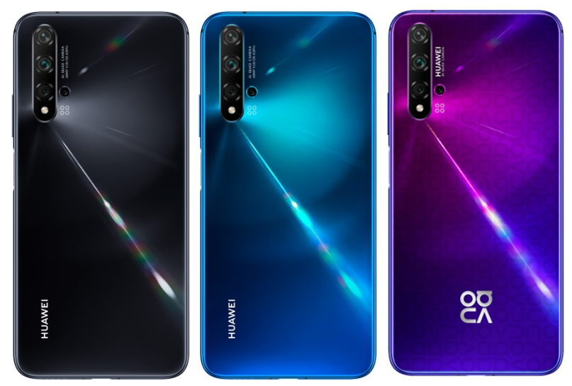
The colours of the nova 5T (Black, Crush Blue, and Midsummer Purple)

The colours of the nova 5T (Black, Crush Blue, and Midsummer Purple)

It also has a side mounted fingerprint reader, and probably one of the craziest colours that I’ve seen on the back of any phone! It comes in a very vibrant Midsummer Purple, a Crush Blue variant, and finally the classic black colour that we have.

So as you can probably tell, this is a truly unique device! Huawei was kind enough to not only send one over but also sponsor this entire project. So what I did was use the nova 5T for an entire day, took it out, took some photos, and used it as I would when I’m on holiday because that’s when I’m using my phone the most, and see how a £399 phone with flagship specs actually performs! 


Before I even set off, I installed all of the apps that I use in a regular basis, so everything; from Twitter, Instagram, YouTube, Creator Studio, Gmail, Hootsuite for scheduling my social media posts, and I’ll be keeping track of the battery life and performance through-out the entire day.

The first thing that I did was to go around the the city centre area and test out the camera. Unfortunately, it was a rainy day and it was also quite cold, but nonetheless the shots ended up being very impressive, and you’ll see what I mean in just a bit.

So whilst on the tram to the city center, I took a few selfies and the way those have turned out, blew me away.

An example shot from the nova 5T’s front facing camera

An example shot from the nova 5T’s front facing camera

This is a 32MP selfie and it’s the sharpest photo with a front facing camera that I have ever seen coming from a phone. All of that is thanks to the massive 32MP sensor, my hair is unbelievably sharp and you can zoom in a considerable amount, without seeing any noticeable pixelation at all, something that is not at all possible with a regular smartphone. 

So when seeing these on my computer, I was blown away. But it gets even better. I then took a few regular photos with the regular module on the back and they were pretty good. They had a great exposure, great colour, pretty much a perfect white balance and they were generally good shots, too bad the weather wasn’t on our side. 

But you see, this phone actually has four camera modules on the back and I wanted to put every single one of them to the test. 

So starting with some zoom photos, thanks to that massive 48MP sensor, we can zoom in up to 10x times digitally. Here’s an example of before and after the 10x zoom.

An example of the 10x zoom

An example of the 10x zoom

We then have the two fun lenses. The Wide and the Macro Lens. 

The wide-angle is something that we’ve started seeing on pretty much every flagship smartphone today, with a few exceptions, so I’m very glad to see Huawei adding a wide angle lens to a mid-range phone. Now I was expecting the wide angle modules to be just okay since even on high end phones the wide angle module is usually the one that’s noticeable worse than the other two. But take a look at this shot.

This was the shot taken with 2x zoom, I have also put in the same shot taken with regular lens, and the wide angle lens. Not only do we get much much more in the scene but I don’t really see any severe softness that wide angle modules usually have.

We took some more wide angle shots of the Manchester Cathedral and what we did next is that we actually went inside of the cathedral to test out the night mode and see how the lenses perform in a fairly dim environment. I think the results speak for themselves, dont you? The nightmode shot is one of the best night mode shots that I’ve seen on a smartphone. It’s extremely sharp but what’s probably even more impressive is that I actually took this with the wide angle module! Just take a look at the picture below, perfect exposure, perfect sharpness, the colours are very accurate as well so I’m very impressed so far.

A wide angle nightmode shot taken in Manchester Cathedral

A wide angle nightmode shot taken in Manchester Cathedral

Ok, next up I wanted to test out that Macro Module. This is actually something that we don’t really have on many other smartphones out there, so it’s a very new and unique feature and I could get extremely close to a leaf with water on, I was about 4cm or even closer than that, and the leaf was still perfectly in focus.

An example Macro Lens shot

An example Macro Lens shot

Back Portrait mode also works surprisingly well and has good background separation, although it does work better outdoors than indoors, since you do need a fair bit of light. 

IMG_20191104_145233.jpg

The nova 5T can also shoot 4K video, up to 30fps. The footage itself is pretty sharp and well exposed. So again, good marks for Huawei on this.

So those were the four modules of this phone and I’m very impressed, especially when you consider that this is a £399 phone, less than half of what a flagship smartphone costs and the results were still very impressive. 

But there’s actually a very special feature that this phone has. So the main module is actually a 48MP sensor. But you see taking 48MP photos will eat up your storage four times faster than what a regular phone’s 12MP camera would. So what the nova 5T does is that it actually uses just the 12MP area of the sensor to take the photos and then it uses the remaining area of the sensor, to improve the clarity. But if you go into the settings menu, there’s actually a secret 48MP mode that allows you to take full 48MP photos and here’s an example. 

A comparison shot between the 12MP Camera and the 48MP secret option

A comparison shot between the 12MP Camera and the 48MP secret option

You can probably see that weirdly enough the 48MP shot is a bit softer, and that’s because in the 12MP mode it’s actually doing that sharpening that I was talking about before. But the real difference between the two lies if you zoom in. When digitally zoomed in the 12MP one starts to look pixely, while the 48MP shot is noticeably sharper. If we had had a bright day with lots of sunlight, the results would’ve been even sharper on the 48MP mode since you do need to be in a well light environment, for the very best results.

So after taking all those photos, Connor and I decided to go and get something to eat. We went to this Italian restaurant where we took some more indoor shots. This was another dimly lit area, so I’ve been using night mode for pretty much all the shots. Now, something that I haven’t mentioned yet, is that the nova 5T also has an AI camera. This means that the camera can detect what it actually shoots and it will automatically adjust based on that.

Above are a couple of examples of the AI Camera. Number one is a picture that I took. Picture one is of my pizza, and you can probably see how sharp the pizza is, and how vibrant the nova 5T made the colours of it look.

Picture two is a photo of a water bottle and same story here, you can see how the AI camera made it stand out from the background, even though this was actually not taken with portrait mode but with the regular photo mode instead.

And finally picture three is a selfie that I took in the restaurant, and whilst it is a bit softer than the outdoor one, it’s still very sharp for low light indoor selfies. 

Ok, so we did get quite a bunch of shots and what we wanted to do was to find a place to sit down, transfer these shots and do some work. In my case, start scripting the main part of the video and drafting this article. We did go to the Central Library but ended up at a coffee shop after I had transferred all the shots. Speaking of, this was a very easy and quick process, thanks to that USB C port that the Huawei nova 5T has, so I had zero issues getting the shots off of the phone.

Many users guessed the images posted on Twitter and Instagram were from the iPhone 11

Many users guessed the images posted on Twitter and Instagram were from the iPhone 11

I wanted to take a few more indoors shots with night mode enabled to see how they would turn out, and like before we got some very impressive shots, especially the one with the floor lamp where the nova 5T made a fantastic job of separating the shadows from one and another. I even posted some of the images that I’d taken with the nova 5T on Twitter and Instagram as stories. Now I did this to to see how many of you got the name of the phone right and pretty much everyone either said that it was an iPhone 11 Pro or a Pixel 4. So from your own thoughts this clearly measures up to flagship quality photography at its £399 price point!

After I had done my first drafts I started watching Marques’s Pixel 4 review, read some news articles, browsed the web. I haven’t really talked about the display, but it’s great. We haven’t really had a sunny day to fully test it outdoors, but in the overcast weather that we had an indoors, it was very easily viewable.

Now you may be wondering how the battery was doing by this point in the day. Well, it was at 80%, however when I was transferring the photos before, I did have it connected to my laptop and the battery charged from 70% up to 90% during that time, in about 30 minutes or so which was quite impressive. 

By this point, since the days are quite short towards the end of the year, it was getting quite dark, so I took a few actual night time shots in some very low light conditions and below are a few of them. They actually have that Pixel style look which I really like! They’re very processed but overall, they’re good, especially when you consider how little this phone costs! 

When we finally got back into the office, the battery was at 75%, but do keep in mind that it did charge 20% while transferring the photos, so the real number would be around 50-55% which is pretty good, considering that I took loads of photos with it all day. 

I wanted to put it on charge and see how fast it would charge. Now, as I mentioned at start, the nova 5T does support Huawei’s SuperCharge which lets you charge up to 50% in just 30 minutes, but what I want to see here, is how fast it would charge from 75%, up to 100%. Charging from closer to 100% is always very slow as the phone tries to preserve the heal of the battery life, by trickle charging or slow charging, the closer they get to 100%, and this was pretty much the case here as well. It took close to a full hour to charge the remaining 25%, but charging up to the first 50% can indeed be done in just 30 minutes. 


CONCLUSION

In conclusion I am pretty impressed. This is a £399 phone and the night mode on this camera and the daytime selfies left me saying “wow” the moment I opened them on my computer, they’re really that good!

You also have the wide angle module which one famous flagship smartphone that costs more than double than this one does, lacks! And we have the macro module which turned out to be quite useful!

The performance was very good. I haven’t noticed any lag or any slowdown whatsoever, and that’s thanks to the Kirin 980 processor and 6GB of RAM on this unit. 

The Side Mounted fingerprint unlock is insanely fast. Literally the moment you rest your finger on it to unlock the phone, since that’s also the power button, it instantly unlocks.

Something I didn’t mention was that it also has an LED notification light inside the top speaker grill. Pretty cool! 

At £399 you get the perfect blend of performance, features, battery life and camera. It comes out on the 8th of November and you can purchase it on all major carriers here in the UK.

Apple AR Glasses (2020) - The FUTURE!


Some of you might know that Apple is working on a pair of AR glasses. Now in case you don’t know what those are, well I’ll explain everything you need to know in this article, alongside why these glasses have the potential of revolutionising the tech industry entirely, just like the iPhone did back in 2007.

I’m personal extremely excited about these, and you will most certainly be as well, by the end of this.

Grab some popcorn and here’s the real future of the tech industry!


Ok, so for those of you who don’t know what AR is, AR means augmented reality and unlike VR or virtual reality where you put this giant headset on and you’re transported into a fully virtual world, AR keeps you in the real world but it ads certain virtual elements to it.

We’ve recently started seeing AR being used in smartphones, like the iPhone 11 Pro Max. Apple released ARKit which is pretty much an API. In simple English it’s a tool that allows developers to easily make AR apps that would automatically take advantage of all the sensors that the iPhone has, such as the accelerometer, the gyroscope, the dual and now the triple lens camera module and so on.

IKEA’s Place app allows you to see how different items of furniture would fit within your home thanks to AR

IKEA’s Place app allows you to see how different items of furniture would fit within your home thanks to AR

So we started seeing apps such as IKEA’s Place app that allows you to place furniture from their store, inside your real world view. That app works incredibly well, the tracking is spot on, it never lost the tracking and the furniture even had real time shadows as well as the ability to get very close to them and see all the details so I was extremely impressed with what this app can do. I recently moved into a new apartment which is still empty so I’ll be using this app to buy some furniture in the upcoming weeks and it’s been great!

And Apple has put so much resources into ARKit that they got to a point where we have real-time shadows on objects, real-time reflections where lights from the real world will get reflected onto the virual objects which is just nuts. But what’s probably even crazier is that with ARKit 3, virtual objects can detect the presence of a real person and circle around it for example.

While I do see VR as more suitable for games and entertainment in general, I see AR as suited more towards productivity. 

And this is why having this AR experience all the time, without having to use your smartphone would be a game-changer. This is where Apple’s upcoming AR headset comes into play.

And the questions you all probably have regarding this headset are:

1. How will it work?

2. What would it look like? 

3. How much will it cost? 

1. HOW WILL IT WORK?

So let’s start off with how it will work? 

Ok, so there’s multiple ways that you can build such a headset. Usually VR headsets are big, bulky and they connect to your PC via an actual cable. 

There are a few examples such as the Oculus Quest which are completely wireless, and that is where the future of VR is heading towards. When it comes to Apple their AR headset will indeed be fully wireless as well.

One of the patents that Apple has filed for regarding their AR Glasses (Source: Patently Apple)

One of the patents that Apple has filed for regarding their AR Glasses (Source: Patently Apple)

There’s been quite a number of patents that Apple has applied for, all showing a very thin and light device, that looks pretty much like a regular pair of glasses. CNET even released a pretty big report back in 2018, with some details that they got from inside sources, on how Apple’s AR glasses would work like. 

The project is apparently called T288 internally, and even back in 2018 it was still aimed at a 2020 release, just like more recent reports have all pointed towards.

CNET did detail that Apple is actually planning on making this a fully wireless device. So instead of Apple building the processor and everything inside the headset, this would be built into a different device, which would then render the entire scene and transmit the video stream to the glasses. This means the glasses will just act as the display, but a different device will actually render the entire scene. Otherwise, the glasses would have to be very thick, in order to accommodate a large battery that would be required for driving such a powerful processor. In case you’re wondering, the glasses will also be housing multiple cameras for tracking the environment, very similar to the Oculus Quest’s cameras, it’s just that the processing would be done outside of the headset.

Now CNET did also mention that Apple will have a separate box that would be processing all the data from the headset. However, Ming-Chi-Kuo, who’s been pretty much the most reliable source in terms of Apple leaks, reported earlier this year in MacRumors that the separate processing box would actually be the iPhone and that the AR Glasses would be “marketed as an iPhone accessory”. So this would be similar to the Apple Watch or the AirPods, essentially a new product category that would go hand in hand with the iPhone. 

Another report from Bloomberg, that we got back in 2017, pointed towards the exact same thing. It suggested that Apple was working on an AR headset that would release in 2020, and that would eventually even end up replacing the iPhone. In the first few years, it will need the iPhone for processing power, but once the chips get even more power efficient and we hopefully get a new battery technology, that would not be required anymore. 

Now that’s all well and good, but what will you be able to do with the Apple Glasses?

Well essentially you would be able to see everything from your iPhone directly in front of your eyes. So things such as; your messages, your Instagram feed, your emails, all of that would be viewable at all times right in front of your eyes. It would not take your entire feel of view, but instead, a small window overlay would display all of that data, and it’s very likely that you would be able to reposition that window, resize it and so on. The AR Glasses themselves will have Siri integration so most of the interaction will be done by voice and by some touch panels which are said to be embedded into the frame itself. 

So that’s pretty cool but what else will it be able to do?

Google Maps now supports AR where your route will be shown in real life (Source: Darrell as a Service)

Google Maps now supports AR where your route will be shown in real life (Source: Darrell as a Service)

Well, the uses cases that I would personally love to see would be integration with Maps, so that you can see arrows and real time directions on the street itself, right in front of your eyes. Google Maps recently had an update with AR integration, so now you can just lift your phone and you would indeed get real time directions in the real world as to which exact way to go. This is just on smartphones at the moment, but imagine having this on a pair of AR Glasses, that would be incredible!

But the most useful case scenario, for me at least, would be just having loads of displays anywhere I am. Imagine having three big curved monitors surrounding you, or even a room full of displays, or just a gigantic display right on your work-desk or even floating above it that you wouldn’t be able to have normally. 

Speaking of displays, one of the current issues with AR and VR today is the pixel density of the display panels. The lower the resolution of the display is, the lower the pixel density will be and the more pixels you will actually see when you put the headset one, which will create this very blurry and grainy effect.

The Oculus Quest for example, which is by far the best VR headset that I have used, has a resolution of 1440x1600 per each eye which is pretty high, it’s actually on par with the HTC Vive Pro. But you see, even with such a high resolution display, I can still easily see the pixels and the image quality just isn’t realistic at all. We’re still years ahead of extremely high resolution displays on VR and AR headsets.

However CNET did mention in their report that Apple would be using 8K displays in their headset! To give context, VR headsets today have close to a 2K display per eye and Apple wants to use an 8K display per eye! That’s insane! With a resolution like that, per eye, you should be able to see a perfectly clear image, without any pixilation at all, or at least barely even noticeable. 

But can the iPhone drive two 8K displays whilst calculating everything required for the AR Tracking in real time? Well considering that the Apple A10X processor that’s inside the AppleTV 4K can actually handle full 4K output and even 4K games albeit mobile ones, and that the Apple A13 processor that we have in this year’s iPhone 11’s is pretty much twice more powerful than that, and the Apple A14 chip which will be coming out next year will be the first to be based on a 5nm process and it should smoke the A13 chip. Well, it’s looking pretty likely that the A14 will indeed be able to push dual 8K output for the Apple AR Glasses.

2. WHAT WOULD IT LOOK LIKE?

Ok, so that was a fairly long section since how it would work is the most interesting and important part of the headset, but now let’s see what it would look like.

Well, considering Apple’s patents and the fact that the glasses themselves will only be streaming the data from the iPhone rather than calculating that itself, they should look very similar to traditional glasses.

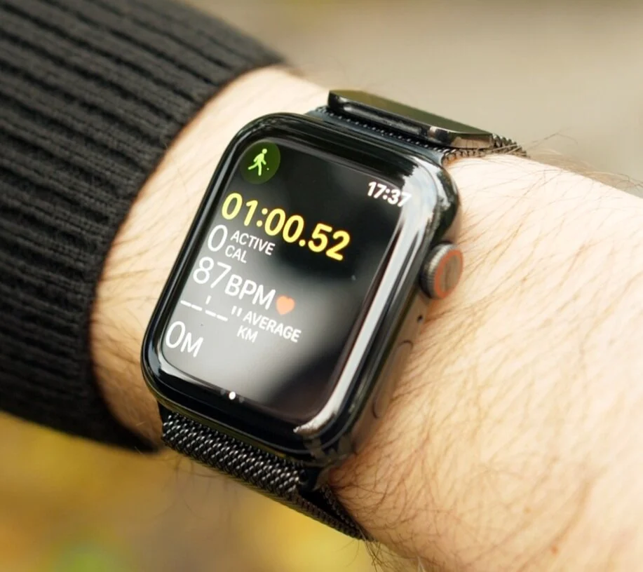
Apple does already have two wearable devices, the Apple Watch and the AirPods, and they both look good. They have an elegant look to them, however we can all agree that they do have a weird/unique look. For example, the Apple Watch is rectangular and you can immediately tell when someone’s wearing an Apple Watch compared to a regular watch, or any other smartwatch for example. The same goes for the AirPods they have this very weird and distinct look to them, and you can always tell when someones wearing them. So I do believe that the Apple Glasses would have a similar look. They would still look like glasses, but they will have Apple’s unique taken on them with a more unusual design.

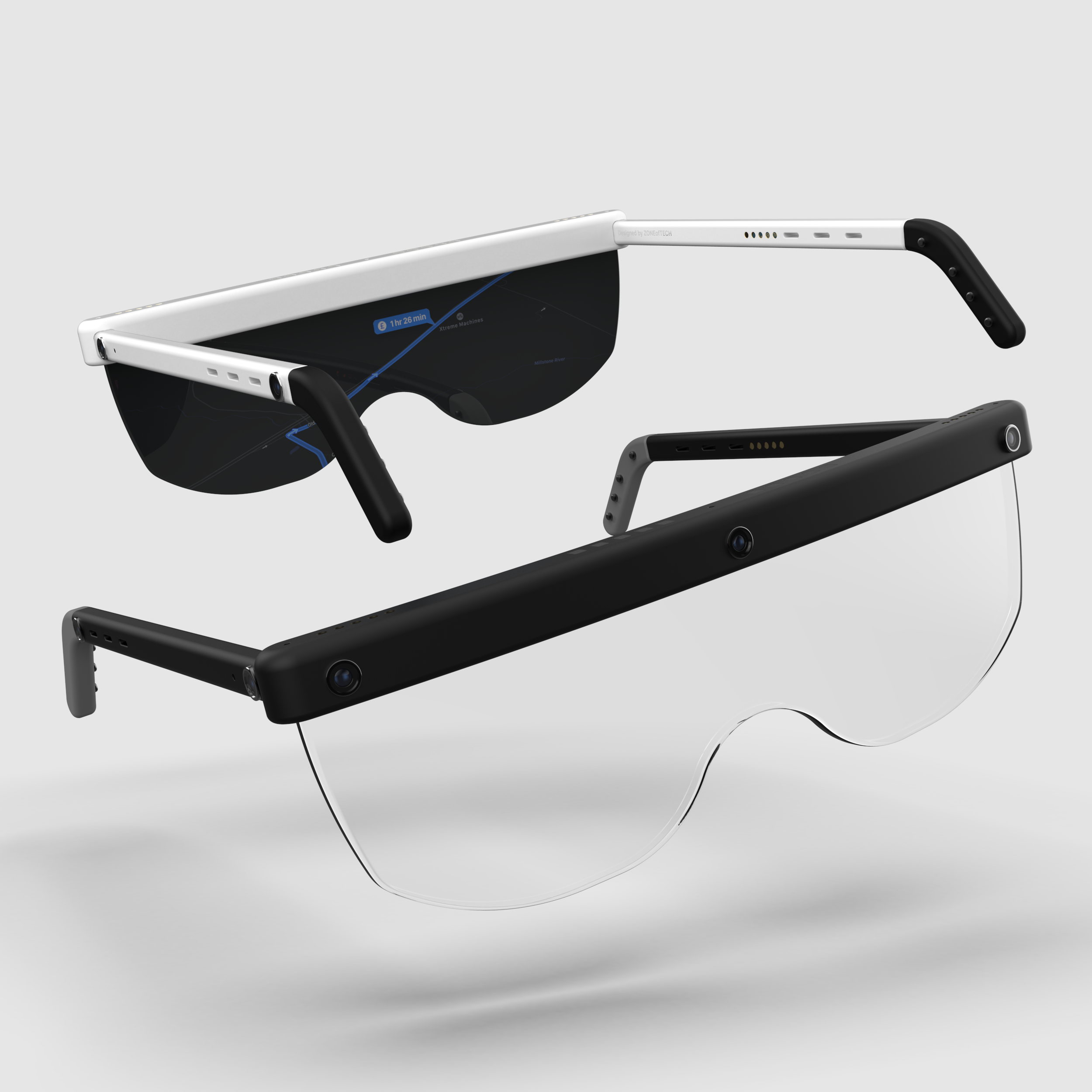
The ZONEofTECH Concept for Apple’s AR Glasses

The ZONEofTECH Concept for Apple’s AR Glasses

In our concept we actually made it in a realistic way, with a fairly thick frame that houses the battery and the chips for capturing the 3D data and then sending it over to the iPhone. We have three cameras on the front and then two more on each side, for special awareness. We have the wireless charging coils because let’s be real, Apple will very likely use a similar charging system as to what they already use in the Apple Watch and the AirPods, so wireless charging. The speakers would be bone conducting speakers, so the grills that you see there are just for the design actually and for airflow. This is of course our take on it, but I wouldn’t be surprised if Apple does something similar. Like I said, a pair of glasses that looks a bit more unique than the rest, just like the AirPods and the Apple Watch. 

3. HOW MUCH WILL IT COST?

Now this is actually a bit of a tricky one because you see in order for Apple to make the best possible AR Glasses, they would need to charge loads. This is a truly futuristic device that won’t be cheap to make by any means. But at the same time, Apple simply cannot price this at say $3000 since who would really buy it in that case? 

The rumoured price is around $1000-$1500 at this point, which I still think is very high and I don’t see many people buying this considering that it is not a phone, but instead an accessory that you also need an iPhone for.

What I think Apple should do is make the best Apple Glasses that they can, even if it costs them $3000 per unit and then price it very low, at $300 or so, around the same price as an Apple Watch costs. If they did this they would sell loads, and then they can make their money back through software purchases. That’s what I would do. 

But whatever price Apple decides to sell them for, we know that they are definitely happening. We have multiple reports from Ming-Chi-Kuo, DigiTimes, Bloomberg and even actual code found in iOS 13, that points towards Apple actively working on the AR Glasses. Apple even applied for a patent that allows you to adjust the opacity of the display so that AR objects are more or less visible in the real world, apparently. 

However, something that I find to be even more interesting is a recent report coming from DigiTimes that claims that Apple has partnered with Valve to develop the AR headset. Valve has just released their own headset, the Valve Index, which is pretty much the highest end VR headset that you can buy, and the HTC Vive and the Vive Pro had both been made in partnership with Valve. So Valve has been in the VR industry for quite a few years now and it’s definitely been one of the pioneers of VR and Apple partnering with them is just some amazing news! 

The article published on Monday explains that Apple has partnered with Valve (Source: MacRumors)

The article published on Monday explains that Apple has partnered with Valve (Source: MacRumors)

So there you have it, all the latest we know about the upcoming AR Glasses. I am personally really excited to see how these turn out, but we will have to wait until next year at least. Let me know what you guys think in the comments.

What Is Happening with the 16" MacBook Pro?


We’ve seen so many leaks, rumors and even actual proof found in Beta versions of macOS, that clearly showed that Apple is working on a brand new generation of MacBook Pro’s. 

We were expecting to see a new MacBook Pro by the end of October, but that hasn’t happened so here’s an update on everything we know so far and what is really the status of the this 16” MacBook Pro!


It is now November which means that Apple has not had any event in October this year like most of us were expecting, or at least were hoping. 

Apple has two big events every single year. We have WWDC in June, which is Apple’s software event where they announce the new versions of iOS, macOS & tvOS, then in September we have the big hardware focused event, where Apple introduces the brand new iPhones, the new Apple Watch and sometimes a few more things as well.

However, the Macs and the iPads never really had a place in any event. WWDC was always too full with software and the September event was always too full with the iPhones. So because of that, Apple sometimes has two more events in the year. A March event where they release new entry level iPads, and an October event where they release new Macs and iPad Pros.

However, when it comes to Mac events it’s a bit more complicated, as Apple need to wait for Intel to release new processors before they can update their machines. 

Now the MacBook Pro and Air are by far the most popular Macs that Apple has ever made and because, unlike the iPhones which get updated every 2-3 years, Macs don’t really get updated that often there is always a lot of hype around a new generation.

The current generation of MacBook Pros came out in 2016, the previous gen came out in 2012 and the one before that came out in 2008. So it seems like every 4 years, Apple releases a brand new design. So a new design to this generation isn’t expected until 2020.

But as you may know, Ming-Chi-Kuo, Bloomberg, DigiTimes Taiwan, and pretty much every well known source has said that Apple will be releasing a new 16” MacBook Pro in 2019, which was supposed to be launching by the end of October. But all this was quite weird. Why would Apple release the new generation of MacBook Pro’s a year earlier than usual, and why didn’t they have any event to announce it?

Especially considering the amount of issues that this generation has had, ranging from severe keyboard issues, thermal throttling issues, creaking noise issues, faulty speaker issues and much more, if a you were going to bring out a new generation that solved those problems you’d make a big deal out of it wouldn’t you?

I’ve made multiple videos with my own issues with this generation of MacBook Pros, and how Apple’s customer support is just straight up garbage when it comes to dealing with expensive devices such as this. Full video on how Apple still hasn’t fixed my broken $5000 MacBook Pro here

Overtime Apple has attempted to fix the keyboard issues with small upgrades to the keys (Source: iFixit)

Overtime Apple has attempted to fix the keyboard issues with small upgrades to the keys (Source: iFixit)

In short, this generation needs to be replaced as soon as. Apple tried “fixing” the keyboard with every new model that they’ve launched since 2016, with small improvements in the key-cap mechanism but they just couldn’t, just because the butterfly key-switch mechanism was faulty from the very start. Apparently this new generation is said to come with a brand new mechanism, the scissor mechanism, which funnily enough was the one that previous generations of MacBook Pros had. This will give us more key travel than before, since at the moment you can barely even feel the keys moving. So a fixed keyboard is the first change.

We’ll also be getting a larger display, a 16-16.4” panel from the 15.4” one that we have on the current model, whilst also getting slimmer bezels. 

The body will also be getting thicker in order to improve cooling but that’s mostly it, in terms of the main changes.

So that doesn’t seem like a lot. We’ve actually made our own concept, in which we increased the size of the touchbar to make it even more usable and extend it to the very top of the frame, as before, this area was unused and it just didn’t look good at all. However, it seems like the changes would be even smaller than we expected.

French Website, MacGeneration found an icon of the 16” MacBook Pro in the latest macOS Catalina 10.15.1 Beta that even has a file name that says 16” in silver & space grey. However, it looks pretty much identical to the current model. But this is as official as it gets until the unveil. 

The MacBook Pro 15” (Left) compared to the leaked 16” icon (Right) (Source: MacGeneration)

The MacBook Pro 15” (Left) compared to the leaked 16” icon (Right) (Source: MacGeneration)

Unfortunately, unless you put them side by side you cannot really tell the difference. By putting them side by side you can see that the entire machine is indeed larger and the bezels are slightly thinner, but the differences are so small that I just cannot call this a new generation of MacBook Pros.

Even though the bezels are thinner, they’re still thicker than on something like a Dell XPS 13” 2-in-1 or many of the more modern laptops released in 2019. We still have the big chin with the MacBook Pro branding on the bottom which I don’t really like, it’s way too fat and it takes up way too much unnecessary space. I always preferred the previous look of the 2012 Retina MacBook Pro’s that had no branding at all on the display.

Now, there are a few other changes that we get, aside from the slightly thinner bezels and the larger display. For example, if you look at the top left section of the touchbar on the 16” MacBook Pro icon, you can see that there seems to be a space in between the touchbar and a button on the left. Now, we’ve even had a second image that was discovered by developer Guilherme Rambo in macOS 10.15.1 beta again, that shows the full official image of the right hand side of the new 16” MacBook Pro. And there’s probably one thing that you’ve noticed right away, and that is how the touchID sensor is separated from the touchbar now. 

The 16” (Bottom) appears to leave some space between the touchbar and a button on the left (Source: MacGeneration)

The 16” (Bottom) appears to leave some space between the touchbar and a button on the left (Source: MacGeneration)

This means that the button on the left is most likely the escape key which will also now be separated from the touchbar as well. That was one of the main complaints that developers had, I had it as well, since escape is a key that I do hit very often in certain apps and not having a physical key for that, can be extremely frustrating. 

Also in this image we can also see the keyboard, but to me at least, it looks identical to the current gen, with no more key travel than what we have now. So that’s pretty disappointing to see.

Keep in mind that if this is a new generation then this is what we’ll get for the next 3-4 years. Which means a total of 6-8 years with what’s mostly the exact same design and what looks to be the same keyboard.

The touchbar is looking to be the same size as before, maybe even a bit shorter because of the introduction of the escape key. When you take into account that you have laptops such as the Asus ZenBook Duo that have two fully usable displays, or laptops that are 2-in-1 with pen support as well, and a 22 hour battery life and crazy specs and features like that, the MacBook Pro feel extremely old and already outdated, even before it’s out!

Unless of course, this is not a new generation of MacBook Pro’s!

Every new generation has seen some massive changes, in pretty much every single way. The 2012 Retina MacBook Pro was by far the biggest change ever, in a MacBook Pro. It had a high resolution Retina Display, something never before seen in a laptop, a full flash storage from the HDD of the previous generation, it had a design that was pretty much half the thickness of the previous model, and it was lighter, so it was years ahead of the previous generation.

The 2016 generation that we have now, was a much smaller upgrade. Aside from the DCI-P3 displays, slightly thinner bezels, space grey colour, the downgraded keyboard and touchID and touchbar, we didn’t really get much else. 

This is mostly because we’ve reached to a point where laptops have become as good as they can be and the only things that we can improve are the specs. Unless of course we have dual displays or innovative concepts such as that, which Apple doesn’t usually do first.

MacRumors posted a gif of the current 15” MacBook Pro and the 16” MacBook Pro leaked image and like I said, they’re pretty much identical, I will leave a link to it here so you can see what I am talking about. The touchbar appears to maybe be a bit taller, barely even noticeable and luckily the top portion of the case is now a bit slimmer. The keys do seem to have more space in between, than on the current 15” model, which is always a welcome change.

So judging by all these official images that were actually found in macOS 10.15.1 beta, the release of the 16” MacBook Pro seems to be imminent. 

Now, Ming-Chi-Kuo actually released a report this week, updating his research note on the 16” MacBook Pro. In it he said that Apple would only switch to a scissor switch keyboard, in Q2 or Q3 2020. Which means either June or September of next year. And he was also the one that initially talked about Apple working on a scissor keyboard switch for the new MacBook Pro 16” for this year. So if that gets delayed, there’s a very high chance that this MacBook Pro 16” will also get delayed, rather than shipping with the old style keyboard which would be another disaster. 

The headline from the article on MacRumors where Ming-Chi Kuo said it was likely that the new keyboard would be mid 2020 (Source: MacRumors)

The headline from the article on MacRumors where Ming-Chi Kuo said it was likely that the new keyboard would be mid 2020 (Source: MacRumors)

DigiTimes reported that Apple will begin receiving shipments of the 16” MacBook Pro. That’s another reason why I do see this being delayed is because of Intel and AMD.

Intel’s 10th generation processors have indeed launched, but these are only the Y and the U series. So the 7W and 15W ones that are aimed at the MacBook Air and the 13” MacBook Pro are here, but not the H series, which represents the 45W processors aimed at the 15” MacBook Pro’s. 

Those are only coming out next year, around May-June, just in time for a truly next generation of MacBooks Otherwise, if this 16” MacBook Pro gets released before then we would still be getting the exact same processor, the Intel 9980HK, that we already have in the May 2019 release. The same goes for the GPU. Aside from the Vega 20 that we got back in November 2018, which is already an outdated architecture, we haven’t had anything new from AMD since. Now, maybe Apple is working alongside AMD on a custom RDNA GPU, similar to what Sony and Microsoft are doing for the PS5 and Xbox 2, but don’t get your hopes too high. The chances of that happening are extremely slim. 

There are a few more leaks that I want to mention. We did a very detailed video on the 16” MacBook Pro back in July and that was when we had barely any leaks on it, and it that video I talked about a few interesting things that I’ve noticed.

A leaked power adapter from the suspected 16” MacBook Pro showing the 96W Charging (Source: Chongdiantou)

A leaked power adapter from the suspected 16” MacBook Pro showing the 96W Charging (Source: Chongdiantou)

For example, how the upcoming Apple Pro Display XDR supports up to 96W of power output, but the current gen 15” MacBook Pro’s, only support up to 87W. So my theory here was that the new 16” MacBook Pro would require either a 94W or a 96W power adapter. 94W was also an option since the new LG UltraFine 5K display supports up to 94W of power output via thunderbolt 3, rather than 96W. And it seems like there’s been a leaked power adapter, presumably for this 16” MacBook Pro that actually shows a 96W USB-C Power adapter. So it seems like my theory might have been correct here and we should be seeing a 16” MacBook Pro with a power requirement of 96W.

In case you’re wondering what we might need those extra 9W of power for, well it’s very likely for the display, which is not just going to be larger but there’s a very high change that Apple will also brand this display a Pro XDR display to match it up with their actual Mac Pro Pro XDR display and also the new Super Retina XDR naming that they’re now using in iPhones. So this display will very likely be brighter than the 500 nit panel that we currently have in the current generation of MacBook Pro’s. 

I’m just very disappointed that this new 16” MacBook Pro which is supposed to be a new generation of MacBook Pro’s, only seems to be a very slight week to the current gen, which we might have to stick with, for the next 4 years. There’s no FaceID, no larger TouchBar, no touchscreen, no flappable display, no OLED display and nothing really that would make this truly next gen.

AirPods Pro - Unboxing, Noise Cancelling, Sound Test & More!


Yesterday we put out our 20 things you didn’t know article and video, explaining all the things you may not have known about the latest addition to the AirPods line-up, and today we have the AirPods Pro in the studio!

So grab those snacks and drinks and check out my live reaction and unboxing in the video above and have a read of three things I wanted to try out first on the AirPods Pro!


COMFORTABILITY

First things first, you can definitely feel them in your ears, so they’re nothing like Apple mentioned where you wouldn’t even notice them thanks to the new vent. You’ll definitely notice them right away, I can tell you that. 

Between the AirPods and the AirPods Pro, the Pros are a bit more comfortable, but that’s mainly because of the smaller size, so you don’t really feel the long foot touching your ear. Also, since they do have the rubber seals, they do secure far better than the regular AirPods do.

By taking the Ear Tip test you can see if you have the right rubber seal in

By taking the Ear Tip test you can see if you have the right rubber seal in

Inside the box you get three sizes of rubber seals; small, medium and large, but they all come with the medium ones pre-installed. I found that the medium ones work best for me, but here’s a Pro tip, once you pair the AirPods with your iPhone you can go into the bluetooth settings and then tap on the i icon, of your AirPods Pro’s and then you get into a menu which allows you to do an Ear Tip Fit Test so you can get the right size. What this does is that it will play a sound and the outwards facing microphone will read how much of that sound escapes from your ear. And if that’s too much, it will give you a message that you need to try a different size ear tip. 

I haven’t seen any other earphones that can do this, so props to Apple for implementing such a system.
Speaking of system, there’s a weird proprietary system of mounting the rubber ear tips. To remove them you have to pull really hard to the point where you think you’re about to break them. However, putting them on is very easy as they just click into place. 


ACTIVE NOISE CANCELLATION

So the biggest new feature that you get with the AirPods Pro’s is of course, noise cancellation. Now this is done both passive and well as actively. It’s done passive via the silicone ear tips that I mentioned before and then actively in a pretty smart way. The three microphones detect the background noise and then the AirPods themselves emit a sound of an opposite frequency in order to eliminate that background noise.

And it actually works extremely well, at least for in-ear earbuds. I mean they’re not as good as actual over the head noise cancelling headphones would be, but still I was very impressed with how well this worked. 

If you go to your volume option, with the AirPods Pro in, you will get the options to switch between the three options.

If you go to your volume option, with the AirPods Pro in, you will get the options to switch between the three options.

Now if you force touch on the Volume bar on your iPhone once they’ve been paired, you can switch between these three modes; Noise Cancellation, then Off and then Transparency mode. Think of this as the level of background noise that’s removed. So when transparency mode is on, the microphones will actually transmit the audio from the outside, back into your ears, in order to re-create that feeling of open-back headphones that the original AirPods had. And it’s not quite the same thing but it’s still pretty impressive. It’s in between in-ear headphones and the original AirPods. Then the off mode, is very similar to regular in-ear headphones where the seal is created by the silicone ear tips and then finally noise cancellation is the one where the AirPods will try to remove as much background noise as they can.

Now, when noise cancelling is on, they do give you that feeling of having a lot of air pressure inside your ears. Basically the same feeling that you get when you’re in a plane. But once I disable noise cancelling or turn on Transparency mode, that feeling is pretty much entirely gone. So I do find them a bit uncomfortable because of this feeling when I’m using noise cancellation, guess it will just take me a while getting use to it.

You also have that pressure sensitive button which is really cool! You see, it’s not really a physical button, it’s just a capacitive touch pad. However when you press it the AirPods Pro’s will actually make this clicking sound to give you the impression that it actually clicks!

And from there you have the three commands that I’ve mentioned before; tap once to pause, double tap to skip to the next song and triple tap to go to the previous song. And if you hold that bar, you can switch between the Noise Cancelling Mode and the Transparency mode, and you can also add an Off mode by going into the bluetooth menu options. 

You can even ask Siri to turn on an off Noise Cancelling or Transparency Mode, so that works as well, alongside the ability to invoke Siri by saying the ‘Hey Siri’ command.


SOUND QUALITY

Finally, when it comes to the actual sound quality, it’s pretty good! It’s much better than the original AirPods, the bass is stronger, the voice is clearer.

But the original AirPods weren’t that well known for their sound quality anyway. So if those were a 6/10, these are probably about a 9. They’re a noticeable upgrade, but that’s mostly due to the noise cancellation which removes all the background noise so that you can focus on your music. So that’s pretty much what makes them sound so much better than the original AirPods did.

There is no real point in getting the AirPods Pro if you have an Android device as the sound quality is much poorer

There is no real point in getting the AirPods Pro if you have an Android device as the sound quality is much poorer

And as a conclusion, I love them. It’s pretty amazing having active noise cancelling earbuds that are this small. The Sony ones are very good as well, but the charging case is just gigantic. 

Also, if you have an Android phone just forget about getting these because the volume would be unbearably low. 

Other than that, they’re great and a huge step up from the original AirPods. But are they £250 / $250 good? Not fully sure just yet, a few more days of testing and I will have a verdict for you.

AirPods Pro - 20 Things You Didn't Know!


So just as we were finishing up a video on the final leaks and rumors on the AirPods Pro, Apple went and released them!

So instead of that article and video, here are 20 things you didn’t know about the newest in-ear headphones from Apple.


1. AIRPODS PRO DIMENSIONS

The new AirPods will feature the biggest design change since the original AirPods that came out in 2016. According to Apple the new AirPods are 30.9mm tall and 21.8mm wide. When you compare this to the original AirPods, which were 40.5mm tall and 16.5mm wide, you get the idea of how different these will look. Picture them like Borat and Azamat, Google them and you will get the idea.


2. CASE DIFFERENCES

But it is not just the AirPods themselves that have had a design change, the case has received one too. Taking a look at its dimensions compared to the original AirPods case we can see that it is going to shorter but wider, like the AirPods Pro themselves, but also thicker as well.

The case dimensions of the AirPods Pro compared to the AirPods

The case dimensions of the AirPods Pro compared to the AirPods

  • Original AirPods Case: 53.5mm x 44.3mm x 21.3mm

  • AirPods Pro Case: 45.2mm x 60.6mm x 21.7mm

This means that the case will take up more space in your pocket, which I am kind of upset about. I loved how small and portable the regular AirPods case was, and I was expecting something thinner and more portable, but it seems like were not getting that with the AirPods Pro.


3. ACTIVE NOISE CANCELLATION

This is the main new feature of the AirPods Pro. How active noise cancellation works is that the AirPod has an outward facing microphone which detects external sounds and the AirPod will emit an equal noise of an opposite frequency to eliminate that noise.

On the AirPods Pro this will continuously be adjusted at 200 times a second, and with the new rubber seals this should make for a great listening experience.


4. RUBBER SEALS

As I mentioned in the previous section, the AirPods Pro will come with rubber seals, like we get on many other in-ear headphones. This is another change from the current and original AirPods, which are a single piece of glossy plastic.

There will be three different sizes; small, medium, and large, so these should fit everyone’s ear and I am certainly curious to try these out.


5. TRANSPARENCY MODE

Now while we do have noise cancellation and rubber seals to make the listening experience more immersive, I did like being able to hear what was going on around me with the original AirPods. However, we get a ‘Transparency Mode’ with the AirPods Pro which is activated by pressing and holding on a new pressure sensor. What this will do is actually let the noise in from the microphone that works for the noise cancellation in real time! Pretty cool stuff!

6. NEW CONTROLS

Speaking of the new pressure sensor, it can actually do more than just switch on and off the microphone for Active Noise Cancellation and Transparency Mode.

You see on the original AirPods you would double tap and that would be the only control, you could customise the double tap for each AirPod in the settings, and have double tap on the right AirPod to skip to the next song and double tap on the left one to go to the previous song. That’s how I had it.

Then with the second generation we got the ‘Hey Siri’ command to summon her, which worked brilliantly.

And with the AirPods Pro you can now press on that force sensor once to play a song, pause or answer a call. You can tap twice to skip forward and tap three times to skip backwards, and then hold to switch between the Active Noise Cancellation and Transparency Modes that I talked about before.


7. VENTS

The air-vents that have been put on the sides are there to help equalise the pressure so that you don’t really feel the AirPods in your ears. According to Apple you’ll feel like there’s nothing in your ear, but I am very sceptical that this will be the case but its another thing I am interested to check out.


8. WATER RESISTANCE

I use that heading quite loosely. The AirPods Pro will be IPX4 rated, so that means that they can deal with splashes of water, but they will have no dust resistance at all. So definitely do not take these swimming as they will not hold up. However they would be perfect for use in the gym or even out on a run when its raining.

Its also important to note that the case itself is not water resistant at all, so keep that in mind.


9. APPLE WATCH SUPPORT

So whilst there is support for these on the Apple Watches, there is no support on the original Apple Watch. If you are planning to get these make sure that you have a more recent model of the Apple Watch to ensure you are getting the most out of the pairing. If you do have an original Apple Watch then you will need to use the original AirPods that came out in 2016, as the second gen are not supported on it either.


10. SUPPORTED DEVICES

On the subject of support and no support here is a full list of devices that the AirPods Pro will be supported on:

  • iPhone SE, 6S and newer

  • iPad Mini 4, iPad Air 2 and newer

  • iPod Touch 7th Gen from 2019

  • Apple Watch Series 1 and newer

  • Apple TV 4K and Apple TV HD

  • Mac Pro from 2013 and newer

  • Mac Mini from 2012 and newer

  • iMac from 2012 and newer

  • MacBook Pro from 2012 and newer

11. USB-C CABLE

In the box with the AirPods Pro we will be getting a USB-C to lightning cable as the AirPods Pro will still have a lightning port on the bottom of the case, but at least the cable itself is now the same one as we get on with the iPhone 11 Pro’s


12. LIVE LISTEN

This is slightly different to the Transparency Mode I mentioned earlier as this is actually an Accessibility Feature, which also works on the regular AirPods too in case you didn’t know. What this feature does is play back audio to you in real time from the microphone, so would certainly be a useful feature for people who may have trouble hearing.


13. WORSE BATTERY LIFE

So although we do get those new feature I mentioned earlier, this does in fact impact the battery life of the new AirPods. The regular AirPods gave 5 hours on each AirPod, and up to 24 hours using the case, whereas the AirPods Pro will have 4 and a half hours each, and up to 24 hours using the case.

However, if you turn off Active Noise Cancellation and Transparency Mode, you can get 5 hours of playback in the AirPods Pro.


14. FASTER CHARGE

With the original AirPods, you could get 3 hours of playback and 2 hours of talk time off a 15 minute charge, whereas with the Pros we get 1 hour of playback and 1 hour of talk time off a 5 minute charge. With that in mind we can estimate that you should get 3 hours of playback and 3 hours of talk time with a 15 minute charge. So a slight increase, but whether or not this turns out to be true is another matter.


15. TRIPLE MICROPHONES

A breakdown of the AirPods Pro showing the inward facing microphone

A breakdown of the AirPods Pro showing the inward facing microphone

The original AirPods also came with two beamforming microphones, which the Pros also come with. However the Pro also comes with an additional third microphone. It is likely that this is the microphone for Active Noise Cancellation, but it seems odd to have that as an inward facing microphone as it should be taking noise from the surrounding area.

16. SOUND QUALITY

When it comes to sound quality, the AirPods were okay. But with an adaptive EQ, the vent system for pressure equalising, custom high-excursion Apple driver, custom higher dynamic range amplifier, Active Noise Cancellation, and sealed ear tips, the Pros might just have the best sounding wireless headphones on the market! We will of course test them out though to make sure.


17. WIRELESS CHARGING

Whats good to see is that we are getting a free wireless charging case in the box with the AirPods Pro, whereas you would have to pay $40 extra to get this with the regular AirPods.


18. VERSUS AIRPODS

So compared to the AirPods 2 that came out in 2019, are these worth it? Well, the AirPods 2 cost $200 and these cost $250, so if you’re already paying $200 for the AirPods and another $40 for the wireless charging case, you might as well just pay $50 and get the Pro’s as these are a much bigger upgrade.

However, if you don’t want the Pro’s, then the regular AirPods at $160 are very good already. Aside from wireless charging you don’t miss out on anything. You even have the same Apple H1 processor that the AirPods Pro already have.


19. VERSUS POWER BEATS PRO

But the big question here is, how do they compare with the PowerBeats Pro?
You see Beats are owned by Apple, so the PowerBeats Pro, which are their newest model, are the closest thing to the AirPods Pro and they’re also made by Apple

The PowerBeats Pro seem to be focused even more towards fitness users. They have an over the ear clasp that helps them stay secure. They have the H1 processor as well, just like the AirPods and the AirPods Pro, so they will automatically connect to your iPhone and other Apple devices. ‘Hey Siri’ is also supported and the battery life is actually better with up to 9 hours on each earbud and over 24 hours with the case. 
Water resistance is also there, but there is no official rating it seems, just a mention.

In addition they cost $200 compared to the $250 of the AirPods Pro, so they look like a better option, right?

Well, they kind of are. Sound quality should be better with the AirPods Pro, since there’s much more talk about it on Apple’s website, whereas the PowerBeats Pro are focused more towards fitness and use during workouts. Also their case is much bigger than the AirPods Pro case.


20. APPLE PUSHING AIRPODS

And the last section in this article is about Apple pushing the AirPods Pro. If you go over to the Apple website you will see the Pros promoted on almost every single Apple product page that they have. They’re featured in the iPad tab, the iPhone tab, the Apple Watch tab, the TV tab, and the Music tab.

CONCLUSION

So there you have it. 20 things you didn’t know about Apple latest product announcement. It is likely that we will hear more from Apple in the coming days regarding other product releases, but make sure to stay up to date with the channel and our articles to find out how the AirPods Pros really are!

iPhone 11 Pro Max Review - The COMPLETE Review!


This is the iPhone 11 Pro Max, definitely not the best name for a phone. Apple should’ve really called this the iPhone Pro, which would then come in two sizes, 5.8” and 6.5”, so that they have the same naming scheme on the iPhone as they do on the iPad and MacBooks. We don’t have a MacBook Pro 5 Max or iPad Pro 3 Max on those so why do we have iPhone 11 Pro Max?

But leaving the bad naming scheme aside, this is by far the best iPhone Apple has ever released, like it should be because it’s the newest one, but actually this one fixes all the major issues that the iPhones have had for years, and I’m pretty impressed!

I’ve been using this as my daily driver since it came out in mid-September, and this is my full in-depth review of the iPhone 11 Pro Max, covering my final thoughts on the Design, Display, Camera, Performance, Special Features, Battery & Value!


DESIGN

A design front on design comparison between the iPhone 11 Pro Max (Left) and XS Max (Right)

A design front on design comparison between the iPhone 11 Pro Max (Left) and XS Max (Right)

Starting off with the Design, from the front, the iPhone 11 Pro Max looks very disappointing. It’s got the exact same design as the iPhone XS Max from 2018, which is the same design as the iPhone X from 2017. That means we still have that massive notch, which does have some high end tech inside for mapping your Face in 3D and unlocking the phone, so there is an actual reason why it is this big.

But when you compare it to the Note 10’s design, the Samsung Galaxy S10’s or especially the OnePlus 7 Pro and the 7T Pro, both of which have no notch and no camera cutout at all, you can probably see where I’m going with this. The iPhone 11 Pro Max just has a very boring look to it, that will in fact change next year luckily, but until then we’re stuck with this two year old design until late 2020. 

However, there are a few things that have changed design wise. The back now has that famous triple lens camera module which I’ll get into more detail in the camera section of this article.  But Apple has also changed the back glass now. It is now a frosted glass rather than the traditional glass back that we had on the XS, which means that it won’t leave any fingerprints, and it’s also much smoother to the touch so your finger glides much easier, whereas before you would have a tiny bit of resistance. So this does make the iPhone 11 Pro Max the best feeling iPhone that I have held in my hands, but at the same time it also makes it the slipperiest.

Luckily, Apple did say that they’ve added the most durable glass in smartphone into this, which is very likely a slightly modified version of Gorilla Glass 6. And there have been quite a few drop tests done by other tech outlets and channels and long story short, it’s still glass so it will break. It’s just that it won’t break as easily as the previous iPhones did. But you see, the way glass works is that if you want it to be more durable to drops, you need to add more plastic into it to make it more flexible, which also decreases the scratch resistance. So I don’t know if you’ve seen my twitter post, which I’ll link here, but I actually managed to get my iPhone 11 Pro Max scratched very heavily, and I ended up having that replaced because of it. 

Now, there are a few more design changes that Apple has made, such as moving the Apple Logo towards the middle now, which I do believe looks better now than ever before. We also have no more iPhone branding on the back, and no regulatory information either, unless you have the European model which still has those unfortunately. But other than that, you get an extremely clean look on the back. Now something that I do like is that the inside of the camera module now matches the colour of the iPhone, unlike the mock-ups that we had, where it was entirely black so I do think that it looks better this way. Something else that I like about this is that Apple has actually made the inside of the camera module glossy, while on the regular iPhone 11, we have the exact opposite, a glossy back and a frosted glass camera module. 

Also the iPhone 11 Pro & Pro Max are still one of the only ones on the market that come with a stainless steel frame. All the other ones come with either an aluminium, magnesium, or polished aluminium frame in the case of the Galaxy Note 10+ for example.

A slight design change with this years models is thickness. At 8.1mm thick, these iPhones are one of the thickest flagships on the market right now. The regular iPhone 11 is a bit thicker at 8.3mm, but aside from that the only iPhone thicker than those is the iPhone 4 from 2010.  Ever since then, Apple kept making their iPhones thinner and thinner to the point where batteries also had to be made thinner, and the battery life ended up being affected. But in the more recent years, Apple has decided to do quite the opposite. Make their iPhones thicker and thicker every single year and also extend the battery life as a result. I’ll talk more about the battery life once we get to the battery section of this article, but when it comes to how the 11 Pro Max feels in the hand, the moment I got it, I could definitely tell that it was bulkier than my XS Max, was which was already bulkier than my X was, and so on. It’s not a fat phone by any means but it does give you that solid feel in the hand when you hold it, because of its thickness and that premium stainless steel frame.

The colours of the iPhone 11 Pro Max

The colours of the iPhone 11 Pro Max

Now, the final design change when it comes to these new iPhones are the colours. We get four colours this year; the regular Space Grey, Silver, Gold, and now we also get a brand new Midnight Green colour. The Space Grey has a very clean and matte black look now which I absolutely love! The silver now has a frosted white look, where the Apple logo is barely visible at all, and if I’m being honest there’s something about the White model that kind of makes me regret going for the Space Grey for my personal one. The Midnight Green one looked good but extremely similar to the Space Grey one, aside from the stainless steel frame which was indeed dark green. The gold one looks ok, but I do think that the previous gold XS looked much better.


DISPLAY

Moving on to the Display, we have the same 5.8” and 6.5” sizes as last year with a resolution of 2688x1242 on the 11 Pro Max and 2436x1125 on the 11 Pro, and both at 458PPI.

Apple has this weird thing where they adjust the resolution in order to keep the same PPI number. They do this so that they can keep the app scaling consistent across their devices and to make it easier for developers to optimise their apps.

We still have the True Tone Display from the years before but we no longer have 3D Touch. Apple added 3D touch with the iPhone 6S and it let you have a secondary tap, a right click so to say, when you applied pressure to certain elements of the UI. The problem with 3D touch was that it wasn’t clear which elements supported 3D touch and it also increased the thickness of the device by quite a bit, space which they could’ve been used for stuff like a larger battery. So instead of 3D touch, you now have to hold for longer and then you get a vibration to let you know that it worked. This means that with the new iPhones and iOS13 you have to do a long hold on the apps and then you get the 3D touch options, and then if you hold for longer they will wiggle and then you can move them around. Previously this was pressure based and I honestly prefer it this way. Before, if I just wanted to arrange the apps I had to press soft enough for the icons to jiggle, since if I pressed harder, 3D touch would activate and I had to repeat the process until I got the icons to jiggle. 

A brightness comparison between the iPhone 11 Pro Max (Top) and XS Max (Bottom)

A brightness comparison between the iPhone 11 Pro Max (Top) and XS Max (Bottom)

Now, when it comes to the actual display quality Apple has actually made some improvements. We now have what they’re calling the Super Retina XDR display, again another horrible overly complicated name. Essentially this phone has a Samsung panel and it’s Samsung newest generation of AMOLED displays. Part of the same generation that they’re using in the S10 and the Note 10 from a few months ago. This means that when compared to the XS Max from last year, the display can get up to 1200 nits when playing back HDR content compared to around 1000 nits. When you use it outdoors, it can now go up to 800 nits from 625, so it’s easier to view when outdoors. I also found this display to actually be brighter than the Note 10’s in both outdoor and manual brightness. 

We’ve actually bought a professional display colour calibration tool and here are the results that we got out of the 11 Pro Max’s display. So on a white surface with a maxed out manual brightness, we got 524 nits, while on the exact same image the Note 10+ for comparison got 349 nits.

So while this is overall the best display on any smartphone, I do actually prefer the Note 10’s display, just because of the lack of a notch, and the even more vibrant colours. I wish Apple would allow you to change the colour profiles like Samsung does, since I do personally prefer punchier colours rather than the more natural one that Apple has. But if you’re into editing photos and videos on the go, than the iPhone 11 Pro is perfect for this. With a DCI-P3 coverage and iOS, this is the best platform to post your Instagram photos and stories from.

Aside from the Notch, the only thing that I really dislike about this display is that you cannot watch videos on YouTube higher than 1080p. Even though we have a close to 3K display on this. This is because Apple doesn’t support Google’s VPN codec, and Google doesn’t support h.265 which Apple does. This is a current issue with all of Apple’s products. iPads cannot play 4K YouTube videos, not even the 4K Apple TV can which is quite ironic! The only way to watch 4K YouTube videos on an Apple product is to use a Mac and download Chrome.

So because of this whilst the iPhone 11 Pro’s display is the best display for editing photo and videos, scrolling through your social media feed, and just reading content, it is not the best display for watching content on YouTube, because of the notch and the resolution limit on videos to just 1080p. 


CAMERA

Now remember when I said that the iPhone 11 Pro fixes all the major issues that the previous iPhone’s had? Well, I was actually referring to two major issues, and the first one was the camera.

You see, back in the days of the iPhone 5S and the iPhone 6, the iPhone had the best camera in a smartphone! But then, with the more recent releases, the camera quality started falling behind the competition. Manufacturers like Huawei included a 10x optical zoom camera, Samsung added a wide angle lens, and Google added a night mode which Apple was still missing. Samsung even had 4K video recording on the front, a wider angle module, and QHD recording on the front ever since the Galaxy S6 which launched in 2015. Apple was still lacking all of these on the iPhone XS Max from 2018 which was quite ridiculous at that point. 

But luckily, Apple has now fixed all of their camera issues, and ironically the iPhone 11 Pro & Pro Max now have the best camera on any smartphone at the moment!

So, what changed?

A sample of the wide front facing camera, the iPhone 11 Pro Max on the Left and the Pixel 4XL on the right

A sample of the wide front facing camera, the iPhone 11 Pro Max on the Left and the Pixel 4XL on the right

Well, the front camera did get a resolution bump to 12MP from the 7PM that we have had since the iPhone 7. But instead of Apple just giving you all that resolution, the selfies are still 7MP in resolution, but you can now zoom out and use the entire resolution of the sensor to capture more in the scene. So with this technique we actually get a wide angle front facing camera, which now happens to be the widest one on any smartphone of 2019, just on par with the Pixel 4. 

Then, we also get significantly improved video on the front. Before the iPhone 11’s we only had 1080p 60fps max, but now we can record in up to 4K 60 on the front! Which is just nuts! No other smartphone can do this! Apple went from behind in last place to literally being first just like that! And I’m really impressed with the quality of the front facing camera on the 11 Pro! Colours are natural, the image is still very sharp and the exposure and dynamic range is just incredible! 

My only complaint regarding the front camera is that we don’t have a Night Mode like we do have on the Pixel. So light low shots with the front camera aren’t great but daytime ones are very very good.

Astrophotography on the iPhone 11 Pro Max (Top Left), the Note 10+ (Top Right), the OnePlus 7T Pro (Bottom Left) and Pixel 4 XL (Bottom Right)

Astrophotography on the iPhone 11 Pro Max (Top Left), the Note 10+ (Top Right), the OnePlus 7T Pro (Bottom Left) and Pixel 4 XL (Bottom Right)

Speaking of Night Mode, whilst we don’t have it on the front, we do have it on the back! And unlike the one on the Google Pixel which can be enabled manually, the iPhone one is automatic. This means that once you’re in a low light scenario, the night mode indicator will appear and then from there you can adjust the duration of the exposure. I found Night Mode to actually work very well, even better than on the Pixel 4 in a lot of cases. The only case where it wasn’t as good was in tripod mode, which is Apple’s automatic long exposure mode which activates when it detects that it’s on a tripod. It was still better than on the OnePlus 7T Pro and the Samsung Galaxy Note 10+, but the Astrophotography mode on the Pixel 4 is just on another level. But aside from that, Night Mode on the 11 Pro is extremely good! Also, it works with both the main and telephoto lens. It doesn’t work with the wide-angle lens unfortunately, for that you’d have to use a 3rd party app such as NeuralCam. 

Now in terms of day to day shots, because we now have that third wide angle module, which Apple is calling an ultra-wide, but in my eyes that’s wide. We can take some very wide angle shots now. We can even take wide angle panoramas, and portrait with both the telephoto and regular modules now. 

So with these three cameras, we can take a zoomed in shot, a regular shot, and then also a wide angle shot. We can capture so much more in the scene and by having this wide angle module and I have the perfect combo of lenses right in my pocket. Now Apple were not the first to have three lenses on a phone, they were one of the latest ones to the party, but at least we finally have a wide angle on the iPhone as well now. And what I really like about Apple’s implementation is that all modules are very similar. They’re all 12MP sensors, different sensor sizes unfortunately, but they can all record 4K 60 video which is something that no other smartphone can do with the wide angle lens. In addition, they all try to match the colour and exposure between them so that you can have a consistent shot when switching through the lenses.

There will be a big new feature coming in iOS 13.2 called Deep Fusion, which will take multiple photos at different exposure levels even before you tapped the shutter button and then merge them, for an even sharper image. What this will do is noticeably improve low light shots that are taken when night mode isn’t yet available. So indoor dimly lit photos would get the biggest bump here. 

Here are a few samples of Deep Fusion from twitter user Tyler Stalman (@stalman)

So overall, the camera is a very big improvement from the XS from last year, but the thing is aside from the wide angle lens which is a hardware feature, things such as Deep Fusion and Night Mode can, in theory, be enabled on older iPhones easily, but for whatever reason Apple won’t enable them. It’s likely that they are doing this so that people just buy the iPhone 11’s instead.

Now, if you do want to learn more about the camera do watch our ultimate camera comparison at the link here, where we compared the iPhone 11 Pro Max against the Note 10+, the Pixel 4 XL and the OnePlus 7T Pro. There are 30 Individual Test Categories, most of them with multiple samples, so you can get a very good idea of how good these cameras really are! But like I said, overall the iPhone 11 Pro Max does have the best camera in any smartphone thanks to its industry leading video capabilities and very good HDR and Night Mode processing as well.


PERFORMANCE

When it comes to the iPhone 11 Pro Max’ performance I have mixed feelings. It comes with Apple’s newest A13 processor which is still around one to two years ahead in terms of raw performance, when compared to the competition. Long story shot this means that your low light photos will get processed much faster than on something like a Pixel 4. High frame rates such as 4K 120fps are indeed something that this chip can handle in real time, which is just insane! 4K 120? Yes, the iPhone 11’s all record in 4K 120fps and then the final 4K 60fps output is actually a processed HDR video with wide dynamic range.

Benchmark scores for the iPhone 11 Pro Max and the 2019 15” MacBook Pro

Benchmark scores for the iPhone 11 Pro Max and the 2019 15” MacBook Pro

So the RAW performance is definitely there but unfortunately it is not being used as much as I wanted. Yes, you can edit 4K videos on your iPhone and export them noticeably faster than any other smartphone out there but I kind of want more. I would love it if Apple had something similar to Samsung’s DeX, where you connect your smartphone to a monitor and it loads up a desktop UI on the monitor. If you then added a mouse and keyboard, you’re pretty much turning your smartphone into a full desktop PC. The iPhone definitely has the power to do that as single core wise it is actually more powerful than a top of the line 15” 2019 8-core i9 MacBook Pro, which is just unbelievable on a smartphone! 

So Apple’s definitely in the lead when it comes to smartphone processors, it’s just that I would prefer to see them used more. Hopefully that changes in the future.

Speaking of change, we unfortunately did not get any RAM upgrades. We still have 4GB of RAM on both the 11 Pro and the 11 Pro Max which is at least two times less, if not even three times less than what other manufacturers use. The Note 10+ for example comes with 12GB of RAM. Now, iOS is more efficient than Android when it comes to system resources so less RAM may not seem a big issue, but I’ve actually had some pretty bad experience with RAM management on my 11 Pro Max, where YouTube for example would not be kept in the background most of the time. I’ve had this issue with multiple apps, hopefully this will get better with future software updates, but the issue here is Apple sticking to 4GB of RAM in 2019 where even low to mid range phones today have 6GB of RAM or even 8GB.


SPECIAL FEATURES

When it comes to the special features, there’s not a lot of new features in this iPhone.

We do get an improved water resistance, up to 4M up to 30 minutes, which is the highest level of water resistance on any phone. Aside from this, we do have WiFi 6 or WiFI 802.11 ax support which is the next generation of WiFi. It not only supports top speeds of up to 9.6Gb/s from around 7Gb/s of WiFi 5, but it will also eliminate network congestion almost entirely, as long as you have a WiFI 6 enabled router and multiple WiFI 6 devices as well. So this is more of like a future-proofing feature.

Now, something that I was not expecting to see with the iPhone 11 Pro’s was improved speakers. Not only are they louder now but they also support something called Spatial Audio, as well as Dolby Atmos. Essentially whenever you’re watching movies that support Dolby Atmos, which are mostly the ones from iTunes and AppleTV, you would get this virtual 3D sound effect. It does work nicely, but don’t expect anything like a theatre quality experience, since this is still a smartphone speaker. I do like the fact that they’re louder now, since I always listen to podcasts while taking a shower, and I actually need a very powerful speaker in that case. So I could easily tell that my 11 Pro Max was louder than my XS Max. The regular 11 Pro is not as loud as the 11 Pro Max is, but it’s still very good for a smartphone.

There’s also a brand new U1 chip that improves AirDrop file sharing and precisely locating the iPhone. But aside from this we don’t really get anything new. 

At the moment only Huawei and Samsung have phones that support reverse wireless charging

At the moment only Huawei and Samsung have phones that support reverse wireless charging

We have the same haptic engine as before, the same USB 2.0 lightning port, which is pretty bad in the first place. By not having USB C transferring files via an SD card from your camera is horribly slow, on what’s supposed to be a Pro phone. 

There’s still no always on display and still no reverse wireless charging like it was rumoured and leaked to come with, so this means that if you have the new second generation AirPods with the wireless charging case, you’ll need a Samsung phone ironically to charge the AirPods from the back of the phone, as you cannot do that with an iPhone yet. 

There’s also no 90Hz refresh rate display, and nothing else that really makes the 11 Pro stand out feature wise over the competition. 


BATTERY

The second issue that was fixed with the 11 Pro was the battery life, and I can’t believe I’m saying this, but the iPhone 11 Pro Max has the best battery life in any smartphone that I’ve used!

This thing can finally last me for an entire day of use easily and even 2 days. Last weekend I was out pretty much all day and using my iPhone constantly to take photos and at the end of the day I still had 40% battery life, so this thing it just insane! 

This is thanks to the larger 3969mAh battery up from the 3174mAh one that the XS Max, which was made possible thanks to the removal of 3D touch, the thicker body, and thanks to the Apple A13 chip which is also much more power efficient with up to 40% less power consumption for the GPU.

We also get a fast charger inside the box at last! This is an 18W Charger compared to the 5W one that we got before, which can now charge your iPhone to 50% in just 30 minutes!

So I’m very glad and quite surprised to have an iPhone that lasts longer than the Note 10+ or any other android phone on the market, since the iPhone has always been a meme because of its poor battery life.  Also, pro tip, if you do use dark mode on iOS 13, battery life would be noticeably better. Phonebuff did an amazing video on that, which I’ll leave linked here.


VALUE

Ok, so in the end what are my thoughts on the iPhone 11 Pro Max? Is it worth it’s huge £1,150 starting price tag?

Well, aside from its name which is straight up stupid and it makes no sense because, let’s be honest, this is not a Pro phone. The camera is very good but it’s not a pro camera, otherwise we would have custom luts, first party mounts, and at least the ability to change the resolution and frame-rate from the camera app. But the camera is noticeably better than last year and the battery life is the best one there has been on any iPhone and any phone for that matter! 

In addition there’s no 90Hz refresh rate display like other ”Pro” phones have, and there’s no USB 3.0 or especially USB C on this.

However, if you do want those 2 features, the regular iPhone 11 has pretty much everything that the Pro and Pro Max do, aside from an OLED display and a zoom camera. And that’s honestly worth it so much more!

Check out the review of it here!

Note 10 Plus FULL REVIEW - The Best Tech Product of 2019!


Every few years there’s this one product that comes out that changes my perspective on tech entirely. You see tech today, mostly smartphones, are quite boring. They all look almost the same, they do the same things, and after using so many smartphones over the years, it’s become quite rare for me to get excited and truly enjoy using a new smartphone, like I used to when I got my first iPhone the 3G, or my Galaxy S4 or my 2013 Retina MacBook Pro. Those were devices that I’ve enjoyed using so much.

But nowadays it’s very hard for me to get excited and hyped about new smartphones, since nothing really changes. However the Note 10+ is a bit of a different story. This has been for me, by far the most enjoyable smartphone I’ve used in years and the second most enjoyable piece of tech of 2019 for me, right after the Oculus Quest.

So, get some popcorn and drinks ready and here’s my full in-depth review of the Galaxy Note 10+, after two months of use, as my daily driver.


DESIGN

Ok, so starting with the design, the Note 10+ is by far my favourite looking phone ever! I’ve enjoyed using the S10+ a lot, and even that was my daily driver for around 2-3 months, until the OnePlus 7 Pro came out but the Note 10 for me at least, looks so much better.

A design comparison between the Note 10+ (Left) and S10+ (Right)

A design comparison between the Note 10+ (Left) and S10+ (Right)

It’s got a more squared off design when compared to the S10+, even thinner bezels, and a smaller camera cutout. It just looks about a year ahead of the S10+ in terms of the looks, even though it only came out five months after. 

Then if you compare it side by side to the iPhone 11 Pro Max, the Note looks about two years ahead in terms of the design! There’s no notch, much thinner bezels on the sides and the top, and the bottom ones are almost identical as well. 

I would say that the only phone on the market right now that might look better than the Note, at least for me, is the OnePlus 7 Pro and the OnePlus 7T Pro. These phones have no camera cutout at all, but they do have slightly thicker bezels all around the phone. 

So design wise, I’m very much into this phone. It is a bit uncomfortable to hold and use, I can definitely say that. You see, because of the squared off shape the corners of the phone will feel a bit sharp in your palm, when compared to the corners of the S10+ for example, which are more rounded.

Add that massive 6.8” display to this and you can probably tell that the Note 10+ is closer to a small tablet in size. It’s definitely the biggest phone that I have ever used and I actually love it! Clearly not a one-handed smartphone but for viewing content and productivity, this is the best one there is.


DISPLAY

Speaking of viewing content, let's talk about the display.

The Note 10+ comes with a gigantic 6.8” display, which is also Samsung’s latest generation of AMOLED panels for smartphones, which is actually the same display generation that the iPhone 11 Pro Max also uses. It’s a 3040x1440 resolution panel, with a 498 PPI so it’s very sharp. It supports HDR10+ and full DCI-P3 coverage, and it’s honestly the most gorgeous smartphone display that I’ve ever seen.

Outdoor screen brightness comparison between the iPhone 11 Pro Max (Left) and Note 10+ (Right)

Outdoor screen brightness comparison between the iPhone 11 Pro Max (Left) and Note 10+ (Right)

Now displaymatte actually gave the crown to the iPhone 11 Pro’s display, which does indeed get brighter outdoors in direct sunlight, when compared to the Note. And same goes for manual brightness you can bump the iPhone 11 Pro higher than you can with the Note. But they both go up to around 1200 nits when playing HDR content, so that’s all good. 

However, I can honestly tell you when seeing both in person, indoors at least, the Note 10+’s display does look better. The colours are punchier, and whilst the brightness is lower than on the iPhone it’s not that noticeable indoors as it is outdoors. When you also add in the fact that you can watch videos on YouTube in higher than 1080p, which you cannot do on the iPhone, makes the Note 10+’s display for me at least, the best display on any smartphone for watching videos and reading content. 

We’ve actually bought a professional display colour calibration tool and here are the results that we got out of the Note 10+’s display. On a white surface with a maxed out manual brightness, we got 349 nits, while on the exact same image on the iPhone 11 Pro Max, maxed out brightness again, we got 524 nits.

When it comes to the camera punch hole, I honestly forgot that it was even there after about 10 minutes or so of use, so honestly don’t worry about it. I even like it more than on my S10+ since it’s smaller and also centred and Samsung and the Community have made some amazing wallpapers just for Note 10!

CAMERA

Now, when it comes to the camera it’s pretty good! It’s definitely in the top 3, right after the iPhone 11 Pro’s camera.

So it’s got three lenses on the back; a regular module, a zoom module, and a wide angle module. As well as some extra features which I’ll cover in the Special Features section of this video. I won’t go into too much detail here as we’ve already done two insanely detailed camera comparisons between the Note 10+ and the Pixel 4, the iPhone 11 Pro Max and the OnePlus 7T Pro, the most recent of which I’ll link right here.

And those include thirty individual test categories, each with multiple camera samples ranging from; macro Shots, to HDR front and back, stabilization in 4K, stabilisation with the wide angle, portrait mode, slow motion, timelapse, panorama, night mode, night mode with zoom and night mode with telephoto and many more. So if you do want to see how this camera performs, do check those videos out!

But long story short, it’s got the second best video recording capabilities in the phone, right after the iPhone 11 Pro Max. So It cannot do 4K 60 with the wide angle lens or 4K 60 with the front, but other than that, this is an amazing camera.

The wide angle is even better than on the iPhone, mostly because it bumps the highlights, shadows, and the vibrancy even more and for me at least, the images were slightly more pleasing to the eye. Night mode shots were very good, not as good as on the Pixel 4 or iPhone 11 Pro but pretty close. It definitely has the best portrait mode when it comes to the background separation, thanks to the extra TOF sensors, which I’ll cover more in just a bit. Where the Note 10+ excels is really just regular photos. HDR shots taken indoors and outdoors are just stunning, so if you care a lot about the camera the Note 10+ will not disappoint.

You can see an example of each of these below:

The only disappointment that I do have with this camera is that it’s very similar to the S10. Aside from the zoom module which now has an f/2.1 aperture from the f/2.4, the main camera is the exact same camera as on the S10, which fun fact, was the exact same camera as on the S9, and the S8, and the S7. I mean yes, Samsung has released brand new image sensors for these phones and they have improved the image processing over the years, so the pictures have improved from each generation, but the sensor specs have remained exactly the same since the S7. We have the same 12MP resolution 1/2.55 inch sensor with 1.4 micron sized pixels, with dual pixel technology on the sensor for focusing.

However there are rumors that are suggesting that Samsung may release a new generation of cameras with the Galaxy S11. Therefore if you’re holding off getting a new phone, and camera is your number one focus, the S11 will be a pretty big jump in camera quality from the Note and you should wait for that.


PERFORMANCE

Ok, so now, what about the performance? Well, it’s pretty good for the most part.

The Exynos 9825 chip is new to the Galaxy line, as the S10 came with the 9820 (Source: Digital Trends)

The Exynos 9825 chip is new to the Galaxy line, as the S10 came with the 9820 (Source: Digital Trends)

We have pretty much the best specs you can have on an android phone today. We have the Exynos 9825, which is actually a brand new processor from the 9820 that we got with the Galaxy S10 just five months before. So this is now based on a new 7nm process now and in benchmarks at least, this is the processor that scores the highest, in an android phone at least.

Now, if you get the US variant of the Note 10, it will come with Snapdragon 855 and interestingly enough not the 855+ like it was rumoured to come with, and like what the OnePlus 7T & 7T Pro come with, which is a bit of a let down. But the 855+ is just an overclocked 855 anyways, so you’re not really missing out on much.

We also get 256GB of storage as the baseline model and 12GB of RAM by default which is just nuts on a phone! RAM management on this has just been incredible. In a lot of cases, I opened an app that I had open a few days before and it was still there perfectly loaded in the background and perfectly usable!

So I’m very impressed with the RAM management and overall performance on the Note 10, however it’s not perfect. I did have quite a few stutters and app crashes on my Note, definitely way more than I’ve had on my iPhone or Pixel, but the thing is that this phone comes with so many features, that a few crashes and slow downs here are there, are passable for me at least.

SPECIAL FEATURES

Apps Edge on the Note 10+ allows you to quickly access your choice of apps

Apps Edge on the Note 10+ allows you to quickly access your choice of apps

First off, Samsung’s skin OneUI is just amazing! Design-wise, I like it the most out of any other Android Skins, even more than OnePlus’s OxygenOS or the Pixel Launcher. The reason for this is mostly because it looks very clean and it also offers a lot of customisation. Aside from changing the icons, the text font, the wallpaper to an actual video, and even the always on display style, something that as far as I’m aware no other launcher can do, is having app folders inside of Apps Edge. This means that you can essentially have an iPhone style home-screen in the app drawer, while keeping your home-screen very very clean.  And you also have this edge panel which allows you to easily access apps and tools, with a swipe from the right side of your screen. Some people might call this a gimmick but personally, I actually ended up using this feature a lot, keeping most of my delivery apps there, my alarm, and the apps that I use quite frequently that I just don’t want to have on my home-screen. Samsung has also sped up their update cycle quite a bit. OneUI 2.0 is coming very soon, with Android 10 support, and the Beta is already out on the S10. This means that the S10 and the Note 10 will then be the world’s third manufacturers to release Android 10, right after Google and OnePlus, which is pretty amazing to hear, especially when it comes to a Samsung phone.

But it’s not just that, we also get a ton of special features that we don’t really get on many other phones.

We do have an always on display which Apple still lacks on the iPhone, and this is also noticeably better than Google’s always on display, since it does give you a ton of more customisation options. 

We also have a microSD card slot for adding even 1TB of extra storage to this, for a total of 1.5TB which is just a complete overkill on a phone but hey, if you store a ton of games and have all of your movies locally, then the Note is the perfect phone for this.

The Note also comes with reverse wireless charging, which allows you to now only charge another phone from the back of it but also charge wireless accessories such as the Samsung Galaxy Buds, or even the AirPods, from the back of the Note 10. What’s ironic is that you cannot do this if you have AirPods and the newest iPhone 11 Pro. 

Speaking of wireless, one of the new features that the Note 10+ comes with is WiFi 802.11ax, also known as WiFi 6, which is pretty huge. WiFi 5 or 802.11 ac, which is the current standard that most devices use, launched back in 2014, so there’s a 5 year technology leap in between the two. WiFi 6 gives you a theoretical speed of up to 9.6Gb/s or 1.2GB/s which is just incredible! But the best part about WiFi 6 is that if you have a lot of WiFi 6 enabled devices, and a WiFi 6 router as well, they will manage themselves much better than WiFi 5 could and pretty much get rid of any traffic congestion entirely.

Along with improved speaker quality, the water resistance is still here, with IP68 certification for up to a 1.5m submersion up to 30 min. I’ve taken multiple Samsung phones with me to the seaside and the pool and I’ve never had an issue with any of them breaking but if they do break from water damage, do keep in mind that this isn’t covered under warranty. 

Now aside from these features, there are three more that are unique to the Note and these three are the features that truly make the Note a one-of-a-kind phone.

The S-Pen is certainly a useful tool but may go unused after a while by some consumers

The S-Pen is certainly a useful tool but may go unused after a while by some consumers

The first one being of course the S-Pen. This is the built-in stylus that Samsung has in their Note line of smartphones, and this year it gets an accelerometer and gyroscope so that you can control some apps, such as the camera app, with gestures in the air, which is pretty cool. But honestly, I found myself not using the S-Pen after the first few days, mostly because of the app support. Don’t get me wrong, it’s not bad but if you want to use the S-Pen to its fullest you need to use Samsung Notes. The problem here is that it only works on Android, so no desktop or cloud app for your laptop or tablet, and it only works on Samsung devices. Which kinda turns the Note 10 into a physical notebook, where you only have your notes on that specific device. You can still use the S-Pen in OneNotes or Google Keep, but it’s just not as fluid and the functionality is still far better with Samsung Notes. Also since I’m always much faster at taking notes with a keyboard than I am with a pen, I found myself avoiding to use the S-Pen unless I was editing photos. For me, this has been by far the best functionality of the S-Pen. If you use it in Lightroom and Photoshop Express for masking things, making a selection, or even just adjusting the highlights dial for example it is such an amazing thing to have right in your pocket! 

The second big new features is that TOF (time-of-flight) sensor right next to the camera, which allows the Note to not only take some amazing portrait mode shots, like I mentioned before, of both people and objects, but you can also use it to 3D scan objects. This is a very cool thing to do but it doesn’t really work that well, and same as the S-Pen, I only found myself using this once or twice and never used it again since. 

But the third unique feature is pretty big, and that is DeX! When you connect your Note 10 to a monitor via USB C, it will actually boot into a desktop UI mode, and then you can connect a mouse and keyboard and literally use this similar to how you would use a Windows PC. You have full access to desktop apps such as Microsoft Office and Google Chrome so that’s pretty amazing! So if you’re the kind of person that mostly uses their smartphone and doesn’t really need a full laptop or a desktop PC, then getting a Samsung phone with DeX is a pretty good option. All Samsung phones from the S8 onwards do support DeX, although the S8 and Note 8 do need a separate dock.

But the Note 10 can actually do an extra thing that previous Samsung phones couldn’t. You can now connect it to your laptop as well, and open up the DeX UI on your laptop. Personally, I don’t really get the point of you doing that since one, you do need a cable and two, the whole point of DeX is to turn your smartphone into a PC. But if you’re already carrying a PC then what’s the point? But if you do care about this feature, the S10 did get a recent update to support this as well! 

So as you can see, the Note 10+ is packed with features! There’s not a single smartphone on the market that has more features than this phone does, and while some of them are indeed gimmicks, like drawing with the S-Pen in AR, at least you do get a ton for what you’re paying for! 

Now Samsung has actually removed the headphones jack from the Note 10, making this their first major smartphone to lack the 3.5mm jack. For me this hasn’t really been an issue at all, since I do use wireless headphones all the time, but I do see why some people might be outraged especially when Samsung didn’t include a 3.5mm to USB-C adapter in the box, meaning you do have to buy it separately now. 

BATTERY LIFE

So with all those special features in mind, the huge display on this thing, and the internals, how is the battery?

Well it is actually pretty great! The Note 10+ comes with a 4300mAh battery and it can easily last me through a full day of use, unless I’m travelling. When I’m travelling I’m always on my phone and I haven’t found a phone yet that can last me a whole day in that case. But for my day to day use, the Note 10+ can even last me two days, so it’s been pretty amazing for me.

We also have a much faster fast charging of up to 45 Watts! Yes, the Note 10+ has the fastest charge on any smartphone on the market right now! Now out of the box, we do not get that 45W charger, so you need to buy that separately from Samsung, but we do get a 25W fast charger which can charge the Note up to 50% is just about 30min which is pretty amazing. You can get a full charge in around an hour and twenty minutes or so. With that 45W charger you get a full charge in around forty five minutes or so from what I’ve seen.


VALUE

So in the end is the Note 10+ worth it?

Well, the Note 10+ costs £1000 or $1100 in the US, which is actually the exact same price than the iPhone 11 Pro Max starts at. However you get so much more with the Note, the 256GB compared to the 64GB of storage, as well as microSD card expansion. 12GB of RAM compared to 4GB. A larger display, and the ability to play 4K videos on YouTube compared to just 1080p. The S-Pen, reverse wireless charging and so much more, the Note 10 is the true Swiss army knife of smartphones, and I would recommend this to anyone who wants the ultimate experience in a smartphone! 

Samsung does have the smaller Note 10 variant which I didn’t really talk about since the true new Note this year is the Note 10+.

Pixel 4XL vs iPhone 11 Pro Max vs Samsung Galaxy Note 10+ vs OnePlus 7T Pro - Blind Camera Comparison!


The Google Pixel 3 had some of the best camera abilities on a smartphone at the time of its release. Now the Google Pixel 4 has an additional lens on the back and one less on the front.

We compared it to the most recent releases from Apple, Samsung, and OnePlus to see how it would compare. You can check out our full blind camera comparison above, but here are a few of the shots from the test. Let us know which ones you prefer and why in the comments!

Also, the order of the phones in this article are not the order of the phones in the blind comparison.


FRONT CAMERA - WIDE SELFIE

OnePlus 7T Pro

OnePlus 7T Pro

Samsung Galaxy Note 10+

Samsung Galaxy Note 10+

Pixel 4XL

Pixel 4XL

iPhone 11 Pro Max

iPhone 11 Pro Max


REAR CAMERA - PORTRAIT MODE

OnePlus 7T Pro

OnePlus 7T Pro

Samsung Galaxy Note 10+

Samsung Galaxy Note 10+

Pixel 4XL

Pixel 4XL

iPhone 11 Pro Max

iPhone 11 Pro Max

REAR CAMERA - HDR (High Dynamic Range)

OnePlus 7T Pro

OnePlus 7T Pro

Samsung Galaxy Note 10+

Samsung Galaxy Note 10+

Pixel 4XL

Pixel 4XL

iPhone 11 Pro Max

iPhone 11 Pro Max


REAR CAMERA - ZOOM

OnePlus 7T Pro

OnePlus 7T Pro

Samsung Galaxy Note 10+

Samsung Galaxy Note 10+

Pixel 4XL

Pixel 4XL

iPhone 11 Pro Max

iPhone 11 Pro Max

REAR CAMERA - FOOD

OnePlus 7T Pro

OnePlus 7T Pro

Samsung Galaxy Note 10+

Samsung Galaxy Note 10+

Pixel 4XL

Pixel 4XL

iPhone 11 Pro Max

iPhone 11 Pro Max


REAR CAMERA - ASTROPHOTOGRAPHY

OnePlus 7T Pro

OnePlus 7T Pro

Samsung Galaxy Note 10+

Samsung Galaxy Note 10+

Pixel 4XL

Pixel 4XL

iPhone 11 Pro Max

iPhone 11 Pro Max


So which one did you like overall? Don’t forget to watch the full camera comparison to make your full decision, as there are 30 different tests for each camera!

iPad 10.2" (2019) - FULL Review!


This is iPad. Not the Air, or the Pro, this is the entry level iPad. I know that this might be a bit confusing to some, so let me explain.

Back in the days of Steve Jobs, Apple only had 1 single iPad, unsurprisingly called the iPad. Then came the iPad 2, the iPad 3, the iPad 4 and then, instead of Apple releasing the iPad 5, they revamped the entire naming scheme, and called it the iPad Air. So then we had the iPad Air 2 and then Apple killed the iPad Air naming scheme as well, releasing the iPad Pro. And then they actually brought back the iPad Air in 2019 with the iPad Air 3rd generation, and back in 2017 they also brought back the original iPad naming scheme, by launching the iPad 5th generation, and this was essentially the entry-level iPad. It didn’t have any other name, such as Air or Pro, it was the essential iPad, the one for everyone that just needed a very good tablet. In 2018, Apple released the 2nd entry level iPad, the iPad 6th generation, and now in 2019 we have the 7th generation

So, here’s my final thoughts on this iPad, covering the Design, Display, Camera, Performance, Special Features, Battery & Value!


DESIGN

Starting off with the design, and this is a bit of a weird one. The 5th gen iPad, the 1st entry level iPad from 2017, actually had the exact same design as the iPad Air 1 from 2013. We had the same thick body and the same non-laminated display, so it was really a pretty big step backwards. Then in 2018 the 2nd entry level iPad, or the 6th gen, had the exact design as the 1st one and now the 3rd entry level iPad, or the 7th gen, now finally gets a brand new design, kind of.

The six year old design of the 10.” iPad features thick bezels and a home button

The six year old design of the 10.” iPad features thick bezels and a home button

We still have the same 7.5mm thickness as the previous two entry-level iPads and the iPad Air 1 from 2013. So this is a fairly bulky tablet. It’s noticeably thicker than the 2019 iPad Pro which is 5.9mm, or the iPad Air 2019 which is 6.1mm. And it’s also quite heavy as well, at 483g for the WiFi only model, making it the 2nd heaviest iPad since the iPad Air 1. Only the iPad Pro 12.9” is heavier that this iPad. So using it in one hand isn’t necessarily impossible, but for me at least I found it quite uncomfortable and tiring. 

Also, the design itself is very outdated, as we still have the same thick top and bottom bezels, the same fairly thick side bezels which are even thicker than on the iPad Air 2019, and the good old home button.

Now, I did mention that this iPad got a design upgrade from last year, and that’s true. We did get a larger display. We now have a 10.2” display up from the 9.7” one that we had before. What this means is that the actual dimensions of this iPad are identical to the ones of the iPad Air 2019, same 25.6cmm height and the same 17.4cm width. The only difference between the two is the thickness difference. The Air does have a slightly larger 10.5” display, and the Pro has an 11” display, but this means that the entry level iPad does have the thickest bezels out of the three.


DISPLAY

So there is a display increase but what about the actual quality of the display? 

Well, resolution wise it’s pretty good. We have a 2160x1620 resolution panel, which has the same 264PPI as all the other iPads, aside from the Mini which has 364PPI. So it’s a very sharp and clear panel.  The brightness is very good as well. It’s 500 nits, so the same brightness as on the iPad Air. It’s not as bright as the Pro’s which get up to 600 nits but it’s still very good. However, that’s where all the positives end.

The difference between the laminated display of the Air and the non-laminated display of the 10.2”

The difference between the laminated display of the Air and the non-laminated display of the 10.2”

This display is unfortunately far behind what we get with the Air or the Pro, and that’s because it is not a laminated display. What this means is that there’s a gap in between the glass and the actual LCD panel underneath it. So it will always feel as if you’re touching a display that’s behind a windshield or a very very thick glass screen protector. This not only breaks away from the immersion but it also means that you’ll get much more reflection that you would on all the other iPads.

Aside from this, there is no True Tone display, that both the Air and the Pros have, which automatically adjusts the colour temperature to make it easier on the eyes, and we also lack a Wide Colour DCI-P3 panel, that both the Air and the Pros also have. So if you’re into professional colour grading, whilst this is a pretty good panel overall, the Air and the Pro would be much more suited for any work that requires colour accuracy. 

So, the design is indeed quite outdated but the display is the worst part about this iPad. But don’t get me wrong, it’s not a bad display, it’s just that it’s noticeably worse than even what the iPad Air 2 from 2014 had. 

CAMERA

When it comes to the camera I know that this isn’t an important feature of an iPad, since we all have smartphones with a much better camera anyways, but a camera on an iPad can be useful in cases where you want to FaceTime your family and friends, when your phone’s battery is dead and you really need something to take a photo with.

A front facing camera comparison between the iPad Pro (Left) and 10.2” iPad (Right)

A front facing camera comparison between the iPad Pro (Left) and 10.2” iPad (Right)

This iPad has a 1.2MP front facing camera, which is pretty bad when compared to the iPad Air, the iPad Pro, or the iPhone 11. Video recording on the front is capped at 720p so again, they all compare. It’s obviously not the best but considering the massive price difference between these devices, it’s pretty good.

The back facing camera is a bit better. This is essentially the same camera that the iPhone 5 had, back in 2012, 7 years ago. So it’s an 8MP sensor, f/2.4 aperture, and it can do 1080p video recording in up to 30fps.

The pictures do actually look better than on the iPhone 5, thanks to a better image processing, and yes, while this camera is so much worse than the one on the iPad Air 2019 or the latest iPad Pro , it’s still perfectly usable for that time when you do need an emergency camera to just capture a scene.


PERFORMANCE

Moving on to the performance, this is also a bit of an odd one. You see, this 7th gen iPad comes with the Apple A10 processor, the same exact processor that the iPhone 7 from 2016 came with, and the exact same chip that the iPad 6th gen from last year got. So unfortunately, we don’t get any processor upgrade with this year’s iPad, which is pretty disappointing. 

Considering that the iPhone 6 got dropped from iOS 13 support, the iPhone 6s, which comes with the Apple A9 processor, is the last supported iPhone. So, the A10 could be dropped in iOS 15, which would mean that this iPad will only get 2 years of updates, compared to 5 years for example, that the iPad Air 2 had.

Now, we did get 1 upgrade performance wise and that is 3GB of RAM, up from 2GB. This means that you can now keep more apps open in the background, and this also helps a ton when it comes to split screen multitasking.


SPECIAL FEATURES

At this point in the article I wouldn’t blame you for thinking that this iPad isn’t that impressive. It’s an iPad with a six year old design, a slightly larger display, but a non-laminated one, a seven year old camera and three year old specs. But you see, even though it looks bad on paper, the remaining three sections of this review is where it really excels.

In terms of the Special Features this iPad, same as the one from last year, supports the Apple Pencil. It doesn’t support the 2nd generation one that the 2018 iPad Pro got, and it does not have that very smooth 120Hz refresh rate Pro-Motion that the iPad Pro has, so the overall experience isn’t as good as on an iPad Pro. But at least you can use it. I’ve seen comments from actual graphic artists that were using the entry level iPad from last year to make some amazing drawings so this can actually be used for professional work. It’s just that it’s not as good as a Pro is for drawing but it’s definitely usable.

With the smart connector you can now connect keyboards like the Apple one to type with

With the smart connector you can now connect keyboards like the Apple one to type with

And something new this year, is a smart connector! Like with the iPad Air 2019, and all the iPad Pro’s, we have a smart connector which allows you to connect apple’s 1st party keyboard. Now this is actually the exact same keyboard that the 2nd gen iPad Pro 10.5” or the iPad Air 2019 use, so if you already have a keyboard for those iPads, it would work perfectly on this one. However Apple’s keyboard is very expensive, coming in at $160, pretty much half of what this entire $330 iPad costs. Not only that but there are so many better keyboards out there that work via Bluetooth, and also have a better typing experiences, such as ones from Logitech and Brydge. The Apple one is also very mushy, and aside from the fact that it’s very slim and you don’t have to charge it since it gets its power from the iPad itself through that smart connector, it doesn’t do anything extra that a 3rd party keyboard doesn’t do. However, the fact we now have Apple Pencil support and a smart connector on this entry level iPad, which used to be a key selling feature of the iPad Pro is a huge deal! 

Moving on from the keyboard, we wouldn’t be talking about special features if we didn’t talk about the biggest one out there, iPadOS. This is essentially iOS 13 but as it is on the iPad it has a new name, iPadOS, just because of how big the changes are. With iPadOS we can load full desktop pages in Safari by default, rather than getting that mobile view, which means that Google Docs on the web is now fully usable with full comments on the side, which wasn’t possible at all before on an iPad. You can now use multiple slideover apps for an even better multitasking experience, and also use multiple windows of the same app side by side, such as multiple instances of the notes app for example. There is even on-screen widgets now when you’re on the home screen in landscape, which is something that I’ve been wanting Apple to include for years.

Like with the Pro, the 10.2” will allow you to connect a games console controller to play games on it

Like with the Pro, the 10.2” will allow you to connect a games console controller to play games on it

If gaming is your thing, you can also use a PS4 or Xbox controller with this natively and play games such as Fornite, or even use the PlayStation Remote app and literally play your very own PlayStation games directly on this iPad, how insane is that! And now that Apple has launched Apple Arcade, their subscription gaming platform, you can play console quality games such as Oceanhorn 2, directly on this iPad with ease. This makes this entry level iPad pretty much a Nintendo Switch. It’s actually better than the Switch in so many ways, from raw performance to app support and the things you can actually do with this. Once Apple Arcade grows even more, we’ll get some even more high end games on this, so it’s just a matter of time. 

And probably the best part about iPadOS is that if you have a Mac with MacOS Catalina, you can also use it as a secondary monitor for your Mac, and Apple Pencil support will work as well! 

So there you go, from both a productivity and a gaming side, this iPad is an amazing tool to have.

BATTERY

Moving on to the Battery, Apple claims up to 10 hours of web browsing on this which fun fact, has actually been their claim for every single iPad model, ever since the original iPad in 2010.

So, Apple has kept that same battery life and made the iPads thinner over the years, made the displays brighter and the chips more powerful, while mentioning the same battery life over the years. I’ve never really had a battery life issue with any of my iPads over the years, but I also never got 10 hours. I mostly get around 7 hours or so, but battery life does depend on how you actually use the iPad. But do expect at least 6-7 hours out of this.


VALUE

And finally we have the value, is this iPad worth it? And my answer is yes! Definitely!

Even though it has a 6 year old design, a 6 year old display, a 7 year old camera and a 3 year old processor, it can actually do every single thing that an iPad Pro can, it’s just that it will do those things slightly slower, that’s it. And at $330, this iPad costs less than an entry level Apple Watch Series 5, which starts at $400. It’s $180 less than the iPad Air 2019 which starts at $500 and $470 less than the iPad Pro 11”. 

And because of this and the fact that like I said, this iPad can do everything that the iPad Pro can, just not as fast, I highly recommend it to everyone that just need a base iPad and doesn’t really care about any other extra features. I mean hey, you even have the exact same navigation gestures like you do on the iPad Pro. So even though that home button is there, you still have the same functionality that the iPad Pro has.

Whether you’re a student, an elder, a kid or someone new to iPads in general, this is the right iPad for you.

[EXCLUSIVE] PS5 (2020) - First Look, Release Date & More!


So a last week we put out a video about the PS5 and the response was amazing! But since then we have had even more leaks and even an exclusive never seen before image of the PS5. If you haven’t seen that video, check it out on this link. But for now let us give you a breakdown of all the new leaks we have!


LEAKED IMAGE

Ok, so a few days ago, someone who I’m not going to name, sent me an email that contained something very unique, an actual first look at the PlayStation 5!

The leaked image we received

The leaked image we received

Right off the bat, this design looks pretty much identical to the leaked PS5 patent that I’ve talked about in the previous video. We have the same V shape vent in the middle, we have the exact same air exhausts on the sides and probably on the back as well.

So on the left, we have the optical drive unit this will support double layer blu-ray drives, up to 100GB in size.

And then we have all the buttons and ports that we’ve had in the actual patent as well including buttons for; On/Standby, Reset, Eject, System Initialisation and Network initialisation. 

On the right hand side, we have that weird connector, that looks to be a USB type B port, then 5 more USB type A ports, out of which the 1st one seem to be USB 2.0, judging by the black inside. The next 3 seem to be USB 3.0 or higher, judging by the blue inside and then we have one more that seems to have an actual cable plugged into it. That’s probably USB 3.0 or higher as well.

And then we also have that weird circle which I believed to be a camera, looking at the patent. Especially since we have had reports that Sony and Microsoft as well, could actually be including 4K cameras into the consoles itself, for live-streaming.  But looking at this leaked image, I cannot see any camera lens or anything inside of that, so that round thing is probably just the power button in this case.

But as you can see, all of these match perfectly with the actual ports on the PS5 patent. Same layout, same number, same dimensions, so this is indeed the real deal.

Now, there are a few more things in this image, that weren’t visible in the patent. For example, we have a few more light indicators, from 7 to 0 on the left hand side, which probably show the number of controllers connected or, even more likely, the number of CPU cores being used. We also have 2 more status lights – status 2 and status 1. 1 appears to be lit up. Then we have a hidden serial number and some sort of QR code I think, on the right and a label saying that this is a prototype, Prototype 1 in this case, and that it is not for sale. 

So yes, it seems like this is indeed a developers unit and not the final version of the PS5.

In that previous video I did say that I found it odd that Sony was patenting the development unit and that I actually believed that to be the final version of the PS5. Now, the thing is the final PS5 would not look identical to this Developer Kit that we see here, but there is a very strong change that it will indeed look very very similar.

The cooling system on the Dev Kit looks to be extremely well designed. It looks like there has been a lot of thought put into this. How it sucks the air from the middle with that massive V shaped intake, which by the way, V is also the roman numeral for 5. The Air is then blown out through the sides and the back, which we cannot see in this image. So the cooling system is very well done, another reason why I think that Sony would definitely not downgrade the cooling in the final unit. Otherwise this is also going to cause a huge performance issue. If the developers work on their games and in the final unit, they end up running worse because the system is throttling due to the downgraded cooling, well that won’t be good for anyone.

Our concept of the PS5 based on the previously leaked patent.

Our concept of the PS5 based on the previously leaked patent.

Now, in the last video, we actually did actually make our very own concept based on that leaked patent and we’ve even made some changes of our own. For example, we added a water cooling system that goes all around the console, cooling both the processor and the graphics card, which would be located right in the middle of the unit. The fans will still be present which will further help cool the system down.

Now even though we have made our concept more visually appealing than in the actual Sony Patent by aligning the ports, cleaning up some details and adding LED’s and water cooling, a lot of you said that it was still quite ugly. Which is true, let’s be honest it is not the prettiest console. Personally I don’t really care about the looks as long as it’s properly cooled and it runs at 4K60 like Sony officially confirmed, on the highest settings possible, without any frame drops.

Now something that I did mention in the previous video, was that on the top of the PS5, we had something that kinda looked like rubber feet. Interesting enough, if we go back to that PS5 image and bump up the shadows, you can now easily see that those rubber feet are actually here on the dev kit as well. Now this makes me think that you can also flip the PS5 and have the air intake on the bottom rather than on the top and in that case, it could actually look better. 

Now, I tried looking at the image for some more details. EXIF files were all removed, so I couldn’t see any details such as what camera module took this, when it was taken and where but I could at least see the file name. And this was ‘2019-10-10 at 03:49:44am’, so judging by the file name at least, this was taken just a few days ago, probably when no-one else was in the building, because of that time. 

So, in conclusion regarding this PS5 design, the bad this is that we still don’t have a look at the final design. However, the good news is that the PS5 will have a brand new cooling system, which like I said, will very likely end up being extremely similar to this patent and it will also look prettier at the same time.

The PS4 Pro dev kit was just gigantic, same for the PS4 dev kit, and the final units ended up being much smaller and thinner and they also looked so much better. So whatever the PS5 is going to look like, it won’t be as ugly as the dev kit unit is.

MARK CERNY

Now, aside from this we’ve also had some more details regarding the PS5 directly from Sony themselves.

The Wired posted a massive article with a ton of exclusive details on the PS5, coming from Mark Cerny, the lead architect on the PS5 and here’s what they said.

First of all, Playstation 5 is the official name. Which I mean I think we all kind of knew that this was going to be the case, but Sony has only referred to the PS5 as “next-gen” console whenever they talked about it. But now, the official name is confirmed and surprise surprise it’s PS5.

Next up the release date is also official. Mark Cerny confirmed that the PS5 is coming in Holiday Season 2020. Which was also what I believed to be the case as well. So a November – December release date is very likely going to be the case here. I would even say that November is looking more likely than December, since that way retailers would have enough time to stock the PS5 in stores for Christmas a month later.

It is also confirmed now that the PS5 will have an AMD Ryzen CPU and an AMD Navi architecture GPU. There will be no more spinning hard-drive, instead we would have an insanely fast flash storage inside the unit, with read and write speeds of close to 2GB/s. Now, the only problem with this, is that this kind of storage is very expensive. So Sony will very likely limit this to 1TB, but hopefully they will be offering some higher capacity models. I personally am quite curious to see how this would impact external storage. Obviously if games are optimised at loading their assets for that insanely fast internal storage, and then some users add an external HDD for more capacity, this would have a huge downgrade on the game’s performance. So I do believe that Sony might limit external devices to external SSDs, or even release some sort of 1st party m.2 enclosure, which with those USB 3.0 or even 3.2 ports, that should be able to reach 1GB/s speeds as well. 

Aside from this, Cerny has also confirmed that the PS5 will actually have hardware accelerated Ray-Tracing support. Now we did know that the PS5 will indeed support ray tracing, but we weren’t sure if this would be software based or not. But from the report it seems like it would actually be hardware enabled, just like the Nvidia RTX series of graphic cards! Pretty impressive! This would significantly improve the graphics quality and the realism in games. We’ve seen the same thing happen with Minecraft, where enabling RTX would literally turn it into a different game, something that looks almost as realistic as real life. Whereas Minecraft, as you all probably known, was quite a different story.

A comparison of Minecraft graphics with RTX enabled (Right) and disabled (Left) (Source: Nvidia)

A comparison of Minecraft graphics with RTX enabled (Right) and disabled (Left) (Source: Nvidia)

On top of this, Mark Cerny also said that the game size will be noticeably reduced. At the moment since the HDD is so slow the data actually had to be duplicated in some cases on the disk, just to make it more easily accessible. This will no longer be required with the flash storage.

And Mark Cerny as also confirmed that the PS5 will be using 100GB Blu-Ray disks, essentially dual layer Blu-Ray drives AND the PS5 will also support 4K Blu-Ray disks for watching movies, which the PS4 Pro ironically lacked. Sony invented Blu-Ray disks and the Blu-Ray players and they also hold all the rights for those, yet, they didn’t include one on the PS4 Pro for movies.

Something else he mentioned was that the game installation would be different on the PS5. Apparently, you would now be able to select which part of a game to install. For example, you would now be able to uninstall the campaign, if you’ve finished that or even the multiplayer, if it’s something you’re not interested in, and save some crucial space.

The UI will also be redesigned. Now you will be able to see your game missions and even the game lobby, without even starting the game, as all of this will now be visible on the home-screen. 

And yeah, there’s even more updates that Mark Cerney has shared, including a completely redesigned controller, so keep an eye out for another video and article, as I’ve got a ton of things I want to cover in that one as well.

Apple Watch Series 5 - Review


Let me give you some context before I begin on this article, I’ve been a huge Apple Watch fan myself. I couldn’t wait for the Apple Watch to be released, I even made a few Leaks & Rumors episodes on the “iWatch”, way before it even got announced.

I then used the original for a year, the Series 2 for two years, the Series 3 for three weeks as I ended up returning it since the improvements weren’t big enough from the Series 2. I then used the Series 4 for a year and now I’ve got the Series 5.

But rather than just doing a usual review of the Series 5, I want to to talk about my entire Apple Watch experience in general

So get those snacks and drinks ready and here are the five main roles of the Apple Watch for me!


WRIST PHONE

The ability to make calls on the Apple Watch means that it almost negates the need for a phone

The ability to make calls on the Apple Watch means that it almost negates the need for a phone

So starting off the Apple Watch is essentially a smartphone attached to your wrist. I have the Series 5 with Cellular support which means that it’s always connected even when you’re not on WiFi or close to you iPhone. I can make or receive phone calls, I can navigate maps, I can check my emails and constantly get notified whenever I get any new messages on social media.

Really, aside from a Camera, the Apple Watch is a full fledged smartphone attached to your wrist. Especially now with watchOS 6, we have a the full Apple Watch App store directly on the Apple Watch, so you no longer need your iPhone to download apps to it as you can do it directly from the watch itself.

However, even though it has pretty much all the functionality that a smartphone has, it is not a smartphone replacement, as you do need an iPhone to set it up and it does not work on Android in any way.

In my case, I did end up leaving my iPhone behind quite a few times when I would go out and just take my Apple Watch. I actually felt even more connected with the real world, because I didn’t have a display to constantly check, yet still getting important notifications and the ability to make a phone call, in case of an emergency. 

The only thing that I felt I was missing from having my iPhone with me, was the camera, but aside from that, this a smartphone attached to your wrist.


PERSONAL DOCTOR

I use the phrase loosely but the Series 5, just like Series 4 before it, features the 2nd generation Heart Rate monitor, which is faster and more reliable than the 1st generation that the first three Apple Watches had. 

The 2nd gen Heart Rate monitor measures your heart rate constantly, but you can check it manually.

The 2nd gen Heart Rate monitor measures your heart rate constantly, but you can check it manually.

Your heart rate is measured every few minutes and constantly, whenever you’re doing a workout. On top of this, the Series 4 and 5 can also take your ECG (Electrocardiogram), you know that graph that shows you exactly how your heart beats, yeah that one! 

And according to multiple tests and studies the HR monitor and ECG Meter are as accurate as the actual medical devices used in hospitals which is very impressive.  Now, there are now some other smartwatches that can do this, some hybrid watches from Withings and the Samsung Galaxy Watch Active 2, but the Apple Watch was the first one to have this functionality with the Series 4. 

And there are a few more things that the Series 5 can do.

The Series 4 for example had something called ‘Fall Detection’, where if you fell over and didn’t move, it would automatically call the emergency services. This is extremely useful and in some cases it even save some lives. There were quite a few articles of incidents like this happening. The same thing applies to the ECG meter. The Apple Watch can detect Atrial Fibrillation, which is a heart condition that cases an irregular and abnormally fast heart rate. Quite a few users have reported that after the Apple Watch gave them the message that Atrial Fibrillation was detected in their heart they went to the doctor who immediately ran some tests on the patients and found that they needed immediate surgery. And this ended up saving their lives.

So the Apple Watch can actually save lives just on its own, which is something that regular tech devices don’t usually do. 

Now, the Series 5 did actually get a big improvement over the Series 4’s life saving capabilities and you can now make SOS calls even outside of the country that you bought it from. With the Series 4, it only had cellular antennas for the country that you bought it from, which meant that if you were using it in a different country roaming wouldn’t work at all. But with the Series 5 is does work for SOS calls only! So now if you’re on holiday in Spain or somewhere and you fall or get injured, your Apple Watch will automatically call the local emergency services! 

The new compass feature will come in handy if you get lost and have no cellular signal

The new compass feature will come in handy if you get lost and have no cellular signal

Something else that was added to the Series 5 was a built-in compass. This is something that we’ve had on smartphones since the iPhone 3Gs came out in 2009 10 years ago, but this is the first time we’ve had it on the Apple Watch. What this does is that it allows you to see the direction that you’re facing, compared to magnetic north. In Maps you can now see the exact direction that you’re facing, which is extremely useful if you do use the Apple Watch to quickly navigate the streets. In addition you can also have the separate compass app, which is again very useful for when you’re outdoors, and let’s say you maybe get lost and you have no cellular signal this can help you get back on your track. 

GYM COACH

The third main role of the Apple Watch is being your personal Gym Coach.

You have the famous activity ring, where the Blue ring represents the time you stood up, the red ring represents how much movement you did during the day, while the yellow ring represents the actual workouts and heavy duty exercises that you’ve done during the day. The idea is that you fill all three, every day, in order to stay in shape and be healthy. You do get achievements for completing these, so the Apple Watch always tries to keep you motivated.

The workout app allows you to track workouts including your working heart rate, length of workout and calories burnt

The workout app allows you to track workouts including your working heart rate, length of workout and calories burnt

Then when you do go to the gym, you do have a built-in dedicated workouts app that has a ton of different workouts to choose from, from running, to walking, cycling, and then you can even add some more specific ones such as Tennis or American Football. The Apple Watch will even sync up with some gym equipment in order to save the data from those running speeds and distances, for example, onto the Watch. Once you’re in a workout it will constantly track your HR, the amount of calories you’ve burnt and you can easily go to your favourite songs by swiping left and right to play some music.

Speaking of music, the Apple Watch will connect to your Bluetooth headphones, no matter which ones you have, so you don’t need to have AirPods by the way. Although the AirPods with this is fire! 

Also even if you do not have the cellular model of the Apple Watch, you can in fact download music directly onto your Apple Watch for offline playback. You can easily do this from the Apple Watch app on your iPhone, and the Series 5 also has 32GB of internal storage up from 16GB on the Series 4, so now you can store twice the number of songs.

The Series 5 is now water resistant up to 50M

The Series 5 is now water resistant up to 50M

Something else which is useful when it comes to exercise and the Apple Watches is that starting from the Series 2, all Apple Watches are now water resistant up to 50M of depth. This means you can easily take them swimming, even diving. I’ve had them in sea water and they were absolutely fine! Before you go into the water you activate the water mode or the swimming workout in the workouts app, and then when you get out of the water you rotate the crown and the Apple Watch will make a noise and eject the water that got inside, really cool stuff! 

So the Apple Watch is perfect for swimming and doing any outdoor or indoor activities. But with the built-in GPS and cellular, this is also the perfect device to carry around you for when you’re running.


PERSONAL DESIGNER

Now one of my favourite features of the Apple Watch is that you can really make it your own. Which funnily enough is quite the opposite of what Apple stands for. Apple has usually been the company that offered one All-In-One Desktop design, one laptop design, one phone design and one tablet design.

But recently they’ve started becoming more accepting to the fact that everyone wants a slightly different thing. So we now have three iMac models to choose from, two sizes for the regular one and the iMac Pro which unfortunately, aside from the colour, the design is identical. There are also two laptop choices now the MacBook Pro and the Air, each in multiple colours, and two different sizes for the Pro. We now have four iPhones to choose from, again each in multiple colour options, and even multiple sizes in the case of the iPhone 8 and iPhone 11 Pro. And finally we also have four different iPads to choose from now, each in multiple colours and even 2 sizes for the iPad Pro. 

So Apple’s finally offering us more and more choice. But really, there is no other Apple product that offers more choice than the Apple Watch does.

The different case materials you can purchase the Series 5 in (From top left: Aluminium, Ceramic, Stainless Steel, Titanium)

The different case materials you can purchase the Series 5 in (From top left: Aluminium, Ceramic, Stainless Steel, Titanium)

First off you choose the size, 40mm or 44mm case. Then you choose the material that that case is made from, and here you have four materials; Aluminium, Stainless Steel, Titanium and Ceramic. And the first 3 even come in multiple colours to chose from. Aluminium comes in Silver, Space Grey and Gold. Stainless Steel comes in Silver, Space Black and Gold and Titanium comes in Regular and Space Black. 

The Titanium is the brand new casing material now and it’s a bit of an odd one because it’s more expensive than the Stainless Steel models are but it sits right in between the Aluminium and the Stainless Steel model, when it comes to looks and feels. It is lighter than the Stainless Steel model is, but slightly heavier than the Aluminium. For example, for the 44mm model, the Aluminium weighs 36.5g, the Titanium is 41.7g and the Stainless Steel is 47.8g. Personally I couldn’t really tell that much of a different between the two in terms of weight. Even when it comes to the texture, the Titanium one looks closer to the Aluminium than to the Stainless Steel. The Stainlesss Steel has this glossy and in my opinion more premium look to it, so the black stainless steel is my favourite Apple Watch case. 

But like I said, you do have nine different case colours and materials to chose from, so you get plenty of choice. 

And then you have the bands. So not only are the bands fully compatible with every generation of the Apple Watch ever released but Apple offers eight different bands to choose from, each with multiple colour options which Apple also refreshes every few months or so. But even if you don’t like Apple’s selection that’s fine, you don’t even have to stick with Apple’s own bands. There are many other 3rd party options that not only offer better quality that Apple’s own bands, but also an even larger selection, such as BandWerk.

TIME KEEPER

And finally the 5th big feature for me, when it comes to the Apple Watch is that it’s the a very good time keeper. You get thirty one Watch Faces to choose from, with more and more being added in every watchOS update, which is in September every year. Not only that, but whenever you select a watch face, you can customise it even more. You can change the style of it, the size of the actual clock on some of them, the colour of the second hand, there is just a ton you can do with them

The watch face is entirely customisable so you can put whatever you like on it using third party apps

The watch face is entirely customisable so you can put whatever you like on it using third party apps

On top of this you can even add complications, which are basically widgets onto the watch faces themselves, to get not just quicker access to things such as workouts or music, but also have more information displayed on the watch face. Other things you can get are things like when it is going to rain, the UV Index, Podcasts, pretty much anything you want. And yes, you can even add complications for the 3rd party apps that you have installed, so the selection here is just massive! 

In Always-On mode the clock face with dim and go into a black and white version of your watch face to conserve battery

In Always-On mode the clock face with dim and go into a black and white version of your watch face to conserve battery

Now the Series 5 did finally add something quite big in terms of keeping time, and that is an Always On Display. Now, there is a lot of fuss about this, however Android smartwatches have had this for many years now so it’s nothing new for a smartwatch, but it Is definitely new for the Apple Watch. The way it works is that when you’re putting the Apple Watch to sleep manually or it just goes to sleep by itself the display won’t turn off anymore, instead it will still show you the watch-face, just with a lower brightness. Also, if you have a bright watch face, with lots of colour and white accents, your watch face will slightly change and the animations will be turned off, in the Always-On Display. Apple did include an LTPO display or a low power display in this Apple Watch to make the Always-On Display possible, but what Apple didn’t mention is that the Series 4 also had this very same display technology.

So then why don’t we have an Always-On-Display in the Apple Watch Series 4? 

Well the Series 4 lacks the new display controller that allows the Series 5 to dynamically adjust the refresh rate from 60Hz down to just 1Hz. This means that when you’re not using it, in Always-On mode, the Apple Watch will refresh its display every second, rather than 60 time a second, like it normally does, and this does help conserve batter life.

Speaking of the battery life, at the end of the day with my Series 4 I had about 60% battery life left which was nuts! This meant that in quite a few cases, I even used my Apple Watch for two days straight without charging it. With the Series 5 however, with the Always-On Display on, in my first few days I only had about 15% left at the end of the day which was quite bad. That was without me even going to workout, because if I did that, especially with GPS and cellular turned on, it would’ve died on me mid-day.

However, after about 1-2 weeks of use the battery life started improving considerably. So now, I actually end up the day with about 50% batter left. Still not as good as my Series 4 was, but much much better than my Series 5 was in the first few days. 

So if you’re experiencing issues with the battery life, just use it for a few days until all the files get indexed, and it will improve.


CONCLUSION

Ok, so in the end…should you get an Apple Watch Series 5?

Well, if you already have a Series 4 – absolutely not. You’re just getting an always on display and a compass which you’ll probably never use, so it’s just not worth it for that.

But if you have a Series 3 or earlier – the Series 5 is a very VERY good upgrade.

Not only are you getting a brand new design, a larger display, but you also get the ECG meter, an improved HR monitor, fall detection, a much faster processor which the Series 5 also has btw – yes the Series 4 and 5 have the exact same processor. 

And you’re also getting the always on display.

Now if you don’t have an Apple Watch at all, again the Series 5 is a very strong choice since now we finally have that always on display that many android smartphones have had.

But if you don’t need one right away, the Series 6 will very likely come with a brand new design, next September.

Google Pixel 4 - Announced!


Google's October 2019 Event is over, and being a Pixel 3XL owner I was hoping for some improvements on what I felt was a pretty decent phone. There had been many many leaks on this phone and basically all of them were right. You can check out our article on the Final Leaks and Rumors surrounding the Pixel 4 if you like to see for yourself. If not, let me give you the rundown. 

Also check out Daniels live reaction unboxing at the video above.


DESIGN

The limited edition ‘Oh So Orange’ Pixel 4 (Source: Rabbit TV)

The limited edition ‘Oh So Orange’ Pixel 4 (Source: Rabbit TV)

The design is exactly as we had seen, block colour body rather than the dual tone, with a black camera module on the back, no large notch on the front for the XL, but instead a larger forehead which house some of the newer features to the Pixel of the Soli Radar chip and the Face Unlock Flood Illuminator. It is also coming in the colours that we thought it would do; ‘Just Black’, ‘Clearly White’ and the limited edition ‘Oh So Orange’.

In terms of the screen we are getting a 90Hz refresh rate OLED display on both, with the Pixel 4 having a 5.7” display, up 0.2” from the 3, and the Pixel 4XL will have the same size screen as the 3 XL with 6.3”. Both the phones are going to be slightly larger than their predecessors, with the 4 being 1.5mm taller than the 3 and the 4XL being 2.4mm larger than the 3XL.


CAMERA

So we are getting minor changes to both the actual build of the phone and the screen on the phone. But what I personally look for in a phone is a good camera, and with the Pixel 3XL having an extremely good camera, I was excited to see what improvements were going to be made. Unfortunately I was let down.

The hardware on this is no huge improvement over my current Pixel. Whilst we are getting a new camera module on the back, with a 16MP main camera and a 12.2MP secondary camera, we still have no Wide Angle but a new telephoto lens! That’s right, we hoped they wouldn’t do it, we didn’t want to believe the leaks but they were right. Come on Google, why do we still not have one? We touched on this in our Leaks and Rumors Article but you can always zoom in post, but you cannot take a wide angle image without a wide angle lens! In addition, we were right in thinking that there was going to be a single camera on the front, which is only 8MP, so no real improvements here, and it can only do 1080p at 30FPS. The Pixel 3 could do that, so why Google isnt trying to match both Samsung and Apple, who are able to do 4K on the front facing cameras, I don’t know. In terms of the rest of the video capabilities here you are, they are pretty much the same as the 3 but some are locked to specific FPSs:

Rear Camera

  • 4K @ 30FPS

  • 720P @ 240FPS

  • 1080P @ 30, 60 and 120 FPS

Front Camera

  • 1080P @ 30FPS

I am hoping that there are some major improvements when it comes to the software of the Pixel 4’s camera that would make up for the lack of improvement in the hardware. But whether those software improvements will come to the 3’s as well, we will have to wait and see.

Something new that is coming with the camera though is the Astrophotography, which was further shown off at the event. What this appears to be is an extended Night Sight of soughts but this astrophotography requires a 4 minute exposure time in order to take the image, so unless you want to stand perfectly still while it takes the picture, I’d suggest getting a tripod for it, unless you want to be in the picture, in which case you will have to stand still for the entire exposure time. Personally I see this as quite a gimmick but I could be surprised.

An example image of the Astrophotography from the Pixel 4 (Source: 9to5Google)

An example image of the Astrophotography from the Pixel 4 (Source: 9to5Google)

CPU & RAM

So whilst all the leaks have been right so far there was something that we did get wrong, the CPU. We thought that these were going to come with the Snapdragon 855+, which is essentially an overclocked 855. However, we are not getting any overclock at all, and are instead getting the Snapdragon 855 regular, which is the same processor you find in an S10. However, although that sounds great, the S10 had the best CPU at the time seeing as the S10 was released in March and the 855 was released in December of last year, but the Pixel could have had the 855+ which was released in July.

But we did get the RAM correct, with 6GB up from 4 on the 3XL. This is another questionable move, seeing as many phones come with 12GB of RAM nowadays.


PRICE

We also got the prices wrong, and in a good way this time. So from the leaks it looked like we were going to have to spend £730 for the 4 and £1,000 for the XL, but luckily those were overestimated prices and instead the Pixel 4 will start at £669, and the XL at £829. But whether that makes up for the lack of improvements, we will have to get one and find out!

The Pre-Order prices the for 4 and 4XL (Source: Google)

The Pre-Order prices the for 4 and 4XL (Source: Google)


CONCLUSION

So in the end I am not massively impressed. The design to me isn’t great, we are getting no huge improvements in performance or camera, and the only large camera update to me seems gimmicky but I am interested to see what kind of pictures it produces.

Until I have seen one for myself and had a go with it, I personally wouldn’t look to upgrade from my 3XL as there simply isn’t enough to make me want to upgrade, and if anything now could be the time to get a Pixel 3 if you’ve been wanting one as the price is sure to drop.

iPhone 11 (2019) - FULL Review!


Apple used to release just a single new iPhone every year. But then in 2014 everything changed when Apple released two, rather than just one. We had the iPhone 6 and the much larger iPhone 6 Plus, for those that wanted a larger display size. From there on that’s what the lineup looked like, until 2018 when Apple added a third model, an iPhone “Lite”. This was a lower end iPhone for those that still wanted the latest specs and camera but don’t want to spend a ton on a new phone. That was the iPhone XR from 2018 which launched alongside the iPhone XS and the XS Max. 

This year Apple has done the same thing, they’ve released the iPhone 11 Pro and the 11 Pro Max which are the successors to the XS and XS Max from last year, and the iPhone 11 which is the successor to the iPhone XR from last year. As it turns out this is actually a very good iPhone and this is my full review with my final thoughts on Apple’s lowest end iPhone for 2019 which just like the Nintedo Switch Lite, ended up being better than the more expensive models. 

This article contains 7 different sections with my full thoughts on the Design, Display, Camera, Performance, Special Features, Battery Life & Value, so get all those snacks and drinks ready and enjoy!


DESIGN

Despite being the more recent model, the 11 (Right) has thicker bezels than the X (Left)

Despite being the more recent model, the 11 (Right) has thicker bezels than the X (Left)

Lets start off with the design the iPhone 11 which is a bit of a mix between the iPhone 8 and the iPhone X. What I mean by this is that it has the aluminium frame of the iPhone 8 rather than the stainless steel frame that the iPhone X and the Pro’s have, so it feels a bit less premium, but you still have that iPhone 8, 7, 6 feel in your hand. You also have the iPhone X style design on the front with the notch, however the bezels are thicker than on the iPhone X, and interesting enough the side bezels are actually thicker than on the iPhone 8. This is why this phone is a mix between the old iPhone 8 style design and the new iPhone X style design, and I have to be honest, I’m not a huge fan of this design.

The iPhone 11 Pro’s already look outdated as they are still using the exact same design from 2017 with the X so all look identical from the front, and the regular iPhone 11 looks just as outdated. This looks to me like an early 2017 design, considering that the iPhone X came out in late 2017 and already had a more modern design, when compared to the 11. Which is such a shame seeing as competitor devices like the Galaxy S10, the Note 10, the OnePlus 7 Pro and 7T Pro and many other smartphones already look so much more futuristic than the iPhones do. Just because of the lack of a notch and the full screen displays. 

Measuring 8.3mm in thickness, this is the thickest iPhone since the 4S (Left)

Measuring 8.3mm in thickness, this is the thickest iPhone since the 4S (Left)

Also the iPhone 11 is quite thick. At 8.3mm this is the thickest iPhone that Apple has released since the iPhone 4S in 2011, 8 years ago. Taking a look at the bottom of the phone, you’ll not only find a lightning port but you might also notice that the lightning port is not aligned perfectly with the screws and the speaker grill, like they are on the Pro’s for example.

Apple used to be the company that payed a lot of attention to detail, but unfortunately that hasn’t been the case for quite a few years now. 

The back however, does look better than I expected. On the mock-ups that we had it just look horrendous, but seeing it in person, on the final unit I think it looks pretty decent. I definitely prefer having the Apple logo in the middle, just like on the iPads and the MacBooks, and the camera module doesn’t look that bad either.

I do like how the inside of the camera module has the same colour as the back of the phone does, rather than being full black like it was on the mock-ups, and the glass inside the module is matte, whereas the glass on the rest of the back is glossy. Fun Fact, the iPhone 11 Pro has these reversed with a matte glass back and a glossy camera module.

But overall I’m not a big fan of this design. It’s the same one as the iPhone XR from 2018 which already had an outdated design compared to the iPhone X from 2017 and the colours are just not as vibrant as last year.


DISPLAY

Moving on to the Display, this is a bit of an odd one, since Apple gave the low end iPhone a medium sized display, rather than giving it the smallest display. We have a 6.1” display on the 11 compared to the 5.8” on the 11 Pro, and 6.5” on the 11 Pro.

To be fair it actually does make sense for it to be this way. People who want the smallest iPhone possible, still get all the features from the Pro, while people who want a cheaper iPhone still get a fairly big display, and at 6.1” this is a very good size display. It’s small enough for me to almost use it in one hand and large enough to comfortably view your content. When you compare it side by side to the 11 Pro Max, you can tell that the 11 isn’t that much shorter than the Pro Max is but it’s definitely not as wide, meaning that it’s much more comfortable to hold.

The LCD Panel on the iPhone 11 compared to the OLED panel on the Samsung Galaxy S10

The LCD Panel on the iPhone 11 compared to the OLED panel on the Samsung Galaxy S10

Now, the display on the 11 is actually the main downgrade that you’re getting from the Pro. With the 11 we get an LCD display compared to the OLED displays that we get on the Pro’s. LCD is what Apple was using before the iPhone X. In LCD displays the pixels only provide the colour and not the light source. So you need a separate back light to light the pixels up. This means that when you are displaying a scene with black in it, the back light will still be on for the other pixels and the black would have this blue-ish grey-ish look. With OLED displays, there is no back light because the pixels are the light source themselves. This means that when you’re displaying black, the pixels are actually turned off entirely for that section, and therefore you get true blacks.

Also, if you’re using Dark Mode on iOS 13 the battery life would be improved by having an OLED panel, again because the display will be turned off for the sections where black is displayed. Aside from this, thanks to the OLED display, the Pro’s have a much better contrast of 2 million to 1, vs 1400:1 on the 11. 

Colours look more vibrant as well, with the display being brighter on the Pro, up to 1200 nits in HDR content compared to 625 nits, and yes the 11 Pro’s can actually display HDR 10 content natively. The viewing angles are also better on the Pro’s thanks to that OLED display, and the resolution is also higher as well.

We have 326PPI or pixel density on the iPhone 11 compared to 458 on the 11 Pro Max. Compare that to the 550 PPI that the Samsung Galaxy S10 has, and yes there is a pretty big difference especially with the 11.

Now realistically you would not be able to tell the difference unless you look at the phones very closely. However if you watch a lot of YouTube content, then I have some bad news for you. The iPhone 11 only has a 1792 x 828 resolution display, which is actually lower than 1080p. Which means that you would not be able to play 1080p videos on YouTube. Yes, the YouTube player does let you select 1080p but that doesn’t really mean anything since the display itself is sub 1080p. Also on iOS you cannot play any YouTube videos higher than 1080p anyways, even if you have an iPhone 11 Pro Max for example. 

But comparing the Video Quality on YouTube on the 11 to the 11 Pro, you cannot really that much of a difference between the two. However, when you compare this to the regular Galaxy S10 which actually costs less than the iPhone 11 now, there is a gigantic difference between the two displays in every single way. 

So I’m not saying that this is a bad display, it’s just that it’s nowhere near as good as the iPhone Pros, or pretty much any of the android competition at this price point.


CAMERA

So so far it doesn’t look good for the iPhone 11. It comes with an outdated design and a fairly downgraded display for its price, but the good news is that that is where all the downsides end, because everything else is very good on this phone.

The camera for example is mostly the exact same one that we get on the iPhone 11 Pro’s, which is overall the best smartphone camera on the market right now.

An example Night Mode photo from the 11

An example Night Mode photo from the 11

We have full 4K 60 video recording with the front camera, which no other smartphone can do at the moment. We have a wider field of view on the front as well, so whenever you’re taking photos you can zoom out to get more into the shot which you couldn’t do before.

HDR photography has been improved and so has night shots have been improved dramatically, with a dedicated night mode that kicks in automatically.

So this is a gigantic improvement from the XS.

We also have that ultra-wide angle module which lets you capture so much more in the scene. You can even record 4K 60 video with that module, which again no other smartphone can do at the moment.

You can smoothly transition between all 3 lenses, so this is overall the best smartphone camera on the market right now.

The Note 10 also has a very good camera, even a bit better in terms of the wide angle photography but video is much better on the iPhone, and I’m very glad that the 11 got mostly the same camera as the Pro’s did. I say mostly because it is lacking the zoom or the telephoto module which is not really a big downgrade since you can always zoom in digitally, it’s just that the zoomed in photos won’t be as sharp. 


PERFORMANCE

Performance wise this is a champion as well. No really, it has the exact same Apple A13 processor that the iPhone 11 Pro’s get, which is still the fastest processor in any smartphone, and is at least an entire year ahead of the competition, if not even more than that.

In addition we now have 4GB of RAM up from 3GB, matching the amount of RAM we have on the iPhone 11 Pro’s.

In fact, because of that lower resolution display, the performance on this iPhone will actually be even better than on the Pros! And performance has been very good on my 11 Pro Max, for example the only issue that I’ve had and I still have this every now and then is RAM management. Sometimes apps keep refreshing in the background which is quite frustrating. I don’t have this issue at all on my Note 10+, but that also has 12GB of RAM compared to 4.

Make sure to watch our ultimate speed test of the iPhone 11 Pro Max versus the Note 10+, as the iPhone 11 will perform very similar to the iPhone 11 Pro Max. 


SPECIAL FEATURES

Moving on to the special features, we do actually get quite a few new ones.

Despite being the strongest glass on an iPhone, they are still susceptible to scratches

Despite being the strongest glass on an iPhone, they are still susceptible to scratches

For example, we get what Apple’s calling the strongest glass in a smartphone, which is what they have been saying for a few years now. We get this on both the Pro’s and the 11.  I already have scratches on mine and I actually ended up having my 11 Pro Max replaced because of this, but that’s actually how glass works. If you want to make a glass durable to drops you have to also make it flexible, and if you make it flexible it means that you add plastic which will make it scratch easier.

So yes, while the glass on the iPhone 11’s is way more durable to drops than older iPhones, they will still scratch. So do keep that in mind, I would consider buying a screen-protector if you haven’t already.

The water resistance has been improved on the iPhone 11’s

The water resistance has been improved on the iPhone 11’s

Aside from the improved glass, water resistance has also been improved on the 11. We now have up to 2m of depth up to 30min, from 1m for 30min which was what we had on the XR. This means that the iPhone 11 is now as water resistant as the iPhone XS was, and even more water resistant that the 8 and the X. The 11 Pro’s now have up to 4m of depth resistance, but personally I’ve submerged all of the iPhones from the 7 to the 11 Pro in swimming pools and even sea water and they were all fine. Do keep in mind that water damage is not covered under warranty. 

As well as those we also get the improved speakers that we got with the iPhone 11 Pro’s. So we get special audio playback and Dolby atmos support as well. 

But something that we do not get is a fast charger. Apple finally bundled one in the box of the iPhone 11 Pro’s but the 11 still gets that very slow 5W charger which is so annoying.


BATTERY LIFE

Speaking of chargers, let’s talk about the battery life.

So last year, ironically the iPhone XR had a better battery life than the XS & XS Max had, even though those actually had an OLED display, which was also more power efficient. The effect of this was that many people actually picked the iPhone XR over the XS’s, just because they wanted more battery life.

Well this year, things have changes.

Apple has now removed 3D touch from the iPhone 11 Pro’s and increased the battery size. Alongside the more power efficient Apple A13 chip, we get four more hours of battery life on the 11 Pro compared to the XS, and five more hours on the 11 Pro Max compared to the XS Max when playing back video. So that’s a massive improvement. But the iPhone 11 also get an improvement of one extra hour, over the XR from last year.

So while it’s not as good as the 11 Pro or Pro Max, it’s actually even better than the XR from last year which was already known to have the best battery life in any iPhone yet.


VALUE

So in the end. What are my final thoughts on the iPhone 11? 

Well, this lower end iPhone has the exact camera, aside from the zoom module, and the exact same performance that the much more expensive iPhone 11 Pro’s do. Those are the two things that are what most people care about the most in a phone; speed and camera.

So if you can look past the outdated design and lower end display I can assure you that you’ll absolutely love this phone! And at $700, $300 less than the iPhone 11 Pro and $400 less than the Pro Max, this is in my opinion the iPhone that’s worth it the most in 2019.

But is it the smartphone that’s worth it the most in 2019?

Well no, that would be the regular Galaxy S10, which offers a much better display, a more modern design than even the iPhone 11 Pro’s, and a triple lens camera module that is on par with the iPhone 11 Pro Max.

But if you’re an iPhone user this is the one that I would recommend to most people, and then you’ll have $300-$400 left to spend on AirPods or an Apple Watch.

OnePlus 7T Pro Unboxing - The Best Android Smartphone of 2019?


OnePlus has sent over this special mystery package and I have a pretty good idea of one thing that’s inside of this but this package is huge so there’s probably quite a few things inside.

So without any further ado, here’s my unboxing and my first impressions of the OnePlus 7T Pro!


UNBOXING

Ok, so we get this big red box, this is the OnePlus 7T Pro Media Pack, which means that if you’re just buying the 7T Pro from the Store, you wouldn’t really be getting this unfortunately,as this is something that only the reviewers get.

Now when you compare the 7T Pro Media Pack to the one that we got just a few months ago with the 7 Pro, you can see how much bigger this one really is. It’s significantly larger and thicker as well and I think that it also looks better, with that full on red look.

So OnePlus logo on the front and nothing else really on the sides and the back.

Taking off the sleeve takes us to the actual box. Now I think that this one’s really cool, it’s got the ‘Never Settle’ logo on the front, but the front also slides away in this butterfly like style and the contents of the box are revealed.

An example of the drawing styles in the Media Pack that comes in this box

An example of the drawing styles in the Media Pack that comes in this box

The first thing here is this black OnePlus sleeve which seems to contains the OnePlus 7 Pro booklet. This is essentially a guide made for reviewers, so that they get accustomed with all the new features that the OnePlus 7T Pro comes with, and they’ve actually changed the style significantly, from the one that the OnePlus 7 Pro used to come with. There’s no actual images of the phone itself, just drawings and graphics, which I do like! Whoever designed it should get a promotion! This is just a brilliant job and the whole booklet is made out the same cardboard like paper that the box is also made from. So it’s a much thicker and textured paper, than what we got before with the 7 Pro reviewers guide. Also inside the booklet we get a OnePlus branded cleaning cloth - which I don’t think I’ll ever open. This is way too precious to open. This has also had a design change as we now have this landscape cloth rather than the portrait style one that we had before.

Removing that and we get 2 compartments. I opened the one on the right first, since the one on the left seems to be the box for the 7T Pro. Inside of that we get 3 cases for the OnePlus 7 Pro. So we get a Sandstone case and 2 which from the outside look pretty much the same, but they’re actually quite different. They’re both part of the Karbon series of cases, but one is the Karbon Protective Case while the other is the Karbon Bumper case, which does offer more protection to the frame of the phone. I just love both, the feeling on the back is just incredible, but I prefer the Bumper One. It’s a bit weird to explain as it’s made from one piece of plastic, however, the back is more solid while the edge is made from rubber, but there’s no seam line or anything. It’s all just made from one block or at least merged together in a perfect manner.

The size difference between the OnePlus 7T Pro Box (Left) and the 7 Pro (Right)

The size difference between the OnePlus 7T Pro Box (Left) and the 7 Pro (Right)

Then finally we get to the actual OnePlus 7T Pro box. The first thing I noticed about this box is that it’s very tall. Comparing this to the OnePlus 7 Pro box, this is about 25% taller, however it’s also not as wide or as thick as the 7 Pro box. Now, I actually prefer this design, it’s much sleeker, not just in terms of the form factor but also in terms of the style of the box. We have a red box with the message “This is the OnePlus 7T Pro. It is the culmination of all our design and engineering efforts and crafted for those, who like us, always strive for the very best”.

On the sides we get the OnePlus 7T Pro branding, nothing on the top and bottom and on the back we get color (Haze Blue), the Capacity (256GB) as well as the RAM (8GB). Then on the bottom of this box we have ‘Never Settle’.

So once we have removed the phone what else do we get? Well, we get this very long booklet that says OnePlus on it, and inside that we get quite a few things; another card that says invitation on it, which has a message from Pete Lau, the Founder & CEO of OnePlus. We then get three OnePlus stickers, all different. We then get two manuals, one being a quick start guide that also shows you the layout of the phone, and the other one being the warranty and the safety guide. 

There is also another cases in here too, a silicone case just like with the 7 Pro which is really nice to see OnePlus including this in the box, giving day 1 protection!

We then get another card with the sim eject tool, the charging cable which is the same iconic OnePlus red and white cable, definitely the best looking charging cable out there, and we finally get the Warp Charge 30T charger which actually looks identical to the 7 Pro charger, same design, same size, even the exact same specifications and the exact same model number, yet the 7T Pro can charge 23% faster than the 7 Pro could. It seems like the reason for this speed increase is actually some optimisations done in software or it could be thanks to the new processor which I’ll talk about just in a minute. 

Ok, so that’s pretty much it when it comes to the MediaPack. The box was indeed bigger but we actually got less stuff than with the 7 Pro MediaPack, which also included the Bullet Wireless 2 Headphones as well as a OnePlus Car Charger. However, we did get 3 cases this time round, rather than just 2.

THE PHONE

Ok, so now let’s remove the plastic wrap from the 7T Pro and take a look at the actual phone!

Design wise, it looks pretty much identical to the 7 Pro from just a few months ago. We have the same exact bezel sizes, the same display, the same display resolution at 3120x1440, the same 516 PPI. It also has the same 90Hz refresh rate, as well as the same camera system, the same haptic engine and I’ll promise that this is the last time I’ll say “the same” in this article.

Holding these in my hand it’s pretty much impossible to tell which is which from the front.

But in that case, what’s different?

The new Haze Blue 7T Pro, the small black mark next to the camera is the Macro shot assistant

The new Haze Blue 7T Pro, the small black mark next to the camera is the Macro shot assistant

Well, 7 things really.

First off we do get a new colour called the Haze Blue which replaces the Nebula Blue that the 7 Pro came in. It’s a bit lighter than the Nebula Blue and it also reflects more light so it’s a bit shinier. Personally I like both. 

Then the second change is the processor. We now have the Snapdragon 855+ compared to the 855 that the 7 Pro had. The GPU is now 15% faster which means slightly higher FPS in some more demanding games like Call of Duty mobile for example. 

Thirdly there is a new addition next to the camera module, which is for the new Macro mode that this phone now has. Essentially you can get as close as 2.5cm from an object and it will still focus, where most phones will fail. Here’s an example of how close the 7T Pro can focus vs the iPhone 11 Pro that’s all blurry here so this is perfect for photographing insects or plants or just textures in general. 

Then the fourth edition is that the battery is slightly larger at 4085mAh compared to 4000mAh, mostly for that 855+ chip which is essentially an overclocked 855 in the end.

Fifth. If you ever used the Reading Mode on the 7 Pro, on the 7T Pro now allows you to use it in Full Colour mode rather than just Black & White.

Sixth. The 7T Pro comes with Android 10 right out of the box. The 7 Pro will also be getting Android 10 soon, I don’t have it on my unit just yet, but it should be here by the end of the month.

And finally seventh we actually do get a faster fast charge with Warp Charge 30T, which like I said before is 23% faster than on the 7 Pro.


CONCLUSION

So in the end, the OnePlus 7T Pro is a very small upgrade over the 7 Pro that we got back at the end of May, just four and a bit months ago. However, I don’t think that that’s necessarily a bad thing. 

The 7 Pro was already an amazing smartphone. Pretty much the best android phone overall, especially considering the price and the 7T Pro is now an even better version of that. Yes, it still doesn’t have a camera that’s as good as the Note 10’s or the iPhone 11 Pro’s, but it does have a very usable and good camera for the price which by the way OnePlus has improved a ton with software updates which they’ve been slamming in a few times a month. 

If you add that to the insanely fast UI, with the near stock android experience, day two updates right after Pixel phones, that 90Hz refresh rate display, and no notch or display cutouts at all, all for $670 or £650 less than what the regular iPhone 11 costs! Well, you guys have what’s probably the best all round android phone of 2019!

Google Pixel 4 - Final Leaks & Rumors!


The Google Pixel 4 is coming out this month! This will be one of the best smartphones to get in 2019, and it might have the best camera in a smartphone for 2019, alongside some very unique features. Personally I’m very excited for the Pixel 4 and here’s everything you need to know about the soon to be device from Google.

This article contains 8 sections: Design, Display, Camera, Performance, Special Features, Battery, Release Data & Price, so you’ll definitely need some popcorn and drinks for this one!


DESIGN

Ok, so Pixel phones are mostly known for 3 things; the amazing camera, the pure stock android experience with no bloatware and day one updates, and the not so pretty design.

The Pixel 1 looked like an iPhone with no home button, but it did have on screen buttons which made the bezels horrendously thick. The Pixel 2 which was released in 2017 already had an outdated design, when compared to the competition, such as the Galaxy S8 or the iPhone X. The Pixel 3 from 2018 had the famous notch which was even bigger and more noticeable than the one on the iPhone X, while lacking any 3D Depth Sensing technology or Face Unlock like the iPhones had. 

And now the Pixel 4 will have another questionable design. Google has tweeted about this and even posted a few teasers. There are so many leaks for this phone that I think its the most leaked phone ever!

A hands on showing the forehead of the new Pixel 4 (Soure: 9to5Google)

A hands on showing the forehead of the new Pixel 4 (Soure: 9to5Google)

First off, the Pixel 4 no longer has that huge notch. Instead we have a fairly noticeable forehead that resembles the one that we had on the Pixel 2XL, back in 2017.  But this year Google is actually packing some serious tech inside that forehead which I’ll cover soon, so it’s not just there without any purpose. The side bezels are fairly thin, they do look to be about the same thickness as on the iPhone 11 Pro and Pro Max, and finally the bottom chin does appear to be thicker than on most phones today, but this one might also have its own purpose.

Moving on to the back we no longer have that iconic dual tone look that Pixel phones were known for, instead we have a single colour glass panel, which is again said to have the same frosted material that the Pixel 3 had and that the iPhone 11 Pro’s now have. 

Google’s ad in Times Square showing the new ‘Oh So Orange’ colour and new camera module. (Source: Reddit)

Google’s ad in Times Square showing the new ‘Oh So Orange’ colour and new camera module. (Source: Reddit)

The leaked colours at least, are black, orange and white. Google even had a massive Time Square poster, teasing the Pixel 4 which featured the orange model, so orange is definitely confirmed at this point. Evan Blass (@evleaks) also confirmed this colours, with their names apparently being “Just Black”, “Clearly White” and “Oh So Orange”! 

Finally, and probably the most noticeable thing on the back, is that camera module which looks so different to how it looked on the previous Pixels. It looks very similar to the iPhone 11 Pro’s module the only differences is that it’s black on the inside rather than matching the colour of the back of the phone. In a way it does look very similar to the camera module on the iPhone 11 Pro mock-ups that we had. It’s not a triple lens camera module unfortunately it’s just a dual one but I’ll be covering that more in the camera section of this article.

Also, the fingerprint reader is now gone and it has now been replaced by something even better. This means that the back has quite a clean look and I overall I do think that Google’s moving into the right direction when it comes to the design. It’s still not as sleek as the S10 is, or the OnePlus 7 & 7T Pro but it will come with some very unique features which I’ll cover later on. 


DISPLAY

Moving on to the display, the regular Pixel 4 will come with a 5.7” FullHD+ display, at 2160x1080 resolution and 424 PPI, whereas the Pixel 4 XL will come with a 6.3” QuadHD+ panel, so 3040x1440 resolution at 534PPI. 

These will both be OLED displays, with Gorilla Glass 6, HDR support, 100% DCI-P3 coverage so they will be very good panels but they will also feature something quite special, a 90Hz refresh rate display! A high refresh rate display such as this, is something that we already have on phones such as the OnePlus 7 Pro, the 7T’s, the Asus ROG gaming phones, and the Razer phones. What this means is that all the animations would be 50% more fluid than on a regular phone which has a 60Hz refresh rate panel. Your laptop, your computer, your monitor, most of them also have 60Hz. So the Pixel 4 will be more fluid than those.

CAMERA

Now the Pixels are known for having amazing cameras but the thing is the camera hardware itself was never anything ground-breaking. Instead, Google’s machine learning has been by far the best in the industry and they’ve been able to deliver some amazing results.

The Pixel 3 introduced a dual front facing camera set up (Source: Google)

The Pixel 3 introduced a dual front facing camera set up (Source: Google)

Where all the other manufactures have had dual, triple, even quad camera modules, Google has only had one module. In 2018 with the Pixel 3, we did get a dual front facing camera module, which was one of the first in any smartphone. We had a wide-angle lens for group selfies which was actually a very useful thing to have, but literally nothing extra on the back.

So this year we are getting a dual camera module on the back, which means that Google would still be a year behind the competition. Smartphones in 2017 and 2018 got a second telephoto or a zoom camera module, then a wide angle in 2019. Unfortunately, according to all the leaks that we’ve seen the second module on the Pixel 4 will actually be a zoom module rather than a wide angle module, which is pretty disappointing. You can always zoom in digitally but you cannot take a wide angle shot, without a wide angle lens. 

What’s even more disappointing is that Google already has a very good digital zoom. Google calls it SuperRes zoom, and while it’s nowhere near the quality of an actual zoom module, it’s very very close. So whilst all the leaks seem to be pointing to a zoom module, I’m still holding out for it to be a wide angle.

From the looks of the leaked designs, the Pixel 4 wont have the same dual front facing camera module that we have seen previously (Source: Genk.vn)

From the looks of the leaked designs, the Pixel 4 wont have the same dual front facing camera module that we have seen previously (Source: Genk.vn)

Now, speaking of the modules, it seems like we won’t be getting a dual camera module on the front anymore. From the official images that Google posted there is only one camera module there, I’ll talk about all the other sensors once we get to the special features section. However, this is expected to be a wide angle lens, or ultrawide as everyone’s calling it now, which means that Google will probably take all photos zoomed in digitally at a lower resolution and them zoom out for that wider field of view, when you need to. A similar technique to what Apple is now doing with the iPhone 11 Pro’s.

In terms of the camera specs the selfie camera is reported to be an 8MP sensor, f/2.0 aperture with 1080p video recording at 30fps. This is quite a big downgrade from the 4K60 that the iPhone 11 Pro for example can do. The back camera is reported to be a 12.2MP sensor with f.1.6 aperture. Same 1 / 2.55” sensor like we had on the Pixel 3 but with that f/1.6 aperture from f/1.8, which means we will be getting more light to the sensor, which in turn means better low light photography. 

Video recording with the back facing camera will finally be bumped to 4K60, as the Pixel 3 could only do 4K30 and we’ve had 4K since on phones since 2017 with the iPhone 8.

In addition this camera will actually have two brand new features. The first one being called the ‘Pixel Neural Core’. This is essentially the next gen version of the Pixel Visual Core which was the imaging chip found in the Pixel 3. This was also the chip responsible for processing the data required for the Night Sight photography. Speaking of Night Sight probably the most impressive camera features for me at least, we are getting a brand new Astral Photography mode which seems to be an even more improved version of Night Sight.

We do now have full leaked images from the Pixel 4 thanks to 9to5Google, which you can check out below.

They’re definitely coming from a Pixel, I can tell that by looking at the portrait mode shot in the first image, where the subjects are clearly separated from the background, so they look as if they were added in photoshop.

That portrait mode of the dog looks incredible (Image 2). That’s some very good background separation right there, were the image becomes blurrier the further away you get from the lens, and that 2nd camera module is definitely helping make that portrait mode look realistic. 

There’s also a Night Sight shot (Image 3) that look very good and has that signature Pixel look, where the colours are quite vibrant and cool compared to the warmer tint that we get with Samsung phones and iPhones.

Image 4 is a sample of the Astral photography mode which just look mind-blowing! I can’t believe that these were taken on a phone.

And then we a leaked Macro shot (Image 4) which just looks stunning, look at that detail!

Then we also have samples of food (Image 5) which seems to be very sharp and very colour accurate. 


PERFORMANCE

Now, when it comes to the Performance, Pixel phones have never been that impressive. I mean sure, they were smooth and fluid and got day one updates but raw performance wise, they were quite weak when compared to the competition. This is because Pixel phones get released in October and they are one of the last smartphones to be released in the year. Whereas Qualcomm announces their new processors in December, so Pixel phones only get two months until they are already outdated.

In terms of the CPU, the Pixel 4 will come with the Snapdragon 855+. This is actually a fairly new CPU, being launched back in August, however it is just an overclocked 855 and not anything like the 865 will be, which will be announced around December. Still, the 855+ is a very good processor and a pretty big bump from the 845 that the Pixel 3 had.

Aside from the CPU, Pixel phones were also lacking RAM. The Pixel 3’s only come with 4GB of RAM which for an iPhone that’s quite normal but for an Android phone, 4GB of RAM is usually what you now find on low end handsets. Google stated that they don’t need more RAM since they optimise their Pixels very well which unfortunately hasn’t been the case. They were lots of complaints with the RAM management on the Pixel 2 & 3, which Google could easily fix by just adding more RAM in the Pixel 4. And they will, it’s just that the leaks suggest a bump to 6GB of RAM from 4, which isn’t that much. Today we have Android smartphones that come with 12GB and many more than come with 8 as standard. So even 6GB would be slightly outdated.

SPECIAL FEATURES

Ok, now aside from the camera upgrades, and the performance improvements, what are the features that make the Pixel 4 unique? Well, this is where we get the biggest improvements!

A leaked tear down of the forehead showing the implementation of the Soli Radar Chip (Source: Genk.vn)

A leaked tear down of the forehead showing the implementation of the Soli Radar Chip (Source: Genk.vn)

First off, we get the brand new Soli chip. So this is essentially a miniaturised radar that can detect and measure movement much better than a camera can. In fact, Google had a special team just working on this Soli chip. What this chip allows you to do is control your Pixel 4 using Air Gestures. Now this isn’t anything new. We’ve had this with the Galaxy S4 and some other smartphones as well, and while you will be able to just wave at your Pixel to stop an alarm or skip to the next song, I still find this to be a gimmick.

Leaks suggest that Face Unlock will be coming to the Pixel 4 (Source: Genk.vn)

Leaks suggest that Face Unlock will be coming to the Pixel 4 (Source: Genk.vn)

But the good news is that It will work in conjunction with the other sensors in that forehead, to enable the second big new special feature, Face Unlock. Just like we have on the iPhone X and newer, the Pixel 4 will have a full 3D Depth sensing camera. At the moment, no one apart from Apple, Huawei and now Google, are using this tech, mostly because it’s quite expensive. But, Google Face Unlock might be even better than Apple’s, thanks to that Soli Radar chip. Reportedly, the Pixel 4 lights up the display as soon as it sees your face, and unlocks the phone. This is will make it so much faster than Apple’s approach, where you have to lift the phone or tap the display, for the display to even light up. Also, if you take a look at the entire list of sensors that Google has inside that forehead, they’re actually using 2 Face unlock IR cameras, rather than just 1 like Apple uses. This could mean that Google will be using those for even better 3D depth mapping or even faster and more secure unlock.

The 3rd new feature will be UFS 3.0 storage. So just like the OnePlus 7 Pro and the Samsung Galaxy Note 10, the Pixel 4 will have the fastest storage on the market, with Read speeds of just over 1GB/s, which is really impressive to have on a smartphone! This will go really well with that 90Hz refresh rate panel. 

The 4th, and final, new feature is 8x zoom with the back facing camera. We’ve seen some hands-on videos with the final retain unit of the Pixel 4. Unfortunately it seems like it will have a telephoto module rather than an ultra wide angle module, like I am hoping. And that 8X zoom would be digital instead of optical but hey, at least it’s there.


BATTERY

In terms of the battery, this is reported to be 2800mAh for the Pixel 4 and 3700mAh for the Pixel 4 XL.

Interesting enough, this is actually a downgrade on the Pixel 4, from the 2915mAh that the Pixel 3 had, but it is however an upgrade on the Pixel 4XL from the 3430mAh that we had on the Pixel 3XL. 

No updates on the fast charging as to whether it is going to be improved in any way. 

RELEASE DATE

So the actual Pixel 4 event is happening on October the 15th, which is just next week! This will be when Google will unveil the Pixel 4, the new Pixel Buds and possibly some brand new Google Home’s as well. 

In terms of when the Pixel 4 would actually be released, this should also be on the 15th. Usually it’s about a week or two after the unveil but considering the amount of leaks that we’ve had, including people making videos with the actual retail unit of the Pixel, months before release, seems like Google already has the Pixel 4’s ready to ship.


PRICE

Price-wise we’ve only had one leak from a website called Elara, which was discovered by 9to5Google and according to this leak the prices for the Pixel 4’s would be 820 euros (£730) and 1126 euros for the XL (£1,000). Now although this is quite the price increase from the Pixel 3’s, I wouldn’t be surprised if that’s the case. The Soli radar chip and Face Unlock are indeed some very expensive components which will increase the manufacturing cost of the Pixel 4. But at the same time, Google didn’t sell a lot of Pixel 3’s so they really shouldn’t be bumping up the price.

Leaks from Elara appear to show the prices of the yet to be released Pixel 4s (Source: Elara & 9to5Google)

Leaks from Elara appear to show the prices of the yet to be released Pixel 4s (Source: Elara & 9to5Google)

Also we’ve had a leaked listing of what we get inside the box, posted by 9to5Google, and it seems that we get a USB c to USB C charging cable, the power adapter, which is actually the same 18W charger that we got with the Pixel 3, the sim eject tool and the quick start guide. So no headphones again, which to me is another reason why Google should drop the price, since all the other smartphones at this price point do include headphones and more accessories, especially when it comes to Samsung.


CONCLUSION

Ok, so in the end, what do I think about the Pixel 4? Well, it’s not out just yet so I’ll reserve my final thoughts until then but based on all the leaks that we’ve seen, it’s going to be a very strong phone. Basically a OnePlus 7T Pro, with a much worse design but with Face Unlock, Air Gestures, a much better camera and even more stock OS with literally day 1 updates.

It won’t be the prettiest but it might just be the best android phone of 2019.